


An important part of any website or application design is the navigation menu. The user must know where they are and where they are going when they click a link. People have tried several new ideas and stuck to a design that gives better results for several years. The hardware design of the machines has changed. Every day we get new devices and designs. Websites and applications are accessed through smartphones, smart wearables, and, recently, smart home devices. If you are planning to build a unique navigation system that works across all these devices, the CSS menu designs in this list will give you some inspiration; in other words, you can use them as a muse for your custom design.
The basic principle of menu design is to list the options you need. Some websites, such as magazine websites, must manage multiple categories and submenus. Whereas for a simple business or personal website, a single horizontal menu bar will do the job. No matter for what purpose you are making a menu design, there will be a design inspiration for you on this list. Make sure you check them all.
Free CSS Menu Examples
Easy-to-use and implement CSS menu examples with source code are collected in this list.
Whether you want a smart, mobile-responsive CSS menu design or a full-screen animated CSS menu design, you’ll find one in this list. So take your time and find the best concept for your project.
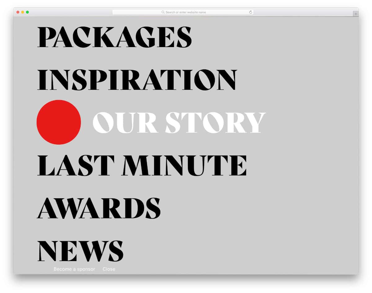
CSS Menu V17

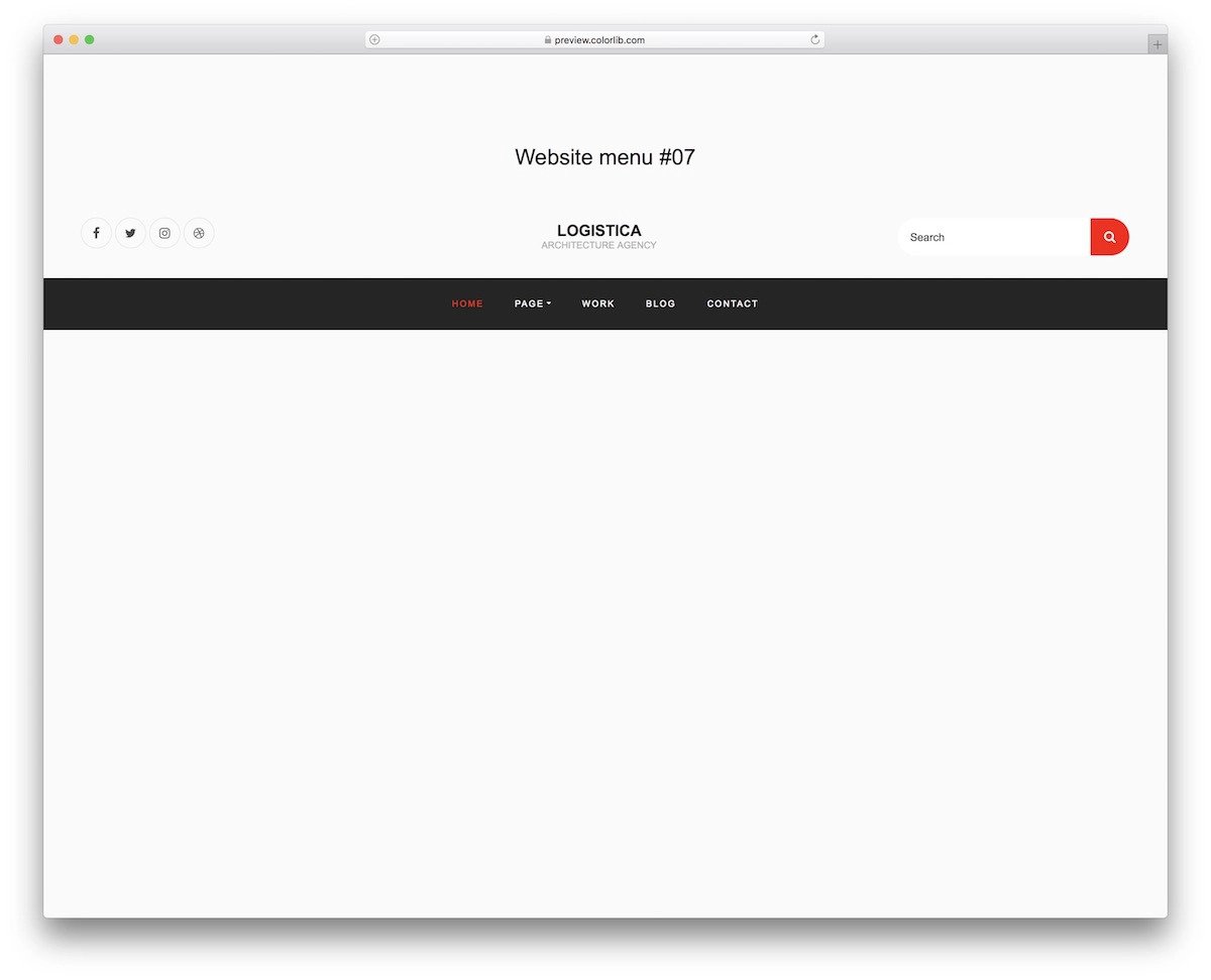
V17 is a CSS menu bar design example. This template has almost all the elements needed on a top bar—for example, social media icons, search bars, and a logo space at the center.
The menu bar uses a dark theme and neatly separates it from the main content area. Contrasting colors like white and bright red for the menu text and highlighting help get the user’s attention. Plus, the contrast color enhances the website’s overall aesthetics. The source code for this template is included in the download file for easy editing.
Menu V20
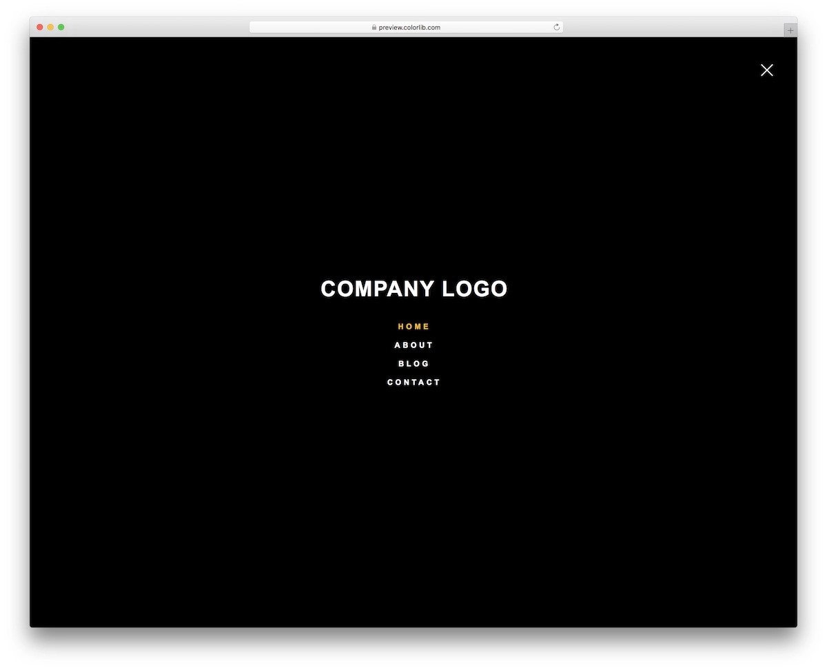
The V20 CSS menu example gives you a hamburger-style full-page design.
Though it is a free template, the creator has given you a fully functional design. Right from the transition effect to the hover effects, everything works flawlessly. Even the minute animations when you hover over the hamburger icon and cross icon are done neatly in this template. This is the best option for you if you are looking for a fully functional CSS menu example with source code. Code-wise, the creator has kept it as simple as possible so you can easily use this design in your projects.
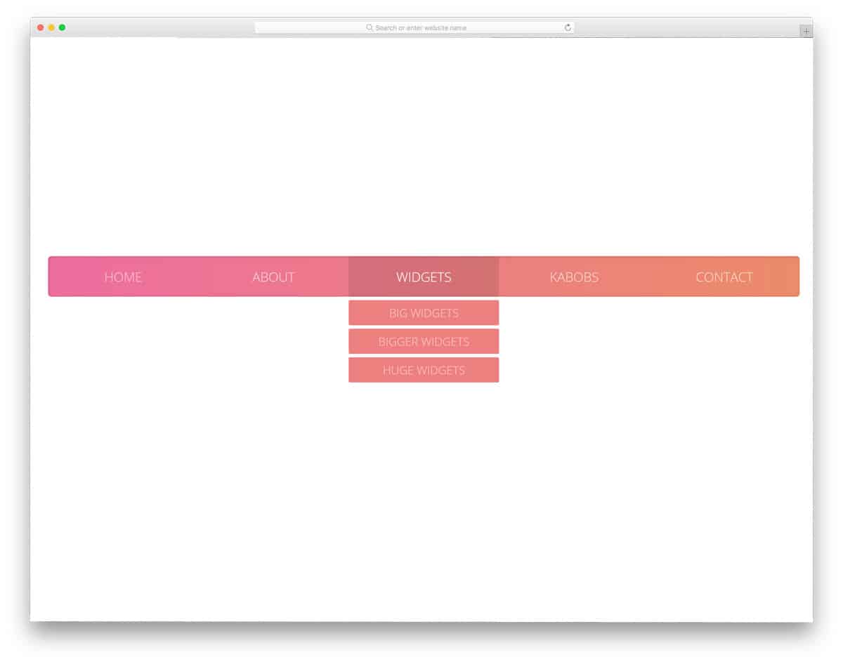
Website Menu V06
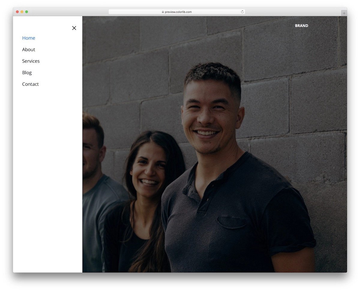
As the name implies, the V06 is a CSS menu example for website menus.
This hamburger-style menu slides from the left. The menu options are neatly listed in the hamburger menu. More than ample space is given between each option, and after that, you also get plenty of space left to add your own custom elements. For example, you can add an email subscription form, social media icons, and many more. You can easily scale these menu options as per your design requirements.
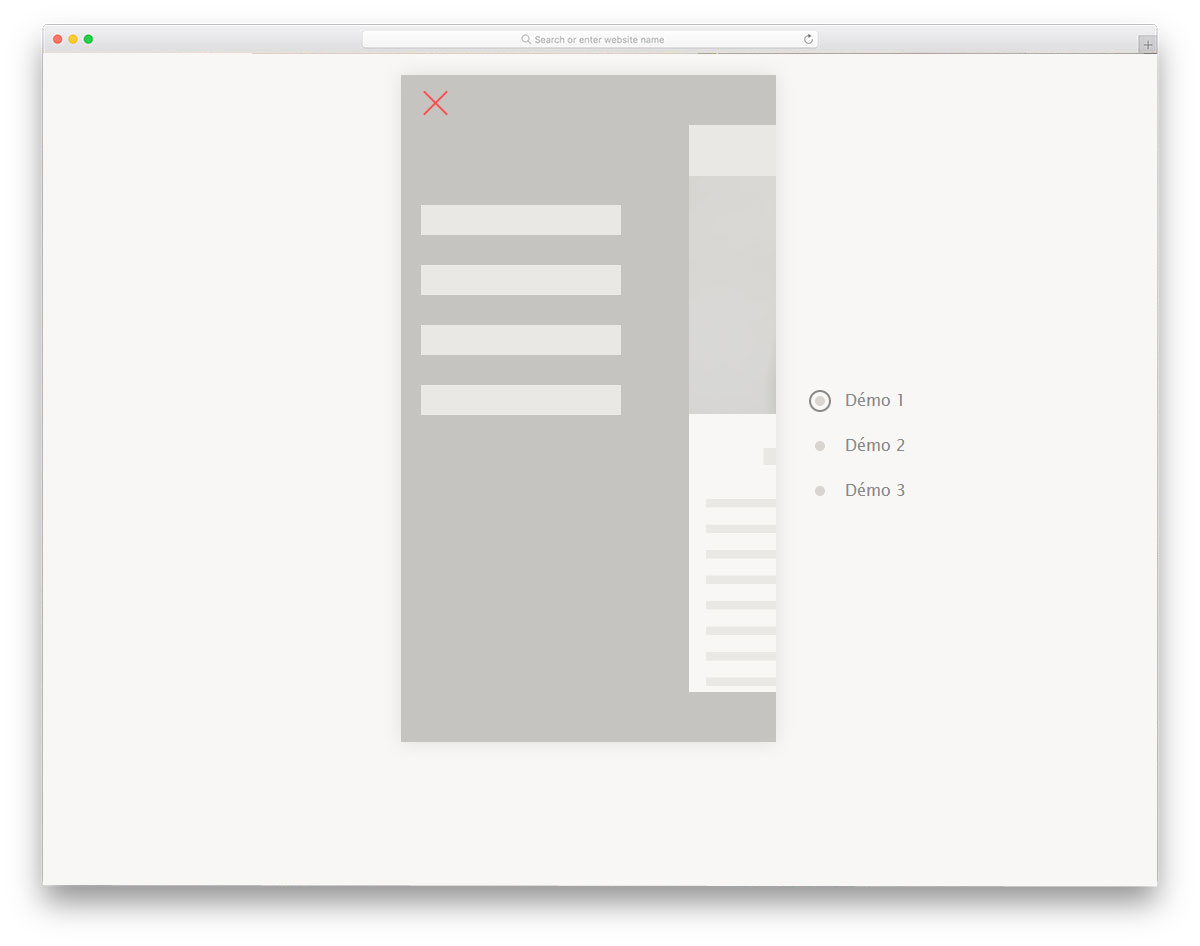
Website Menu V03

Website Menu V03 has a plain CSS menu bar example. This menu bar’s transparent design reveals the background image to the audience. A blue highlighter is used to show the selected/interacting menu option. This one will be a good choice if you are looking for a professional-looking CSS menu design example. A drop-down menu option and a submenu category are also included by default, which will come in handy for large websites with many pages.
Pure CSS Full Page Menu
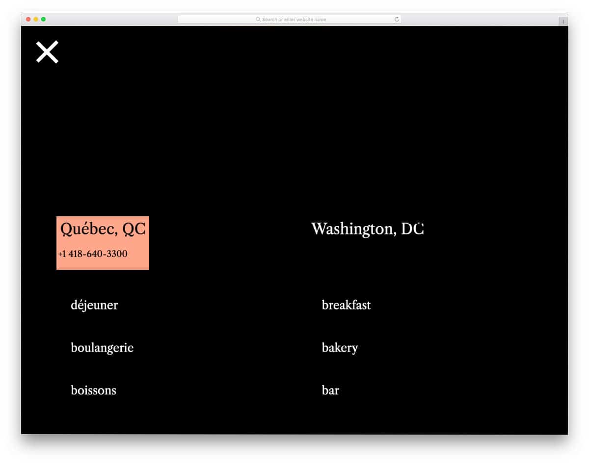
This one is a sensibly designed CSS menu. The creator has used hover effects to display related information and link details. For example, when you hover over the contact link, a quick overview of the address is shown along with the contact details. A sensible CSS menu design like this will make your website easy to use and smarter, which most modern users will love. Since the whole design is made using the CSS script, you can easily add custom elements and animations to this design.
Menu with Awesome Hover

Those who want a unique CSS menu design will like this concept. The creator has used a hexagon pattern for the menu options and bright, attention-grabbing hover animations. If you plan to use a full-page navigation design, this concept will fit perfectly. Since all elements are designed with the CSS script, they look crisp across all screen sizes. Plus, the user can see the details and interact with the menu options without issues.
Randomly Generated CSS Blobby Nav
This CSS-blobby menu concept gives you a full-page animated menu. Menu options are shown in animated bubbles when the user clicks the hamburger menu icon. The default concept makes it a perfect option for cleaning, laundry, and plumbing websites. Of course, you need to tweak the bubble designs to fit your concept. The given code structure is flexible enough to handle your custom effects, so you can use this code snippet to create your unique CSS menu design. Speaking of plumbing websites, check out our plumbing service website templates, which feature several pre-designed creative elements.
Inspiration for Menu Hover Effects
In this CSS menu design example, the creator has given different hover effects for the menu options. Nearly eight types of hover effects are given in this pack, and all of them are different. The creator has kept the hover effects quick and smooth so users won’t get annoyed by the animations. In this pack, you get both creative and simple effects. You can pick the effect you want based on your need and tune it to fit in your design. You get the complete code script in the download file so you can easily work with this CSS menu example pack.
Draggable Menu with Image Grid

In this CSS menu example, you get a creative design. If you are looking for something different from the usual design to give users an interactive feel, this example might inspire. The default menu design makes it a perfect fit for digital agency websites with creative design. As the name implies drag interface is used in this design. The drag interface will be a good choice for touch devices, but for computers, it is better to include keyboard input options. The corresponding image gallery is shown in the default design, but you can map it to the page or any other element you want.
Line Menu Styles
This is another hover animation example for menu options. As the name suggests, this example uses line menu style. More than ten types of line style animation effects are given in this pack. If you like simple, creative animation effects, it’s worth bookmarking this page. All animation effects are simple and neat so you can use this line menu style in all types of professional websites without any hesitation. The properly structured code script will help you easily utilize the code in your project.
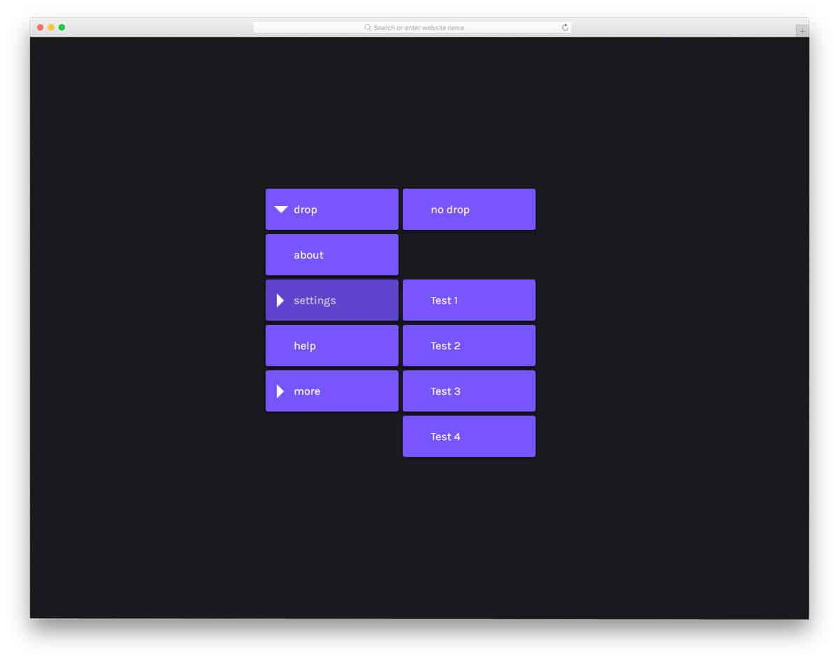
Multibox Menu
If you are planning to use Windows tile style navigation menu for your website, this design will impress you. The creator has used a full-page menu design for this example to give you more space to add menu links and creative stuff. The creator has also given hover effects in this example along with the creative tile style. This script will simplify your job if you are looking for a fully functional CSS menu design. Since all the basic optimizations are already done in this example, you can focus on customization and adding the features you want.
Animated Border Menus

This example might give you some fresh ideas if you plan to use screen borders for your navigation menu. Six demo variations are included in this pack, each unique. The screen becomes dull so the border navigation menus look more evident to the users. All four corners are utilized smartly in this example. The creator has kept the animation and transition effects as simple as possible so the menu design doesn’t weigh down your website. Plus, users can also easily access the menu options. The entire code script is provided as a download file to make it easy for developers to use.
Distorted Link Effects on Menus
This example will give you ideas for menu hover effects. As the name implies, this example uses distorted effects for the menu options. The creator has included six demo variations in this pack. Each effect is unique and will give the website/mobile application menus a different character. Since the effects are bold, it is better to use them for full-page menu designs. Well-written code script makes the animations swift and smooth. Mostly modern animations are used in this example, so you can use them for contemporary web designs without any hesitation.
Menu 1

The developer Virgil Pana has given a concept for hamburger menu designs. Though the original design is displayed on a mobile screen, you can use this pretty damn quick animated menu for all types of websites/applications. Both folding and unfolding animations are given in this pack, so you can get a better idea of the design before implementing it on your website. A few lines of JavaScript are also used in this example to make the animations even smoother. The entire code script is shared with you on the CodePen editor. You can trim the code per your needs and visualize it in the editor itself.
Mobile Navigation Animation

This example also gives you an animated mobile menu concept. The quick-moving split-screen transition effects will surely give an engaging user experience. Menu option hover effects are also included along with the transition effects. If you are a beginner, codes CSS menu designs like this will help you understand the whole design concept. The code is kept as simple as possible so developers can easily understand it. Since the default design is complete and works properly, you can use this code snippet directly on your project.
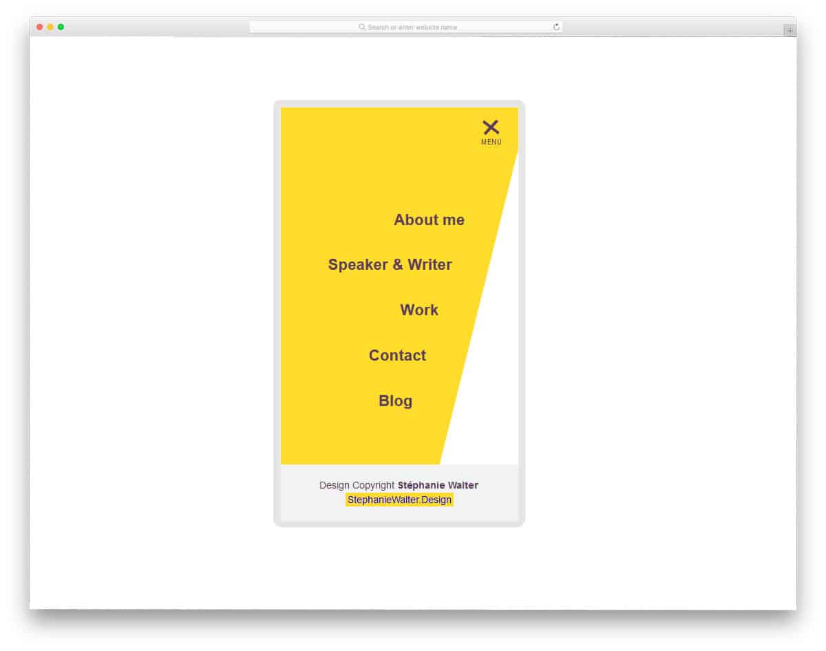
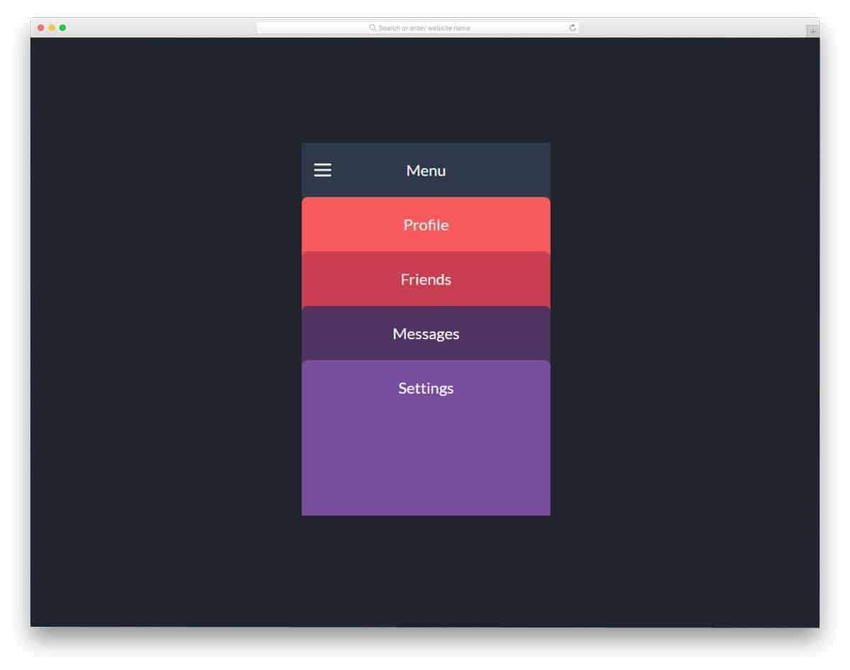
Colorful Flower Popup Menu

A radial menu design concept is used in this design. The bubbly effect and drop shadows give an authentic radial bubble effect. Different colors are used for each bubble to help users easily identify menu options. Icons are used for menu options to make the menu design even more appealing. Since this is a concept model, you still have room to add your own custom features and options. Another advantage of this design is it is made purely using the CSS3 script. Hence, you can easily use the code in your project without any hitches.
Expanding Grid Menu

Expanding Grid Menu is also similar to the Multibox Menu mentioned above, but this one is more similar to the Windows tile interface. The creator has given you a solid color design and image background design in this example. If you like to spice up the design, you can add video and image slider backgrounds in the tiles. You only need to fix the timing for menu folding and unfolding. Though the animation effect is smooth, the unfolding effects take a little longer than usual. Apart from the timing issues, this menu concept will help you make an interesting and applicable menu design.
Menu cpc-Menus
This CSS menu design is built purely using HTML and CSS3. The visual effects are smooth, and you can expect them to perform better even on small-screen devices. As most of the effects are sleek and quick, the user does not need to wait for the option to appear. A gradient color scheme is followed in the demo, but you can add your own color scheme. As this menu uses the latest CSS3 framework, you can add any trendy colors based on your requirements. This type of menu suits any modern and creative website template designs.
CSS Menu By Adam

If you are making a cool looking restaurant website or fast food, using a menu like this will make the users awe-struck. This menu design is full of cool effects and the sub-menu options jump out of the main category. The creator has treated the menu like a mega menu, with an option to add images. If your restaurant offers different services and different types of foods, having a mega menu option with images will help you properly organize the options. Since the developer has used only HTML5 and CSS3 framework, you can easily incorporate this menu in your project. By making a few customizations, you can easily add this to your project.
Sticky Navigation Menu With Smooth Scrolling

Sticky Navigation Menu With Smooth Scrolling is a design that you can use on any website. Menu designs like this will be a good option for landing pages and one-page templates. The menu bar automatically expands and contracts as the user scrolls down the page. This smart navigation bar behavior gives you enough screen space to see the contents without any issues. To make this design, the creator has used HTML5, CSS3, and a few lines of JavaScript. The entire code structure for this design is shared with you so you can trim it as per your preferences.
Pull Menu – Menu Interaction Concept

This Pull menu concept is an interesting design. When the user pulls down the menu bar, the navigation menu will change. The developer has wisely placed the interaction area at the top so the user won’t accidentally trigger the menu. The only downside of the design is that you can’t jump to the pages with a single click. You have to pull down and hold until the desired menu option appears. This menu concept is a perfect option for short menu navigation lists, but not for long navigation menus. The developer has used HTML5, SCSS, and JavaScript to make this design.
Touch Device Jelly Menu Concept
Touch device jelly menu concept is a navigation animation effect for mobile menus. Like most smartphones, even the budget ones offer a good quality touch experience, animation effects like this will look great. If you are using a full-screen menu style, this navigation animation will give your design a lively feel.
Floatting Draggable Menu
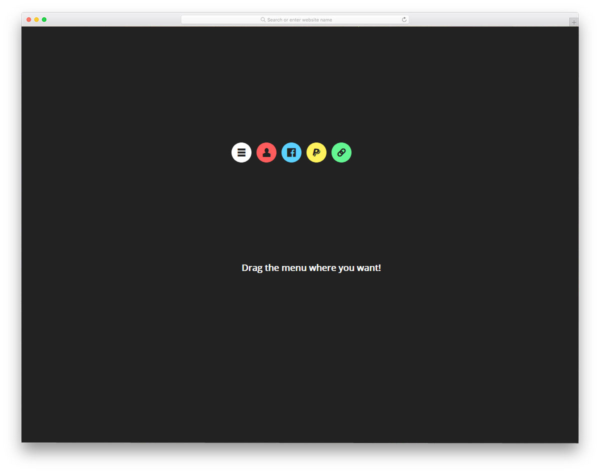
This design is inspired by the Facebook Messenger chat head concept. You can easily drag and place the menu bubble anywhere on the website. This menu concept is good, but in practice, it works only for mobile applications. If you want to make menu options easily accessible to users, this design will help. Since it is a dynamic design, the developer has predominantly used JavaScript, and the CSS script is used to refine the result. Though it is a demo concept, it works perfectly, and the menu unfolding directions change as per the screen space. Hence, you can use this code without any worries and customize it as per your requirements.
Recursive Hover Nav
This minimal-looking menu can be used in almost all websites and web applications. The visual effects are sleek and subtle without making any fuss. As the name implies, the drop-down menu appears when the user hovers over the menu. Multiple sub-menu options are also provided in this demo to give you a clear idea before using it on your website or project. As the developer has shared the code directly, you can get hands-on experience with this menu design. The Codepen environment helps you to visualize the changes as you make them.
Mobile Menu
As sliding gestures increase in the mobile UI you must make your mobile applications accordingly. For example, switching between apps and getting to the home screen in iOS (after iPhone X) and in Android P now use gestures. The latest swiping gesture interface inspires the menu animation effects in this mobile menu design. In the default demo itself, the transition effects are fluid and clean. You can use it as such in your application. Even if you need you can make little improvements. Since the code is shared with you by the developer of this menu, you can easily customize it. Speaking of iPhones, look at our iPhone mockups to elegantly showcase your designs.
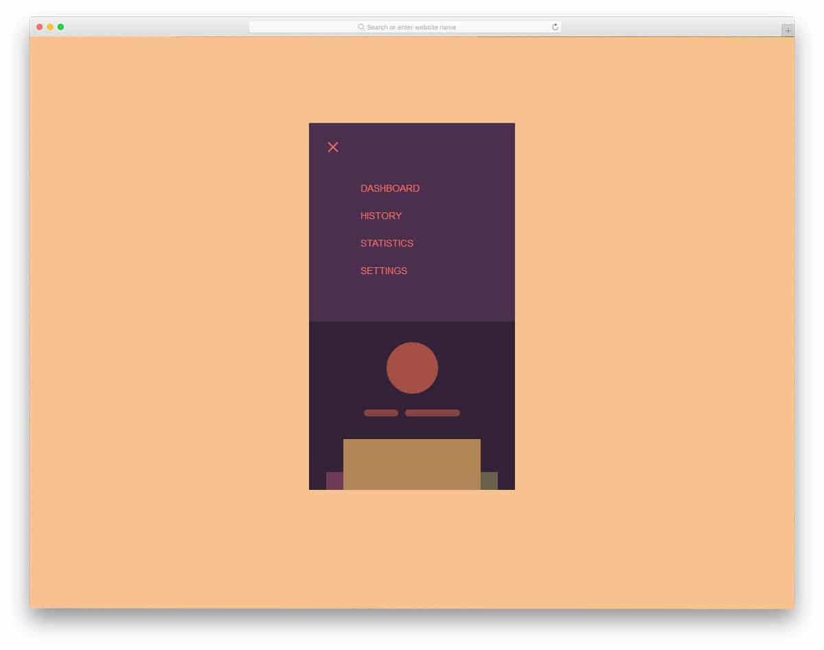
Mobile Menu Concept

This mobile menu has been inspired by the Android P interface. Google is known for its smart AI features. In the Android P version onwards, Google will suggest some of the applications you frequently use, before jumping into the main app tray. The designer of this menu has given you similar quick menu options at the bottom. Sliders provide more options in a single place, and search options are also available in that small area. This design not only looks beautiful, but it also practically works. The whole coding used for this beautiful menu is given in the info link below, check it out to know more.
Mobile Menu Animation
As smartphones are getting taller, keeping your menu options at the top will make them difficult for users to reach. Edge-to-edge screens are becoming popular and are now a standard; in smartphones like this, you can keep all your important menu options at the bottom. The designer of this menu has put the menu options at the bottom center of the screen instead of keeping it on the top. Still, it has a minor fault, users will find it annoying when they scroll through the pages. So you can keep the menu at any one side of the bottom corners. The menu options open in full-screen mode, so the user can easily select an option.
Animated Mobile Menu Step by Step
You might have seen this menu style frequently in many modern websites. One of the biggest advantages of modern web development frameworks is the ability to use any shapes in your design. Consistently you can carry those shapes in your menu options as well. Adding a few animation effects can give your menu options life. Since the mobile screen space is limited, menu options mostly open in full screen; this reduces the risk of false clicks and annoyance. You can use this menu style in all modern websites and applications. Though the creator of this menu has tested it on a small-screen device, you can use it on the computer version of your website.
Pure CSS Mobile Nav Animation
The creator of this CSS mobile menu has given you three variations. All three variations are clean and subtle, so you can use them for any professional website. This menu design is best suited for blogs and small eCommerce stores. As the name implies, the developer has concentrated more on the navigation menu animation effects. You can use this concept and add your menu options. The developer has shared the entire code used in all three variations. All you have to do is pick the one you like and start working on it. You can easily edit and view your results in the provided Codepen editor.
Mobile Menu Slider Prototype
As the name implies, this menu design has menu sliding effects. This menu design best suits image-rich websites, such as Unsplash. Without any disturbance, the user can easily enjoy the photographs in full-screen mode. As this menu pushes the main screen away, you can’t use this menu design on all screens and web pages. You can use this in full-screen mode alone or with other types of animation. The developer has shared the code with you directly; you can play with it however you want.
App Navigation By Ian Turner
Though this navigation design is made for applications, this can be used for websites. All the menu options are treated as cards. To make it look more beautiful, different color schemes are used. Using a color scheme for different menus helps the user to easily identify the options or the pages they are in. The effects are smooth and clean so that the user won’t feel any lag. For a buttery smooth effect, the developer has used a few lines of JavaScript. This menu design is the best option for digital agencies and other creative websites. You can easily use this menu on your website or project by making a few adjustments.
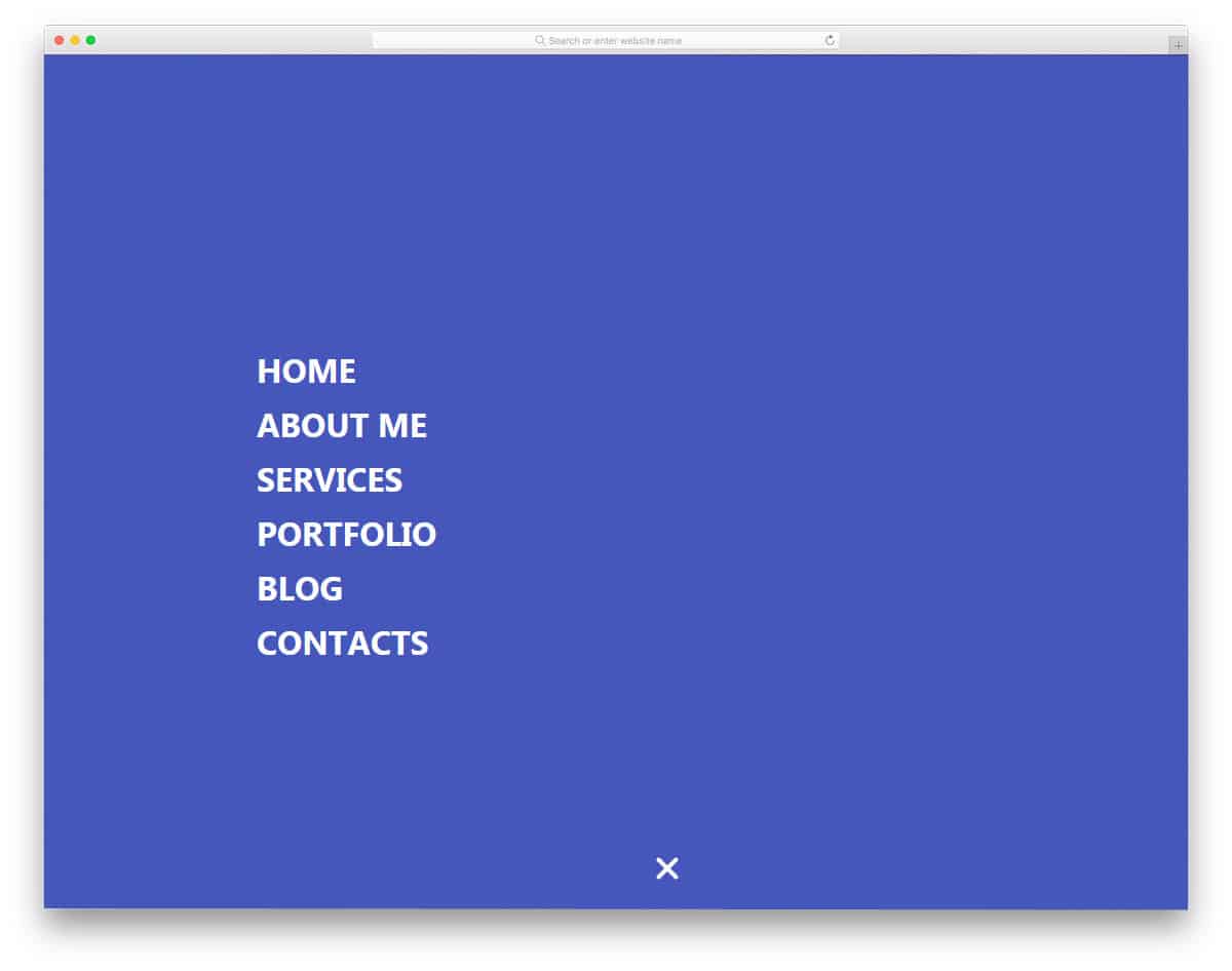
Purple Sidebar Menu

Purple Sidebar Menu is a simple menu bar that you can easily use on all types of websites. If you wish to give more space for the contents and make the navigation menu easily accessible, the sidebar menu is the best option. As the name implies, this menu design uses a purple menu color scheme. But you can always add your own color scheme based on your website or application design. Navigation menu animations are not given in this menu design. If you are looking for some cool effects, keep reading this post, there are more for you to get inspired.
Menu Hover Line Effect
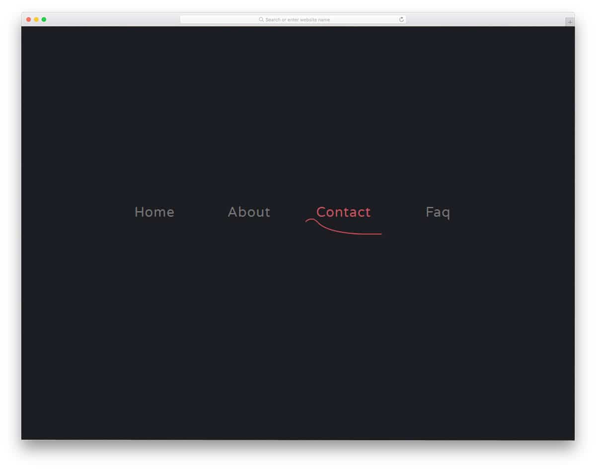
This menu design gives you inspiration for hover effects. The creator of this menu has used simple yet effective animation. You can use this animation as such on a music website and on a hospital website. The sine wave like design will match the core theme of a music website and a hospital website. Effects are kept sleek and simple so that the user will notice them easily. This effect best suits the main menu options; if you plan to add sub-menu options, you may need to tweak the menu design a bit. The developer of this menu design has used only HTML and CSS3, so you can easily use it in your project.
Clip-path CSS Menu Concept
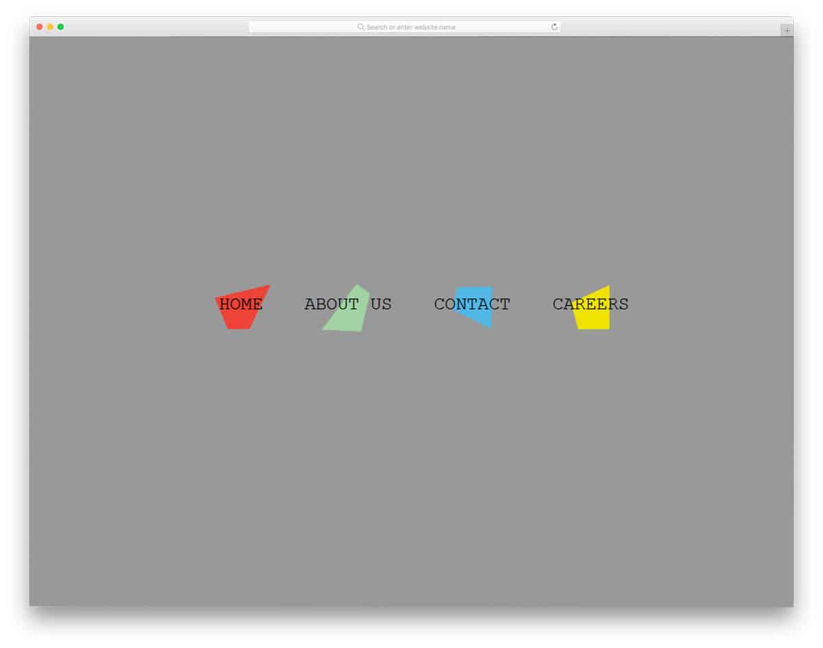
Clip-path CSS Menu Concept is a lively menu design with fun-filled clean animation effects. You can use this menu design in kids school website and in event websites. Each shape is treated as a separate element so they change shapes when you hover over the menu. You can keep them wriggling around all the time or keep them still and animate only when the user hovers over them. Animation effects like this will get user attention easily, even on a content-rich website. Since the designer has done this purely using CSS, you can work with easily and use it in your design.
Lavalamp CSS Menu
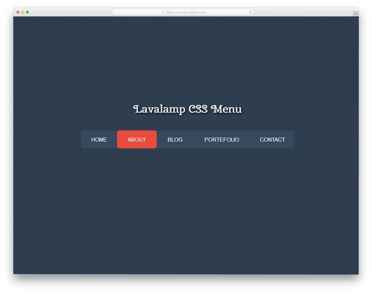
Lavalamp CSS Menu is an interactive menu design. The designer has used colorful highlighters to indicate which menu the user selects. Different color tags are used on the magazine website templates to easily organize content by category. Using the color code itself, the user can easily find the content category. You can use this colorful CSS menu design on websites such as magazines and news sites. The transition effects are fluid and snappier so that the user can interact with your menu without any issue. As the name implies, this menu is designed using only HTML and CSS.
Slide-Menu 2
Slide-Menu 2 design is perfect for one-page website templates and landing pages. Neat icons are used along with the wording to elegantly display the menu options. Combining smooth scrolling with this menu gives you an impressive page navigation effect. Like most other CSS menu inspirations in this list, this one is also made purely using the latest CSS3 framework. As most of the effects are default effects in CSS3, you can easily make a menu design like this in no time. Or you can simply use the code from this menu design and tweak it to save time.
Another Menu Concept

This menu concept is a more common one and can be used in all types of website navigation menu designs. The creator of this menu has used a hamburger-style menu, and the menu options open in a full-page view. Effects are kept very simple, which makes it a perfect fit for all types of websites. By default, the menu options are arranged horizontally. But if you need to, you can arrange them vertically as well. The coding is shared with you in Codepen editor, where you can edit and see your results simultaneously.
Full Width Menu & SVG Animation
The developer of this menu has given you a fully functional menu design concept. You can use this menu straightaway on your website by making a few adjustments. This colorful menu design is the best fit for portfolio websites and for any website with creative design. The developer has followed the modern design trends in this menu design. Texts are made bold and stylish with cool fonts, bright colors, and neat animation effects. Latest frameworks like HTML5 and CSS3 are used in this menu design so you can bring the latest design and colors in this menu. The entire code used to build this menu is given in the info link below, take a look at it to get your hands on it.
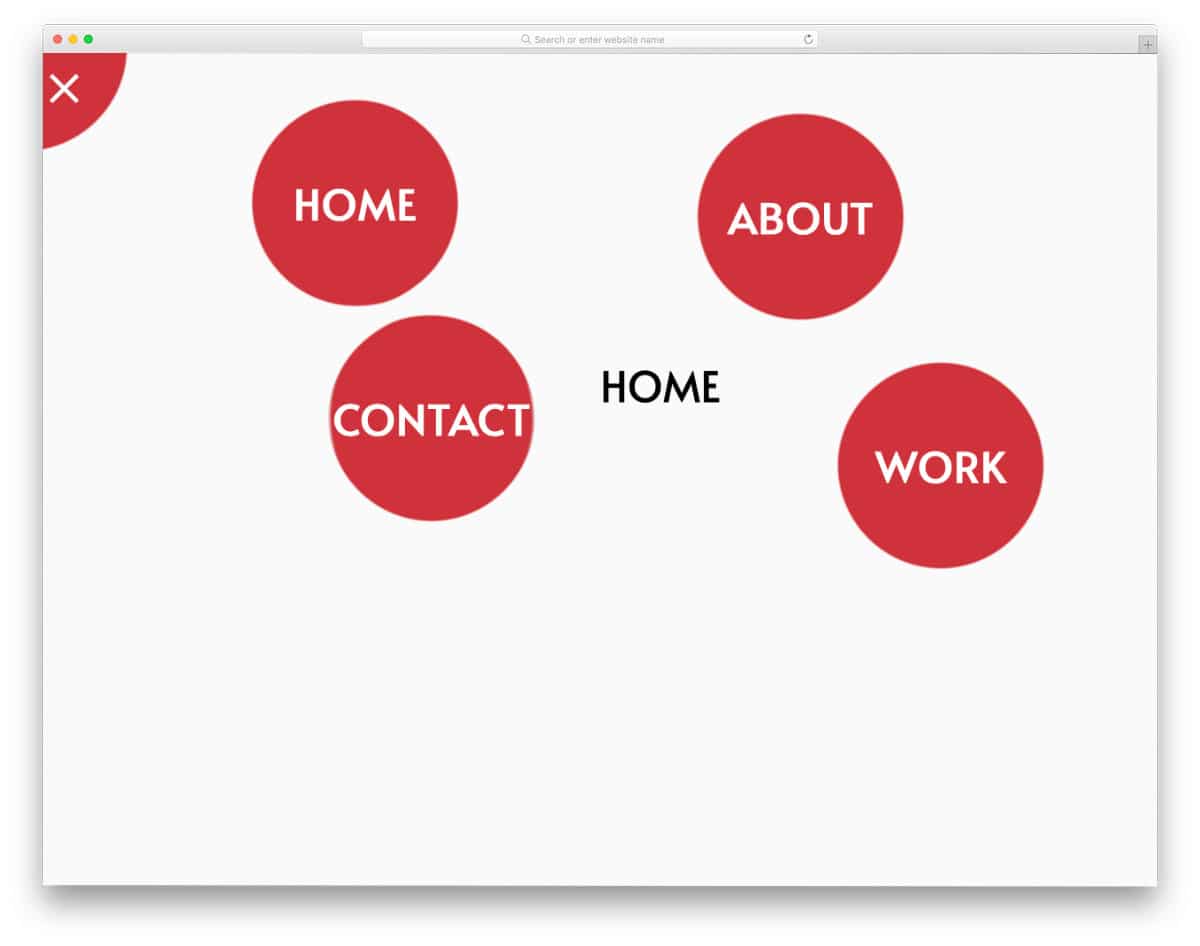
Pure CSS Fullscreen Navigation Menu

While the previous menu design features a colorful concept, this one uses a clean circular menu design. As the name implies, this one is also a full-page navigation menu design. The developer has adopted a more practical design approach in this menu. So you can use this menu in all types of websites with hamburger-style options. This menu design is lighter than the previous Full-Width Menu & SVG Animation menu design mentioned above. The developer has used only HTML5 and CSS3 codings to build this beautiful menu. Based on your requirement, you can go for the menu design that suits you.
Gooey Menu
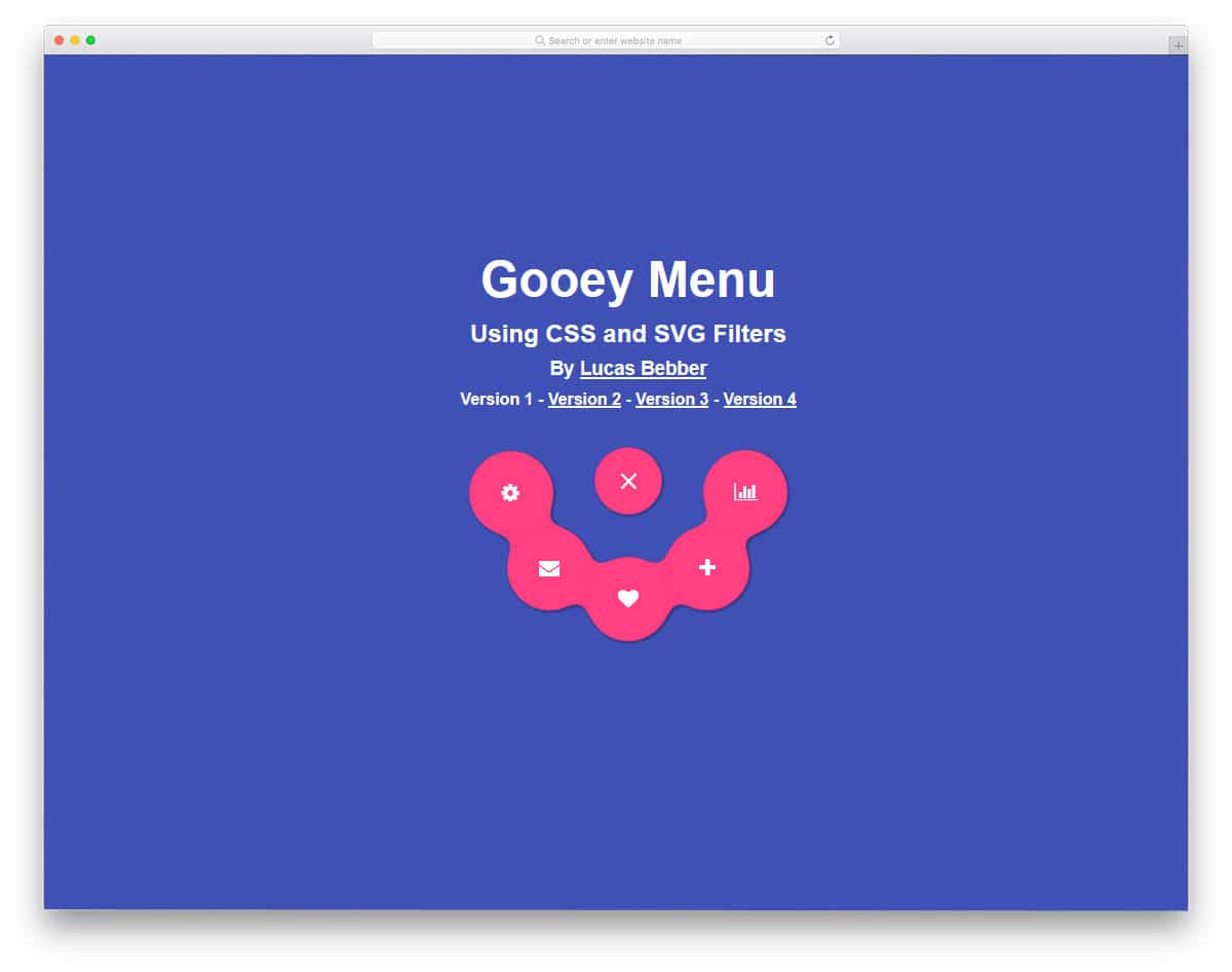
Gooey Menu has a fun design concept. Without taking up much screen space, the menu options are neatly displayed. Since space is very limited, you can only add icons to the menu options. This type of menu design is best suited for applications and for showing settings options. The effects are smooth and fluid, so the user can feel a complete effect. Circular design elements are mostly used in this design, which looks neat and properly contains the elements. The best thing about the menu design is that the developer has kept it really light, using only HTML5 and a CSS3 framework.
Fully Responsive CSS3 Menu
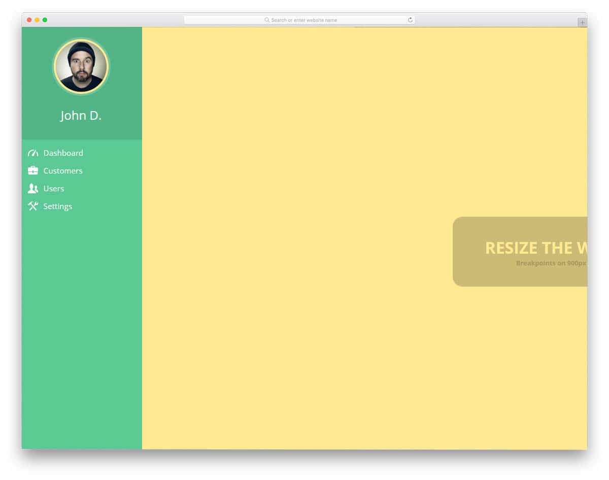
Fully responsive CSS3 menu is a concept design for your admin dashboard menu navigation. The creator has added colors to the admin template to make it more presentable. The navigation design is kept very simple, as you would normally see in all web application dashboards. If you are a beginner, you can start with this template. The developer has kept the coding structure really simple so you can find and edit the parts you want. Only HTML5 and CSS3 frameworks are used in this design. You can keep this as a base and create your own custom design.