


Collection of the best CSS gradient button concepts you can use in 2025.
Gradient color schemes are almost dead in the flat-style web design era. But now, the gradient colors are gradually returning in web and mobile app designs. In the recent update, Adobe XD has made it easier to add gradient colors, showing how quickly the trend is spreading among designers. The designers love gradients because they add depth and life to the design. Using the gradient color scheme, you can easily make a web or app element stand out. In this list, we have collected CSS gradient buttons to help you express the feel and depth of the button’s function.
Easy-to-Use CSS Gradient Button Designs
All CSS gradient button examples in this list have a professional code structure, so you can utilize the code easily in your projects. To make the job even simpler for you, code snippets of the designs are also included.
Here are the best CSS gradient buttons.
CSS Gradient Button Text
You get clean, beautiful CSS gradient button text in this example. The creator has used gradients elegantly on both the button text and the borders. A subtle hover animation is added to this button to make it more engaging. Since the whole gradient button and text concept is made using the latest CSS3 script, you can try modern animations and designs on this button to give your personal touch.
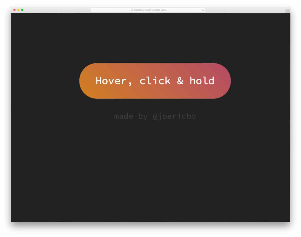
Animated Gradient Buttons
Two types of CSS gradient buttons are given in this pack. One is a standard double-color gradient button, and the other is a multicolor gradient button. Color-shifting hover animations are handled smartly in this pack to look more vibrant and engaging. Animation timing and natural colors give the design an authentic look, thanks to the latest CSS3 script. The entire code script is shared with you in the CodePen editor so you can easily use it in your project.
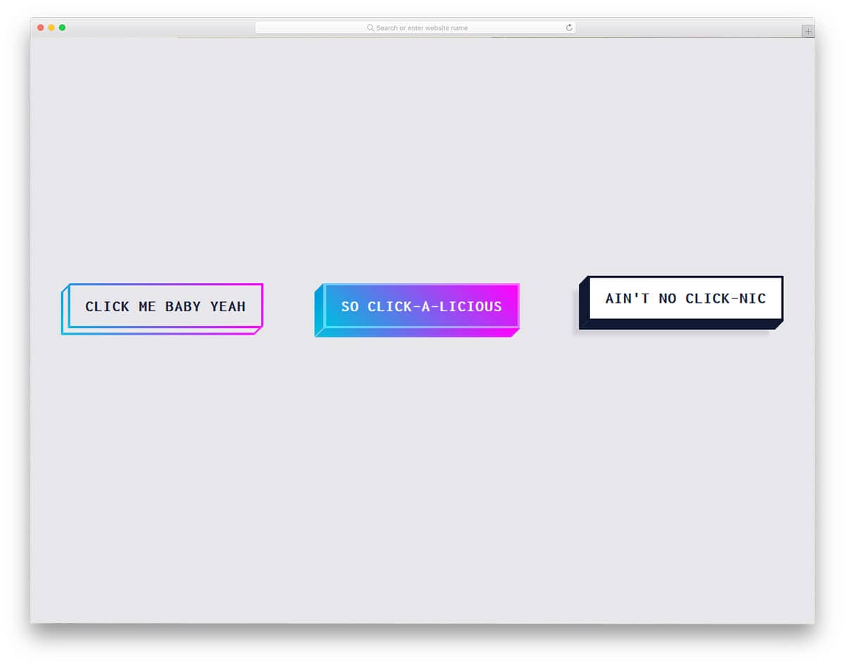
Linear Gradient Button
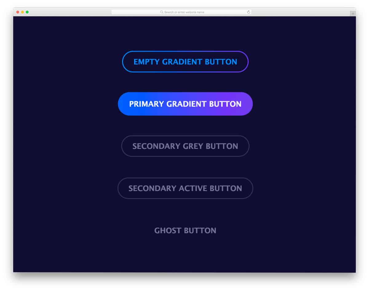
In this gradient button design pack, you get two linear CSS gradient button designs and two single-color buttons. Two different gradient animations are used in this pack; both look beautiful. Plus, the bright gradient button will easily catch the user’s attention. A blue-and-purple gradient color scheme is used in the default design. You can try your own colors to make the gradient button fit your website or application. A ghost button is included with the gradient buttons and may be handy for you.
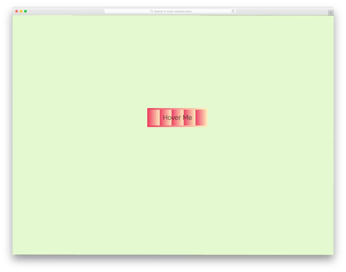
Peach Beach Button
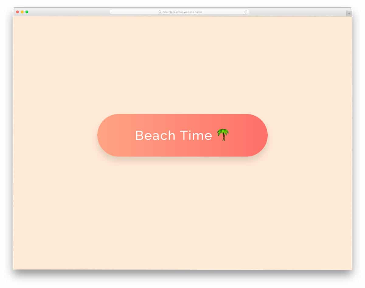
The Peach Beach Button is a perfect example of using contrast gradient colors smartly. This button uses a simple green & yellow gradient at the normal state and turns into an orange and red gradient when you hover over it. The creator has handled the color-shifting effects cleverly in this example, which makes it special. Since the entire design uses the latest CSS script, you can try new gradient colors and new effects to spice up the design.
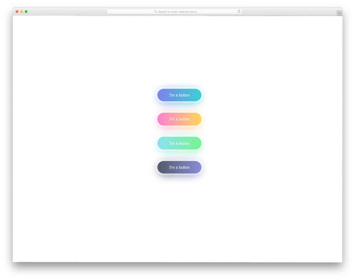
Simple Login Card

As the name implies, this login card example uses a gradient button. Instead of color-shifting effects, the creator used a glow effect, which makes this design attractive. If you are designing a modern login page with bright colors, gradient buttons like these will come in handy. Speaking of cards, look at our Bootstrap card examples for more interactive designs that can help you present content in an interactive, bite-sized format.
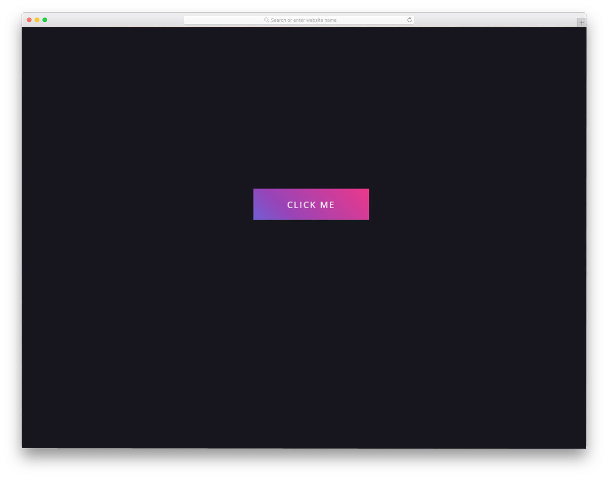
Sexy Gradient Button
Sexy Gradient Button is a bold and attention-grabbing gradient button design. The use of a modern, bold font and highly contrasting gradient colors makes this CSS gradient button unique. The creator added a depth effect to the button to make it more noticeable. All effects in this design are made using HTML5 and CSS. Hence, you can easily handle the code and use it even on an existing website. The animation timing and flow are smooth in the default design, so there might not be any issues if you use this code as is.
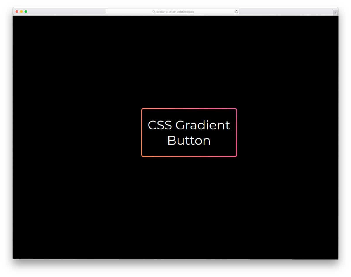
CSS Gradient Button By Will
Animated CSS Gradient Ghost Button
As the name suggests, the creator has applied a gradient color effect to the ghost button. Designers prefer ghost buttons when they don’t want the background content hidden and want to add visual aesthetics to the design. If you want to make your ghost button attractive, you can use a gradient color-shifting animation. In the default design, the creator has kept the gradient animation as automatic. But you can edit the code to trigger the animation on a specific action, such as hovering over the button. The entire button animation is made purely with CSS3, so the developer can easily use the code in their project.
Button With Gradient Shadow
Using shadows and lightings in the design gives depth and dimension to the design. We can create realistic elements with modern web development frameworks. In this example, the creator has used the gradient shadow effect to give the gradient button a natural look. The hover effects effectively highlight the button against the background. This example gives two types of hover animations: zoom in and out. You can take the design concept and can use your own hover effect. For more inspiration take a look at our CSS hover effect example collection.
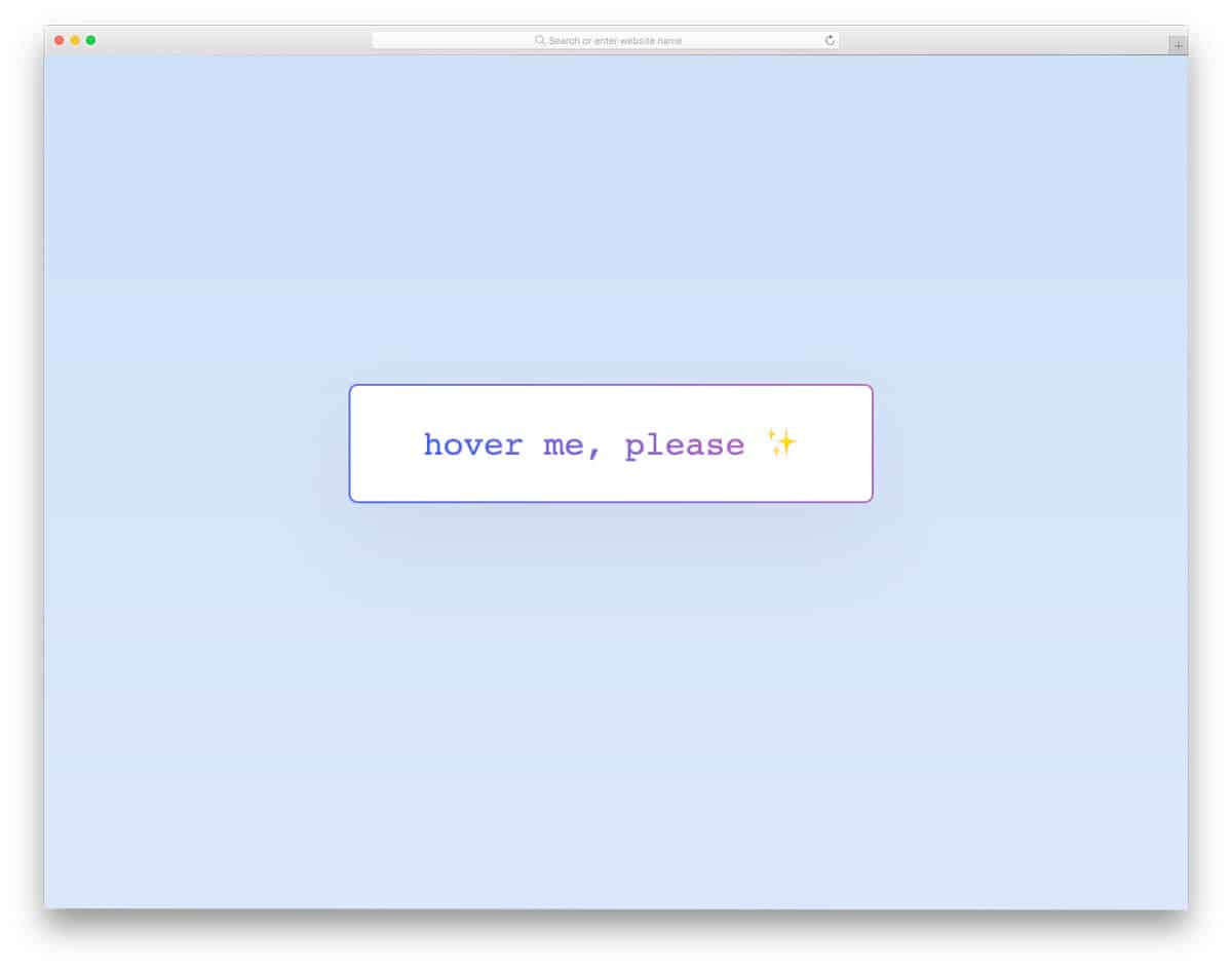
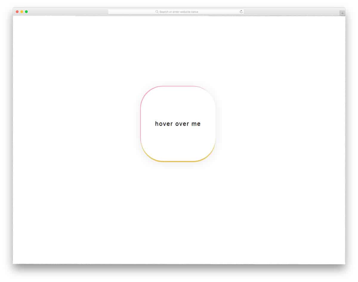
Hover Smoothly CSS Gradient Button
This developer has added the feature we missed in the previous CSS gradient button example. A lively color-shifting hover effect is used in this design. The best part is that the animation appears in the border of the button as well. A hollow button design with a gradient color gives the button a glass finish. The developer has used a pattern in the background to present the design elegantly to the audience. If you want a trendy background pattern to highlight the important section on the web page, look at our CSS background pattern collection.
CSS Gradient Button
The developer used a gradient color on the button’s border in this design. The button glows continuously to draw the user’s attention to the special element. You can use attention-grabbing elements in your landing page design to guide users to the desired web pages. As mentioned in the CSS link style, one of the most commonly used methods to highlight important links is the call-to-action button. As the developer has shared the code structure directly, you can either keep the animation as such or you can make it a hover effect.
Animated Gradient Button

In this example, the creator has created a neat animated gradient button on a card element. Cards are among the most versatile elements in responsive design, so you can see them in many mobile apps and web designs nowadays. This design makes the gradient button’s color-shifting effect attractive. Since the whole design uses the latest CSS script, you can use any modern gradient colors without issue.
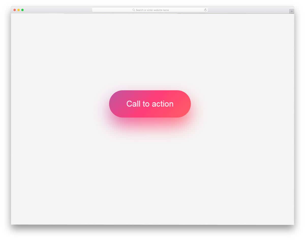
Glowing Gradient Button
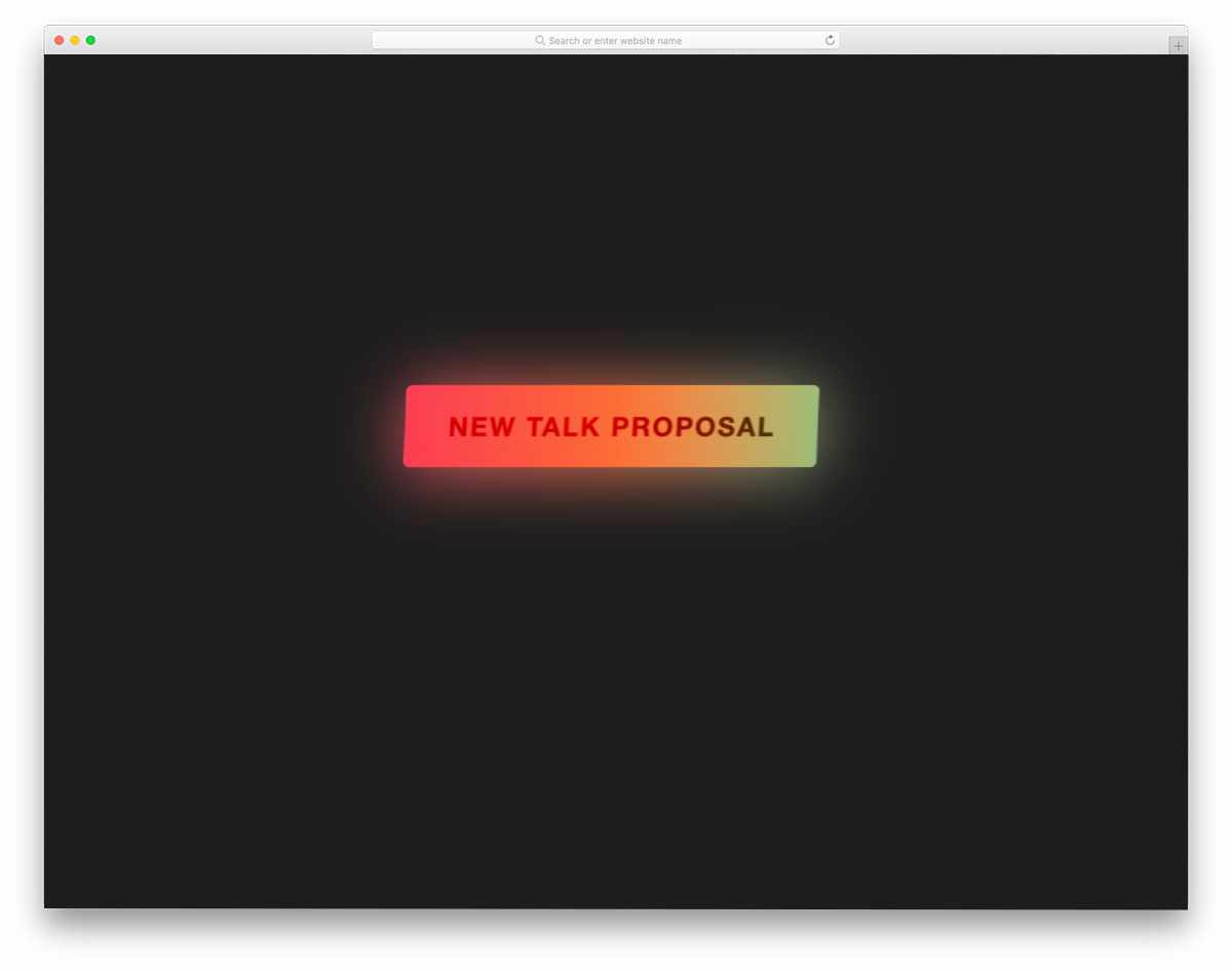
Glowing effects always add depth to the design. Combining the right gradient color and glow effect should be a match made in heaven; Users will love using your website/application. Plus, you can also neatly highlight the important button from the others. The code is kept as straightforward as possible to let you easily add the custom features you want. For more glowing effects like this, take a look at our CSS glow effects design collection.
Gradient Button With Subtle Animations
This is another hover-activated animated CSS gradient button design. Gradient colors smoothly shift when you hover over them. Just as the design is simple and neat, the code is too. Another advantage of using light-weight code is that it loads faster, and you have plenty of room to add custom features. You can use this code on your website or form by making a few minor changes.
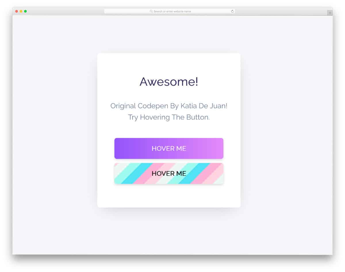
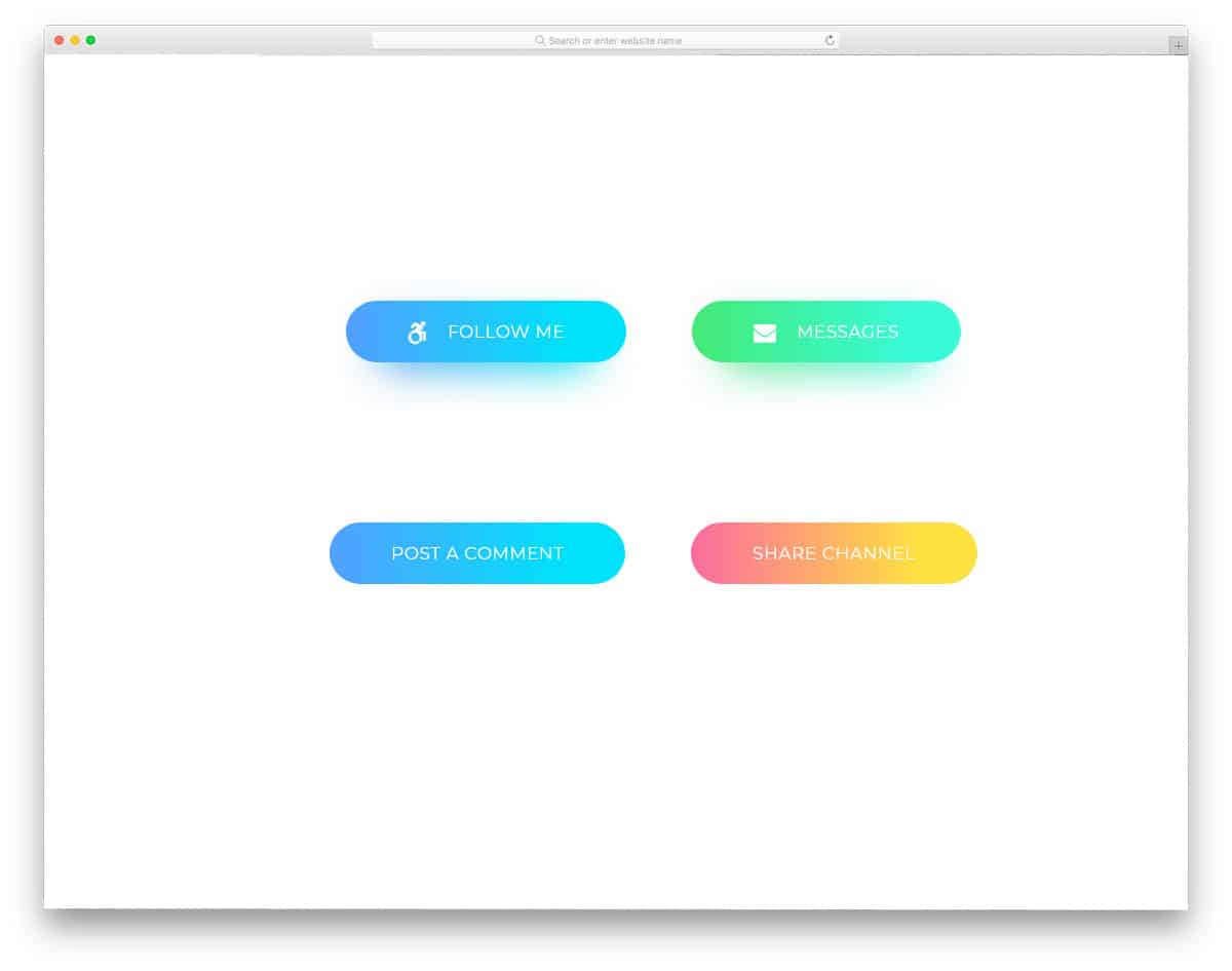
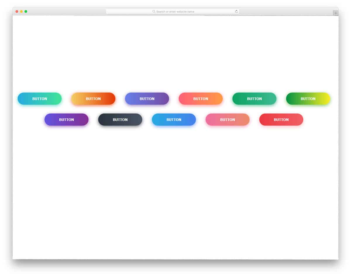
CSS Gradient Buttons

The CSS Gradient Buttons give you different call-to-action buttons. All the buttons follow the same design but use different gradient color schemes and icons. You also get hover effects in this design along with the gradient buttons. The default hover animation is very gentle and slow, but you can adjust the animation speed to your requirements. Since this design is built entirely with HTML5 and CSS3, customizing the buttons will be easy. Mostly, Font Awesome icons are used in these call-to-action buttons. Hence, you have plenty of optimized icons to choose from.
Gradient Button By Eric Grucza
This is another flat-style gradient button. The developer has given you both a gradient button design and a gradient color-shifting hover effect. The design and code structure are also simple, enabling quick and easy customization. Since it is a CSS3-based design, you can add any trendy colors to this design. If you are not satisfied with the default animation effect, you can also play with the animation effect. The simple flat design of the button makes it a perfect fit for any web design templates and mobile applications. You can use this code on your existing website by making few adjustments to the code.
Background-Color Changing Gradient Buttons
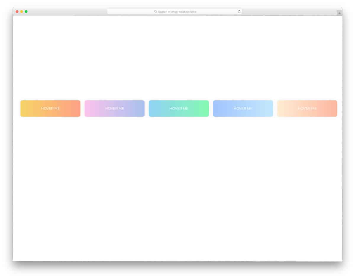
As the name implies, this one is an animated gradient button. The developer has given you five gradient color buttons, all of which use the same gradient color-changing effect. But, if you need, you can change the direction of the color-changing animation. In the code script itself, the developer has mentioned how to change the animation direction. All five gradient colors used in the demo are cool and light color-based color combinations. Since it is a CSS3-based design, it supports all modern colors and animation effects. Pick the gradient button you like and start working on it to make it a perfect fit for your design.
Gradient Ghost Buttons
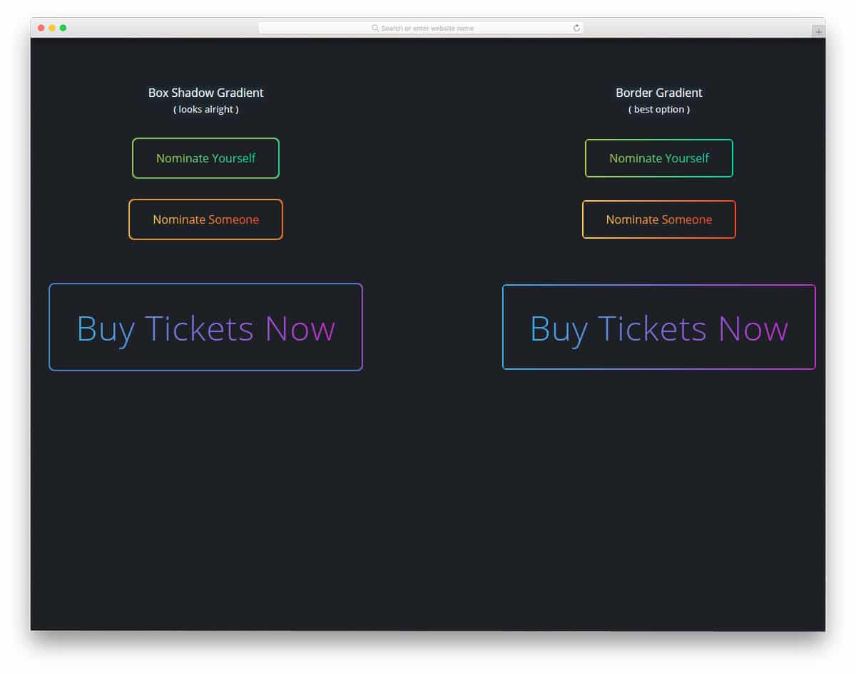
This is another example of ghost buttons. In this gradient button example, the creator has provided three button designs: a box-shadow gradient, a border gradient, and no border-radius. Since it is a concept model the creator hasn’t used hover animation on this CSS gradient button. But you can add custom animations to these buttons to make them livelier. The creator used CSS3 to create this design, so it can handle any modern animation effects. If you like using animation effects for your elements, look at our Bootstrap animation examples collection.
Gradient Button Shadows
Conceptually, this design is similar to the Button With Gradient Shadow example mentioned above. However, the creator has used a different design approach in this example. Though the CSS gradient button in this example isn’t animated, it still looks attractive. You can add the type of animation effect you want by editing the code. Like most other CSS gradient button examples in this list, this one is mostly made with CSS3. Hence, you can easily utilize the code on your existing website or application.
Gradient Toggle Button
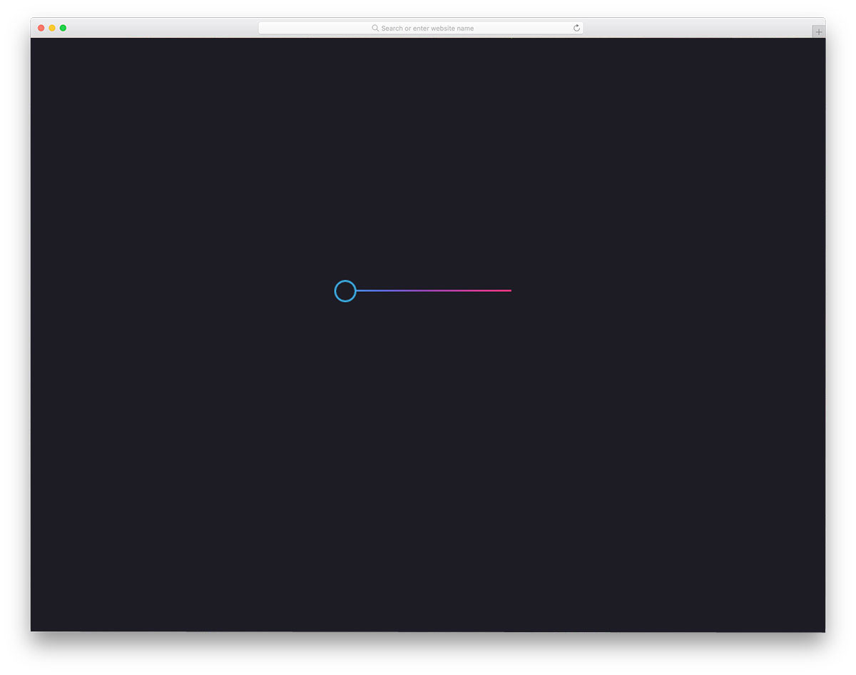
In this example, the creator used a toggle button instead of a regular call-to-action button. Toggles are widely used across different parts of the design because users can interact with them more naturally on touch devices. Various animation and transition effects are used for the toggle buttons. In this example, the creator has used gradient colors. The slider line and the slider circle also change color smoothly when you move the button from one to the other.
Gradient Button Hover
Gradient Button Hover is similar to the Background-Color Changing Gradient Buttons mentioned above. The only difference is that it has different color schemes and more rounded buttons. Script-wise, there are many differences in the gradient button design. Each developer has used a different code structure. But both code structures are easy to handle, so other developers won’t find them difficult to use. In this design, you get more vibrant colors that look attractive when animated. Shadow effects are used smartly to highlight the buttons from the background. Overall, it is a clean, attractive collection of gradient buttons. All you have to do is pick the design you like and use it in your design.
Animated Gradient Buttons

Animated Gradient Buttons: You get three types of buttons and three types of button animation. All three animations are based on the gradient color scheme, so you will get an attractive button with this code. To give a smooth animation effect, the developer has used CSS3 and JavaScript in this design. Since both the code scripts are the latest frameworks, you can also use other animation effects. The spin and the rise animation effects are very professional, so you can use them on any modern business website. The Sweep animation is a bit intense, so make sure you know where you are going to use this button.
Gradient Button Animations

You get two animation effects in this animated gradient button example. One is a regular color-changing hover effect, and the other is an infinite color-changing effect. The infinite color-changing effect is a cool-looking trend now. Another advantage of this gradient button design is that it is entirely built with HTML5 and CSS3. Hence, you can easily incorporate this design even on your existing website or design. Because of this simple code structure, adding and editing features to the gradient button will be easy for developers.
Existential Gradient Buttons
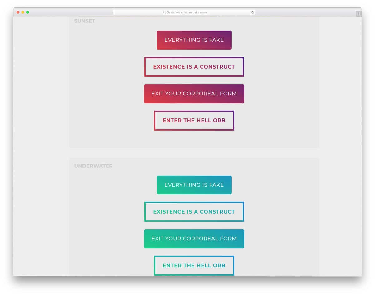
The developer of this gradient button has provided you with both full-gradient and border-gradient hollow buttons. Apart from the color-shifting animation effect, you also get an expanding effect when hovering over the call-to-action button. In the demo, you get three types of color gradients, but the button design remains the same. Thanks to the CSS3 script, you get natural colors and smooth animation. You can easily use this code in your project or application by making a few customizations. Properly structured code scripts will help the developers to easily find and edit the feature they want.
3D Gradient Buttons
As the name implies, this developer has given us a 3D button. Along with the protruding animation effect, the 3D button looks surreal. Users can feel the buttons popping out from the screen. Gradient colors are used smartly on all sides of the 3D element to get a well-balanced button. The developer has given us both a fully colored button and a colored hollow button. Shadow effects also indicate the buttons protruding from the clean background. All these effects and designs are made entirely with CSS3, which makes this gradient button so special on this CSS gradient button list.
Gradient Buttons

All the CSS gradient button designs above were made for the call-to-action buttons. In this design, the developer has made gradient buttons for icon links. You get both light and dark versions of the button in this set. For demo purposes, the creator has used social media profile links. The effects are more visible on the dark version than on the light version. Shadow effects and shadow colors are used effectively across light and dark versions so you get the same experience on both. HTML5 and CSS3 scripts are used to make this clean design.
Cool Effect Gradient Button
In this gradient button design, you get fading out style color effects. The edges and the colors on the rightmost edges are blurred to give an authentic experience; a lighter version of the same color is used in the gradient scale. But you can change the design if you want. Like most other CSS gradient buttons on this list, this one is made entirely with CSS3. Since it uses the latest frameworks, the developers have full freedom to use their own creativity in the design. If you like the default design, you can use the code in your design.
Animated Gradient Button

This is a fluorescent-style gradient button that glows continuously. If you want to differentiate the important link or button from the rest of the options, this design will be wise. Since all the animation effect happens inside the button, you don’t have to adjust your web page design to add the button. Plus, this button is built with CSS3, so it will be easy to use on your existing website. The developer has shared the entire code structure in the CodePen editor. Hence, you can easily edit and visualize the results before using this code on your website or project.
Gradient Buttons By Arturo

The developer has provided you with animated gradient buttons for this gradient design. The creator has given you color-shifting effects in different directions, i.e., left-to-right, clockwise, counterclockwise, and right-to-left. A different gradient color scheme is used for each button. You can easily change the gradient button to the color you like. The developer has used HTML5 and CSS3 code scripts for this design. A well-structured codebase will help you easily find and edit a button feature. You can use this code in your design by optimizing a few things.
CSS Button With Glowing Background

CSS Button with Glowing Background is another version of the Animated gradient button design mentioned above. In this design, you also get a continuously glowing gradient button. Though the designs are the same, both developers have handled the code differently. Plus, the glowing effect is also different, so you get a completely different glowing button in this design. The shadow effect is used effectively to give you a neat, professional look. This neat, business-like look makes this design a perfect fit for all types of websites. As the glowing effect happens on the inner side of the button, you no need to adjust other elements on your web page.
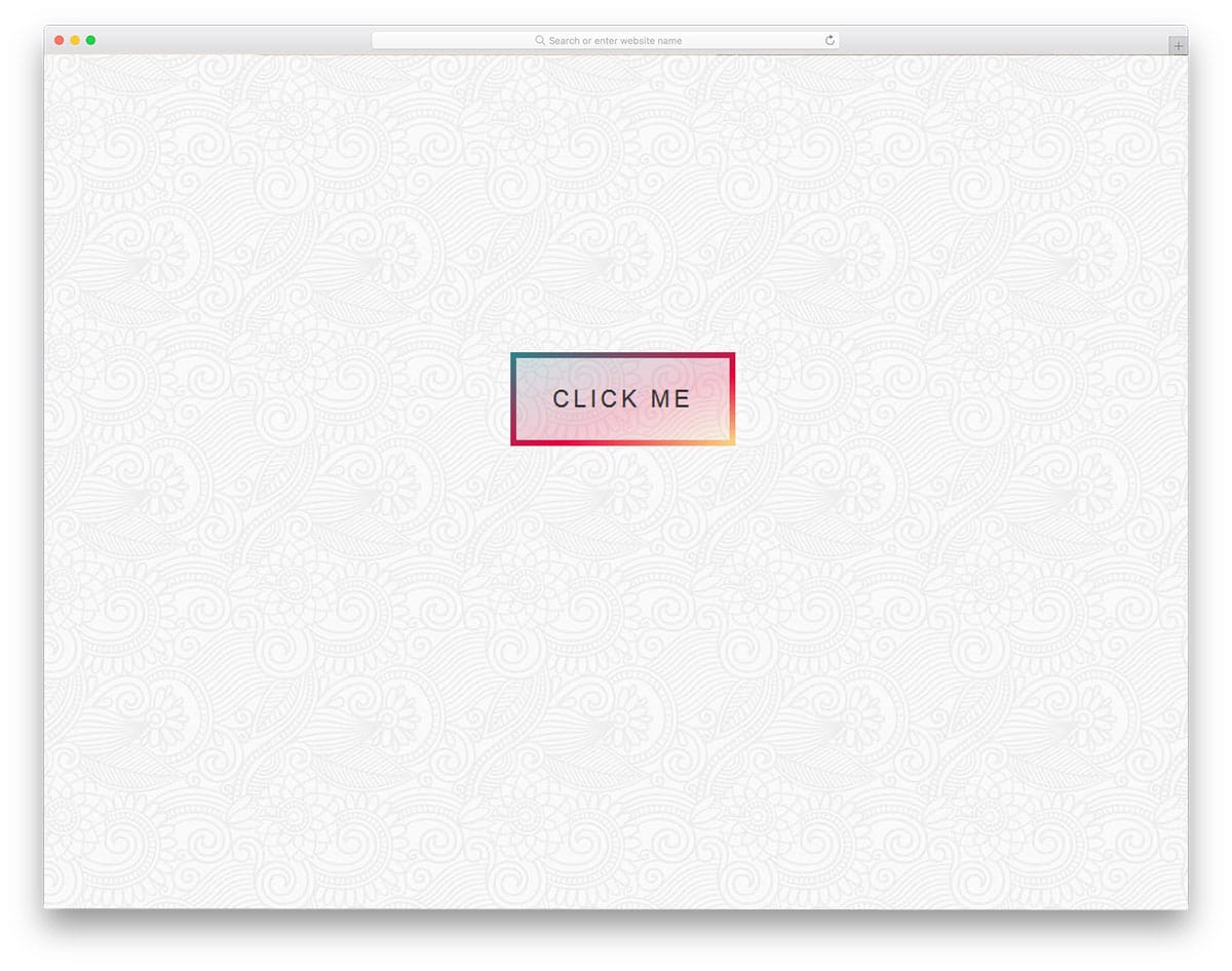
Outline Gradient Button
The name of the outline gradient button clearly explains this button design. The gradient color scheme decorates the button’s border, and the entire button is filled with the gradient when you hover over it. The text in the middle of the button is a smart element that changes color on hover. Hence, the text will be readable with this button, and the user can easily interact. The complete CSS script used to create this design is shared with you so you can easily edit and use it in your design.
Gradient Button By Aaron Scarborough
The developer, Aaron Scarborough, has given us an interactive gradient button design. If you plan to use a gradient button in your header section with a big hero image, this button design is a good option. The developer has applied a gradient to the border of the call-to-action button. The gradient color scheme on the hollow button looks attractive and fits well with modern web design templates. This gradient button also keeps the design and code structure very simple. Hence, other developers can easily utilize this code on their projects or web designs.
One Div Hover Animation
One div hover animation is a hover effect for the call-to-action buttons. The developer has used the plain background and the hover effect smartly to surprise the users. The gradient effect smoothly transitions around the button, elegantly highlighting it. Shadow effect is also used to give an embossed effect to the button. Surprise elements like this tend to perform better at getting user attention and increasing user engagement. All these smart effects in this design are smartly made using the CSS3 script, hence you will get better performance with this code.