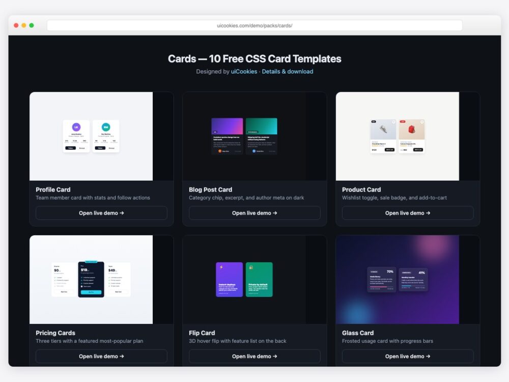
Every card design on this page was designed and coded in-house by uiCookies — our own pack, not a roundup of CodePen embeds. Each design is a single self-contained HTML file with the CSS inlined (and a line or two of vanilla JavaScript where a toggle needs it). No libraries, no web fonts, no build step.
The ten designs cover the card layouts that actually come up in real projects — profile and team cards, blog and product cards, pricing tiers, flip cards, glassmorphism, dashboard stat cards with sparklines, testimonials, hover-reveal image cards, and horizontal media cards. They use no Bootstrap class names, so they drop into Bootstrap, Tailwind, React, or plain HTML pages without collisions.
Download all 10 (free) Browse live demos
The designs
1. Profile Card
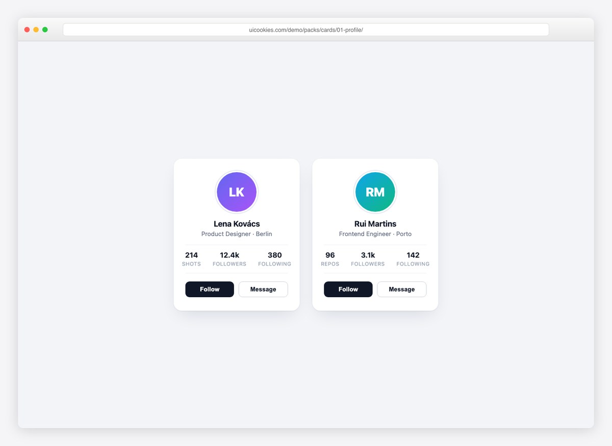
A team-member or social profile card with avatar, role, follower stats, and follow/message actions. The whole card lifts on hover — a small touch that makes grids of these feel alive.
2. Blog Post Card
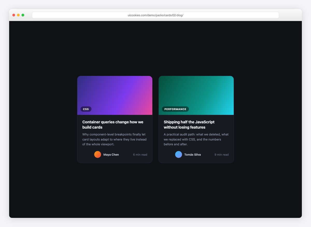
Dark-theme article card with a gradient cover, category chip, excerpt, and author meta. Built for post grids where covers are generated rather than photographic.
3. Product Card
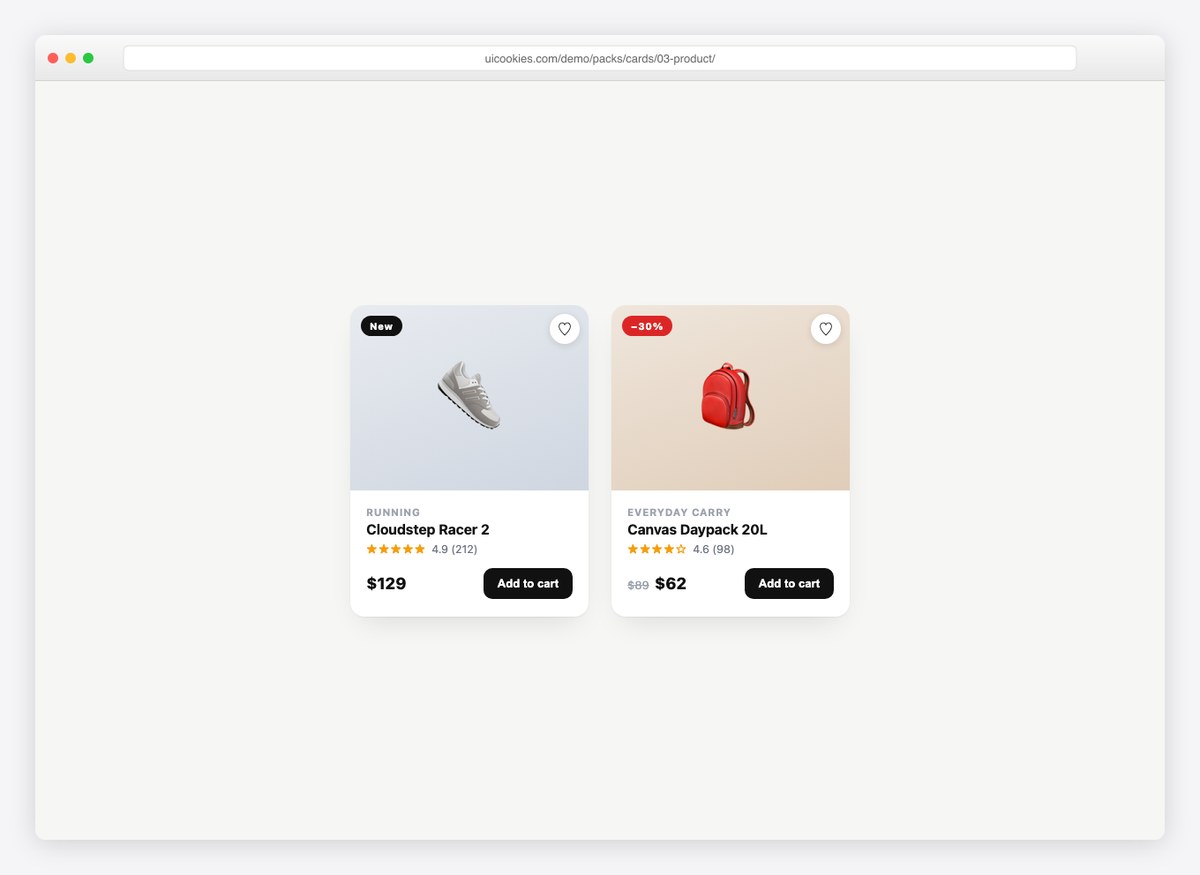
An e-commerce card with everything a listing needs: sale badge, wishlist heart that toggles, star rating with review count, price (including strike-through sale pricing), and an add-to-cart button.
4. Pricing Cards
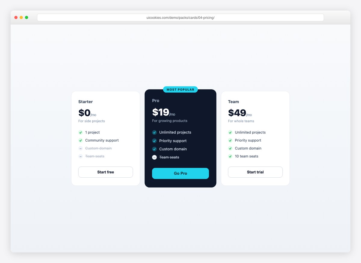
A three-tier pricing row with a scaled-up, dark “most popular” plan. Included and excluded features use checked and struck list items, so plans compare at a glance.
5. Flip Card
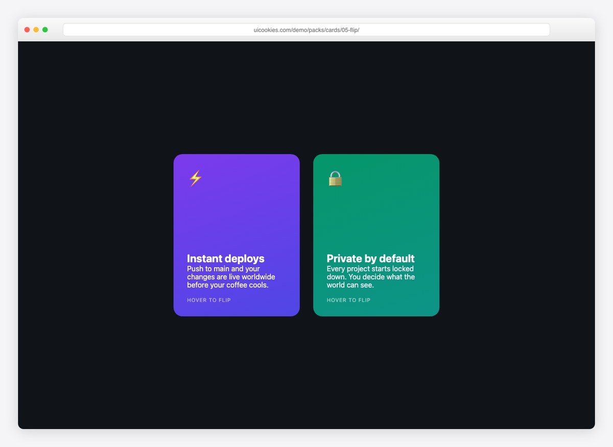
The classic CSS 3D card flip, done accessibly: it flips on hover and on keyboard focus. Gradient front for the pitch, dark back for the feature list and call-to-action.
6. Glass Card
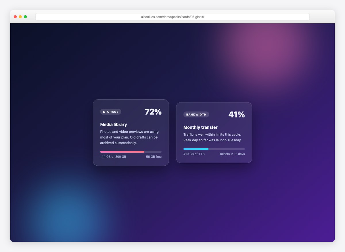
A frosted-glass usage card with progress bars, floating over color orbs. Pure CSS backdrop filters — a design that looks expensive and costs nothing.
7. Stat Cards
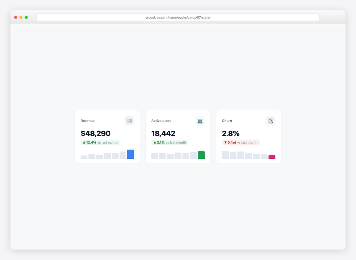
Dashboard KPI cards with the number, a delta chip (up/down), and a pure-CSS sparkline. Drop a row of these above any admin table and the page reads like a product.
8. Testimonial Card
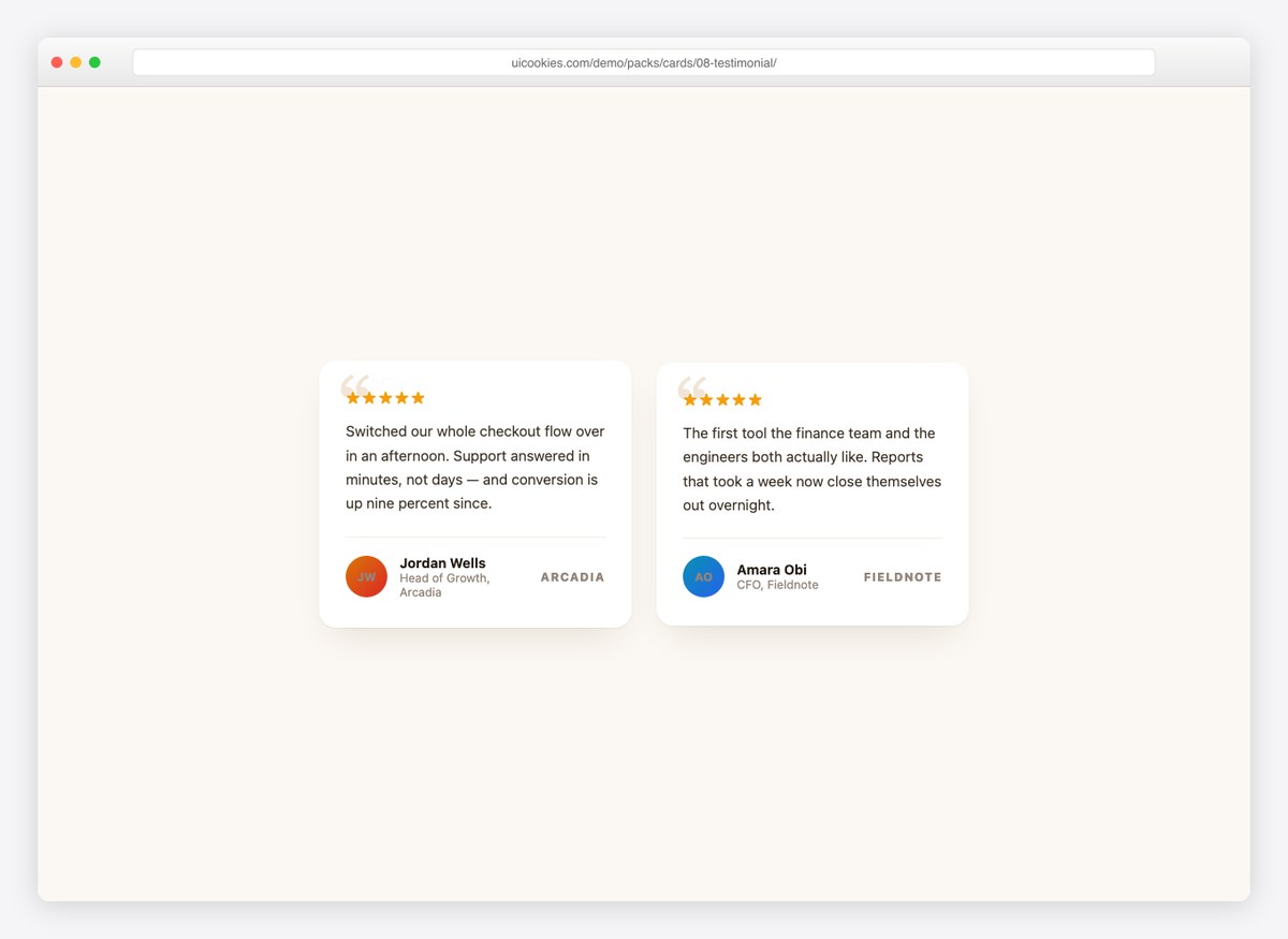
A review card with an oversized serif quote mark, star row, and attribution footer with avatar and company. Warm palette that fits marketing pages.
9. Hover Reveal Card
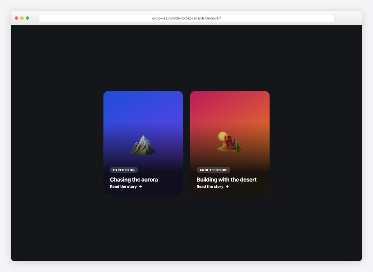
A full-image card whose description slides up from the bottom on hover, while the background photo gently zooms. The whole card is a link — right for editorial and portfolio grids.
10. Horizontal Card
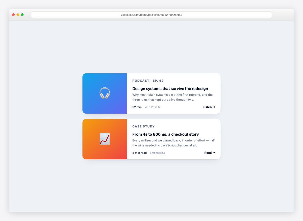
Media-left, content-right — the layout lists and search results want. Stacks vertically below 560px, so it stays readable on phones without extra work.
Using the cards in your project
Each card is a self-contained block: copy its markup and the CSS block from the top of the file into your project and it renders identically. In a Bootstrap layout, place a card inside any grid column and it fills the width; nothing in the pack overrides Bootstrap’s own .card styles. Colors, radii, and shadows are declared once per file, so restyling a design to your brand is a few minutes of find-and-replace. Full usage notes ship in the pack download.
Frequently asked questions
Are these card templates free?
Yes. The whole pack downloads free from the uiCookies pack page — no signup, no email gate. See the uiCookies license page for attribution details.
Do the cards work with Bootstrap?
Yes. The designs use their own class names, so they coexist with Bootstrap without conflicts. You can also lift just the visual treatment (shadows, radii, hover) onto Bootstrap .card components if you prefer.
Is there a CSS card flip example included?
Yes — the Flip Card design implements the 3D flip with backface-visibility and transform-style: preserve-3d, and it flips on keyboard focus as well as hover, which most flip-card snippets get wrong.
Do I need JavaScript for these cards?
Almost none. Eight of the ten designs are pure CSS; the product card uses one line of JavaScript for its wishlist toggle, and the flip card works without any at all.
Need full pages rather than components? Browse our free HTML website templates, or grab the matching login form templates.