
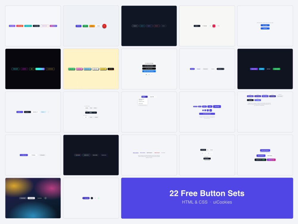
Every button on this page was designed and coded in-house by uiCookies — this is our own pack, not a roundup of CodePen embeds. Each set is a single self-contained HTML file with the CSS inline: no framework, no build step, no icon font. Twenty-two sets, 126 individual buttons.
Want your own? Design one in the free CSS button generator, which checks contrast, focus and target size for every state and exports CSS, Tailwind and Bootstrap.
The first eleven are the styles people go looking for: gradients, 3D presses, ghosts, neon, neobrutalism, pills, shines and moving icons. The rest are the half of a button system that usually gets improvised — a size scale that holds together, every state actually designed, groups and toolbars, segmented controls, split buttons — plus the written notes below on hierarchy, hit targets and when a button should have been a link.
Download all 22 sets (free) Browse live demos
Which set do you need?
| What the button is for | Start with |
|---|---|
| The one action on the screen | Gradient (1), 3D (2) or Marketing CTA (20) |
| A secondary action beside it | Ghost (3) or Text (18) |
| A filter or a tag | Pill (9) |
| Choosing between two or three options | Segmented Control (12) |
| One main action with variations | Split Button (13) |
| A row of related controls | Button Group / Toolbar (19) |
| Something that toggles on and off | Change on Click (16) or Group (19) |
| An action that takes a moment | Loading States (5) and Every State (15) |
| A dense toolbar with no room for labels | Icon (4) or Expanding Icon (22) |
| Signing in with Google or GitHub | Social Sign-in (8) |
| Building a scale for a design system | Size Scale (14) and Every State (15) |
Sets 1–8: styles and effects
The original eight, each a family of related buttons rather than a single style.
1. Gradient Buttons
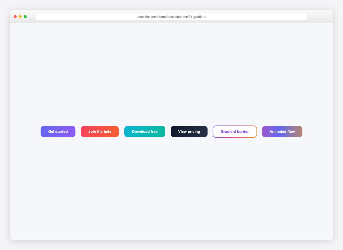
Six gradient treatments: solid fills with colored hover shadows, a gradient border on white, and a continuously flowing animated gradient. Copy the one that fits and delete the rest.
Live Demo CSS, Bootstrap & Tailwind code
2. Pressable 3D Buttons
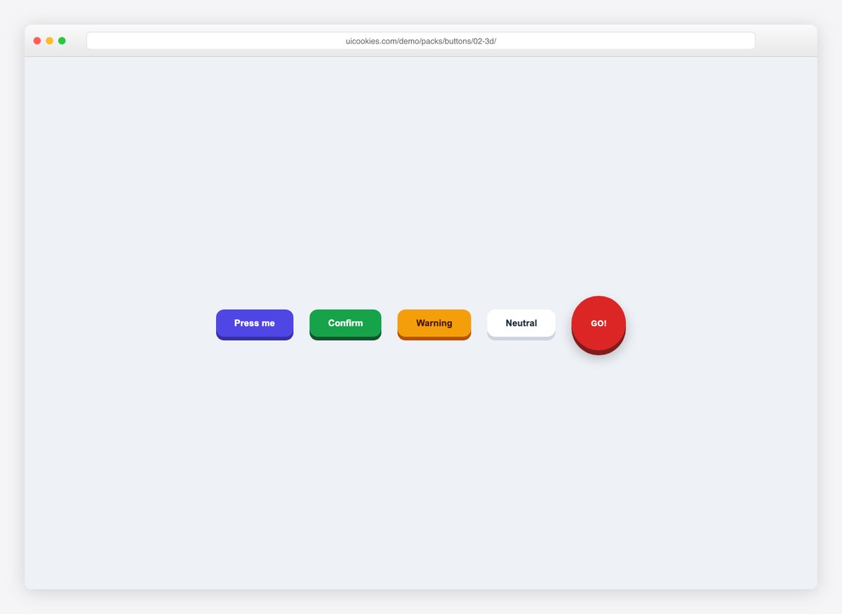
Buttons with real travel: a solid lower edge that compresses in two steps on hover and press, plus a round arcade button for the fun of it.
Live Demo CSS, Bootstrap & Tailwind code
3. Ghost Buttons
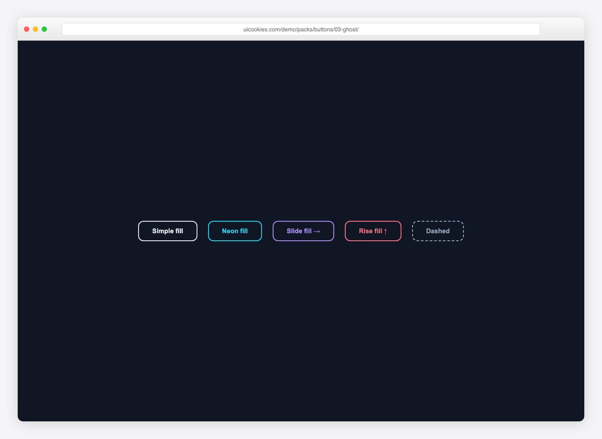
Outline buttons that fill on hover — instantly, sliding from the left, or rising from the bottom — done with pseudo-element transforms, not background hacks.
Live Demo CSS, Bootstrap & Tailwind code
4. Icon Buttons
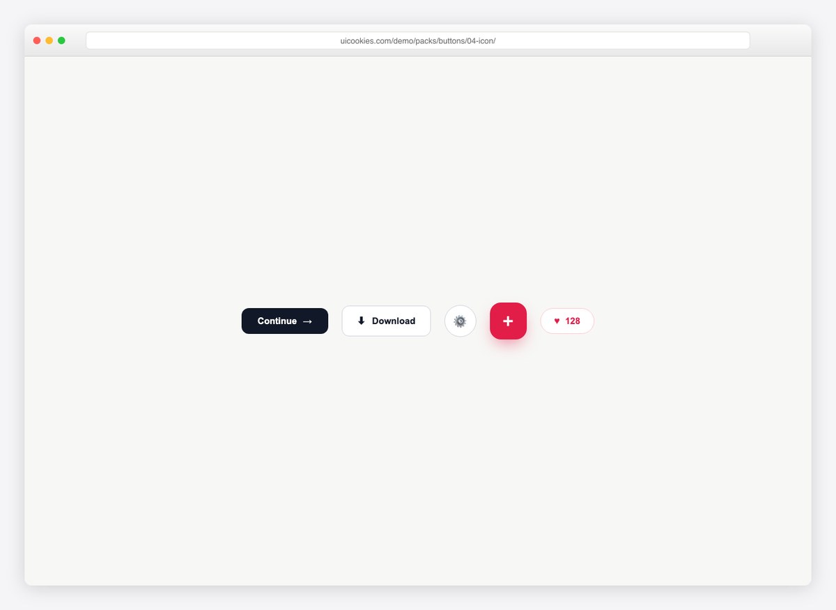
Arrow-lead CTAs whose icons nudge on hover, a download button with a dipping arrow, circular icon buttons, a rotating FAB, and a working like-counter toggle.
Live Demo CSS, Bootstrap & Tailwind code
5. Loading-State Buttons
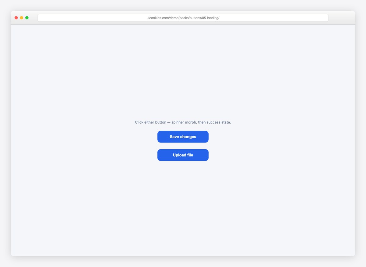
Click and watch: the label swaps, a spinner appears (one variant fills like a progress bar), and the button morphs to a green success state before resetting.
Live Demo CSS, Bootstrap & Tailwind code
6. Neon Buttons
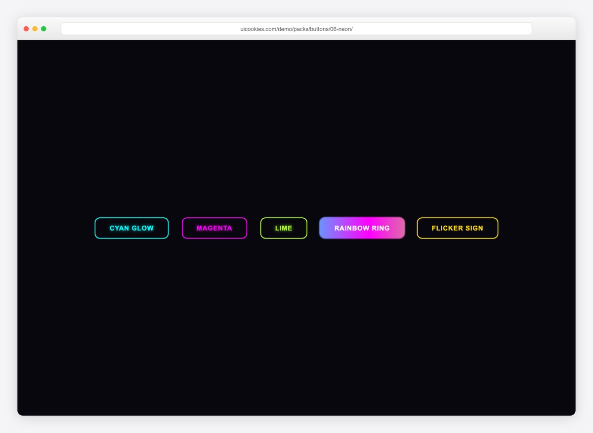
Sign-glow buttons in cyan, magenta, and lime; a rainbow ring that blurs on hover; and a flickering-sign variant with an interval-timed opacity animation.
Live Demo CSS, Bootstrap & Tailwind code
7. Neobrutalist Buttons
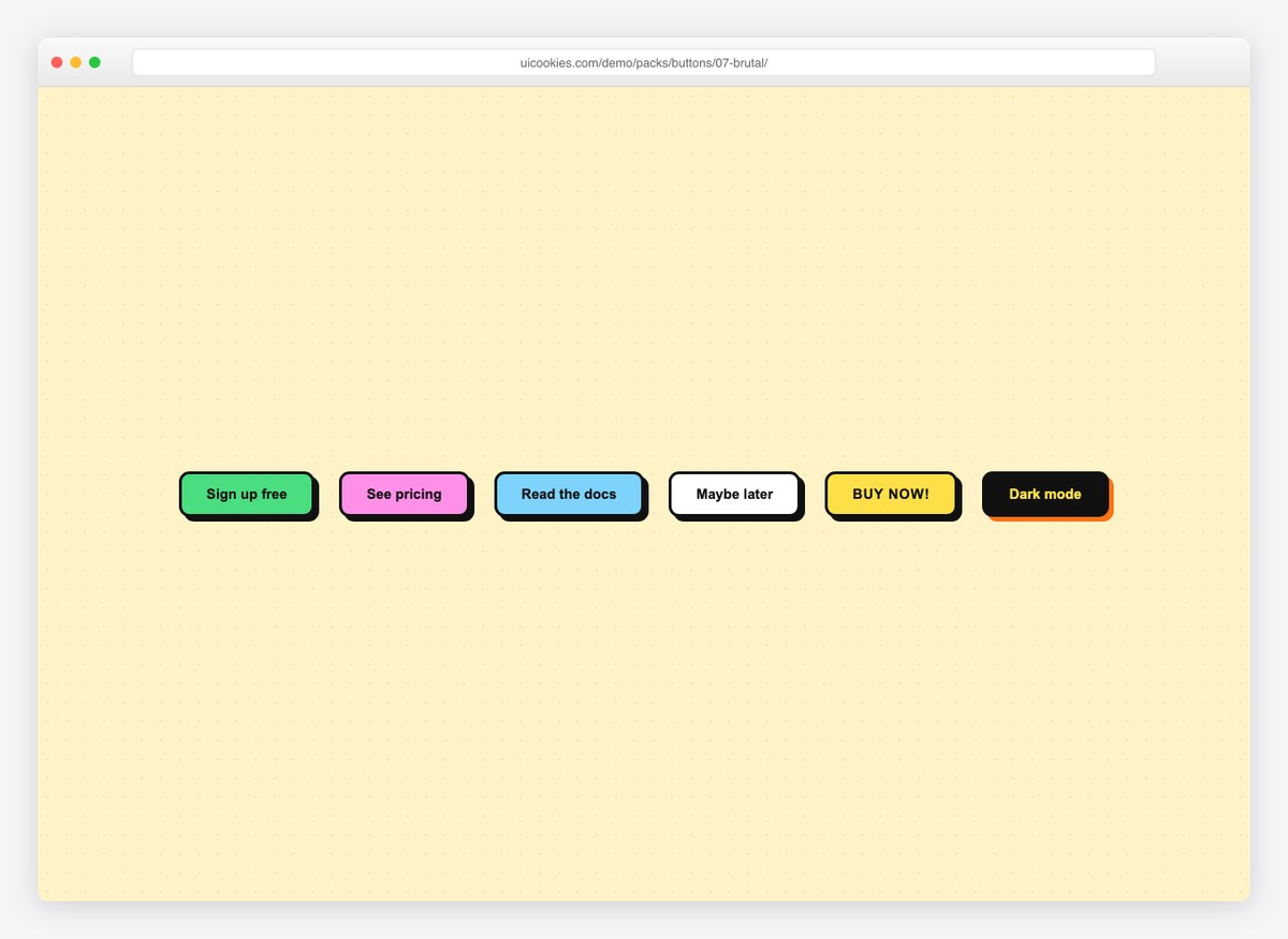
Thick borders and hard offset shadows that collapse as the button physically travels on press. Six colorways including an inverted dark one.
Live Demo CSS, Bootstrap & Tailwind code
8. Social Sign-In Buttons
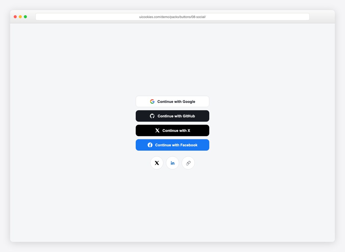
Pixel-correct Google, GitHub, X, and Facebook sign-in buttons with inline SVG logos, plus round share buttons — no icon font, no image requests.
Live Demo CSS, Bootstrap & Tailwind code
Sets 9–11: three more style families
9. Pill Buttons

The fully rounded family — solid, tinted, bordered, one with a status dot and one with a count badge. Pills read as filters and tags rather than commands, which is exactly when to reach for them and exactly why a pill makes a poor primary submit button.
Live Demo CSS, Bootstrap & Tailwind code
10. Shine and Sweep Buttons

Four hover sweeps, each built from a single pseudo-element moving across the button: a diagonal shine, a wipe fill, a split that opens from top and bottom, and a gradient that shifts position rather than re-rendering.
Live Demo CSS, Bootstrap & Tailwind code
11. Buttons with Moving Icons

The icon carries the motion instead of the whole button — the arrow slides, the download dips, the external mark lifts away. Each is one transform, and each fires on :focus-visible as well as hover so keyboard users get the same feedback.
Live Demo CSS, Bootstrap & Tailwind code
Sets 12–22: structure, states and layout
These eleven are the parts of a button system that get left to improvisation — the size scale, the states, the groupings — with a few more effect sets alongside them.
12. Segmented Controls

A segmented control is a set of radio inputs, not a row of buttons, so this is built that way. You get arrow-key navigation and a correctly announced selection for free, and the sliding indicator is pure CSS. Three variants: default, dark and full-width.
Live Demo CSS, Bootstrap & Tailwind code
13. Split Buttons

A primary action fused to a menu trigger. The menu is a native <details>, so it opens on click and closes on Escape without a library, and the two halves stay separate controls with separate names rather than one ambiguous button.
Live Demo CSS, Bootstrap & Tailwind code
14. Button Size Scale

Five sizes generated from one rule with three custom properties overridden, so padding, radius and type scale together instead of drifting apart. Includes the square icon-only variants that have to stay square, and a full-width block button.
Live Demo CSS, Bootstrap & Tailwind code
15. Every Button State

Rest, hover, focus-visible, active, disabled, toggled and busy — labelled and side by side. The toggle uses aria-pressed rather than a class, and the busy button keeps its width so the layout does not jump when the spinner appears.
Live Demo CSS, Bootstrap & Tailwind code
16. Buttons That Change on Click

Add to cart becoming Added, Follow becoming Following, and a copy button that confirms. All three are a checkbox and a label, so the changed state persists with no JavaScript — and both labels stay in the DOM, so the control is never unnamed.
Live Demo CSS, Bootstrap & Tailwind code
17. Animated Border Buttons

Four ways to put a moving edge on a button with no wrapper element: a conic gradient animated through a registered @property, a gradient painted into the border box, an outline that draws itself on hover, and a dashed march.
Live Demo CSS, Bootstrap & Tailwind code
18. Text and Link Buttons

The lowest-emphasis tier, where nearly all the craft is in the underline — text-underline-offset, text-decoration-thickness and text-decoration-skip-ink do more for a link than any hover animation, and keeping the underline on by default avoids the most common accessibility regression in a link set.
Live Demo CSS, Bootstrap & Tailwind code
19. Button Groups and Toolbars

Attached buttons that stay attached: shared borders that do not double up, corner radii only on the ends, and a vertical variant. Each group is wrapped in a labelled role="group", and the formatting toolbar in a role="toolbar", so they are announced as one control rather than a loose pile.
Live Demo CSS, Bootstrap & Tailwind code
20. Marketing CTA Buttons

The big landing-page buttons: a primary with a reassurance line underneath, a primary-and-secondary pair, one carrying a discount badge, and one with a glow tuned to stay close enough to a shadow that it still reads as a button.
Live Demo CSS, Bootstrap & Tailwind code
21. Glass Buttons

Frosted buttons over a colourful ground, where the whole effect is backdrop-filter and a translucent border. Both the light-on-dark and dark-on-light variants are included, because a real page never gets away with only one.
Live Demo CSS, Bootstrap & Tailwind code
22. Expanding Icon Buttons
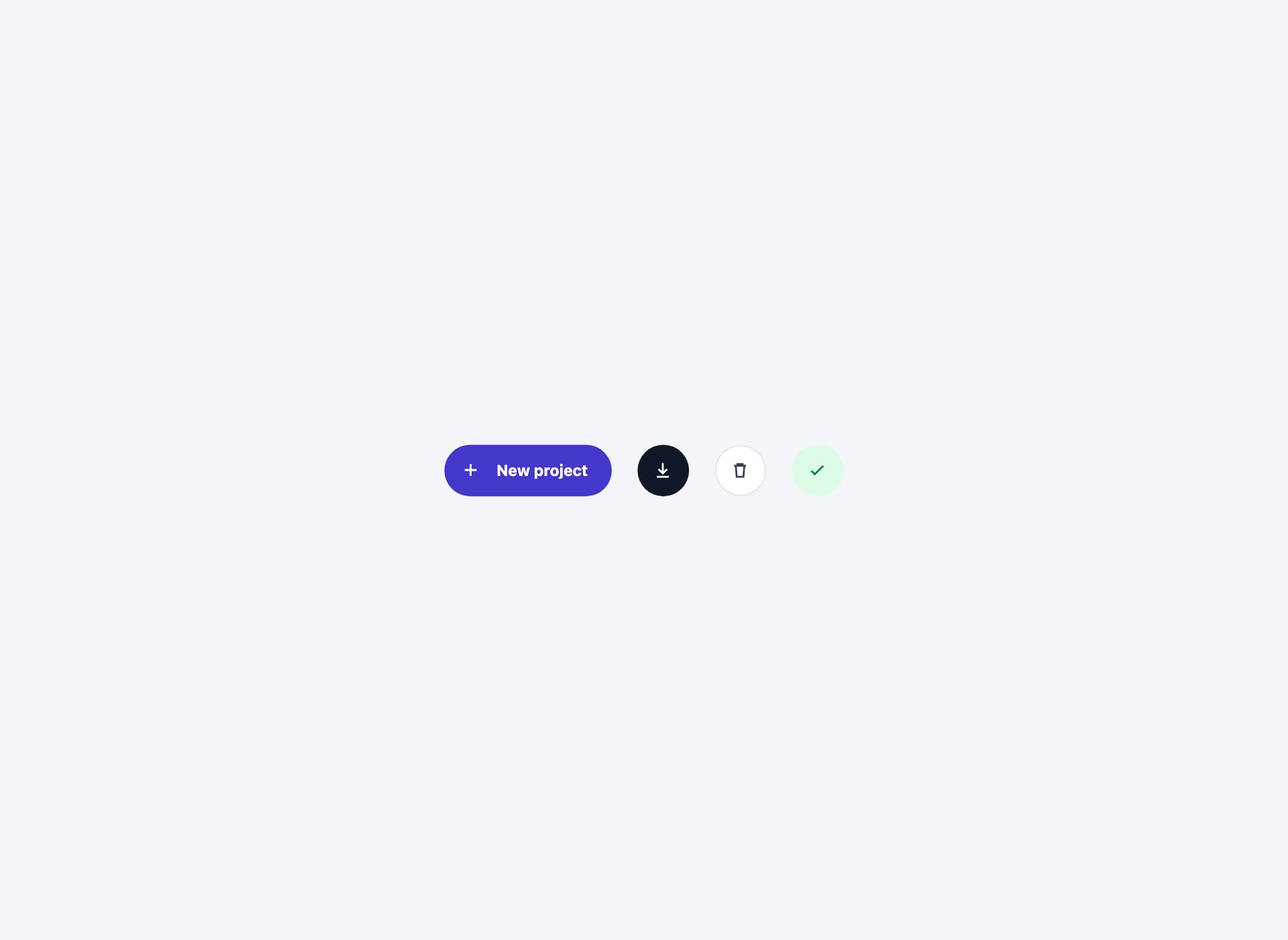
Icon buttons that grow to reveal their label on hover and focus, using a grid column animating from 0fr to 1fr. The label is always in the DOM, so the accessible name never depends on someone hovering.
Live Demo CSS, Bootstrap & Tailwind code
Button hierarchy: one primary per screen
Almost every button problem is a hierarchy problem. Three tiers are enough:
- Primary — solid fill, highest contrast. One per screen, or one per distinct region. If two buttons are competing, neither is primary.
- Secondary — outlined or tinted. The alternative you expect a reasonable number of people to take.
- Tertiary — text only. Cancel, Skip, Learn more. Present, but not asking for anything.
Destructive actions are not a fourth tier — they are a colour applied to whichever tier they belong to. A delete that people do all day is a secondary button in red; a delete that ends an account is a primary one, behind a confirmation.
Button or link?
The rule is about what happens, not what it looks like:
- It changes the URL →
<a href>, even styled as a solid button. - It acts on the current page →
<button>, even styled as plain text.
This is not pedantry. A link responds to Enter and offers open-in-new-tab; a button responds to Enter and Space and offers neither. A screen reader announces them differently, and someone who hears “link” expects to go somewhere. Style them however you like — swap the element and you break both.
The related trap is <div onclick>, which is neither: not focusable, not announced, not operable by keyboard. If you find one, replacing it with a <button> and resetting the styles is a smaller job than the accessibility fixes it needs otherwise.
Sizing and hit targets
Aim for a 44×44px hit area for anything that gets touched — that is roughly the pad of a finger, and it is the figure both Apple and the WCAG target-size guidance land near.
Get there with padding, not a fixed height. A button with height: 44px breaks the moment its label wraps or someone raises their default text size; a button with vertical padding grows with its content. Set 14 is built this way — the whole scale is three custom properties, so the sizes stay in proportion instead of drifting apart as they get edited.
Small icon-only buttons in a dense toolbar are the common exception. If the visual button has to be 32px, keep the hit area at 44px with an invisible pseudo-element:
.icon-btn { position: relative; }
.icon-btn::before {
  content: "";
  position: absolute;
  inset: -6px;
}
The states you have to design
Most button sets ship rest and hover and leave the rest to whatever the browser does. There are seven:
- Rest and hover — the two everyone does.
- Focus visible — use
:focus-visiblerather than:focus, so keyboard users get a ring and mouse users do not. Never remove the outline without replacing it. - Active — a 1px shift or a darker fill. Small, but it is what makes a button feel like it was pressed.
- Disabled — and prefer not to use it. A disabled button gives no reason and cannot be focused; an enabled button that explains what is missing is almost always better.
- Toggled —
aria-pressed="true", not a class. The class styles it; the attribute is what tells a screen reader it is on. - Busy —
aria-busy="true", with the width held so the layout does not jump.
Set 15 shows all seven together, labelled, so they can be compared rather than imagined.
Accessibility checklist
- Every icon-only button has an
aria-label. An SVG is not a name. - Focus is always visible, and the ring has contrast against both the button and the page behind it.
- Text meets 4.5:1 against its own fill — the easiest place to lose this is a light tint like a pale pill.
- Hover is never the only route to information. If a label appears on hover, it is also in the DOM (that is why set 22 works the way it does).
type="button"on any button inside a form that is not the submit, or it will submit the form.- Motion sits behind
prefers-reduced-motion; a spinner slows rather than freezing.
Using these with Bootstrap
Nothing here touches .btn, so you can load both. To apply one of these designs to a Bootstrap button, copy its rules onto a class of your own and add that class alongside .btn — do not edit Bootstrap’s own rules, or the next upgrade overwrites the work.
One thing worth knowing: Bootstrap 5 sets --bs-btn-* custom properties on .btn, so recolouring a Bootstrap button is often three property overrides rather than a new ruleset. Where you want the whole visual treatment — a gradient, a 3D press, an animated border — take the set from this pack instead; those are not expressible as variable overrides.
Using the sets in your project
Download the pack, open the folder for the set you want, and copy the buttons you need along with their rules from the <style> block. Each set is self-contained — nothing depends on the other 21. Rename the short class names (.p1, .s2) to something that fits your codebase, and they are yours.
Frequently asked questions
Are these button styles free?
Yes. All 22 sets — 126 individual buttons — are free for personal and commercial projects, including client work. No attribution required.
Will these override Bootstrap’s .btn styles?
No. Every set uses its own class names, so nothing collides with .btn. If you want a design applied to Bootstrap’s button instead, copy the rules onto your own class and add it alongside .btn rather than editing Bootstrap.
Do I need JavaScript for any of them?
Only the original loading demo. Everything added since is pure CSS — the segmented control is radio inputs, the split button is a native <details>, and the change-on-click buttons are a checkbox and a label.
How do I add a loading state to a button?
Set aria-busy="true", keep the button’s width fixed so the layout does not jump, and render the spinner from a pseudo-element rather than swapping the text out. Set 5 shows the spinner and progress-fill versions; set 15 shows how it sits next to the other states.
Should I use a button or a link?
If it navigates to a URL, it is an <a>, even when it looks like a button. If it does something on the current page — submits, opens, toggles, deletes — it is a <button>. The distinction decides keyboard behaviour and what a screen reader announces, so styling one to look like the other is fine, but swapping the element is not.
How big should a button be?
Aim for a 44×44px hit area for anything touched. Get there with padding rather than a fixed height so the button still grows if the label wraps or the user increases their text size.
Do the social buttons need an icon font?
No. The logos are inline SVG, so there is no font to load and nothing breaks if an icon CDN goes down.
Can I use these in a template I sell?
Yes, in client work and in products you sell. What you cannot do is repackage the pack itself as a button pack for redistribution.
Download all 22 button sets (free) Browse live demos

I’ve been so long time looking for this kind of CTAs for my Website. Do u have maybe some examples of websites Wich are actually using this buttons. It would be great to see them ‘live’ on action.
Thanks and Greetings from Germany