Open demo

CSS code

HTML
<div class="hc-grid">
  <article class="hc-card">
    <span class="hc-bg hc-g1" aria-hidden="true">🏔️</span>
    <div class="hc-veil">
      <span class="hc-tag">Expedition</span>
      <h2 class="hc-title"><a class="hc-link" href="#">Chasing the aurora</a></h2>
      <p class="hc-text">Twelve nights above the Arctic Circle with nothing but a camera, a thermos, and very patient batteries.</p>
      <span class="hc-cta" aria-hidden="true">Read the story <i>→</i></span>
    </div>
  </article>
  <article class="hc-card">
    <span class="hc-bg hc-g2" aria-hidden="true">🏜️</span>
    <div class="hc-veil">
      <span class="hc-tag">Architecture</span>
      <h2 class="hc-title"><a class="hc-link" href="#">Building with the desert</a></h2>
      <p class="hc-text">How rammed-earth studios keep cool at noon and warm at midnight — no compressor in sight.</p>
      <span class="hc-cta" aria-hidden="true">Read the story <i>→</i></span>
    </div>
  </article>
</div>
CSS
/* Overlay story cards. The title link is stretched over the card; hovering or focusing it zooms the
   background and slides the description open. On touch screens (no hover) the description is always shown. */
.hc-grid,.hc-grid *,.hc-grid *::before,.hc-grid *::after{box-sizing:border-box}
.hc-grid{display:flex;flex-wrap:wrap;justify-content:center;gap:26px}
.hc-card{position:relative;width:290px;height:380px;border-radius:18px;overflow:hidden}
.hc-bg{position:absolute;inset:0;display:flex;align-items:center;justify-content:center;font-size:6rem;transition:transform .35s ease}
.hc-g1{background:linear-gradient(150deg,#1d4ed8,#7c3aed)}
.hc-g2{background:linear-gradient(150deg,#be185d,#f59e0b)}
.hc-card:hover .hc-bg,.hc-card:focus-within .hc-bg{transform:scale(1.08)}
.hc-veil{position:absolute;inset:0;background:linear-gradient(180deg,transparent 30%,rgba(8,10,14,.92) 78%);display:flex;flex-direction:column;justify-content:flex-end;padding:24px}
.hc-tag{align-self:flex-start;font-size:.68rem;font-weight:800;letter-spacing:.09em;text-transform:uppercase;color:#fff;background:rgba(255,255,255,.16);-webkit-backdrop-filter:blur(4px);backdrop-filter:blur(4px);padding:5px 11px;border-radius:999px;margin-bottom:12px}
.hc-title{font-size:1.25rem;letter-spacing:-.01em;margin:0 0 6px}
.hc-link{color:#fff;text-decoration:none}
.hc-link::after{content:"";position:absolute;inset:0;z-index:1}
.hc-link:focus-visible{outline:2px solid transparent}
.hc-card:has(.hc-link:focus-visible){outline:3px solid #fff;outline-offset:3px}
@supports not selector(:has(*)){.hc-link:focus-visible{outline-color:#fff;outline-offset:2px}}
.hc-text{color:#c8cede;font-size:.85rem;line-height:1.6;margin:0;max-height:0;opacity:0;overflow:hidden;transition:max-height .35s ease,opacity .3s ease .05s,margin .35s ease}
.hc-card:hover .hc-text,.hc-card:focus-within .hc-text{max-height:110px;opacity:1;margin-bottom:14px}
.hc-cta{display:inline-flex;align-items:center;gap:7px;color:#fff;font-size:.85rem;font-weight:700}
.hc-cta i{font-style:normal;transition:transform .25s ease}
.hc-card:hover .hc-cta i,.hc-card:focus-within .hc-cta i{transform:translateX(5px)}
@media (hover:none){.hc-text{max-height:none;opacity:1;margin-bottom:14px}}
@media (prefers-reduced-motion:reduce){.hc-bg,.hc-text,.hc-cta i{transition:none}.hc-card:hover .hc-bg,.hc-card:focus-within .hc-bg,.hc-card:hover .hc-cta i,.hc-card:focus-within .hc-cta i{transform:none}}

Bootstrap 5 code

Requires: Bootstrap 5.3.8 CSS

HTML
<div class="row row-cols-auto justify-content-center g-4">
  <div class="col">
    <article class="card hc-card">
      <span class="card-img hc-bg hc-g1 d-flex align-items-center justify-content-center" aria-hidden="true">🏔️</span>
      <div class="card-img-overlay d-flex flex-column justify-content-end">
        <span class="badge rounded-pill align-self-start hc-tag">Expedition</span>
        <h2 class="card-title hc-title"><a class="stretched-link" href="#">Chasing the aurora</a></h2>
        <p class="card-text hc-text">Twelve nights above the Arctic Circle with nothing but a camera, a thermos, and very patient batteries.</p>
        <span class="hc-cta d-inline-flex align-items-center" aria-hidden="true">Read the story <i>→</i></span>
      </div>
    </article>
  </div>
  <div class="col">
    <article class="card hc-card">
      <span class="card-img hc-bg hc-g2 d-flex align-items-center justify-content-center" aria-hidden="true">🏜️</span>
      <div class="card-img-overlay d-flex flex-column justify-content-end">
        <span class="badge rounded-pill align-self-start hc-tag">Architecture</span>
        <h2 class="card-title hc-title"><a class="stretched-link" href="#">Building with the desert</a></h2>
        <p class="card-text hc-text">How rammed-earth studios keep cool at noon and warm at midnight — no compressor in sight.</p>
        <span class="hc-cta d-inline-flex align-items-center" aria-hidden="true">Read the story <i>→</i></span>
      </div>
    </article>
  </div>
</div>
CSS
/* Bootstrap .card with .card-img + .card-img-overlay, a .badge and a .stretched-link title.
   Hovering or focusing the card zooms the background and slides the description open; touch screens always show it. */
.hc-card{--bs-card-border-width:0;--bs-card-border-radius:18px;--bs-card-inner-border-radius:18px;--bs-card-img-overlay-padding:24px;--bs-card-bg:#14161a;width:290px;height:380px;overflow:hidden}
.hc-bg{position:absolute;inset:0;font-size:6rem;transition:transform .35s ease}
.hc-g1{background:linear-gradient(150deg,#1d4ed8,#7c3aed)}
.hc-g2{background:linear-gradient(150deg,#be185d,#f59e0b)}
.hc-card:hover .hc-bg,.hc-card:focus-within .hc-bg{transform:scale(1.08)}
.hc-card .card-img-overlay{background:linear-gradient(180deg,transparent 30%,rgba(8,10,14,.92) 78%)}
.hc-tag{--bs-badge-font-size:.68rem;--bs-badge-font-weight:800;--bs-badge-padding-x:11px;--bs-badge-padding-y:5px;background:rgba(255,255,255,.16);-webkit-backdrop-filter:blur(4px);backdrop-filter:blur(4px);letter-spacing:.09em;text-transform:uppercase;margin-bottom:12px}
.hc-title{font-size:1.25rem;font-weight:700;line-height:normal;letter-spacing:-.01em;margin:0 0 6px}
.hc-title a{color:#fff;text-decoration:none}
.hc-title a:focus-visible{outline:2px solid transparent}
.hc-card:has(.stretched-link:focus-visible){outline:3px solid #fff;outline-offset:3px}
@supports not selector(:has(*)){.hc-title a:focus-visible{outline-color:#fff;outline-offset:2px}}
.hc-text{color:#c8cede;font-size:.85rem;line-height:1.6;margin:0;max-height:0;opacity:0;overflow:hidden;transition:max-height .35s ease,opacity .3s ease .05s,margin .35s ease}
.hc-card:hover .hc-text,.hc-card:focus-within .hc-text{max-height:110px;opacity:1;margin-bottom:14px}
.hc-cta{gap:7px;color:#fff;font-size:.85rem;font-weight:700}
.hc-cta i{font-style:normal;transition:transform .25s ease}
.hc-card:hover .hc-cta i,.hc-card:focus-within .hc-cta i{transform:translateX(5px)}
@media (hover:none){.hc-text{max-height:none;opacity:1;margin-bottom:14px}}
@media (prefers-reduced-motion:reduce){.hc-bg,.hc-text,.hc-cta i{transition:none}.hc-card:hover .hc-bg,.hc-card:focus-within .hc-bg,.hc-card:hover .hc-cta i,.hc-card:focus-within .hc-cta i{transform:none}}

Tailwind 4 code

Requires: Tailwind CSS 4

HTML
<div class="flex flex-wrap justify-center gap-[26px]">
  <article class="group relative h-[380px] w-[290px] overflow-hidden rounded-[18px] has-[a:focus-visible]:outline-3 has-[a:focus-visible]:outline-offset-3 has-[a:focus-visible]:outline-white">
    <span aria-hidden="true" class="absolute inset-0 flex items-center justify-center bg-linear-[150deg] from-[#1d4ed8] to-[#7c3aed] text-[6rem] transition-transform duration-[350ms] ease-in-out group-focus-within:scale-[1.08] group-hover:scale-[1.08] motion-reduce:transition-none motion-reduce:group-focus-within:scale-100 motion-reduce:group-hover:scale-100">🏔️</span>
    <div class="absolute inset-0 flex flex-col justify-end bg-[linear-gradient(180deg,transparent_30%,rgba(8,10,14,.92)_78%)] p-6">
      <span class="mb-3 self-start rounded-full bg-white/16 px-[11px] py-[5px] text-[.68rem] font-extrabold tracking-[.09em] text-white uppercase backdrop-blur-[4px]">Expedition</span>
      <h2 class="mb-1.5 text-[1.25rem] font-bold tracking-[-.01em]"><a href="#" class="text-white after:absolute after:inset-0 after:z-[1] focus-visible:outline-2 focus-visible:outline-transparent">Chasing the aurora</a></h2>
      <p class="max-h-0 overflow-hidden text-[.85rem] leading-[1.6] text-[#c8cede] opacity-0 transition-[max-height,opacity,margin] duration-[350ms] ease-in-out group-focus-within:mb-3.5 group-focus-within:max-h-[110px] group-focus-within:opacity-100 group-hover:mb-3.5 group-hover:max-h-[110px] group-hover:opacity-100 motion-reduce:transition-none [@media(hover:none)]:mb-3.5 [@media(hover:none)]:max-h-none [@media(hover:none)]:opacity-100">Twelve nights above the Arctic Circle with nothing but a camera, a thermos, and very patient batteries.</p>
      <span aria-hidden="true" class="inline-flex items-center gap-[7px] text-[.85rem] font-bold text-white">Read the story <i class="not-italic transition-transform duration-[250ms] ease-in-out group-focus-within:translate-x-[5px] group-hover:translate-x-[5px] motion-reduce:transition-none motion-reduce:group-focus-within:translate-x-0 motion-reduce:group-hover:translate-x-0">→</i></span>
    </div>
  </article>
  <article class="group relative h-[380px] w-[290px] overflow-hidden rounded-[18px] has-[a:focus-visible]:outline-3 has-[a:focus-visible]:outline-offset-3 has-[a:focus-visible]:outline-white">
    <span aria-hidden="true" class="absolute inset-0 flex items-center justify-center bg-linear-[150deg] from-[#be185d] to-[#f59e0b] text-[6rem] transition-transform duration-[350ms] ease-in-out group-focus-within:scale-[1.08] group-hover:scale-[1.08] motion-reduce:transition-none motion-reduce:group-focus-within:scale-100 motion-reduce:group-hover:scale-100">🏜️</span>
    <div class="absolute inset-0 flex flex-col justify-end bg-[linear-gradient(180deg,transparent_30%,rgba(8,10,14,.92)_78%)] p-6">
      <span class="mb-3 self-start rounded-full bg-white/16 px-[11px] py-[5px] text-[.68rem] font-extrabold tracking-[.09em] text-white uppercase backdrop-blur-[4px]">Architecture</span>
      <h2 class="mb-1.5 text-[1.25rem] font-bold tracking-[-.01em]"><a href="#" class="text-white after:absolute after:inset-0 after:z-[1] focus-visible:outline-2 focus-visible:outline-transparent">Building with the desert</a></h2>
      <p class="max-h-0 overflow-hidden text-[.85rem] leading-[1.6] text-[#c8cede] opacity-0 transition-[max-height,opacity,margin] duration-[350ms] ease-in-out group-focus-within:mb-3.5 group-focus-within:max-h-[110px] group-focus-within:opacity-100 group-hover:mb-3.5 group-hover:max-h-[110px] group-hover:opacity-100 motion-reduce:transition-none [@media(hover:none)]:mb-3.5 [@media(hover:none)]:max-h-none [@media(hover:none)]:opacity-100">How rammed-earth studios keep cool at noon and warm at midnight — no compressor in sight.</p>
      <span aria-hidden="true" class="inline-flex items-center gap-[7px] text-[.85rem] font-bold text-white">Read the story <i class="not-italic transition-transform duration-[250ms] ease-in-out group-focus-within:translate-x-[5px] group-hover:translate-x-[5px] motion-reduce:transition-none motion-reduce:group-focus-within:translate-x-0 motion-reduce:group-hover:translate-x-0">→</i></span>
    </div>
  </article>
</div>

About this set

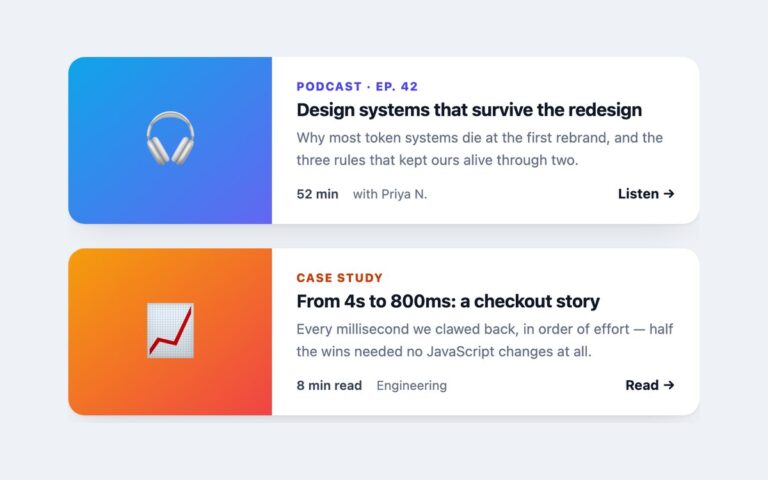
Tall story cards with full-bleed artwork and text laid over a dark gradient veil at the bottom: a frosted category tag, the title, a hidden description and a Read the story cue with an arrow. On hover the background zooms in slightly, the description slides open by animating max-height and opacity, and the arrow nudges right. Keyboard focus does the same through :focus-within, and on touch screens, which cannot hover, the description is always shown. The card uses the stretched link pattern: the title is the only link and its ::after covers the card, so the whole card is clickable while screen readers hear just the title. The Read the story cue is visual only and is hidden from assistive technology. Because the link sits in a heading rather than wrapping the card, the tag and description are read as normal text and are not swallowed into the link name. Swap the gradient and emoji for an img with alt text, or alt=”” if decorative. Bootstrap builds it from .card-img, .card-img-overlay, .badge and .stretched-link.

What’s included

  • Stretched title link with the whole card clickable
  • Description revealed on hover and on keyboard focus
  • Description always visible on touch screens without hover
  • Background zoom and arrow nudge, off under prefers-reduced-motion
  • Card-level focus ring while the link is focused

Accessibility

The title link is the card's single link and its text is its name; the visual Read the story cue is aria-hidden. Keyboard focus reveals the description and draws a white 3px ring around the card. The zoom, slide and arrow motion are removed under prefers-reduced-motion, and devices without hover show the description all the time.

Customise it

Change the artwork gradients in .hc-g1 and .hc-g2, the veil darkness in .hc-veil and the reveal height in the max-height rule. Bootstrap uses the same colours on .card-img and .card-img-overlay; in Tailwind edit the from-/to- utilities and group-hover:max-h-[110px].