About this set
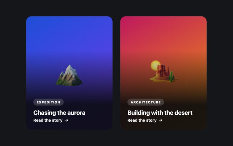
Wide cards with a media panel on the left and text on the right, stacked in a column: a podcast episode and a case study. Each has a coloured kicker line, a heading, a short description and a footer with duration, a secondary detail and a Listen or Read link pushed to the right. Below 560 pixels (576 in the Bootstrap version) the media panel moves on top and the card becomes vertical. The footer link is the card’s only link and is stretched over the whole card with ::after, so clicking anywhere opens the episode or article; visually hidden text adds the item title to the link, so screen readers hear Listen to Design systems that survive the redesign rather than just Listen. Use it for podcast lists, article feeds, search results or case study indexes. The media panel is a gradient with an emoji; replace it with an img and alt text, or alt=”” if decorative. The Bootstrap version uses .card with .flex-column .flex-sm-row and .stretched-link, and Tailwind uses a max-[560px]:flex-col variant.
What’s included
- Side-by-side media and text that stack on narrow screens
- Footer link stretched over the card as its single link target
- Link text completed with the item title for screen readers
- Kicker, heading, description and meta footer
- Hover lift that is turned off under prefers-reduced-motion
Accessibility
Each card has one link, named with the item title through visually hidden text, and the arrow is aria-hidden. While the link is focused an indigo 3px ring surrounds the card. The kicker and footer colours were darkened to pass 4.5:1, and the hover lift is disabled under prefers-reduced-motion.
Customise it
Change the media gradients in .hz-m1 and .hz-m2, the kicker colours in .hz-kicker and .hz-k2, and the stacking breakpoint in the max-width media query. In Bootstrap the stack point follows .flex-sm-row; in Tailwind change max-[560px]: and the text- utilities.