
Cards – 10 Free CSS Card Templates
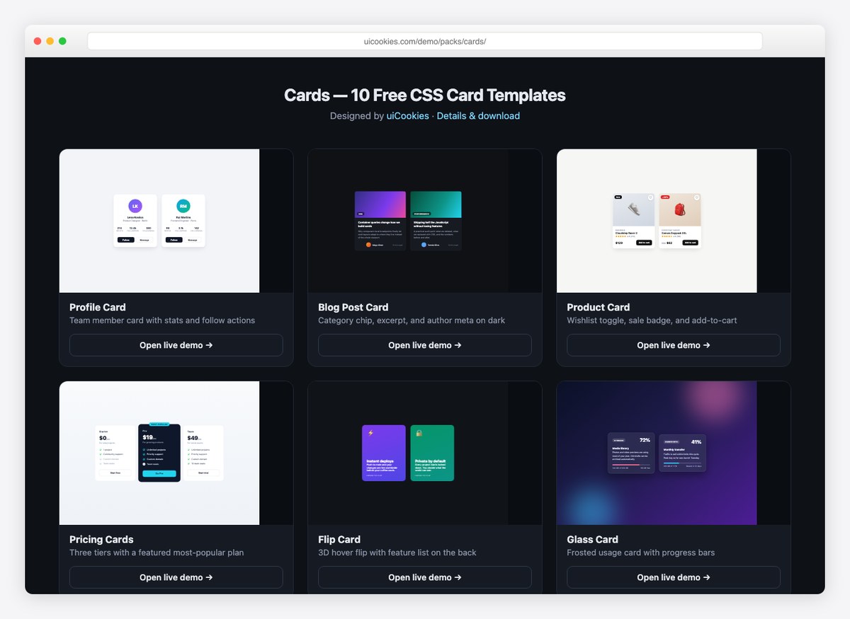
Cards is a pack of ten card templates covering the layouts real projects actually need: profile cards, blog cards, product cards, pricing tiers, flip cards, glassmorphism, dashboard stat cards, testimonials, hover-reveal image cards, and horizontal media cards. Each design is a single self-contained HTML file with the CSS (and the occasional line of vanilla JavaScript) inlined — no libraries, no fonts to load, no build step.
Most demos ship two or three variants of the design, so you can see how the card behaves with different content lengths and color treatments before you commit to it.
The ten designs
- Profile Card — avatar, role, follower stats, and follow/message actions with a hover lift.
- Blog Post Card — cover gradient, category chip, excerpt, and author meta on a dark theme.
- Product Card — sale badge, wishlist toggle, star rating, and add-to-cart row.
- Pricing Cards — three tiers with a scaled-up featured plan and checked/struck feature lists.
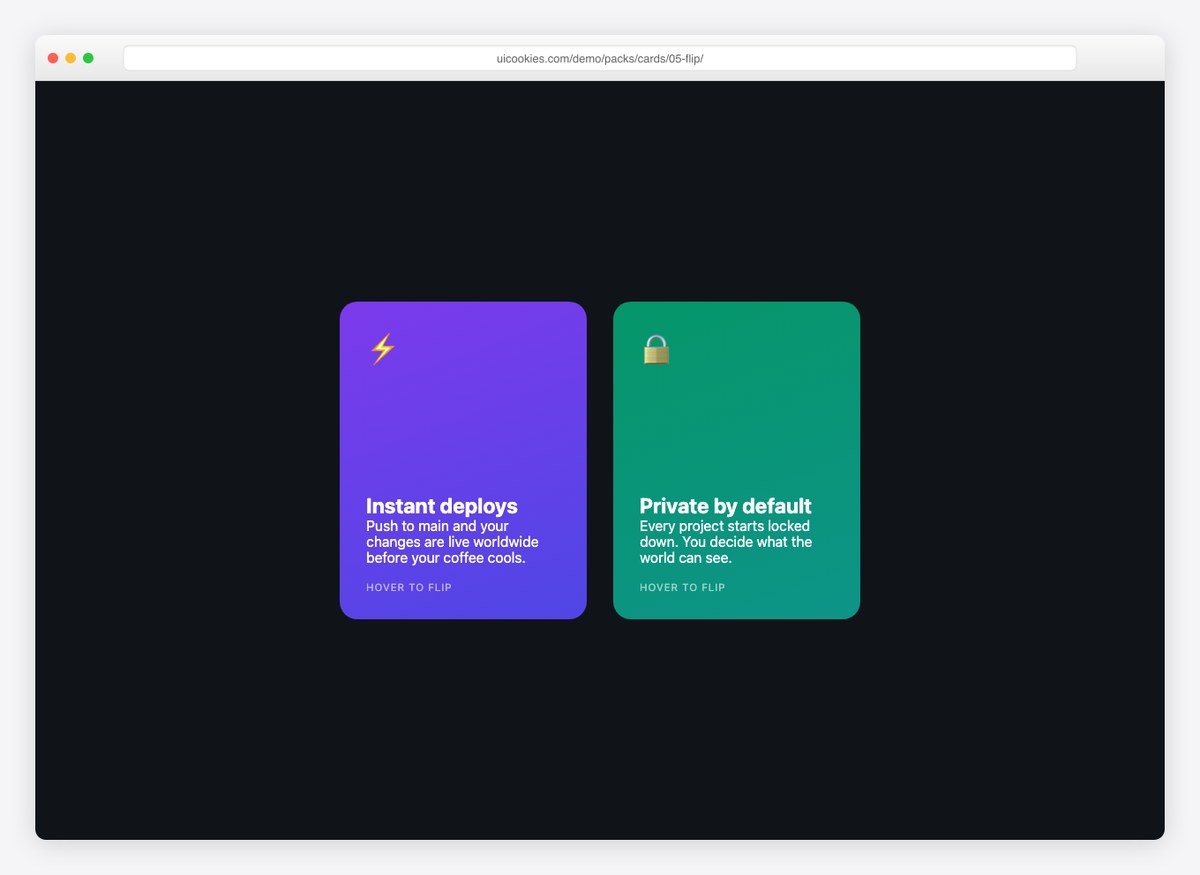
- Flip Card — 3D hover/focus flip revealing a feature list and call-to-action on the back.
- Glass Card — frosted usage/quota card with progress bars over a gradient scene.
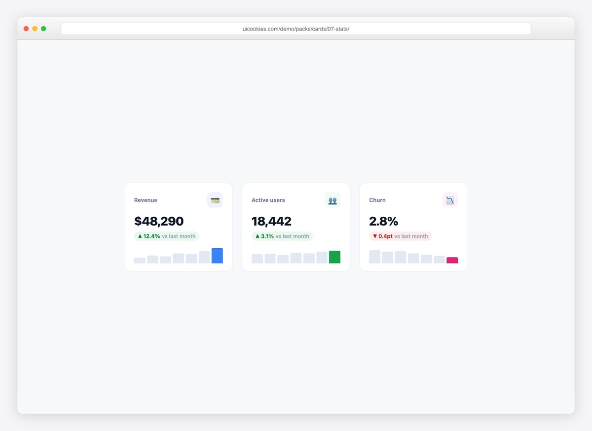
- Stat Cards — dashboard KPIs with delta chips and pure-CSS sparklines.
- Testimonial Card — oversized quote mark, star row, and attribution footer.
- Hover Reveal — image overlay card whose description slides up on hover.
- Horizontal Card — media-left layout that stacks vertically on small screens.
At a glance
- 10 designs, one folder each, single
index.htmlper design - Plain HTML and CSS with minimal vanilla JavaScript — zero dependencies
- Drop-in compatible with Bootstrap, Tailwind, React, Vue, or plain pages
- Responsive behavior built in (the horizontal card stacks, grids wrap)
- System font stacks — no web-font requests
- README with a design index and usage notes
How to use
Copy the markup of the card you want into your project — each card is a self-contained block, so it inherits nothing from the demo page except the font stack. Colors and spacing sit in a small CSS block at the top of each file. Inside Bootstrap projects the cards coexist fine with .card components; they don’t use Bootstrap class names, so nothing collides.
Preview everything on the live demo index, or read the full design write-ups on our free card templates page.
FAQ
Can I use these in commercial projects?
Yes — the pack follows the standard uiCookies license. Attribution details are on the license page.
Do the cards require Bootstrap?
No. They are plain CSS and work anywhere, including alongside Bootstrap. If you use Bootstrap’s grid, place a card inside any column and it will fill the available width.