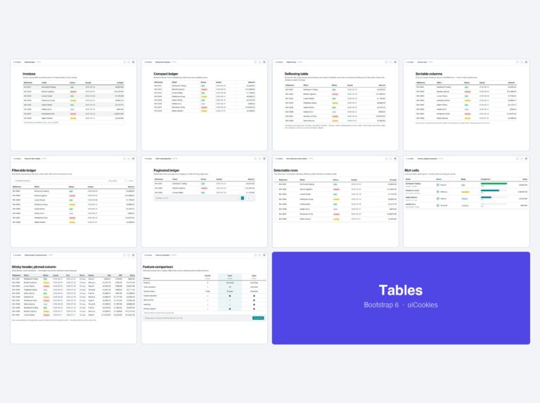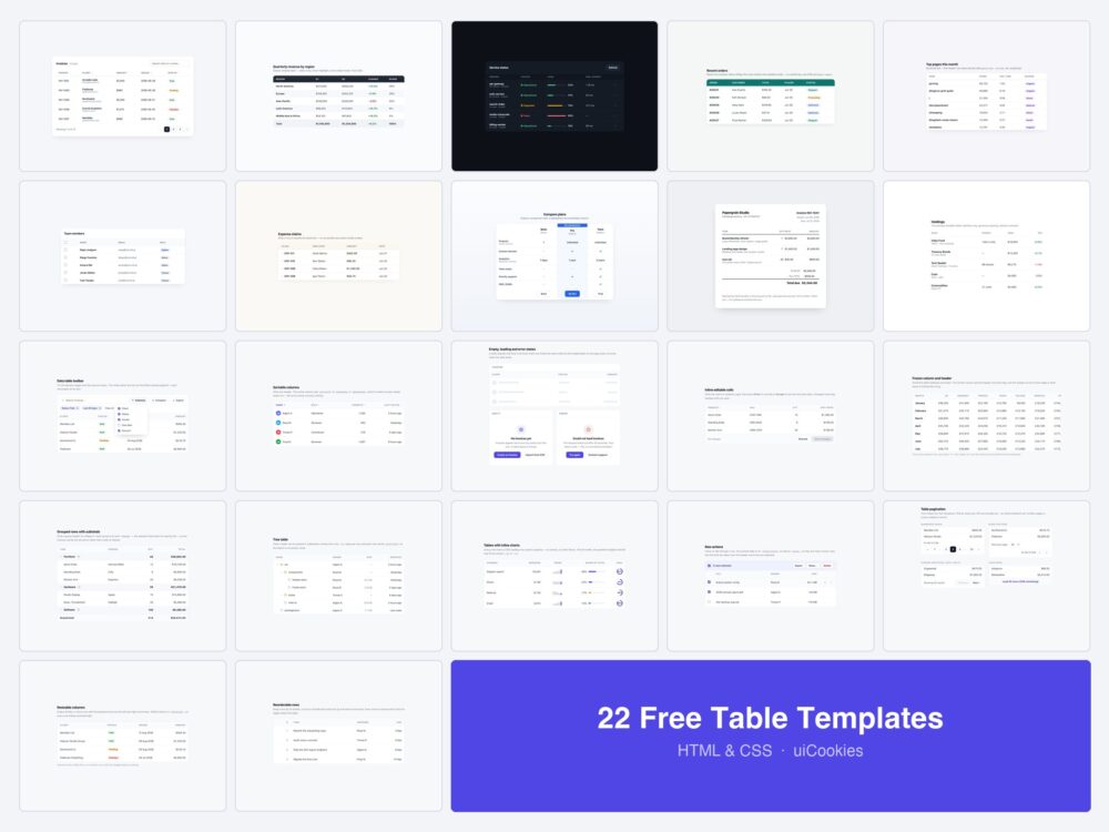
Every table on this page was designed and coded in-house by uiCookies — this is our own pack, not a roundup of CodePen embeds. Each design is a single self-contained HTML file with the CSS inline, and ten of the 22 use no JavaScript at all.
The first ten are table layouts — striped, dark, minimal, responsive, invoice, comparison. The other twelve are the pieces that turn a table into a data table: a toolbar, real sort states, frozen columns, grouped rows, inline editing, pagination, resizable columns, reorderable rows, and the empty, loading and error states that every table needs and almost none ship with.
Download all 22 (free) Browse live demos
Which table do you need?
| What you are showing | Start with |
|---|---|
| A long list people need to search and sort | Vanilla JS Datatable (1) plus Toolbar (11) |
| A table on a phone | Responsive Stack (4) |
| More columns than fit the screen | Frozen Column (15) |
| Hundreds of rows | Sticky Header (5) and Pagination (20) |
| Rows the user acts on | Selectable Rows (6) and Row Actions (19) |
| Data the user edits | Inline Editable Cells (14) |
| Figures that roll up into totals | Grouped Rows (16) |
| Anything hierarchical | Tree Table (17) |
| A dashboard metric table | Inline Charts (18) or Stat-style Dark Admin (3) |
| A plan or feature comparison | Comparison Table (8) |
| A billing document | Invoice Table (9) |
| A table that is sometimes empty | Empty / Loading / Error (13) |
Data table features
These nine are the functional pieces — the parts you would otherwise pull in a whole library for.
11. Data Table Toolbar

The bar above the table — search, removable filter chips, a column visibility menu, a density toggle and export. This is the part people mean when they say the built-in table is not enough, and it is almost never included in a table template.
Live Demo CSS, Bootstrap & Tailwind code
12. Sortable Columns

Sorting done properly: each header is a real button, the column carries aria-sort so the direction is announced rather than merely drawn, and the indicator has three states — unsorted, ascending, descending — instead of the usual two.
Live Demo CSS, Bootstrap & Tailwind code
13. Empty, Loading and Error States

The three states every table spends real time in and almost no table template ships: a skeleton that holds the layout so the page does not jump, an empty state that says what to do next, and an error that gives a reason and a retry. A spinner in a blank box is not a state.
Live Demo CSS, Bootstrap & Tailwind code
14. Inline Editable Cells

Click a cell to edit in place, Enter to commit, Escape to restore the previous value. Changed rows stay marked until saved and the save button is disabled until something actually changed — the part most inline editors leave out.
Live Demo CSS, Bootstrap & Tailwind code
15. Frozen Column and Header

A wide table where the first column and the header both stay put while the rest scrolls. Both use position: sticky, and the frozen column gets an edge shadow so it reads as pinned rather than as a rendering fault. The scroll container is focusable, so it can be scrolled from the keyboard.
Live Demo CSS, Bootstrap & Tailwind code
16. Grouped Rows with Subtotals

Rows collected under collapsible group headers, each with its own subtotal and a grand total in the footer. Each group is its own <tbody> — which is what multiple tbodies are for — so the structure lives in the markup rather than in a pile of classes.
Live Demo CSS, Bootstrap & Tailwind code
17. Tree Table

Hierarchical rows with indent guides: a folder structure, an org chart or a chart of accounts in table form. Depth is expressed with aria-level and one custom property per row, and expanding a branch reveals only its immediate children.
Live Demo CSS, Bootstrap & Tailwind code
18. Tables with Inline Charts

Bars, sparklines and progress rings inside cells, every one drawn in CSS from a single percentage — no canvas, no chart library. The number gives the value; the bar beside it gives the shape of the column at a glance.
Live Demo CSS, Bootstrap & Tailwind code
19. Row Actions

Three ways to hang actions off a row: buttons that fade in on hover and :focus-within, a kebab menu built on <details>, and a bulk bar that takes over the header once rows are selected. Hover-only actions lock out every keyboard user, which is why these do not.
Live Demo CSS, Bootstrap & Tailwind code
Columns and rows the user can change
20. Table Pagination

Four footers for four situations: numbered pages, a rows-per-page selector with a range read-out, previous-and-next for cursor APIs, and a load-more button. Pick by what your endpoint can do — a cursor API cannot number pages, however much the design wants to.
Live Demo CSS, Bootstrap & Tailwind code
21. Resizable Columns

Drag the divider between two headers, or focus one and use the arrow keys. Widths are applied to a <colgroup> rather than to individual cells, which is what keeps every row in step, and a 90px floor stops a column being dragged away to nothing.
Live Demo CSS, Bootstrap & Tailwind code
22. Reorderable Rows

Drag a row by its handle to reorder it, with a drop indicator showing where it will land. The handle is a button, so the same move works with the arrow keys, and every move is announced in a live region — drag-and-drop on its own excludes anyone not using a mouse.
Live Demo CSS, Bootstrap & Tailwind code
The ten table layouts
The designs this pack started with — the visual treatments, plus a complete vanilla-JS datatable.
1. Vanilla JS Datatable
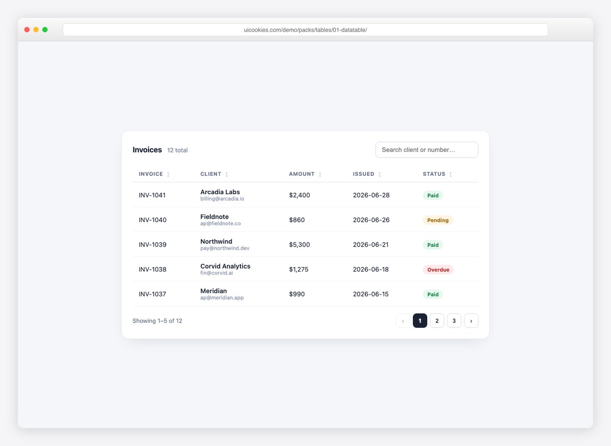
The full datatable, no jQuery required: live search, click-to-sort columns with direction indicators, and pagination with page numbers — about eighty lines of readable vanilla JavaScript. The data lives in a plain array, so wiring it to your API is a one-line swap.
Live Demo CSS, Bootstrap & Tailwind code
2. Striped Table
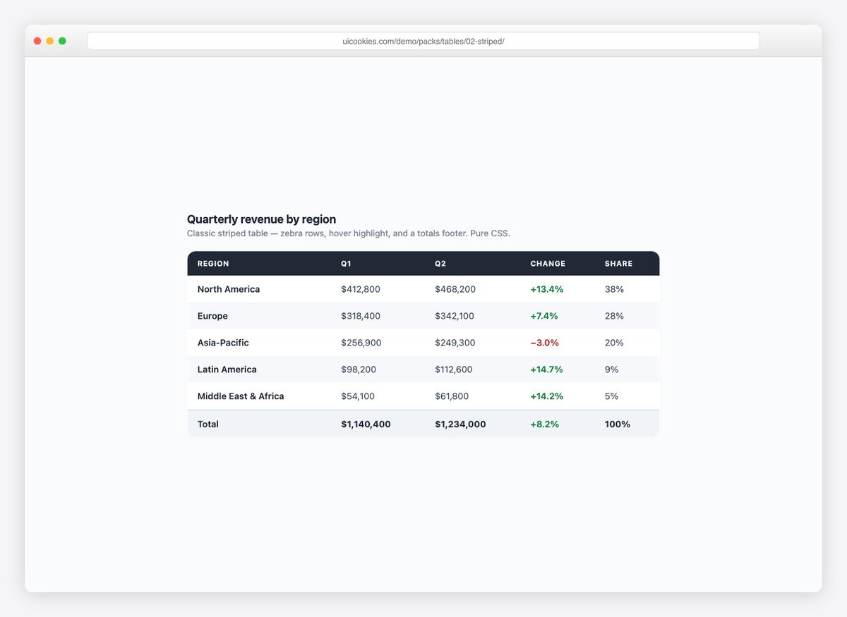
The classic zebra-striped report table with hover highlighting, a dark header row, and a totals footer. Pure CSS — the design most admin screens actually need most of the time.
Live Demo CSS, Bootstrap & Tailwind code
3. Dark Admin Table
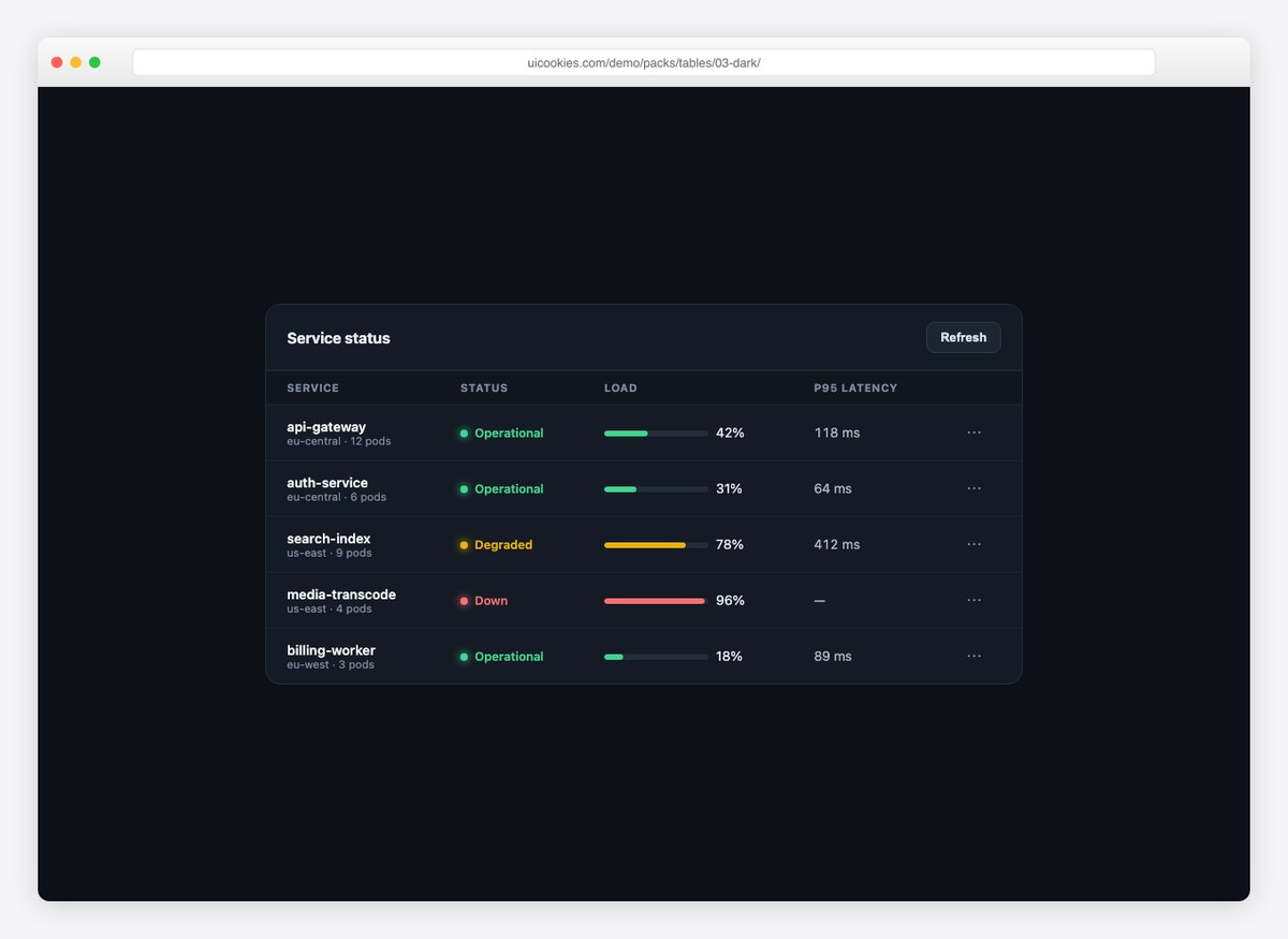
A service-status table for dark dashboards: glowing status dots, CSS load bars, tabular latency numbers, and a row-actions button. Reads like a monitoring product out of the box.
Live Demo CSS, Bootstrap & Tailwind code
4. Responsive Stack Table
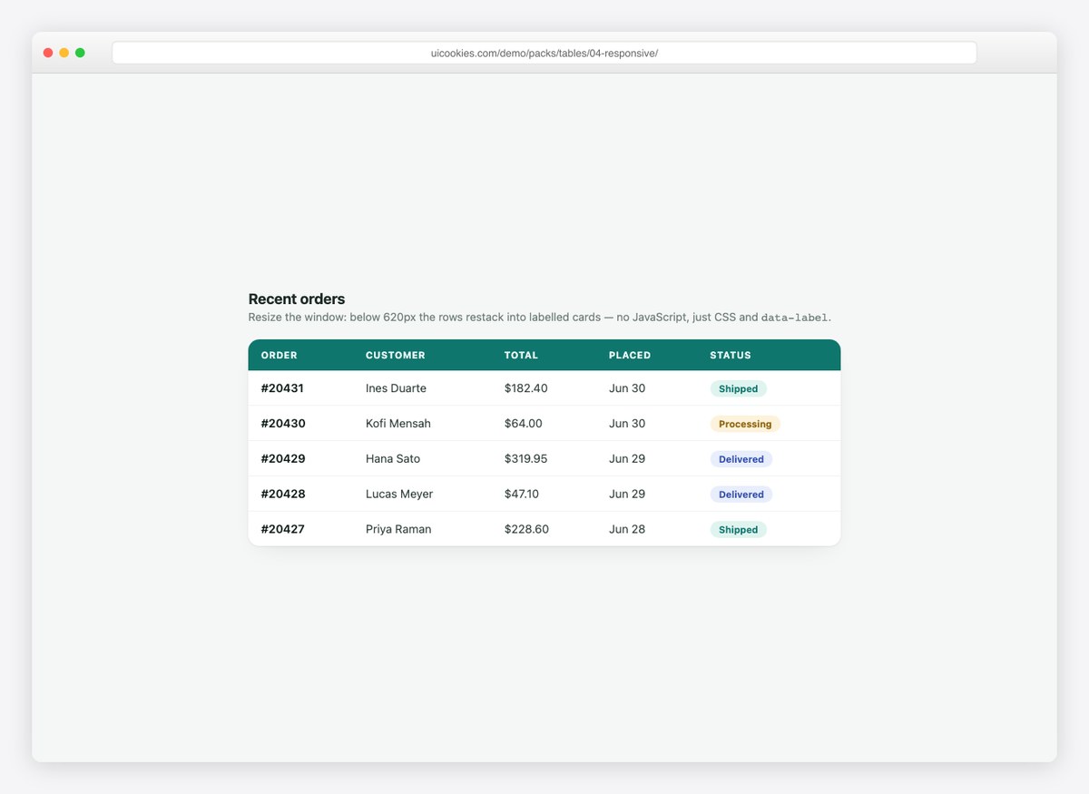
The mobile-table problem, solved with CSS alone: below 620px every row restacks into a labelled card using data-label attributes. No horizontal scrolling, no truncated columns.
Live Demo CSS, Bootstrap & Tailwind code
5. Sticky Header Table
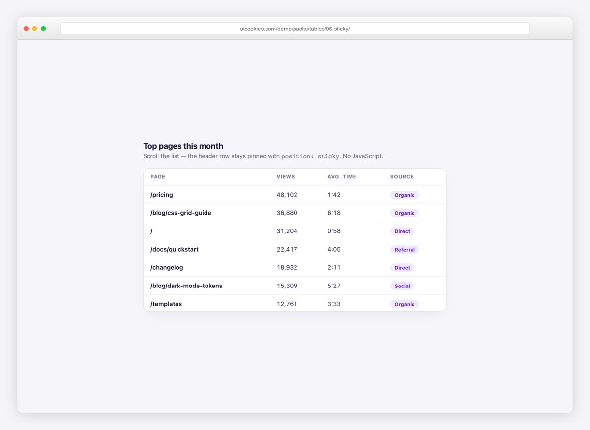
A scrollable table body with a header that stays pinned via position: sticky. Right for long lists inside fixed-height panels — no plugin, no JavaScript.
Live Demo CSS, Bootstrap & Tailwind code
6. Selectable Rows
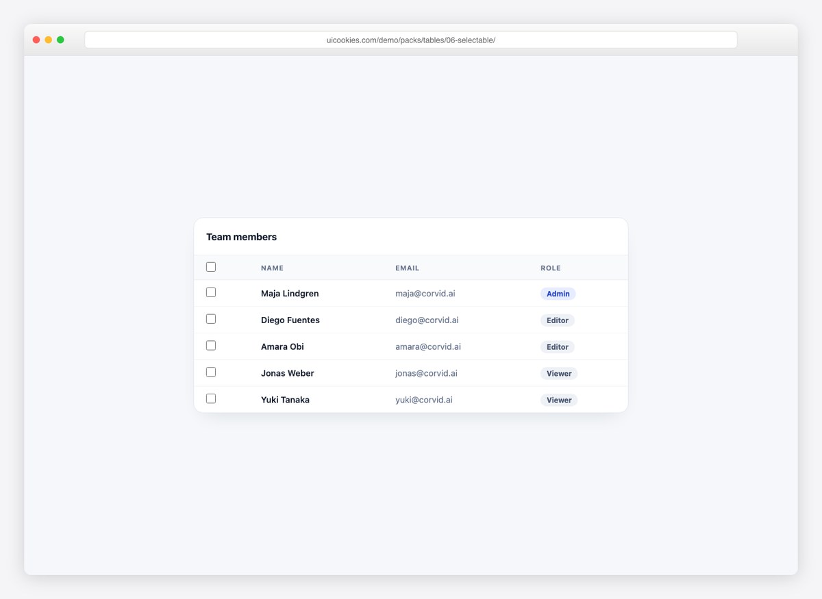
Checkbox selection done properly: a select-all with a true indeterminate state, row highlighting, and a bulk-action bar that appears only when something is selected.
Live Demo CSS, Bootstrap & Tailwind code
7. Expandable Rows
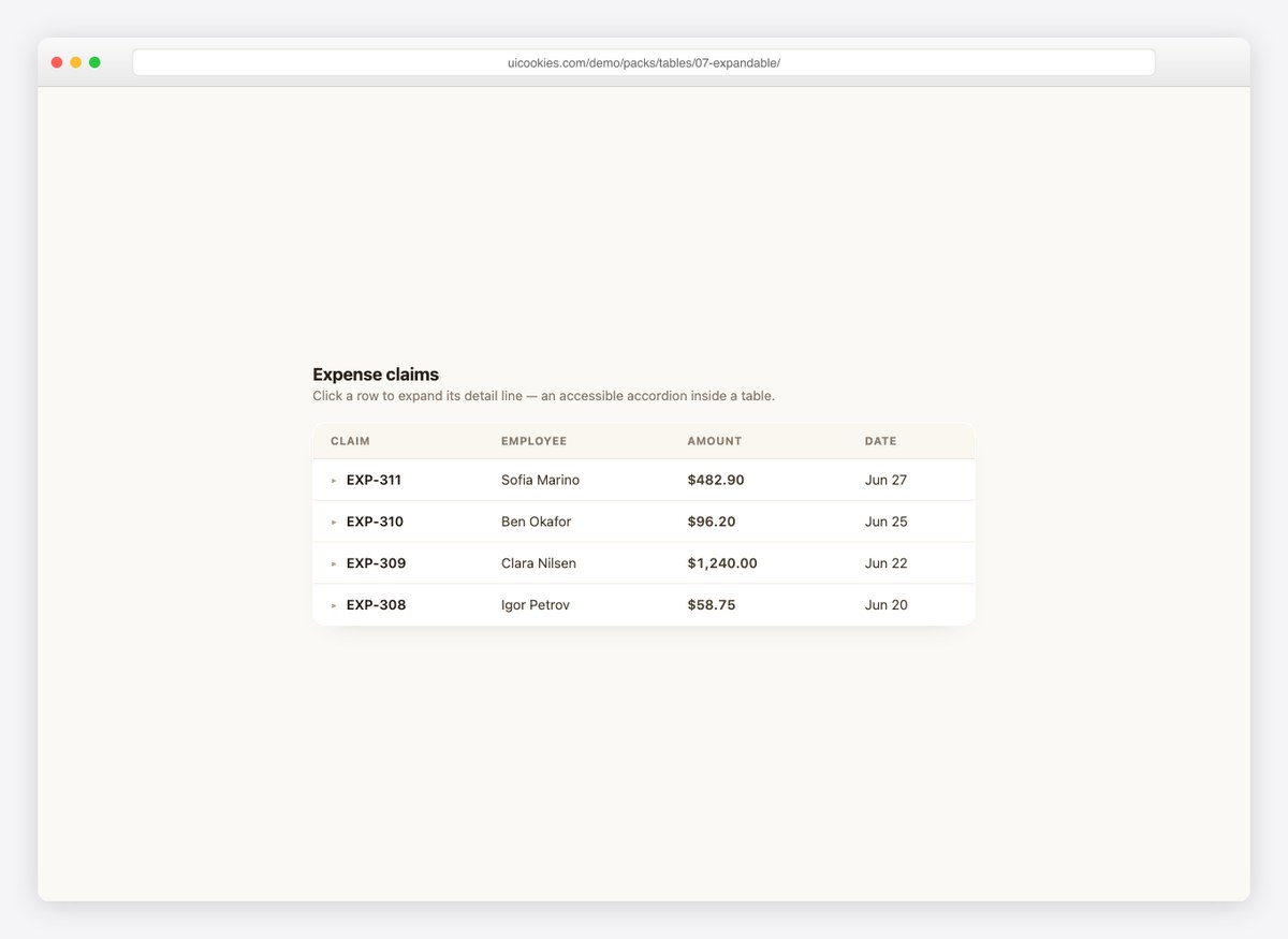
Click a row and its detail line accordions open beneath it. Useful whenever rows carry more context than columns can hold — expenses, orders, tickets.
Live Demo CSS, Bootstrap & Tailwind code
8. Comparison Table
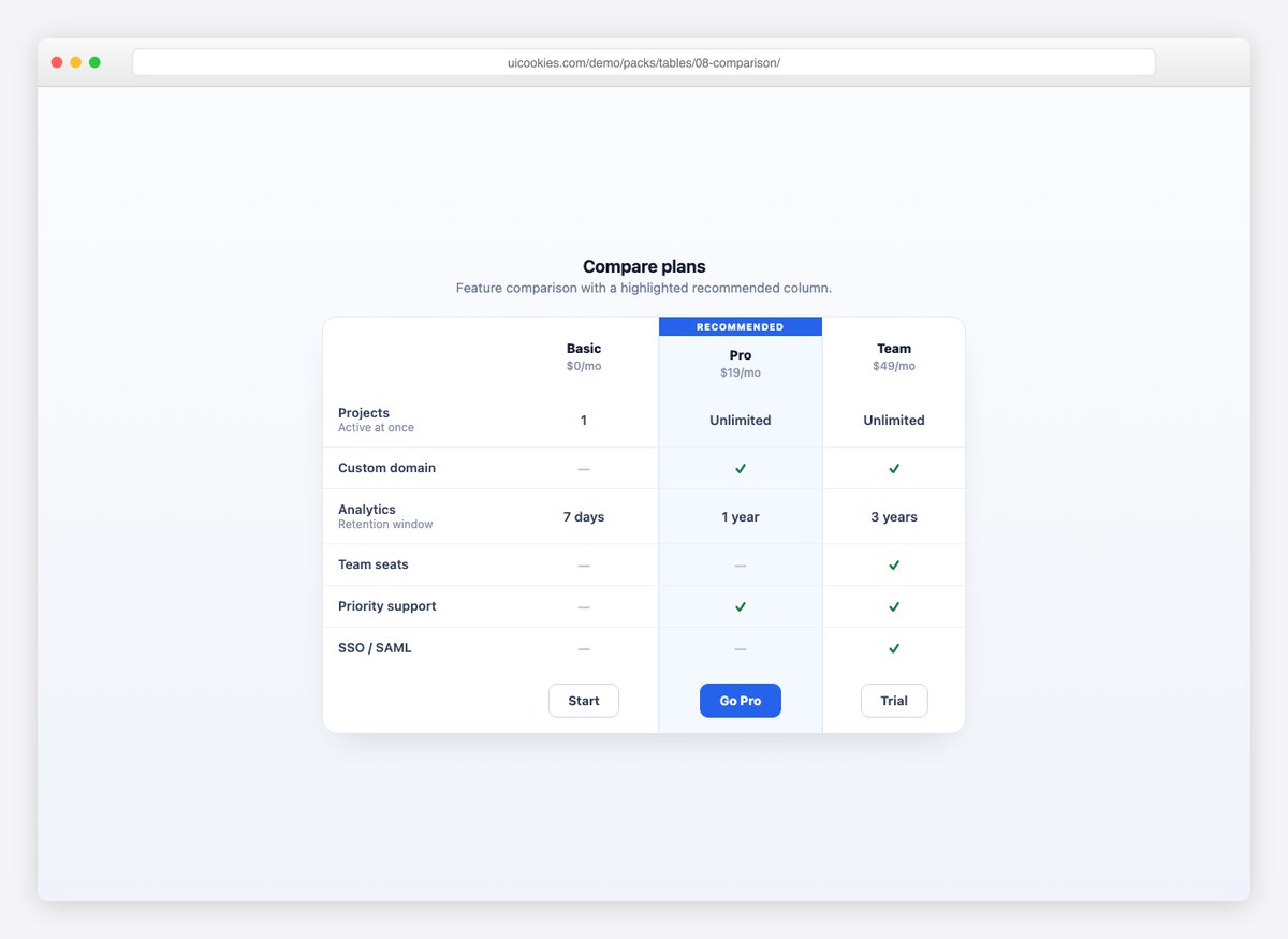
A pricing and feature matrix with a highlighted “recommended” column, check and dash states, and per-plan buttons in the footer. Ready for any pricing page.
Live Demo CSS, Bootstrap & Tailwind code
9. Invoice Table
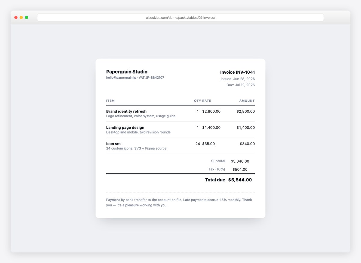
A complete invoice sheet: line items with descriptions, subtotal/tax/total rows, and print styles so it exports cleanly to PDF from the browser.
Live Demo CSS, Bootstrap & Tailwind code
10. Minimal Table
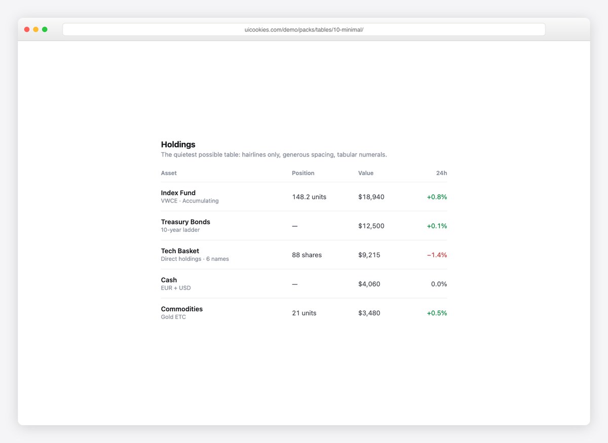
Hairline dividers, generous spacing, tabular numerals, and nothing else. For financial data and content-heavy pages where the table should disappear.
Live Demo CSS, Bootstrap & Tailwind code
Do you actually need a datatable library?
DataTables.js is the default answer to “I need a sortable table”, and for a lot of projects it is the wrong size of tool. It is a good library — but it brings jQuery, roughly 80KB before your own code, and a set of generated markup and class names you then have to override to make it look like your product.
A plain table plus the pieces on this page is enough when: the data set is in the hundreds or low thousands, sorting and filtering can happen in the browser, and you want the markup to be yours. Design 1 covers search, sort and pagination in about sixty lines of vanilla JavaScript.
Reach for a real grid library when: you need server-side processing over tens of thousands of rows, virtualised scrolling so only visible rows exist in the DOM, column pinning combined with grouping and aggregation, or spreadsheet-grade editing and export. Those are genuinely hard, and worth someone else’s code.
The failure mode worth avoiding is loading a full grid library to get sorting on a forty-row table — you pay the whole cost for one feature that is thirty lines.
Making a table responsive
There are two honest answers and the right one depends on what the table is for.
If each row is a record read on its own — an order, a user, an invoice — restack it into cards on a narrow screen. Give each cell a data-label and show it as a prefix:
@media (max-width: 640px) {
  thead { display: none; }
  tr, td { display: block; }
  td::before {
    content: attr(data-label);
    font-weight: 600;
  }
}
That is design 4. Every cell keeps its header even though the header row is gone.
If the value is in comparing rows — a month-by-region grid, a price list — do not restack it. Comparison dies the moment the columns are stacked. Keep the table, scroll it horizontally, freeze the first column so the labels stay, and give the scroll container tabindex="0" with a label so it can be reached by keyboard. That is design 15.
What not to do: shrink the font until it fits. It fits and nobody can read it.
Accessibility for data tables
Tables are one of the few components where semantic markup does most of the work for you — and where a wrapper div throws all of it away.
- Use real table elements.
<table>,<thead>,<th>,<tbody>. A grid built from divs has to reimplement every relationship the browser gives you for nothing. - Every header cell is a
<th>with ascope—scope="col"across the top,scope="row"down the side. That is what lets a screen reader say “Revenue, March, £56,930” instead of reading a bare number. - Sortable headers hold a button and set
aria-sorton the active column only. - Give the table a
<caption>, or anaria-label, so it is identifiable in a list of tables. It can be visually hidden. - Scroll containers need
tabindex="0"and arole="region"with a label, or a keyboard user cannot scroll them at all. - Never hide actions behind hover alone. Pair every
:hoverwith:focus-within, as design 19 does. - Announce changes. Sorting, reordering and bulk selection should update a
role="status"region — otherwise the table silently rearranges itself for anyone not watching it.
Using the tables in your project
Download the pack, open the folder for the design you want, and copy the markup along with the rules from its <style> block. Each design is self-contained — nothing depends on the other 21. The functional ones keep their JavaScript in the same file, commented, so you can lift just the behaviour you need.
Frequently asked questions
Are these table templates free?
Yes. All 22 are free for personal and commercial projects, including client work. No attribution required.
Do I need jQuery or DataTables.js?
No. Design 1 is a complete datatable — live search, sortable columns and pagination — in about sixty lines of vanilla JavaScript. Ten of the 22 use no JavaScript at all. DataTables.js is a good library, but it brings jQuery and roughly 80KB with it, which is a lot for a table of forty rows.
When should I use a real datatable library instead?
When you need server-side processing over tens of thousands of rows, virtualised scrolling, column pinning combined with grouping and aggregation, or Excel-grade export. Below that, a plain table plus the pieces on this page is smaller, faster and easier to style. The honest line is roughly a few thousand rows and more than two of those features at once.
Do the tables work with Bootstrap?
Yes. They use their own class names, so nothing collides with .table. If you want Bootstrap’s base, keep <table class="table"> and add the rules you want from here — Bootstrap 5 exposes --bs-table-* custom properties, so recolouring is often a few variable overrides rather than new rules.
How do I make a table responsive on mobile?
Two approaches, and the right one depends on the data. If each row is a record someone reads one at a time, restack it into labelled cards — that is design 4, and it works with a data-label attribute per cell. If the value is in comparing rows, keep the table and scroll it horizontally with the first column frozen, which is design 15. Never shrink the text until it fits.
How do I make sorting accessible?
Put a <button> inside the <th> so it is focusable and operable, and set aria-sort to ascending, descending or nothing on that column only. The arrow is decoration — the attribute is what a screen reader reads. Design 12 shows it.
Can I make table columns resizable?
Yes, and the trick is where the width goes: set it on a <colgroup>, not on cells, so every row follows automatically. Design 21 does that, with a keyboard path via the arrow keys and a minimum width so a column cannot vanish.
Can I use these in a template I sell?
Yes, in client work and in products you sell. What you cannot do is repackage the pack itself as a table pack for redistribution.
Download all 22 table templates (free) Browse live demos