Open demo

CSS code

HTML
<div class="tcard">
  <div class="tscroll" role="region" tabindex="0" aria-label="Invoices, scrollable">
    <table class="tbl" data-resizable>
      <caption class="sr-only">Invoices. Column dividers in the header can be dragged, or focused and moved with the arrow keys, to resize a column.</caption>
      <colgroup><col style="width:210px"><col style="width:150px"><col style="width:140px"><col style="width:120px"></colgroup>
      <thead><tr>
        <th scope="col">Client <span class="grip" role="separator" tabindex="0" aria-orientation="vertical" aria-label="Resize the Client column" aria-valuemin="90" aria-valuemax="480"></span></th>
        <th scope="col">Status <span class="grip" role="separator" tabindex="0" aria-orientation="vertical" aria-label="Resize the Status column" aria-valuemin="90" aria-valuemax="480"></span></th>
        <th scope="col">Issued <span class="grip" role="separator" tabindex="0" aria-orientation="vertical" aria-label="Resize the Issued column" aria-valuemin="90" aria-valuemax="480"></span></th>
        <th scope="col" class="num">Amount</th>
      </tr></thead>
      <tbody>
        <tr><td>Meridian Ltd</td><td><span class="pill ok">Paid</span></td><td>12 Aug 2026</td><td class="num">$584.40</td></tr>
        <tr><td>Halcyon Studio Group</td><td><span class="pill ok">Paid</span></td><td>09 Aug 2026</td><td class="num">$1,220.00</td></tr>
        <tr><td>Northwind Co</td><td><span class="pill warn">Pending</span></td><td>04 Aug 2026</td><td class="num">$318.75</td></tr>
        <tr><td>Fieldnote Publishing</td><td><span class="pill bad">Overdue</span></td><td>28 Jul 2026</td><td class="num">$2,940.00</td></tr>
      </tbody>
    </table>
  </div>
</div>
CSS
/* Resizable columns: table-layout:fixed with widths on <colgroup>. Each header holds a thin
   role="separator" divider on its right edge that shows a line on hover, drag and focus. */
.tcard{background:#fff;border:1px solid #e7e9f0;border-radius:14px;overflow:hidden}
.tscroll{overflow-x:auto}
.tscroll:focus-visible{outline:2px solid #4f46e5;outline-offset:-2px}
.sr-only{position:absolute;width:1px;height:1px;padding:0;margin:-1px;overflow:hidden;clip:rect(0,0,0,0);white-space:nowrap;border:0}
.tbl{width:100%;min-width:620px;table-layout:fixed;border-collapse:collapse;font-size:.89rem}
.tbl thead th{position:relative;text-align:left;font-size:.74rem;letter-spacing:.06em;text-transform:uppercase;
  color:#5f6778;font-weight:700;padding:13px 16px;background:#fafbfc;border-bottom:1px solid #eceef3}
.tbl th,.tbl td{overflow:hidden;white-space:nowrap;text-overflow:ellipsis}
.tbl td{padding:13px 16px;border-bottom:1px solid #f2f4f7;color:#3c4048}
.tbl tbody tr:last-child td{border-bottom:0}
.tbl tbody tr:hover{background:#fafbfd}
.tbl .num{font-variant-numeric:tabular-nums;text-align:right}
.tbl thead th.num{text-align:right}
.pill{display:inline-flex;align-items:center;font-size:.75rem;font-weight:700;padding:3px 10px;border-radius:999px}
.pill.ok{background:#e8f8ee;color:#15803d}
.pill.warn{background:#fff7e6;color:#b45309}
.pill.bad{background:#fdecec;color:#b91c1c}
.grip{position:absolute;top:0;right:-4px;width:9px;height:100%;cursor:col-resize;z-index:2;touch-action:none}
.grip::after{content:"";position:absolute;top:22%;bottom:22%;left:4px;width:2px;border-radius:2px;
  background:transparent;transition:background .15s}
.grip:hover::after,.grip:focus-visible::after,.grip.on::after{background:#4f46e5}
.grip:focus-visible{outline:2px solid #4f46e5;outline-offset:-2px}
@media(prefers-reduced-motion:reduce){.grip::after{transition:none}}
JavaScript
// Resizable columns. Widths go on <col>, never on cells, so every row follows. Each divider is a
// focusable role="separator"; a pointer drag and the arrow keys (Shift for bigger steps) both go
// through the same setter, which also updates aria-valuenow for screen readers.
document.querySelectorAll('[data-resizable]').forEach(table => {
  const MIN = 90, MAX = 480;
  const cols = [...table.querySelectorAll('colgroup col')];
  const grips = [...table.querySelectorAll('[role=separator]')];

  // The table stretches past its declared widths, so pin each col to its rendered width once,
  // or the first drag or key press would snap the column instead of nudging it.
  [...table.tHead.rows[0].cells].forEach((th, i) => {
    if (cols[i]) cols[i].style.width = th.getBoundingClientRect().width + 'px';
  });
  const widthOf = i => parseFloat(cols[i].style.width);
  const setWidth = (i, px) => {
    const w = Math.round(Math.min(MAX, Math.max(MIN, px)));
    cols[i].style.width = w + 'px';
    grips[i].setAttribute('aria-valuenow', w);
    grips[i].setAttribute('aria-valuetext', `${w} pixels`);
  };

  grips.forEach((grip, i) => {
    setWidth(i, widthOf(i));
    grip.addEventListener('pointerdown', e => {
      e.preventDefault();
      const startX = e.clientX, startW = widthOf(i);
      grip.classList.add('on');
      document.body.style.cursor = 'col-resize';
      grip.setPointerCapture(e.pointerId);
      const move = ev => setWidth(i, startW + (ev.clientX - startX));
      const up = () => {
        grip.removeEventListener('pointermove', move);
        grip.classList.remove('on');
        document.body.style.cursor = '';
      };
      grip.addEventListener('pointermove', move);
      grip.addEventListener('pointerup', up, { once: true });
      grip.addEventListener('pointercancel', up, { once: true });
    });
    grip.addEventListener('keydown', e => {
      if (e.key !== 'ArrowLeft' && e.key !== 'ArrowRight') return;
      e.preventDefault();
      const step = e.shiftKey ? 40 : 12;
      setWidth(i, widthOf(i) + (e.key === 'ArrowRight' ? step : -step));
    });
  });
});

Bootstrap 5 code

Requires: Bootstrap 5.3.8 CSS

HTML
<div class="card tcard overflow-hidden">
  <div class="table-responsive" role="region" tabindex="0" aria-label="Invoices, scrollable">
    <table class="table table-hover align-middle mb-0 tbl" data-resizable>
      <caption class="visually-hidden">Invoices. Column dividers in the header can be dragged, or focused and moved with the arrow keys, to resize a column.</caption>
      <colgroup><col style="width:210px"><col style="width:150px"><col style="width:140px"><col style="width:120px"></colgroup>
      <thead><tr>
        <th scope="col">Client <span class="grip" role="separator" tabindex="0" aria-orientation="vertical" aria-label="Resize the Client column" aria-valuemin="90" aria-valuemax="480"></span></th>
        <th scope="col">Status <span class="grip" role="separator" tabindex="0" aria-orientation="vertical" aria-label="Resize the Status column" aria-valuemin="90" aria-valuemax="480"></span></th>
        <th scope="col">Issued <span class="grip" role="separator" tabindex="0" aria-orientation="vertical" aria-label="Resize the Issued column" aria-valuemin="90" aria-valuemax="480"></span></th>
        <th scope="col" class="text-end">Amount</th>
      </tr></thead>
      <tbody>
        <tr><td>Meridian Ltd</td><td><span class="badge rounded-pill pill-ok">Paid</span></td><td>12 Aug 2026</td><td class="text-end num">$584.40</td></tr>
        <tr><td>Halcyon Studio Group</td><td><span class="badge rounded-pill pill-ok">Paid</span></td><td>09 Aug 2026</td><td class="text-end num">$1,220.00</td></tr>
        <tr><td>Northwind Co</td><td><span class="badge rounded-pill pill-warn">Pending</span></td><td>04 Aug 2026</td><td class="text-end num">$318.75</td></tr>
        <tr><td>Fieldnote Publishing</td><td><span class="badge rounded-pill pill-bad">Overdue</span></td><td>28 Jul 2026</td><td class="text-end num">$2,940.00</td></tr>
      </tbody>
    </table>
  </div>
</div>
CSS
/* Bootstrap .card + .table-responsive + .table-hover with table-layout:fixed and widths on
   <colgroup>. Status uses .badge.rounded-pill; the role="separator" dividers are custom CSS. */
.tcard{--bs-card-border-color:#e7e9f0;--bs-card-border-radius:14px;--bs-card-bg:#fff}
.tcard .table-responsive:focus-visible{outline:2px solid #4f46e5;outline-offset:-2px}
.tbl{--bs-table-color:#3c4048;--bs-table-bg:#fff;--bs-table-border-color:#f2f4f7;
  --bs-table-hover-color:#3c4048;--bs-table-hover-bg:#fafbfd;min-width:620px;table-layout:fixed;font-size:.89rem}
.tbl > :not(caption) > * > *{padding:13px 16px;overflow:hidden;white-space:nowrap;text-overflow:ellipsis}
.tbl > tbody > tr:last-child > *{border-bottom-width:0}
.tbl > thead > tr > th{position:relative;font-size:.74rem;letter-spacing:.06em;text-transform:uppercase;color:#5f6778;
  --bs-table-bg:#fafbfc;border-bottom-color:#eceef3}
.tbl .num{font-variant-numeric:tabular-nums}
.tbl .badge{font-size:.75rem;font-weight:700;padding:3px 10px;line-height:normal}
.pill-ok{background:#e8f8ee;color:#15803d}
.pill-warn{background:#fff7e6;color:#b45309}
.pill-bad{background:#fdecec;color:#b91c1c}
.grip{position:absolute;top:0;right:-4px;width:9px;height:100%;cursor:col-resize;z-index:2;touch-action:none}
.grip::after{content:"";position:absolute;top:22%;bottom:22%;left:4px;width:2px;border-radius:2px;
  background:transparent;transition:background .15s}
.grip:hover::after,.grip:focus-visible::after,.grip.on::after{background:#4f46e5}
.grip:focus-visible{outline:2px solid #4f46e5;outline-offset:-2px}
@media(prefers-reduced-motion:reduce){.grip::after{transition:none}}
JavaScript
// Resizable columns. Widths go on <col>, never on cells, so every row follows. Each divider is a
// focusable role="separator"; a pointer drag and the arrow keys (Shift for bigger steps) both go
// through the same setter, which also updates aria-valuenow for screen readers.
document.querySelectorAll('[data-resizable]').forEach(table => {
  const MIN = 90, MAX = 480;
  const cols = [...table.querySelectorAll('colgroup col')];
  const grips = [...table.querySelectorAll('[role=separator]')];

  // The table stretches past its declared widths, so pin each col to its rendered width once,
  // or the first drag or key press would snap the column instead of nudging it.
  [...table.tHead.rows[0].cells].forEach((th, i) => {
    if (cols[i]) cols[i].style.width = th.getBoundingClientRect().width + 'px';
  });
  const widthOf = i => parseFloat(cols[i].style.width);
  const setWidth = (i, px) => {
    const w = Math.round(Math.min(MAX, Math.max(MIN, px)));
    cols[i].style.width = w + 'px';
    grips[i].setAttribute('aria-valuenow', w);
    grips[i].setAttribute('aria-valuetext', `${w} pixels`);
  };

  grips.forEach((grip, i) => {
    setWidth(i, widthOf(i));
    grip.addEventListener('pointerdown', e => {
      e.preventDefault();
      const startX = e.clientX, startW = widthOf(i);
      grip.classList.add('on');
      document.body.style.cursor = 'col-resize';
      grip.setPointerCapture(e.pointerId);
      const move = ev => setWidth(i, startW + (ev.clientX - startX));
      const up = () => {
        grip.removeEventListener('pointermove', move);
        grip.classList.remove('on');
        document.body.style.cursor = '';
      };
      grip.addEventListener('pointermove', move);
      grip.addEventListener('pointerup', up, { once: true });
      grip.addEventListener('pointercancel', up, { once: true });
    });
    grip.addEventListener('keydown', e => {
      if (e.key !== 'ArrowLeft' && e.key !== 'ArrowRight') return;
      e.preventDefault();
      const step = e.shiftKey ? 40 : 12;
      setWidth(i, widthOf(i) + (e.key === 'ArrowRight' ? step : -step));
    });
  });
});

Tailwind 4 code

Requires: Tailwind CSS 4

HTML
<div class="overflow-hidden rounded-[14px] border border-[#e7e9f0] bg-white">
  <div class="overflow-x-auto focus-visible:outline-2 focus-visible:-outline-offset-2 focus-visible:outline-[#4f46e5]" role="region" tabindex="0" aria-label="Invoices, scrollable">
    <table class="w-full min-w-[620px] table-fixed border-collapse text-[.89rem] [&_td]:truncate [&_td]:border-b [&_td]:border-[#f2f4f7] [&_td]:px-4 [&_td]:py-[13px] [&_td]:text-[#3c4048] [&_tbody_tr:hover]:bg-[#fafbfd] [&_tbody_tr:last-child_td]:border-b-0 [&_th]:truncate" data-resizable>
      <caption class="sr-only">Invoices. Column dividers in the header can be dragged, or focused and moved with the arrow keys, to resize a column.</caption>
      <colgroup><col class="w-[210px]"><col class="w-[150px]"><col class="w-[140px]"><col class="w-[120px]"></colgroup>
      <thead><tr>
        <th scope="col" class="relative border-b border-[#eceef3] bg-[#fafbfc] px-4 py-[13px] text-[.74rem] font-bold tracking-[.06em] text-[#5f6778] uppercase text-left">Client <span class="group/grip absolute top-0 -right-1 z-2 h-full w-[9px] cursor-col-resize touch-none focus-visible:outline-2 focus-visible:-outline-offset-2 focus-visible:outline-[#4f46e5] after:absolute after:inset-y-[22%] after:left-1 after:w-0.5 after:rounded-sm after:transition-colors after:duration-150 hover:after:bg-[#4f46e5] focus-visible:after:bg-[#4f46e5] [&.on]:after:bg-[#4f46e5] motion-reduce:after:transition-none" role="separator" tabindex="0" aria-orientation="vertical" aria-label="Resize the Client column" aria-valuemin="90" aria-valuemax="480"></span></th>
        <th scope="col" class="relative border-b border-[#eceef3] bg-[#fafbfc] px-4 py-[13px] text-[.74rem] font-bold tracking-[.06em] text-[#5f6778] uppercase text-left">Status <span class="group/grip absolute top-0 -right-1 z-2 h-full w-[9px] cursor-col-resize touch-none focus-visible:outline-2 focus-visible:-outline-offset-2 focus-visible:outline-[#4f46e5] after:absolute after:inset-y-[22%] after:left-1 after:w-0.5 after:rounded-sm after:transition-colors after:duration-150 hover:after:bg-[#4f46e5] focus-visible:after:bg-[#4f46e5] [&.on]:after:bg-[#4f46e5] motion-reduce:after:transition-none" role="separator" tabindex="0" aria-orientation="vertical" aria-label="Resize the Status column" aria-valuemin="90" aria-valuemax="480"></span></th>
        <th scope="col" class="relative border-b border-[#eceef3] bg-[#fafbfc] px-4 py-[13px] text-[.74rem] font-bold tracking-[.06em] text-[#5f6778] uppercase text-left">Issued <span class="group/grip absolute top-0 -right-1 z-2 h-full w-[9px] cursor-col-resize touch-none focus-visible:outline-2 focus-visible:-outline-offset-2 focus-visible:outline-[#4f46e5] after:absolute after:inset-y-[22%] after:left-1 after:w-0.5 after:rounded-sm after:transition-colors after:duration-150 hover:after:bg-[#4f46e5] focus-visible:after:bg-[#4f46e5] [&.on]:after:bg-[#4f46e5] motion-reduce:after:transition-none" role="separator" tabindex="0" aria-orientation="vertical" aria-label="Resize the Issued column" aria-valuemin="90" aria-valuemax="480"></span></th>
        <th scope="col" class="relative border-b border-[#eceef3] bg-[#fafbfc] px-4 py-[13px] text-[.74rem] font-bold tracking-[.06em] text-[#5f6778] uppercase text-right">Amount</th>
      </tr></thead>
      <tbody>
        <tr><td>Meridian Ltd</td><td><span class="inline-flex items-center rounded-full bg-[#e8f8ee] px-2.5 py-[3px] text-[.75rem] font-bold text-[#15803d]">Paid</span></td><td>12 Aug 2026</td><td class="text-right tabular-nums">$584.40</td></tr>
        <tr><td>Halcyon Studio Group</td><td><span class="inline-flex items-center rounded-full bg-[#e8f8ee] px-2.5 py-[3px] text-[.75rem] font-bold text-[#15803d]">Paid</span></td><td>09 Aug 2026</td><td class="text-right tabular-nums">$1,220.00</td></tr>
        <tr><td>Northwind Co</td><td><span class="inline-flex items-center rounded-full bg-[#fff7e6] px-2.5 py-[3px] text-[.75rem] font-bold text-[#b45309]">Pending</span></td><td>04 Aug 2026</td><td class="text-right tabular-nums">$318.75</td></tr>
        <tr><td>Fieldnote Publishing</td><td><span class="inline-flex items-center rounded-full bg-[#fdecec] px-2.5 py-[3px] text-[.75rem] font-bold text-[#b91c1c]">Overdue</span></td><td>28 Jul 2026</td><td class="text-right tabular-nums">$2,940.00</td></tr>
      </tbody>
    </table>
  </div>
</div>
JavaScript
// Resizable columns. Widths go on <col>, never on cells, so every row follows. Each divider is a
// focusable role="separator"; a pointer drag and the arrow keys (Shift for bigger steps) both go
// through the same setter, which also updates aria-valuenow for screen readers.
document.querySelectorAll('[data-resizable]').forEach(table => {
  const MIN = 90, MAX = 480;
  const cols = [...table.querySelectorAll('colgroup col')];
  const grips = [...table.querySelectorAll('[role=separator]')];

  // The table stretches past its declared widths, so pin each col to its rendered width once,
  // or the first drag or key press would snap the column instead of nudging it.
  [...table.tHead.rows[0].cells].forEach((th, i) => {
    if (cols[i]) cols[i].style.width = th.getBoundingClientRect().width + 'px';
  });
  const widthOf = i => parseFloat(cols[i].style.width);
  const setWidth = (i, px) => {
    const w = Math.round(Math.min(MAX, Math.max(MIN, px)));
    cols[i].style.width = w + 'px';
    grips[i].setAttribute('aria-valuenow', w);
    grips[i].setAttribute('aria-valuetext', `${w} pixels`);
  };

  grips.forEach((grip, i) => {
    setWidth(i, widthOf(i));
    grip.addEventListener('pointerdown', e => {
      e.preventDefault();
      const startX = e.clientX, startW = widthOf(i);
      grip.classList.add('on');
      document.body.style.cursor = 'col-resize';
      grip.setPointerCapture(e.pointerId);
      const move = ev => setWidth(i, startW + (ev.clientX - startX));
      const up = () => {
        grip.removeEventListener('pointermove', move);
        grip.classList.remove('on');
        document.body.style.cursor = '';
      };
      grip.addEventListener('pointermove', move);
      grip.addEventListener('pointerup', up, { once: true });
      grip.addEventListener('pointercancel', up, { once: true });
    });
    grip.addEventListener('keydown', e => {
      if (e.key !== 'ArrowLeft' && e.key !== 'ArrowRight') return;
      e.preventDefault();
      const step = e.shiftKey ? 40 : 12;
      setWidth(i, widthOf(i) + (e.key === 'ArrowRight' ? step : -step));
    });
  });
});

About this set

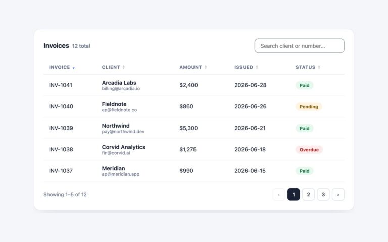
An invoice table with column dividers you can drag, or focus and move with the arrow keys, to resize the Client, Status and Issued columns. Widths are written to col elements in a colgroup, and the table uses table-layout fixed, so every row follows the new width at once and long text is cut off with an ellipsis. Each divider is a 9 pixel wide handle on the right edge of its header, drawn as a thin indigo line on hover, while dragging and on keyboard focus. The dividers are focusable elements with role=”separator” and aria-valuenow, so screen readers announce the current width in pixels, and the left and right arrow keys change it by 12 pixels, or by 40 with Shift. Columns stay between 90 and 480 pixels, so none can be dragged away to nothing. On load the script pins each col to its rendered width, so the first drag or key press nudges a column instead of snapping it. Use it for admin tables where content widths vary, such as long client names or notes. Save the widths to local storage if they should persist.

What’s included

  • Drag or arrow-key resizing, Shift for bigger steps
  • Widths on a colgroup so all rows follow
  • Focusable role="separator" dividers with aria-valuenow
  • 90px minimum and 480px maximum per column
  • Ellipsis for text that no longer fits

Accessibility

The caption explains how to resize. Each divider is a focusable role="separator" with aria-orientation, an aria-label naming its column, and aria-valuenow and aria-valuetext kept current in pixels. Dividers show an indigo line and a 2px outline on keyboard focus, and the line's colour transition is removed under prefers-reduced-motion.

Customise it

Change MIN, MAX and the 12 and 40 pixel steps in the script, the starting widths on the col elements, and the #4f46e5 divider colour in the .grip rules (plain CSS and Bootstrap) or the after: utilities on each divider (Tailwind).