About this set
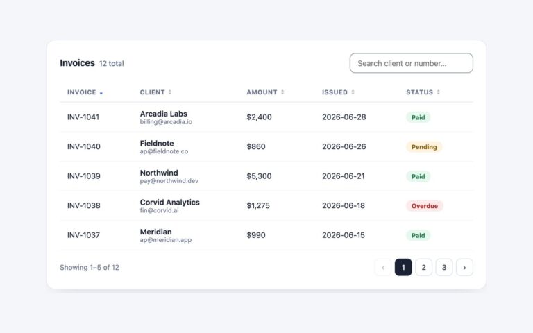
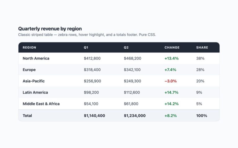
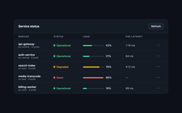
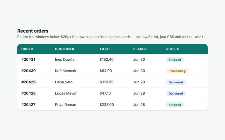
The controls that sit above a data table, wired to an invoices table. A search field filters rows as you type and a hidden status line announces how many are shown. A Columns menu, a details element with a checkbox per column, shows and hides columns, including a Due date column that starts hidden; Escape or a click outside closes it. A Compact button with aria-pressed switches the table to tighter rows and shows its pressed state. Export is a plain button for your own handler. Under the bar, removable filter chips show the filters in effect; each has a named remove button, Clear all removes them together, and focus moves to the next chip or the search field so it is never lost. Use it as the header of any admin list. The table itself scrolls sideways in a focusable region on phones. The Bootstrap version uses .form-control, a .dropdown with auto-close set to outside so it stays open while you tick, and .table-sm for compact rows; the Tailwind version uses a details element, aria-pressed: and data-dense: utilities.
What’s included
- Search that filters rows and announces the result count
- Columns menu that shows and hides table columns
- Density toggle with aria-pressed and compact rows
- Removable filter chips with Clear all and managed focus
- Bootstrap dropdown and .table-sm version
Accessibility
The search field and column checkboxes have labels, the density button reports its state with aria-pressed, and each chip's remove button names its filter. A visually hidden role="status" line announces search results and removed filters. Every control shows a 2px indigo focus outline, and the menu closes with Escape and returns focus to its button.
Customise it
The accent is #4f46e5 and the chips use #eef2ff and #3730a3 in the .tb rules; compact padding is the [data-dense] rule. In Bootstrap set the --bs-btn-*, --bs-dropdown-* and --bs-table-* variables and the .table-sm padding; in Tailwind edit the colour utilities and data-dense: padding.