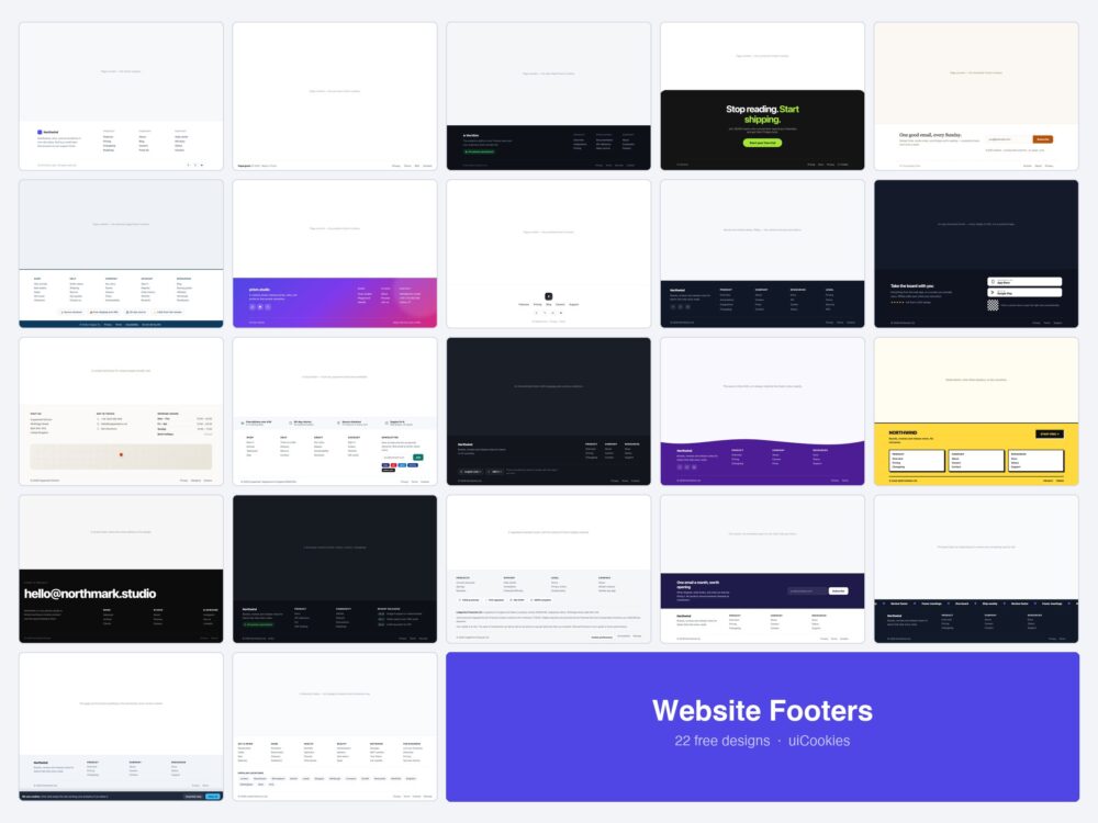
Twenty-two website footers, all designed and coded in-house by uiCookies. Each is a single self-contained HTML file with the CSS inline, and not one of them uses JavaScript.
That is deliberate rather than a boast. The footer is where people go when something else has failed them — when the navigation did not have what they wanted, when they need the phone number, when they are looking for the terms. It should not depend on a script that might not run.
Download all 22 (free) Browse live demos
Which footer do you need?
| What the site is | Start with |
|---|---|
| A normal marketing site | Column Footer (1) or Centred (8) |
| Almost nothing to say | One-Liner (2) |
| Links that must survive a phone | Columns → Accordions (9) |
| A shop | E-commerce (12) |
| A local business | Contact Footer (11) |
| An app | App Download (10) |
| A developer product | Status Row (17) |
| A regulated business | Compliance (18) |
| A studio or portfolio | Big-Type Portfolio (16) |
| A marketplace or directory | Directory (22) |
| Selling across countries | Locale Switchers (13) |
| Growing a mailing list | Newsletter First (5) or Two-Tone Split (19) |
| One action you cannot miss | Sticky Bar (21) or Big CTA (4) |
| Something with personality | Neobrutalist (15), Wave (14) or Marquee (20) |
The original eight
The shapes the pack started with — the layouts most sites end up needing.
1. Classic Column Footer
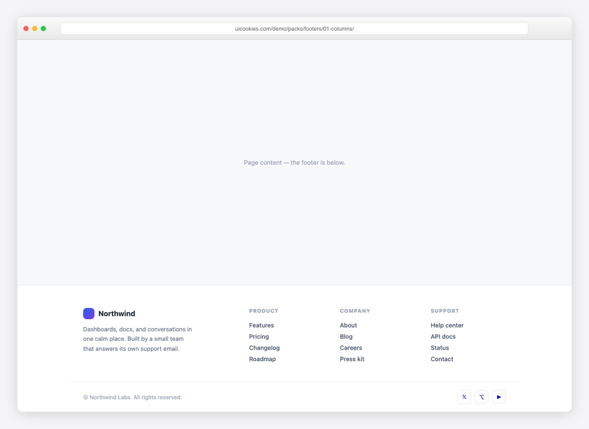
The default done well: brand blurb with logo, three link columns, and a legal row with social buttons that lift on hover. Collapses to two columns on phones.
Live Demo CSS, Bootstrap & Tailwind code
2. One-Line Footer
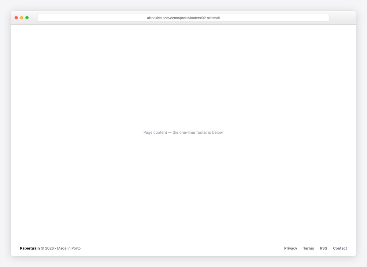
Copyright on the left, inline nav on the right, one hairline above. For portfolios and products that don’t need a sitemap in the basement.
Live Demo CSS, Bootstrap & Tailwind code
3. Dark SaaS Footer
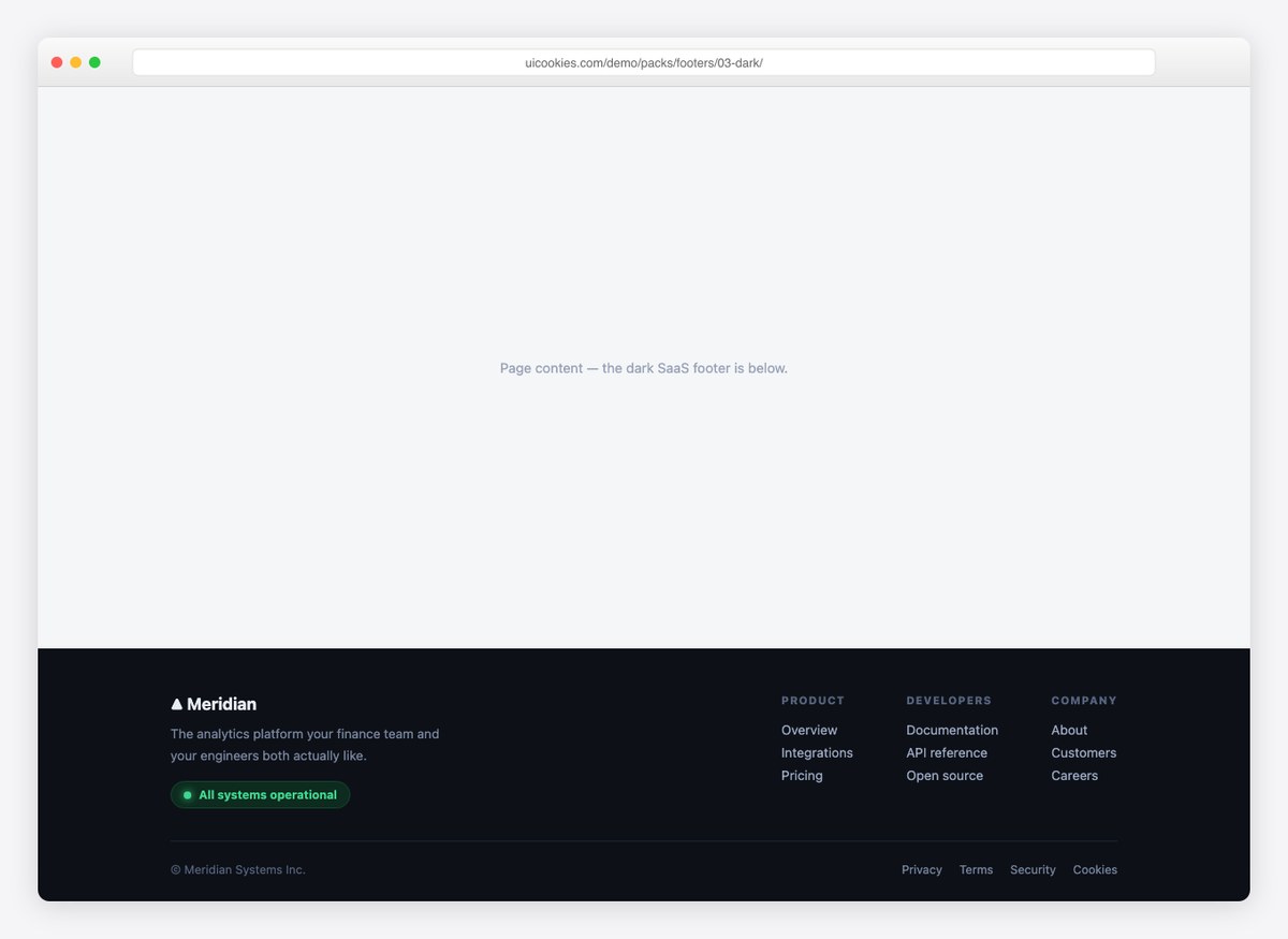
A dark footer with a live “all systems operational” status pill, grouped product/developer/company links, and a proper legal row. Reads like a serious product.
Live Demo CSS, Bootstrap & Tailwind code
4. Big CTA Footer
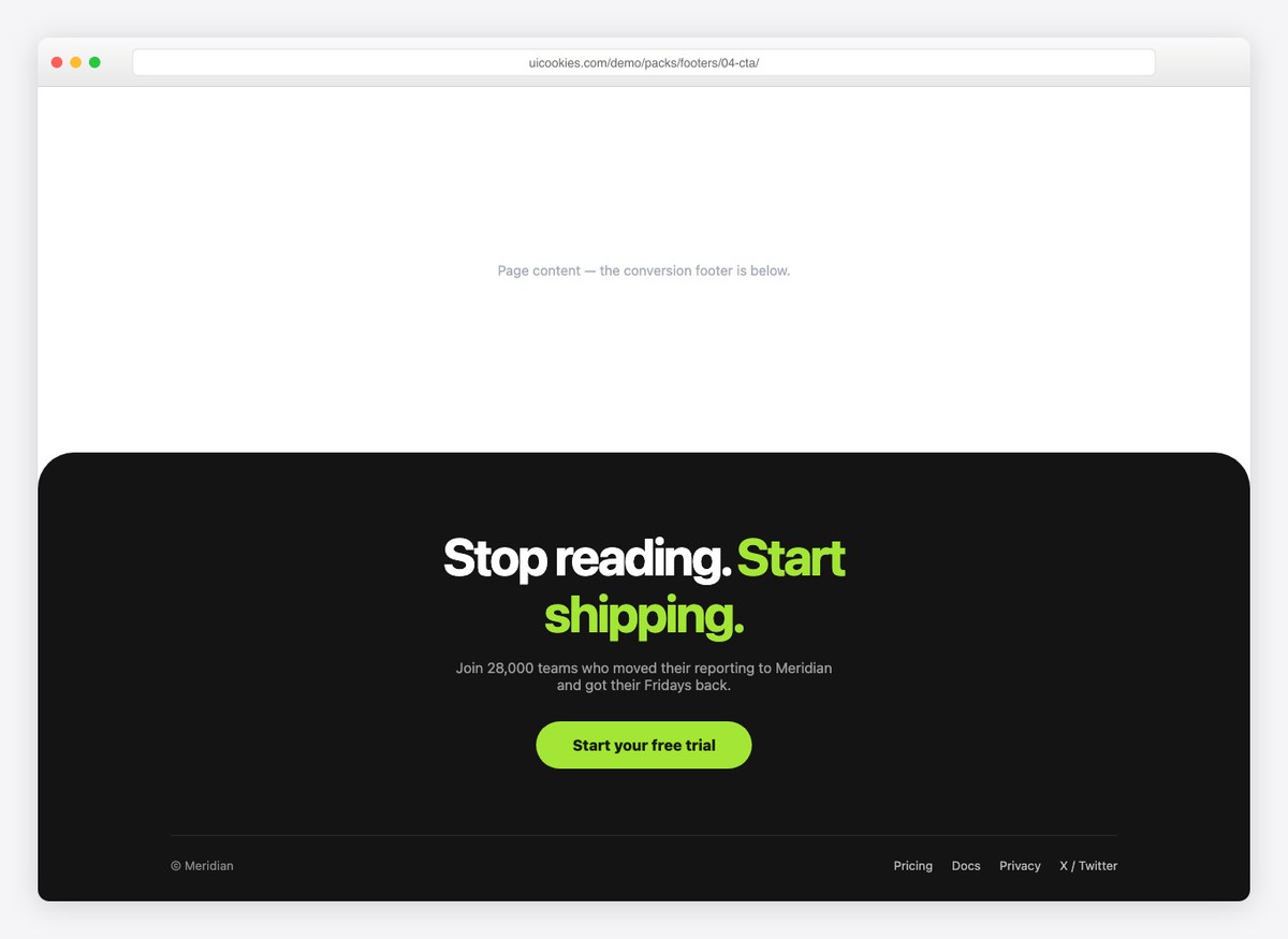
The footer as a last conversion moment: a giant two-tone headline, a single rounded call-to-action, and a rounded top edge that lifts it off the page.
Live Demo CSS, Bootstrap & Tailwind code
5. Newsletter Footer
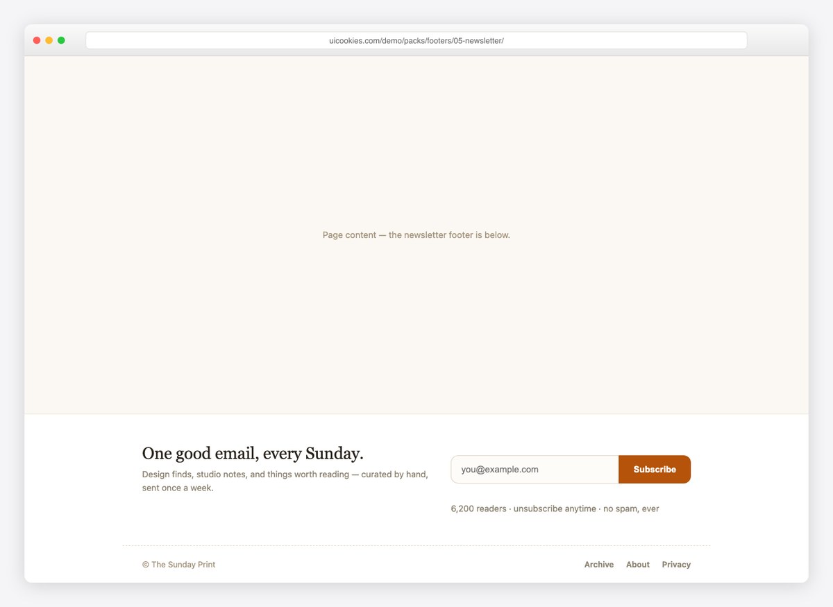
A subscribe-first footer with an editorial serif headline, an inline form with a built-in success state, and honest fine print about frequency.
Live Demo CSS, Bootstrap & Tailwind code
6. Ecommerce Mega Footer
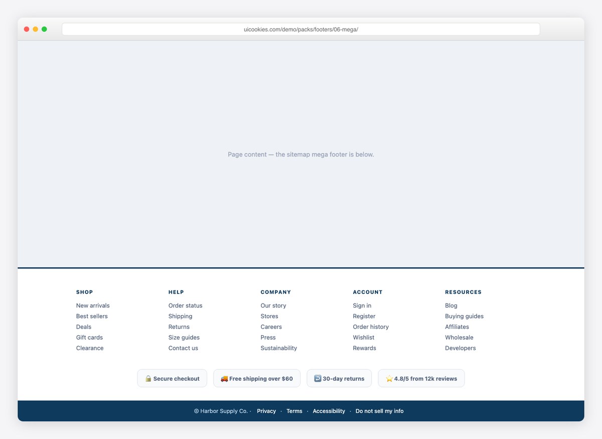
The sitemap footer stores need: five link columns, a row of trust badges (shipping, returns, reviews), and a full-width legal strip.
Live Demo CSS, Bootstrap & Tailwind code
7. Gradient Studio Footer
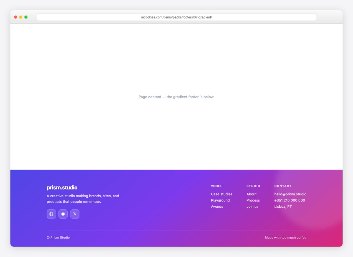
A vivid gradient footer with glassy social buttons and a soft light orb — for agencies and creative studios that want the last scroll to feel designed.
Live Demo CSS, Bootstrap & Tailwind code
8. Centered Footer
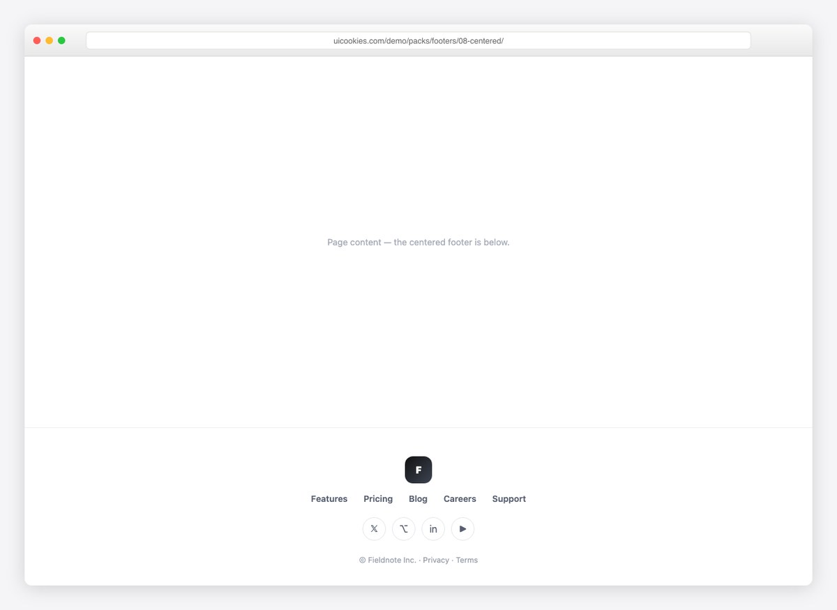
Logo mark, one nav row, social circles, fine print — all centered. The symmetric option that suits landing pages and microsites.
Live Demo CSS, Bootstrap & Tailwind code
Fourteen more
These carry a job rather than only a shape: app download, contact, shop trust, locale, compliance and status — plus the decorative treatments people ask for by name.
9. Columns That Become Accordions
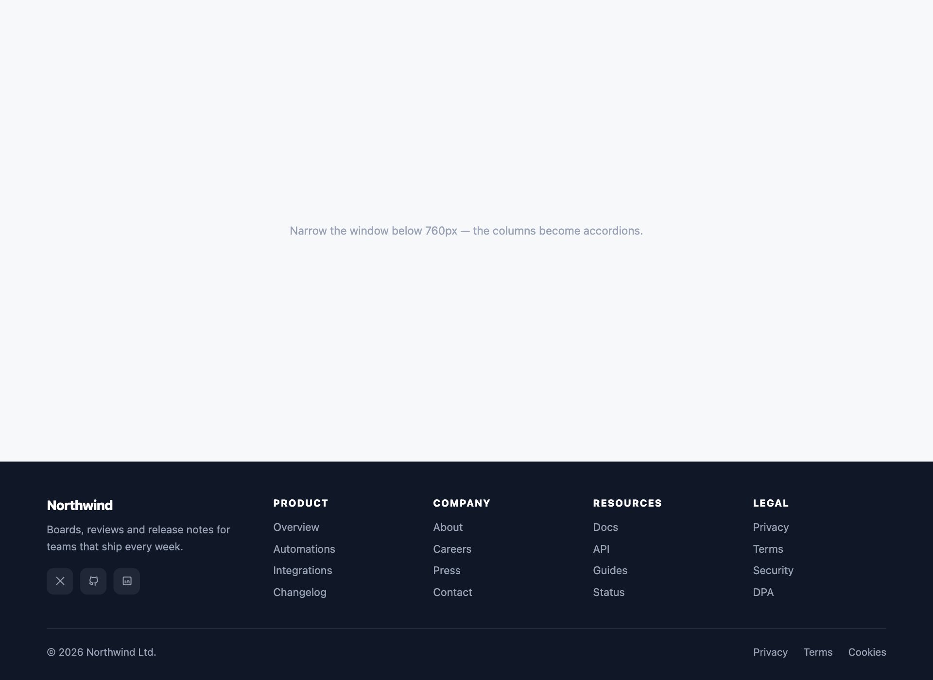
The fix for the most common footer failure there is: five link columns that turn into a six-screen scroll on a phone. Each column is a <details> forced open above 760px and collapsed below it, so one block of markup serves both layouts — no duplicated links, no JavaScript, and nothing hidden from search engines.
Live Demo CSS, Bootstrap & Tailwind code
10. App Download Footer
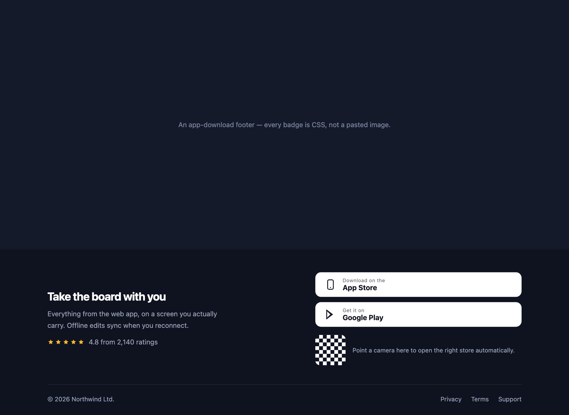
For a product with an app: store buttons drawn as real buttons rather than pasted badge images, a QR block, and the rating that makes people tap them. Nothing here is an image, so it stays sharp at any pixel density and none of it can 404.
Live Demo CSS, Bootstrap & Tailwind code
11. Contact Footer
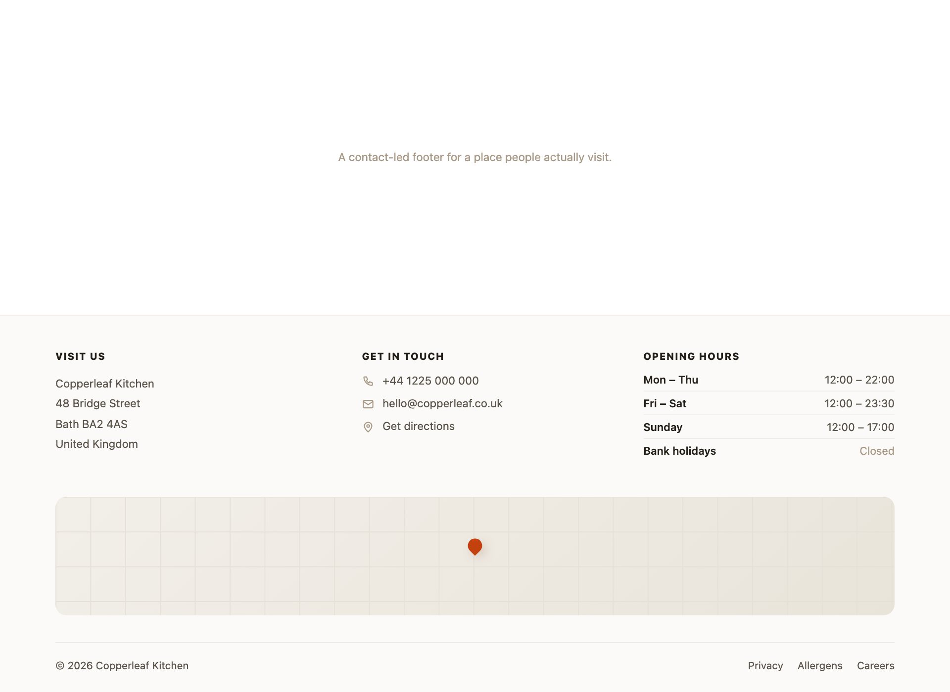
For a business people need to physically reach — address, phone, opening hours and a map block. The address sits in a real <address> element and the phone is a tel: link, so a tap dials it instead of selecting text.
Live Demo CSS, Bootstrap & Tailwind code
12. E-commerce Footer
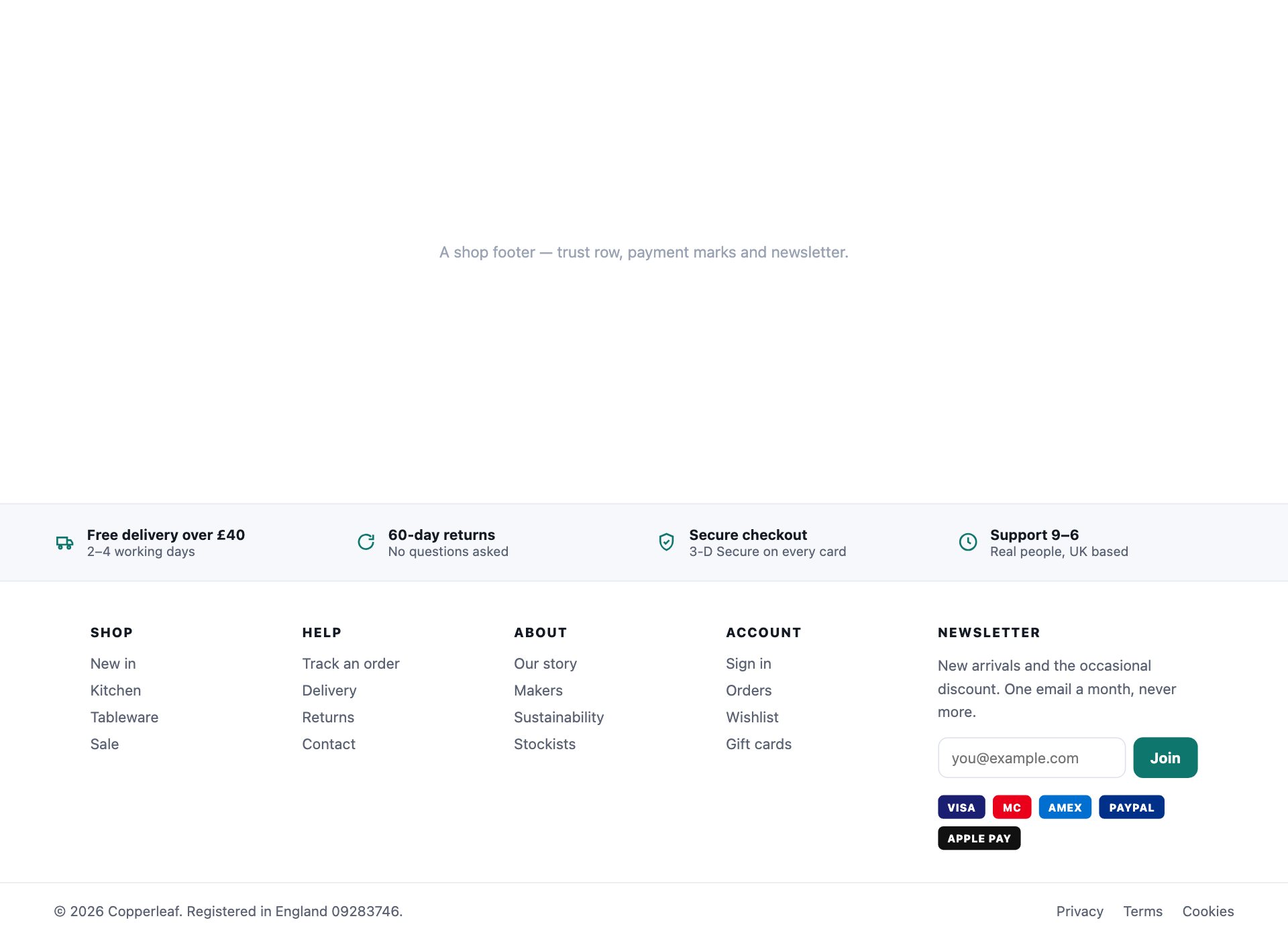
The shop footer, which has more jobs than any other: categories, help links, the trust row that measurably reduces abandoned carts, payment methods and a newsletter. The payment marks are CSS rather than a sprite, so none of them can go missing.
Live Demo CSS, Bootstrap & Tailwind code
13. Footer with Locale Switchers
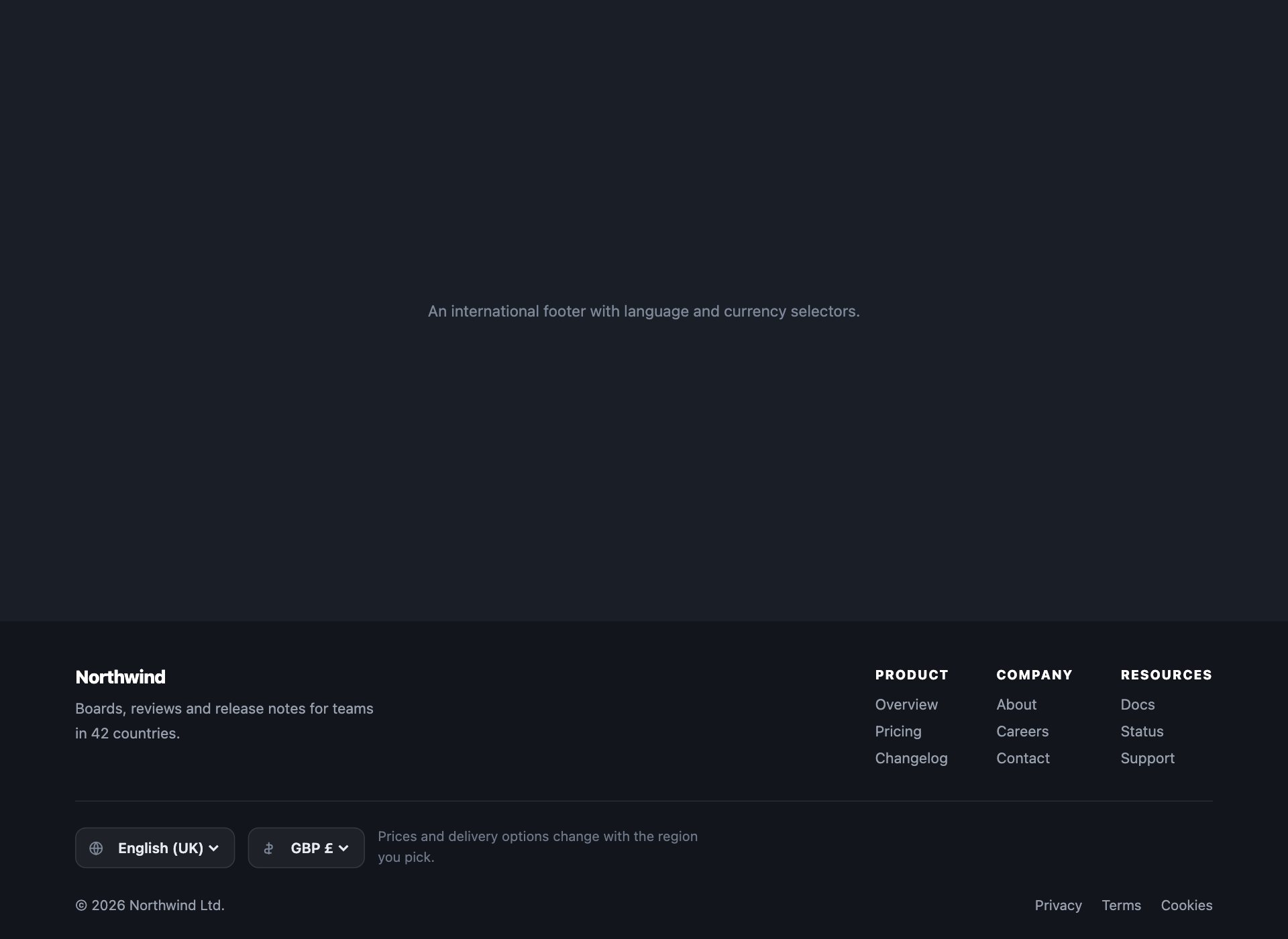
What an international footer needs and most omit — a language selector, a currency selector and a note that both change what people see. Native <select> elements, so they work on every device with no custom dropdown to maintain.
Live Demo CSS, Bootstrap & Tailwind code
14. Footer with a Wave Divider
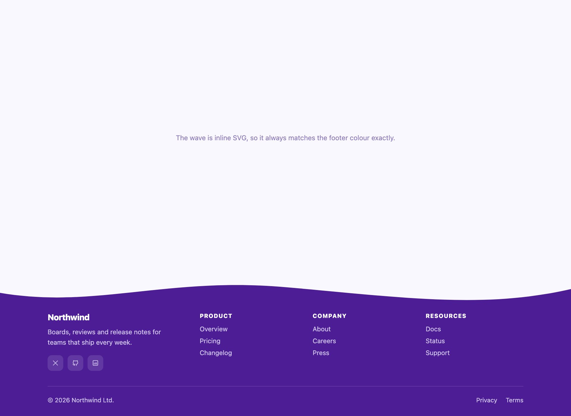
The curved top edge, drawn as inline SVG rather than a background image so it recolours with the footer and never mismatches by a pixel at an awkward viewport width.
Live Demo CSS, Bootstrap & Tailwind code
15. Neobrutalist Footer
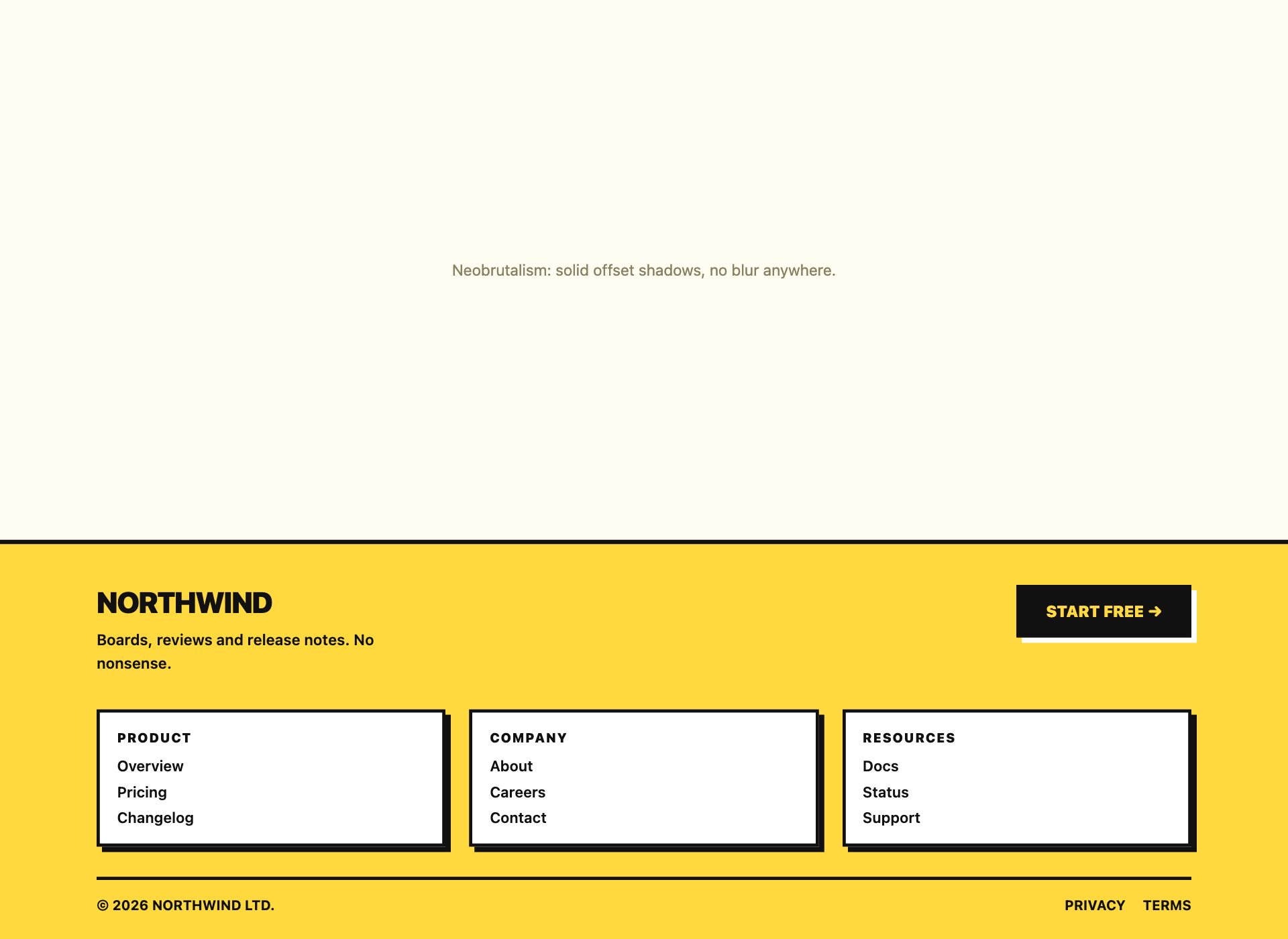
Hard borders, offset shadows and a colour that does not apologise. Every shadow is a solid offset rather than a blur — that is the entire trick — and the contrast still clears 4.5:1 despite the palette.
Live Demo CSS, Bootstrap & Tailwind code
16. Big-Type Portfolio Footer
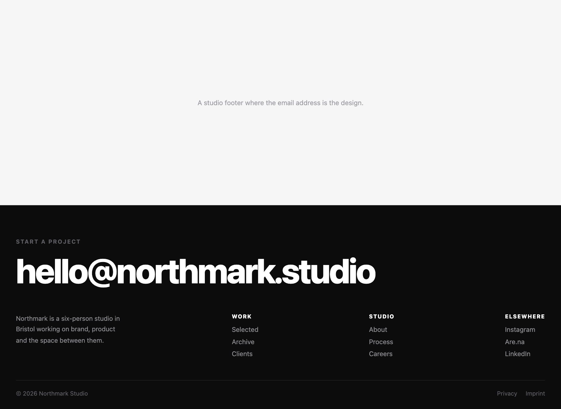
The studio footer that is mostly one enormous email address. The type is fluid through clamp(), so it fills the width at any size without a stack of breakpoints, and the underline wipes in from the left on hover and focus alike.
Live Demo CSS, Bootstrap & Tailwind code
17. Footer with a Status Row
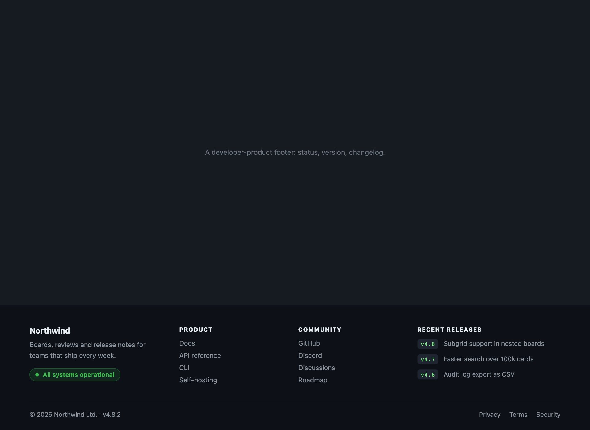
The developer-product footer: a live status pill, the current version and the last few changelog entries. What an engineer scrolls to the bottom looking for, rather than the marketing links they scroll past.
Live Demo CSS, Bootstrap & Tailwind code
18. Compliance Footer
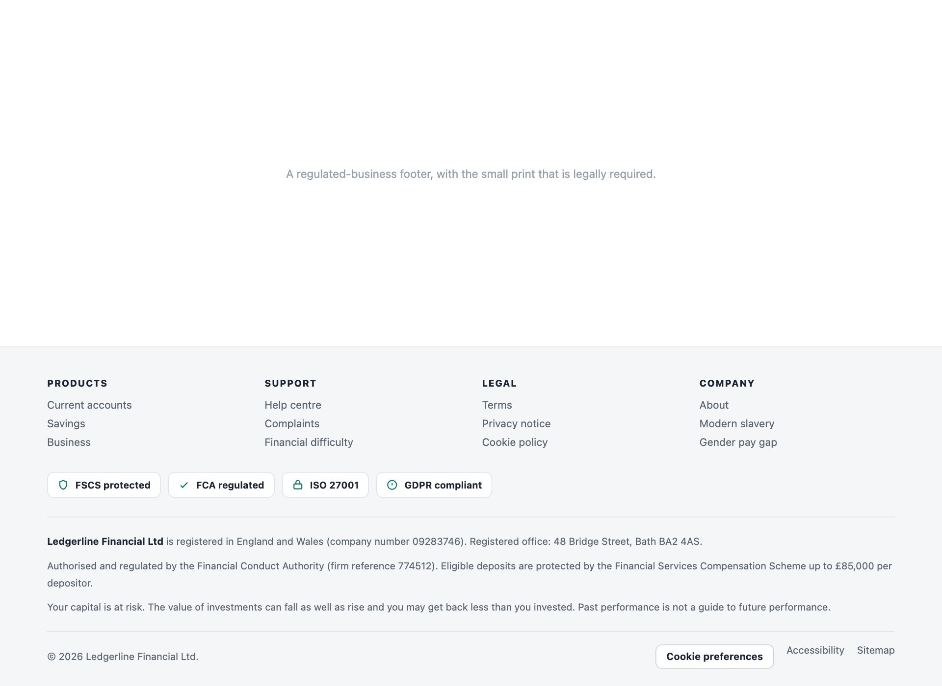
The footer a regulated business actually needs — registered company details, regulator reference numbers, compliance badges, and a cookie-preferences control that is a real <button> rather than a link to nowhere.
Live Demo CSS, Bootstrap & Tailwind code
19. Two-Tone Split Footer
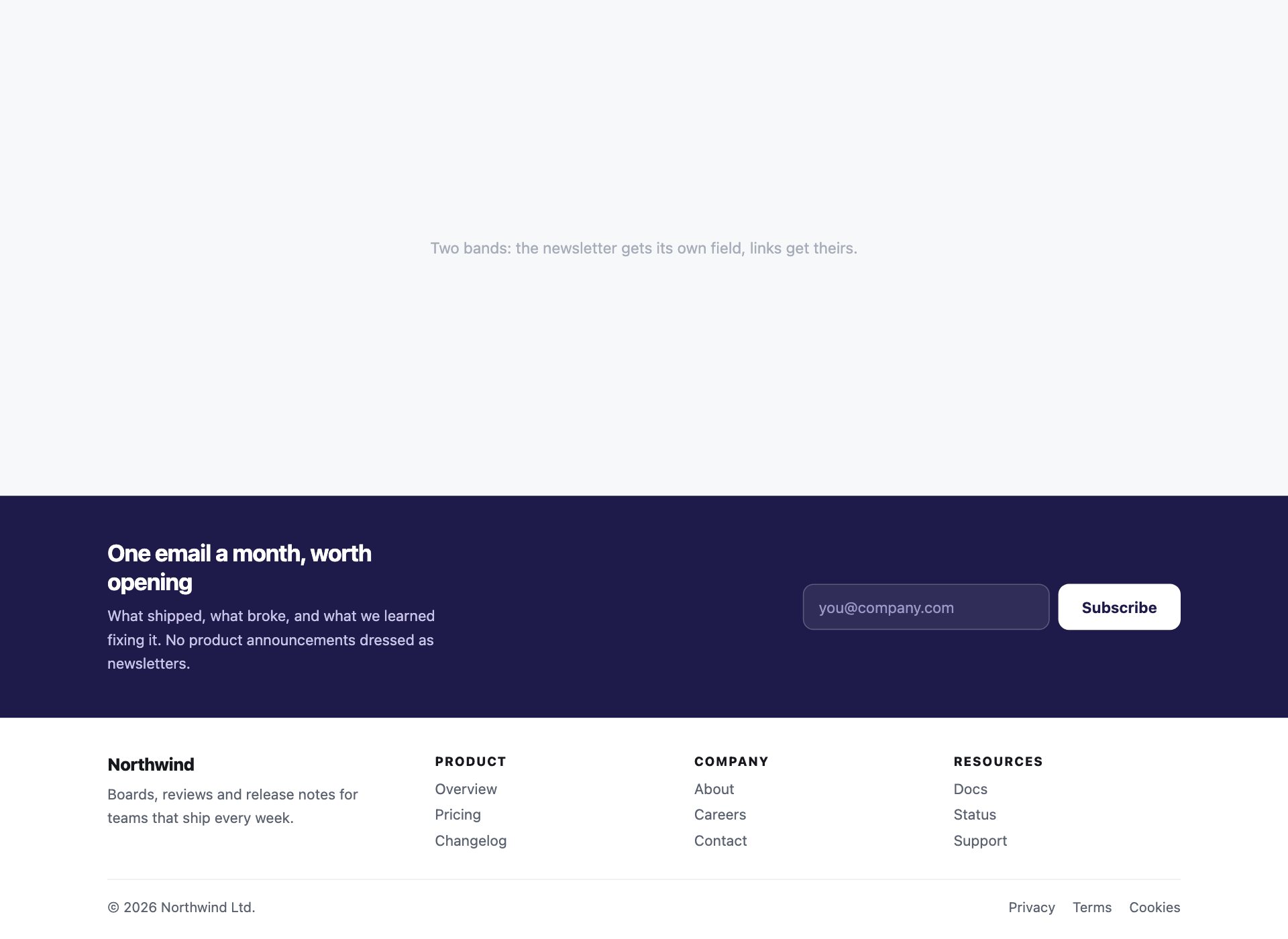
A dark upper band carrying the newsletter over a light lower band carrying the links, so the call to action gets its own visual field instead of competing with four columns of navigation.
Live Demo CSS, Bootstrap & Tailwind code
20. Footer with a Scrolling Band
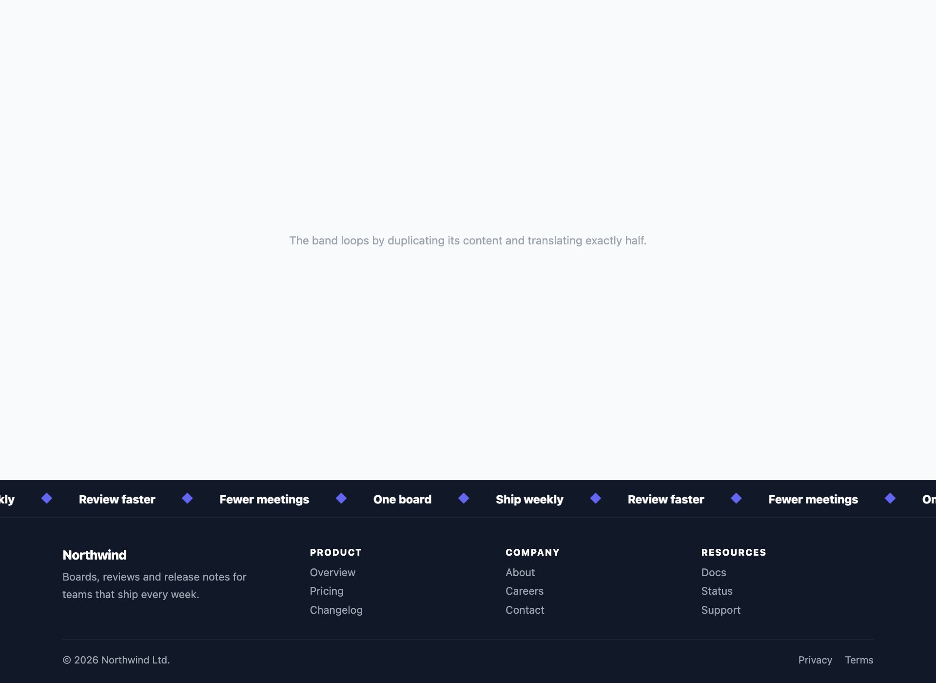
A marquee strip above the footer, looping seamlessly by duplicating the track and translating exactly half its width. It stops completely under prefers-reduced-motion, because a permanently moving band is precisely what that setting exists for.
Live Demo CSS, Bootstrap & Tailwind code
21. Sticky Bar Plus Footer
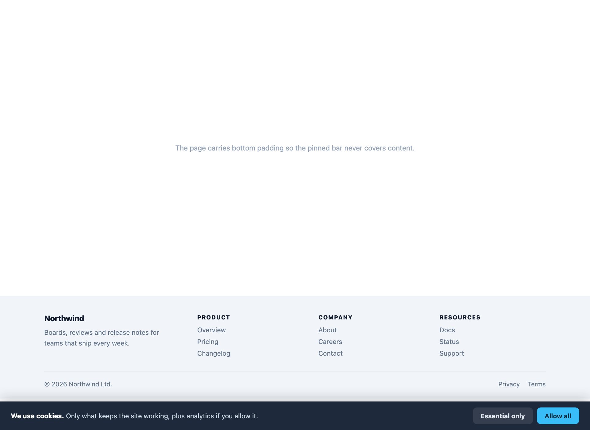
A bar pinned to the bottom of the viewport carrying one action, with the real footer below it in the page — the pattern every launch banner and cookie notice needs. The page carries bottom padding so the bar never covers the last line of content.
Live Demo CSS, Bootstrap & Tailwind code
22. Directory Footer
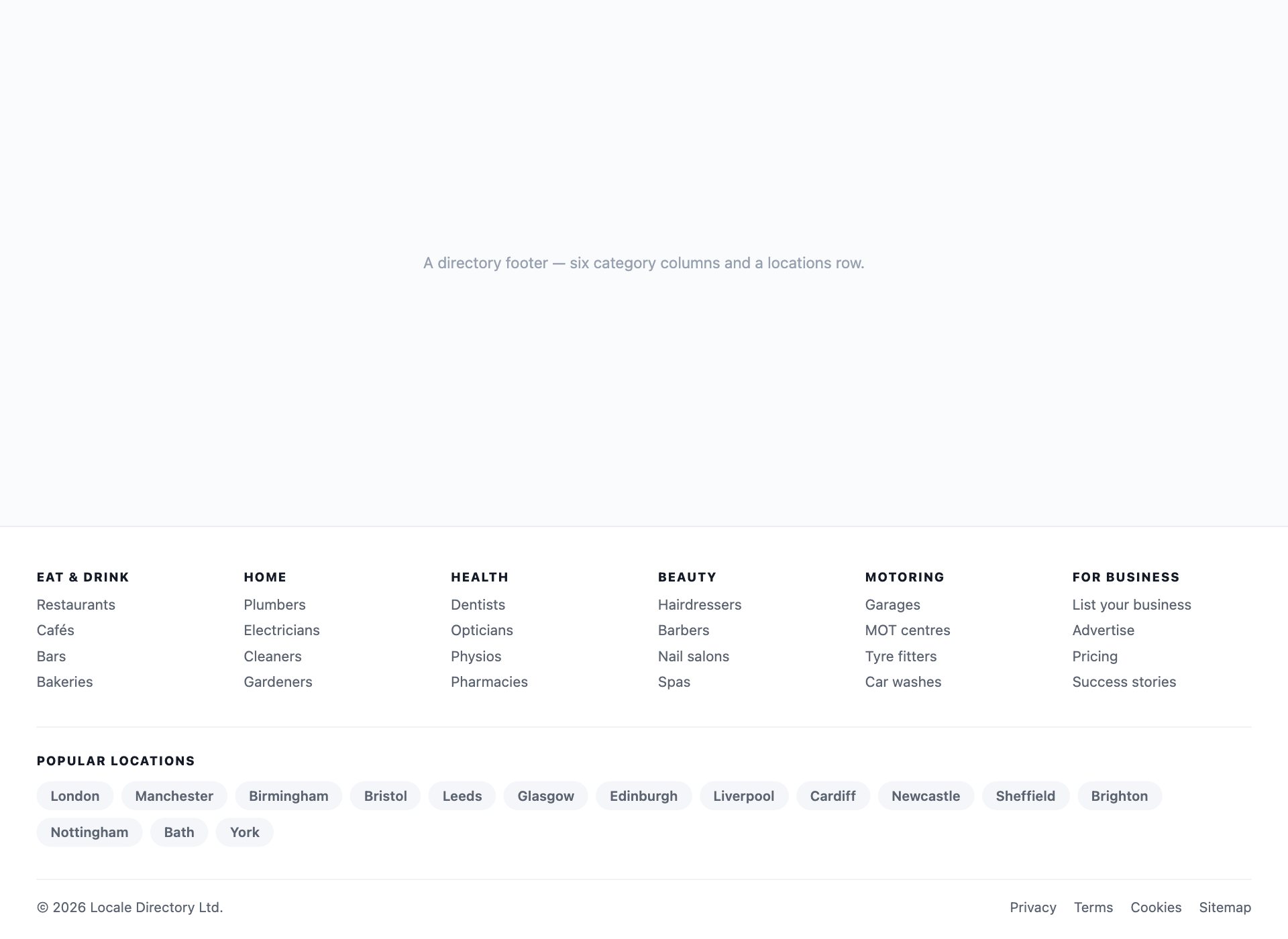
The very wide footer a marketplace or directory ends up with: six columns of categories plus a popular-locations row. It is genuinely large, so it is built as a real sitemap with headings rather than a wall of undifferentiated links.
Live Demo CSS, Bootstrap & Tailwind code
What belongs in a footer
Footers accumulate. Every team that cannot agree where a link goes puts it in the footer, and after two years it holds sixty of them and helps nobody. Four things earn their place:
- Navigation people cannot find elsewhere. A real sitemap for the deeper parts of the site — not a copy of the header menu, which they have already seen.
- The information you are obliged to publish. Company registration, VAT number, regulator references, contact details. For a regulated business this is not optional, and design 18 shows the shape of it.
- One clear next step. Newsletter, trial, contact — one, not four. If everything is emphasised, nothing is.
- Trust signals, if you are asking for money. Delivery terms, returns, payment methods, security. Design 12 puts them in a band above the links because that is where they get read.
What does not belong: a second copy of the main navigation, social icons for accounts that have not posted since 2019, and a block of keyword links no visitor would ever click.
Footers on mobile
This is where most footers fall over. Five columns stacked vertically become most of the page — people scroll past a screen and a half of links to reach the copyright line.
The right answer is an accordion, and it does not need JavaScript. Make each column a <details> and force it open above your breakpoint:
details[open] > summary ~ * { display: block; }

@media (min-width: 760px) {
  details { /* desktop: always open, no toggle */ }
  summary { cursor: default; pointer-events: none; }
  summary .chevron { display: none; }
}
One block of markup, both layouts, every link present in the HTML on every screen size — which matters, because links hidden with display: none on mobile are still crawled but are not available to the people on the device you hid them from.
Footer links and SEO
Footer links are useful when they help people and a liability when they exist to pass link equity. A footer sitemap that reflects real site structure genuinely aids crawling and is exactly what design 22 is for. A block of two hundred “plumber in town name” links that no visitor would ever click is a recognised spam pattern, and Google has been discounting it for years.
The test is not technical. Would a real person plausibly click this link? If not, it is not helping anybody, including you.
Accessibility notes
- Wrap link groups in
<nav>with anaria-label— “Footer”, “Legal” — so they are distinguishable in a landmark list from the main navigation. - Social icons need accessible names. An SVG is not a name; every icon link here carries an
aria-labelnaming both the network and the account. - Contact details should use the right elements:
<address>for the postal address,tel:andmailto:links for phone and email. - Keep contrast honest. Footers are traditionally where grey text on grey backgrounds goes to die — every design here clears 4.5:1 on body text.
- A cookie-preferences control is a button, because it opens something. It is not a link.
Using the footers in your project
Download the pack, open the folder for the design you want, and copy the <footer> markup with the rules from its <style> block. Each design is self-contained — nothing depends on the other 21, and there is no script to wire up.
Frequently asked questions
Are these footer templates free?
Yes. All 22 are free for personal and commercial projects, including client work. No attribution required.
Do any of them need JavaScript?
None. All 22 are pure CSS, including the mobile accordions, the locale selectors and the sticky bar. That is deliberate: a footer holds the links people fall back to when something else has gone wrong, so it should not itself depend on a script that might not run.
How should a footer behave on mobile?
The columns have to collapse, and the honest way is an accordion — design 9 does it with <details> elements forced open above 760px. What does not work is leaving five columns stacked, which turns the footer into most of the page, or hiding links entirely on small screens, which removes navigation for the people who most need it.
What should actually go in a website footer?
Four things earn their place: navigation people cannot find elsewhere (a real sitemap, not a duplicate of the header), the legal and contact information you are obliged to publish, one clear next step, and trust signals if you are asking for money. Everything else is filler — and a footer stuffed with links dilutes the ones that matter.
Are footer links good or bad for SEO?
Useful when they help people, unhelpful when they are there to pass link equity. A footer sitemap that mirrors real site structure is fine and genuinely aids crawling. A block of keyword-stuffed location or category links that no visitor would ever use is a recognised spam pattern. The test is simple: would a person plausibly click it?
Do they work with Bootstrap or Tailwind?
Yes. They use their own class names, so nothing collides. Each footer is one self-contained block you can paste at the end of a page and restyle from there.
Can I use these in a template I sell?
Yes, in client work and in products you sell. What you cannot do is repackage the pack itself for redistribution.
Download all 22 footer templates (free) Browse live demos