About this set
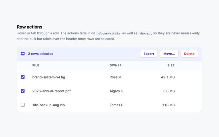
A team members table with a checkbox on every row, a select-all checkbox in the header and a bulk action bar that appears once something is selected. Ticking rows highlights them in light blue, the header checkbox turns indeterminate when only some rows are selected and fully checked when all are, and the bar in the card header shows how many are selected next to Export and Remove buttons. A small script keeps these in sync; the checkboxes are native inputs, so clicking, Space to toggle and form submission all work as usual. Each checkbox is named after its row, for example Select Maja Lindgren, rather than a repeated Select row, and a visually hidden status line announces the count, such as 2 of 5 selected, to screen reader users. Use it for user management, file lists and inboxes where people act on several rows at once. The Bootstrap version uses .form-check-input and marks selected rows with .table-active; the Tailwind version highlights rows with has-checked: so the row styling needs no script.
What’s included
- Per-row checkboxes with names that include the row
- Select-all that goes indeterminate on a partial selection
- Bulk action bar that appears with the selected count
- Selection count announced through a role="status" line
- Bootstrap .table-active and Tailwind has-checked: highlighting
Accessibility
Every checkbox has an aria-label naming its person and the header checkbox is labelled Select all team members. The selection count is announced by a visually hidden role="status" element. Checkboxes, buttons and the scroll region show a 2px blue focus outline, and the button hover transition is removed under prefers-reduced-motion.
Customise it
Selection colours are .sel tbody tr.is-selected (#eff4ff) and accent-color #2563eb on the checkboxes. In Bootstrap set --bs-table-active-bg and the .form-check-input:checked colour; in Tailwind change has-checked:bg-[#eff4ff] and accent-[#2563eb].