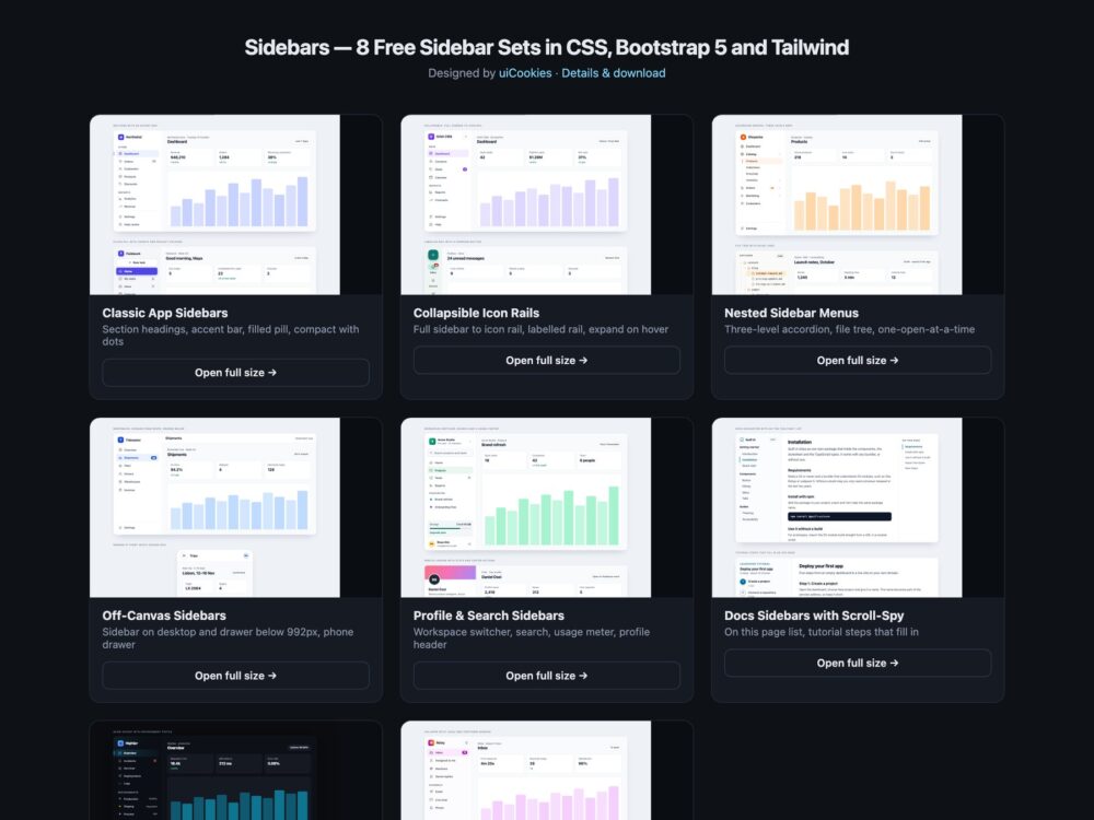
A pack of eight sidebar and side-navigation sets for apps, dashboards and documentation, designed and maintained in-house by uiCookies. Every set is shown inside a small working app frame and comes three ways: a Bootstrap 5.3.8 version that uses Bootstrap’s own nav, offcanvas, dropdown and scrollspy components, a plain CSS version with no dependencies, and a Tailwind CSS 4 version written in utility classes. Pick the one that matches your stack and copy the marked snippet.
A good sidebar tells people where they are and gets out of the way. That means marking the current page with aria-current rather than only a colour, keeping labels in the markup when the sidebar collapses to icons so every link still has a name, giving keyboard users a focus ring they can see on both light and dark backgrounds, and pinning secondary links such as Settings to the bottom instead of mixing them with the main destinations. On small screens it should become a drawer that closes with Esc, not a column that squeezes the content to nothing.
Free download Browse live demos All snippets
The sets
1. Classic App Sidebars
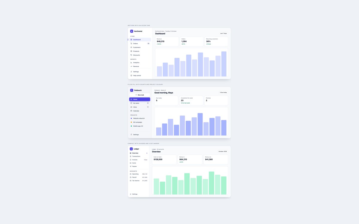
Three everyday app sidebars: section headings with an accent bar, a tinted rail with a filled pill and project colours, and a compact finance sidebar with dividers and balances.
Use them as the starting point for an admin or dashboard. The current page is styled from aria-current and the footer links are pinned to the bottom with margin-top:auto.
Live Demo CSS, Bootstrap & Tailwind code
2. Collapsible Icon Rail Sidebars
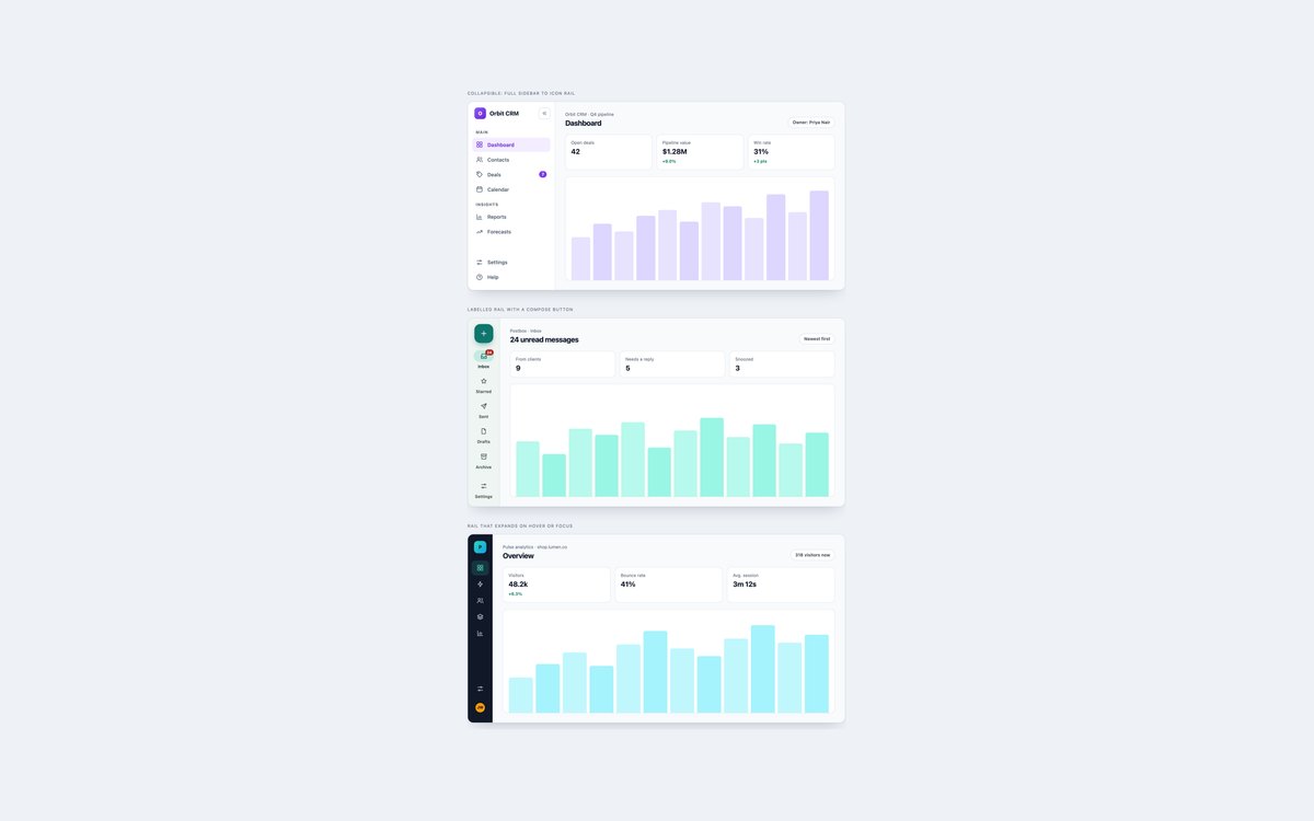
A sidebar that collapses to a 72px icon rail with tooltips, a Material-style labelled rail with a compose button, and a dark rail that widens on hover or focus.
Reach for these when content needs the width. The collapse button uses a short script and aria-pressed; the other two rails are pure CSS.
Live Demo CSS, Bootstrap & Tailwind code
3. Nested Sidebar Menus
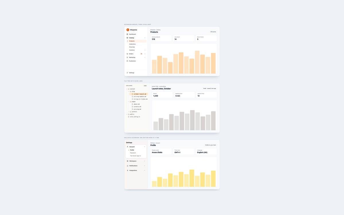
Multi-level menus built on native details: a three-level admin accordion, a monospace file tree, and a settings accordion where only one section opens at a time.
They need no JavaScript, because the browser opens, closes and announces each group, and the parent of the current page is highlighted with :has().
Live Demo CSS, Bootstrap & Tailwind code
4. Off-Canvas Sidebars
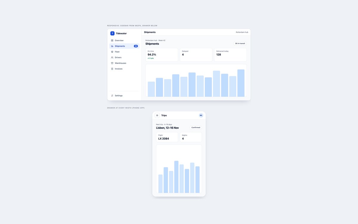
A dashboard sidebar that sits in the layout from 992px and turns into a slide-in drawer below it, and a phone app whose menu is a drawer at every width.
The Bootstrap version uses .offcanvas-lg and .offcanvas; the plain CSS and Tailwind versions use the popover attribute, so Esc and outside clicks close them without a script.
Live Demo CSS, Bootstrap & Tailwind code
5. Profile & Search Sidebars
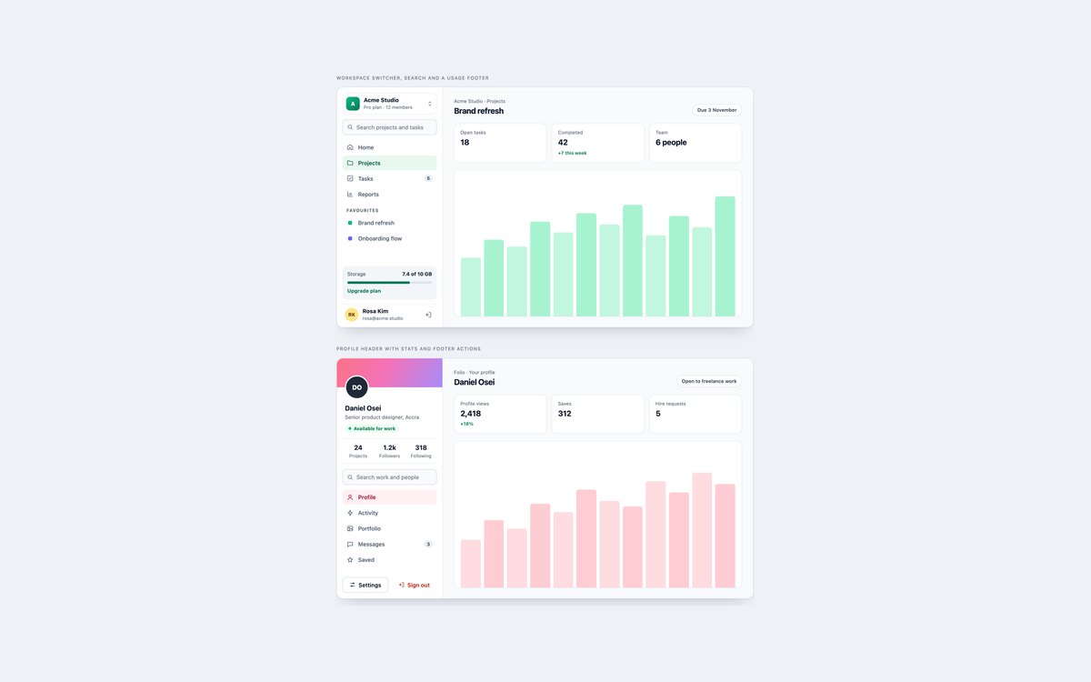
A workspace sidebar with a switcher, search, favourites, a storage meter and the signed-in user, and a profile sidebar with a cover, status, stats and footer actions.
Use them for team tools and profile-centred apps. Search fields have real labels, the meter exposes its value, and the icon-only Log out button is named.
Live Demo CSS, Bootstrap & Tailwind code
6. Docs Sidebars with Scroll-Spy
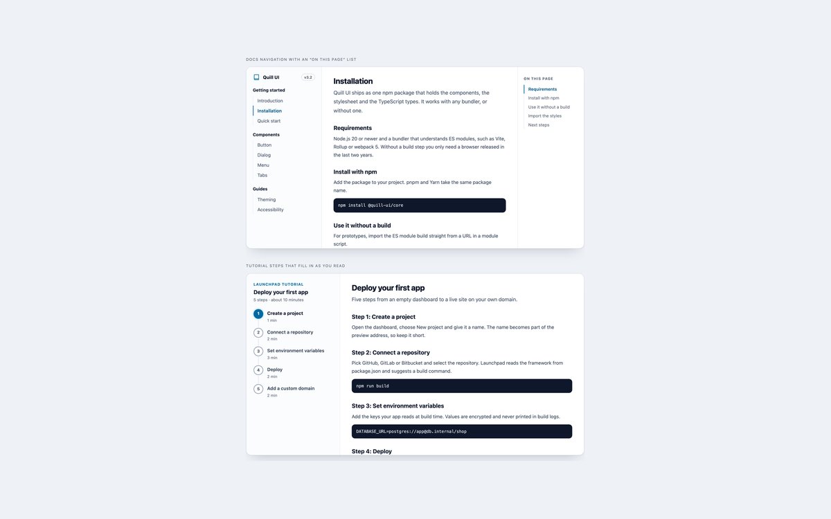
A docs layout with section navigation and an On this page list that follows the scroll, and a tutorial sidebar whose numbered steps fill in as you read.
Bootstrap uses its ScrollSpy plugin; the other versions use a short script that moves aria-current, and finished steps turn green through :has().
Live Demo CSS, Bootstrap & Tailwind code
7. Dark Sidebars
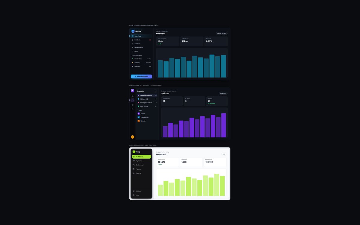
Three dark sidebars: a glowing accent with environment status, an app rail beside a project panel, and a floating dark card inside a light page.
Muted text is tuned to 4.5:1 on near-black, status is written out as well as coloured, and focus rings use a bright accent that stays visible.
Live Demo CSS, Bootstrap & Tailwind code
8. Modern CSS Sidebars
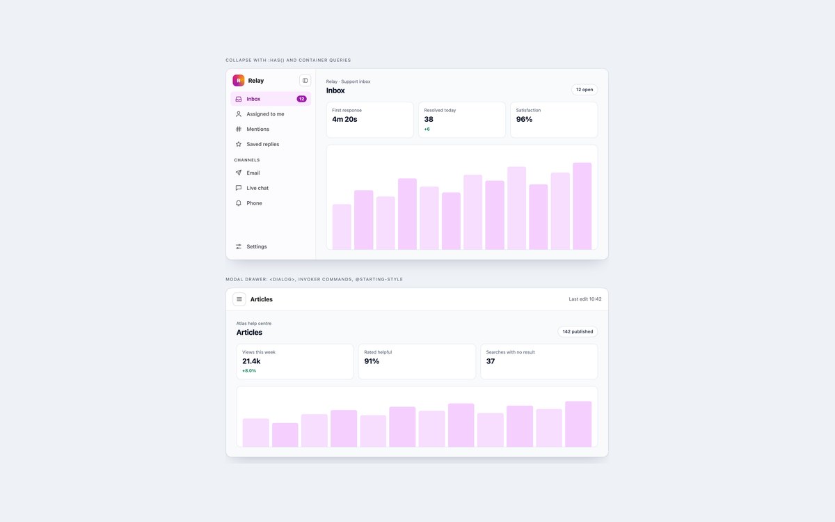
A sidebar that collapses through :has() and compacts itself with a container query, and a modal dialog drawer opened with invoker commands and animated with @starting-style.
Both do in CSS and HTML what usually takes JavaScript. They work in current Chrome, Safari and Firefox, and a small script covers browsers without invoker commands.
Live Demo CSS, Bootstrap & Tailwind code
Frequently asked questions
Are these sidebars free to use?
Yes. All eight sets are free for personal and commercial projects, including client work and products you sell. Attribution is optional but always welcome. The full terms are on the uiCookies licence page.
Do the sidebars need JavaScript?
Most do not. Links, nested menus, the hover rail, the off-canvas drawer in plain CSS and Tailwind, and the modern set are HTML and CSS only. The collapse button in set 2 and the scroll-spy in set 6 use a few lines of vanilla JavaScript, and the Bootstrap versions of sets 4, 5 and 6 load the Bootstrap bundle for Offcanvas, Dropdown and ScrollSpy.
Are the sidebars accessible?
Each sidebar is a nav landmark with a label, the current page is marked with aria-current, icon-only controls have accessible names, and every link and button shows a visible focus outline. All sets pass an axe-core WCAG 2.1 AA check, and animations switch off when the reader prefers reduced motion.
Which frameworks are covered?
Every set comes as plain CSS with no dependencies, as Bootstrap 5.3.8 using Bootstrap’s own nav, badge, button, offcanvas, dropdown and scrollspy components, and as Tailwind CSS 4 utility classes. The three versions of a set look the same, so you can switch stacks without redesigning.
How do I make a Bootstrap sidebar collapse on mobile?
Wrap the sidebar in .offcanvas-lg (or -md, -xl) and add a button with data-bs-toggle="offcanvas" that is hidden from that breakpoint up. Above the breakpoint the sidebar sits in the layout; below it Bootstrap turns it into a drawer with a backdrop, Esc to close and focus kept inside. Set 4 shows the full markup with a matching plain CSS version built on the popover attribute.
More sidebars from the community
Examples by other designers and developers, collected before we built our own set. Each links to its original source.
Bootstrap Fixed Sidebar V06
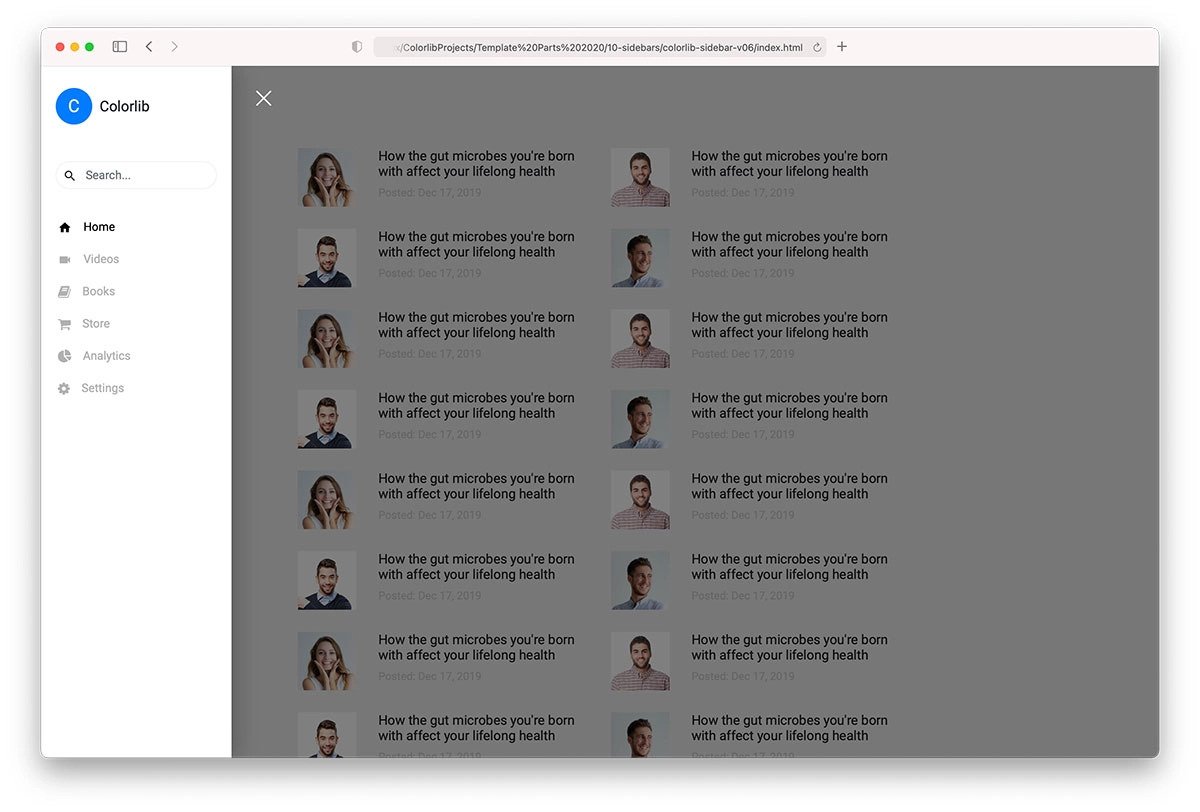
You get a nice and elegant-looking Bootstrap fixed sidebar design in this template. Only icons are shown in the default look to give more space for the main content. Users can expand the fixed sidebar to access the full menu options. A contrasting color is used for the sidebar to differentiate it from the main page. This template uses the latest CSS3 and the Bootstrap framework; therefore, you can use any modern colors to spice up the overall look as per your design needs.
Bootstrap Sidebar Menu With Submenu V8
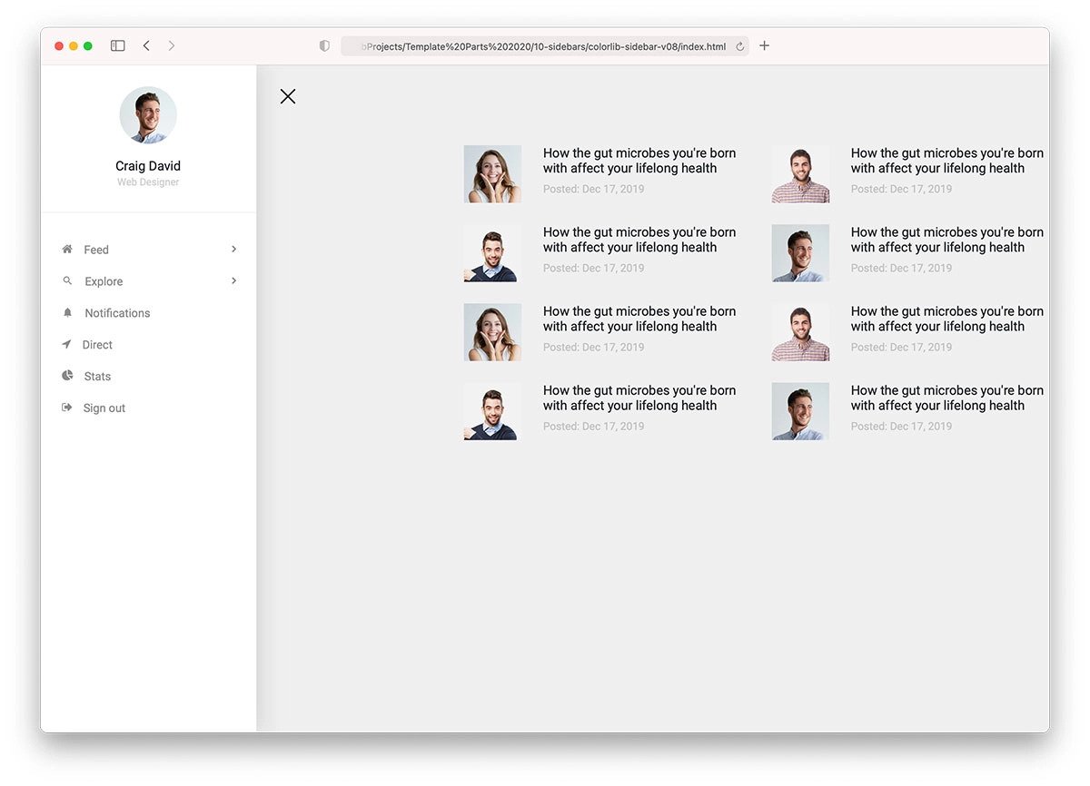
Those who want to make navigation a lot easier for their audience must consider this bootstrap sidebar menu with a submenu template.
One of the biggest advantages of the sidebar menu design is that users can easily get to the pages they want. Instead of listing all the options, you can group them into submenus to keep the sidebar clutter-free and make interactions easier for users on both small and large screen devices.
Bootstrap Sidebar Menu Collapse V5
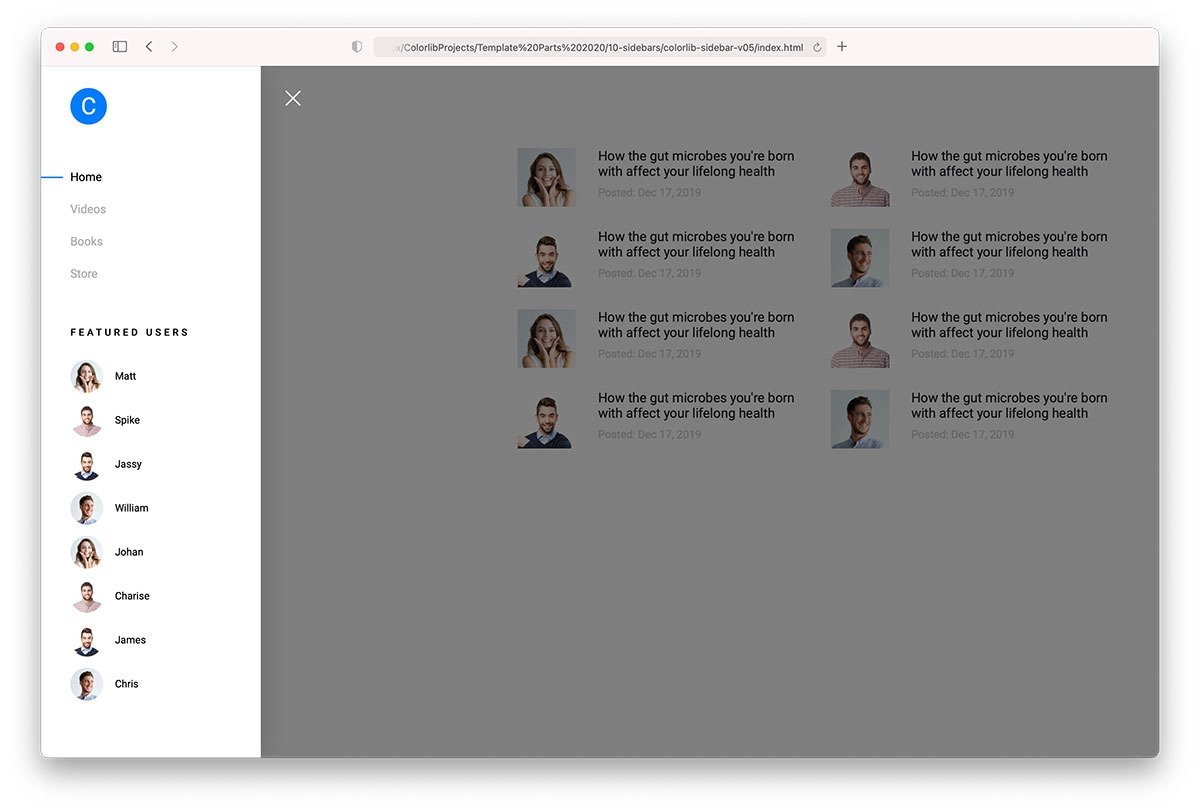
As the name implies, this bootstrap sidebar menu has a collapsible design. A smooth transition effect and a clean sidebar design make this template visually appealing. You can use this design on any website or application because of its simpler layout. Another advantage of this design is it has a familiar look and is functional. Hence, the audience will love using this sidebar design, and it will eventually improve your website’s interaction. The entire code file is available for download so developers can use it easily in their projects.
Colorlib Sidebar V04

The V04 is a unique sidebar example. This design is made for a particular function, and in this template, the concept is chat/contact. If you plan to make an engaging landing page design, interesting details like this will help you receive better results. Depth & Shadow effects are used smartly to distinguish the sidebar from the main page. Plus, the shadows give a realistic touch to the overall design. This template is just a concept; you can customize it and use it to reach your goal.
Colorlib Sidebar V2
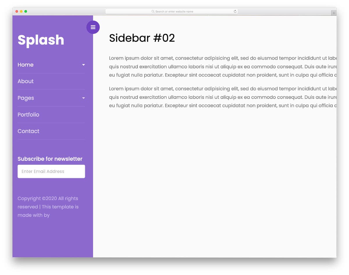
The V2 bootstrap sidebar is a simple, elegant design. Transition effects are smooth; You can expect the same level of smoothness on small-screen devices because this template uses the latest Bootstrap framework and is optimized for mobile responsiveness. If you plan to use a slide-in sidebar for your website or applications, this code snippet will be handy.
Sidebar by Colorlib V5

The V5 sidebar also uses a similar concept to that of the V2 mentioned above, but this template uses a little protrusion style design at the top left corner to give a subtle hint that there are options behind it. You can try a fluid-style animation or a water-droplet animation to make this sidebar design even more engaging. Since this template uses the latest Bootstrap and CSS script, it can handle any modern animations and elements effortlessly right out of the box. Overall, the V5 is not only a user-friendly template but is also a developer-friendly design.
Sidebar by Colorlib V7
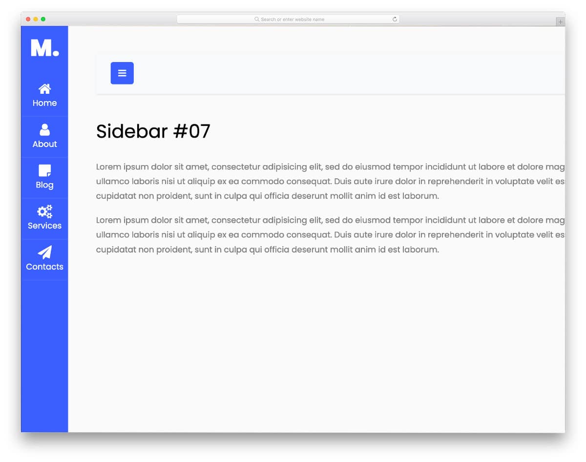
The creator has used Font Awesome icons since it is a concept model. Icons are used effectively in this sidebar design to let users know the available options without expanding the sidebar. The icon shrinking and enlarging transitions are very smooth, which most users won’t even notice. If you want, you can add micro-interactions to the icons when the user hovers over them. You can add other custom icons or a premium icons pack in this template as per your requirement.
Steakshop

Steakshop is an original restaurant website template designed with branding in mind. The designer has handled the sidebar menu elegantly for easier navigation and to make the restaurant logo visible on all pages. Shadow effects are used effectively to give the sidebar a more elevated look. Along with the shadow effect, the designer has also used a glowing animation to easily capture the user’s attention. To make the letters and icons even more legible, you can increase the width of the sidebar. Since it is a bootstrap sidebar design, you can use it in responsive websites.
Elen
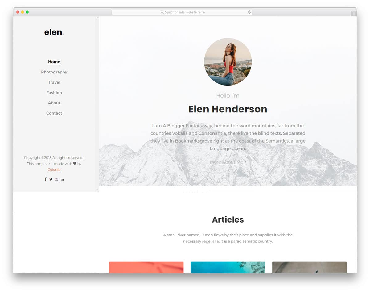
In this bootstrap sidebar example, you get a minimal, spacious sidebar. Though the original design is made for navigation, you can add other elements in it. For example, this sidebar is used in a personal websit,e so you can add a small portfolio widget to curate your audience. The coding structure of this template is well-organized, making it easy for developers to work with. Line animation is used for the hover effects to let the user know which option they are going to select. Overall, this one is a thoughtfully designed sidebar, which you can use for navigation and promotions.
Louie
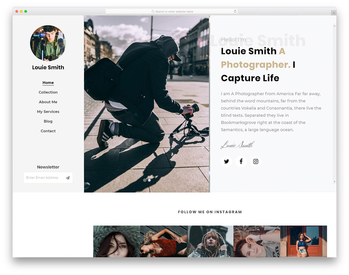
Running a blog isn’t easy, we have to be patient and do the right thing at the right time. If you feel like your blog has started gaining momentum, your next step is to increase the subscriber count. The creator has smartly placed the newsletter subscription widget on the side navigation bar in this sidebar design. Since this is a sticky sidebar, the user will see your subscription widget on all pages. This smart placement will increase the chances of boosting subscription count. If you are into email marketing, check out our free email template collection.
Capture

If you are looking for a stylish sidebar design, this example might pique your interest. Since this bootstrap sidebar is designed for photography websites, the creator has added an artistic touch. The designer is exact with the spacing, the sidebar neither too big nor too small. Users can easily interact with the menu and navigate to other pages. Since it is a mobile responsive website template, you get a smart sidebar that works perfectly in both mobile and desktop version. At the bottom of the sidebar, you can add social media profile links. Take a look at our social media icon design collection to spice up the design.
Vcard2
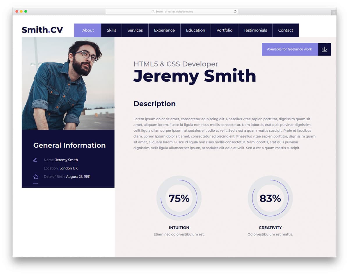
Vcard2 is a perfect sidebar design for virtual cards and online resume templates. In the sidebar, you have most of the portion reserved for the image. Since it is a Vcard design, the designer has used image space to add your image. You have a scrollable area below the image to display related content. The developer has added contact information and social media profile links in the default design. The solid code base gives you full freedom to customize the template as per your design requirements. The main design uses a tabbed interface, so this sidebar gives the template a unique look.
Cocoon
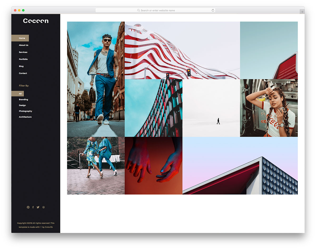
Cocoon is a stylish looking gallery template. The designer of this template has treated the homepage itself a mini gallery to curate the users. Hence, you get filter options and the navigation menu in the sidebar. To make the sidebar smarter, you can show page-related options on the sidebar. For example, you can show testimonials in the service page and related posts while the user is on the blog page. The developer has given us a solid foundation to let you build a unique website with all the features you need. Since it uses the latest HTML5, CSS3, and Bootstrap framework, you can integrate any modern tools to this template.
Work
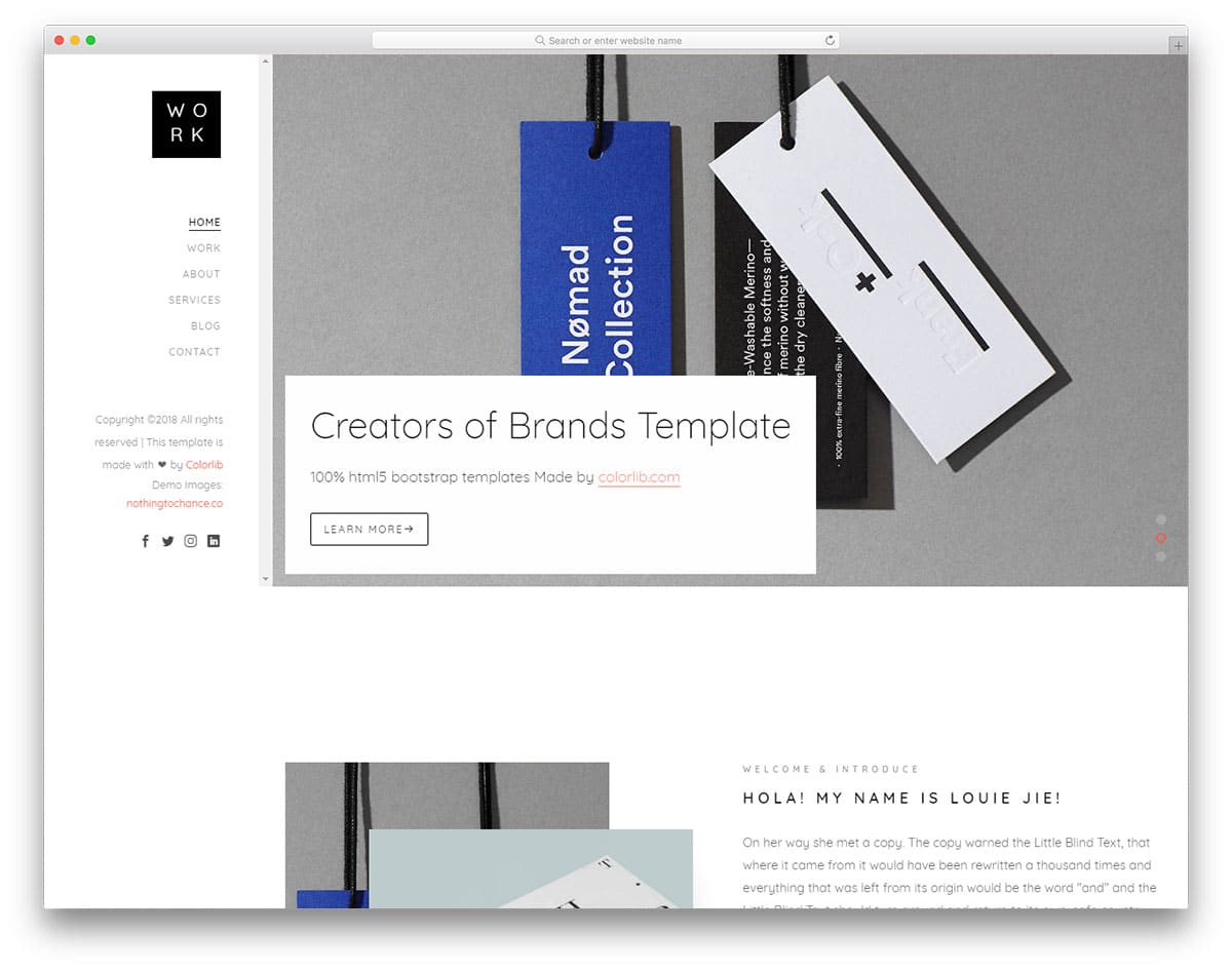
The Work template includes another minimal sidebar. In this minimal sidebar, you have plenty of space to add the elements you need. The creator has made the sidebar wider so you can add the widgets you like. For example, if you are using this sidebar on a hotel website, you can add a calendar widget to show the rooms available on each date. If you are interested in using calendars in your design, take a look at our CSS calendar collection for inspiration. Smooth line effects highlight the menu options. You can see a text space near the bottom area in the default design. This text space can be used to give a short intro to your website.
Suppablog
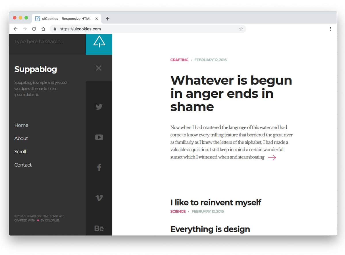
The Suppablog template uses a responsive sidebar, helping you save plenty of screen space. The creator of this template has used a two-step sidebar. Normally, you see a slim sidebar with icons, and to see more options, you can click the hamburger menu icon at the top. This two-step sidebar elegantly shows the important options. And the user can also access advanced options whenever they want. The tabs’ dark grey color scheme gives a visual break to the clean white main content area. Since it is a two-step sidebar, you can add widgets to make it more user-friendly.
PhotoGallery

You can understand from the name itself that this is a photography website template. The creator has used a full-width layout to show the images clearly to the users. Contents are given more importance in this design, and to give a distraction-free environment, all the options are given in the sidebar. Another friendly feature of the sidebar is that it is scrollable. So you can add a long list of links in this sidebar without any issue. You can use a hover-activated unfolding animation to display secondary options, such as social media profile links.
Adminator

Adminator is one of the most downloaded free dashboard templates. This one is not only downloaded for the features but also for the user-friendly design. Though it is a free template, the designer has given us a premium quality material. Colorful icons and text elegantly list the navigation menus in the sidebar. Because of the minimal design, this sidebar manages to show multiple contents without clouding the sidebar. Fluid and swift animation effects are used in this template so the user doesn’t have to wait for the option to appear.
ElaAdmin

ElaAdmin is minimal and colorful dashboard template. The designer has carried the same minimalist design to the sidebar as well. Icons are made larger to clearly show the options when the sidebar is folded. The transition effect is handled smoothly, so the user barely notices the transformation when the menu is unfolded. The pitch-black text and icons are clearly visible on the clean white background. To help you manage submenus, the developer has used an accordion design. The default sidebar has plenty of space to add other elements as per your requirements.
Gentelella
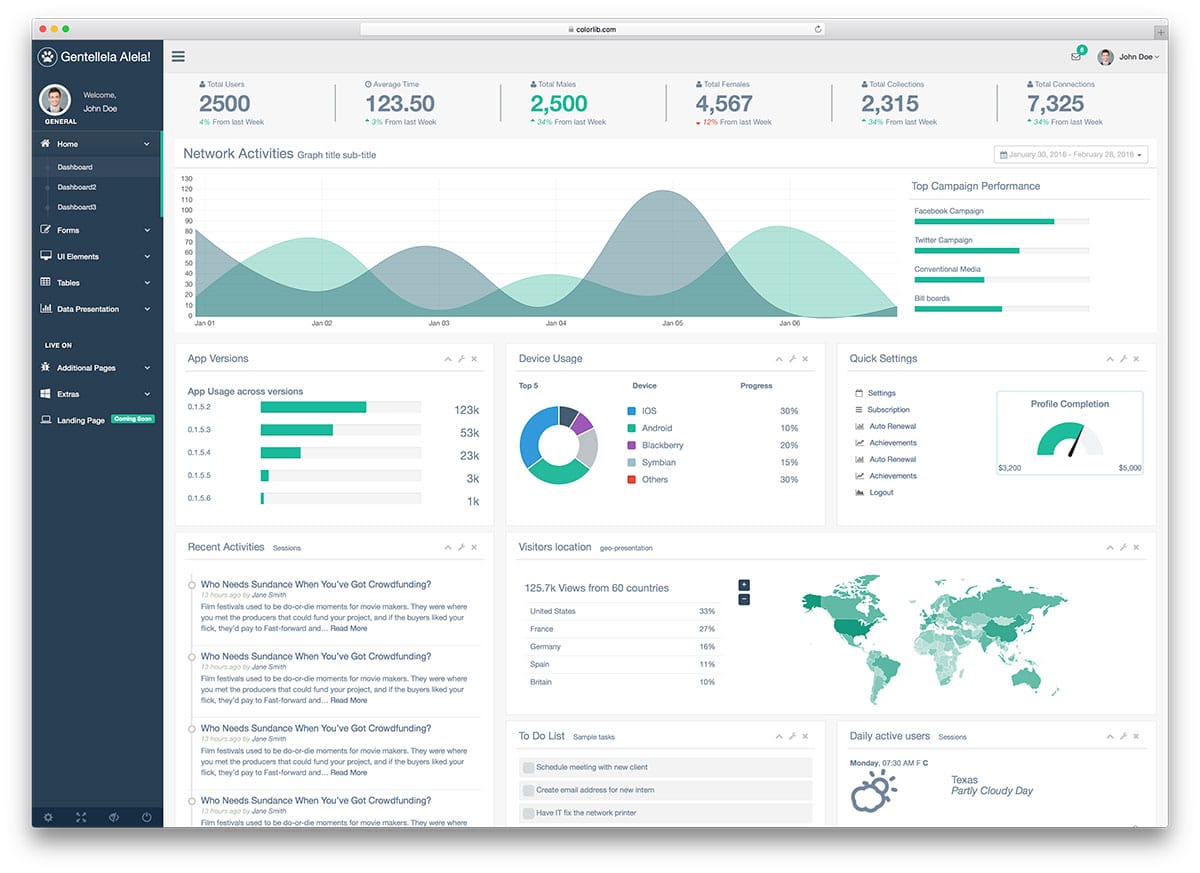
This bootstrap sidebar design would be a good option if you are building a dashboard for multiple users. At the top of the sidebar, you can add a profile image and user details. Showing user images lets users know whether they are in the correct profile. In addition to the regular navigation options, this sidebar includes a special section at the bottom. Useful options such as logout, settings, and full-page views are available in a dedicated section. If the user is accessing the dashboard from a mobile device, this special section will be helpful for them to access the regularly used options easily.
Adminty
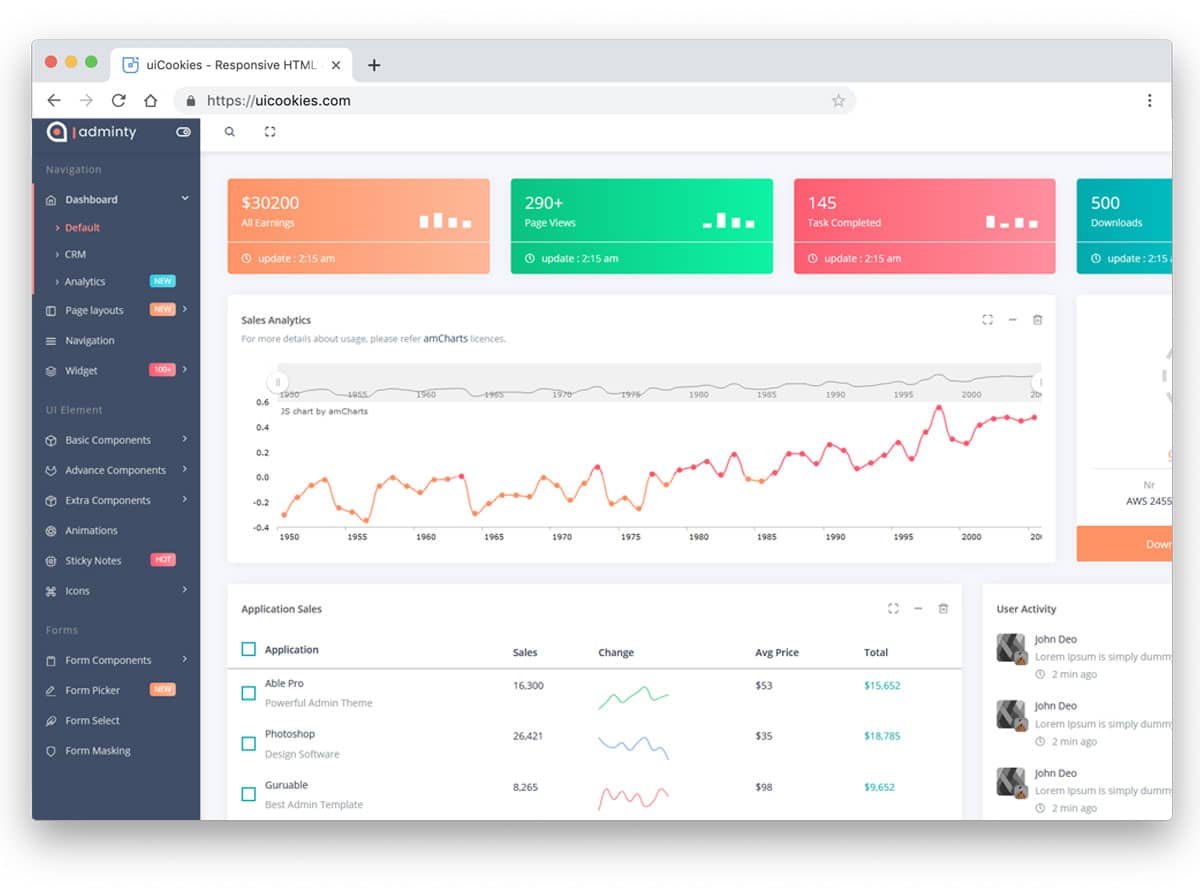
Adminty has a colorful and trendy looking sidebar design. Since the creator has used gradient colors throughout the dashboard, the sidebar also has gradient elements. On the dark grey theme sidebar, the gradient elements look attractive. If you are using color codes to organize the contents, these gradient tags will come in handy. A toggle switch at the top of the sidebar lets the user completely hide the sidebar. Since Adminty is a dashboard template, this toggle switch helps the user focus more on the main content. Icons and text are used effectively in this sidebar to provide a clear idea of the options. In addition to the navigation sidebar, you get a retractable sidebar to display customization options.
Admindek

Admindek is a perfect sidebar navigation design for professional dashboard designs. If you have to handle multiple menus and submenus, this is the sidebar design. You also have a toggle button at the top to easily show or hide the sidebar. The transition animations in this template are fluid and smooth. Colorful tags are used effectively to display notifications in that menu. For example, you have five notifications in the charts menu, indicated by the number five near the chart menu. This thoughtfully designed sidebar will improve the user experience for your users.
SVG Gooey Hover Menu Concept

This bootstrap sidebar design is an interesting concept. The developer has used interactive animation to make this sidebar unique. A slight water droplet movement is a creative touch that will surely get the user’s attention. A small glitch line appears when you move the cursor up and down. But it can be fixed by tuning the code a little bit. The developer has used CSS3 and JavaScript frameworks to make the animation buttery smooth. The entire code structure used to create this interactive sidebar design is shared with you directly. Hence, you can work with this design easily.
Secret Project

This app concept not only provides a sidebar design but also a fully functional app. The sidebar is sleek and easy to use, so users can easily jump to the options they want. And the screen transitions are also buttery smooth. If you are specifically looking for a mobile app sidebar design, this one is the best option for you. The code structure is long and complex because this concept involves many front-end functionalities. But a well-organized code structure will help you understand the code more easily and customize it to your needs.
Add to Cart Interaction

You can infer from the name that this bootstrap sidebar is designed for eCommerce stores. Being an eCommerce store’s sidebar, it must handle plenty of options. The creator has designed the sidebar sensibly so that users can access the options easily. The important feature of this sidebar design is the cart option. When the user adds a product to the cart, it smoothly flies and falls into it. Users can see the products on their cart without even leaving the page. The default design would work on a small boutique store website. If you are looking for a fully functional boutique store website template, look at our Shopify boutique store templates collection.
Triangular Sidebar Menu

As the name suggests, this template uses a triangular sidebar design. Since it is a sidebar menu concept, you also get toggle animations in this example. The entire concept is unique and creative. If you plan to make an interactive landing page for mobile devices and other small-screen devices, this design concept may be useful. Just like the design, this example’s code script is also a bit complex. The creator has neatly structured the code so you can easily understand and customize it to your needs.
Simple YouTube Menu Effect

The creator has given you simple transition effects for your sidebar in this example. Though the original design is made for the YouTube menus, you can use it for other types of websites. The animation effect is smooth and quick, so that the user can easily access the menu options in the sidebar. Another advantage of this animated sidebar menu is that it saves a lot of screen space and appears only when needed. The entire code used to create this design is available for download. The neatly organized code script will help you work with this design more easily.
Slide and Push Menus

You have only one animation effect in the previous YouTube menu effect example in the previous YouTube menu effect example. If you’d like to see more transition effects for your sidebar menu, this example is for you. The creator has given you four sliding animation effects and two push menu effects in this example. All the animations are simple and neat to use it on your website or application without any issue. Another advantage of using a sidebar with a simple animation effect is that it works smoothly on computers and mobile devices. By making a few design adjustments, you can use this template on your website.
Vertical Icon Menu
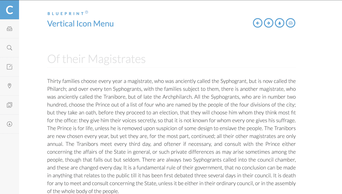
You can use this vertical icon sidebar menu concept for the folded version of your menu. Instead of using wording on your sidebar menu, you can use icons to save space. Present-day icons are clear and easy to understand, so users can easily identify the menu options. But still, it is better to use wording in the menu options. In the default design, ample space is provided for each icon to allow the user to easily interact with it. Hover effects are also provided to clearly show which options the user will select.
Elastic SVG Sidebar Material Design
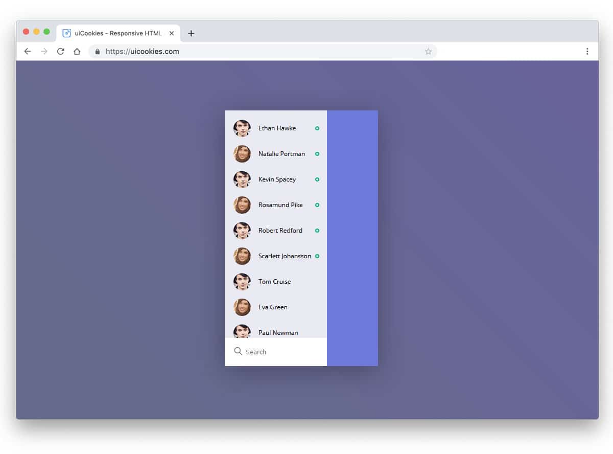
Elastic SVG Sidebar Material Design is made for mobile applications. As modern user interfaces have become more natural to use, this design will impress your users. This bootstrap sidebar example is fluid and interactive. As you pull the sidebar from the left, it bulges and bounces, giving it an elastic look. The animation is perfectly scaled, so your user will love using it. The entire code structure used to create this cool-looking sidebar is available in the CodePen editor. Since it is the CodePen editor, you can easily customize and visualize the result before using it on your main design.
React Motion Sidebar

The default design itself looks minimal so that you can take this framework and create your custom sidebar. If you want to access the sidebar with a single click, this Bootstrap sidebar design might help. The entire design is built entirely in JavaScript. Hence, you can expect only transition or motion animation in this tab example. The developer has given both folding and unfolding animations in this example. Since it is a Unicode design, editing and using it on your website or application will be easy.
Sidebar Transition
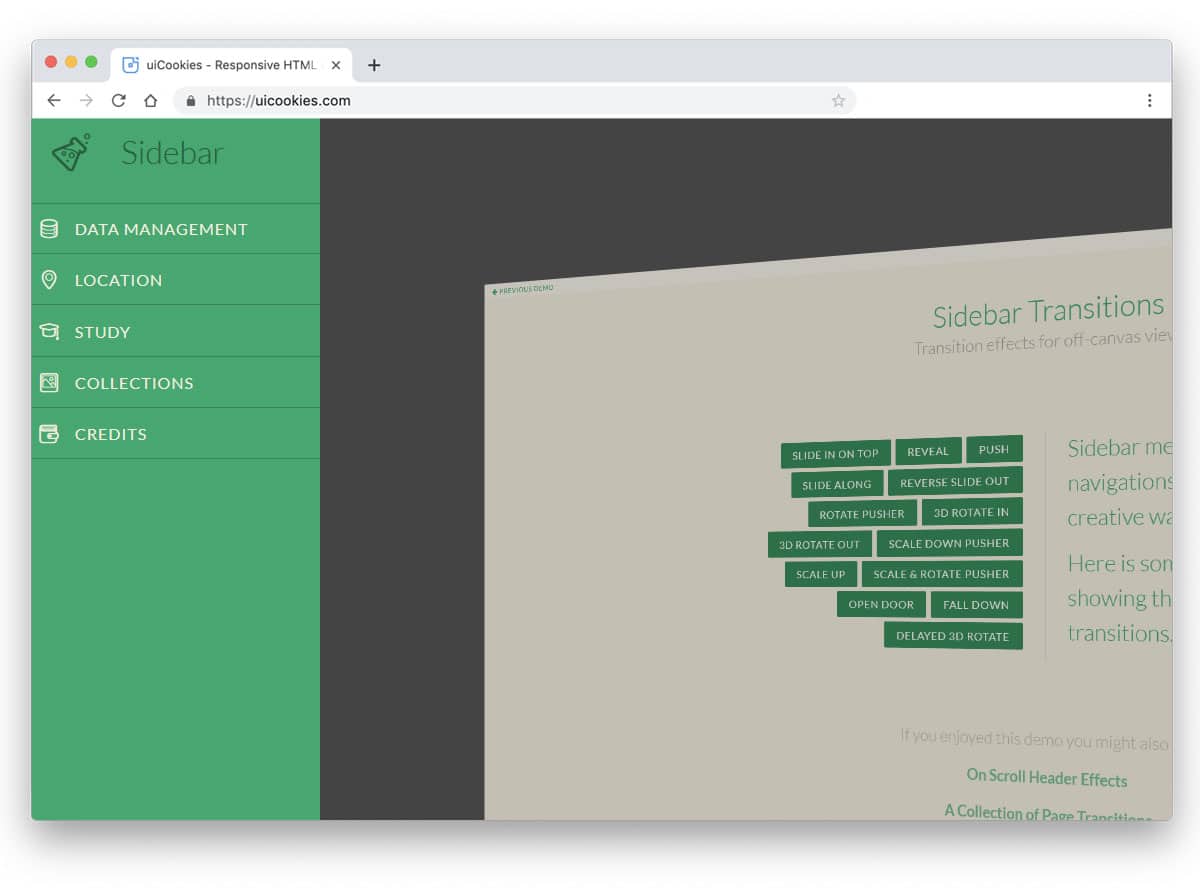
As the name implies, the developer of this Bootstrap sidebar sign has concentrated more on the transition effects. The creator has given us nearly fourteen types of sidebar transition effects. All 14 animation effects are robust and easily draw the user’s attention. As the developer used an off-canvas design, the entire page is used in the animation. Since all the animations are done using the latest CSS3 script, you can easily utilize the code in your design. Just pick the effect you like and get started.