Open demo

CSS code

HTML
<div class="bc-grid">
  <article class="bc-card">
    <div class="bc-cover bc-c1"><span class="bc-chip">CSS</span></div>
    <div class="bc-body">
      <h2 class="bc-title"><a class="bc-link" href="#">Container queries change how we build cards</a></h2>
      <p class="bc-excerpt">Why component-level breakpoints finally let card layouts adapt to where they live instead of the whole viewport.</p>
      <div class="bc-meta"><span class="bc-dot bc-d1" aria-hidden="true"></span><b>Maya Chen</b><span class="bc-time">6 min read</span></div>
    </div>
  </article>
  <article class="bc-card">
    <div class="bc-cover bc-c2"><span class="bc-chip">Performance</span></div>
    <div class="bc-body">
      <h2 class="bc-title"><a class="bc-link" href="#">Shipping half the JavaScript without losing features</a></h2>
      <p class="bc-excerpt">A practical audit path: what we deleted, what we replaced with CSS, and the numbers before and after.</p>
      <div class="bc-meta"><span class="bc-dot bc-d2" aria-hidden="true"></span><b>Tomás Silva</b><span class="bc-time">9 min read</span></div>
    </div>
  </article>
</div>
CSS
/* Blog post cards on a dark page. The title link is stretched over the whole card with ::after,
   so the card has one link target; the focus ring is drawn on the card itself. */
.bc-grid,.bc-grid *,.bc-grid *::before,.bc-grid *::after{box-sizing:border-box}
.bc-grid{display:flex;flex-wrap:wrap;justify-content:center;gap:26px}
.bc-card{position:relative;width:330px;background:#171a21;border:1px solid #232833;border-radius:16px;overflow:hidden;transition:transform .18s,border-color .18s}
.bc-card:hover{transform:translateY(-5px);border-color:#3b4354}
.bc-cover{height:170px;display:flex;align-items:flex-end;padding:14px}
.bc-c1{background:linear-gradient(120deg,#312e81,#7c3aed 60%,#ec4899)}
.bc-c2{background:linear-gradient(120deg,#064e3b,#0d9488 60%,#22d3ee)}
.bc-chip{background:rgba(0,0,0,.45);-webkit-backdrop-filter:blur(6px);backdrop-filter:blur(6px);color:#fff;font-size:.7rem;font-weight:700;letter-spacing:.06em;text-transform:uppercase;padding:5px 11px;border-radius:999px}
.bc-body{padding:20px 22px 22px}
.bc-title{font-size:1.05rem;line-height:1.4;letter-spacing:-.01em;margin:0 0 8px}
.bc-link{color:#f2f4f8;text-decoration:none}
.bc-link::after{content:"";position:absolute;inset:0;z-index:1}
.bc-link:focus-visible{outline:2px solid transparent}
.bc-card:has(.bc-link:focus-visible){outline:3px solid #a78bfa;outline-offset:3px}
@supports not selector(:has(*)){.bc-link:focus-visible{outline-color:#a78bfa;outline-offset:2px}}
.bc-excerpt{font-size:.85rem;line-height:1.6;color:#8a93a6;margin:0 0 18px}
.bc-meta{display:flex;align-items:center;gap:10px;font-size:.78rem;color:#808a9e}
.bc-dot{width:30px;height:30px;border-radius:50%;flex:none}
.bc-d1{background:linear-gradient(135deg,#f59e0b,#ef4444)}
.bc-d2{background:linear-gradient(135deg,#38bdf8,#818cf8)}
.bc-meta b{color:#c6cdda;font-weight:600}
.bc-time{margin-left:auto}
@media (prefers-reduced-motion:reduce){.bc-card{transition:none}.bc-card:hover{transform:none}}

Bootstrap 5 code

Requires: Bootstrap 5.3.8 CSS

HTML
<div class="row row-cols-auto justify-content-center g-4">
  <div class="col">
    <article class="card h-100 bc-card">
      <div class="card-img-top bc-cover bc-c1"><span class="badge rounded-pill bc-chip">CSS</span></div>
      <div class="card-body">
        <h2 class="card-title bc-title"><a class="stretched-link" href="#">Container queries change how we build cards</a></h2>
        <p class="card-text bc-excerpt">Why component-level breakpoints finally let card layouts adapt to where they live instead of the whole viewport.</p>
        <div class="bc-meta d-flex align-items-center"><span class="bc-dot bc-d1 rounded-circle" aria-hidden="true"></span><b>Maya Chen</b><span class="ms-auto">6 min read</span></div>
      </div>
    </article>
  </div>
  <div class="col">
    <article class="card h-100 bc-card">
      <div class="card-img-top bc-cover bc-c2"><span class="badge rounded-pill bc-chip">Performance</span></div>
      <div class="card-body">
        <h2 class="card-title bc-title"><a class="stretched-link" href="#">Shipping half the JavaScript without losing features</a></h2>
        <p class="card-text bc-excerpt">A practical audit path: what we deleted, what we replaced with CSS, and the numbers before and after.</p>
        <div class="bc-meta d-flex align-items-center"><span class="bc-dot bc-d2 rounded-circle" aria-hidden="true"></span><b>Tomás Silva</b><span class="ms-auto">9 min read</span></div>
      </div>
    </article>
  </div>
</div>
CSS
/* Bootstrap .card + .card-img-top + .stretched-link + .badge, recoloured through --bs-card-* variables.
   .stretched-link makes the title link cover the card; the focus ring is drawn on the card. */
.bc-card{--bs-card-bg:#171a21;--bs-card-border-color:#232833;--bs-card-border-radius:16px;--bs-card-inner-border-radius:15px;
  --bs-card-spacer-x:22px;--bs-card-spacer-y:20px;--bs-card-title-spacer-y:8px;width:330px;overflow:hidden;transition:transform .18s,border-color .18s}
.bc-card:hover{transform:translateY(-5px);--bs-card-border-color:#3b4354}
.bc-cover{height:170px;display:flex;align-items:flex-end;padding:14px}
.bc-c1{background:linear-gradient(120deg,#312e81,#7c3aed 60%,#ec4899)}
.bc-c2{background:linear-gradient(120deg,#064e3b,#0d9488 60%,#22d3ee)}
.bc-chip{--bs-badge-font-size:.7rem;--bs-badge-font-weight:700;--bs-badge-padding-x:11px;--bs-badge-padding-y:5px;
  background:rgba(0,0,0,.45);-webkit-backdrop-filter:blur(6px);backdrop-filter:blur(6px);letter-spacing:.06em;text-transform:uppercase}
.bc-card .card-body{padding-bottom:22px}
.bc-title{font-size:1.05rem;font-weight:700;line-height:1.4;letter-spacing:-.01em}
.bc-title a{color:#f2f4f8;text-decoration:none}
.bc-title a:focus-visible{outline:2px solid transparent}
.bc-card:has(.stretched-link:focus-visible){outline:3px solid #a78bfa;outline-offset:3px}
@supports not selector(:has(*)){.bc-title a:focus-visible{outline-color:#a78bfa;outline-offset:2px}}
.bc-excerpt{font-size:.85rem;line-height:1.6;color:#8a93a6;margin:0 0 18px}
.bc-meta{gap:10px;font-size:.78rem;color:#808a9e}
.bc-dot{width:30px;height:30px;flex:none}
.bc-d1{background:linear-gradient(135deg,#f59e0b,#ef4444)}
.bc-d2{background:linear-gradient(135deg,#38bdf8,#818cf8)}
.bc-meta b{color:#c6cdda;font-weight:600}
@media (prefers-reduced-motion:reduce){.bc-card{transition:none}.bc-card:hover{transform:none}}

Tailwind 4 code

Requires: Tailwind CSS 4

HTML
<div class="flex flex-wrap justify-center gap-[26px]">
  <article class="relative w-[330px] overflow-hidden rounded-2xl border border-[#232833] bg-[#171a21] transition-[translate,border-color] duration-[180ms] hover:-translate-y-[5px] hover:border-[#3b4354] has-[a:focus-visible]:outline-3 has-[a:focus-visible]:outline-offset-3 has-[a:focus-visible]:outline-[#a78bfa] motion-reduce:transition-none motion-reduce:hover:translate-y-0">
    <div class="flex h-[170px] items-end bg-linear-[120deg] from-[#312e81] via-[#7c3aed] via-60% to-[#ec4899] p-3.5"><span class="rounded-full bg-black/45 px-[11px] py-[5px] text-[.7rem] font-bold tracking-[.06em] text-white uppercase backdrop-blur-[6px]">CSS</span></div>
    <div class="px-[22px] pt-5 pb-[22px]">
      <h2 class="mb-2 text-[1.05rem] leading-[1.4] font-bold tracking-[-.01em]"><a href="#" class="text-[#f2f4f8] after:absolute after:inset-0 after:z-[1] focus-visible:outline-2 focus-visible:outline-transparent">Container queries change how we build cards</a></h2>
      <p class="mb-[18px] text-[.85rem] leading-[1.6] text-[#8a93a6]">Why component-level breakpoints finally let card layouts adapt to where they live instead of the whole viewport.</p>
      <div class="flex items-center gap-2.5 text-[.78rem] text-[#808a9e]"><span aria-hidden="true" class="size-[30px] flex-none rounded-full bg-linear-135 from-[#f59e0b] to-[#ef4444]"></span><b class="font-semibold text-[#c6cdda]">Maya Chen</b><span class="ml-auto">6 min read</span></div>
    </div>
  </article>
  <article class="relative w-[330px] overflow-hidden rounded-2xl border border-[#232833] bg-[#171a21] transition-[translate,border-color] duration-[180ms] hover:-translate-y-[5px] hover:border-[#3b4354] has-[a:focus-visible]:outline-3 has-[a:focus-visible]:outline-offset-3 has-[a:focus-visible]:outline-[#a78bfa] motion-reduce:transition-none motion-reduce:hover:translate-y-0">
    <div class="flex h-[170px] items-end bg-linear-[120deg] from-[#064e3b] via-[#0d9488] via-60% to-[#22d3ee] p-3.5"><span class="rounded-full bg-black/45 px-[11px] py-[5px] text-[.7rem] font-bold tracking-[.06em] text-white uppercase backdrop-blur-[6px]">Performance</span></div>
    <div class="px-[22px] pt-5 pb-[22px]">
      <h2 class="mb-2 text-[1.05rem] leading-[1.4] font-bold tracking-[-.01em]"><a href="#" class="text-[#f2f4f8] after:absolute after:inset-0 after:z-[1] focus-visible:outline-2 focus-visible:outline-transparent">Shipping half the JavaScript without losing features</a></h2>
      <p class="mb-[18px] text-[.85rem] leading-[1.6] text-[#8a93a6]">A practical audit path: what we deleted, what we replaced with CSS, and the numbers before and after.</p>
      <div class="flex items-center gap-2.5 text-[.78rem] text-[#808a9e]"><span aria-hidden="true" class="size-[30px] flex-none rounded-full bg-linear-135 from-[#38bdf8] to-[#818cf8]"></span><b class="font-semibold text-[#c6cdda]">Tomás Silva</b><span class="ml-auto">9 min read</span></div>
    </div>
  </article>
</div>

About this set

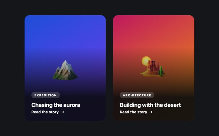
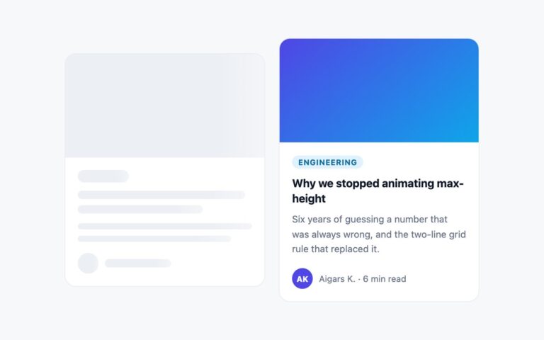
Blog post cards for a dark page: a gradient cover with a frosted category chip in the corner, the post title, a two-line excerpt and an author row with a small gradient avatar dot, the author’s name and the reading time. The two examples use a violet-to-pink and a green-to-cyan cover. The whole card is clickable through the stretched link pattern: the title is the only link, and its ::after pseudo-element is positioned over the entire card, so a click anywhere opens the post while screen readers and keyboard users meet a single link named by the title instead of a wrapper link around everything. When the link has keyboard focus the card itself gets a violet ring. Hovering lifts the card and brightens its border. Swap the gradient divs for img elements with alt text, or alt=”” if the picture only decorates, when you have real cover images. In Bootstrap the cover is a .card-img-top, the chip a .badge and the title link a .stretched-link; the Tailwind version uses after:absolute after:inset-0 on the link and has-[a:focus-visible] on the card.

What’s included

  • Stretched title link makes the whole card clickable with one link target
  • Focus ring drawn around the whole card while the link is focused
  • Frosted category chip over a gradient cover
  • Author row with avatar dot, name and reading time
  • Hover lift and border highlight, off under prefers-reduced-motion

Accessibility

Each card is an article whose h2 contains the only link, so screen readers announce the post title once. A violet 3px ring appears around the card when the link has keyboard focus, with a transparent outline on the link kept for Windows forced-colours mode. The meta line is light enough to pass 4.5:1 on the dark card, and the hover lift is disabled under prefers-reduced-motion.

Customise it

Change the cover gradients in .bc-c1 and .bc-c2, the card surface in .bc-card and the focus ring colour in the :has() rule. In Bootstrap the surface and border are --bs-card-bg and --bs-card-border-color on .bc-card; in Tailwind edit the bg-, border- and has-[a:focus-visible]:outline- utilities.