Open demo

CSS code

HTML
<div class="fc-grid">
  <article class="fc-scene">
    <div class="fc-flip">
      <div class="fc-face fc-front fc-f1">
        <span class="fc-icon" aria-hidden="true">⚡️</span>
        <h2 class="fc-title">Instant deploys</h2>
        <p class="fc-text">Push to main and your changes are live worldwide before your coffee cools.</p>
        <p class="fc-hint" aria-hidden="true">Hover to flip</p>
      </div>
      <div class="fc-face fc-back">
        <h3 class="fc-sub">What you get</h3>
        <ul class="fc-list">
          <li>Global edge network</li>
          <li>Preview URLs per branch</li>
          <li>Instant rollbacks</li>
          <li>Zero-config SSL</li>
        </ul>
        <a class="fc-cta" href="#">Learn more<span class="fc-sr"> about instant deploys</span></a>
      </div>
    </div>
  </article>
  <article class="fc-scene">
    <div class="fc-flip">
      <div class="fc-face fc-front fc-f2">
        <span class="fc-icon" aria-hidden="true">🔒</span>
        <h2 class="fc-title">Private by default</h2>
        <p class="fc-text">Every project starts locked down. You decide what the world can see.</p>
        <p class="fc-hint" aria-hidden="true">Hover to flip</p>
      </div>
      <div class="fc-face fc-back">
        <h3 class="fc-sub">What you get</h3>
        <ul class="fc-list">
          <li>Role-based access</li>
          <li>Audit logs</li>
          <li>SSO & 2FA</li>
          <li>Encrypted at rest</li>
        </ul>
        <a class="fc-cta" href="#">Learn more<span class="fc-sr"> about private projects</span></a>
      </div>
    </div>
  </article>
</div>
CSS
/* 3D flip cards. Hover flips the card; so does keyboard focus on the link on the back (:focus-within).
   Both faces stay in the accessibility tree, so screen readers read front and back in order. */
.fc-grid,.fc-grid *,.fc-grid *::before,.fc-grid *::after{box-sizing:border-box}
.fc-grid{display:flex;flex-wrap:wrap;justify-content:center;gap:30px}
.fc-scene{width:280px;height:360px;perspective:1200px}
.fc-flip{position:relative;width:100%;height:100%;transform-style:preserve-3d;transition:transform .65s cubic-bezier(.4,.1,.2,1)}
.fc-scene:hover .fc-flip,.fc-scene:focus-within .fc-flip{transform:rotateY(180deg)}
.fc-face{position:absolute;inset:0;-webkit-backface-visibility:hidden;backface-visibility:hidden;border-radius:20px;padding:30px;display:flex;flex-direction:column}
.fc-front{color:#fff}
.fc-f1{background:linear-gradient(160deg,#7c3aed,#4f46e5);--fc-soft:#ede9fe}
.fc-f2{background:linear-gradient(160deg,#047857,#0f766e);--fc-soft:#d1fae5}
.fc-back{background:#1a2027;color:#dbe2ec;transform:rotateY(180deg);border:1px solid #2b333e}
.fc-icon{font-size:2.4rem;margin-bottom:auto}
.fc-title{font-size:1.35rem;letter-spacing:-.02em;margin:0 0 8px}
.fc-text{font-size:.88rem;line-height:1.55;color:var(--fc-soft);margin:0}
.fc-hint{margin:18px 0 0;font-size:.72rem;letter-spacing:.08em;text-transform:uppercase;color:var(--fc-soft)}
.fc-sub{font-size:1.05rem;margin:0 0 14px;color:#fff}
.fc-list{list-style:none;margin:0 0 auto;padding:0;font-size:.85rem;line-height:2;color:#a7b1c2}
.fc-list li::before{content:"→ ";content:"→ "/"";color:#22d3ee}
.fc-cta{display:block;text-align:center;padding:11px;border-radius:10px;background:#22d3ee;color:#082f36;font-size:.88rem;font-weight:800;text-decoration:none;transition:filter .15s}
.fc-cta:hover{filter:brightness(1.1)}
.fc-cta:focus-visible{outline:3px solid #fff;outline-offset:3px}
.fc-sr{position:absolute;width:1px;height:1px;margin:-1px;padding:0;overflow:hidden;clip:rect(0,0,0,0);white-space:nowrap;border:0}
@media (prefers-reduced-motion:reduce){.fc-flip,.fc-cta{transition:none}}

Bootstrap 5 code

Requires: Bootstrap 5.3.8 CSS

HTML
<div class="row row-cols-auto justify-content-center g-4">
  <div class="col">
    <article class="fc-scene">
      <div class="fc-flip position-relative w-100 h-100">
        <div class="card fc-face fc-front fc-f1 position-absolute top-0 start-0 w-100 h-100">
          <div class="card-body d-flex flex-column">
            <span class="fc-icon" aria-hidden="true">⚡️</span>
            <h2 class="card-title fc-title">Instant deploys</h2>
            <p class="card-text fc-text">Push to main and your changes are live worldwide before your coffee cools.</p>
            <p class="fc-hint" aria-hidden="true">Hover to flip</p>
          </div>
        </div>
        <div class="card fc-face fc-back position-absolute top-0 start-0 w-100 h-100">
          <div class="card-body d-flex flex-column">
            <h3 class="fc-sub">What you get</h3>
            <ul class="fc-list list-unstyled">
              <li>Global edge network</li>
              <li>Preview URLs per branch</li>
              <li>Instant rollbacks</li>
              <li>Zero-config SSL</li>
            </ul>
            <a class="btn d-block fc-cta" href="#">Learn more<span class="visually-hidden"> about instant deploys</span></a>
          </div>
        </div>
      </div>
    </article>
  </div>
  <div class="col">
    <article class="fc-scene">
      <div class="fc-flip position-relative w-100 h-100">
        <div class="card fc-face fc-front fc-f2 position-absolute top-0 start-0 w-100 h-100">
          <div class="card-body d-flex flex-column">
            <span class="fc-icon" aria-hidden="true">🔒</span>
            <h2 class="card-title fc-title">Private by default</h2>
            <p class="card-text fc-text">Every project starts locked down. You decide what the world can see.</p>
            <p class="fc-hint" aria-hidden="true">Hover to flip</p>
          </div>
        </div>
        <div class="card fc-face fc-back position-absolute top-0 start-0 w-100 h-100">
          <div class="card-body d-flex flex-column">
            <h3 class="fc-sub">What you get</h3>
            <ul class="fc-list list-unstyled">
              <li>Role-based access</li>
              <li>Audit logs</li>
              <li>SSO & 2FA</li>
              <li>Encrypted at rest</li>
            </ul>
            <a class="btn d-block fc-cta" href="#">Learn more<span class="visually-hidden"> about private projects</span></a>
          </div>
        </div>
      </div>
    </article>
  </div>
</div>
CSS
/* Each face is a Bootstrap .card stacked with .position-absolute; the 3D flip itself is custom CSS
   (Bootstrap has no utilities for perspective or backface-visibility). Hover or keyboard focus on the back link flips it. */
.fc-scene{width:280px;height:360px;perspective:1200px}
.fc-flip{transform-style:preserve-3d;transition:transform .65s cubic-bezier(.4,.1,.2,1)}
.fc-scene:hover .fc-flip,.fc-scene:focus-within .fc-flip{transform:rotateY(180deg)}
.fc-face{--bs-card-border-radius:20px;--bs-card-spacer-x:30px;--bs-card-spacer-y:30px;-webkit-backface-visibility:hidden;backface-visibility:hidden}
.fc-front{--bs-card-border-width:0;--bs-card-color:#fff}
.fc-f1{--bs-card-bg:transparent;background:linear-gradient(160deg,#7c3aed,#4f46e5);--fc-soft:#ede9fe}
.fc-f2{--bs-card-bg:transparent;background:linear-gradient(160deg,#047857,#0f766e);--fc-soft:#d1fae5}
.fc-back{--bs-card-bg:#1a2027;--bs-card-color:#dbe2ec;--bs-card-border-color:#2b333e;transform:rotateY(180deg)}
.fc-icon{font-size:2.4rem;margin-bottom:auto}
.fc-title{font-size:1.35rem;font-weight:700;line-height:normal;letter-spacing:-.02em;margin:0 0 8px}
.fc-text{font-size:.88rem;line-height:1.55;color:var(--fc-soft);margin:0}
.fc-hint{margin:18px 0 0;font-size:.72rem;letter-spacing:.08em;text-transform:uppercase;color:var(--fc-soft)}
.fc-sub{font-size:1.05rem;font-weight:700;line-height:normal;margin:0 0 14px;color:#fff}
.fc-list{margin:0 0 auto;font-size:.85rem;line-height:2;color:#a7b1c2}
.fc-list li::before{content:"→ ";content:"→ "/"";color:#22d3ee}
.fc-cta{--bs-btn-padding-y:11px;--bs-btn-font-size:.88rem;--bs-btn-font-weight:800;--bs-btn-border-radius:10px;--bs-btn-border-width:0;
  --bs-btn-color:#082f36;--bs-btn-bg:#22d3ee;--bs-btn-hover-color:#082f36;--bs-btn-hover-bg:#22d3ee;--bs-btn-active-color:#082f36;--bs-btn-active-bg:#22d3ee;
  --bs-btn-focus-box-shadow:none;transition:filter .15s}
.fc-cta:hover{filter:brightness(1.1)}
.fc-cta:focus-visible{outline:3px solid #fff;outline-offset:3px}
@media (prefers-reduced-motion:reduce){.fc-flip,.fc-cta{transition:none}}

Tailwind 4 code

Requires: Tailwind CSS 4

HTML
<div class="flex flex-wrap justify-center gap-[30px]">
  <article class="group h-[360px] w-[280px] perspective-[1200px]">
    <div class="relative size-full transition-transform duration-[650ms] ease-[cubic-bezier(.4,.1,.2,1)] transform-3d group-focus-within:rotate-y-180 group-hover:rotate-y-180 motion-reduce:transition-none">
      <div class="absolute inset-0 flex flex-col rounded-[20px] bg-linear-[160deg] from-[#7c3aed] to-[#4f46e5] p-[30px] text-white backface-hidden">
        <span aria-hidden="true" class="mb-auto text-[2.4rem]">⚡️</span>
        <h2 class="mb-2 text-[1.35rem] font-bold tracking-[-.02em]">Instant deploys</h2>
        <p class="text-[.88rem] leading-[1.55] text-[#ede9fe]">Push to main and your changes are live worldwide before your coffee cools.</p>
        <p aria-hidden="true" class="mt-[18px] text-[.72rem] tracking-[.08em] text-[#ede9fe] uppercase">Hover to flip</p>
      </div>
      <div class="absolute inset-0 flex rotate-y-180 flex-col rounded-[20px] border border-[#2b333e] bg-[#1a2027] p-[30px] text-[#dbe2ec] backface-hidden">
        <h3 class="mb-3.5 text-[1.05rem] font-bold text-white">What you get</h3>
        <ul class="mb-auto text-[.85rem] leading-[2] text-[#a7b1c2] [&>li]:before:text-[#22d3ee] [&>li]:before:content-['→_'] [&>li]:before:[content:'→_'_/_'']">
          <li>Global edge network</li>
          <li>Preview URLs per branch</li>
          <li>Instant rollbacks</li>
          <li>Zero-config SSL</li>
        </ul>
        <a href="#" class="block rounded-[10px] bg-[#22d3ee] p-[11px] text-center text-[.88rem] font-extrabold text-[#082f36] transition-[filter] duration-150 hover:brightness-110 focus-visible:outline-3 focus-visible:outline-offset-3 focus-visible:outline-white motion-reduce:transition-none">Learn more<span class="sr-only"> about instant deploys</span></a>
      </div>
    </div>
  </article>
  <article class="group h-[360px] w-[280px] perspective-[1200px]">
    <div class="relative size-full transition-transform duration-[650ms] ease-[cubic-bezier(.4,.1,.2,1)] transform-3d group-focus-within:rotate-y-180 group-hover:rotate-y-180 motion-reduce:transition-none">
      <div class="absolute inset-0 flex flex-col rounded-[20px] bg-linear-[160deg] from-[#047857] to-[#0f766e] p-[30px] text-white backface-hidden">
        <span aria-hidden="true" class="mb-auto text-[2.4rem]">🔒</span>
        <h2 class="mb-2 text-[1.35rem] font-bold tracking-[-.02em]">Private by default</h2>
        <p class="text-[.88rem] leading-[1.55] text-[#d1fae5]">Every project starts locked down. You decide what the world can see.</p>
        <p aria-hidden="true" class="mt-[18px] text-[.72rem] tracking-[.08em] text-[#d1fae5] uppercase">Hover to flip</p>
      </div>
      <div class="absolute inset-0 flex rotate-y-180 flex-col rounded-[20px] border border-[#2b333e] bg-[#1a2027] p-[30px] text-[#dbe2ec] backface-hidden">
        <h3 class="mb-3.5 text-[1.05rem] font-bold text-white">What you get</h3>
        <ul class="mb-auto text-[.85rem] leading-[2] text-[#a7b1c2] [&>li]:before:text-[#22d3ee] [&>li]:before:content-['→_'] [&>li]:before:[content:'→_'_/_'']">
          <li>Role-based access</li>
          <li>Audit logs</li>
          <li>SSO & 2FA</li>
          <li>Encrypted at rest</li>
        </ul>
        <a href="#" class="block rounded-[10px] bg-[#22d3ee] p-[11px] text-center text-[.88rem] font-extrabold text-[#082f36] transition-[filter] duration-150 hover:brightness-110 focus-visible:outline-3 focus-visible:outline-offset-3 focus-visible:outline-white motion-reduce:transition-none">Learn more<span class="sr-only"> about private projects</span></a>
      </div>
    </div>
  </article>
</div>

About this set

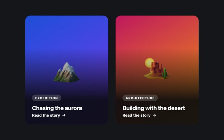
Two feature cards that turn over in 3D. The front is a gradient panel with an emoji icon, a heading, a short pitch and a small Hover to flip hint; the back is a dark panel with a What you get heading, four bullet points and a Learn more button link. The flip uses perspective on the outer element, transform-style: preserve-3d on the inner one and backface-visibility: hidden on both faces, with the back face pre-rotated 180 degrees. Hovering the card flips it, and so does keyboard focus: the scene uses :focus-within, so tabbing to the Learn more link on the back turns the card over before the link is shown. Both faces stay in the document, so screen readers read the front and back in order without needing the animation. Use flip cards for feature highlights, service summaries or team members with a bio on the back. Under prefers-reduced-motion the card switches faces instantly instead of rotating. There is no JavaScript. In Bootstrap each face is a .card stacked with position utilities, and Tailwind uses perspective-, transform-3d, backface-hidden and rotate-y-180.

What’s included

  • CSS-only 3D flip with perspective, preserve-3d and backface-visibility
  • Flips on hover and when keyboard focus reaches the link on the back
  • Both faces readable by screen readers in source order
  • Instant face swap under prefers-reduced-motion
  • No JavaScript

Accessibility

The card flips when its Learn more link receives keyboard focus, so the focused link is always visible, and the link shows a white 3px outline. Each link adds visually hidden context such as about instant deploys. The front text colours and the green gradient were darkened to reach 4.5:1, the visual Hover to flip hint is hidden from screen readers, and the rotation becomes an instant swap under prefers-reduced-motion.

Customise it

Change the front gradients in .fc-f1 and .fc-f2 (and their --fc-soft text colour), the back surface in .fc-back and the flip speed in the .fc-flip transition. Bootstrap uses the same classes on top of .card variables; in Tailwind edit the from-/to- utilities and duration-[650ms].