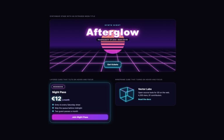
3D Effects
Neon 3D Effects
Neon 3D for dark interfaces, in three variants. The synthwave stage is an event hero with a striped sunset sun, a glowing…

73 sets, each in CSS, Bootstrap 5 and Tailwind 4
Every dark set from our UI packs on one page. Each one was designed dark from the start rather than inverted, so surfaces step up in lightness instead of relying on shadows, text and borders are checked against WCAG contrast on the dark background, and focus rings stay visible.
Every set ships in plain CSS, Bootstrap 5 (through --bs-* variables and data-bs-theme) and Tailwind 4, with a live demo and copyable code. Free for personal and commercial use.
3D Effects
Neon 3D for dark interfaces, in three variants. The synthwave stage is an event hero with a striped sunset sun, a glowing…
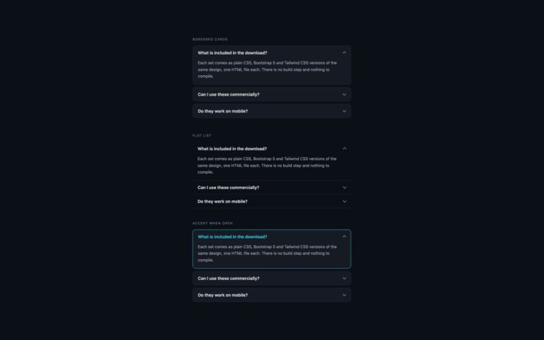
Accordions
Three accordion treatments for dark interfaces such as dashboards, developer tools and dark-mode sites, with a cyan accent.
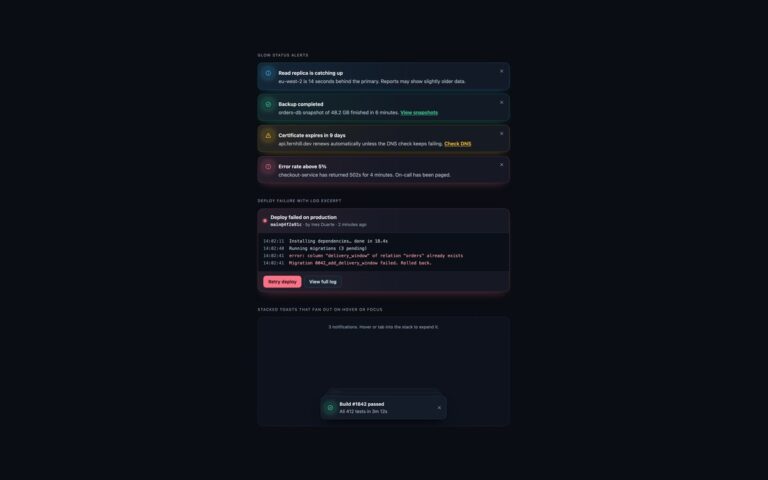
Alerts
Alerts and toasts for dark dashboards and developer tools, where light-theme alerts turn into glaring blocks.
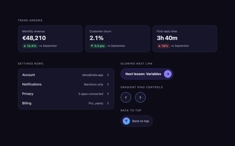
CSS Arrows
Arrows for dark dashboards and apps, where thin grey arrows from a light theme tend to vanish.
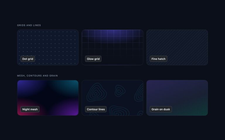
Background Patterns
Six patterns tuned for dark interfaces, where a light-theme pattern either vanishes or turns into noise.
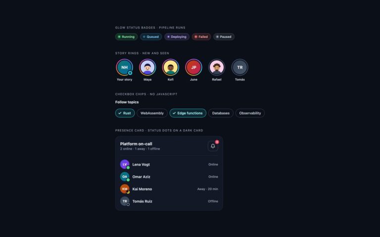
Badges & Avatars
Badges and avatars designed for dark interfaces, where light-theme tints turn muddy.
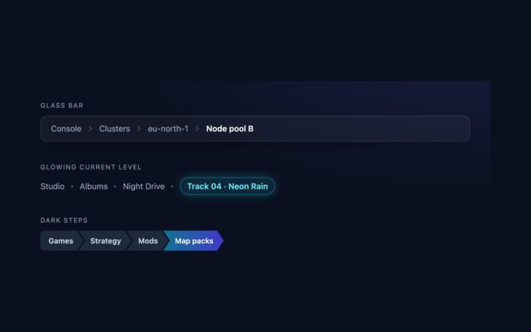
Breadcrumbs
Breadcrumbs tuned for dark interfaces, where a light theme trail turns grey on grey.
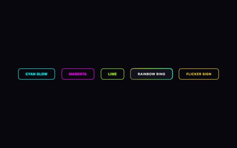
Buttons
Uppercase outline buttons for dark, gaming and nightlife designs, styled like neon tubes.
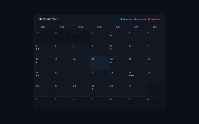
Calendars
A dark month calendar for status pages, release dashboards and night-mode apps.
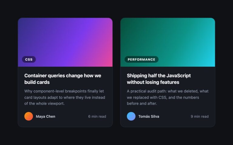
Cards
Blog post cards for a dark page: a gradient cover with a frosted category chip in the corner, the post title, a…
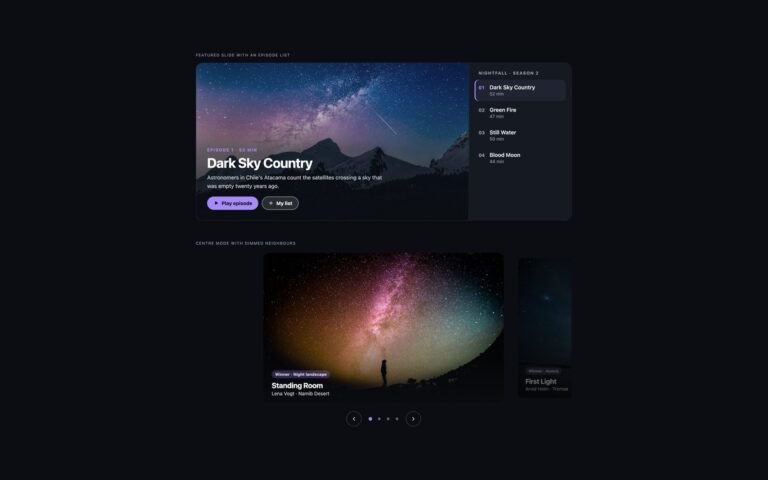
Carousels
Carousels for dark interfaces such as streaming, music and photography sites.
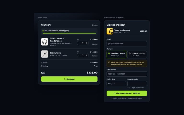
Shopping Carts
A cart and an express checkout for dark storefronts, with a single lime accent on near-black cards.
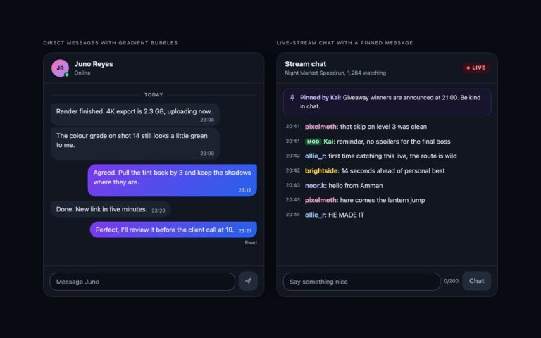
Chat UI
Two chat interfaces for dark products. Direct messages pairs a dark grey received bubble with a violet-to-blue gradient for your messages, an…
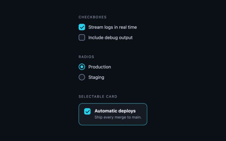
Checkboxes & Radios
Checkboxes and radio buttons built for dark surfaces, where a light-theme control loses its border and reads as a smudge.
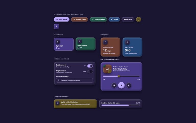
Claymorphism
The clay kit on a deep indigo night sky. Setting data-clay="dark" on any wrapper swaps every token at once: the page turns…
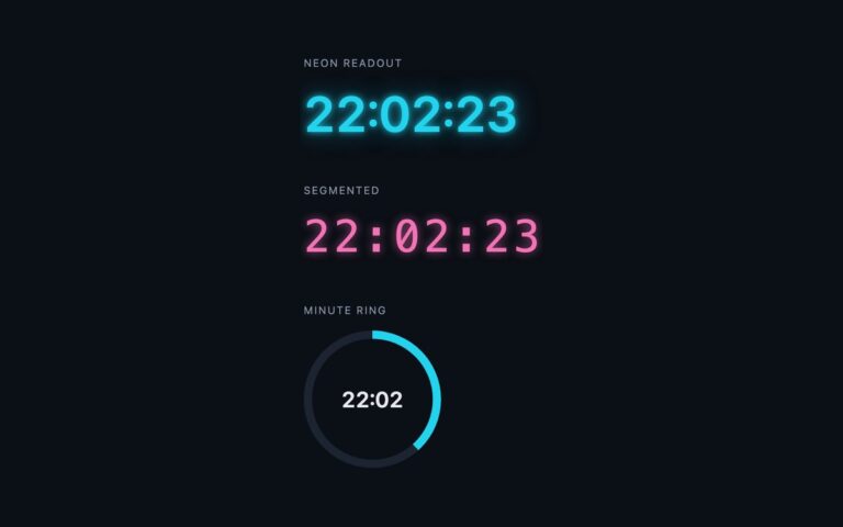
Clocks
Three clocks designed for dark interfaces. The neon readout is a cyan 24-hour time with a two-layer text-shadow glow, for a hero,…
Coming Soon Pages
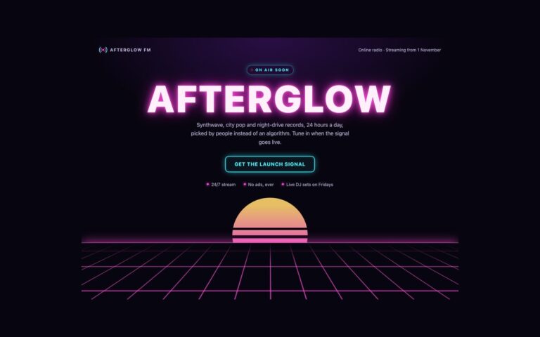
A dark synthwave coming soon page for an online radio station, and the modern-CSS set in this pack.
Comment Sections
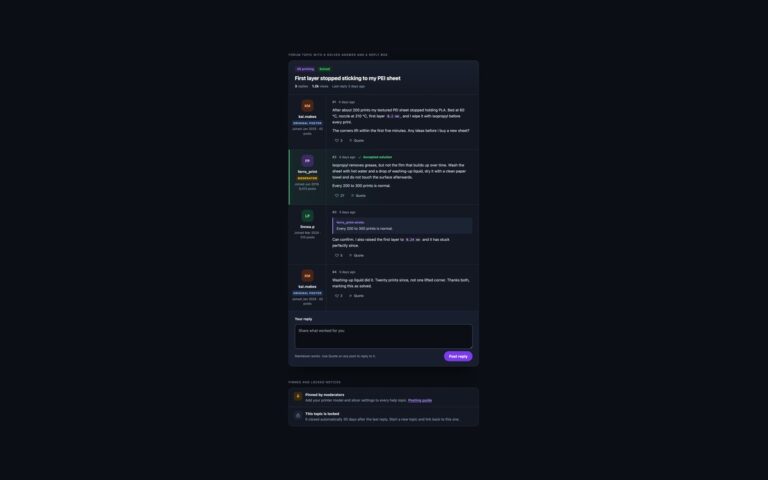
A forum topic in a dark theme, plus two notices that forums need sooner or later.
Dark UI Kit
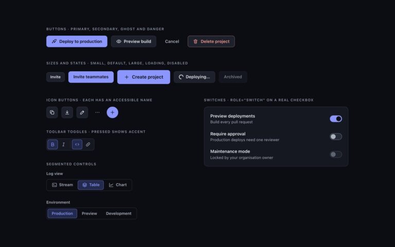
The buttons and toggles of the uiCookies dark UI kit. Buttons come as a primary accent button, a secondary button on the…
Dark UI Kit
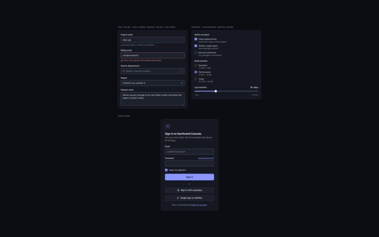
Form controls for the uiCookies dark UI kit and a complete login card.
Dark UI Kit
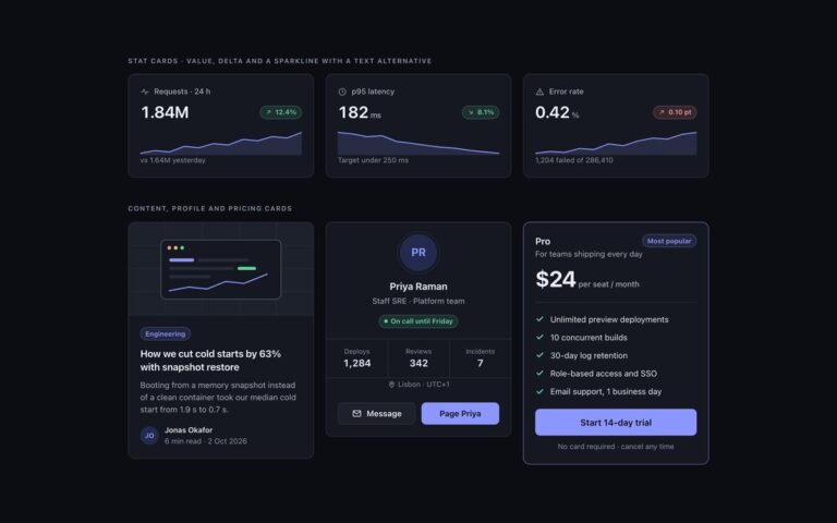
Cards from the uiCookies dark UI kit, built to show how elevation works without shadows.
Dark UI Kit
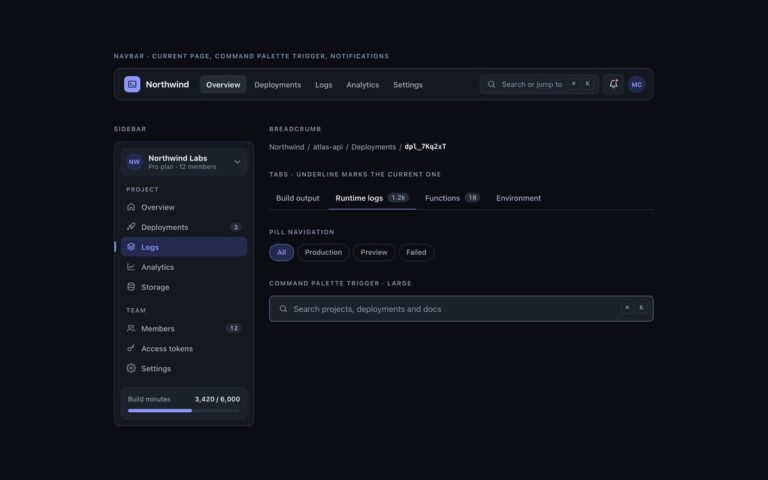
Navigation for the uiCookies dark UI kit. The navbar has a brand mark, main links with the current page marked by aria-current…
Dark UI Kit
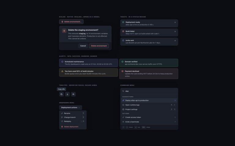
Overlays and feedback for the uiCookies dark UI kit. The dialog is a native dialog element for deleting an environment, shown inline…
Dark UI Kit
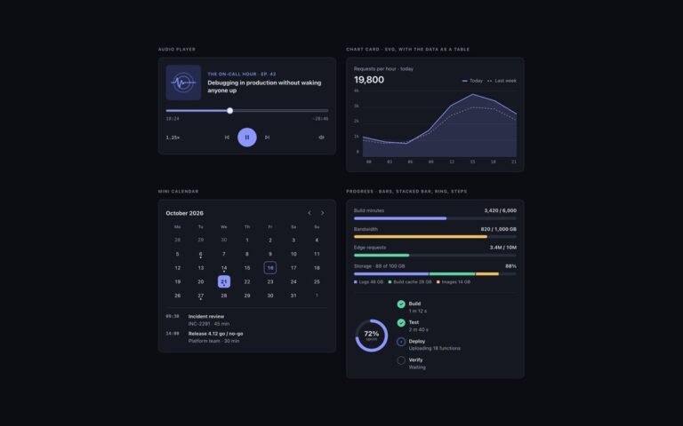
Media and data widgets for the uiCookies dark UI kit. The audio player has token-coloured cover art, a show line and episode…
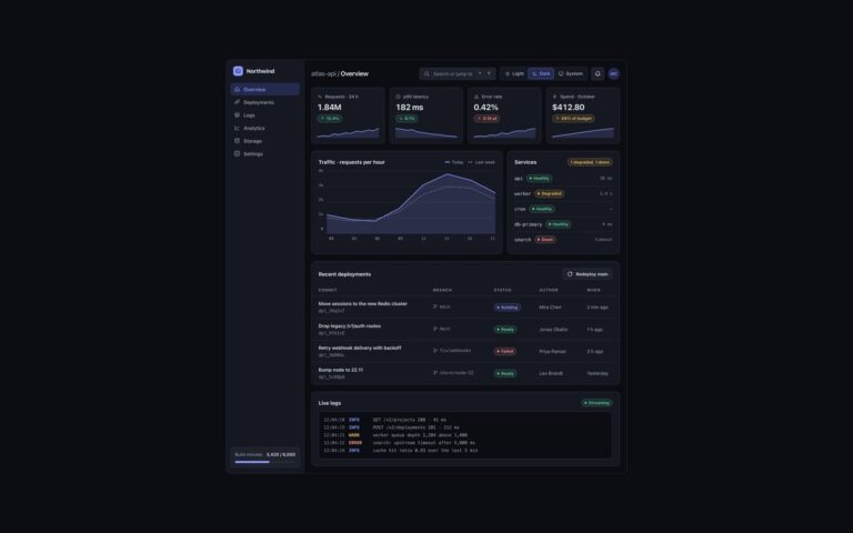
Dark UI Kit
A full developer console dashboard built only from the kit's components, with a working light, dark and system theme toggle.
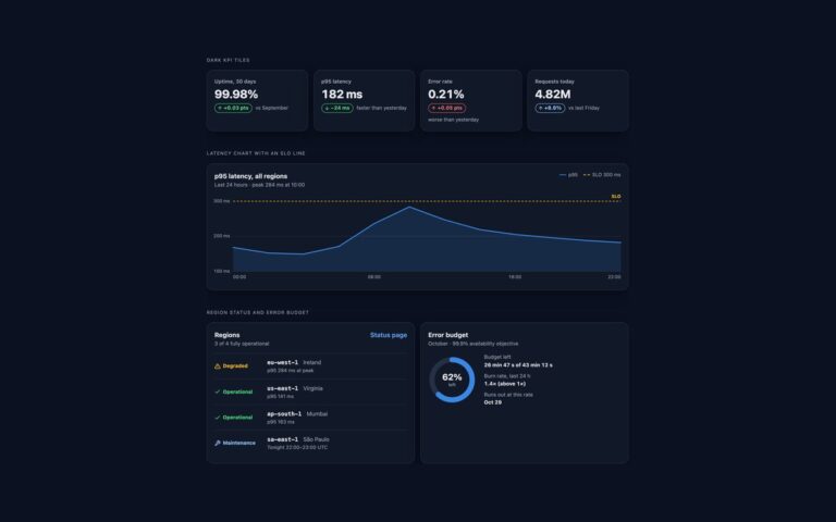
Dashboard Widgets
An ops dashboard on a near-black ground, where light-theme greys and blues lose contrast.
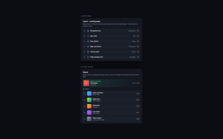
Drag and Drop
Drag and drop for dark interfaces, where the usual light grey placeholder disappears and focus rings are easy to lose.
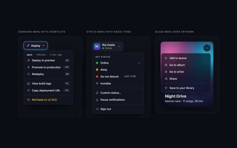
Dropdown Menus
Three dropdowns for dark interfaces. Command menu with shortcuts is a Deploy button with a gradient border and glow, whose menu starts…
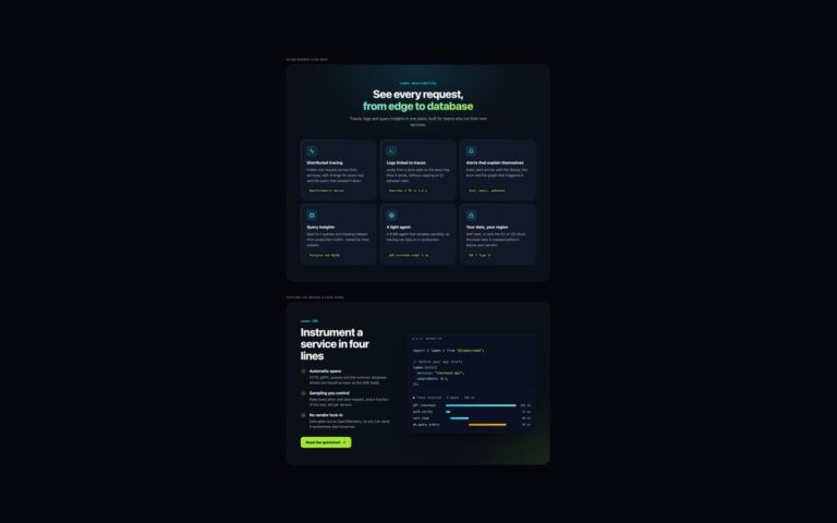
Feature Sections
Two feature sections for dark interfaces and developer products.
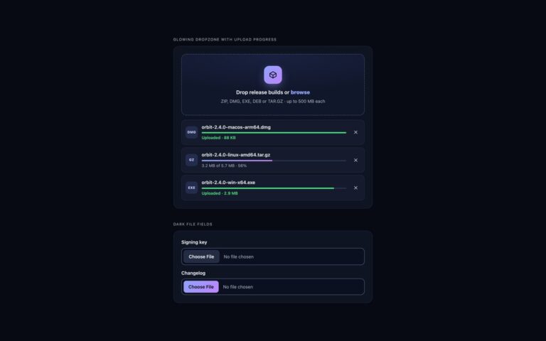
File Uploads
File upload components for dark interfaces such as developer tools, dashboards and media apps.
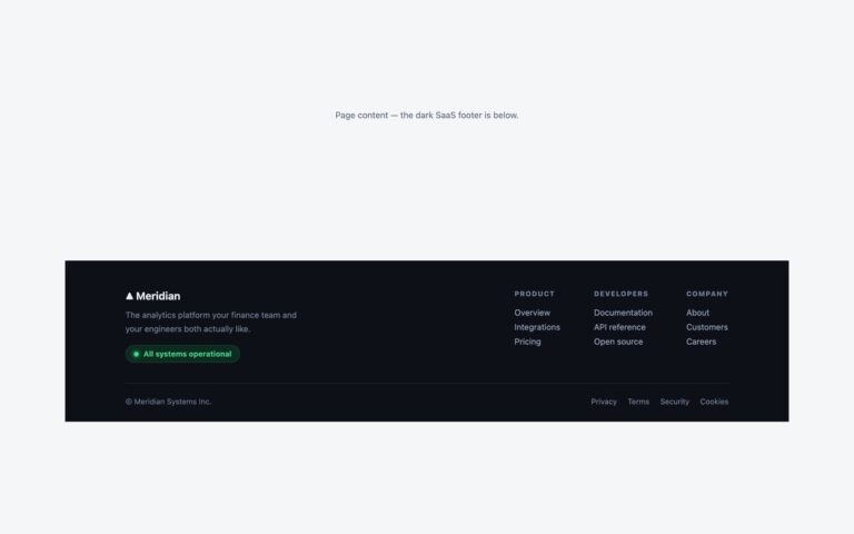
Footers
A near-black footer for software products. On the left sits the brand with a one-line pitch and a green pill link reading…
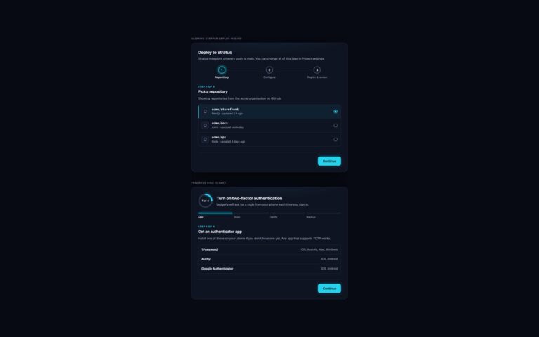
Form Wizards
Two multi-step forms for dark interfaces, with a cyan glow for the current step and lime for finished ones.
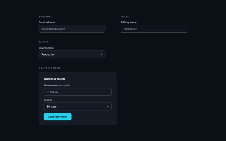
Forms
Form fields tuned for dark interfaces such as developer dashboards and admin panels, with a cyan accent.
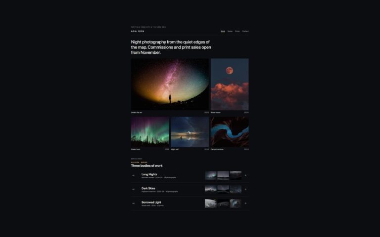
Galleries
Two dark layouts for a photographer's portfolio, where a black ground lets night and landscape photos glow.
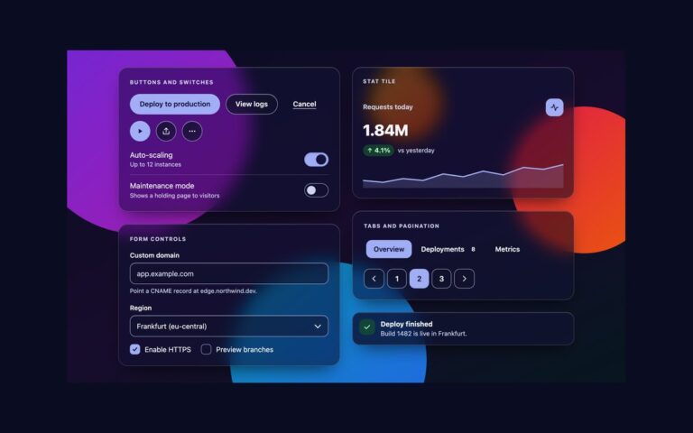
Glassmorphism
The core components of the uiCookies glassmorphism UI kit on the dark scene: buttons, icon buttons and switches, form controls, a stat…
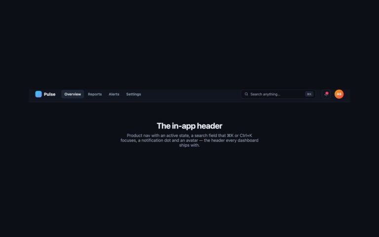
Headers
The header a dashboard or web app ships with, in a dark theme: a gradient logo mark, product navigation with a highlighted…
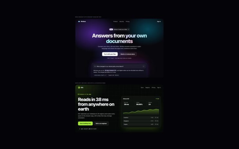
Hero Sections
Two dark heroes that get their depth from layered gradients rather than images.
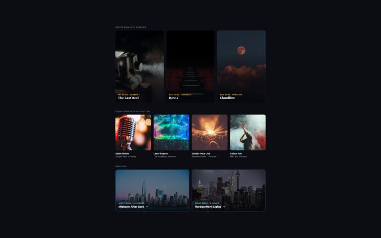
Hover Effects
Three hover treatments for dark interfaces, where a drop shadow disappears and light and colour have to do the work.
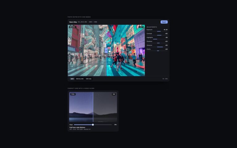
Image Compare
A comparison slider dressed as a photo editor, for photo apps, preset shops and retouching portfolios on a dark interface.
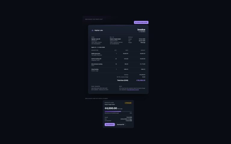
Invoices
A dark invoice and a dark invoice card for night-themed apps that still print as a normal light document.
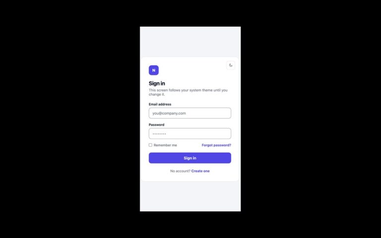
Login Forms
A login card with light and dark themes that follows the operating system until the person picks one.
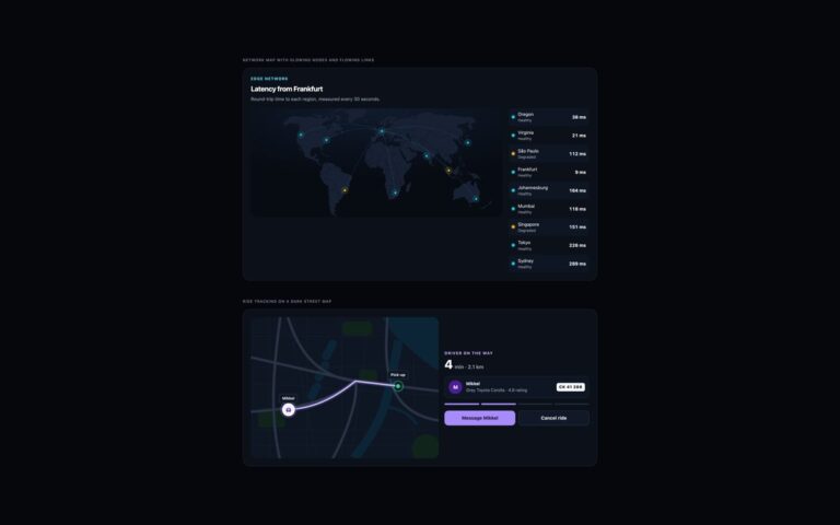
Maps
Two maps for dark dashboards and apps, drawn as inline SVG. The edge network map shows the world in deep slate with…
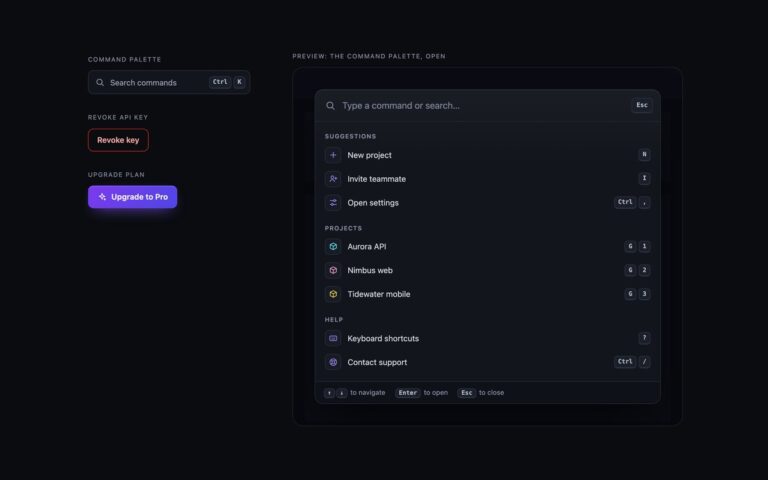
Modals
Three dark-theme dialogs for developer tools and SaaS dashboards: near-black panels with a hairline border, a soft top highlight, a cyan focus…
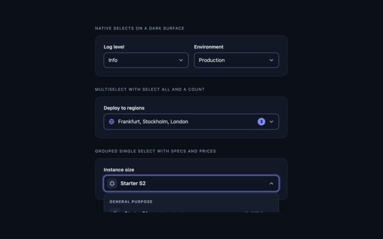
Multiselects
Selects for dark dashboards and developer tools, where light-theme controls lose their borders.
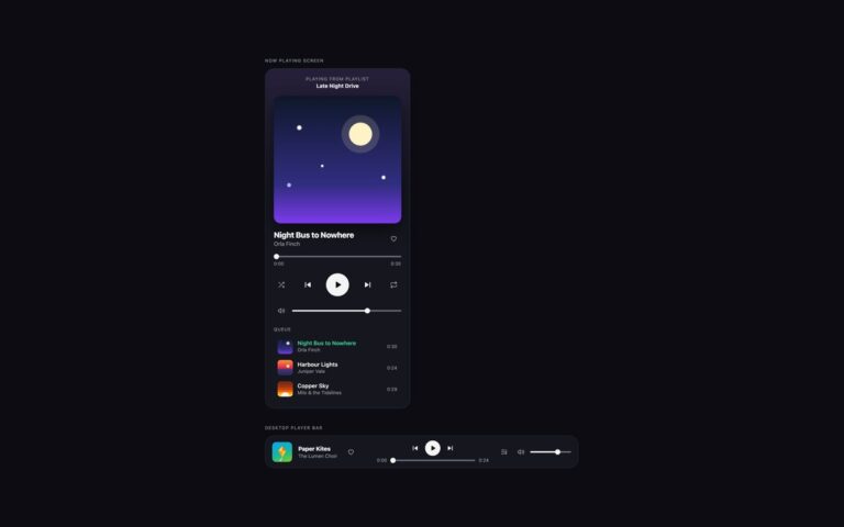
Music Players
Two players for dark streaming-style interfaces. The now playing screen is a phone-width card with the playlist it is playing from, a…
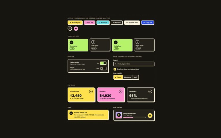
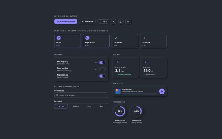
Neumorphism
The same kit on a dark surface, switched by one attribute. Put data-neu="dark" on any wrapper and the shared tokens change to…
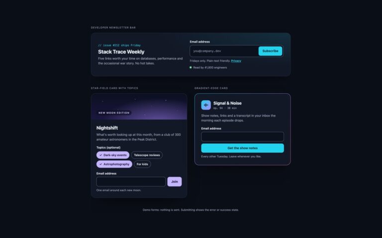
Newsletter Forms
Three newsletter sign-ups for dark sites and apps, where a light-theme form loses its contrast.
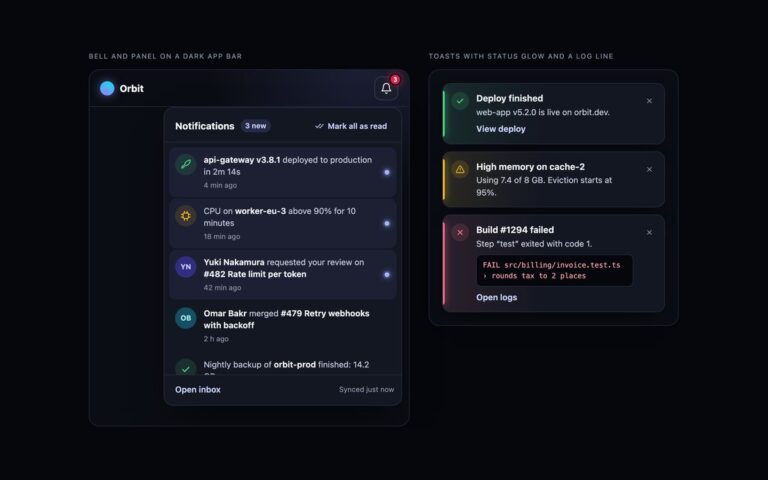
Notifications
Notification UI for dark dashboards and developer tools. A bell on a near-black app bar has a red count with a soft…
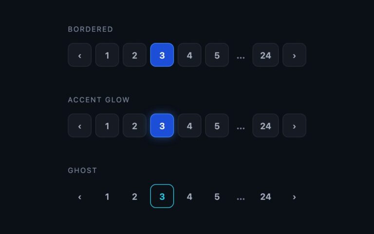
Pagination
Numbered pagination built for dark interfaces such as dashboards, developer tools and media sites.
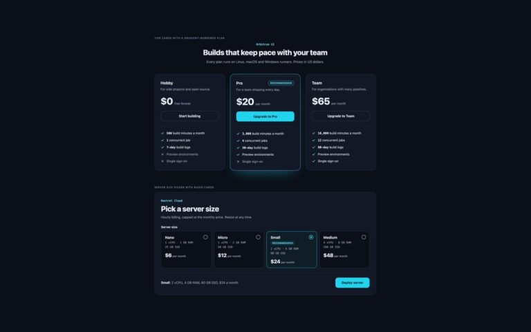
Pricing Tables
Pricing for dark interfaces such as developer tools and hosting dashboards, with colours checked for contrast on a near-black ground.
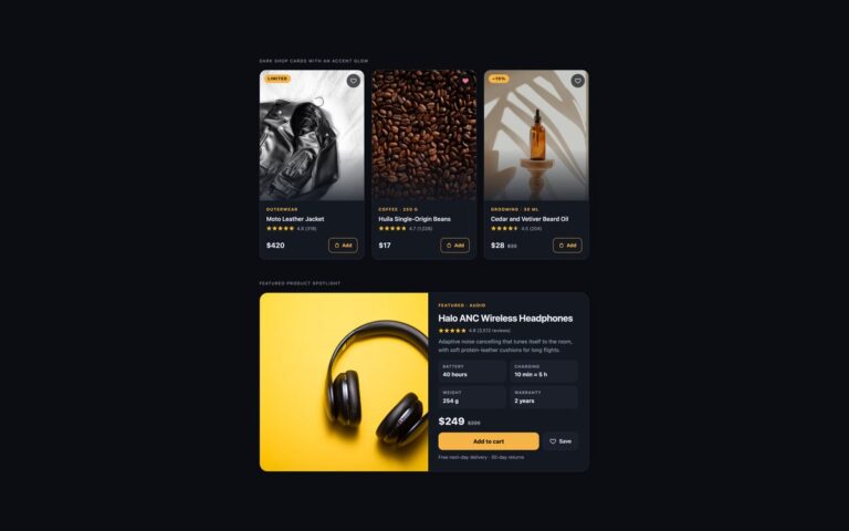
Product Cards
Product cards for a dark storefront, such as a premium fashion, coffee, grooming or audio shop.
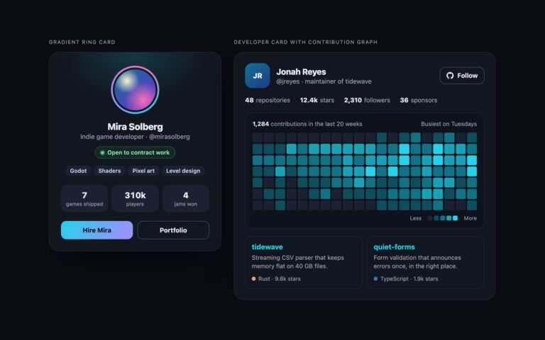
Profile Cards
Profile cards for dark interfaces such as game, developer and music sites.
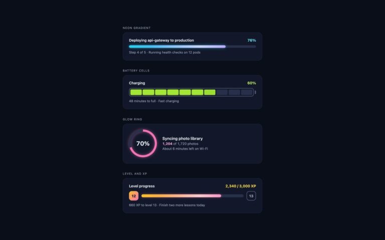
Progress Bars
Progress bars for dark dashboards, developer tools, games and night-mode apps, where a light-theme bar looks flat.
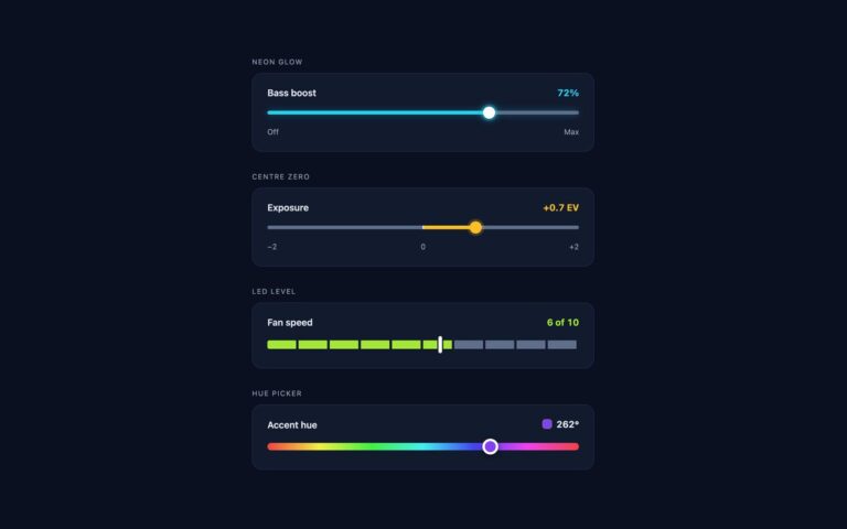
Range Sliders
Four sliders drawn for dark interfaces, where a light theme slider loses its track against the background.
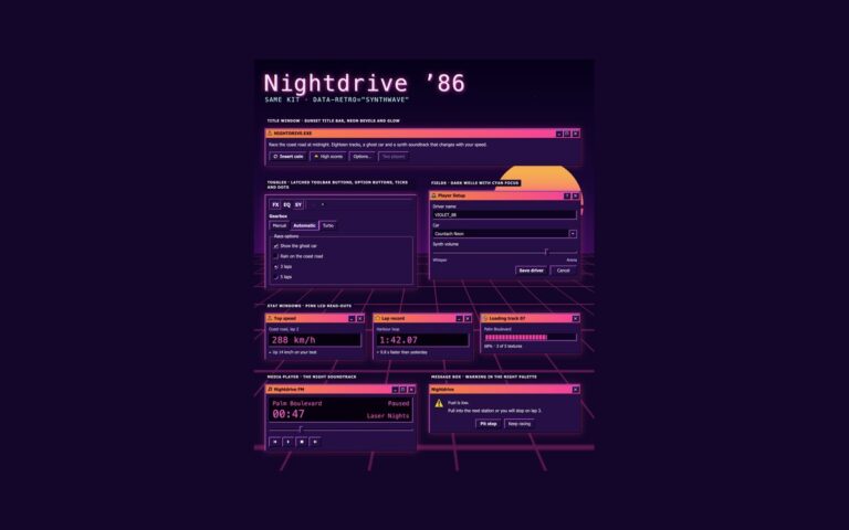
Retro UI
The night variant of the kit: the same buttons, toolbars, fields, windows and widgets with data-retro="synthwave" on a wrapper.
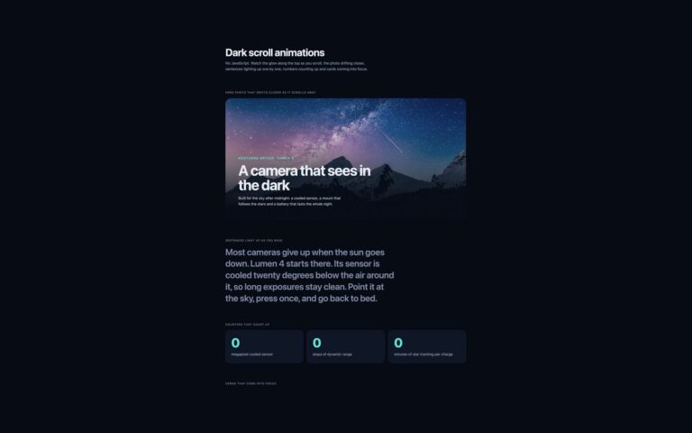
Scroll Animations
A dark product page for a night sky camera with five scroll effects and no JavaScript.
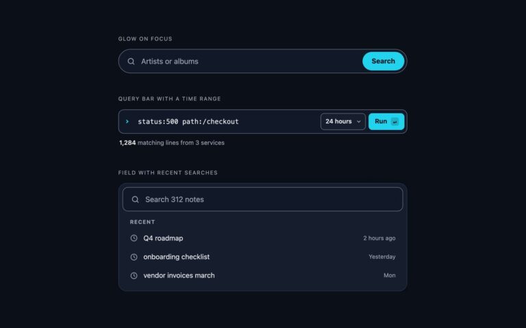
Search Bars
Search bars for dark interfaces, where a light-theme field becomes a grey smudge.
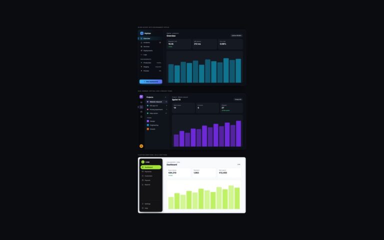
Sidebars
Three sidebars for dark interfaces, where light-theme greys turn into mud and focus rings vanish.
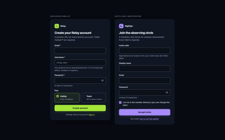
Registration Forms
Two registration forms for dark interfaces such as developer tools and members' communities.
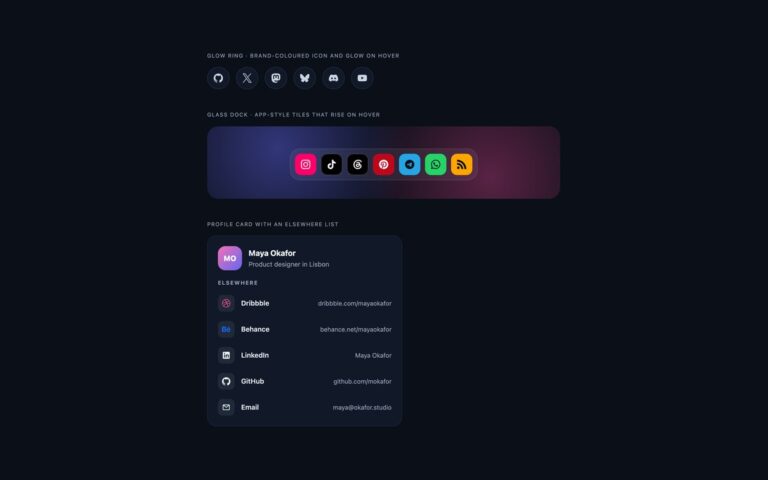
Social Media Icons
Social icons designed for near-black interfaces, where icons made for a light page lose contrast.
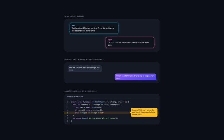
Speech Bubbles
Speech bubbles for dark interfaces, where a white or pale grey bubble turns into a glaring block.
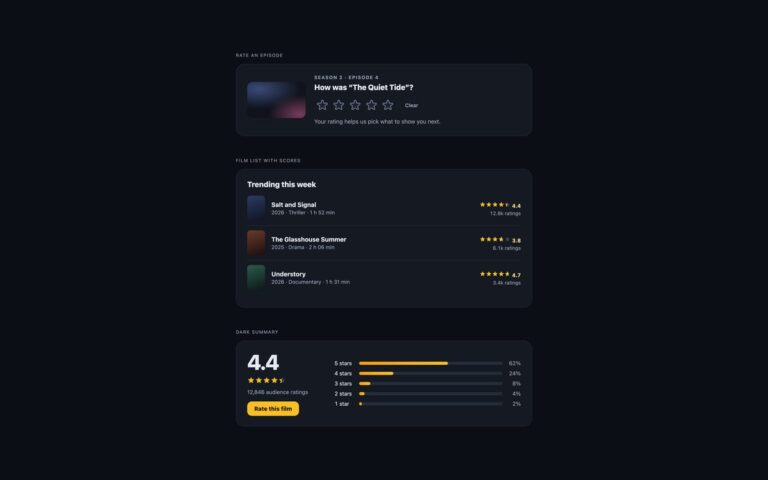
Star Ratings
Star ratings tuned for dark interfaces such as streaming apps and media libraries.
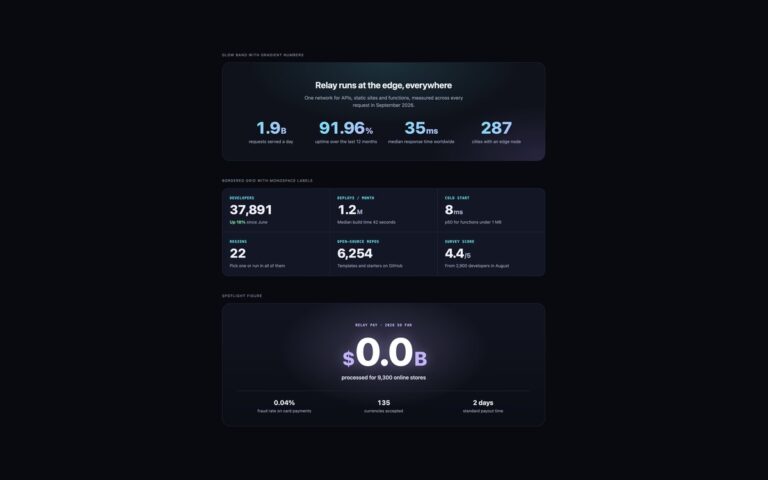
Stats Counters
Stats sections for dark landing pages, where light-theme numbers lose their contrast.
Tables
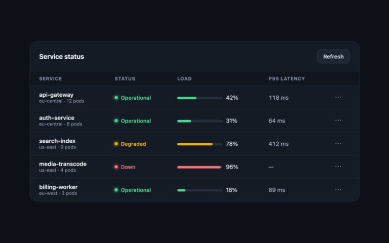
A dark admin panel for service health: a header bar with a title and a Refresh button, then a table of services…
Tabs
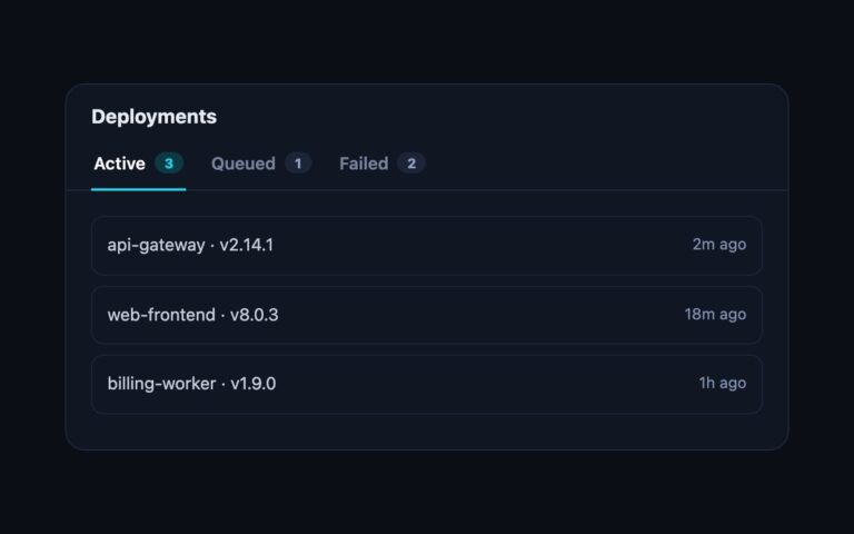
A dark card titled Deployments with three underline tabs, Active, Queued and Failed, each followed by a small count pill, and a…
Testimonials
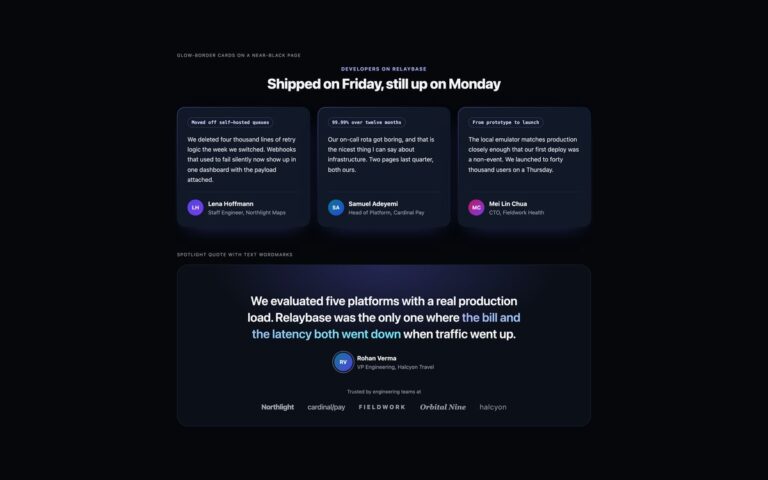
Testimonials for a dark developer tool or SaaS site, where a light card on a black page looks out of place.
Timelines
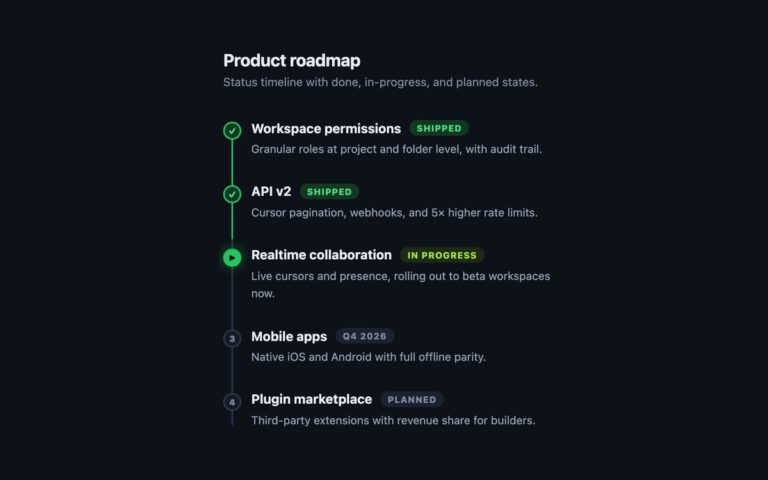
A dark product roadmap that shows status as well as order. Five items run down a thin line: two are Shipped with…
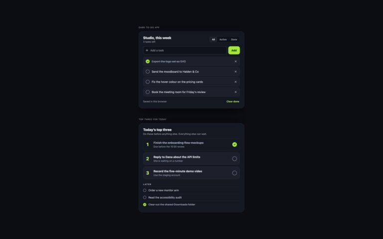
To-Do Lists
To-do lists for dark interfaces, with colours checked for contrast on a near-black ground.
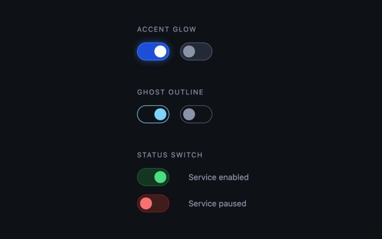
Toggles
Switches designed for dark interfaces, where a switch made for a light theme loses its edges.
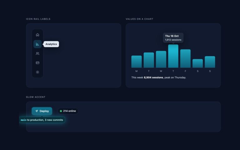
Tooltips
Tooltips for dark dashboards, where a black tooltip disappears into a near-black page.
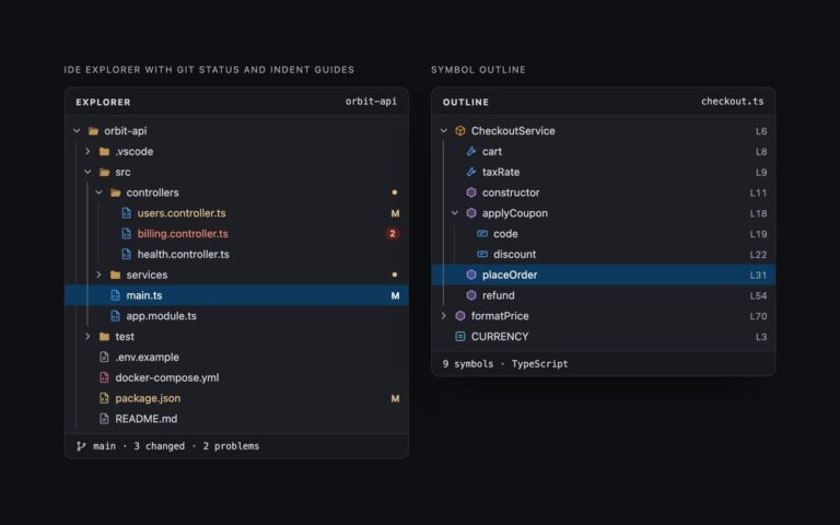
Tree Views
Two dark trees in the style of a code editor's side panel. IDE explorer with git status and indent guides shows an…
Video Players
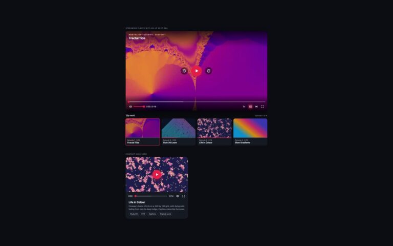
Two dark players in the style of a streaming app. The streaming player shows the series name and episode title at the…