About this set
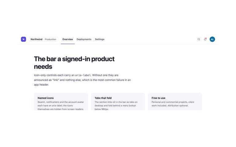
The header a dashboard or web app ships with, in a dark theme: a gradient logo mark, product navigation with a highlighted active page (Overview, Reports, Alerts, Settings), a search field with a ⌘K hint, a notification button with a red unread dot and a round avatar that links to the account page. The search is a real form with a search landmark, and pressing ⌘K or Ctrl+K anywhere focuses it; on a narrow screen the shortcut first opens the menu. The notification button is named Notifications, 3 unread, and the avatar initials are hidden from screen readers in favour of the text Your account. Below 992px the navigation and the search fold into a panel behind a menu button, while the bell and avatar stay in the bar. Use it for admin panels, analytics tools and any signed-in area. The icons are inline SVG that follow currentColor. The Bootstrap version sets data-bs-theme=”dark” on the .navbar, uses a .form-control for the search and draws the dot with position and rounded-circle utilities.
What’s included
- Search form that ⌘K or Ctrl+K focuses
- Active page highlighted and marked with aria-current
- Notification button with an unread dot
- Avatar link to the account page
- Nav and search collapse behind a menu button below 992px
Accessibility
The product links sit in a nav labelled Main, the search is a form with role="search" and a labelled input that advertises its shortcut with aria-keyshortcuts, and the icon buttons have text names. The menu button has aria-expanded and aria-controls and Esc closes it. Focus shows as a cyan outline on the dark background and transitions switch off under prefers-reduced-motion.
Customise it
Change --hdk-bg, --hdk-ink, --hdk-muted, --hdk-line and --hdk-focus on .hdk; the logo and avatar gradients are single declarations. Bootstrap reads the same variables and --bs-navbar-*; in Tailwind edit the --color-hdk-* theme colours.