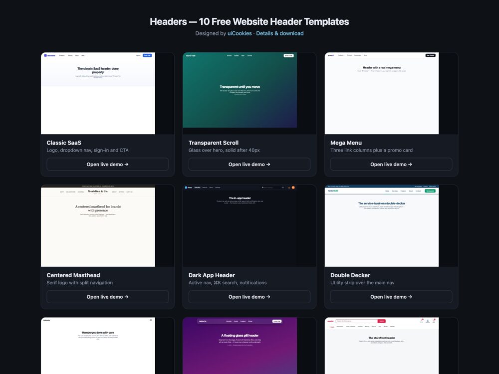
Twenty-two website header designs, built and maintained in-house by uiCookies. Marketing bars, application headers, mastheads, mega menus, storefront bars and side navigation — every one a single HTML file with the CSS inline, free for commercial use.
A header is the one component every page has, and the one most templates get wrong in the same two ways: it works at 1440px and falls apart at 380px, and it looks right until someone reaches it with a keyboard. Every design on this page was checked at 380px for horizontal overflow and every control was checked for an accessible name before it shipped.
Free download Browse live demos
Choosing a header layout
Most of the decision is made by what kind of site you are building and whether the header needs to stay on screen. This is the shortest route to a shortlist:
| Design | Best for | Positioning |
|---|---|---|
| Classic SaaS Header | Product and marketing sites | Sticky |
| Transparent-to-Solid Header | Sites with a full-bleed hero | Fixed |
| Mega Menu Header | Large catalogues and multi-product sites | Sticky |
| Centered Masthead | Portfolios, studios and brands | Static |
| Dark In-App Header | Dashboards and signed-in products | Sticky |
| Double-Deck Service Header | Agencies, clinics and local services | Static |
| Hamburger Drawer Header | Content-heavy sites and mobile-first designs | Fixed |
| Floating Glass Pill | Modern product and landing pages | Fixed |
| Storefront Header | Online shops | Sticky |
| Neobrutalist Header | Editorial and personality-led sites | Static |
| Announcement Bar Header | Launches, sales and notices | Sticky |
| Search-First Header | Documentation and template libraries | Sticky |
| Split Navigation Header | Fashion, hospitality and brand sites | Static |
| Minimal Text Header | Portfolios and writing sites | Static |
| Dual CTA Header | SaaS and subscription products | Sticky |
| Vertical Side Header | Agencies and portfolio sites | Fixed |
| Shrinking Sticky Header | Long-form marketing pages | Sticky |
| Header with Breadcrumbs | Documentation and deep catalogues | Sticky |
| Header with Locale Switcher | Sites shipping in several markets | Sticky |
| Application Header | Signed-in products | Sticky |
| Editorial Masthead | Magazines, blogs and publications | Static |
| Header with Reading Progress | Long articles and documentation | Sticky |
What belongs in a header
Three things earn their place without argument: a logo that links home, the primary navigation, and at most one prominent action. Everything after that is a negotiation.
Search belongs in the header when the site is large enough that browsing is slower than searching — documentation, a template library, a shop with real depth. An account control belongs there when people sign in on most visits. A language selector belongs there only if the site genuinely ships in several markets; otherwise it is a permanent reminder of a decision nobody needs to make. A phone number belongs there for a business people ring, which is why the double-deck design gives it a strip of its own.
The test for anything else is simple: would most visitors use it on most visits? If not, it belongs in the footer, where nobody minds a long list.
Sticky, fixed or static
Static headers scroll away and stay away. They cost nothing, never cover content, and are the right answer for short pages and most phone layouts.
Sticky headers scroll with the page and stop at the top. This is the sensible default for a long marketing page — the navigation is there when someone wants it without permanently taking a slice of the viewport.
Fixed headers never move. Reserve them for interfaces where the bar is part of the tool rather than part of the page: an application header, a documentation site with persistent search.
Whichever you pick, set scroll-padding-top on the html element to the header height. Without it every in-page anchor scrolls its target underneath the header, and readers land on a section whose heading they cannot see — the single most common bug that ships with a sticky header.
Making a header work on a phone
Decide what to drop before deciding what to collapse. A header with a logo, five links, a search field, a language selector and two buttons cannot be rearranged into 380px — something has to go.
The order that usually works: hide tertiary controls outright, move the primary navigation behind a menu button, keep the logo and one action. The vertical header here collapses to a horizontal bar entirely, because a side rail costs width a phone does not have. The breadcrumb header lets its trail scroll sideways rather than forcing the page wide.
Test at 380px, not 768px. Every design on this page was checked for horizontal overflow at that width, and five of the twelve new ones needed a media query before they passed.
Accessibility checklist
- Use a real
<header>and a real<nav>. They create landmarks a screen reader user can jump between; a styled<div>does not. - Mark the current page with
aria-current="page"and style from that attribute rather than an.activeclass, so the visual state and the announced state cannot drift apart. - Give every icon-only control an
aria-label. A basket or bell with no text is announced as “link” and nothing else. - Keep a visible focus state, and prefer
:focus-visibleso the ring appears for keyboard users without flashing on every mouse click. - Add a skip link as the first focusable element on the page. Without one, a keyboard user tabs through the entire navigation on every single page.
- If the header has more than one navigation region — a main nav and a breadcrumb — give each an
aria-labelso they are distinguishable.
Performance notes
Two things in a header show up in Core Web Vitals. A bar that changes height on scroll shifts the content beneath it and is recorded as layout shift; the shrinking design here avoids that by animating only its own height, with the page content unaffected. And a scroll handler that writes styles every frame costs responsiveness — toggle a class past a threshold and let a CSS transition do the rest, which is what the shrinking and transparent designs do.
The frosted glass design is the one to measure. backdrop-filter is expensive to composite over a busy background, and a mid-range phone will show it before a laptop does.
The 22 designs
1. Classic SaaS Header
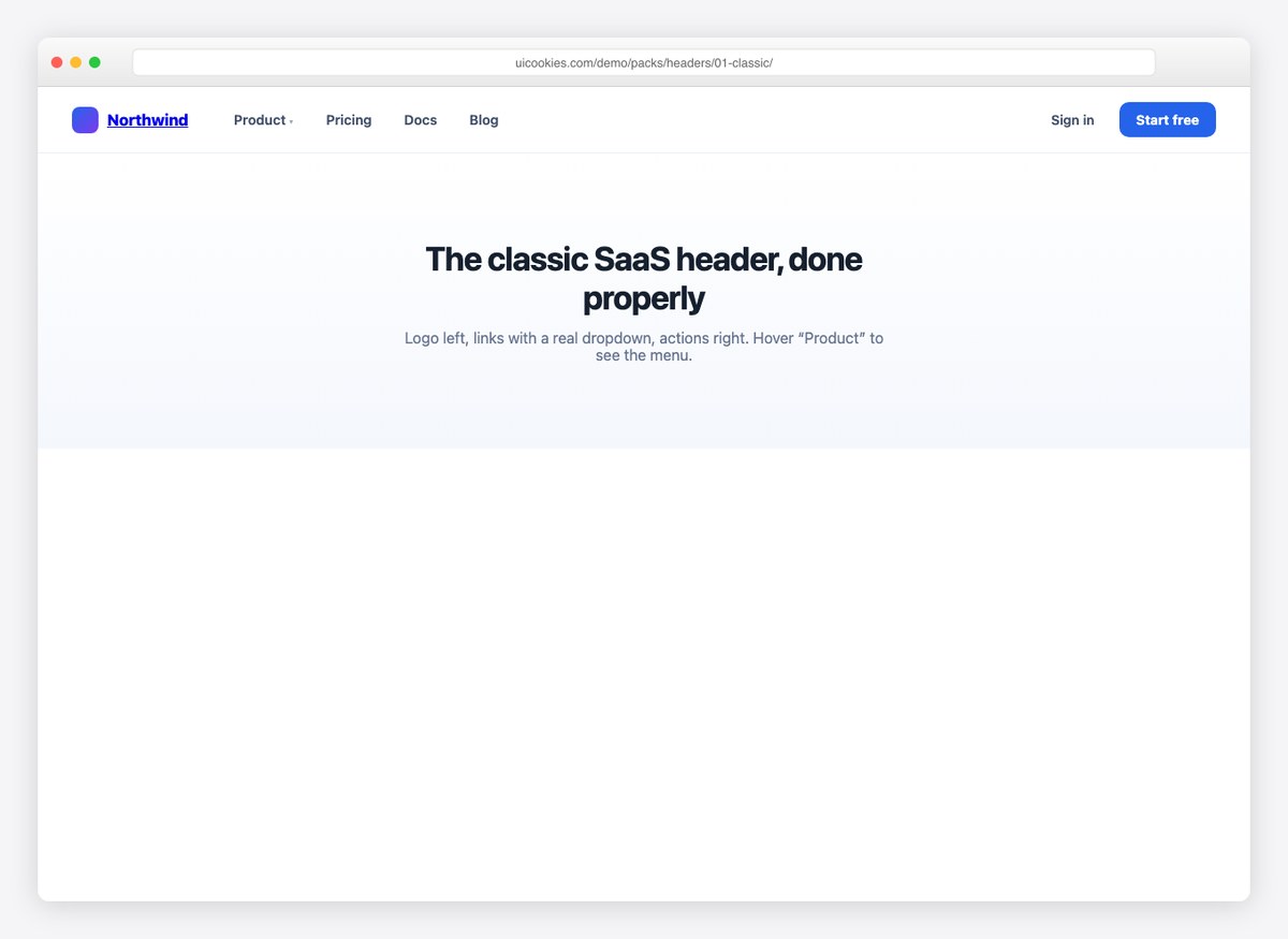
Logo left, navigation centre, a single call to action right. It is the arrangement most visitors have seen a thousand times, which is exactly why it needs no explaining.
Start here unless you have a reason not to. A familiar header costs nothing in attention and leaves the page free to do the persuading.
Live Demo CSS, Bootstrap & Tailwind code
2. Transparent-to-Solid Header
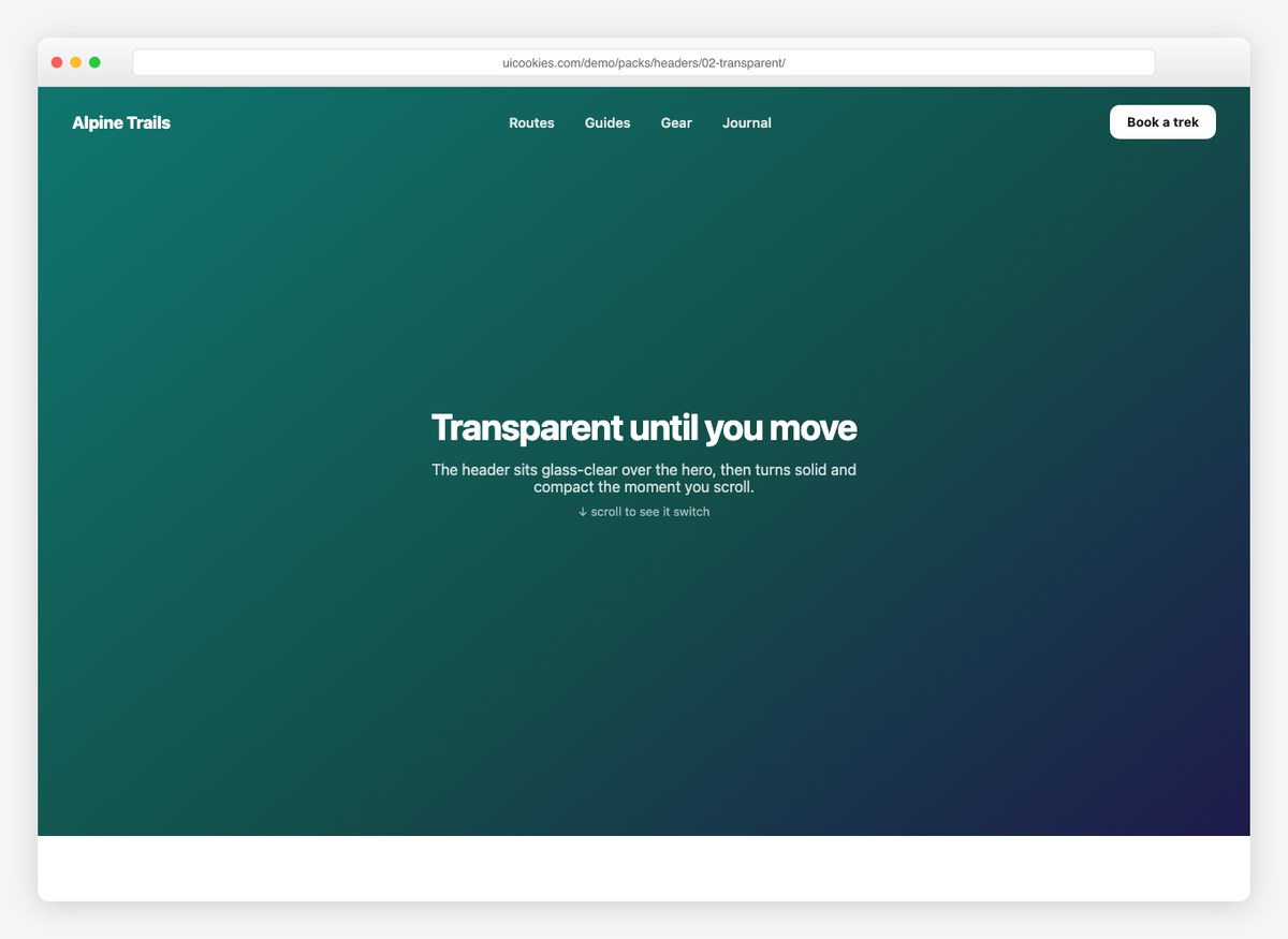
The header sits over the hero image with no background of its own, then takes on a solid fill and a shadow once the page scrolls past it.
The trap is contrast: white nav links over an unknown photograph can be unreadable. Either commit to a dark scrim over the hero or pick images you control.
Live Demo CSS, Bootstrap & Tailwind code
3. Mega Menu Header
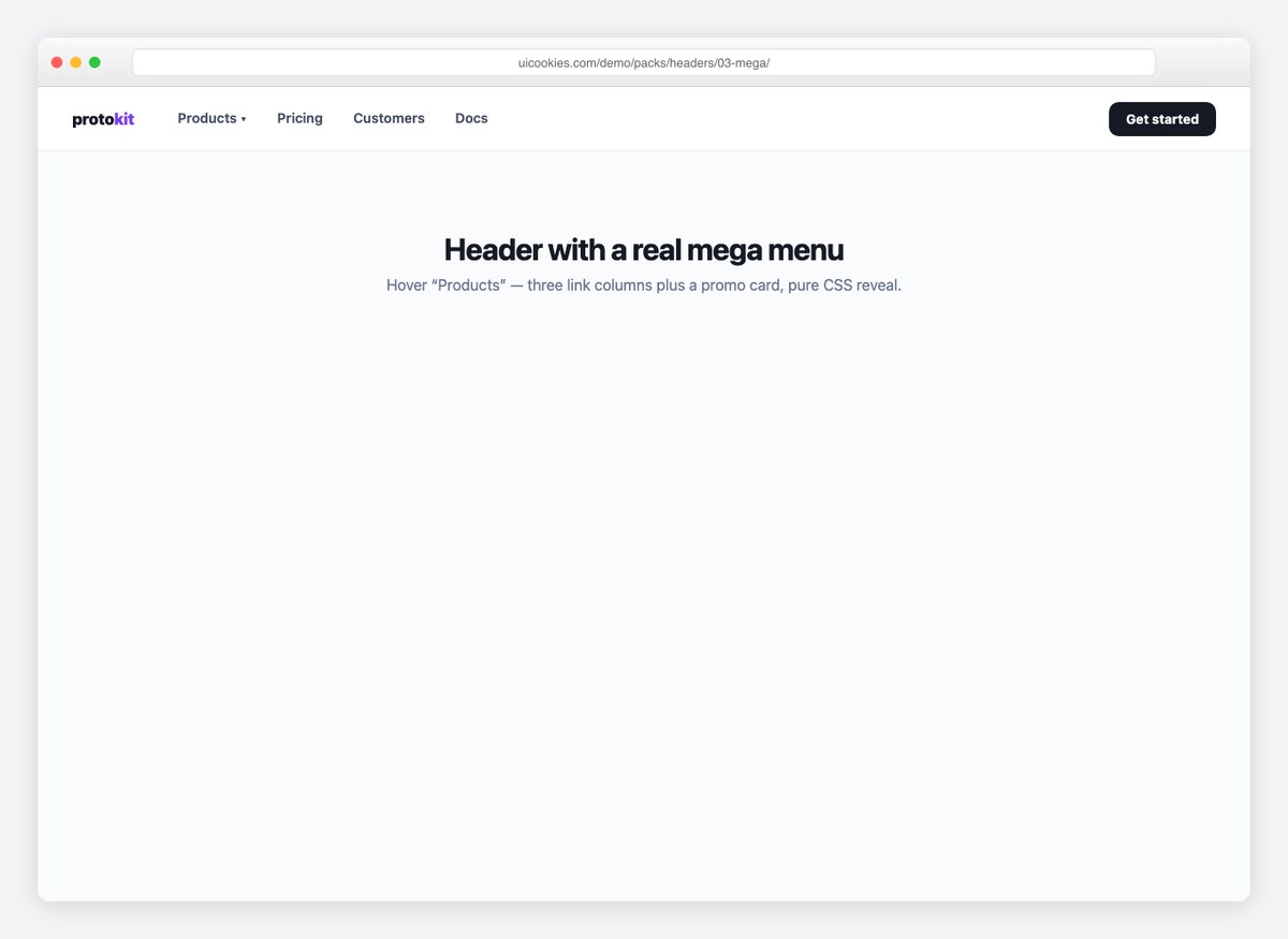
A full-width panel drops beneath the bar, holding several columns of grouped links with room for descriptions rather than bare labels.
Worth it once a section has more than about seven children. Below that a mega menu is a lot of surface area for a short list.
Live Demo CSS, Bootstrap & Tailwind code
4. Centered Masthead
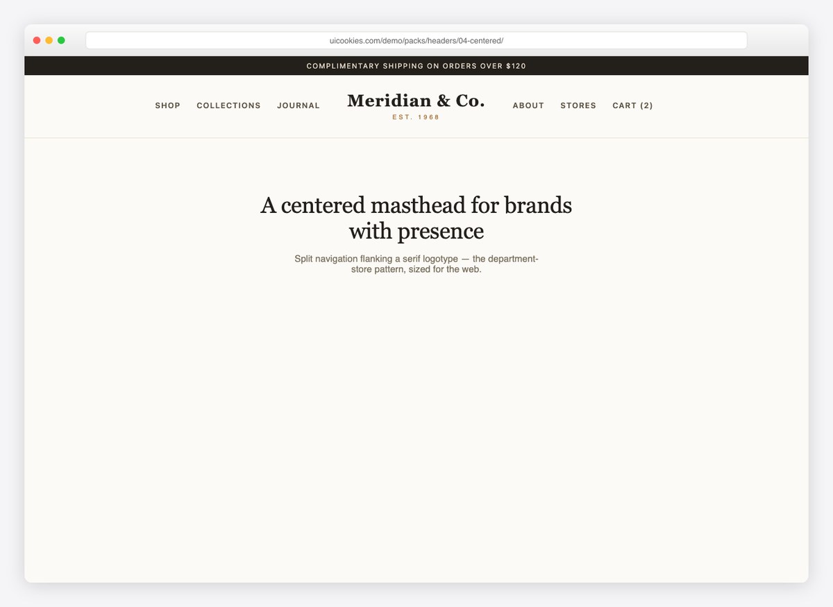
The wordmark sits centred above the navigation, giving the brand the full width of the page before any links appear.
It costs vertical space, so it suits a site where the first impression matters more than getting people straight into a menu.
Live Demo CSS, Bootstrap & Tailwind code
5. Dark In-App Header
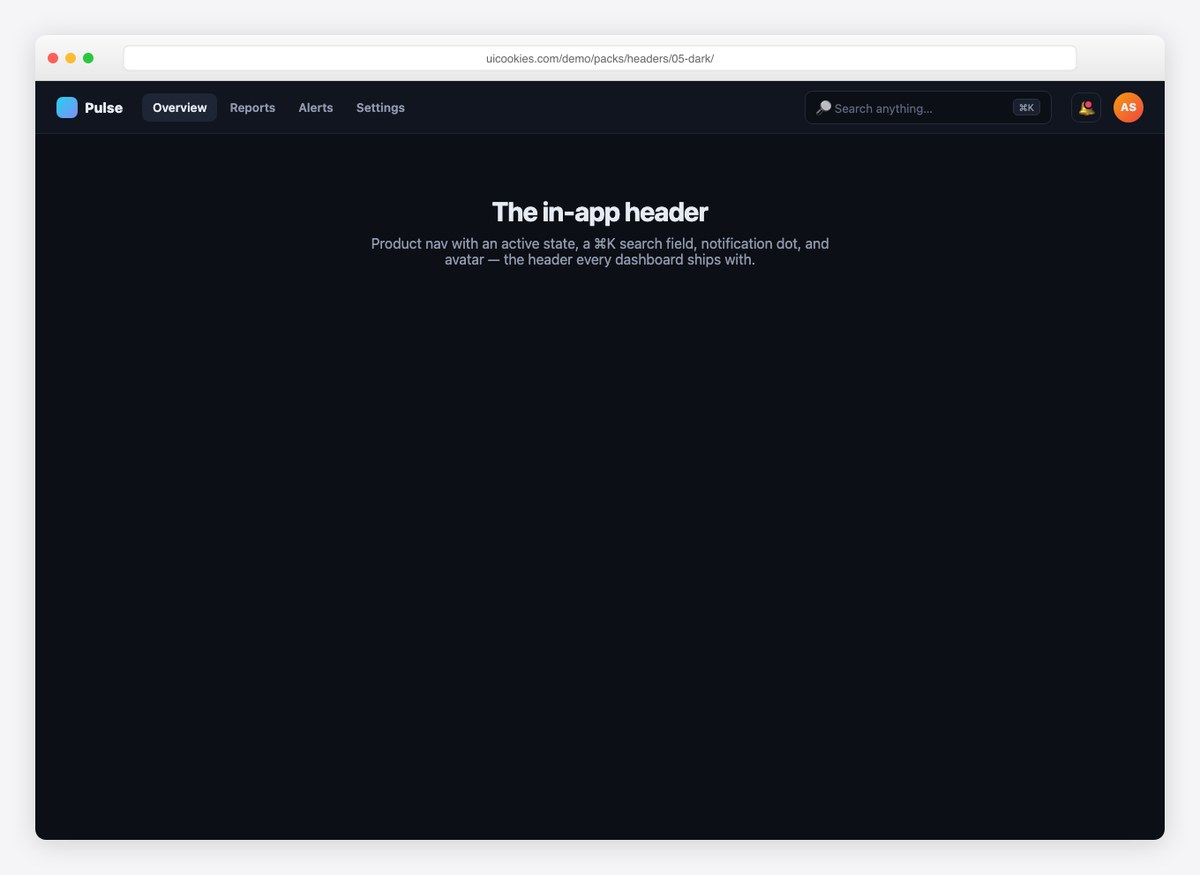
A compact dark bar sized for an application rather than a marketing page — shorter, denser, and quieter so the interface below it can carry the colour.
Application headers should shrink, not grow. Every pixel here is one the actual product does not get.
Live Demo CSS, Bootstrap & Tailwind code
6. Double-Deck Service Header
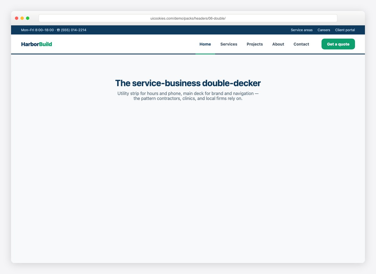
A top strip carrying a phone number and opening hours, with the main navigation on the row beneath it.
For a business people ring rather than sign up to, the contact strip is doing more work than the nav is. Put it where the eye lands first.
Live Demo CSS, Bootstrap & Tailwind code
7. Hamburger Drawer Header
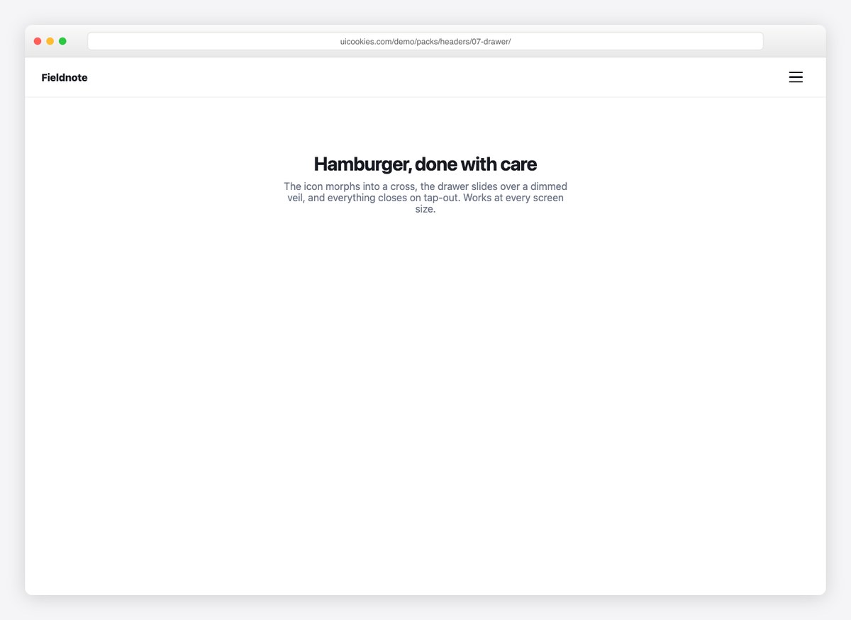
A minimal bar with the navigation behind a menu button, sliding in as a full-height drawer.
A hamburger on desktop hides links people would have used. It earns its place when the menu is genuinely long, or when the design needs the bar to stay almost empty.
Live Demo CSS, Bootstrap & Tailwind code
8. Floating Glass Pill
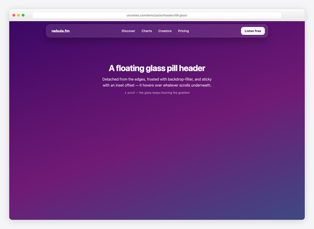
A rounded bar floating clear of the top edge with a frosted backdrop, so the page shows through it as it scrolls.
The frosted effect uses backdrop-filter, which is expensive to composite over a busy background — worth checking on a mid-range phone before committing to it.
Live Demo CSS, Bootstrap & Tailwind code
9. Storefront Header
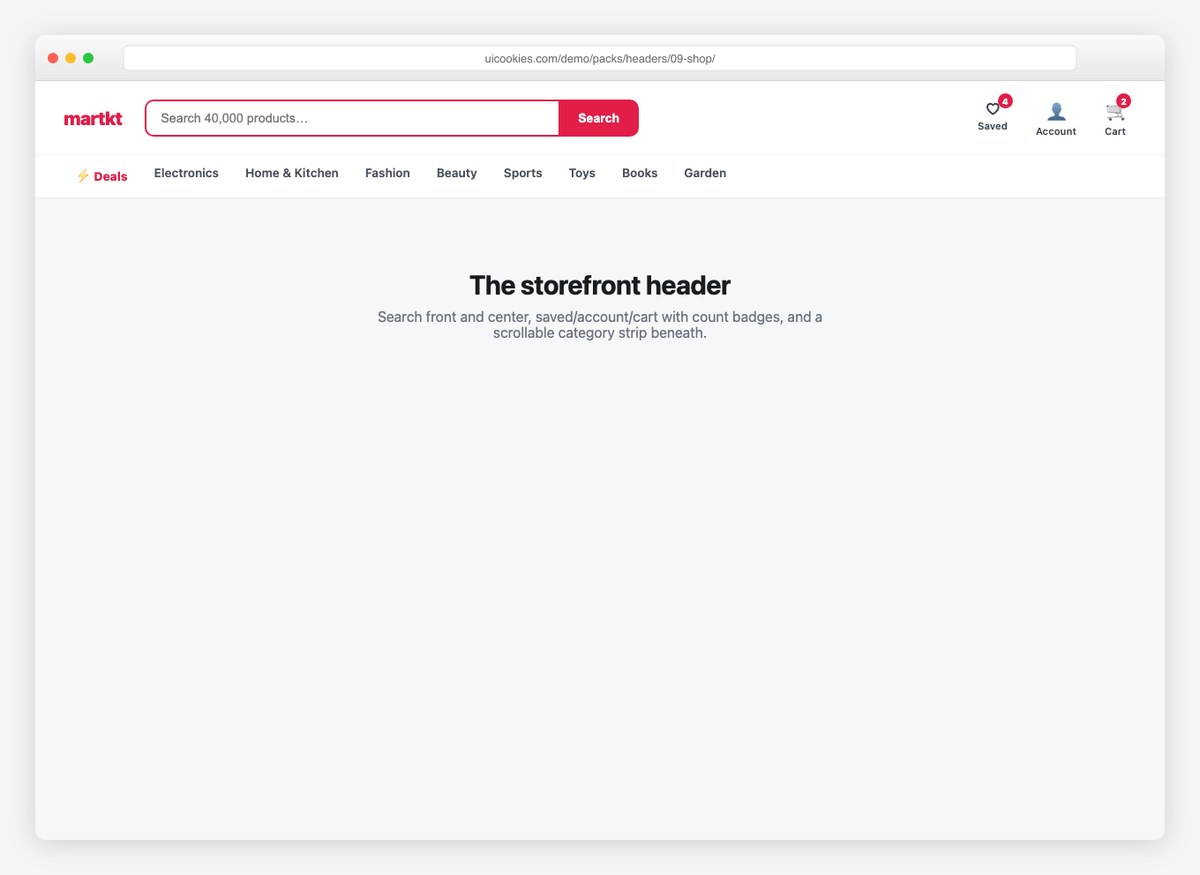
Search, account and a basket with a live count, arranged so the three things a shopper actually reaches for are never more than one tap away.
The basket count belongs in the markup, not a background image, so it can be announced and updated without a repaint.
Live Demo CSS, Bootstrap & Tailwind code
10. Neobrutalist Header
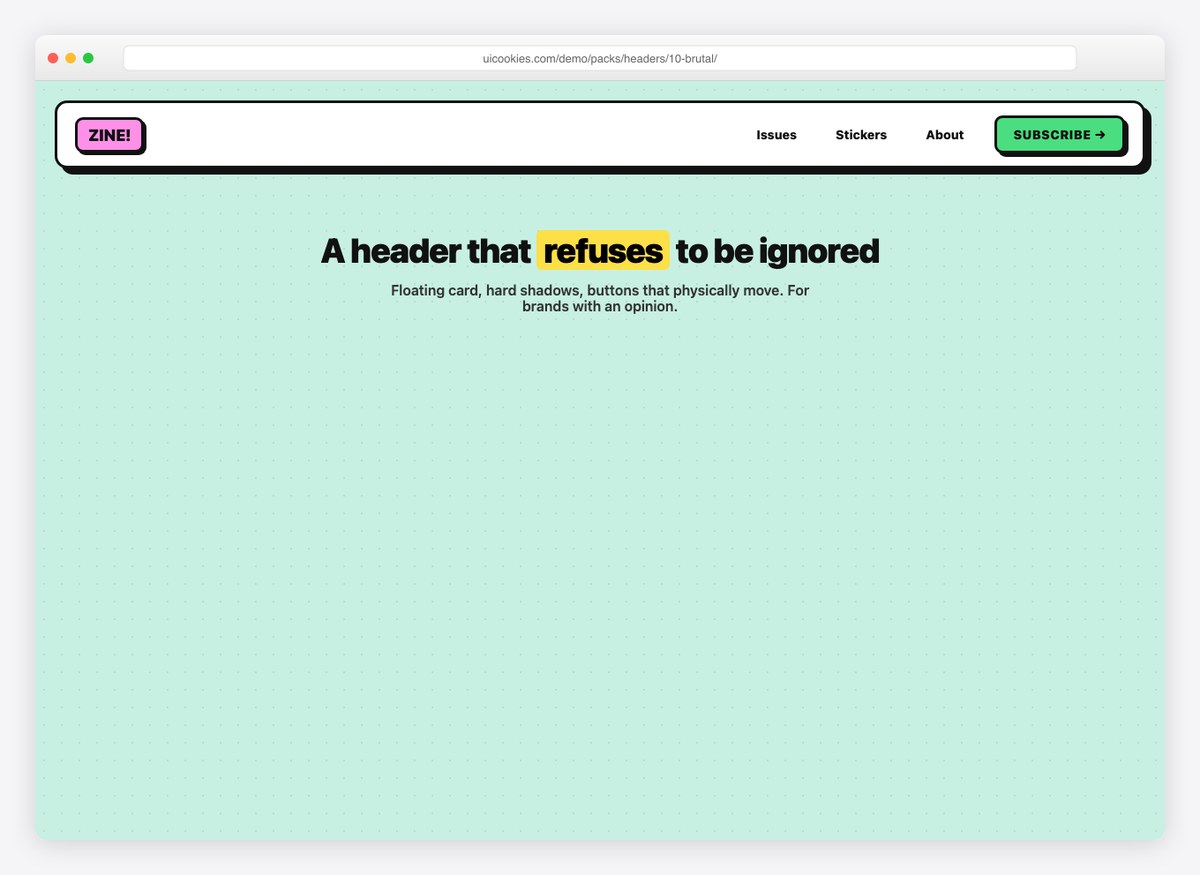
Heavy borders, a hard offset shadow and flat colour — a deliberately loud bar for a site that wants to look nothing like a template.
Check the contrast before shipping it. Neobrutalist palettes tend to pair mid-saturation colours that look decisive and fail AA.
Live Demo CSS, Bootstrap & Tailwind code
11. Announcement Bar Header
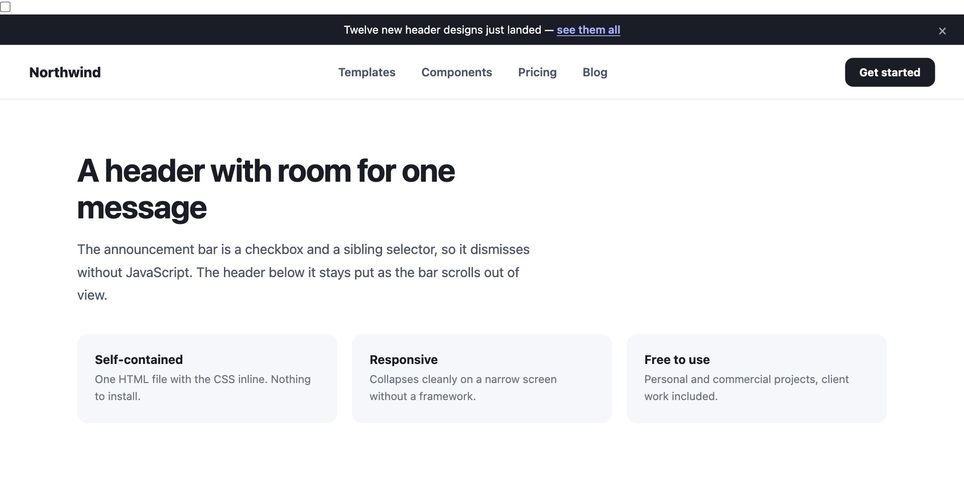
A dismissible strip above the header carrying one message, with the header itself sticking to the top once the bar scrolls away.
The dismiss is a checkbox and a sibling selector — no JavaScript, and no flash of the bar reappearing on the next page load if you persist the state server-side.
Live Demo CSS, Bootstrap & Tailwind code
12. Search-First Header
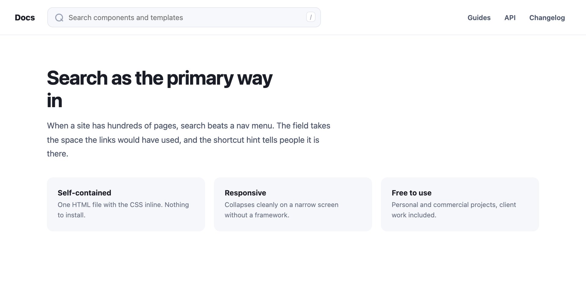
A wide search field takes the space the navigation would have used, with a keyboard shortcut hint at the end of it.
Once a site has a few hundred pages, search beats a menu. The hint matters — a search field nobody knows is focusable gets used far less.
Live Demo CSS, Bootstrap & Tailwind code
13. Split Navigation Header
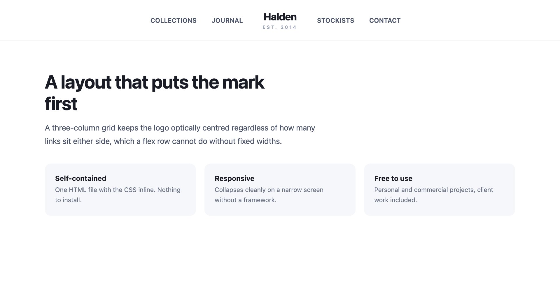
The logo sits centred with navigation divided either side of it, on a three-column grid.
The grid is what keeps the mark optically centred no matter how many links sit either side. A flex row cannot do that without fixed widths.
Live Demo CSS, Bootstrap & Tailwind code
14. Minimal Text Header
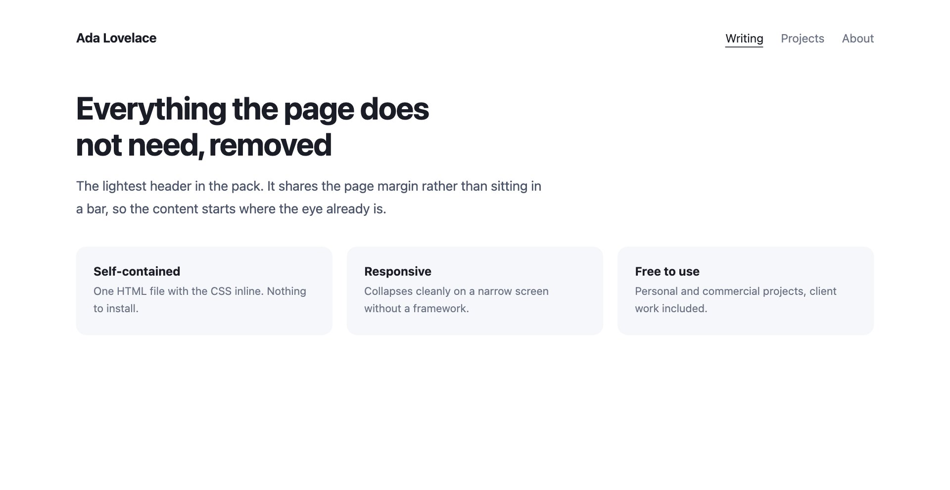
No bar, no border, no background — a wordmark and three links sharing the page margin, with an underline that draws in on hover.
The lightest header in the pack. Content starts where the eye already is rather than below a band of chrome.
Live Demo CSS, Bootstrap & Tailwind code
15. Dual CTA Header
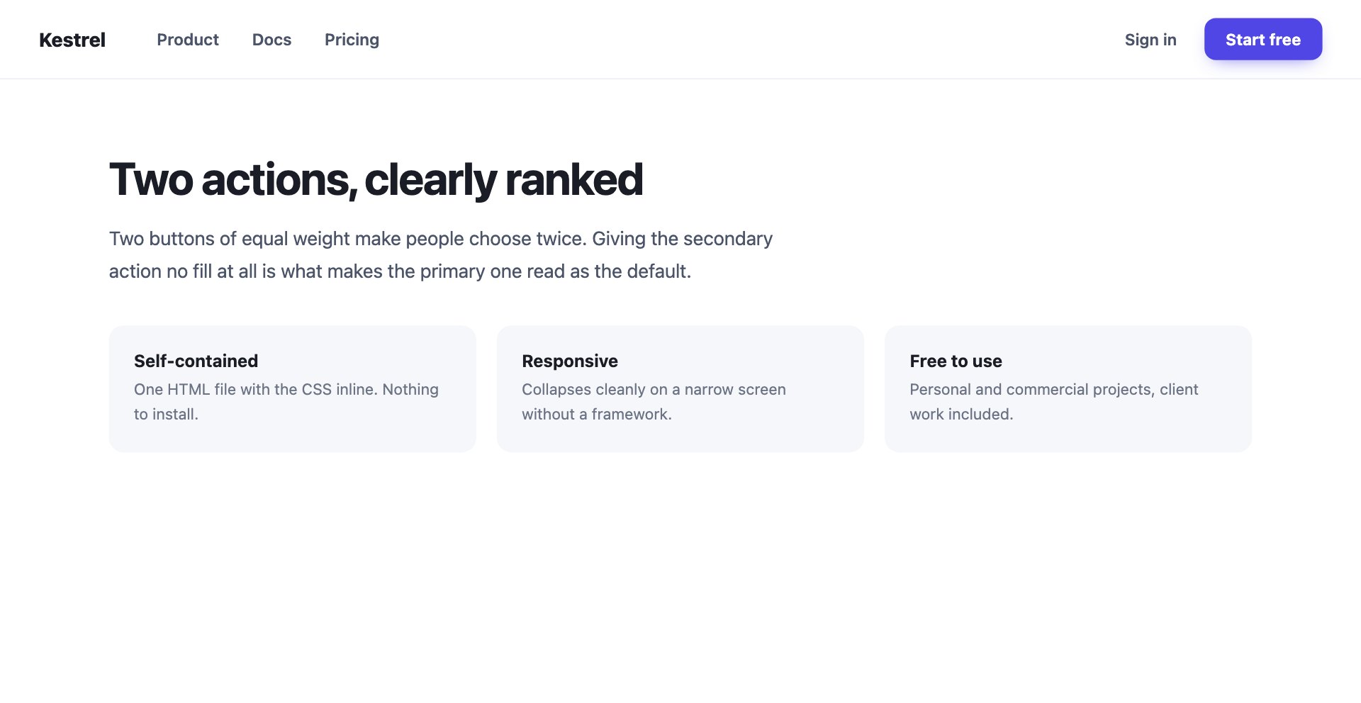
A quiet sign-in link beside a solid primary button — the standard arrangement when a site has both existing users and new ones.
Two buttons of equal weight make people choose twice. Giving the secondary action no fill is what makes the primary one read as the default.
Live Demo CSS, Bootstrap & Tailwind code
16. Vertical Side Header
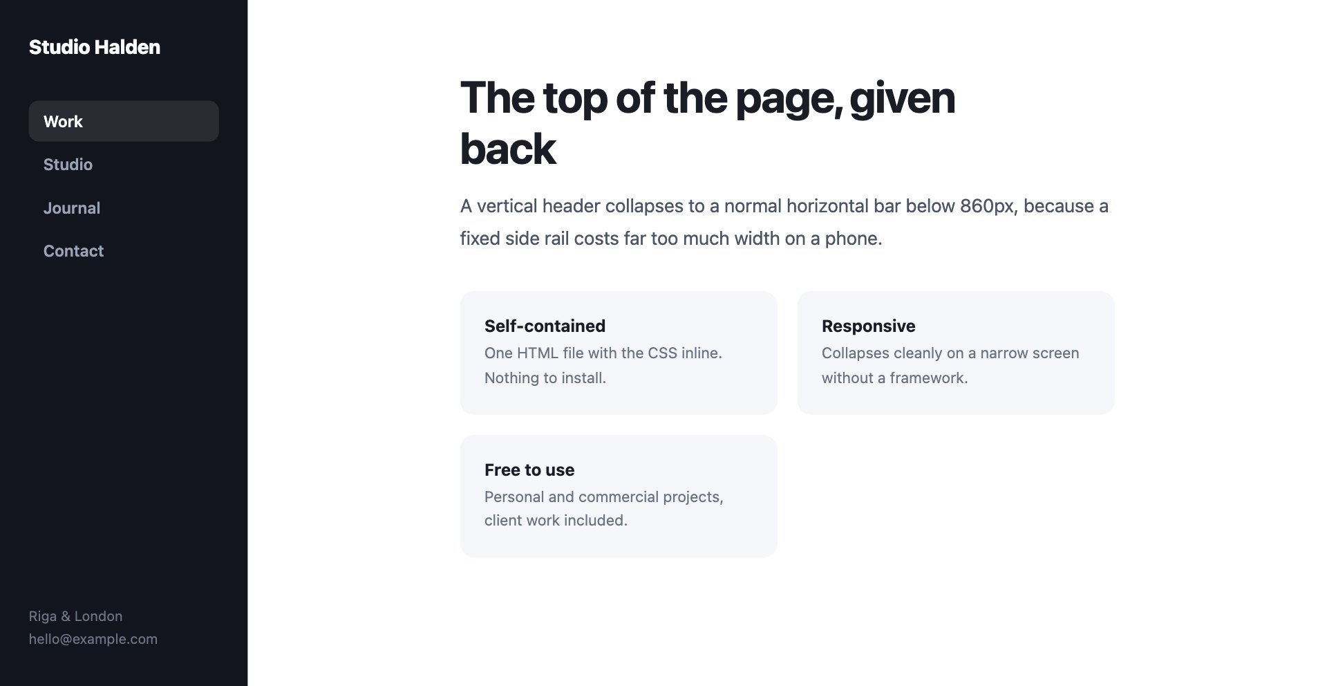
A full-height bar down the left edge, freeing the entire top of the page for content.
It collapses to a normal horizontal bar below 860px, because a fixed side rail costs far too much width on a phone.
Live Demo CSS, Bootstrap & Tailwind code
17. Shrinking Sticky Header
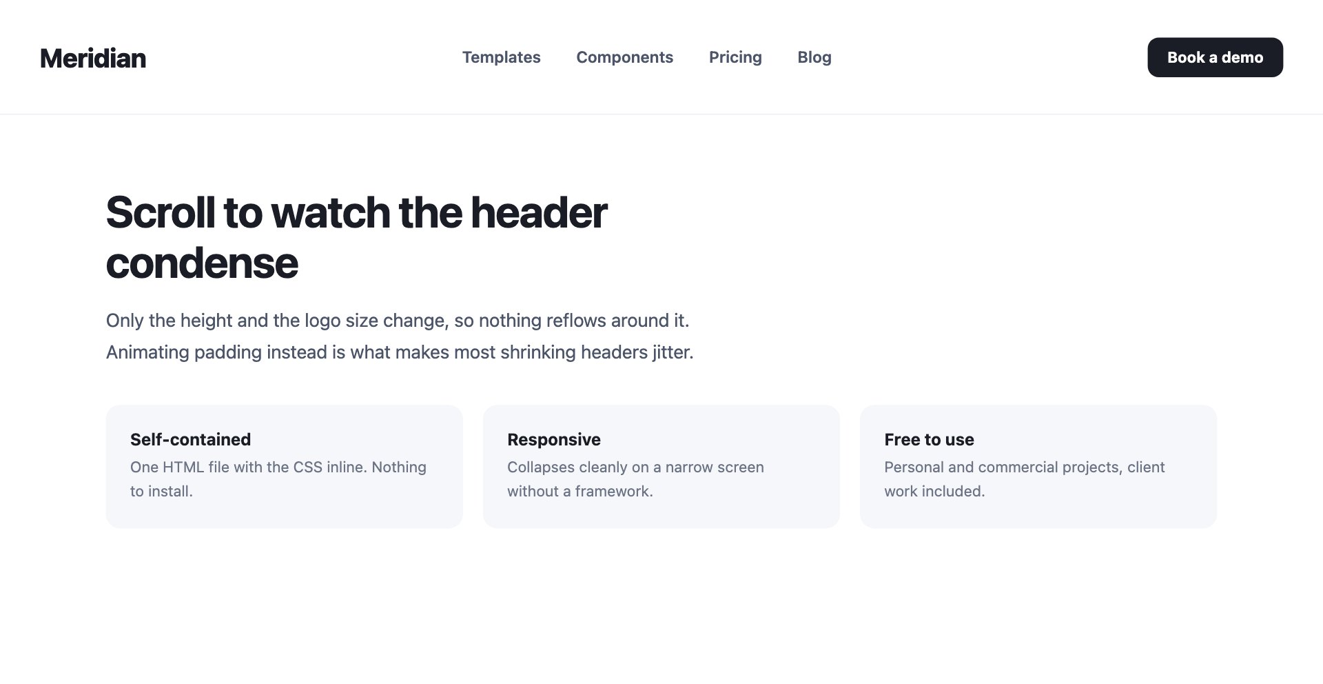
A tall header that condenses as the page scrolls, keeping the navigation reachable without holding the vertical space it needed at the top.
Only the height and the logo size change, so nothing reflows around it. Animating padding instead is what makes most shrinking headers jitter.
Live Demo CSS, Bootstrap & Tailwind code
18. Header with Breadcrumbs
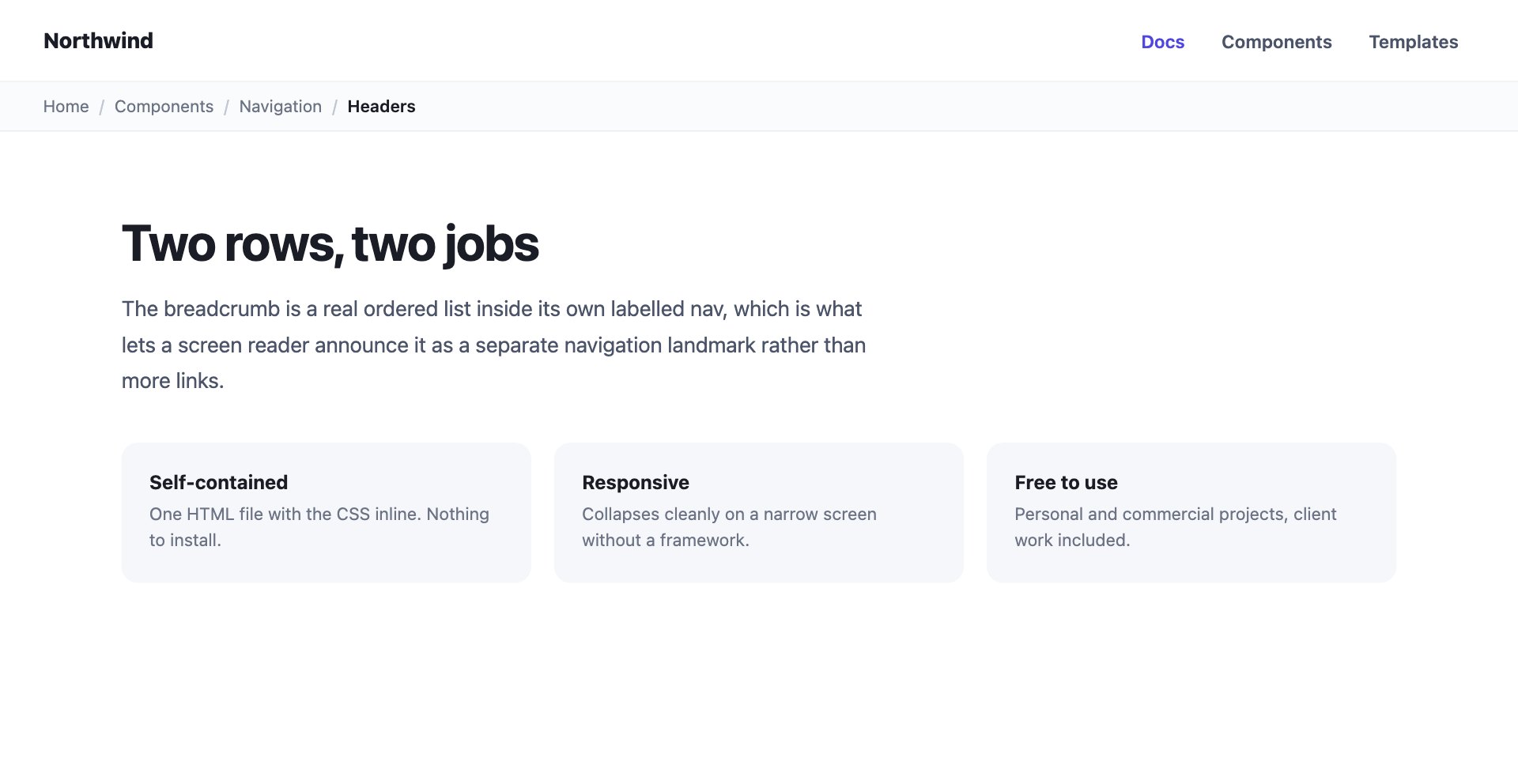
Two rows: navigation on the first, a breadcrumb trail on the second.
The trail is a real ordered list inside its own labelled <nav>, which is what lets a screen reader announce it as a separate landmark rather than more links.
Live Demo CSS, Bootstrap & Tailwind code
19. Header with Locale Switcher
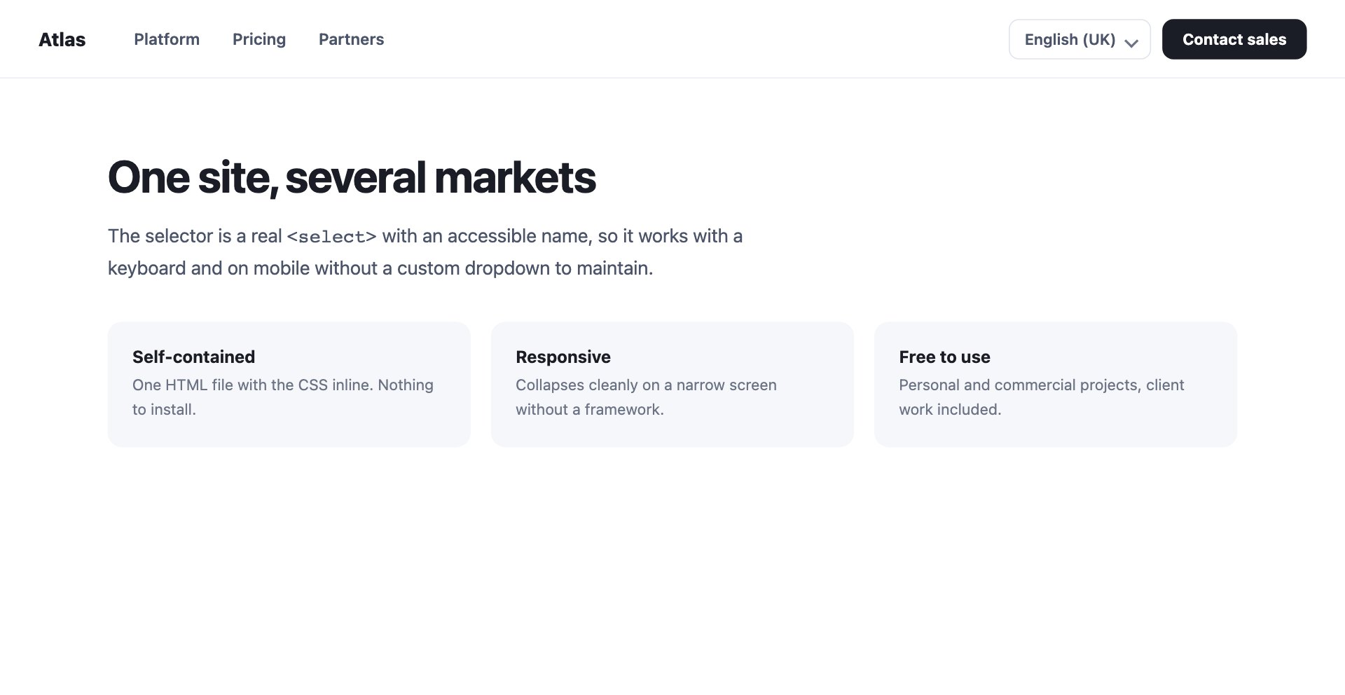
A language and region selector sitting alongside the navigation, built on a real <select>.
A native select works with a keyboard, works on mobile, and needs no dropdown code to maintain — three reasons to resist rebuilding it.
Live Demo CSS, Bootstrap & Tailwind code
20. Application Header
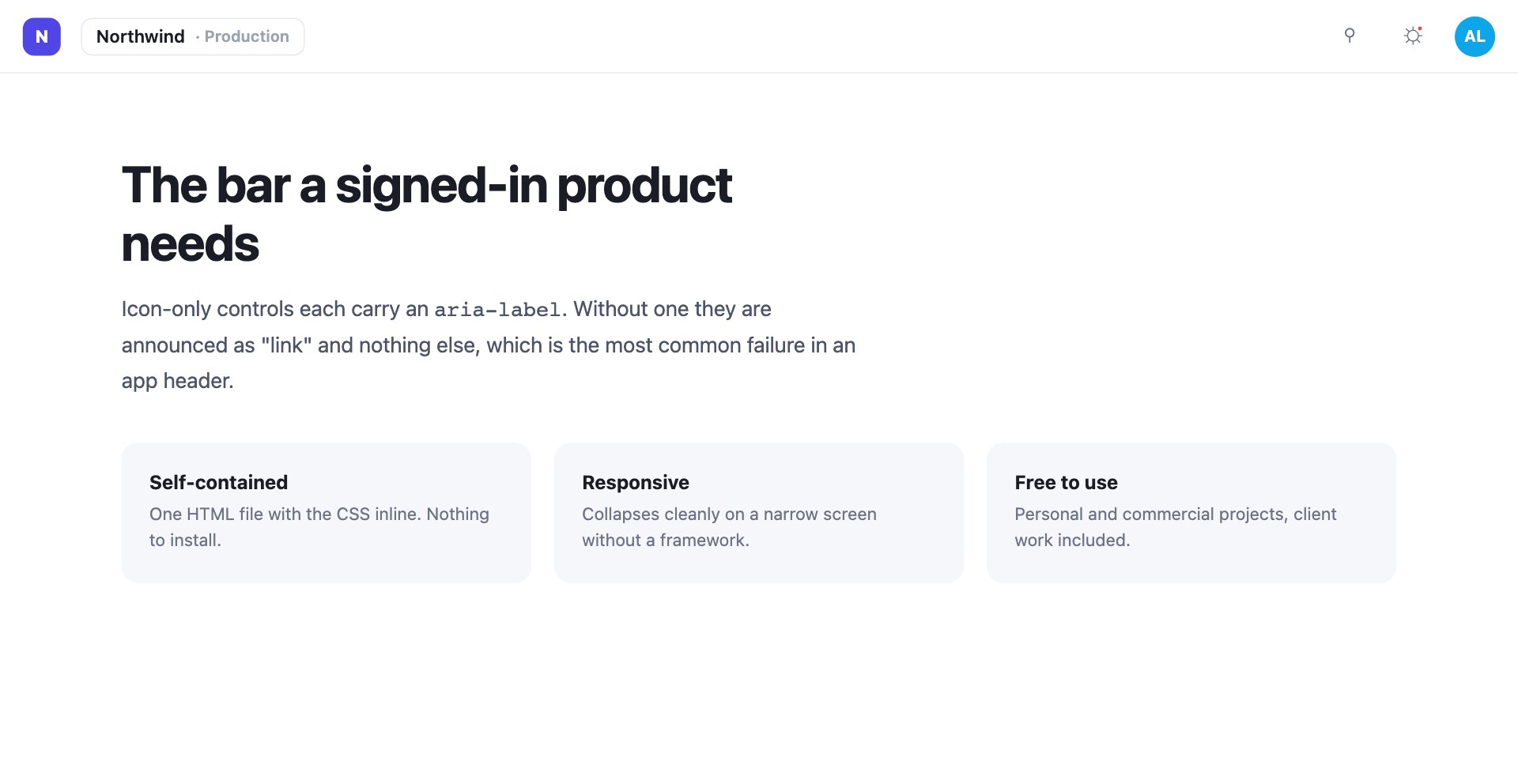
Workspace switcher, search, a notification bell with an unread dot, and an avatar, on a 58px bar.
Every icon-only control carries an aria-label. Without one it is announced as “link” and nothing else, which is the most common failure in an app header.
Live Demo CSS, Bootstrap & Tailwind code
21. Editorial Masthead
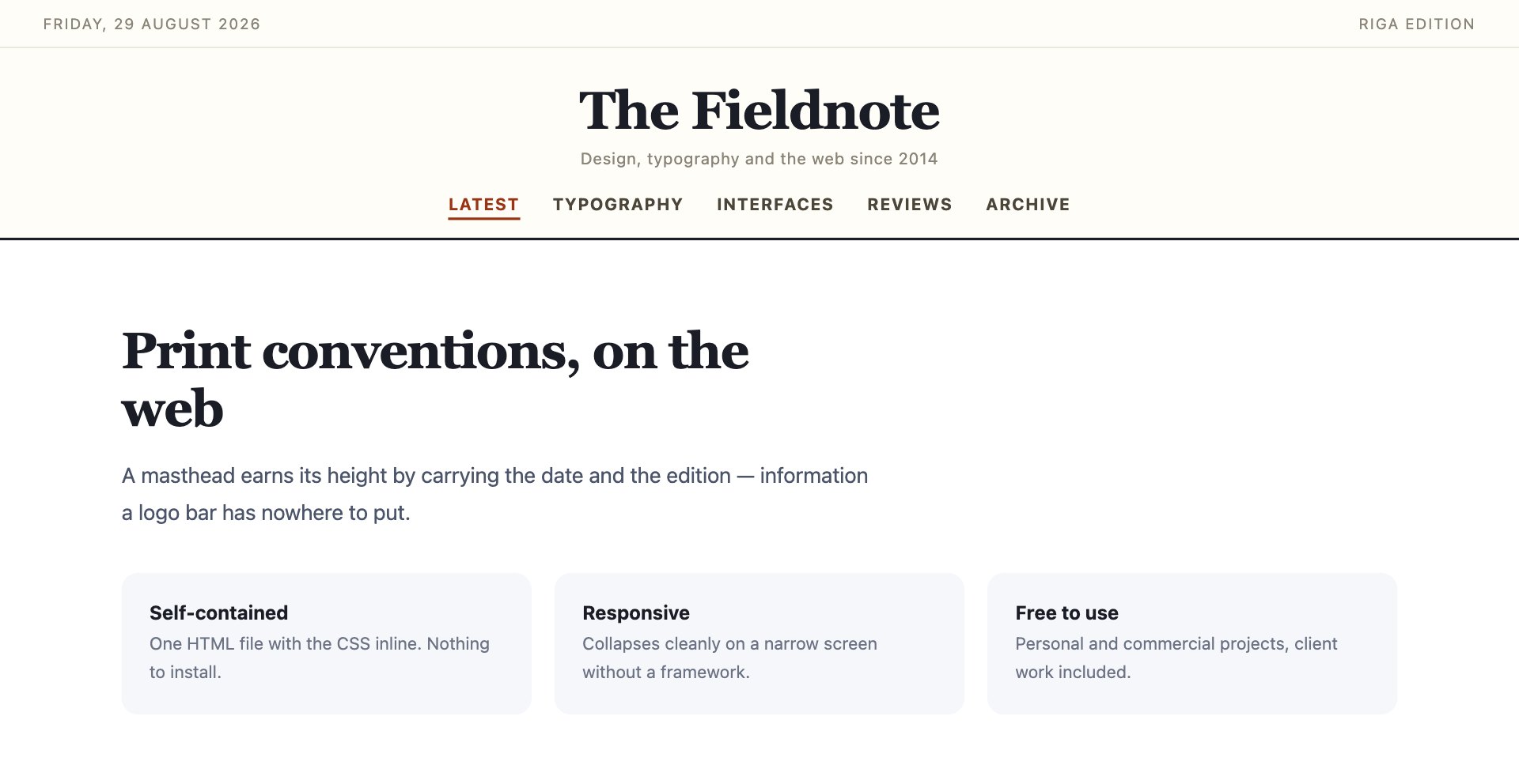
A newspaper-style masthead with the date and edition above a serif wordmark, and a section rail beneath.
A masthead earns its height by carrying the date and the edition — information a logo bar has nowhere to put.
Live Demo CSS, Bootstrap & Tailwind code
22. Header with Reading Progress
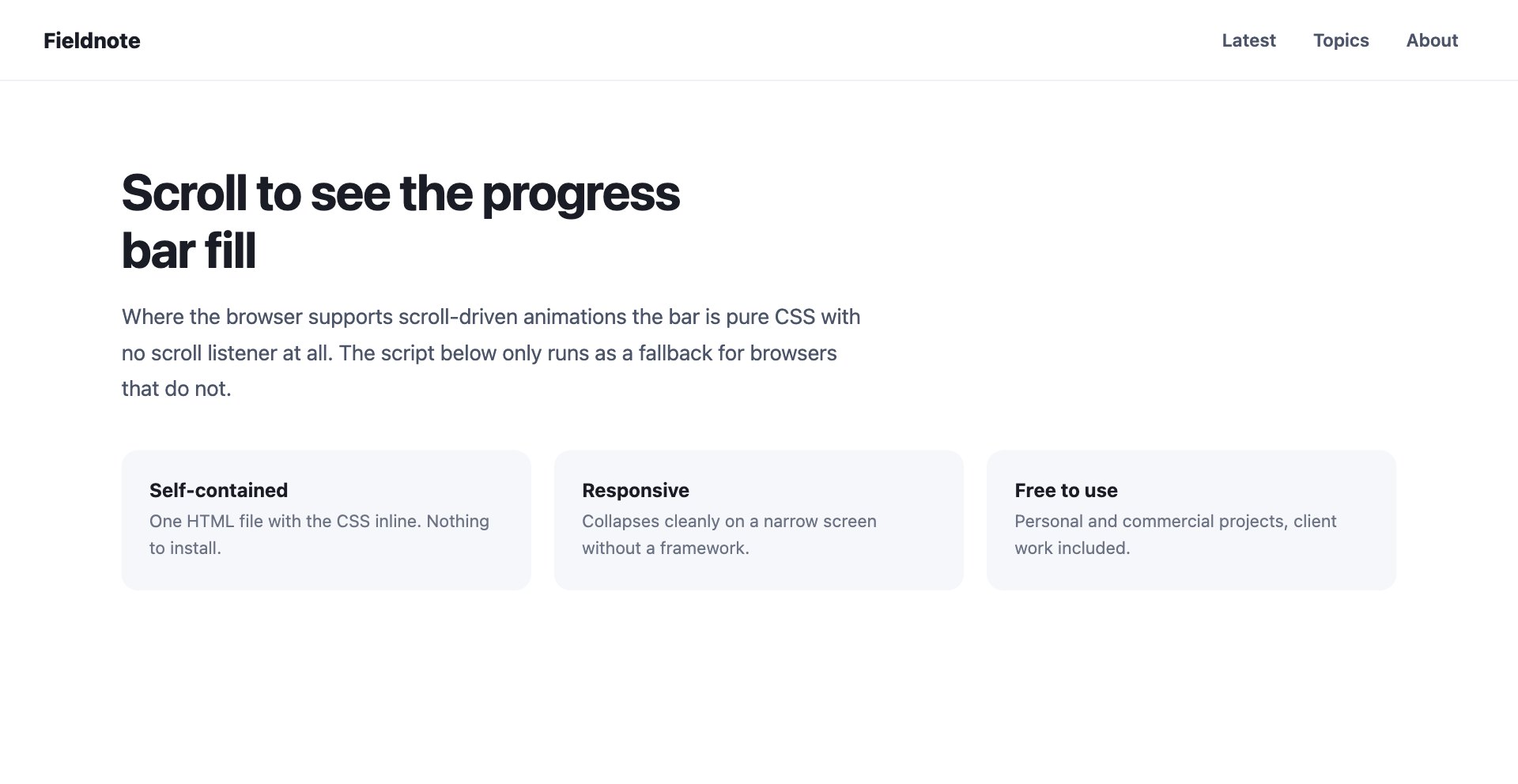
A sticky bar with a reading-progress indicator along its bottom edge.
Where the browser supports scroll-driven animations this is pure CSS with no scroll listener at all; the few lines of JavaScript only run as a fallback.
Live Demo CSS, Bootstrap & Tailwind code
Frequently asked questions
Are these website header templates free?
Yes. All 22 designs are free for personal and commercial projects, including client work, and download as a single ZIP with no signup.
Should a header be sticky, fixed or static?
Sticky suits most sites: the header scrolls away with the page and returns when it is needed without permanently occupying the viewport. Fixed is for a header that must always be reachable — an application bar, or a page with a floating call to action. Static is the right answer more often than people expect, especially on short pages and on phones where a fixed bar can eat a fifth of the screen.
How do I stop a sticky header covering my anchor links?
Add scroll-padding-top to the html element, set to the header height. Without it, jumping to an in-page anchor scrolls the target underneath the header and the reader lands mid-section with the heading hidden.
What should a website header contain?
A link home on the logo, the primary navigation, and at most one prominent action. Anything else — search, account, basket, language — earns its place only if people use it on most visits. A header carrying six competing elements is a header nobody reads.
How do I make a header responsive without a framework?
Decide what to drop before you decide what to collapse. Below roughly 760px the secondary navigation usually goes behind a menu button and any tertiary element is hidden outright. Every design here does this with one media query and no JavaScript, except the drawer, which needs a few lines.
Do sticky headers hurt Core Web Vitals?
They can. A header that changes height on scroll shifts the content beneath it and shows up as Cumulative Layout Shift, and a scroll handler that writes styles on every frame costs responsiveness. The shrinking header here toggles one class past a threshold and lets a CSS transition do the work, which avoids both.
Are these headers accessible?
Each one uses a real <header> and <nav>, marks the current page with aria-current="page", gives every icon-only control an aria-label, and keeps a visible focus state. Add a skip link as the first focusable element on the page and the header is done.
Can I use these with Bootstrap or Tailwind?
Yes. They are plain CSS on their own class names and do not depend on either. Inside Bootstrap you may want to avoid the navbar class names so its own component styles do not fight yours.