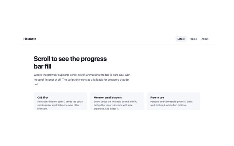
Open demo

CSS code

HTML
<header class="bc">
  <div class="bc-top">
    <a class="bc-logo" href="#">Northwind</a>
    <button class="bc-toggle" type="button" aria-expanded="false" aria-controls="bc-menu" aria-label="Menu" data-menu-button><i></i><i></i><i></i></button>
    <nav class="bc-menu" id="bc-menu" aria-label="Main">
      <ul>
        <li><a href="#" aria-current="page">Docs</a></li>
        <li><a href="#">Components</a></li>
        <li><a href="#">Templates</a></li>
      </ul>
    </nav>
  </div>
  <nav class="bc-crumbs" aria-label="Breadcrumb">
    <ol>
      <li><a href="#">Home</a></li>
      <li><a href="#">Components</a></li>
      <li><a href="#">Navigation</a></li>
      <li><span aria-current="page">Headers</span></li>
    </ol>
  </nav>
</header>
CSS
/* Header with breadcrumbs: the main links and the breadcrumb trail are two separate, labelled nav landmarks.
   The trail is an ordered list with aria-current on the last item. Below 992px the main links fold behind a
   menu button; the trail stays and wraps. */
.bc{position:sticky;top:0;z-index:10;background:#fff;border-bottom:1px solid #e8eaf0;color:#1a1d26}
.bc,.bc *{box-sizing:border-box}
.bc a{text-decoration:none}
.bc ul,.bc ol{list-style:none;margin:0;padding:0}
.bc a:focus-visible,.bc button:focus-visible{outline:2px solid #4f46e5;outline-offset:2px}
.bc-top{display:flex;flex-wrap:wrap;align-items:center;justify-content:space-between;min-height:64px;padding:0 34px}
.bc-logo{font-weight:800;font-size:1.05rem;color:#1a1d26}
.bc-menu ul{display:flex;gap:3px}
.bc-menu a{display:block;padding:9px 13px;font-size:.89rem;font-weight:600;color:#4b5468;border-radius:8px}
.bc-menu a:hover{background:#f3f4f9;color:#1a1d26}
.bc-menu a[aria-current="page"]{color:#4f46e5}
.bc-crumbs{border-top:1px solid #f0f1f6;padding:11px 34px;background:#fafbfd}
.bc-crumbs ol{display:flex;flex-wrap:wrap;align-items:center;gap:8px;font-size:.83rem}
.bc-crumbs a{color:#6b7385}
.bc-crumbs a:hover{color:#1a1d26}
.bc-crumbs li+li::before{content:"/";color:#c2c7d4;margin-right:8px}
.bc-crumbs [aria-current]{color:#1a1d26;font-weight:600}
.bc-toggle{display:none;flex:none;width:44px;height:44px;flex-direction:column;align-items:center;justify-content:center;
  gap:5px;padding:0;background:#fff;border:1px solid #d9dfe8;border-radius:10px;cursor:pointer}
.bc-toggle i{display:block;width:20px;height:2px;border-radius:2px;background:#1a1d26;transition:transform .2s,opacity .2s}
.bc-toggle[aria-expanded="true"] i:nth-child(1){transform:translateY(7px) rotate(45deg)}
.bc-toggle[aria-expanded="true"] i:nth-child(2){opacity:0}
.bc-toggle[aria-expanded="true"] i:nth-child(3){transform:translateY(-7px) rotate(-45deg)}
@media (max-width:991.98px){
  .bc-top{min-height:0;padding:10px 16px}
  .bc-toggle{display:flex}
  .bc-menu{display:none;flex-basis:100%;padding:6px 0 12px;border-top:1px solid #f0f1f6}
  .bc-menu[data-open]{display:block}
  .bc-menu ul{flex-direction:column}
  .bc-menu a{padding:11px 12px}
  .bc-crumbs{padding:10px 16px}
}
@media (prefers-reduced-motion:reduce){.bc *{transition:none!important}}
JavaScript
/* Menu button: toggles aria-expanded on itself and data-open on the menu it controls (aria-controls).
   Esc closes an open menu and returns focus to the button; widening past 992px resets it. */
document.querySelectorAll('[data-menu-button]').forEach(btn => {
  const menu = document.getElementById(btn.getAttribute('aria-controls'));
  if (!menu) return;
  const set = open => { btn.setAttribute('aria-expanded', String(open)); menu.toggleAttribute('data-open', open); };
  btn.addEventListener('click', () => set(btn.getAttribute('aria-expanded') !== 'true'));
  document.addEventListener('keydown', e => {
    if (e.key === 'Escape' && btn.getAttribute('aria-expanded') === 'true') { set(false); btn.focus(); }
  });
  matchMedia('(min-width: 992px)').addEventListener('change', e => { if (e.matches) set(false); });
});

Bootstrap 5 code

Requires: Bootstrap 5.3.8 CSS, Bootstrap 5.3.8 JS bundle

HTML
<header class="bc">
  <div class="navbar navbar-expand-lg bc-top">
    <a class="navbar-brand bc-logo" href="#">Northwind</a>
    <button class="navbar-toggler bc-toggle" type="button" data-bs-toggle="collapse" data-bs-target="#bc-menu" aria-controls="bc-menu" aria-expanded="false" aria-label="Menu"><i></i><i></i><i></i></button>
    <nav class="collapse navbar-collapse" id="bc-menu" aria-label="Main">
      <ul class="navbar-nav ms-lg-auto">
        <li class="nav-item"><a class="nav-link active" href="#" aria-current="page">Docs</a></li>
        <li class="nav-item"><a class="nav-link" href="#">Components</a></li>
        <li class="nav-item"><a class="nav-link" href="#">Templates</a></li>
      </ul>
    </nav>
  </div>
  <nav class="bc-crumbs" aria-label="Breadcrumb">
    <ol class="breadcrumb">
      <li class="breadcrumb-item"><a href="#">Home</a></li>
      <li class="breadcrumb-item"><a href="#">Components</a></li>
      <li class="breadcrumb-item"><a href="#">Navigation</a></li>
      <li class="breadcrumb-item active" aria-current="page">Headers</li>
    </ol>
  </nav>
</header>
CSS
/* Bootstrap .navbar-expand-lg for the top row and Bootstrap's own .breadcrumb for the trail, both restyled
   through their CSS variables. Two labelled nav landmarks; below 992px the main links fold into a collapse. */
.bc{position:sticky;top:0;z-index:10;background:#fff;border-bottom:1px solid #e8eaf0}
.bc a{text-decoration:none}
.bc a:focus-visible,.bc button:focus-visible{outline:2px solid #4f46e5;outline-offset:2px;box-shadow:none}
.bc-top{--bs-navbar-padding-x:34px;--bs-navbar-padding-y:0;--bs-navbar-color:#4b5468;--bs-navbar-hover-color:#1a1d26;
  --bs-navbar-active-color:#4f46e5;--bs-navbar-brand-color:#1a1d26;--bs-navbar-brand-hover-color:#1a1d26;
  --bs-navbar-brand-padding-y:0;--bs-navbar-brand-margin-end:0;--bs-navbar-brand-font-size:1.05rem;--bs-navbar-nav-link-padding-x:13px;min-height:64px}
.bc-logo{font-weight:800}
.bc .navbar-nav{--bs-nav-link-padding-y:9px;--bs-nav-link-font-size:.89rem;--bs-nav-link-font-weight:600;gap:3px}
.bc .nav-link{border-radius:8px}
.bc .nav-link:hover{background:#f3f4f9}
.bc-crumbs{border-top:1px solid #f0f1f6;padding:11px 34px;background:#fafbfd}
.bc-crumbs .breadcrumb{--bs-breadcrumb-margin-bottom:0;--bs-breadcrumb-font-size:.83rem;--bs-breadcrumb-item-padding-x:8px;
  --bs-breadcrumb-divider-color:#c2c7d4;--bs-breadcrumb-item-active-color:#1a1d26}
.bc-crumbs a{color:#6b7385}
.bc-crumbs a:hover{color:#1a1d26}
.bc-crumbs .active{font-weight:600}
.bc .navbar-toggler{width:44px;height:44px;padding:0;display:flex;flex-direction:column;align-items:center;justify-content:center;
  gap:5px;background:#fff;border:1px solid #d9dfe8;border-radius:10px}
.bc .navbar-toggler:focus{box-shadow:none}
.bc .navbar-toggler i{display:block;width:20px;height:2px;border-radius:2px;background:#1a1d26;transition:transform .2s,opacity .2s}
.bc .navbar-toggler[aria-expanded="true"] i:nth-child(1){transform:translateY(7px) rotate(45deg)}
.bc .navbar-toggler[aria-expanded="true"] i:nth-child(2){opacity:0}
.bc .navbar-toggler[aria-expanded="true"] i:nth-child(3){transform:translateY(-7px) rotate(-45deg)}
@media (min-width:992px){.bc .navbar-toggler{display:none}}
@media (max-width:991.98px){
  .bc-top{--bs-navbar-padding-x:16px;--bs-navbar-padding-y:10px;min-height:0}
  .bc .navbar-nav{--bs-nav-link-padding-x:12px;--bs-nav-link-padding-y:11px;padding:6px 0 12px;border-top:1px solid #f0f1f6}
  .bc-crumbs{padding:10px 16px}
}
@media (prefers-reduced-motion:reduce){.bc *{transition:none!important}}
JavaScript
/* Bootstrap's Collapse has no Esc handling of its own: close an open navbar menu on Esc
   and return focus to its toggler. */
document.addEventListener('keydown', e => {
  if (e.key !== 'Escape') return;
  document.querySelectorAll('.navbar-collapse.show').forEach(menu => {
    bootstrap.Collapse.getOrCreateInstance(menu, { toggle: false }).hide();
    document.querySelector(`[data-bs-target="#${menu.id}"]`)?.focus();
  });
});

Tailwind 4 code

Requires: Tailwind CSS 4

HTML
<header class="sticky top-0 z-10 border-b border-[#e8eaf0] bg-white text-[#1a1d26]">
  <div class="flex min-h-16 flex-wrap items-center justify-between px-[34px] max-lg:min-h-0 max-lg:px-4 max-lg:py-2.5">
    <a class="text-[1.05rem] font-extrabold text-[#1a1d26] focus-visible:outline-2 focus-visible:outline-offset-2 focus-visible:outline-[#4f46e5]" href="#">Northwind</a>
    <button class="group flex size-11 flex-none cursor-pointer flex-col items-center justify-center gap-[5px] rounded-[10px] border border-[#d9dfe8] bg-white p-0 focus-visible:outline-2 focus-visible:outline-offset-2 focus-visible:outline-[#4f46e5] lg:hidden " type="button" aria-expanded="false" aria-controls="bc-menu" aria-label="Menu" data-menu-button><i class="block h-0.5 w-5 rounded-sm bg-[#1a1d26] transition-transform duration-200 motion-reduce:transition-none group-aria-expanded:translate-y-[7px] group-aria-expanded:rotate-45"></i><i class="block h-0.5 w-5 rounded-sm bg-[#1a1d26] transition-opacity duration-200 motion-reduce:transition-none group-aria-expanded:opacity-0"></i><i class="block h-0.5 w-5 rounded-sm bg-[#1a1d26] transition-transform duration-200 motion-reduce:transition-none group-aria-expanded:-translate-y-[7px] group-aria-expanded:-rotate-45"></i></button>
    <nav class="hidden data-open:block lg:block max-lg:basis-full max-lg:border-t max-lg:border-[#f0f1f6] max-lg:pt-1.5 max-lg:pb-3" id="bc-menu" aria-label="Main">
      <ul class="flex gap-[3px] max-lg:flex-col">
        <li><a class="block rounded-lg px-[13px] py-[9px] text-[.89rem] font-semibold text-[#4b5468] hover:bg-[#f3f4f9] hover:text-[#1a1d26] aria-[current=page]:text-[#4f46e5] focus-visible:outline-2 focus-visible:outline-offset-2 focus-visible:outline-[#4f46e5] max-lg:px-3 max-lg:py-[11px]" href="#" aria-current="page">Docs</a></li>
        <li><a class="block rounded-lg px-[13px] py-[9px] text-[.89rem] font-semibold text-[#4b5468] hover:bg-[#f3f4f9] hover:text-[#1a1d26] aria-[current=page]:text-[#4f46e5] focus-visible:outline-2 focus-visible:outline-offset-2 focus-visible:outline-[#4f46e5] max-lg:px-3 max-lg:py-[11px]" href="#">Components</a></li>
        <li><a class="block rounded-lg px-[13px] py-[9px] text-[.89rem] font-semibold text-[#4b5468] hover:bg-[#f3f4f9] hover:text-[#1a1d26] aria-[current=page]:text-[#4f46e5] focus-visible:outline-2 focus-visible:outline-offset-2 focus-visible:outline-[#4f46e5] max-lg:px-3 max-lg:py-[11px]" href="#">Templates</a></li>
      </ul>
    </nav>
  </div>
  <nav class="border-t border-[#f0f1f6] bg-[#fafbfd] px-[34px] py-[11px] max-lg:px-4 max-lg:py-2.5" aria-label="Breadcrumb">
    <ol class="flex flex-wrap items-center gap-2 text-[.83rem]">
      <li class="flex items-center gap-2 not-first:before:text-[#c2c7d4] not-first:before:content-['/']"><a class="text-[#6b7385] hover:text-[#1a1d26] focus-visible:outline-2 focus-visible:outline-offset-2 focus-visible:outline-[#4f46e5]" href="#">Home</a></li>
      <li class="flex items-center gap-2 not-first:before:text-[#c2c7d4] not-first:before:content-['/']"><a class="text-[#6b7385] hover:text-[#1a1d26] focus-visible:outline-2 focus-visible:outline-offset-2 focus-visible:outline-[#4f46e5]" href="#">Components</a></li>
      <li class="flex items-center gap-2 not-first:before:text-[#c2c7d4] not-first:before:content-['/']"><a class="text-[#6b7385] hover:text-[#1a1d26] focus-visible:outline-2 focus-visible:outline-offset-2 focus-visible:outline-[#4f46e5]" href="#">Navigation</a></li>
      <li class="flex items-center gap-2 not-first:before:text-[#c2c7d4] not-first:before:content-['/']"><span class="font-semibold text-[#1a1d26]" aria-current="page">Headers</span></li>
    </ol>
  </nav>
</header>
CSS
@theme {
  --breakpoint-lg: 62rem; /* 992px, the same collapse point as Bootstrap's navbar-expand-lg */
}
JavaScript
/* Menu button: toggles aria-expanded on itself and data-open on the menu it controls (aria-controls).
   Esc closes an open menu and returns focus to the button; widening past 992px resets it. */
document.querySelectorAll('[data-menu-button]').forEach(btn => {
  const menu = document.getElementById(btn.getAttribute('aria-controls'));
  if (!menu) return;
  const set = open => { btn.setAttribute('aria-expanded', String(open)); menu.toggleAttribute('data-open', open); };
  btn.addEventListener('click', () => set(btn.getAttribute('aria-expanded') !== 'true'));
  document.addEventListener('keydown', e => {
    if (e.key === 'Escape' && btn.getAttribute('aria-expanded') === 'true') { set(false); btn.focus(); }
  });
  matchMedia('(min-width: 992px)').addEventListener('change', e => { if (e.matches) set(false); });
});

About this set

A two-row header for documentation and deep content: a top bar with the logo and three links, and a tinted row underneath with a breadcrumb trail (Home, Components, Navigation, Headers). The two rows do two jobs, so they are two separate nav landmarks, labelled Main and Breadcrumb, which screen reader users can jump between. The trail is an ordered list, the separators are drawn by CSS rather than typed into the markup, and the last item is plain text marked with aria-current=”page”. The current top-level section is shown in indigo. Use it wherever pages sit three or more levels deep. Below 992px the main links fold behind a menu button while the breadcrumb stays visible and wraps onto a second line if it has to, rather than scrolling sideways. The Bootstrap version uses its own .breadcrumb component for the trail.

What’s included

  • Main links and breadcrumb as two labelled nav landmarks
  • Breadcrumb is an ordered list with CSS separators
  • aria-current="page" on both the section link and the last crumb
  • Breadcrumb stays visible and wraps on phones
  • Bootstrap .breadcrumb restyled with --bs-breadcrumb-* variables

Accessibility

Two nav landmarks, labelled Main and Breadcrumb, and both mark the current page with aria-current="page". The "/" separators come from CSS rather than the markup. The menu button is a real button with an accessible name that reports aria-expanded; it opens with Enter or Space, and Esc closes the menu and returns focus to the button. All links show a 2px indigo outline on keyboard focus.

Customise it

Change #4f46e5 for the current section and #fafbfd for the breadcrumb row on .bc and .bc-crumbs. In Bootstrap set --bs-breadcrumb-divider-color and --bs-breadcrumb-item-active-color on .breadcrumb; in Tailwind edit the not-first:before: and text-[…] utilities.