Open demo

CSS code

HTML
<header class="sk" data-shrink>
  <a class="sk-logo" href="#">Meridian</a>
  <button class="sk-toggle" type="button" aria-expanded="false" aria-controls="sk-menu" aria-label="Menu" data-menu-button><i></i><i></i><i></i></button>
  <nav class="sk-menu" id="sk-menu" aria-label="Main">
    <ul>
      <li><a href="#" aria-current="page">Templates</a></li>
      <li><a href="#">Components</a></li>
      <li><a href="#">Pricing</a></li>
      <li><a href="#">Blog</a></li>
    </ul>
  </nav>
  <a class="sk-cta" href="#">Book a demo</a>
</header>
<div class="sk-spacer" aria-hidden="true"></div>
CSS
/* Shrinking header: fixed to the top, with a spacer of its full height after it, so condensing it never moves
   the page. The script sets data-condensed past 40px of scroll; the CSS transitions do the rest. */
.sk{position:fixed;top:0;left:0;right:0;z-index:10;display:flex;flex-wrap:wrap;align-items:center;justify-content:space-between;
  min-height:104px;padding:0 36px;background:#fff;border-bottom:1px solid #eceef4;color:#1a1d26;
  transition:min-height .22s,padding .22s,box-shadow .22s}
.sk[data-condensed]{min-height:62px;box-shadow:0 6px 22px -14px rgba(15,20,40,.35)}
.sk,.sk *{box-sizing:border-box}
.sk a{text-decoration:none}
.sk ul{list-style:none;margin:0;padding:0}
.sk a:focus-visible,.sk button:focus-visible{outline:2px solid #4f46e5;outline-offset:2px}
.sk-spacer{height:104px}
.sk-logo{font-weight:800;font-size:1.5rem;color:#1a1d26;letter-spacing:-.02em;transition:font-size .22s}
.sk[data-condensed] .sk-logo{font-size:1.08rem}
.sk-menu ul{display:flex;gap:4px}
.sk-menu a{display:block;padding:9px 14px;font-size:.9rem;font-weight:600;color:#4b5468;border-radius:9px}
.sk-menu a:hover,.sk-menu a[aria-current="page"]{background:#f3f4f9;color:#1a1d26}
.sk-cta{font-size:.86rem;font-weight:700;padding:10px 18px;border-radius:10px;background:#1a1d26;color:#fff}
.sk-toggle{display:none;flex:none;width:44px;height:44px;flex-direction:column;align-items:center;justify-content:center;
  gap:5px;padding:0;background:#fff;border:1px solid #d9dfe8;border-radius:10px;cursor:pointer}
.sk-toggle i{display:block;width:20px;height:2px;border-radius:2px;background:#1a1d26;transition:transform .2s,opacity .2s}
.sk-toggle[aria-expanded="true"] i:nth-child(1){transform:translateY(7px) rotate(45deg)}
.sk-toggle[aria-expanded="true"] i:nth-child(2){opacity:0}
.sk-toggle[aria-expanded="true"] i:nth-child(3){transform:translateY(-7px) rotate(-45deg)}
@media (max-width:991.98px){
  .sk{min-height:0;padding:15px 16px}
  .sk[data-condensed]{min-height:0;padding-top:6px;padding-bottom:6px}
  .sk-spacer{height:74px}
  .sk-logo{font-size:1.15rem}
  .sk-cta{order:1;margin-left:auto;padding:9px 14px}
  .sk-toggle{display:flex;order:2;margin-left:10px}
  .sk-menu{order:3;display:none;flex-basis:100%;padding:6px 0 12px;border-top:1px solid #eceef4}
  .sk-menu[data-open]{display:block}
  .sk-menu ul{flex-direction:column}
  .sk-menu a{padding:11px 12px}
}
@media (prefers-reduced-motion:reduce){.sk,.sk *{transition:none!important}}
JavaScript
/* Menu button: toggles aria-expanded on itself and data-open on the menu it controls (aria-controls).
   Esc closes an open menu and returns focus to the button; widening past 992px resets it. */
document.querySelectorAll('[data-menu-button]').forEach(btn => {
  const menu = document.getElementById(btn.getAttribute('aria-controls'));
  if (!menu) return;
  const set = open => { btn.setAttribute('aria-expanded', String(open)); menu.toggleAttribute('data-open', open); };
  btn.addEventListener('click', () => set(btn.getAttribute('aria-expanded') !== 'true'));
  document.addEventListener('keydown', e => {
    if (e.key === 'Escape' && btn.getAttribute('aria-expanded') === 'true') { set(false); btn.focus(); }
  });
  matchMedia('(min-width: 992px)').addEventListener('change', e => { if (e.matches) set(false); });
});

/* Condense past 40px of scroll. Toggling one attribute lets the CSS transitions do the work, and the
   passive listener never delays scrolling. */
document.querySelectorAll('[data-shrink]').forEach(header => {
  const update = () => header.toggleAttribute('data-condensed', scrollY > 40);
  addEventListener('scroll', update, { passive: true });
  update();
});

Bootstrap 5 code

Requires: Bootstrap 5.3.8 CSS, Bootstrap 5.3.8 JS bundle

HTML
<header class="navbar navbar-expand-lg fixed-top sk" data-shrink>
  <a class="navbar-brand sk-logo" href="#">Meridian</a>
  <button class="navbar-toggler sk-toggle order-2 order-lg-0 ms-2" type="button" data-bs-toggle="collapse" data-bs-target="#sk-menu" aria-controls="sk-menu" aria-expanded="false" aria-label="Menu"><i></i><i></i><i></i></button>
  <nav class="collapse navbar-collapse order-3 order-lg-0" id="sk-menu" aria-label="Main">
    <ul class="navbar-nav mx-lg-auto">
      <li class="nav-item"><a class="nav-link active" href="#" aria-current="page">Templates</a></li>
      <li class="nav-item"><a class="nav-link" href="#">Components</a></li>
      <li class="nav-item"><a class="nav-link" href="#">Pricing</a></li>
      <li class="nav-item"><a class="nav-link" href="#">Blog</a></li>
    </ul>
  </nav>
  <a class="btn sk-cta order-1 order-lg-0 ms-auto ms-lg-0" href="#">Book a demo</a>
</header>
<div class="sk-spacer" aria-hidden="true"></div>
CSS
/* Bootstrap .navbar-expand-lg with .fixed-top and a spacer of the same height after it, so condensing never
   moves the page. The script sets data-condensed past 40px; the heights and the shadow are CSS transitions. */
.sk{--bs-navbar-padding-x:36px;--bs-navbar-padding-y:0;--bs-navbar-color:#4b5468;--bs-navbar-hover-color:#1a1d26;
  --bs-navbar-active-color:#1a1d26;--bs-navbar-brand-color:#1a1d26;--bs-navbar-brand-hover-color:#1a1d26;
  --bs-navbar-brand-padding-y:0;--bs-navbar-brand-margin-end:0;--bs-navbar-brand-font-size:1.5rem;--bs-navbar-nav-link-padding-x:14px;
  z-index:10;min-height:104px;background:#fff;border-bottom:1px solid #eceef4;transition:min-height .22s,padding .22s,box-shadow .22s}
.sk[data-condensed]{min-height:62px;box-shadow:0 6px 22px -14px rgba(15,20,40,.35)}
.sk a{text-decoration:none}
.sk a:focus-visible,.sk button:focus-visible{outline:2px solid #4f46e5;outline-offset:2px;box-shadow:none}
.sk-spacer{height:104px}
.sk-logo{font-weight:800;letter-spacing:-.02em;transition:font-size .22s}
.sk[data-condensed] .sk-logo{font-size:1.08rem}
.sk .navbar-nav{--bs-nav-link-padding-y:9px;--bs-nav-link-font-size:.9rem;--bs-nav-link-font-weight:600;gap:4px}
.sk .nav-link{border-radius:9px}
.sk .nav-link:hover,.sk .nav-link.active{background:#f3f4f9}
.sk-cta{--bs-btn-font-size:.86rem;--bs-btn-font-weight:700;--bs-btn-line-height:normal;--bs-btn-padding-x:18px;--bs-btn-padding-y:10px;
  --bs-btn-border-width:0;--bs-btn-border-radius:10px;--bs-btn-color:#fff;--bs-btn-bg:#1a1d26;--bs-btn-hover-color:#fff;
  --bs-btn-hover-bg:#1a1d26;--bs-btn-active-color:#fff;--bs-btn-active-bg:#000;--bs-btn-focus-box-shadow:none}
.sk .navbar-toggler{width:44px;height:44px;padding:0;display:flex;flex-direction:column;align-items:center;justify-content:center;
  gap:5px;background:#fff;border:1px solid #d9dfe8;border-radius:10px}
.sk .navbar-toggler:focus{box-shadow:none}
.sk .navbar-toggler i{display:block;width:20px;height:2px;border-radius:2px;background:#1a1d26;transition:transform .2s,opacity .2s}
.sk .navbar-toggler[aria-expanded="true"] i:nth-child(1){transform:translateY(7px) rotate(45deg)}
.sk .navbar-toggler[aria-expanded="true"] i:nth-child(2){opacity:0}
.sk .navbar-toggler[aria-expanded="true"] i:nth-child(3){transform:translateY(-7px) rotate(-45deg)}
@media (min-width:992px){.sk .navbar-toggler{display:none}}
@media (max-width:991.98px){
  .sk{--bs-navbar-padding-x:16px;--bs-navbar-padding-y:15px;min-height:0}
  .sk[data-condensed]{--bs-navbar-padding-y:6px;min-height:0}
  .sk-spacer{height:74px}
  .sk-logo{font-size:1.15rem}
  .sk-cta{--bs-btn-padding-x:14px;--bs-btn-padding-y:9px}
  .sk .navbar-nav{--bs-nav-link-padding-x:12px;--bs-nav-link-padding-y:11px;padding:6px 0 12px;border-top:1px solid #eceef4}
}
@media (prefers-reduced-motion:reduce){.sk,.sk *{transition:none!important}}
JavaScript
/* Bootstrap's Collapse has no Esc handling of its own: close an open navbar menu on Esc
   and return focus to its toggler. */
document.addEventListener('keydown', e => {
  if (e.key !== 'Escape') return;
  document.querySelectorAll('.navbar-collapse.show').forEach(menu => {
    bootstrap.Collapse.getOrCreateInstance(menu, { toggle: false }).hide();
    document.querySelector(`[data-bs-target="#${menu.id}"]`)?.focus();
  });
});

/* Condense past 40px of scroll. Toggling one attribute lets the CSS transitions do the work, and the
   passive listener never delays scrolling. */
document.querySelectorAll('[data-shrink]').forEach(header => {
  const update = () => header.toggleAttribute('data-condensed', scrollY > 40);
  addEventListener('scroll', update, { passive: true });
  update();
});

Tailwind 4 code

Requires: Tailwind CSS 4

HTML
<header class="group fixed inset-x-0 top-0 z-10 flex min-h-[104px] flex-wrap items-center justify-between border-b border-[#eceef4] bg-white px-9 text-[#1a1d26] transition-[min-height,padding,box-shadow] duration-[220ms] data-condensed:min-h-[62px] data-condensed:shadow-[0_6px_22px_-14px_rgba(15,20,40,.35)] motion-reduce:transition-none max-lg:min-h-0 max-lg:px-4 max-lg:py-[15px] max-lg:data-condensed:min-h-0 max-lg:data-condensed:py-1.5" data-shrink>
  <a class="text-2xl font-extrabold tracking-[-.02em] text-[#1a1d26] transition-[font-size] duration-[220ms] group-data-condensed:text-[1.08rem] focus-visible:outline-2 focus-visible:outline-offset-2 focus-visible:outline-[#4f46e5] motion-reduce:transition-none max-lg:text-[1.15rem] max-lg:group-data-condensed:text-[1.08rem]" href="#">Meridian</a>
  <button class="group flex size-11 flex-none cursor-pointer flex-col items-center justify-center gap-[5px] rounded-[10px] border border-[#d9dfe8] bg-white p-0 focus-visible:outline-2 focus-visible:outline-offset-2 focus-visible:outline-[#4f46e5] lg:hidden max-lg:order-2 max-lg:ml-2.5" type="button" aria-expanded="false" aria-controls="sk-menu" aria-label="Menu" data-menu-button><i class="block h-0.5 w-5 rounded-sm bg-[#1a1d26] transition-transform duration-200 motion-reduce:transition-none group-aria-expanded:translate-y-[7px] group-aria-expanded:rotate-45"></i><i class="block h-0.5 w-5 rounded-sm bg-[#1a1d26] transition-opacity duration-200 motion-reduce:transition-none group-aria-expanded:opacity-0"></i><i class="block h-0.5 w-5 rounded-sm bg-[#1a1d26] transition-transform duration-200 motion-reduce:transition-none group-aria-expanded:-translate-y-[7px] group-aria-expanded:-rotate-45"></i></button>
  <nav class="hidden data-open:block lg:block max-lg:order-3 max-lg:basis-full max-lg:border-t max-lg:border-[#eceef4] max-lg:pt-1.5 max-lg:pb-3" id="sk-menu" aria-label="Main">
    <ul class="flex gap-1 max-lg:flex-col">
      <li><a class="block rounded-[9px] px-3.5 py-[9px] text-[.9rem] font-semibold text-[#4b5468] hover:bg-[#f3f4f9] hover:text-[#1a1d26] aria-[current=page]:bg-[#f3f4f9] aria-[current=page]:text-[#1a1d26] focus-visible:outline-2 focus-visible:outline-offset-2 focus-visible:outline-[#4f46e5] max-lg:px-3 max-lg:py-[11px]" href="#" aria-current="page">Templates</a></li>
      <li><a class="block rounded-[9px] px-3.5 py-[9px] text-[.9rem] font-semibold text-[#4b5468] hover:bg-[#f3f4f9] hover:text-[#1a1d26] aria-[current=page]:bg-[#f3f4f9] aria-[current=page]:text-[#1a1d26] focus-visible:outline-2 focus-visible:outline-offset-2 focus-visible:outline-[#4f46e5] max-lg:px-3 max-lg:py-[11px]" href="#">Components</a></li>
      <li><a class="block rounded-[9px] px-3.5 py-[9px] text-[.9rem] font-semibold text-[#4b5468] hover:bg-[#f3f4f9] hover:text-[#1a1d26] aria-[current=page]:bg-[#f3f4f9] aria-[current=page]:text-[#1a1d26] focus-visible:outline-2 focus-visible:outline-offset-2 focus-visible:outline-[#4f46e5] max-lg:px-3 max-lg:py-[11px]" href="#">Pricing</a></li>
      <li><a class="block rounded-[9px] px-3.5 py-[9px] text-[.9rem] font-semibold text-[#4b5468] hover:bg-[#f3f4f9] hover:text-[#1a1d26] aria-[current=page]:bg-[#f3f4f9] aria-[current=page]:text-[#1a1d26] focus-visible:outline-2 focus-visible:outline-offset-2 focus-visible:outline-[#4f46e5] max-lg:px-3 max-lg:py-[11px]" href="#">Blog</a></li>
    </ul>
  </nav>
  <a class="rounded-[10px] bg-[#1a1d26] px-[18px] py-2.5 text-[.86rem] font-bold text-white focus-visible:outline-2 focus-visible:outline-offset-2 focus-visible:outline-[#4f46e5] max-lg:order-1 max-lg:ml-auto max-lg:px-3.5 max-lg:py-[9px]" href="#">Book a demo</a>
</header>
<div class="h-[104px] max-lg:h-[74px]" aria-hidden="true"></div>
CSS
@theme {
  --breakpoint-lg: 62rem; /* 992px, the same collapse point as Bootstrap's navbar-expand-lg */
}
JavaScript
/* Menu button: toggles aria-expanded on itself and data-open on the menu it controls (aria-controls).
   Esc closes an open menu and returns focus to the button; widening past 992px resets it. */
document.querySelectorAll('[data-menu-button]').forEach(btn => {
  const menu = document.getElementById(btn.getAttribute('aria-controls'));
  if (!menu) return;
  const set = open => { btn.setAttribute('aria-expanded', String(open)); menu.toggleAttribute('data-open', open); };
  btn.addEventListener('click', () => set(btn.getAttribute('aria-expanded') !== 'true'));
  document.addEventListener('keydown', e => {
    if (e.key === 'Escape' && btn.getAttribute('aria-expanded') === 'true') { set(false); btn.focus(); }
  });
  matchMedia('(min-width: 992px)').addEventListener('change', e => { if (e.matches) set(false); });
});

/* Condense past 40px of scroll. Toggling one attribute lets the CSS transitions do the work, and the
   passive listener never delays scrolling. */
document.querySelectorAll('[data-shrink]').forEach(header => {
  const update = () => header.toggleAttribute('data-condensed', scrollY > 40);
  addEventListener('scroll', update, { passive: true });
  update();
});

About this set

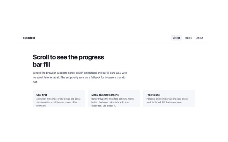
A tall 104px header that condenses to 62px once the page has scrolled 40px, with the logo shrinking from 1.5rem to 1.08rem and a soft shadow appearing underneath. It suits a landing page that wants a generous first impression without giving up space while reading. The header is fixed, and a spacer of its full height sits after it in the page flow, so as it condenses nothing below it moves. A short script toggles a single data-condensed attribute from a passive scroll listener, and CSS transitions do the rest; there is no per-frame style writing. On phones the bar starts at 74px and condenses to 56px. Below 992px the four links fold behind a menu button while the Book a demo button stays in the bar. The Bootstrap version uses .fixed-top on a .navbar-expand-lg and the same attribute.

What’s included

  • Condenses from 104px to 62px after 40px of scroll
  • Fixed header plus spacer, so the page never jumps
  • One data-condensed attribute drives every change
  • Menu button below 992px with the call to action still visible
  • Transitions switch off under reduced motion

Accessibility

The links sit in a nav labelled Main and the current one has aria-current="page". The spacer is aria-hidden. The menu button is a real button with an accessible name that reports aria-expanded; it opens with Enter or Space, and Esc closes the menu and returns focus to the button. Every link and button shows a 2px indigo outline on keyboard focus, and under prefers-reduced-motion the header changes size instantly instead of animating.

Customise it

Change the two min-heights (104px and 62px) and logo sizes on .sk and .sk[data-condensed], keeping .sk-spacer the same height as the tall state, and the 40 in the script for the threshold. In Tailwind edit min-h-[104px] and data-condensed:min-h-[62px].