About this set
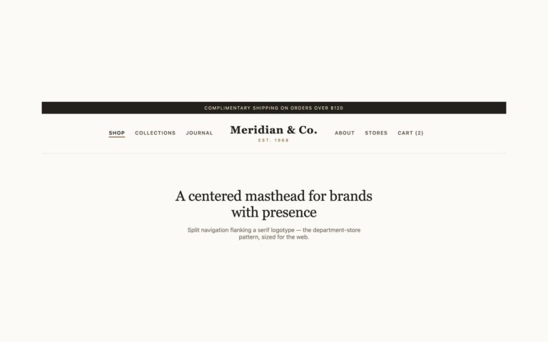
A header with the brand mark in the middle and the navigation split either side of it: Collections and Journal on the left, Stockists and Contact on the right, in small uppercase type, with a small “Est. 2014″ line under the name. It suits a fashion label, a studio or a boutique shop, where the mark matters more than the menu. The header is a CSS grid with three columns of 1fr, auto and 1fr, so the mark stays centred however many links sit either side, which a flex row cannot do without fixed widths. The nav spans all three columns as a subgrid, so its two lists line up with the outer columns while every link stays inside one labelled nav landmark. The current link is underlined from aria-current=”page”. Below 992px the mark stays centred with a menu button on the right, and the four links fold into a centred list underneath it. The Bootstrap version turns .navbar-collapse into the subgrid from 992px.
What’s included
- Centred mark held by a 1fr auto 1fr grid
- Both link groups in one nav landmark through CSS subgrid
- Current page underlined from aria-current="page"
- Centred menu list below 992px, closed with Esc
- Bootstrap .navbar-collapse turned into a subgrid from 992px
Accessibility
All four links are in one nav labelled Main, which follows the mark in reading order, and the current link has aria-current="page". The menu button is a real button with an accessible name that reports aria-expanded; it opens with Enter or Space, and Esc closes the menu and returns focus to the button. Links and the button show a 2px dark outline on keyboard focus, and the menu icon transition switches off under prefers-reduced-motion.
Customise it
Change the hex values on .sp and .sp-menu for colour, the 1.35rem mark size and the 88px min-height for scale. In Bootstrap the link colours are the --bs-navbar-* variables on .sp; in Tailwind edit the text-[…] and aria-[current=page]: utilities.