About this set
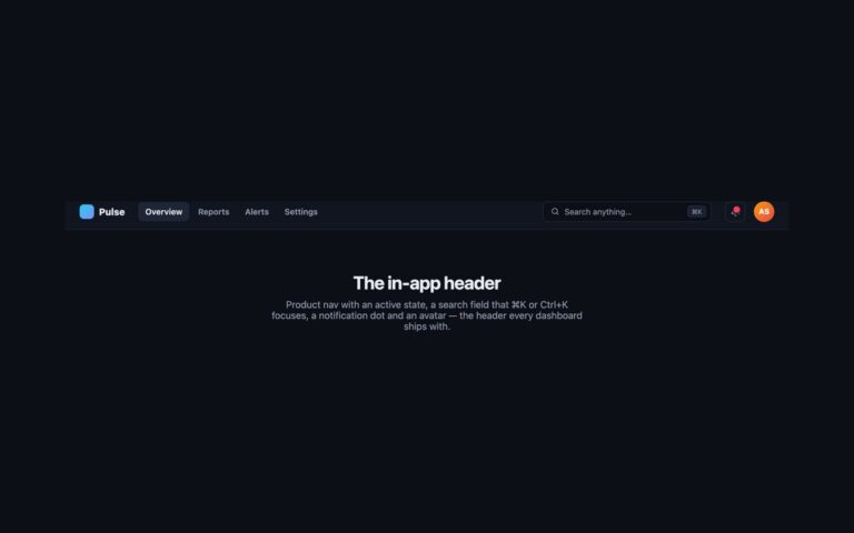
The compact 58px bar a signed-in product needs: a logo square, a workspace switcher (“Northwind · Production”), three section tabs (Overview, Deployments, Settings) with an indigo underline on the current one, and search, notification and account controls on the right. Use it for a dashboard, an admin panel or any web app. Every icon-only control has an aria-label (Search, “Notifications, new activity”, Your account), and the SVG icons are hidden from assistive technology; without the labels they would be announced as “link” and nothing else, which is the most common failure in an app header. The red dot on the bell is decoration, and the label says the same thing in words. Below 992px the environment name hides, the tabs fold behind a menu button, and the icon controls stay in the bar. The Bootstrap version places them with order utilities around .navbar-collapse.
What’s included
- Workspace switcher, section tabs and icon controls in one bar
- aria-label on every icon-only control; SVG icons aria-hidden
- Current tab underlined from aria-current="page"
- Tabs fold behind a menu button while the icons stay visible
- Bootstrap .nav-link tabs with order utilities
Accessibility
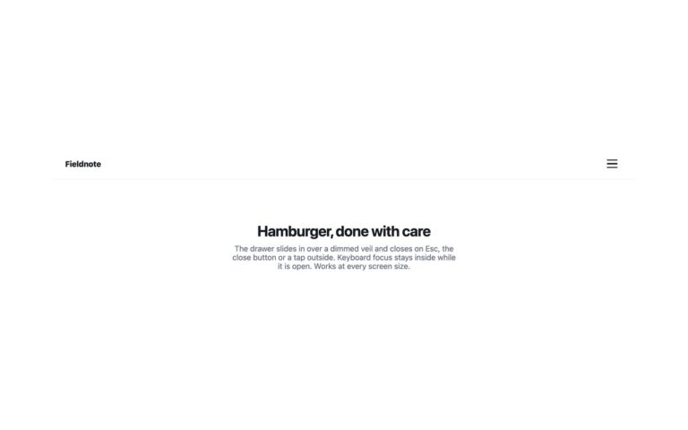
Search, notifications and account each have an aria-label, and their SVG icons are aria-hidden. The tabs sit in a nav labelled Main with aria-current="page" on the current one. The menu button is a real button with an accessible name that reports aria-expanded; it opens with Enter or Space, and Esc closes the menu and returns focus to the button. Every control shows a 2px indigo outline on keyboard focus.
Customise it
Change #4f46e5 on .ap-logo and the current-tab underline, #0369a1 for the avatar and #ef4444 for the notification dot. In Bootstrap the tab colours are the --bs-navbar-* variables on .ap; in Tailwind edit the bg-[…] and shadow-[inset_…] utilities.