Open demo

CSS code

HTML
<header class="pg">
  <a class="pg-logo" href="#">Fieldnote</a>
  <button class="pg-toggle" type="button" aria-expanded="false" aria-controls="pg-menu" aria-label="Menu" data-menu-button><i></i><i></i><i></i></button>
  <nav class="pg-menu" id="pg-menu" aria-label="Main">
    <ul>
      <li><a href="#" aria-current="page">Latest</a></li>
      <li><a href="#">Topics</a></li>
      <li><a href="#">About</a></li>
    </ul>
  </nav>
  <span class="pg-bar" aria-hidden="true" data-progress></span>
</header>
CSS
/* Header with reading progress: a 3px bar along the bottom edge fills as the page scrolls. Where the browser
   supports scroll-driven animations it is pure CSS; the script is a fallback for the rest. The bar follows the
   scroll position and never moves on its own, so it stays on under reduced motion; the link transitions do not. */
.pg{position:sticky;top:0;z-index:10;display:flex;flex-wrap:wrap;align-items:center;justify-content:space-between;
  min-height:64px;padding:0 34px;background:#fff;border-bottom:1px solid #ecedf2;color:#1a1d26}
.pg,.pg *{box-sizing:border-box}
.pg a{text-decoration:none}
.pg ul{list-style:none;margin:0;padding:0}
.pg a:focus-visible,.pg button:focus-visible{outline:2px solid #4f46e5;outline-offset:2px}
.pg-logo{font-weight:800;font-size:1.05rem;color:#1a1d26}
.pg-menu ul{display:flex;gap:3px}
.pg-menu a{display:block;padding:9px 13px;font-size:.89rem;font-weight:600;color:#4b5468;border-radius:8px;
  transition:background-color .15s,color .15s}
.pg-menu a:hover,.pg-menu a[aria-current="page"]{background:#f3f4f9;color:#1a1d26}
.pg-bar{position:absolute;left:0;bottom:-1px;width:0;height:3px;background:#4f46e5;transform-origin:0 50%}
@supports (animation-timeline: scroll()){
  .pg-bar{width:100%;transform:scaleX(0);animation:pg-grow linear both;animation-timeline:scroll(root block)}
}
@keyframes pg-grow{to{transform:scaleX(1)}}
.pg-toggle{display:none;flex:none;width:44px;height:44px;flex-direction:column;align-items:center;justify-content:center;
  gap:5px;padding:0;background:#fff;border:1px solid #d9dfe8;border-radius:10px;cursor:pointer}
.pg-toggle i{display:block;width:20px;height:2px;border-radius:2px;background:#1a1d26;transition:transform .2s,opacity .2s}
.pg-toggle[aria-expanded="true"] i:nth-child(1){transform:translateY(7px) rotate(45deg)}
.pg-toggle[aria-expanded="true"] i:nth-child(2){opacity:0}
.pg-toggle[aria-expanded="true"] i:nth-child(3){transform:translateY(-7px) rotate(-45deg)}
@media (max-width:991.98px){
  .pg{min-height:0;padding:10px 16px}
  .pg-toggle{display:flex}
  .pg-menu{display:none;flex-basis:100%;padding:6px 0 12px;border-top:1px solid #ecedf2}
  .pg-menu[data-open]{display:block}
  .pg-menu ul{flex-direction:column}
  .pg-menu a{padding:11px 12px}
}
@media (prefers-reduced-motion:reduce){.pg-menu a,.pg-toggle i{transition:none}}
JavaScript
/* Menu button: toggles aria-expanded on itself and data-open on the menu it controls (aria-controls).
   Esc closes an open menu and returns focus to the button; widening past 992px resets it. */
document.querySelectorAll('[data-menu-button]').forEach(btn => {
  const menu = document.getElementById(btn.getAttribute('aria-controls'));
  if (!menu) return;
  const set = open => { btn.setAttribute('aria-expanded', String(open)); menu.toggleAttribute('data-open', open); };
  btn.addEventListener('click', () => set(btn.getAttribute('aria-expanded') !== 'true'));
  document.addEventListener('keydown', e => {
    if (e.key === 'Escape' && btn.getAttribute('aria-expanded') === 'true') { set(false); btn.focus(); }
  });
  matchMedia('(min-width: 992px)').addEventListener('change', e => { if (e.matches) set(false); });
});

/* Fallback only: where animation-timeline is supported the bar is pure CSS and this does nothing. */
if (!CSS.supports('animation-timeline: scroll()')) {
  document.querySelectorAll('[data-progress]').forEach(bar => {
    const set = () => {
      const max = document.documentElement.scrollHeight - innerHeight;
      bar.style.width = (max > 0 ? (scrollY / max) * 100 : 0) + '%';
    };
    addEventListener('scroll', set, { passive: true });
    addEventListener('resize', set);
    set();
  });
}

Bootstrap 5 code

Requires: Bootstrap 5.3.8 CSS, Bootstrap 5.3.8 JS bundle

HTML
<header class="navbar navbar-expand-lg pg">
  <a class="navbar-brand pg-logo" href="#">Fieldnote</a>
  <button class="navbar-toggler pg-toggle" type="button" data-bs-toggle="collapse" data-bs-target="#pg-menu" aria-controls="pg-menu" aria-expanded="false" aria-label="Menu"><i></i><i></i><i></i></button>
  <nav class="collapse navbar-collapse justify-content-lg-end" id="pg-menu" aria-label="Main">
    <ul class="navbar-nav">
      <li class="nav-item"><a class="nav-link active" href="#" aria-current="page">Latest</a></li>
      <li class="nav-item"><a class="nav-link" href="#">Topics</a></li>
      <li class="nav-item"><a class="nav-link" href="#">About</a></li>
    </ul>
  </nav>
  <span class="pg-bar" aria-hidden="true" data-progress></span>
</header>
CSS
/* Bootstrap .navbar-expand-lg with a reading-progress bar on its bottom edge. The bar is scroll-driven CSS where
   animation-timeline is supported, with a script fallback. It follows the scroll position and never moves on
   its own, so it stays on under reduced motion; the link transitions do not. */
.pg{--bs-navbar-padding-x:34px;--bs-navbar-padding-y:0;--bs-navbar-color:#4b5468;--bs-navbar-hover-color:#1a1d26;
  --bs-navbar-active-color:#1a1d26;--bs-navbar-brand-color:#1a1d26;--bs-navbar-brand-hover-color:#1a1d26;
  --bs-navbar-brand-padding-y:0;--bs-navbar-brand-margin-end:0;--bs-navbar-brand-font-size:1.05rem;--bs-navbar-nav-link-padding-x:13px;
  position:sticky;top:0;z-index:10;min-height:64px;background:#fff;border-bottom:1px solid #ecedf2}
.pg a{text-decoration:none}
.pg a:focus-visible,.pg button:focus-visible{outline:2px solid #4f46e5;outline-offset:2px;box-shadow:none}
.pg-logo{font-weight:800}
.pg .navbar-nav{--bs-nav-link-padding-y:9px;--bs-nav-link-font-size:.89rem;--bs-nav-link-font-weight:600;gap:3px}
.pg .nav-link{border-radius:8px}
.pg .nav-link:hover,.pg .nav-link.active{background:#f3f4f9}
.pg-bar{position:absolute;left:0;bottom:-1px;width:0;height:3px;background:#4f46e5;transform-origin:0 50%}
@supports (animation-timeline: scroll()){
  .pg-bar{width:100%;transform:scaleX(0);animation:pg-grow linear both;animation-timeline:scroll(root block)}
}
@keyframes pg-grow{to{transform:scaleX(1)}}
.pg .navbar-toggler{width:44px;height:44px;padding:0;display:flex;flex-direction:column;align-items:center;justify-content:center;
  gap:5px;background:#fff;border:1px solid #d9dfe8;border-radius:10px}
.pg .navbar-toggler:focus{box-shadow:none}
.pg .navbar-toggler i{display:block;width:20px;height:2px;border-radius:2px;background:#1a1d26;transition:transform .2s,opacity .2s}
.pg .navbar-toggler[aria-expanded="true"] i:nth-child(1){transform:translateY(7px) rotate(45deg)}
.pg .navbar-toggler[aria-expanded="true"] i:nth-child(2){opacity:0}
.pg .navbar-toggler[aria-expanded="true"] i:nth-child(3){transform:translateY(-7px) rotate(-45deg)}
@media (min-width:992px){.pg .navbar-toggler{display:none}}
@media (max-width:991.98px){
  .pg{--bs-navbar-padding-x:16px;--bs-navbar-padding-y:10px;min-height:0}
  .pg .navbar-nav{--bs-nav-link-padding-x:12px;--bs-nav-link-padding-y:11px;padding:6px 0 12px;border-top:1px solid #ecedf2}
}
@media (prefers-reduced-motion:reduce){.pg .nav-link,.pg .navbar-toggler i{transition:none}}
JavaScript
/* Bootstrap's Collapse has no Esc handling of its own: close an open navbar menu on Esc
   and return focus to its toggler. */
document.addEventListener('keydown', e => {
  if (e.key !== 'Escape') return;
  document.querySelectorAll('.navbar-collapse.show').forEach(menu => {
    bootstrap.Collapse.getOrCreateInstance(menu, { toggle: false }).hide();
    document.querySelector(`[data-bs-target="#${menu.id}"]`)?.focus();
  });
});

/* Fallback only: where animation-timeline is supported the bar is pure CSS and this does nothing. */
if (!CSS.supports('animation-timeline: scroll()')) {
  document.querySelectorAll('[data-progress]').forEach(bar => {
    const set = () => {
      const max = document.documentElement.scrollHeight - innerHeight;
      bar.style.width = (max > 0 ? (scrollY / max) * 100 : 0) + '%';
    };
    addEventListener('scroll', set, { passive: true });
    addEventListener('resize', set);
    set();
  });
}

Tailwind 4 code

Requires: Tailwind CSS 4

HTML
<header class="sticky top-0 z-10 flex min-h-16 flex-wrap items-center justify-between border-b border-[#ecedf2] bg-white px-[34px] text-[#1a1d26] max-lg:min-h-0 max-lg:px-4 max-lg:py-2.5">
  <a class="text-[1.05rem] font-extrabold text-[#1a1d26] focus-visible:outline-2 focus-visible:outline-offset-2 focus-visible:outline-[#4f46e5]" href="#">Fieldnote</a>
  <button class="group flex size-11 flex-none cursor-pointer flex-col items-center justify-center gap-[5px] rounded-[10px] border border-[#d9dfe8] bg-white p-0 focus-visible:outline-2 focus-visible:outline-offset-2 focus-visible:outline-[#4f46e5] lg:hidden " type="button" aria-expanded="false" aria-controls="pg-menu" aria-label="Menu" data-menu-button><i class="block h-0.5 w-5 rounded-sm bg-[#1a1d26] transition-transform duration-200 motion-reduce:transition-none group-aria-expanded:translate-y-[7px] group-aria-expanded:rotate-45"></i><i class="block h-0.5 w-5 rounded-sm bg-[#1a1d26] transition-opacity duration-200 motion-reduce:transition-none group-aria-expanded:opacity-0"></i><i class="block h-0.5 w-5 rounded-sm bg-[#1a1d26] transition-transform duration-200 motion-reduce:transition-none group-aria-expanded:-translate-y-[7px] group-aria-expanded:-rotate-45"></i></button>
  <nav class="hidden data-open:block lg:block max-lg:basis-full max-lg:border-t max-lg:border-[#ecedf2] max-lg:pt-1.5 max-lg:pb-3" id="pg-menu" aria-label="Main">
    <ul class="flex gap-[3px] max-lg:flex-col">
      <li><a class="block rounded-lg px-[13px] py-[9px] text-[.89rem] font-semibold text-[#4b5468] transition-colors duration-150 hover:bg-[#f3f4f9] hover:text-[#1a1d26] aria-[current=page]:bg-[#f3f4f9] aria-[current=page]:text-[#1a1d26] focus-visible:outline-2 focus-visible:outline-offset-2 focus-visible:outline-[#4f46e5] motion-reduce:transition-none max-lg:px-3 max-lg:py-[11px]" href="#" aria-current="page">Latest</a></li>
      <li><a class="block rounded-lg px-[13px] py-[9px] text-[.89rem] font-semibold text-[#4b5468] transition-colors duration-150 hover:bg-[#f3f4f9] hover:text-[#1a1d26] aria-[current=page]:bg-[#f3f4f9] aria-[current=page]:text-[#1a1d26] focus-visible:outline-2 focus-visible:outline-offset-2 focus-visible:outline-[#4f46e5] motion-reduce:transition-none max-lg:px-3 max-lg:py-[11px]" href="#">Topics</a></li>
      <li><a class="block rounded-lg px-[13px] py-[9px] text-[.89rem] font-semibold text-[#4b5468] transition-colors duration-150 hover:bg-[#f3f4f9] hover:text-[#1a1d26] aria-[current=page]:bg-[#f3f4f9] aria-[current=page]:text-[#1a1d26] focus-visible:outline-2 focus-visible:outline-offset-2 focus-visible:outline-[#4f46e5] motion-reduce:transition-none max-lg:px-3 max-lg:py-[11px]" href="#">About</a></li>
    </ul>
  </nav>
  <span class="absolute -bottom-px left-0 h-[3px] w-0 origin-left bg-[#4f46e5] supports-[animation-timeline:scroll()]:w-full supports-[animation-timeline:scroll()]:scroll-progress" aria-hidden="true" data-progress></span>
</header>
CSS
@theme {
  --breakpoint-lg: 62rem; /* 992px, the same collapse point as Bootstrap's navbar-expand-lg */
}
@keyframes pg-grow { from { scale: 0 1; } to { scale: 1 1; } }
/* Scroll-driven fill. The bar follows the scroll position and never moves on its own, so it is not
   switched off under prefers-reduced-motion; the link transitions are (motion-reduce:). */
@utility scroll-progress { animation: pg-grow linear both; animation-timeline: scroll(root block); }
JavaScript
/* Menu button: toggles aria-expanded on itself and data-open on the menu it controls (aria-controls).
   Esc closes an open menu and returns focus to the button; widening past 992px resets it. */
document.querySelectorAll('[data-menu-button]').forEach(btn => {
  const menu = document.getElementById(btn.getAttribute('aria-controls'));
  if (!menu) return;
  const set = open => { btn.setAttribute('aria-expanded', String(open)); menu.toggleAttribute('data-open', open); };
  btn.addEventListener('click', () => set(btn.getAttribute('aria-expanded') !== 'true'));
  document.addEventListener('keydown', e => {
    if (e.key === 'Escape' && btn.getAttribute('aria-expanded') === 'true') { set(false); btn.focus(); }
  });
  matchMedia('(min-width: 992px)').addEventListener('change', e => { if (e.matches) set(false); });
});

/* Fallback only: where animation-timeline is supported the bar is pure CSS and this does nothing. */
if (!CSS.supports('animation-timeline: scroll()')) {
  document.querySelectorAll('[data-progress]').forEach(bar => {
    const set = () => {
      const max = document.documentElement.scrollHeight - innerHeight;
      bar.style.width = (max > 0 ? (scrollY / max) * 100 : 0) + '%';
    };
    addEventListener('scroll', set, { passive: true });
    addEventListener('resize', set);
    set();
  });
}

About this set

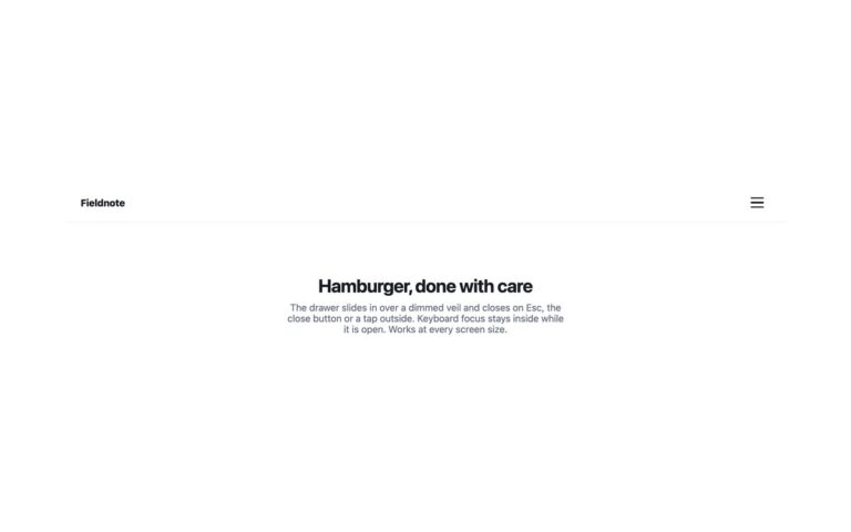
A sticky blog header with a 3px indigo bar along its bottom edge that fills from left to right as the reader scrolls through the page. It suits long articles, guides and documentation, where knowing how much is left helps. Where the browser supports scroll-driven animations, the bar is pure CSS: a keyframe that scales it from 0 to 1, attached to animation-timeline: scroll(root block), with no scroll listener at all. In other browsers a short script sets the bar’s width from a passive scroll listener instead. The bar is decorative and aria-hidden. It follows the scroll position and never moves on its own, so it stays on under reduced motion, while the link transitions switch off. Below 992px the three links fold behind a menu button. The Tailwind version defines the animation as a custom scroll-progress utility behind a supports-[…] variant.

What’s included

  • Progress bar driven by animation-timeline: scroll()
  • Script fallback only where scroll timelines are unsupported
  • Decorative bar hidden from screen readers
  • Menu button below 992px, closed with Esc
  • Tailwind @utility for the scroll-driven animation

Accessibility

The bar is aria-hidden because it repeats what the scroll position already tells assistive technology. The links sit in a nav labelled Main with aria-current="page" on the current one. The menu button is a real button with an accessible name that reports aria-expanded; it opens with Enter or Space, and Esc closes the menu and returns focus to the button. Link transitions switch off under prefers-reduced-motion; the bar only moves when the reader scrolls.

Customise it

Change the 3px height and #4f46e5 on .pg-bar. In Tailwind edit h-[3px] and bg-[#4f46e5] on the bar and the pg-grow keyframes in the text/tailwindcss block.