Open demo

CSS code

HTML
<header class="hdr">
  <a class="logo" href="#">Fieldnote</a>
  <button class="toggle" type="button" aria-haspopup="dialog" aria-expanded="false" aria-controls="hdr-drawer" aria-label="Open menu"><i></i><i></i><i></i></button>
  <dialog class="drawer" id="hdr-drawer" aria-label="Menu">
    <div class="inner">
      <div class="top"><span class="logo">Fieldnote</span><button class="close" type="button" aria-label="Close menu"><svg aria-hidden="true" width="14" height="14" viewBox="0 0 14 14"><path d="M2 2l10 10M12 2 2 12" stroke="currentColor" stroke-width="1.8" stroke-linecap="round"/></svg></button></div>
      <nav aria-label="Main">
        <ul>
          <li><a href="#" aria-current="page">Features <span aria-hidden="true">→</span></a></li>
          <li><a href="#">Pricing <span aria-hidden="true">→</span></a></li>
          <li><a href="#">Customers <span aria-hidden="true">→</span></a></li>
          <li><a href="#">Blog <span aria-hidden="true">→</span></a></li>
          <li><a href="#">Support <span aria-hidden="true">→</span></a></li>
        </ul>
      </nav>
      <div class="foot"><a class="cta" href="#">Start free trial</a></div>
    </div>
  </dialog>
</header>
CSS
/* Sticky header whose menu button opens a side drawer. The drawer is a modal <dialog>: the browser keeps
   focus inside it, makes the page behind inert and sends Esc as a cancel event; ::backdrop is the veil. */
.hdr{--hdr-ink:#171a21;--hdr-line:#eceef2;--hdr-focus:#2563eb;
  position:sticky;top:0;z-index:10;display:flex;align-items:center;justify-content:space-between;height:64px;padding:0 26px;
  background:#fff;border-bottom:1px solid var(--hdr-line);color:var(--hdr-ink);font-family:-apple-system,BlinkMacSystemFont,"Segoe UI",Roboto,Helvetica,Arial,sans-serif}
.hdr,.hdr *{box-sizing:border-box}
.hdr ul{list-style:none;margin:0;padding:0}
.hdr a{text-decoration:none}
.hdr a:focus-visible,.hdr button:focus-visible{outline:2px solid var(--hdr-focus);outline-offset:2px}
.hdr .logo{font-weight:800;font-size:1.02rem;letter-spacing:-.01em;color:var(--hdr-ink);border-radius:6px}
.hdr .toggle{width:44px;height:44px;border:0;border-radius:10px;background:none;cursor:pointer;display:flex;flex-direction:column;align-items:center;justify-content:center;gap:5px}
.hdr .toggle i{display:block;width:22px;height:2.5px;border-radius:99px;background:var(--hdr-ink)}
.hdr .drawer{position:fixed;inset:0 0 0 auto;width:min(320px,86vw);height:100%;max-width:none;max-height:none;margin:0;padding:0;border:0;background:#fff;color:var(--hdr-ink)}
.hdr .drawer[open]{animation:hdr-in .28s cubic-bezier(.4,.1,.2,1)}
.hdr .drawer.closing{animation:hdr-out .28s cubic-bezier(.4,.1,.2,1) forwards}
.hdr .drawer::backdrop{background:rgba(15,18,26,.45);animation:hdr-fade .25s}
.hdr .drawer.closing::backdrop{animation:hdr-fade .25s reverse forwards}
@keyframes hdr-in{from{transform:translateX(100%)}}
@keyframes hdr-out{to{transform:translateX(100%)}}
@keyframes hdr-fade{from{opacity:0}}
.hdr .inner{height:100%;display:flex;flex-direction:column;padding:26px}
.hdr .top{display:flex;justify-content:space-between;align-items:center;margin-bottom:26px}
.hdr .top .logo{font-weight:800}
.hdr .close{display:grid;place-items:center;width:38px;height:38px;border:1px solid #d5d9e0;border-radius:10px;background:none;color:var(--hdr-ink);cursor:pointer}
.hdr .drawer nav a{display:flex;justify-content:space-between;padding:15px 4px;font-size:1.05rem;font-weight:700;color:var(--hdr-ink);border-bottom:1px solid #f1f3f6}
.hdr .drawer nav a span{color:#6b7280}
.hdr .drawer nav a:hover span,.hdr .drawer nav a[aria-current="page"] span{color:var(--hdr-ink)}
.hdr .drawer nav a[aria-current="page"]{background:#f4f5f7;padding-left:12px;padding-right:12px;border-radius:10px;border-bottom-color:transparent}
.hdr .foot{margin-top:auto}
.hdr .cta{display:block;text-align:center;background:var(--hdr-ink);color:#fff;font-weight:700;padding:13px;border-radius:11px}
@media (prefers-reduced-motion:reduce){.hdr .drawer,.hdr .drawer::backdrop{animation:none!important}}
JavaScript
/* Open with showModal(); close with a slide-out (skipped under reduced motion). Esc arrives as a cancel event,
   a click on the dialog element itself is a click on the veil. aria-expanded follows the dialog. */
(() => {
  const btn = document.querySelector('.hdr .toggle'); if (!btn) return;
  const dlg = document.getElementById(btn.getAttribute('aria-controls'));
  const reduce = matchMedia('(prefers-reduced-motion: reduce)');
  const close = () => {
    if (!dlg.open || dlg.classList.contains('closing')) return;
    if (reduce.matches) return dlg.close();
    dlg.classList.add('closing');
    const done = e => { if (e.pseudoElement) return; dlg.removeEventListener('animationend', done); dlg.classList.remove('closing'); dlg.close(); };
    dlg.addEventListener('animationend', done);
  };
  btn.addEventListener('click', () => { dlg.showModal(); btn.setAttribute('aria-expanded', 'true'); });
  dlg.addEventListener('close', () => { btn.setAttribute('aria-expanded', 'false'); btn.focus(); });
  dlg.addEventListener('cancel', e => { e.preventDefault(); close(); });
  dlg.addEventListener('click', e => { if (e.target === dlg) close(); });
  dlg.querySelector('.close').addEventListener('click', close);
})();

Bootstrap 5 code

Requires: Bootstrap 5.3.8 CSS, Bootstrap 5.3.8 JS bundle

HTML
<header class="hdr sticky-top">
  <div class="navbar">
    <div class="container-fluid">
      <a class="navbar-brand" href="#">Fieldnote</a>
      <button class="navbar-toggler" type="button" data-bs-toggle="offcanvas" data-bs-target="#hdr-drawer" aria-controls="hdr-drawer" aria-expanded="false" aria-label="Open menu"><i></i><i></i><i></i></button>
    </div>
  </div>
  <div class="offcanvas offcanvas-end" tabindex="-1" id="hdr-drawer" aria-labelledby="hdr-drawer-title">
    <div class="offcanvas-header">
      <p class="offcanvas-title m-0" id="hdr-drawer-title">Fieldnote</p>
      <button type="button" class="btn-close" data-bs-dismiss="offcanvas" aria-label="Close menu"></button>
    </div>
    <div class="offcanvas-body">
      <nav aria-label="Main">
        <ul class="nav flex-column">
          <li class="nav-item"><a class="nav-link active" href="#" aria-current="page">Features <span aria-hidden="true">→</span></a></li>
          <li class="nav-item"><a class="nav-link" href="#">Pricing <span aria-hidden="true">→</span></a></li>
          <li class="nav-item"><a class="nav-link" href="#">Customers <span aria-hidden="true">→</span></a></li>
          <li class="nav-item"><a class="nav-link" href="#">Blog <span aria-hidden="true">→</span></a></li>
          <li class="nav-item"><a class="nav-link" href="#">Support <span aria-hidden="true">→</span></a></li>
        </ul>
      </nav>
      <div class="mt-auto"><a class="btn cta w-100" href="#">Start free trial</a></div>
    </div>
  </div>
</header>
CSS
/* Bootstrap .navbar.sticky-top whose toggler opens an .offcanvas-end drawer. The Offcanvas plugin traps focus,
   closes on Esc, the close button or the backdrop, and hands focus back to the toggler. */
.hdr{--hdr-ink:#171a21;--hdr-line:#eceef2;--hdr-focus:#2563eb}
.hdr .navbar{--bs-navbar-padding-y:0;--bs-navbar-padding-x:26px;--bs-navbar-brand-color:var(--hdr-ink);--bs-navbar-brand-hover-color:var(--hdr-ink);
  --bs-navbar-brand-padding-y:0;--bs-navbar-brand-margin-end:0;height:64px;background:#fff;border-bottom:1px solid var(--hdr-line)}
.hdr .container-fluid{padding:0}
.hdr .navbar-brand{font-weight:800;font-size:1.02rem;letter-spacing:-.01em;border-radius:6px}
.hdr .navbar-toggler{width:44px;height:44px;padding:0;display:flex;flex-direction:column;align-items:center;justify-content:center;gap:5px;border:0;border-radius:10px}
.hdr .navbar-toggler i{display:block;width:22px;height:2.5px;border-radius:99px;background:var(--hdr-ink)}
.hdr .offcanvas{--bs-offcanvas-width:min(320px,86vw);--bs-offcanvas-padding-x:26px;--bs-offcanvas-padding-y:26px;--bs-offcanvas-border-width:0;--bs-offcanvas-color:var(--hdr-ink);
  --bs-offcanvas-transition:transform .28s cubic-bezier(.4,.1,.2,1)}
.hdr .offcanvas-header{padding-bottom:0;margin-bottom:26px}
.hdr .offcanvas-title{font-weight:800;font-size:1.02rem;letter-spacing:-.01em}
.hdr .offcanvas-body{display:flex;flex-direction:column;padding-top:0}
.hdr .btn-close{--bs-btn-close-opacity:1;--bs-btn-close-hover-opacity:1;--bs-btn-close-focus-shadow:none;width:38px;height:38px;padding:0;margin:0 0 0 auto;
  background-size:12px;border:1px solid #d5d9e0;border-radius:10px}
.hdr .offcanvas .nav-link{display:flex;justify-content:space-between;padding:15px 4px;font-size:1.05rem;font-weight:700;color:var(--hdr-ink);border-bottom:1px solid #f1f3f6}
.hdr .offcanvas .nav-link span{color:#6b7280}
.hdr .offcanvas .nav-link:hover span,.hdr .offcanvas .nav-link.active span{color:var(--hdr-ink)}
.hdr .offcanvas .nav-link.active{background:#f4f5f7;padding-left:12px;padding-right:12px;border-radius:10px;border-bottom-color:transparent}
.hdr .cta{--bs-btn-font-weight:700;--bs-btn-padding-y:13px;--bs-btn-border-radius:11px;--bs-btn-border-width:0;--bs-btn-color:#fff;--bs-btn-bg:var(--hdr-ink);
  --bs-btn-hover-color:#fff;--bs-btn-hover-bg:#2a2f3a;--bs-btn-active-color:#fff;--bs-btn-active-bg:#2a2f3a}
.hdr a:focus-visible,.hdr button:focus-visible{outline:2px solid var(--hdr-focus);outline-offset:2px;box-shadow:none}
.hdr .offcanvas-backdrop{--bs-backdrop-bg:#0f121a;--bs-backdrop-opacity:.45}
@media (prefers-reduced-motion:reduce){.hdr .offcanvas{transition:none}}
JavaScript
/* Offcanvas does not manage aria-expanded on its trigger, so keep it in sync here. */
document.querySelectorAll('.hdr .offcanvas').forEach(drawer => {
  const toggler = document.querySelector(`[data-bs-target="#${drawer.id}"]`);
  drawer.addEventListener('show.bs.offcanvas', () => toggler.setAttribute('aria-expanded', 'true'));
  drawer.addEventListener('hidden.bs.offcanvas', () => toggler.setAttribute('aria-expanded', 'false'));
});

Tailwind 4 code

Requires: Tailwind CSS 4

HTML
<header class="hdr sticky top-0 z-10 flex h-16 items-center justify-between border-b border-hdr-line bg-white px-[26px] text-hdr-ink">
  <a class="rounded-md text-[1.02rem] font-extrabold tracking-[-.01em] text-hdr-ink focus-visible:outline-2 focus-visible:outline-offset-2 focus-visible:outline-hdr-focus" href="#">Fieldnote</a>
  <button class="toggle flex size-11 cursor-pointer flex-col items-center justify-center gap-[5px] rounded-[10px] focus-visible:outline-2 focus-visible:outline-offset-2 focus-visible:outline-hdr-focus" type="button" aria-haspopup="dialog" aria-expanded="false" aria-controls="hdr-drawer" aria-label="Open menu">
    <i class="block h-[2.5px] w-[22px] rounded-full bg-hdr-ink"></i><i class="block h-[2.5px] w-[22px] rounded-full bg-hdr-ink"></i><i class="block h-[2.5px] w-[22px] rounded-full bg-hdr-ink"></i>
  </button>
  <dialog class="fixed inset-y-0 right-0 left-auto m-0 h-full max-h-none w-[min(320px,86vw)] max-w-none bg-white p-0 text-hdr-ink backdrop:bg-[rgba(15,18,26,.45)] open:animate-hdr-in open:backdrop:animate-hdr-fade-in motion-reduce:animate-none! motion-reduce:backdrop:animate-none! [&.closing]:animate-hdr-out [&.closing]:backdrop:animate-hdr-fade-out" id="hdr-drawer" aria-label="Menu">
    <div class="flex h-full flex-col p-[26px]">
      <div class="mb-[26px] flex items-center justify-between"><span class="text-[1.02rem] font-extrabold tracking-[-.01em]">Fieldnote</span><button class="close grid size-[38px] cursor-pointer place-items-center rounded-[10px] border border-[#d5d9e0] text-hdr-ink focus-visible:outline-2 focus-visible:outline-offset-2 focus-visible:outline-hdr-focus" type="button" aria-label="Close menu"><svg aria-hidden="true" width="14" height="14" viewBox="0 0 14 14"><path d="M2 2l10 10M12 2 2 12" stroke="currentColor" stroke-width="1.8" stroke-linecap="round"/></svg></button></div>
      <nav aria-label="Main">
        <ul>
          <li><a class="flex justify-between rounded-[10px] bg-[#f4f5f7] px-3 py-[15px] text-[1.05rem] font-bold text-hdr-ink focus-visible:outline-2 focus-visible:outline-offset-2 focus-visible:outline-hdr-focus" href="#" aria-current="page">Features <span aria-hidden="true">→</span></a></li>
          <li><a class="group flex justify-between border-b border-[#f1f3f6] px-1 py-[15px] text-[1.05rem] font-bold text-hdr-ink focus-visible:outline-2 focus-visible:outline-offset-2 focus-visible:outline-hdr-focus" href="#">Pricing <span class="text-[#6b7280] group-hover:text-hdr-ink" aria-hidden="true">→</span></a></li>
          <li><a class="group flex justify-between border-b border-[#f1f3f6] px-1 py-[15px] text-[1.05rem] font-bold text-hdr-ink focus-visible:outline-2 focus-visible:outline-offset-2 focus-visible:outline-hdr-focus" href="#">Customers <span class="text-[#6b7280] group-hover:text-hdr-ink" aria-hidden="true">→</span></a></li>
          <li><a class="group flex justify-between border-b border-[#f1f3f6] px-1 py-[15px] text-[1.05rem] font-bold text-hdr-ink focus-visible:outline-2 focus-visible:outline-offset-2 focus-visible:outline-hdr-focus" href="#">Blog <span class="text-[#6b7280] group-hover:text-hdr-ink" aria-hidden="true">→</span></a></li>
          <li><a class="group flex justify-between border-b border-[#f1f3f6] px-1 py-[15px] text-[1.05rem] font-bold text-hdr-ink focus-visible:outline-2 focus-visible:outline-offset-2 focus-visible:outline-hdr-focus" href="#">Support <span class="text-[#6b7280] group-hover:text-hdr-ink" aria-hidden="true">→</span></a></li>
        </ul>
      </nav>
      <div class="mt-auto"><a class="block rounded-[11px] bg-hdr-ink p-[13px] text-center font-bold text-white focus-visible:outline-2 focus-visible:outline-offset-2 focus-visible:outline-hdr-focus" href="#">Start free trial</a></div>
    </div>
  </dialog>
</header>
CSS
@theme {
  --color-hdr-ink: #171a21;
  --color-hdr-line: #eceef2;
  --color-hdr-focus: #2563eb;
  --animate-hdr-in: hdr-in .28s cubic-bezier(.4,.1,.2,1);
  --animate-hdr-out: hdr-out .28s cubic-bezier(.4,.1,.2,1) forwards;
  --animate-hdr-fade-in: hdr-fade .25s;
  --animate-hdr-fade-out: hdr-fade .25s reverse forwards;
  @keyframes hdr-in { from { transform: translateX(100%); } }
  @keyframes hdr-out { to { transform: translateX(100%); } }
  @keyframes hdr-fade { from { opacity: 0; } }
}
JavaScript
/* Open with showModal(); close with a slide-out (skipped under reduced motion). Esc arrives as a cancel event,
   a click on the dialog element itself is a click on the veil. aria-expanded follows the dialog. */
(() => {
  const btn = document.querySelector('.hdr .toggle'); if (!btn) return;
  const dlg = document.getElementById(btn.getAttribute('aria-controls'));
  const reduce = matchMedia('(prefers-reduced-motion: reduce)');
  const close = () => {
    if (!dlg.open || dlg.classList.contains('closing')) return;
    if (reduce.matches) return dlg.close();
    dlg.classList.add('closing');
    const done = e => { if (e.pseudoElement) return; dlg.removeEventListener('animationend', done); dlg.classList.remove('closing'); dlg.close(); };
    dlg.addEventListener('animationend', done);
  };
  btn.addEventListener('click', () => { dlg.showModal(); btn.setAttribute('aria-expanded', 'true'); });
  dlg.addEventListener('close', () => { btn.setAttribute('aria-expanded', 'false'); btn.focus(); });
  dlg.addEventListener('cancel', e => { e.preventDefault(); close(); });
  dlg.addEventListener('click', e => { if (e.target === dlg) close(); });
  dlg.querySelector('.close').addEventListener('click', close);
})();

About this set

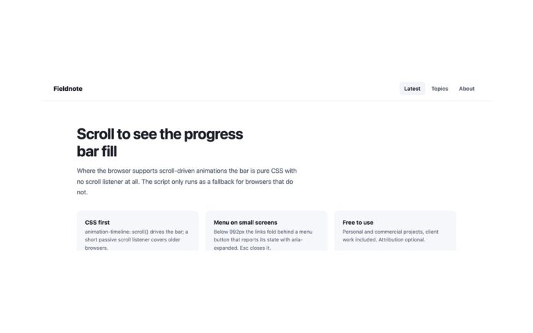
A minimal sticky header, a wordmark on the left and a hamburger button on the right at every screen size, that opens a full-height drawer from the right edge over a dimmed veil. The drawer repeats the logo beside a close button, lists five large links with arrows (the current one on a light grey pill) and pins a dark Start free trial button to the bottom. In the plain CSS and Tailwind versions the drawer is a native dialog opened with showModal(), so the browser keeps keyboard focus inside it, makes the page behind inert and turns Esc into a cancel event; the ::backdrop pseudo-element is the veil, and a click on it closes the drawer. A slide animation plays on the way in and out and is skipped under reduced motion. The Bootstrap version uses .offcanvas-end, which traps focus, closes on Esc, the close button or the backdrop, and returns focus to the toggler. Use it for editorial sites, portfolios, mobile-first products and any header that should stay uncluttered on desktop too.

What’s included

  • Right-hand drawer over a dimmed veil at every screen size
  • Native modal dialog: focus stays inside, the page behind is inert
  • Closes on Esc, the close button or a click on the veil
  • Slide in and out, skipped under reduced motion
  • Call to action pinned to the bottom of the drawer

Accessibility

The menu button has aria-haspopup="dialog", aria-controls and an aria-expanded state that follows the drawer, and focus returns to it when the drawer closes. The drawer is labelled Menu, its links sit in a nav labelled Main with aria-current="page" on Features, and the close button is named Close menu. The arrows are hidden from screen readers, every control has a blue focus outline, and animations stop under prefers-reduced-motion.

Customise it

Change --hdr-ink, --hdr-line and --hdr-focus on .hdr and the width: min(320px, 86vw) on .drawer. Bootstrap uses --bs-offcanvas-width, --bs-offcanvas-padding-x and the backdrop variables; in Tailwind edit the --color-hdr-* colours and the --animate-hdr-* keyframes in the theme.