About this set
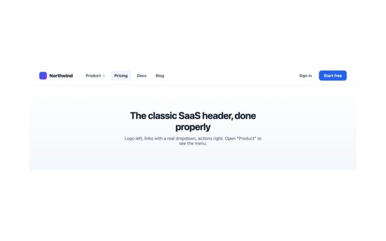
A SaaS header with two actions of clearly different weight: a quiet “Sign in” text link beside a filled indigo “Start free” button with a tinted shadow. Two buttons of equal weight make people choose twice; giving the secondary action no fill is what makes the primary read as the default. The logo and three links (Product, Docs, Pricing) sit on the left and the actions on the right, and the bar is sticky. Use it for a product site where sign-ups matter more than browsing. Below 992px the links fold behind a menu button, but both actions stay in the bar next to it, so the primary action is never hidden in a menu. The layout is one flex row that wraps: order moves the actions before the menu button on narrow screens, and the menu takes a full-width row underneath. In Bootstrap the actions are .btn elements restyled through –bs-btn-* variables and positioned with order utilities.
What’s included
- Ghost secondary action beside a filled primary button
- Both actions stay visible beside the menu button on phones
- Current page styled from aria-current="page"
- Primary button lift switches off under reduced motion
- Bootstrap .btn variants built from --bs-btn-* variables
Accessibility
The links sit in a nav labelled Main with aria-current="page" on the current one. The menu button is a real button with an accessible name that reports aria-expanded; it opens with Enter or Space, and Esc closes the menu and returns focus to the button. Every link and button shows a 2px indigo outline on keyboard focus, and the hover lift and transitions switch off under prefers-reduced-motion.
Customise it
Change #4f46e5 on .cg-primary (and its rgba shadow) for the brand colour, and #f4f5f9 for the hover and current-link fill. In Bootstrap set --bs-btn-bg and --bs-btn-hover-bg on .cg-primary; in Tailwind edit bg-[#4f46e5] and the shadow-[…] utilities.