Open demo

CSS code

HTML
<header class="hc">
  <a class="logo" href="#"><i aria-hidden="true"></i>Northwind</a>
  <button class="toggle" type="button" aria-expanded="false" aria-controls="hc-panel" aria-label="Menu"><i></i><i></i><i></i></button>
  <div class="panel" id="hc-panel">
    <nav aria-label="Main">
      <ul class="links">
        <li class="has-menu">
          <button class="sub-btn" type="button" aria-expanded="false" aria-controls="hc-product">Product <svg aria-hidden="true" width="10" height="10" viewBox="0 0 10 10"><path d="M2 3.5 5 6.5 8 3.5" fill="none" stroke="currentColor" stroke-width="1.6" stroke-linecap="round"/></svg></button>
          <ul class="menu" id="hc-product">
            <li><a href="#"><b>Analytics</b><span>Dashboards your team will read</span></a></li>
            <li><a href="#"><b>Automations</b><span>Reports that build themselves</span></a></li>
            <li><a href="#"><b>Integrations</b><span>Plays nicely with your stack</span></a></li>
          </ul>
        </li>
        <li><a href="#" aria-current="page">Pricing</a></li>
        <li><a href="#">Docs</a></li>
        <li><a href="#">Blog</a></li>
      </ul>
    </nav>
    <div class="actions"><a class="ghost" href="#">Sign in</a><a class="cta" href="#">Start free</a></div>
  </div>
</header>
CSS
/* Classic SaaS header: logo left, links with a dropdown, actions right.
   Below 992px the links and actions collapse behind a menu button. */
.hc{--hc-text:#16202e;--hc-muted:#42506b;--hc-soft:#f2f5fa;--hc-line:#eaeef4;--hc-accent:#2563eb;
  position:relative;display:flex;align-items:center;gap:34px;min-height:70px;padding:0 36px;background:#fff;
  border-bottom:1px solid var(--hc-line);color:var(--hc-text);
  font-family:-apple-system,BlinkMacSystemFont,"Segoe UI",Roboto,Helvetica,Arial,sans-serif}
.hc,.hc *{box-sizing:border-box}
.hc ul{list-style:none;margin:0;padding:0}
.hc a{text-decoration:none}
.hc a:focus-visible,.hc button:focus-visible{outline:2px solid var(--hc-accent);outline-offset:2px}
.hc .logo{display:flex;align-items:center;gap:9px;font-weight:800;font-size:1.05rem;letter-spacing:-.01em;color:var(--hc-text);border-radius:8px}
.hc .logo i{width:28px;height:28px;border-radius:8px;background:linear-gradient(135deg,#2563eb,#7c3aed)}
.hc .panel{flex:1;display:flex;align-items:center;gap:34px}
.hc .panel>nav{margin-right:auto}
.hc .links{display:flex;gap:6px}
.hc .links>li{position:relative}
.hc .links>li>a,.hc .sub-btn{display:flex;align-items:center;gap:6px;padding:10px 14px;font:inherit;font-size:.9rem;font-weight:600;
  color:var(--hc-muted);background:none;border:0;border-radius:9px;cursor:pointer;transition:background .15s,color .15s}
.hc .links>li>a:hover,.hc .sub-btn:hover,.hc .sub-btn[aria-expanded="true"]{background:var(--hc-soft);color:var(--hc-text)}
.hc .links a[aria-current="page"]{color:var(--hc-text);background:var(--hc-soft)}
.hc .sub-btn svg{color:#6b7891;transition:transform .15s}
.hc .sub-btn[aria-expanded="true"] svg{transform:rotate(180deg)}
.hc .menu{position:absolute;top:calc(100% + 6px);left:0;z-index:10;min-width:240px;padding:8px;background:#fff;
  border:1px solid #e7ecf3;border-radius:12px;box-shadow:0 18px 40px -18px rgba(20,32,56,.25);
  opacity:0;visibility:hidden;transform:translateY(6px);transition:opacity .18s,transform .18s,visibility .18s}
.hc .menu::before{content:"";position:absolute;left:0;right:0;top:-8px;height:8px}
.hc .menu[data-open]{opacity:1;visibility:visible;transform:none}
@media (min-width:992px) and (hover:hover){.hc .has-menu:hover .menu{opacity:1;visibility:visible;transform:none}}
.hc .menu a{display:block;padding:9px 12px;border-radius:8px;transition:background .15s}
.hc .menu a:hover{background:var(--hc-soft)}
.hc .menu b{display:block;font-size:.9rem;color:var(--hc-text)}
.hc .menu span{font-size:.76rem;color:#5f6b82}
.hc .actions{display:flex;gap:12px;align-items:center}
.hc .ghost{font-size:.88rem;font-weight:600;color:var(--hc-muted);padding:9px 14px;border-radius:9px}
.hc .ghost:hover{background:var(--hc-soft);color:var(--hc-text)}
.hc .cta{font-size:.88rem;font-weight:700;color:#fff;background:var(--hc-accent);padding:10px 18px;border-radius:10px;transition:background .15s}
.hc .cta:hover{background:#1d4fd1}
.hc .toggle{display:none;margin-left:auto;width:44px;height:44px;flex-direction:column;align-items:center;justify-content:center;gap:5px;
  background:#fff;border:1px solid #d9dfe8;border-radius:10px;cursor:pointer}
.hc .toggle i{display:block;width:20px;height:2px;border-radius:2px;background:var(--hc-text);transition:transform .2s,opacity .2s}
.hc .toggle[aria-expanded="true"] i:nth-child(1){transform:translateY(7px) rotate(45deg)}
.hc .toggle[aria-expanded="true"] i:nth-child(2){opacity:0}
.hc .toggle[aria-expanded="true"] i:nth-child(3){transform:translateY(-7px) rotate(-45deg)}
@media (max-width:991.98px){
  .hc{flex-wrap:wrap;gap:0;padding:13px 16px}
  .hc .toggle{display:flex}
  .hc .panel{display:none;flex-basis:100%;flex-direction:column;align-items:stretch;gap:12px;padding:12px 0 4px}
  .hc .panel[data-open]{display:flex}
  .hc .panel>nav{margin:0}
  .hc .links{flex-direction:column;gap:2px}
  .hc .menu{position:static;display:none;min-width:0;padding:2px 0 6px 14px;border:0;box-shadow:none;opacity:1;visibility:visible;transform:none}
  .hc .menu[data-open]{display:block}
  .hc .actions{padding-top:14px;border-top:1px solid var(--hc-line)}
  .hc .actions a{flex:1;text-align:center}
}
@media (prefers-reduced-motion:reduce){.hc *{transition:none!important}}
JavaScript
/* Menu button (below 992px) and the Product dropdown are disclosure buttons: each toggles aria-expanded
   and a data-open attribute on the element it controls. Esc closes the open one and returns focus. */
(() => {
  const hd = document.querySelector('.hc'); if (!hd) return;
  const toggle = hd.querySelector('.toggle'), subs = [...hd.querySelectorAll('.sub-btn')];
  const set = (btn, open) => { btn.setAttribute('aria-expanded', open); document.getElementById(btn.getAttribute('aria-controls')).toggleAttribute('data-open', open); };
  const isOpen = btn => btn.getAttribute('aria-expanded') === 'true';
  toggle.addEventListener('click', () => set(toggle, !isOpen(toggle)));
  subs.forEach(btn => {
    btn.addEventListener('click', () => { const open = !isOpen(btn); subs.forEach(b => set(b, false)); set(btn, open); });
    btn.parentElement.addEventListener('focusout', e => { if (!btn.parentElement.contains(e.relatedTarget)) set(btn, false); });
  });
  document.addEventListener('click', e => subs.forEach(b => { if (!b.parentElement.contains(e.target)) set(b, false); }));
  document.addEventListener('keydown', e => {
    if (e.key !== 'Escape') return;
    const sub = subs.find(isOpen);
    if (sub) { set(sub, false); sub.focus(); } else if (isOpen(toggle)) { set(toggle, false); toggle.focus(); }
  });
})();

Bootstrap 5 code

Requires: Bootstrap 5.3.8 CSS, Bootstrap 5.3.8 JS bundle

HTML
<header class="hc">
  <nav class="navbar navbar-expand-lg" aria-label="Main">
    <div class="container-fluid">
      <a class="navbar-brand" href="#"><i aria-hidden="true"></i>Northwind</a>
      <button class="navbar-toggler" type="button" data-bs-toggle="collapse" data-bs-target="#hc-panel" aria-controls="hc-panel" aria-expanded="false" aria-label="Menu"><i></i><i></i><i></i></button>
      <div class="collapse navbar-collapse" id="hc-panel">
        <ul class="navbar-nav me-auto">
          <li class="nav-item dropdown">
            <button class="nav-link dropdown-toggle" type="button" data-bs-toggle="dropdown" aria-expanded="false">Product <svg aria-hidden="true" width="10" height="10" viewBox="0 0 10 10"><path d="M2 3.5 5 6.5 8 3.5" fill="none" stroke="currentColor" stroke-width="1.6" stroke-linecap="round"/></svg></button>
            <ul class="dropdown-menu">
              <li><a class="dropdown-item" href="#"><b>Analytics</b><span>Dashboards your team will read</span></a></li>
              <li><a class="dropdown-item" href="#"><b>Automations</b><span>Reports that build themselves</span></a></li>
              <li><a class="dropdown-item" href="#"><b>Integrations</b><span>Plays nicely with your stack</span></a></li>
            </ul>
          </li>
          <li class="nav-item"><a class="nav-link active" href="#" aria-current="page">Pricing</a></li>
          <li class="nav-item"><a class="nav-link" href="#">Docs</a></li>
          <li class="nav-item"><a class="nav-link" href="#">Blog</a></li>
        </ul>
        <div class="actions d-flex align-items-center"><a class="btn ghost" href="#">Sign in</a><a class="btn cta" href="#">Start free</a></div>
      </div>
    </div>
  </nav>
</header>
CSS
/* Bootstrap .navbar-expand-lg with a .dropdown, restyled through the navbar, nav and dropdown variables. */
.hc{--hc-text:#16202e;--hc-muted:#42506b;--hc-soft:#f2f5fa;--hc-line:#eaeef4;--hc-accent:#2563eb}
.hc .navbar{--bs-navbar-padding-y:0;--bs-navbar-padding-x:36px;--bs-navbar-color:var(--hc-muted);--bs-navbar-hover-color:var(--hc-text);
  --bs-navbar-active-color:var(--hc-text);--bs-navbar-brand-color:var(--hc-text);--bs-navbar-brand-hover-color:var(--hc-text);
  --bs-navbar-brand-padding-y:0;--bs-navbar-brand-margin-end:0;--bs-navbar-nav-link-padding-x:14px;
  --bs-nav-link-font-size:.9rem;
  min-height:70px;background:#fff;border-bottom:1px solid var(--hc-line)}
.hc .container-fluid{padding:0;gap:34px}
.hc .navbar-brand{display:flex;align-items:center;gap:9px;font-weight:800;font-size:1.05rem;letter-spacing:-.01em;border-radius:8px}
.hc .navbar-brand i{width:28px;height:28px;border-radius:8px;background:linear-gradient(135deg,#2563eb,#7c3aed)}
.hc .navbar-nav{--bs-nav-link-padding-y:10px;--bs-nav-link-font-weight:600;gap:6px}
.hc .actions{gap:12px}
.hc .nav-link{display:flex;align-items:center;gap:6px;border-radius:9px;transition:background .15s,color .15s}
.hc .nav-link:hover,.hc .nav-link.show,.hc .nav-link[aria-current="page"]{background:var(--hc-soft)}
.hc .dropdown-toggle::after{display:none}
.hc .dropdown-toggle svg{color:#6b7891;transition:transform .15s}
.hc .dropdown-toggle.show svg{transform:rotate(180deg)}
.hc .dropdown-menu{--bs-dropdown-min-width:240px;--bs-dropdown-padding-x:8px;--bs-dropdown-padding-y:8px;--bs-dropdown-spacer:6px;
  --bs-dropdown-border-color:#e7ecf3;--bs-dropdown-border-radius:12px;--bs-dropdown-item-padding-x:12px;--bs-dropdown-item-padding-y:9px;
  --bs-dropdown-item-border-radius:8px;--bs-dropdown-link-hover-bg:var(--hc-soft);--bs-dropdown-link-active-bg:var(--hc-soft);--bs-dropdown-link-active-color:var(--hc-text);
  box-shadow:0 18px 40px -18px rgba(20,32,56,.25)}
.hc .dropdown-item{white-space:normal}
.hc .dropdown-item b{display:block;font-size:.9rem;color:var(--hc-text)}
.hc .dropdown-item span{font-size:.76rem;color:#5f6b82}
.hc .btn{--bs-btn-font-size:.88rem;--bs-btn-border-width:0;--bs-btn-focus-box-shadow:none}
.hc .ghost{--bs-btn-font-weight:600;--bs-btn-color:var(--hc-muted);--bs-btn-hover-bg:var(--hc-soft);--bs-btn-hover-color:var(--hc-text);--bs-btn-padding-x:14px;--bs-btn-padding-y:9px;--bs-btn-border-radius:9px}
.hc .cta{--bs-btn-font-weight:700;--bs-btn-color:#fff;--bs-btn-bg:var(--hc-accent);--bs-btn-hover-bg:#1d4fd1;--bs-btn-hover-color:#fff;--bs-btn-active-bg:#1d4fd1;--bs-btn-active-color:#fff;--bs-btn-padding-x:18px;--bs-btn-padding-y:10px;--bs-btn-border-radius:10px}
.hc a:focus-visible,.hc button:focus-visible{outline:2px solid var(--hc-accent);outline-offset:2px;box-shadow:none}
.hc .navbar-toggler{width:44px;height:44px;padding:0;display:flex;flex-direction:column;align-items:center;justify-content:center;gap:5px;border:1px solid #d9dfe8;border-radius:10px}
.hc .navbar-toggler i{display:block;width:20px;height:2px;border-radius:2px;background:var(--hc-text);transition:transform .2s,opacity .2s}
.hc .navbar-toggler[aria-expanded="true"] i:nth-child(1){transform:translateY(7px) rotate(45deg)}
.hc .navbar-toggler[aria-expanded="true"] i:nth-child(2){opacity:0}
.hc .navbar-toggler[aria-expanded="true"] i:nth-child(3){transform:translateY(-7px) rotate(-45deg)}
@media (min-width:992px){.hc .navbar-toggler{display:none}}
@media (max-width:991.98px){
  .hc .navbar{--bs-navbar-padding-x:16px;padding-top:13px;padding-bottom:13px}
  .hc .container-fluid{gap:0}
  .hc .navbar-nav{gap:2px;padding-top:12px}
  .hc .navbar-nav .nav-link{padding-left:14px;padding-right:14px}
  .hc .dropdown-menu{border:0;box-shadow:none;padding:2px 0 6px 14px}
  .hc .actions{margin:12px 0 4px;padding-top:14px;border-top:1px solid var(--hc-line)}
  .hc .actions .btn{flex:1}
}
@media (prefers-reduced-motion:reduce){.hc *{transition:none!important}}
JavaScript
/* Bootstrap closes an open dropdown on Esc; this also closes the collapsed menu on Esc (below 992px)
   and returns focus to the menu button. Capture phase, so an open dropdown gets the first Esc. */
document.addEventListener('keydown', e => {
  if (e.key !== 'Escape') return;
  const panel = document.querySelector('.hc .navbar-collapse.show');
  if (!panel || panel.querySelector('.dropdown-menu.show')) return;
  bootstrap.Collapse.getOrCreateInstance(panel).hide();
  document.querySelector(`[data-bs-target="#${panel.id}"]`).focus();
}, true);

Tailwind 4 code

Requires: Tailwind CSS 4

HTML
<header class="hc relative flex min-h-[70px] items-center gap-[34px] border-b border-hc-line bg-white px-9 max-lg:flex-wrap max-lg:gap-0 max-lg:px-4 max-lg:py-[13px]">
  <a class="flex items-center gap-[9px] rounded-lg text-[1.05rem] font-extrabold tracking-[-.01em] text-hc-text focus-visible:outline-2 focus-visible:outline-offset-2 focus-visible:outline-hc-accent" href="#"><i class="size-7 rounded-lg bg-linear-135/srgb from-[#2563eb] to-[#7c3aed]" aria-hidden="true"></i>Northwind</a>
  <button class="toggle group ml-auto flex size-11 cursor-pointer flex-col items-center justify-center gap-[5px] rounded-[10px] border border-[#d9dfe8] bg-white focus-visible:outline-2 focus-visible:outline-offset-2 focus-visible:outline-hc-accent lg:hidden" type="button" aria-expanded="false" aria-controls="hc-panel" aria-label="Menu">
    <i class="block h-0.5 w-5 rounded-sm bg-hc-text transition-transform duration-200 group-aria-expanded:translate-y-[7px] group-aria-expanded:rotate-45 motion-reduce:transition-none"></i>
    <i class="block h-0.5 w-5 rounded-sm bg-hc-text transition-opacity duration-200 group-aria-expanded:opacity-0 motion-reduce:transition-none"></i>
    <i class="block h-0.5 w-5 rounded-sm bg-hc-text transition-transform duration-200 group-aria-expanded:-translate-y-[7px] group-aria-expanded:-rotate-45 motion-reduce:transition-none"></i>
  </button>
  <div class="hidden flex-1 items-center gap-[34px] data-open:flex lg:flex max-lg:basis-full max-lg:flex-col max-lg:items-stretch max-lg:gap-3 max-lg:pt-3 max-lg:pb-1" id="hc-panel">
    <nav class="mr-auto max-lg:m-0" aria-label="Main">
      <ul class="flex gap-1.5 max-lg:flex-col max-lg:gap-0.5">
        <li class="group/sub relative">
          <button class="sub-btn group flex cursor-pointer items-center gap-1.5 rounded-[9px] px-3.5 py-2.5 text-[.9rem] font-semibold text-hc-muted transition-colors duration-150 hover:bg-hc-soft hover:text-hc-text focus-visible:outline-2 focus-visible:outline-offset-2 focus-visible:outline-hc-accent aria-expanded:bg-hc-soft aria-expanded:text-hc-text motion-reduce:transition-none" type="button" aria-expanded="false" aria-controls="hc-product">Product <svg class="text-[#6b7891] transition-transform duration-150 group-aria-expanded:rotate-180 motion-reduce:transition-none" aria-hidden="true" width="10" height="10" viewBox="0 0 10 10"><path d="M2 3.5 5 6.5 8 3.5" fill="none" stroke="currentColor" stroke-width="1.6" stroke-linecap="round"/></svg></button>
          <ul class="invisible absolute top-[calc(100%+6px)] left-0 z-10 min-w-60 translate-y-1.5 rounded-xl border border-[#e7ecf3] bg-white p-2 opacity-0 shadow-[0_18px_40px_-18px_rgba(20,32,56,.25)] transition-[opacity,transform,visibility] duration-[180ms] before:absolute before:inset-x-0 before:-top-2 before:h-2 before:content-[''] data-open:visible data-open:translate-y-0 data-open:opacity-100 motion-reduce:transition-none lg:group-hover/sub:visible lg:group-hover/sub:translate-y-0 lg:group-hover/sub:opacity-100 max-lg:visible max-lg:static max-lg:hidden max-lg:min-w-0 max-lg:translate-y-0 max-lg:border-0 max-lg:pt-0.5 max-lg:pr-0 max-lg:pb-1.5 max-lg:pl-3.5 max-lg:opacity-100 max-lg:shadow-none max-lg:data-open:block" id="hc-product">
            <li><a class="block rounded-lg px-3 py-[9px] transition-colors duration-150 hover:bg-hc-soft focus-visible:outline-2 focus-visible:outline-offset-2 focus-visible:outline-hc-accent motion-reduce:transition-none" href="#"><b class="block text-[.9rem] text-hc-text">Analytics</b><span class="text-[.76rem] text-[#5f6b82]">Dashboards your team will read</span></a></li>
            <li><a class="block rounded-lg px-3 py-[9px] transition-colors duration-150 hover:bg-hc-soft focus-visible:outline-2 focus-visible:outline-offset-2 focus-visible:outline-hc-accent motion-reduce:transition-none" href="#"><b class="block text-[.9rem] text-hc-text">Automations</b><span class="text-[.76rem] text-[#5f6b82]">Reports that build themselves</span></a></li>
            <li><a class="block rounded-lg px-3 py-[9px] transition-colors duration-150 hover:bg-hc-soft focus-visible:outline-2 focus-visible:outline-offset-2 focus-visible:outline-hc-accent motion-reduce:transition-none" href="#"><b class="block text-[.9rem] text-hc-text">Integrations</b><span class="text-[.76rem] text-[#5f6b82]">Plays nicely with your stack</span></a></li>
          </ul>
        </li>
        <li><a class="block rounded-[9px] bg-hc-soft px-3.5 py-2.5 text-[.9rem] font-semibold text-hc-text focus-visible:outline-2 focus-visible:outline-offset-2 focus-visible:outline-hc-accent" href="#" aria-current="page">Pricing</a></li>
        <li><a class="block rounded-[9px] px-3.5 py-2.5 text-[.9rem] font-semibold text-hc-muted transition-colors duration-150 hover:bg-hc-soft hover:text-hc-text focus-visible:outline-2 focus-visible:outline-offset-2 focus-visible:outline-hc-accent motion-reduce:transition-none" href="#">Docs</a></li>
        <li><a class="block rounded-[9px] px-3.5 py-2.5 text-[.9rem] font-semibold text-hc-muted transition-colors duration-150 hover:bg-hc-soft hover:text-hc-text focus-visible:outline-2 focus-visible:outline-offset-2 focus-visible:outline-hc-accent motion-reduce:transition-none" href="#">Blog</a></li>
      </ul>
    </nav>
    <div class="flex items-center gap-3 max-lg:border-t max-lg:border-hc-line max-lg:pt-3.5">
      <a class="rounded-[9px] px-3.5 py-[9px] text-[.88rem] font-semibold text-hc-muted hover:bg-hc-soft hover:text-hc-text focus-visible:outline-2 focus-visible:outline-offset-2 focus-visible:outline-hc-accent max-lg:flex-1 max-lg:text-center" href="#">Sign in</a>
      <a class="rounded-[10px] bg-hc-accent px-[18px] py-2.5 text-[.88rem] font-bold text-white transition-colors duration-150 hover:bg-[#1d4fd1] focus-visible:outline-2 focus-visible:outline-offset-2 focus-visible:outline-hc-accent motion-reduce:transition-none max-lg:flex-1 max-lg:text-center" href="#">Start free</a>
    </div>
  </div>
</header>
CSS
@theme {
  --breakpoint-lg: 62rem; /* 992px, the same collapse point as Bootstrap's navbar-expand-lg */
  --color-hc-text: #16202e;
  --color-hc-muted: #42506b;
  --color-hc-soft: #f2f5fa;
  --color-hc-line: #eaeef4;
  --color-hc-accent: #2563eb;
}
JavaScript
/* Menu button (below 992px) and the Product dropdown are disclosure buttons: each toggles aria-expanded
   and a data-open attribute on the element it controls. Esc closes the open one and returns focus. */
(() => {
  const hd = document.querySelector('.hc'); if (!hd) return;
  const toggle = hd.querySelector('.toggle'), subs = [...hd.querySelectorAll('.sub-btn')];
  const set = (btn, open) => { btn.setAttribute('aria-expanded', open); document.getElementById(btn.getAttribute('aria-controls')).toggleAttribute('data-open', open); };
  const isOpen = btn => btn.getAttribute('aria-expanded') === 'true';
  toggle.addEventListener('click', () => set(toggle, !isOpen(toggle)));
  subs.forEach(btn => {
    btn.addEventListener('click', () => { const open = !isOpen(btn); subs.forEach(b => set(b, false)); set(btn, open); });
    btn.parentElement.addEventListener('focusout', e => { if (!btn.parentElement.contains(e.relatedTarget)) set(btn, false); });
  });
  document.addEventListener('click', e => subs.forEach(b => { if (!b.parentElement.contains(e.target)) set(b, false); }));
  document.addEventListener('keydown', e => {
    if (e.key !== 'Escape') return;
    const sub = subs.find(isOpen);
    if (sub) { set(sub, false); sub.focus(); } else if (isOpen(toggle)) { set(toggle, false); toggle.focus(); }
  });
})();

About this set

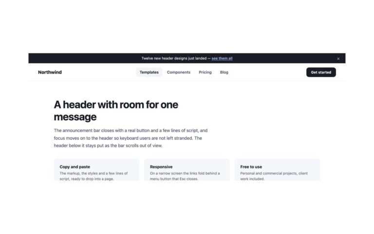
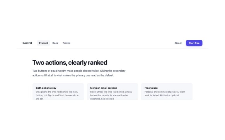
The classic software-product header: a gradient logo mark on the left, a row of links in the middle and Sign in plus a blue Start free button on the right. The first link, Product, opens a dropdown of three entries, each with a bold title and a one-line description, so visitors can see what Analytics, Automations and Integrations do before they click. On a mouse the dropdown opens on hover; everywhere it is also a real button that opens on click, Enter or Space, and closes on Esc, on a click elsewhere or when focus leaves it. The current page, Pricing, is marked with aria-current and a soft grey pill. Below 992px the links and both actions fold into a panel behind a menu button whose three bars turn into a cross, and the dropdown expands inline inside that panel. Use it for SaaS marketing sites, product landing pages and documentation portals. The Bootstrap version is a .navbar-expand-lg with a .dropdown and the Collapse plugin; the plain CSS and Tailwind versions share one short script.

What’s included

  • Product dropdown with a title and description per entry
  • Opens on hover for mice and on click or Enter for everyone
  • Esc, an outside click or tabbing away closes the dropdown
  • Links and actions collapse behind a menu button below 992px
  • Current page marked with aria-current="page"

Accessibility

The links sit in a nav labelled Main and the current one has aria-current="page". The Product control and the menu button are buttons with aria-expanded and aria-controls; Esc closes whichever is open and returns focus to its button. Every link and button shows a 2px blue focus outline, and transitions switch off under prefers-reduced-motion.

Customise it

Change --hc-accent, --hc-text, --hc-muted and --hc-soft on .hc in the plain CSS and Bootstrap versions (Bootstrap also reads the --bs-navbar-* and --bs-dropdown-* variables). In Tailwind edit the --color-hc-* theme colours; --breakpoint-lg sets where the menu collapses.