About this set
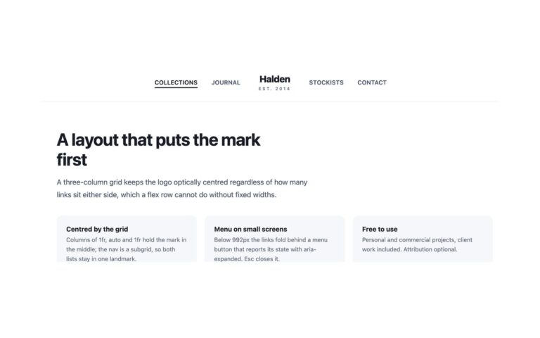
A department-store masthead: a dark message strip on top, then a serif logotype, Meridian & Co. with a small Est. 1968 line, centred between two short navigation lists. Shop, Collections and Journal sit to its left; About, Stores and Cart sit to its right. Links are small uppercase sans-serif with wide letter spacing, and a bronze underline grows from the left on hover and stays under the current page. The header is a three-column grid; the two navs sit in a wrapper that uses display: contents on wide screens, so they land either side of the logo while the source order stays logo first. Below 992px that wrapper becomes a drop-down panel behind a menu button on the left, the logo stays centred, and the six links stack in one list with hairline dividers. Use it for fashion, homeware, hotel and restaurant brands where the name should be the first thing anyone sees. The Bootstrap version applies the same grid to a .navbar-expand-lg and makes its .navbar-collapse display: contents from 992px.
What’s included
- Serif logotype centred between two navigation lists
- Underline grows from the left on hover and marks the current page
- Message strip above the masthead
- Both lists fold into one menu below 992px
- Grid layout with display: contents, so the logo comes first in the source
Accessibility
The two lists are separate navs labelled Shop and Customer, and the current link has aria-current="page". The menu button has aria-expanded and aria-controls, and Esc closes the menu and returns focus to it. The bronze accent was darkened to #8a5a26 so the small Est. 1968 line reaches 4.5:1; focus shows as a bronze outline and the underline animation stops under prefers-reduced-motion.
Customise it
Change --hcn-ink, --hcn-muted, --hcn-accent and --hcn-line on .hcn, and the Georgia stack for another serif. Bootstrap reads the same variables plus --bs-navbar-*; in Tailwind edit the --color-hcn-* and --font-hcn-* theme values.