/* ── Dark UI kit tokens (uiCookies) — identical in every set ──────────────────────────────
   Dark first. Elevation is a lighter surface, not a shadow: surface-0 is the page, 1 cards and
   panels, 2 controls, menus and dialogs, 3 hover, selected rows and tooltips.
   Every colour is a light-dark() pair, so flipping color-scheme turns the whole kit light:
   data-theme="dark" | "light" | "system" on any wrapper (system follows prefers-color-scheme),
   or a checked .theme-pick radio inside a [data-theme] element (:has()).
   Contrast, dark | light, on the worst surface (surface-3): text-1 12.2 | 15.0, text-2 6.6 | 7.3,
   text-3 4.8 | 5.4, accent 5.4 | 5.1, success 7.7 | 5.0, warning 8.4 | 5.2, danger 6.8 | 5.0;
   edge (control boundaries) 3.3 | 3.1 and focus 7.9 | 5.9 against every surface. */
:root{color-scheme:dark}
[data-theme="dark"]{color-scheme:dark}
[data-theme="light"]{color-scheme:light}
[data-theme="system"]{color-scheme:light dark}
[data-theme]:has(.theme-pick[value="dark"]:checked){color-scheme:dark}
[data-theme]:has(.theme-pick[value="light"]:checked){color-scheme:light}
[data-theme]:has(.theme-pick[value="system"]:checked){color-scheme:light dark}
:root{
  --surface-0:light-dark(#eef1f5,#0b0d12);   /* page */
  --surface-1:light-dark(#ffffff,#151821);   /* cards, panels, navbar, sidebar */
  --surface-2:light-dark(#f6f7f9,#1d212c);   /* controls, menus, dialogs, toasts */
  --surface-3:light-dark(#e6e9ef,#262b38);   /* hover, selected rows, tooltips */
  --text-1:light-dark(#12151c,#eceef3);      /* primary text */
  --text-2:light-dark(#434a5a,#aab1bf);      /* secondary text */
  --text-3:light-dark(#555d6e,#8f96a8);      /* captions, placeholders, axis labels */
  --border:light-dark(#dde1e8,#2a2f3c);      /* decorative 1px dividers and card edges */
  --edge:light-dark(#7c8496,#737b90);        /* control boundaries: fields, boxes, tracks */
  --accent:light-dark(#4452d0,#8b97ff);      /* the one vivid colour: links, selected, primary */
  --accent-soft:light-dark(#e6e8ff,#232a4d); /* selected backgrounds; accent text keeps 5.2 | 5.3 on it */
  --on-accent:light-dark(#ffffff,#0b0d12);   /* text on accent fills, 6.2 | 7.4 */
  --success:light-dark(#11713f,#5fd4a0);     /* desaturated for dark, so they do not vibrate */
  --warning:light-dark(#875500,#f0c060);
  --danger:light-dark(#bb2532,#ff9790);
  --focus:light-dark(#3b48c4,#b5bdff);       /* 2px focus ring */
  --highlight:light-dark(rgb(255 255 255 / 0),rgb(255 255 255 / .045)); /* 1px top light on dark surfaces */
  --shadow-color:light-dark(rgb(16 24 40 / .16),rgb(0 0 0 / .55));     /* overlays only */
  --radius:12px;--radius-sm:8px;
  --mono:ui-monospace,"SF Mono","Cascadia Code",Menlo,Consolas,monospace;
}
/* No light-dark() (Chrome < 123, Safari < 17.5, Firefox < 120): the same values, chosen by attribute */
@supports not (color:light-dark(#fff,#000)){
  :root,[data-theme="dark"]{--surface-0:#0b0d12;--surface-1:#151821;--surface-2:#1d212c;--surface-3:#262b38;--text-1:#eceef3;--text-2:#aab1bf;--text-3:#8f96a8;--border:#2a2f3c;--edge:#737b90;--accent:#8b97ff;--accent-soft:#232a4d;--on-accent:#0b0d12;--success:#5fd4a0;--warning:#f0c060;--danger:#ff9790;--focus:#b5bdff;--highlight:rgb(255 255 255 / .045);--shadow-color:rgb(0 0 0 / .55)}
  [data-theme="light"]{--surface-0:#eef1f5;--surface-1:#ffffff;--surface-2:#f6f7f9;--surface-3:#e6e9ef;--text-1:#12151c;--text-2:#434a5a;--text-3:#555d6e;--border:#dde1e8;--edge:#7c8496;--accent:#4452d0;--accent-soft:#e6e8ff;--on-accent:#ffffff;--success:#11713f;--warning:#875500;--danger:#bb2532;--focus:#3b48c4;--highlight:rgb(255 255 255 / 0);--shadow-color:rgb(16 24 40 / .16)}
  @media (prefers-color-scheme:light){[data-theme="system"]{--surface-0:#eef1f5;--surface-1:#ffffff;--surface-2:#f6f7f9;--surface-3:#e6e9ef;--text-1:#12151c;--text-2:#434a5a;--text-3:#555d6e;--border:#dde1e8;--edge:#7c8496;--accent:#4452d0;--accent-soft:#e6e8ff;--on-accent:#ffffff;--success:#11713f;--warning:#875500;--danger:#bb2532;--focus:#3b48c4;--highlight:rgb(255 255 255 / 0);--shadow-color:rgb(16 24 40 / .16)}}
}
@media (prefers-contrast:more){:root{--border:var(--edge);--text-3:var(--text-2)}}
[data-theme]{background:var(--surface-0);color:var(--text-1)}
/* The tokens above as Tailwind utilities: bg-surface-0…3, text-ink-1…3, border-line, border-edge,
   bg-accent, bg-accent-soft, text-on-accent, text-success|warning|danger, outline-focus, rounded-ui… */
@theme inline {
  --color-surface-0: var(--surface-0); --color-surface-1: var(--surface-1);
  --color-surface-2: var(--surface-2); --color-surface-3: var(--surface-3);
  --color-ink-1: var(--text-1); --color-ink-2: var(--text-2); --color-ink-3: var(--text-3);
  --color-line: var(--border); --color-edge: var(--edge);
  --color-accent: var(--accent); --color-accent-soft: var(--accent-soft); --color-on-accent: var(--on-accent);
  --color-success: var(--success); --color-warning: var(--warning); --color-danger: var(--danger);
  --color-focus: var(--focus); --color-highlight: var(--highlight);
  --radius-ui: var(--radius); --radius-ui-sm: var(--radius-sm);
  --font-mono: var(--mono);
  --shadow-overlay: 0 18px 48px -12px var(--shadow-color);
  --inset-shadow-hl: inset 0 1px 0 var(--highlight);
}
About this set
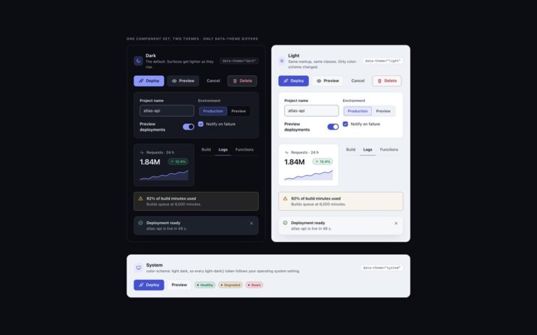
The buttons and toggles of the uiCookies dark UI kit. Buttons come as a primary accent button, a secondary button on the raised surface, a quiet ghost button and a danger button with tinted text, in small, default and large sizes, plus a loading button with a spinner and a disabled state. Icon buttons are square or round and every one has an aria-label. The toolbar toggles are real checkboxes styled as icon buttons for bold, italic, code and link, and the segmented controls are radio groups for a log view and an environment. Switches are checkboxes with role=”switch” in a settings card, with a hint line and a disabled row. Elevation comes from lighter surfaces instead of shadows: buttons sit on surface-2, hover lifts them to surface-3, and a one-pixel top highlight replaces the drop shadow. One recipe drives every button, and a variant only swaps four custom properties. The pressed and selected states use the accent-soft fill with accent text, which was measured at 5.3:1 in dark and 5.2:1 in light, and the switch track has a 3:1 edge on every surface level.
What’s included
Primary, secondary, ghost and danger buttons in three sizes
Loading and disabled states
Icon buttons with accessible names
Toolbar toggles and segmented controls on native inputs
Switches built on checkboxes with role="switch"
Same tokens as the rest of the kit, light theme by flipping color-scheme
Accessibility
Every button has visible text or an aria-label, toolbar toggles are checkboxes with aria-label inside a labelled group, and segmented controls are radio groups in a fieldset with a legend. Text reaches 4.5:1 and control edges 3:1 on every surface level in both themes. Focus is a 2px ring in the --focus colour, and transitions and the spinner slow down or stop under prefers-reduced-motion.
Customise it
Change --accent, --on-accent and --accent-soft in the token block to recolour primary, pressed and selected states, and --radius-sm for the corner. In Bootstrap the tokens feed --bs-btn-* on .btn-dk; in Tailwind use bg-accent, bg-surface-2, border-line and rounded-ui-sm.