
Dark UI Kit – 8 Free CSS, Bootstrap & Tailwind Sets
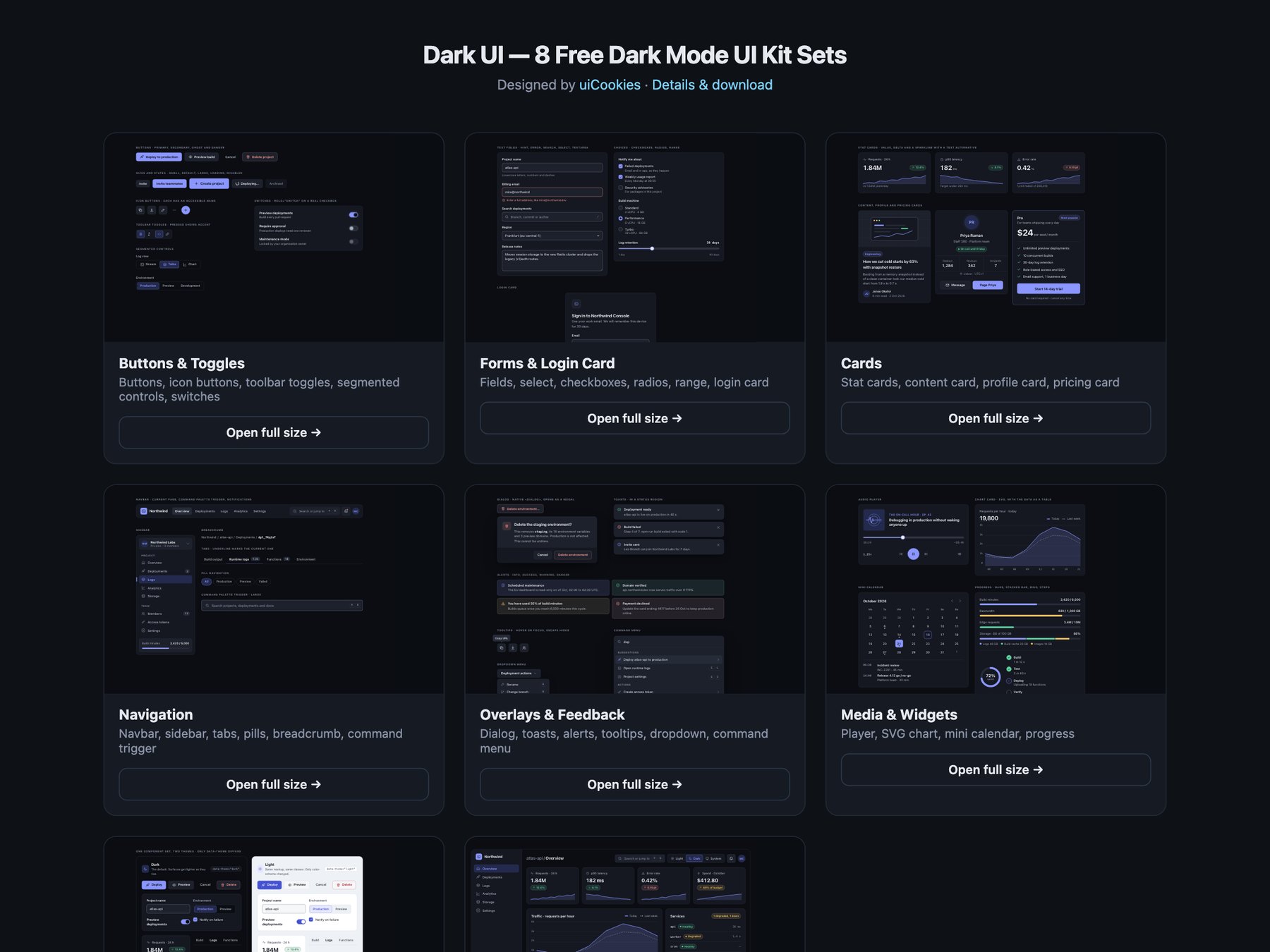
Dark UI is a free dark mode UI kit of eight sets, designed and maintained in-house by uiCookies. It is one design language rather than a pile of dark components: every set starts with the same block of design tokens for four surface levels, three text levels, a border, a control edge, one accent and the success, warning, danger and focus colours, so buttons, forms, cards, navigation, overlays and widgets all match. Every set comes in three versions that look the same: plain HTML and CSS, Bootstrap 5.3.8 with data-bs-theme="dark" and the tokens fed into Bootstrap's own variables, and Tailwind CSS 4 with the tokens mapped to theme utilities such as bg-surface-1, text-ink-2 and bg-accent. The kit covers buttons and toggles, form controls with a login card, cards, navigation, overlays and feedback, media and data widgets, a light theme built from the same markup, and a developer console dashboard with a light, dark and system switch.
A dark theme done properly is more than inverted colours. Pure black behind white text is harsh and leaves no room for depth, so the page here is a near-black blue-grey and each level up is a little lighter: elevation comes from the surface, not from shadows that disappear on a dark background. Saturated colours that work on white vibrate on dark grey, so the accent and the success, warning and danger colours are desaturated for dark and deepened for light. Contrast has to hold on every surface, not just the page: in this kit every text colour was measured at 4.5:1 and every control edge at 3:1 against all four surface levels in both themes. Focus gets its own colour so it stays visible on accent buttons, and the light theme is not a second stylesheet: each token is a light-dark() pair, so data-theme="light", "dark" or "system" on any wrapper is enough to switch.