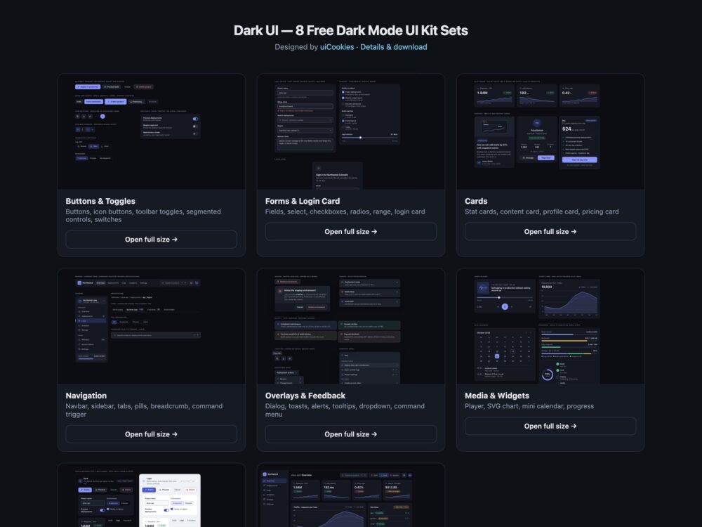
Dark UI is a free dark mode UI kit of eight sets, designed and maintained in-house by uiCookies. It is one design language rather than a pile of dark components: every set starts with the same block of design tokens for four surface levels, three text levels, a border, a control edge, one accent and the success, warning, danger and focus colours, so buttons, forms, cards, navigation, overlays and widgets all match. Every set comes in three versions that look the same: plain HTML and CSS, Bootstrap 5.3.8 with data-bs-theme="dark" and the tokens fed into Bootstrap’s own variables, and Tailwind CSS 4 with the tokens mapped to theme utilities such as bg-surface-1, text-ink-2 and bg-accent. The kit covers buttons and toggles, form controls with a login card, cards, navigation, overlays and feedback, media and data widgets, a light theme built from the same markup, and a developer console dashboard with a light, dark and system switch.
A dark theme done properly is more than inverted colours. Pure black behind white text is harsh and leaves no room for depth, so the page here is a near-black blue-grey and each level up is a little lighter: elevation comes from the surface, not from shadows that disappear on a dark background. Saturated colours that work on white vibrate on dark grey, so the accent and the success, warning and danger colours are desaturated for dark and deepened for light. Contrast has to hold on every surface, not just the page: in this kit every text colour was measured at 4.5:1 and every control edge at 3:1 against all four surface levels in both themes. Focus gets its own colour so it stays visible on accent buttons, and the light theme is not a second stylesheet: each token is a light-dark() pair, so data-theme="light", "dark" or "system" on any wrapper is enough to switch.
Free download Browse live demos All snippets
The sets
1. Dark UI Buttons & Toggles
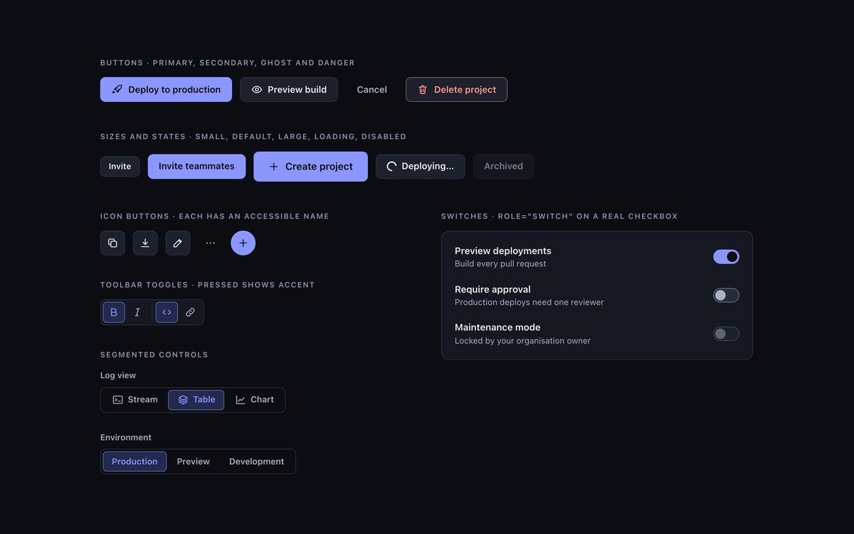
Primary, secondary, ghost and danger buttons in three sizes with loading and disabled states, icon buttons, toolbar toggles, segmented controls and a settings card of switches.
Use them as the base controls of a dark interface. Pressed and selected states share one accent-soft treatment, and hover raises a control one surface level instead of adding a shadow.
Live Demo CSS, Bootstrap & Tailwind code
2. Dark UI Forms & Login Card
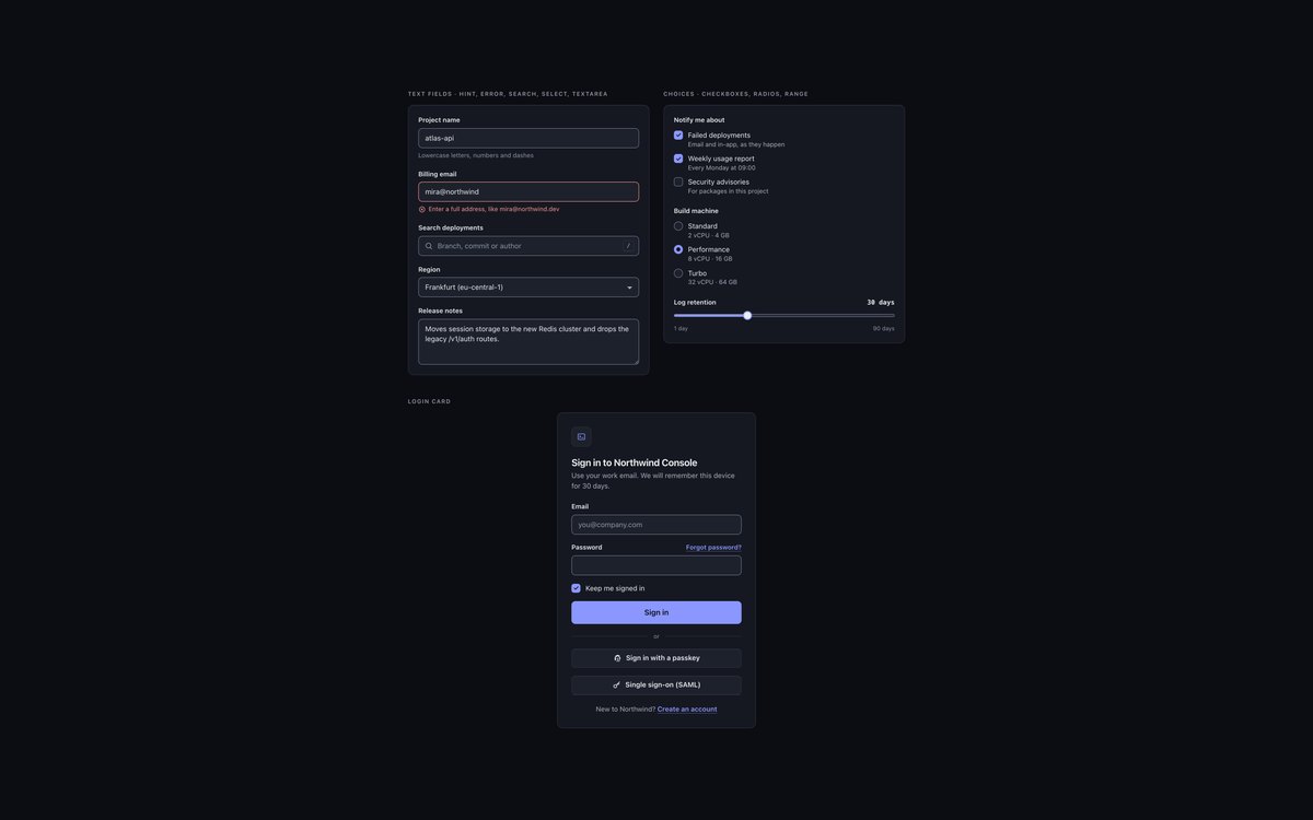
Text, email, search, select and textarea fields with hint and error states, checkbox and radio groups, a range slider and a complete login card with passkey and SSO buttons.
Fields keep a 3:1 edge on every surface level so they still read as inputs in a dark theme, and the Bootstrap version recolours .form-control, .form-select and .form-check-input through the tokens.
Live Demo CSS, Bootstrap & Tailwind code
3. Dark UI Cards
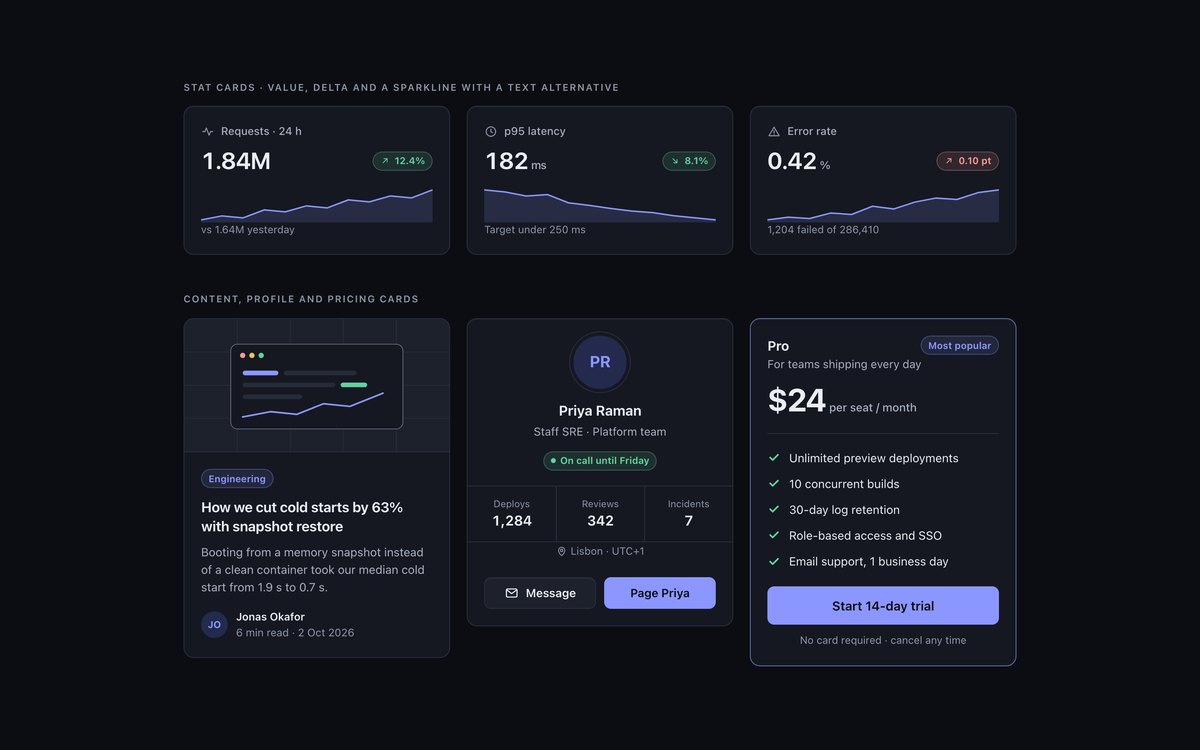
Three stat cards with sparklines, a content card with cover art, a profile card and a featured pricing card, side by side on the dark page.
They show the kit’s elevation rule in practice: cards are surface-1 with a hairline border, and anything that needs to stand out moves up a surface level instead of gaining a shadow.
Live Demo CSS, Bootstrap & Tailwind code
4. Dark UI Navigation
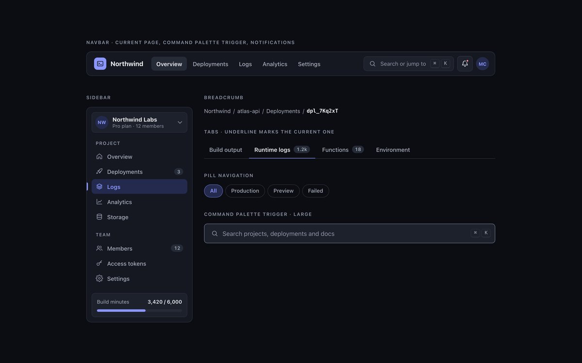
A navbar with a command palette trigger, a sidebar with grouped links, counts and a usage meter, underline tabs, pill navigation and a breadcrumb.
Everything is plain links with aria-current, so there is no JavaScript, and the current item is marked by a fill, an underline or a bar as well as colour.
Live Demo CSS, Bootstrap & Tailwind code
5. Dark UI Overlays & Feedback
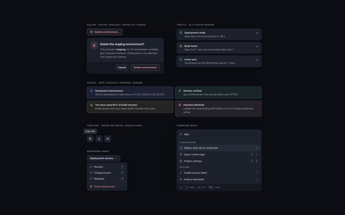
A native dialog, success, error and info toasts, four inline alerts, tooltips, a dropdown menu and a command menu with keyboard hints.
Overlays lift to surface-2 and add a soft shadow, the only shadow in the kit. About a dozen lines of JavaScript open the dialog as a modal, dismiss toasts and close tooltips and menus with Escape.
Live Demo CSS, Bootstrap & Tailwind code
6. Dark UI Media & Widgets
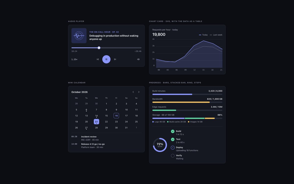
An audio player, an SVG chart card with a data table, a mini calendar, labelled meters, a stacked storage bar, a progress ring and a deployment step tracker.
Every colour in the art and charts comes from the tokens, so the widgets switch to the light theme without new markup, and each one has a text alternative.
Live Demo CSS, Bootstrap & Tailwind code
7. Dark UI Light Theme Variant
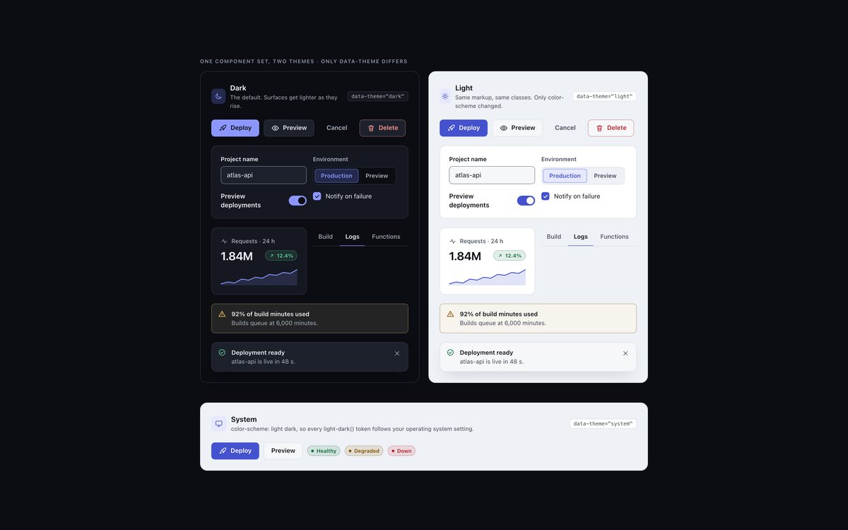
The same buttons, fields, switch, stat card, tabs, alert and toast rendered under data-theme="dark", "light" and "system", with identical markup.
Every colour token is a light-dark() pair, so a theme is just a color-scheme on a wrapper. Browsers without light-dark() fall back to the same values set by attribute.
Live Demo CSS, Bootstrap & Tailwind code
8. Dark Developer Console
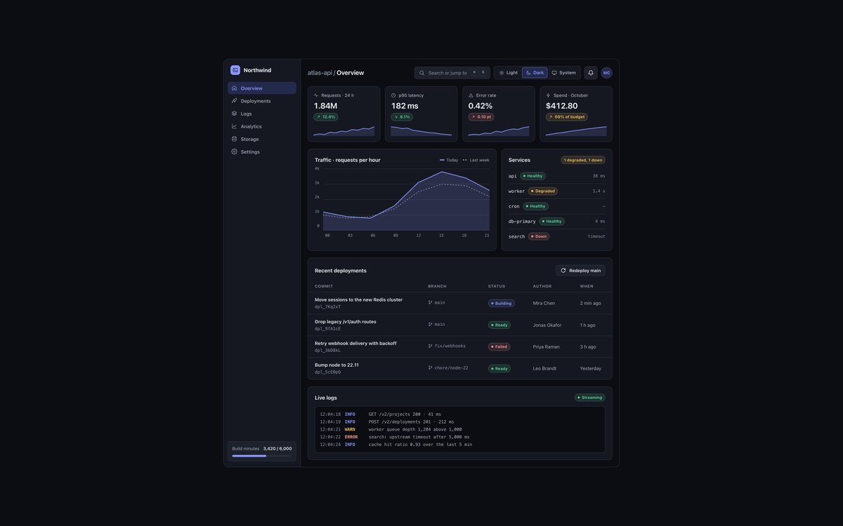
A developer console with a sidebar, command palette trigger, KPI tiles, a traffic chart, a services list, a deployments table and a live log stream.
A light, dark and system toggle in the top bar switches the whole dashboard with :has() and light-dark(), and a few lines of JavaScript remember the choice.
Live Demo CSS, Bootstrap & Tailwind code
Frequently asked questions
Is this dark UI kit free for commercial projects?
Yes. Every set is free for personal and commercial projects, including client work and products you sell. Attribution is optional but always welcome. The licence is at uicookies.com/license/.
Does the dark UI kit need JavaScript?
Mostly no. The overlays set uses about a dozen lines to open the dialog as a modal, dismiss toasts and close tooltips and menus with Escape; the forms and widgets sets use a few lines to keep slider fills in step; and the dashboard uses a short script to remember the chosen theme. The theme switch itself works with CSS alone, and the Bootstrap versions do not load Bootstrap’s JavaScript bundle.
Is the dark theme accessible?
Every text colour was measured at 4.5:1 and every control edge at 3:1 against all four surface levels, in both the dark and the light theme. Focus is a 2px ring in its own colour, states are shown by more than colour, prefers-contrast: more strengthens borders, and animations stop or slow under prefers-reduced-motion. Each set also passes an automated axe-core WCAG 2.1 AA check.
Which frameworks are included?
Every set has three files that look the same: plain HTML and CSS, Bootstrap 5.3.8 and Tailwind CSS 4. The Bootstrap files use data-bs-theme="dark" and feed the tokens into Bootstrap variables for .btn, .card, .form-control, .form-switch, .nav, .breadcrumb, .toast, .alert, .tooltip, .dropdown-menu, .progress and .table. The Tailwind files map the same tokens to utilities with @theme inline.
How do I add a light theme to a dark CSS theme?
Write each colour token as a light-dark(light value, dark value) pair and set color-scheme on the element: color-scheme: dark for dark, light for light, or light dark to follow the operating system through prefers-color-scheme. Every token then resolves for that element and its children, so one attribute switches a whole page or a single panel. For browsers without light-dark(), add an @supports not block that sets the same values by attribute, as this kit does.