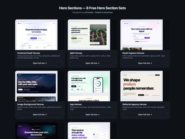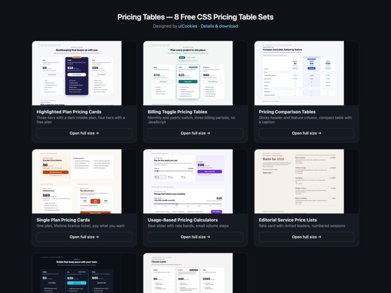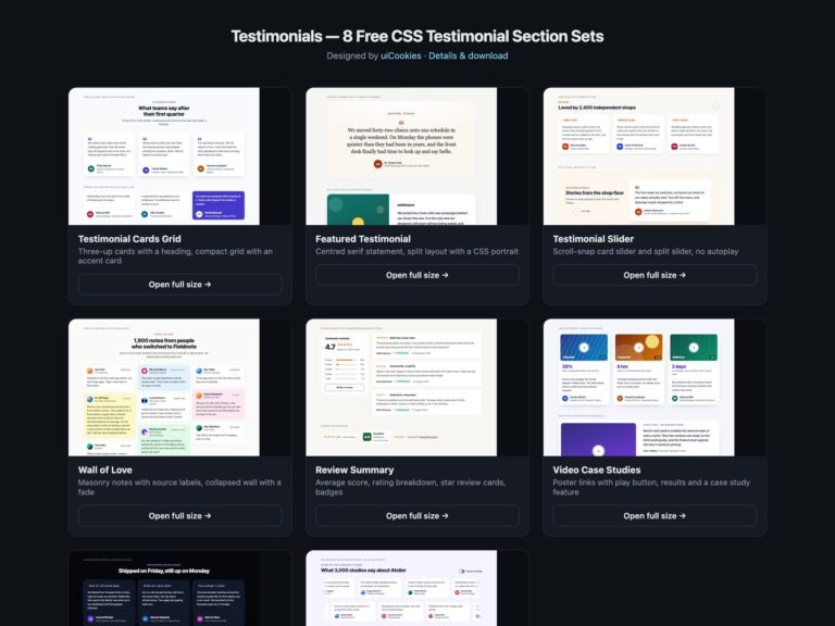
Feature Sections is a pack of eight sets of landing page feature and call to action sections, designed and maintained in-house by uiCookies. Every set comes in three versions that look the same: plain HTML and CSS, Bootstrap 5 using its grid, .card, .btn, .btn-check, .badge, .table, .progress and .form-control where they fit, and Tailwind CSS 4. The sets cover icon grids, alternating image and text rows with a product screenshot drawn in CSS, bento grids, how it works steps with a comparison table, call to action bands with email capture and an app download, logo clouds with metrics and a review strip, a dark set with a code window and a modern CSS set built on subgrid, container queries, :has() and scroll-driven animation. None of them uses JavaScript.
A good features section is easy to scan. Each feature gets a short heading that names the benefit and one or two sentences that make it concrete, with a number or an example where you have one, rather than a paragraph of adjectives. Headings follow the page outline, with the section as an h2 under the hero and each feature as an h3, so screen reader users can jump between them. Icons support the text but never replace it, so they are hidden from assistive technology, and anything that signals a state, such as a tick, a cross or a low stock warning, uses a shape or a word as well as colour. Links say where they go instead of Learn more, calls to action are limited to one main action per band, and logos and figures come with a source so the proof is believable.
Free download Browse live demos All snippets
The sets
1. Icon Grid Feature Sections
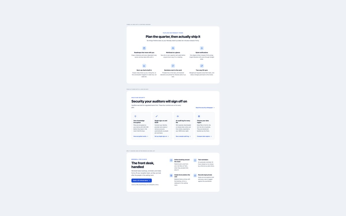
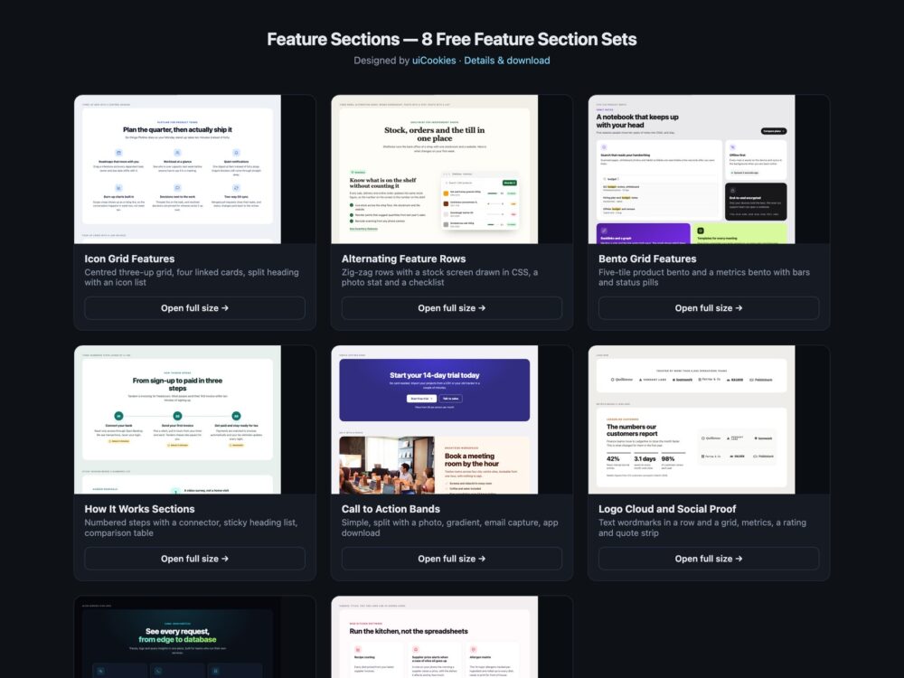
A centred grid of six features with tinted icon tiles, four bordered cards that each end in a descriptive link, and a split layout with a headline and button beside a two-column icon list.
Use the grid for a product overview straight after the hero, and the linked cards when each feature has its own page. The icons are inline SVG that take the accent colour.
Live Demo CSS, Bootstrap & Tailwind code
2. Alternating Feature Rows
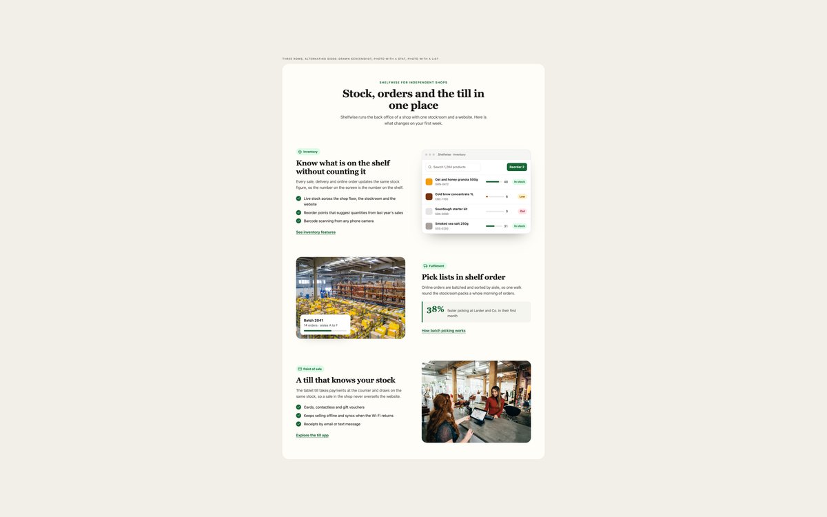
Three zig-zag rows under a centred heading: a stock screen drawn in HTML and CSS, a warehouse photo with a floating progress card and a statistic, and a till photo with a checklist.
This is the layout for explaining a product one feature at a time. Rows flip with the order property, stack with the copy first below 992px, and the drawn screen has a text description.
Live Demo CSS, Bootstrap & Tailwind code
3. Bento Grid Feature Sections
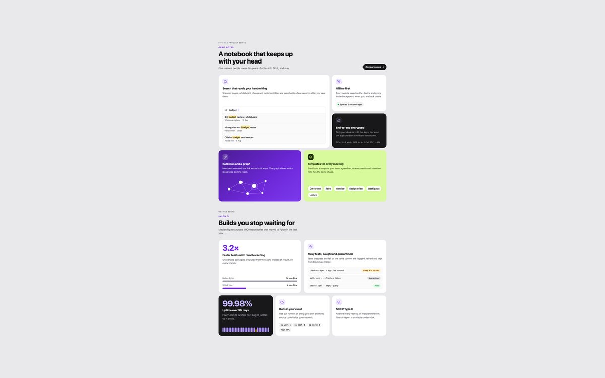
A five-tile product bento with drawn search results, a link graph and template chips, and a metrics bento with labelled comparison bars, flaky test states and an uptime strip.
The plain CSS version is a six-column grid with spanning tiles, and the Bootstrap version builds the same shape from .row and .col-lg classes. Mini pictures are decorative and hidden.
Live Demo CSS, Bootstrap & Tailwind code
4. How It Works Sections
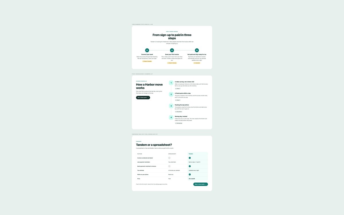
Three numbered steps joined by a dashed line, a sticky heading beside a four-step list with timing chips, and a comparison table with ticks, crosses and short text answers.
Steps are an ordered list so the count is announced, and the table has a caption, row and column headers and hidden Included or Not included text behind every icon.
Live Demo CSS, Bootstrap & Tailwind code
5. Call to Action Bands
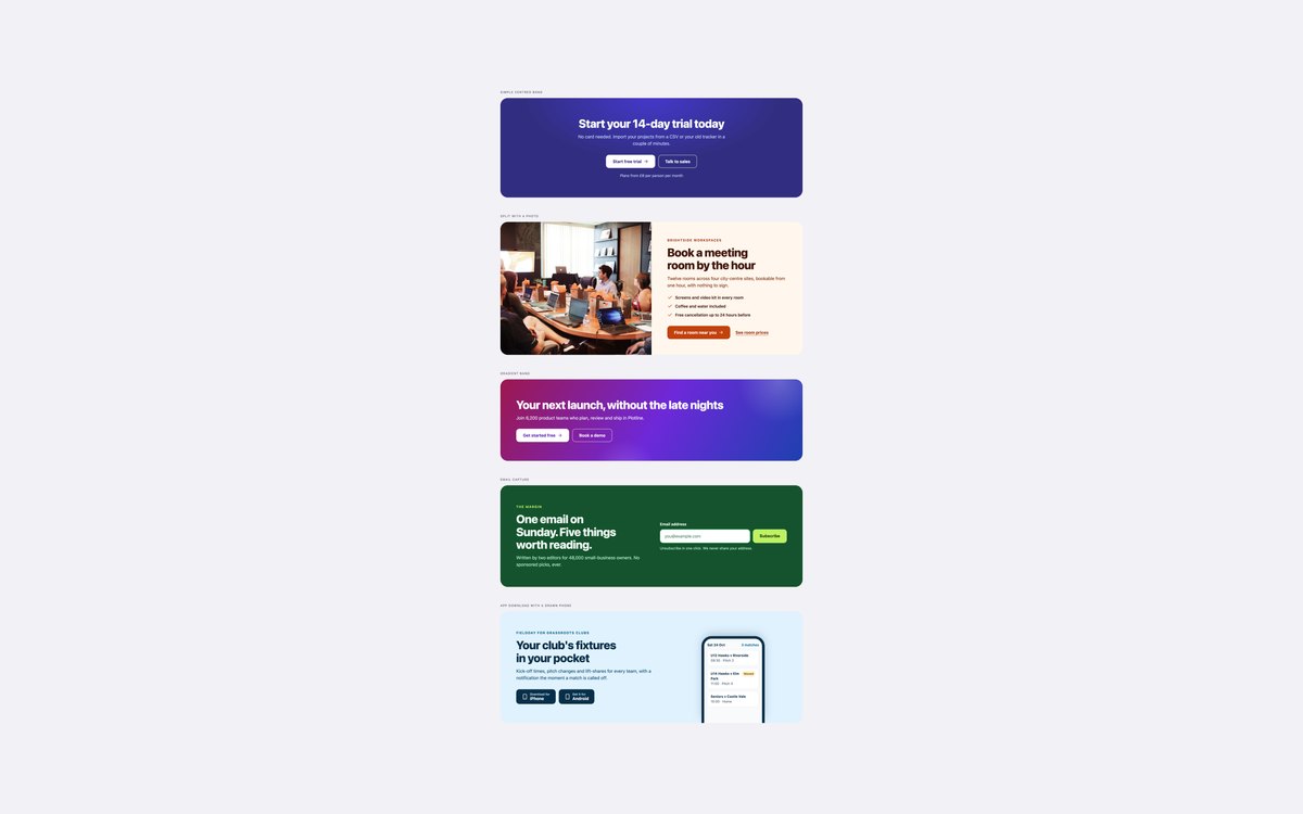
Five call to action bands: simple centred, split with a meeting room photo, gradient, email capture with a labelled field and hint, and an app download band with a phone drawn in CSS.
Each band has one main action and at most one secondary one, with focus outlines picked to read on each background. The email form relies on the browser’s own required and type email checks.
Live Demo CSS, Bootstrap & Tailwind code
6. Logo Cloud and Social Proof
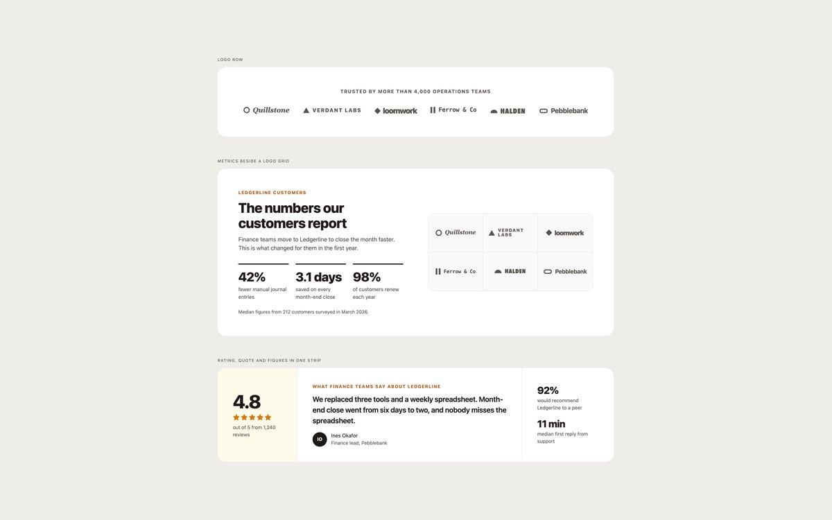
A row of six customer wordmarks, a logo grid beside three metrics with a stated source, and a strip that combines a rating, a customer quote and two figures.
The wordmarks are fictional names set as styled text with marks drawn in CSS, so there are no image requests or borrowed brands. Replace them with your own SVG logos when you have them.
Live Demo CSS, Bootstrap & Tailwind code
7. Dark Feature Sections
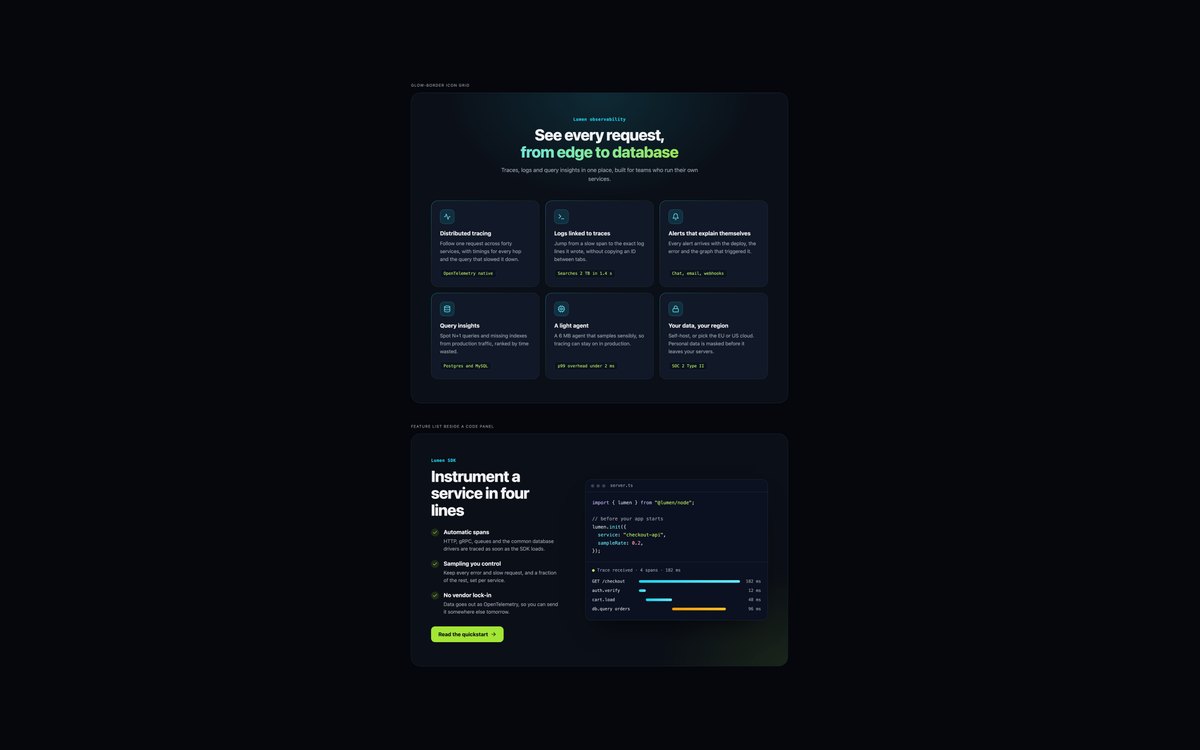
A dark icon grid with gradient card borders and gradient headline text, and a feature list beside a code window with selectable code and a trace waterfall.
Every text and syntax colour was checked at 4.5:1 on the dark grounds, and the gradient text has a solid fallback. The Bootstrap version runs in data-bs-theme="dark".
Live Demo CSS, Bootstrap & Tailwind code
8. Modern CSS Feature Sections
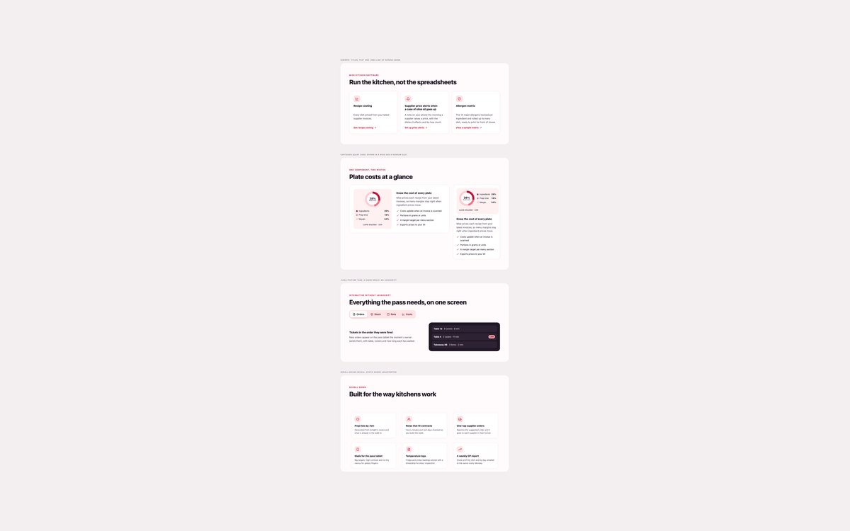
Subgrid cards whose titles and links line up, a container-query card shown in a wide and a 320px slot, feature tabs built on a radio group with :has(), and a scroll-driven reveal.
Each technique has a fallback: flex cards without subgrid, every panel shown without :has(), and static cards where animation-timeline is missing or reduced motion is on.
Live Demo CSS, Bootstrap & Tailwind code
Frequently asked questions
Are these feature sections free for commercial projects?
Yes. Every set is free for personal and commercial projects, including client work and products you sell. Attribution is optional but always welcome. The licence is at uicookies.com/license/.
Do these feature sections need JavaScript?
No. Layouts are CSS grid and flexbox, the feature tabs in set 08 are a radio group switched with :has(), the email form uses the browser’s own validation and the reveal is a scroll-driven CSS animation. The Bootstrap versions load only Bootstrap’s CSS, not its JavaScript bundle.
Are the feature sections accessible?
Each section is named by its h2, features use h3 headings, and steps and features are real lists. Icons are hidden from screen readers, drawn pictures have a text description, and ticks, crosses and status pills use shapes or words as well as colour. Every link, button and field has a visible focus outline, motion stops under prefers-reduced-motion, and every set passes an automated axe-core WCAG 2.1 AA check.
Which frameworks are included?
Every set has three files that look the same: plain HTML and CSS, Bootstrap 5.3.8 and Tailwind CSS 4. The Bootstrap files use the grid, .card, .btn, .btn-check, .badge, .table, .progress, .form-control and .figure where they fit, with a small style block for the rest. The Tailwind files use utility classes in the markup, with a style block only in set 08 for the scroll-driven animation and the :has() fallback.
How many features should a features section show?
Three to six is the range people scan comfortably. Three columns of one or two rows suit a product overview, four linked cards suit features that each have their own page, and alternating rows or a bento grid suit three to five features that need a picture. If you have more, group them under separate headings instead of growing one grid.