Accordions
Basic Accordions
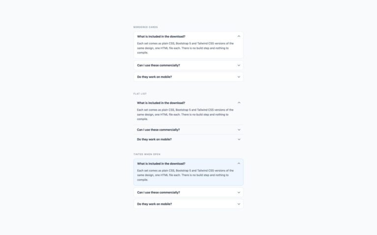
Three plain accordion treatments that fit most pages. Bordered cards give each question its own white card with an 11px radius and…

Every set from our UI packs, each built three ways: plain CSS, Bootstrap 5 and Tailwind 4. Live demos, copyable code, accessibility checked, free to use.
Accordions
Three plain accordion treatments that fit most pages. Bordered cards give each question its own white card with an 11px radius and…
Accordions
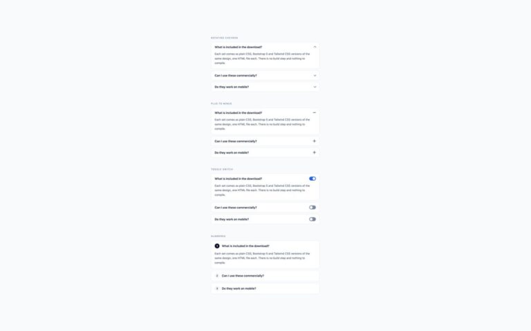
Four ways to show whether an accordion panel is open, all on the same bordered-card layout.
Accordions
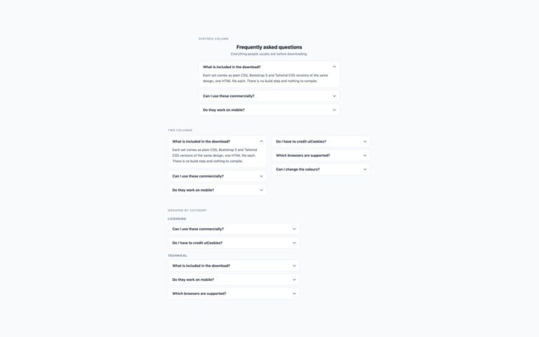
Three page layouts for a frequently asked questions section, each built from the same bordered accordion cards.
Accordions
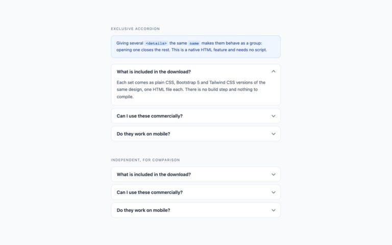
An accordion where opening one panel closes the others, shown next to an independent accordion so the difference is easy to try.
Accordions
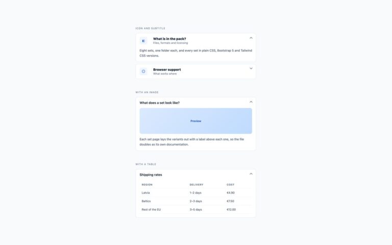
Accordions for content that is more than a line of text. Icon and subtitle puts a tinted icon tile and a two-line…
Accordions
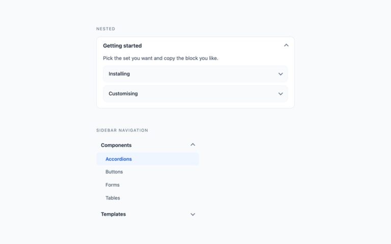
Two accordion patterns for documentation and navigation. Nested places a second accordion inside an open panel: the inner items use a lighter…
Accordions
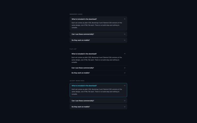
Three accordion treatments for dark interfaces such as dashboards, developer tools and dark-mode sites, with a cyan accent.
Accordions
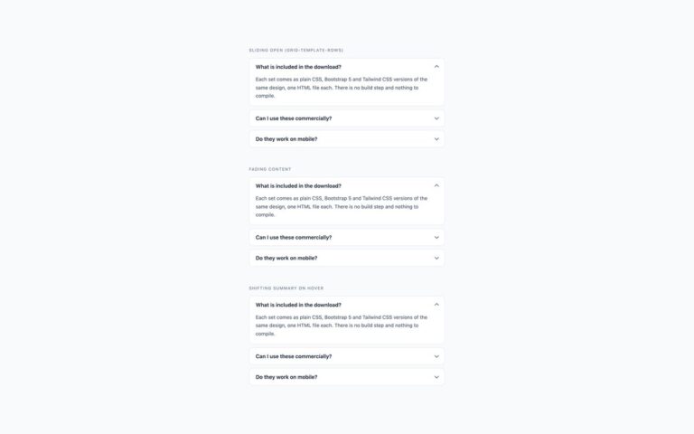
Three ways to add motion to an accordion without a JavaScript animation library.
Alerts
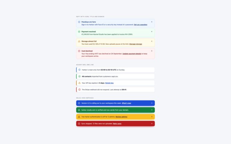
Twelve alerts in three weights, each in the four statuses every interface needs: info, success, warning and danger.
Alerts
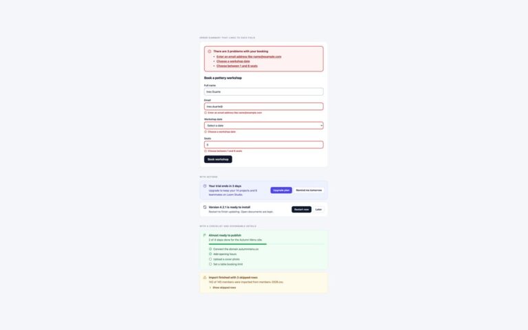
Alerts that ask the reader to do something. The error summary sits at the top of a pottery workshop booking form, says…
Alerts
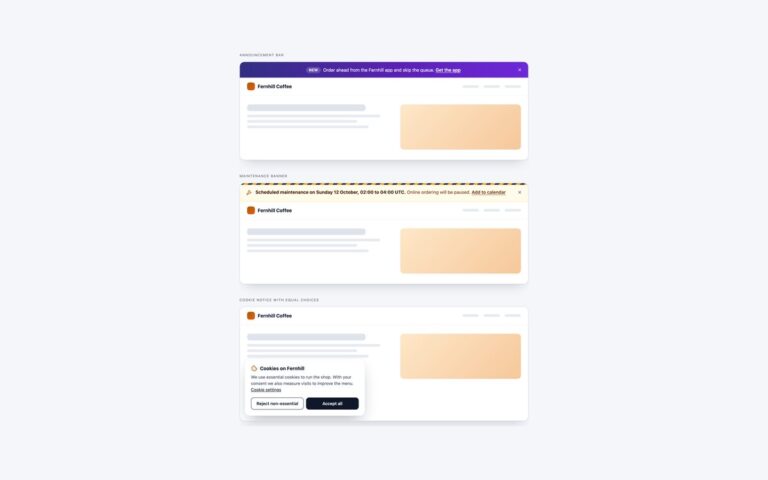
Three banners that speak to everyone on a site, each shown at the top or corner of a small coffee shop page.
Alerts
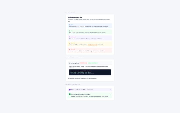
Callouts for documentation, shown inside a page of fictional docs for a static site builder called Quarry.
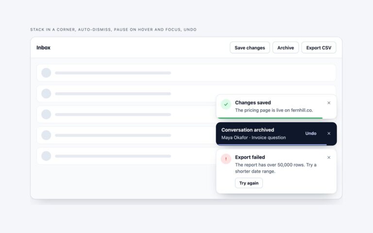
Alerts
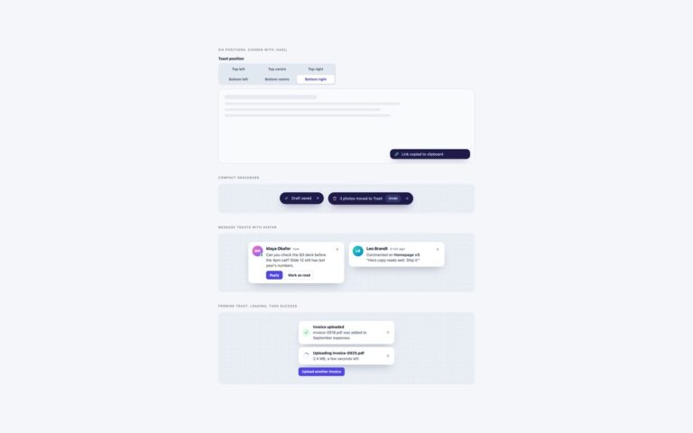
Four more toast patterns. The position picker is a segmented control of six radio buttons, top left to bottom right, that moves…
Alerts
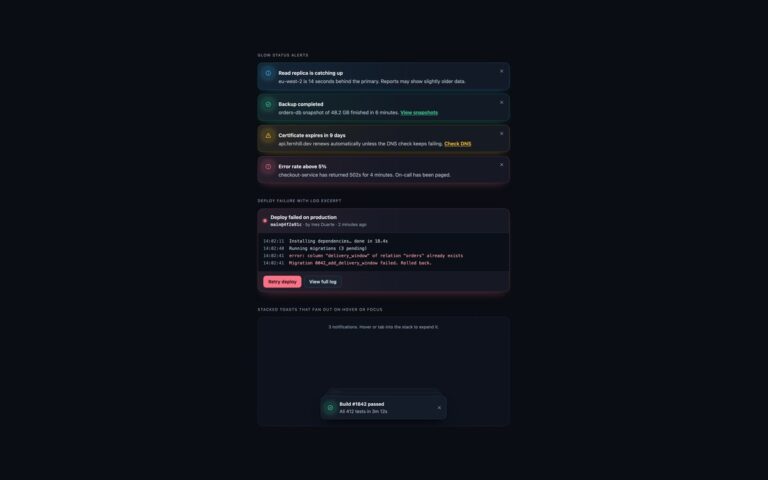
Alerts and toasts for dark dashboards and developer tools, where light-theme alerts turn into glaring blocks.
Alerts
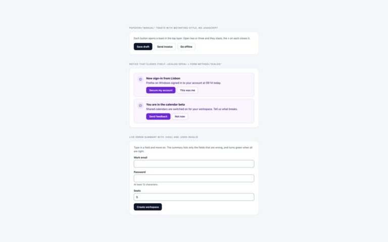
Three patterns that usually need JavaScript, done with current HTML and CSS instead.
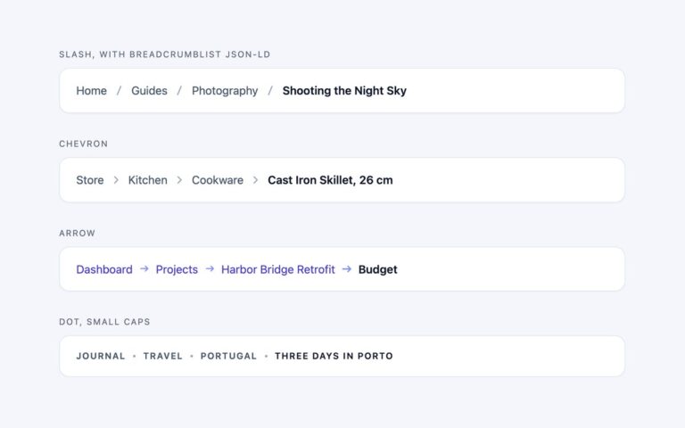
Breadcrumbs
The four separator styles most sites use, each on a white bar: a thin slash, a chevron, an arrow with indigo links,…
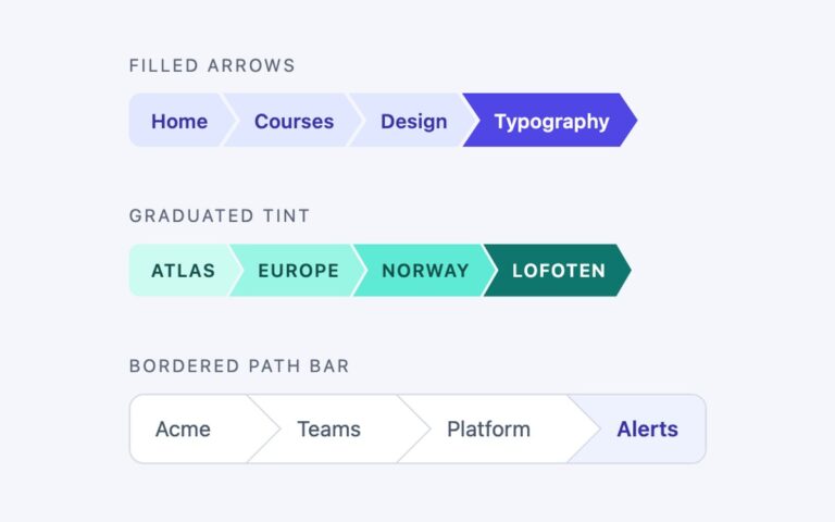
Breadcrumbs
Three breadcrumbs where every level is a shape rather than a word between separators.
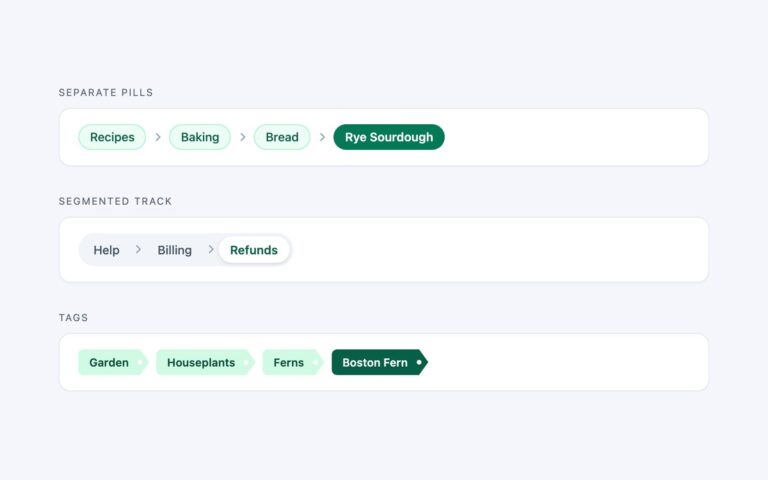
Breadcrumbs
Breadcrumbs made of chips, for interfaces that already use rounded controls.
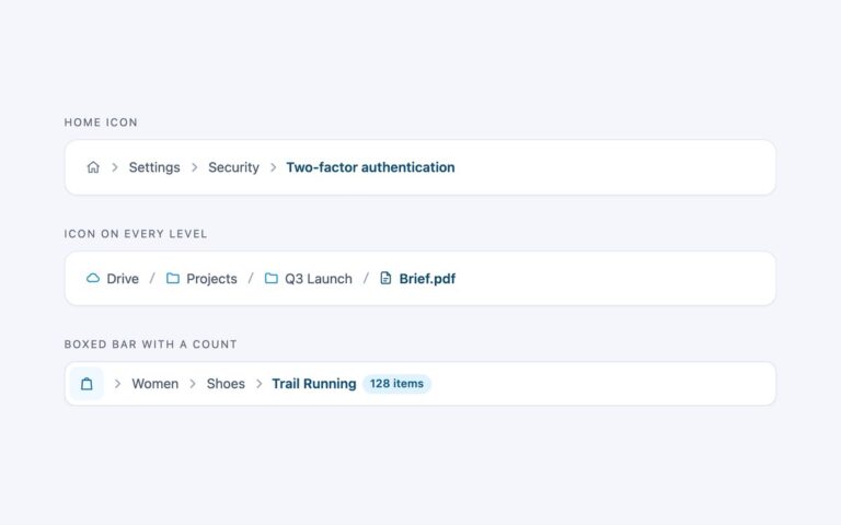
Breadcrumbs
Three ways to add icons without hurting the text trail. Home icon replaces the first level with a house glyph, the most…
Breadcrumbs
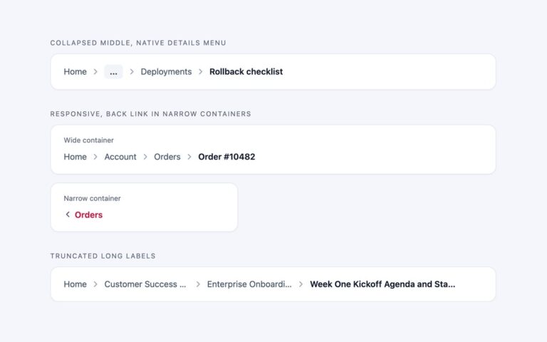
Three answers to the long path problem. Collapsed middle keeps the first level, the parent and the current page, and folds the…
Breadcrumbs
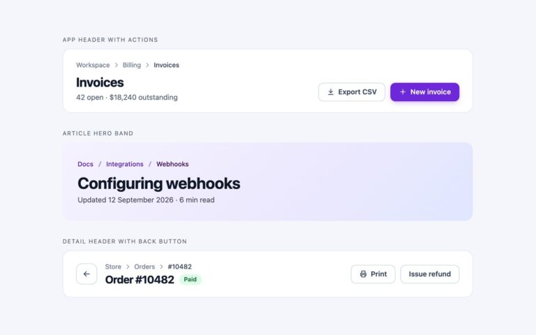
Breadcrumbs as part of a complete page header, which is where most of them live.
Breadcrumbs
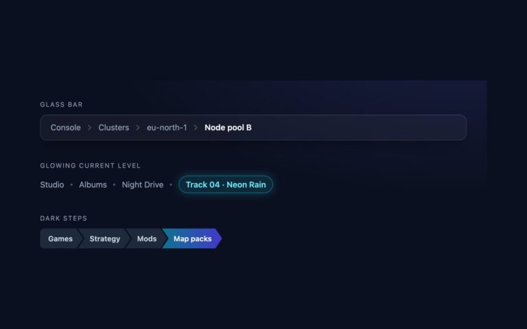
Breadcrumbs tuned for dark interfaces, where a light theme trail turns grey on grey.
Breadcrumbs
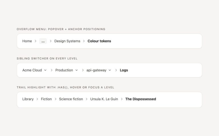
Breadcrumb behaviour that usually needs a dropdown script, done with current CSS and HTML.
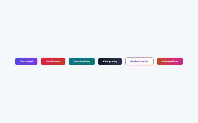
Buttons
Six call-to-action buttons built on CSS gradients. Four are solid two-colour fills: indigo to purple, rose to burnt orange, teal to emerald…

Buttons
Chunky buttons that look like physical keys. A solid, unblurred box-shadow in a darker shade of the face colour draws a 6…

Buttons
Five transparent outline buttons for dark backgrounds, each with a different way of filling in on hover.

Buttons
Five buttons that pair or replace a label with an inline SVG icon.

Buttons
Two submit-style buttons that show work in progress and then success.
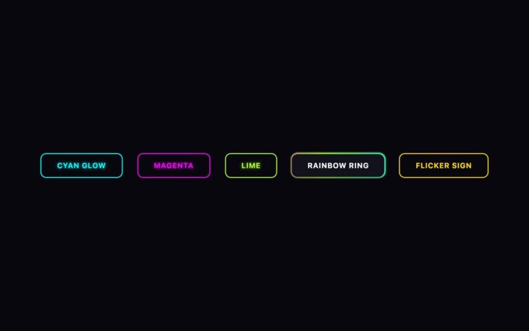
Buttons
Uppercase outline buttons for dark, gaming and nightlife designs, styled like neon tubes.

Buttons
Flat, loud buttons in the neobrutalist style: a 3 pixel black border, heavy 900 weight labels, bright flat fills and a hard…

Buttons
A stack of full-width sign-in buttons and a row of round share buttons.

Buttons
Five fully rounded buttons for modern product interfaces. Solid pill is indigo with a darker hover and a tinted shadow.

Buttons
Four solid buttons for dark pages, each with a different hover sweep.


Buttons
Three segmented controls for choosing one option from a short list: a light Billing period control with Monthly, Yearly and Lifetime, a…

Buttons
Two split buttons that pair a main action with a short list of related ones.

Buttons
A five-step button size scale, extra small, small, default, large and extra large, plus square icon-only buttons in four matching sizes and…
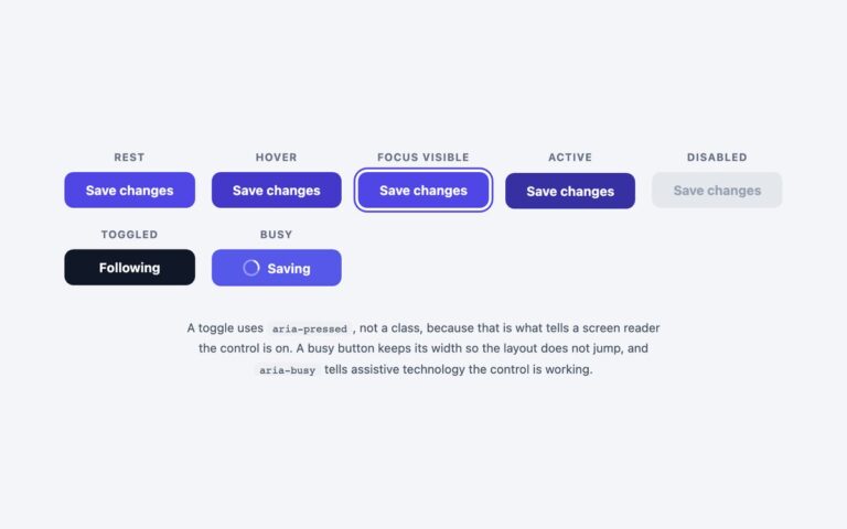
Buttons
One primary button drawn in each of its seven states, side by side with a caption: rest, hover, focus visible, active, disabled,…

Buttons
Three buttons that confirm what they did by changing their label and colour.
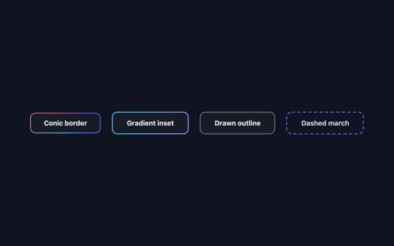
Buttons
Four dark buttons whose border is the effect. Conic border rotates an indigo, cyan and rose conic gradient behind a 2 pixel…

Buttons
Five buttons with no fill, where the text and its underline do the work.

Buttons
Three ways to join buttons into one control. An attached horizontal group picks a view density, Comfortable, Cosy or Compact.

Buttons
Call-to-action buttons for landing and pricing pages, in the combinations they are usually used.

Buttons
Four frosted glass buttons shown over a colourful ground of amber, pink and blue light on deep navy.

Buttons
Four round 48 pixel icon buttons that widen into pills to reveal their label on hover or keyboard focus: New project in…
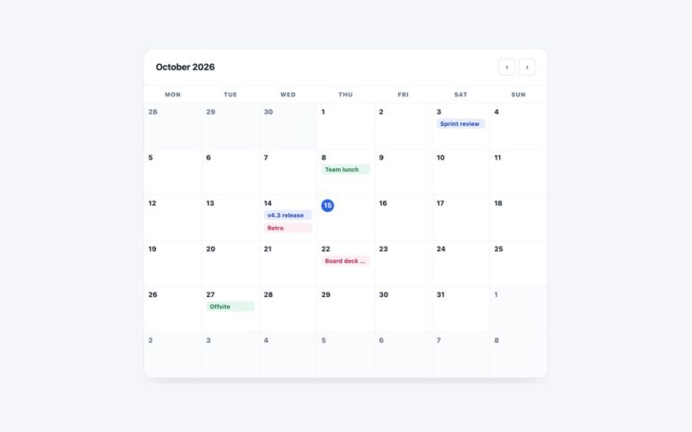
Calendars
A full-width month calendar for dashboards, booking back offices and team planners.
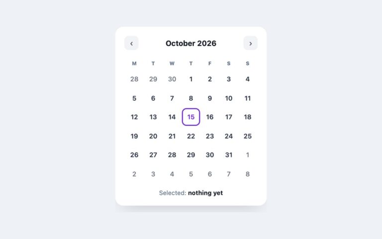
Calendars
A compact 300 pixel calendar card for sidebars, booking widgets and settings pages where someone needs to pick one date.
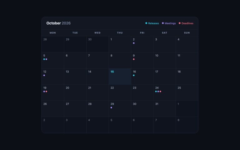
Calendars
A dark month calendar for status pages, release dashboards and night-mode apps.
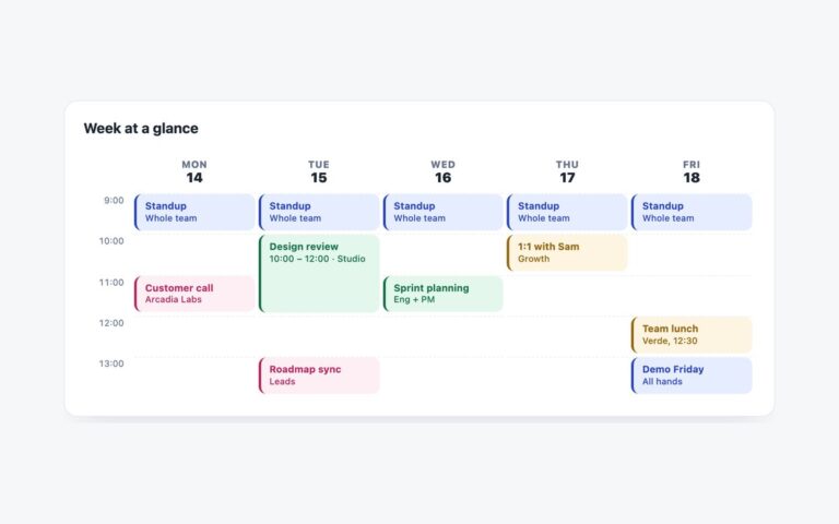
Calendars
A Monday-to-Friday time grid for team schedules, class timetables and room planners.
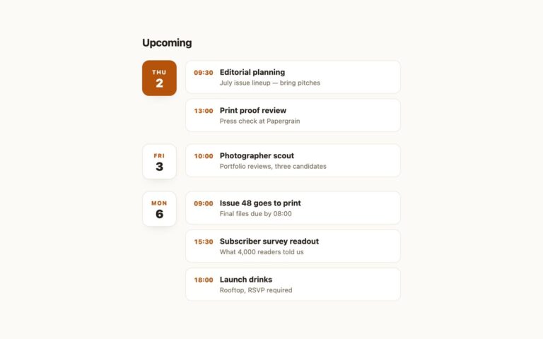
Calendars
A vertical agenda for upcoming events, suited to newsletters, editorial calendars, sidebars and mobile screens where a month grid would be too…
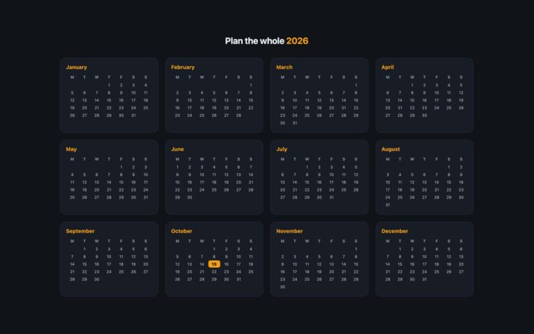
Calendars
A dark, full-year planner that shows all twelve months at once, useful for holiday planning, content calendars, academic years and annual reports.
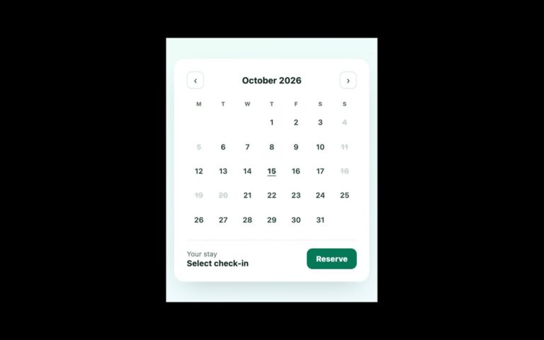
Calendars
A date range picker for hotel stays, rentals, equipment hire and any booking that has a check-in and a check-out.
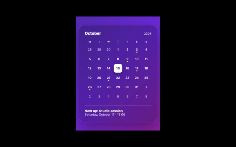
Calendars
A frosted-glass calendar widget for hero sections, portfolio sites, music and event pages, or a personal dashboard laid over a colourful background.
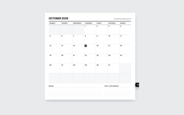
Calendars
A monthly planner sheet that looks like paper on screen and prints cleanly, for printable downloads, teacher resources, habit trackers and office…
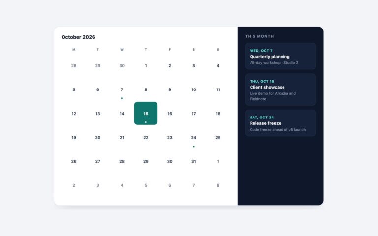
Calendars
A month calendar and an events list combined in one panel, for dashboards, community sites, studios and course pages that want both…
Calendars
A form field that opens a calendar, for booking forms, travel search, checkout delivery dates and admin filters.
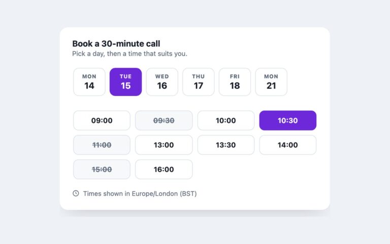
Calendars
A booking card for a 30-minute call: a horizontal strip of six days, a grid of ten time slots and a time…
Calendars
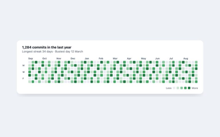
A contribution-style heatmap: a year of days laid out as 52 week columns of seven cells, each shaded in one of five…
Calendars
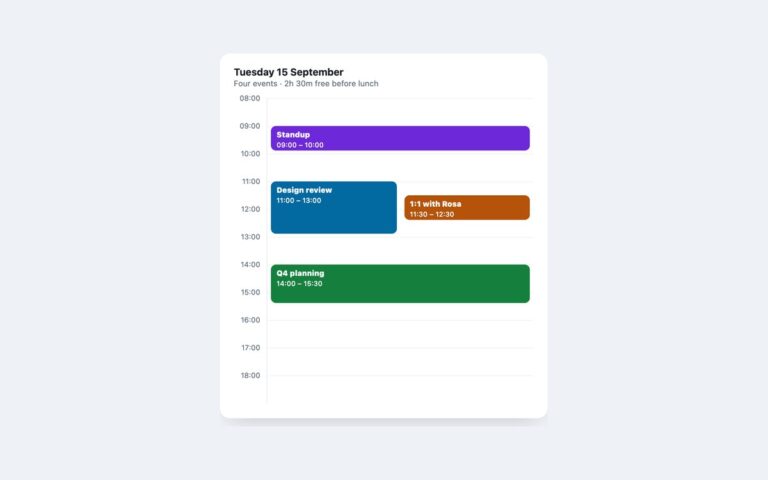
A single-day calendar from 08:00 to 19:00 with hour rows, four events and a red line marking the current time.
Calendars
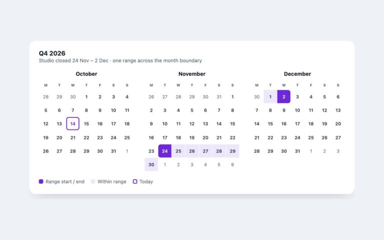
Three months side by side, October to December 2026, with today ringed and a closure range from 24 November to 2 December…
Calendars
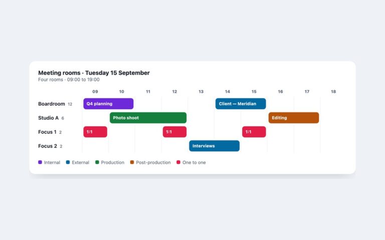
A resource view for one day: four meeting rooms down the side, the hours from 09:00 to 19:00 across the top and…
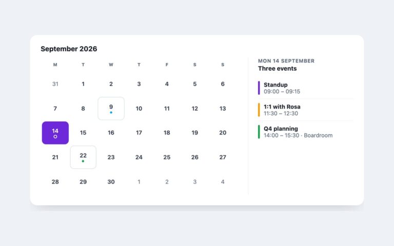
Calendars
A month grid for September 2026 next to a detail panel. Three days have events and are outlined as selectable; choosing one…
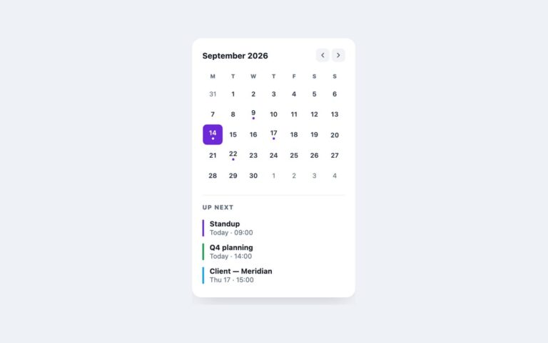
Calendars
A 290 pixel calendar card for dashboards and sidebars: a month header with previous and next buttons, a small month grid with…
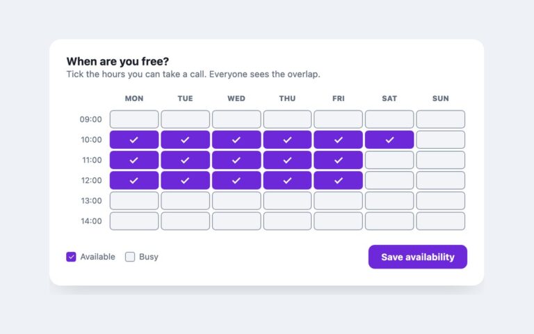
Calendars
A weekly availability grid where people tick the hours they are free: seven days across, six one-hour slots down from 09:00, a…
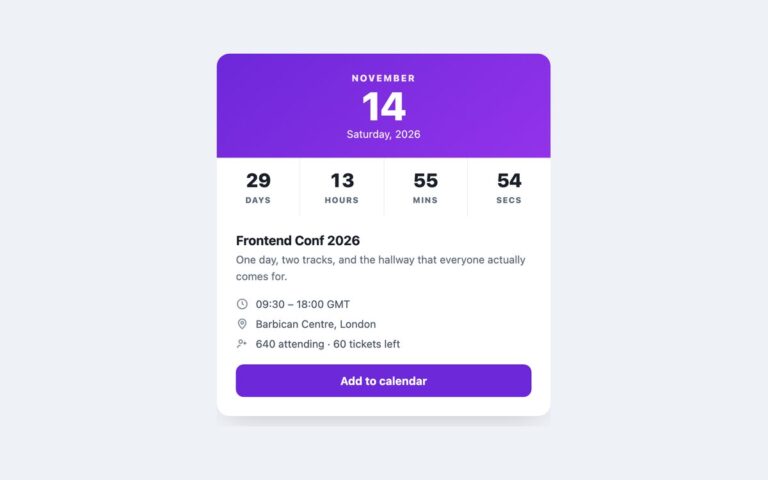
Calendars
An event card with a large date header, a live countdown in days, hours, minutes and seconds, a short description, time, venue…
Calendars
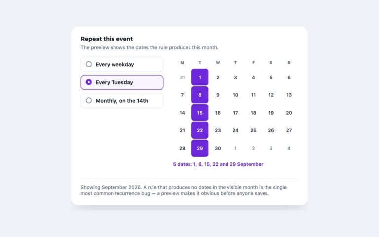
A recurrence picker with a live preview. Three options, every weekday, every Tuesday and monthly on the 14th, sit beside a September…
Calendars
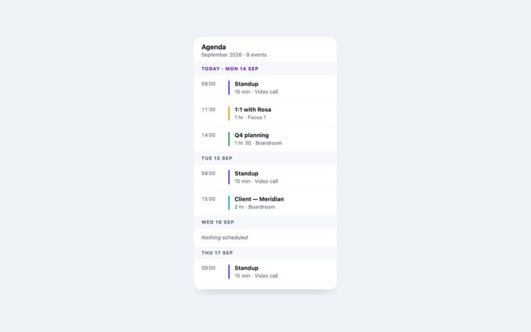
A phone-sized agenda: a sticky title bar with the month and event count, then one sticky heading per day and the events…
Cards
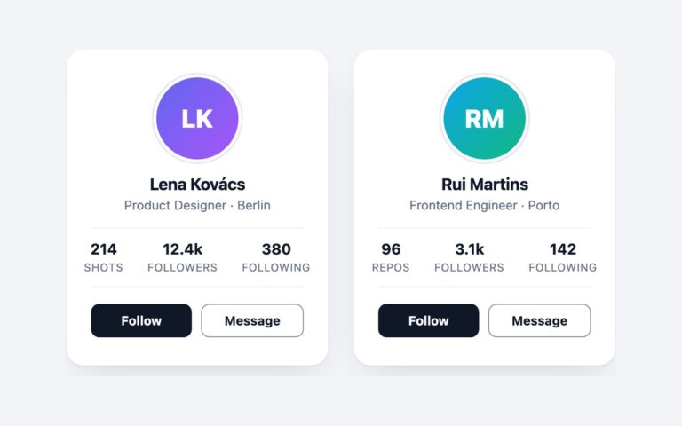
Two team or creator profile cards: a round gradient avatar with the person's initials inside a thin ring, their name and role,…
Cards
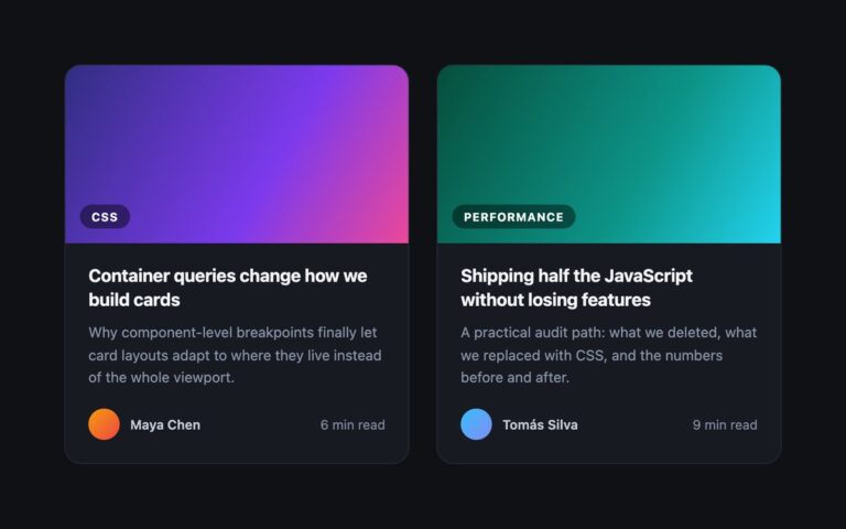
Blog post cards for a dark page: a gradient cover with a frosted category chip in the corner, the post title, a…
Cards
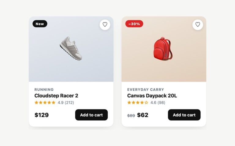
Shop product cards with a soft gradient image area, a New or sale badge, a round wishlist heart, the category, product name,…
Cards
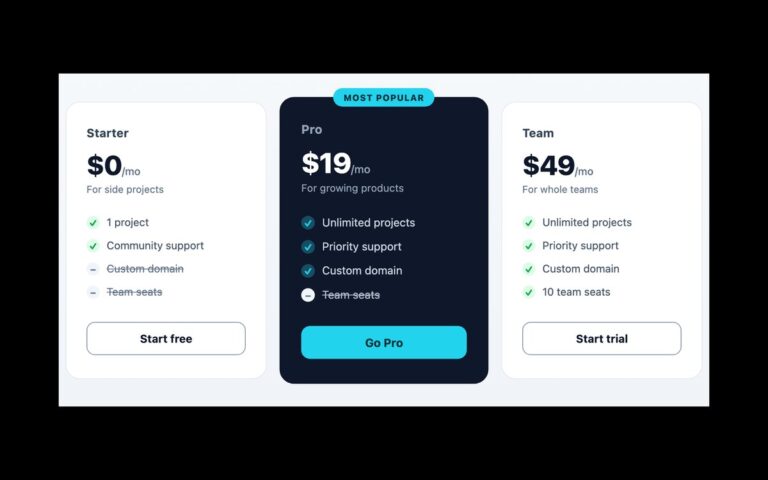
A three-plan pricing row with Starter, Pro and Team cards. Each card has the plan name, a large monthly price, a one-line…
Cards
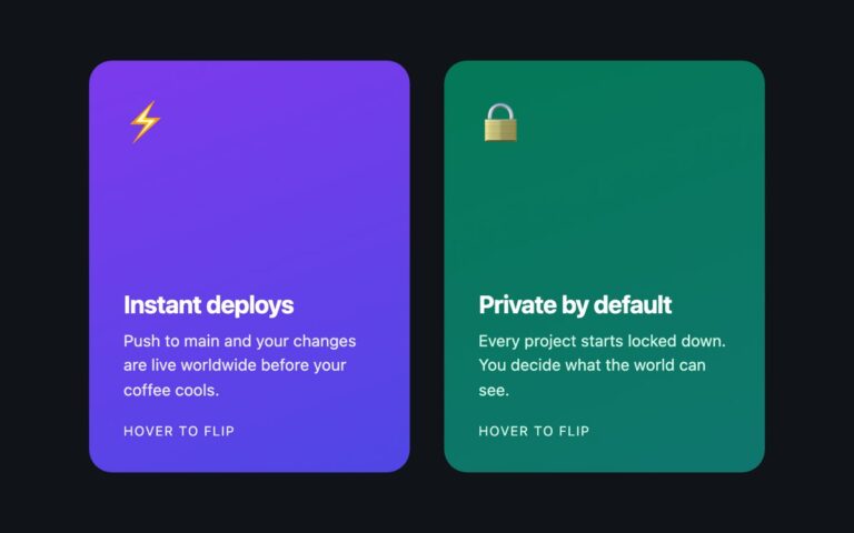
Two feature cards that turn over in 3D. The front is a gradient panel with an emoji icon, a heading, a short…
Cards
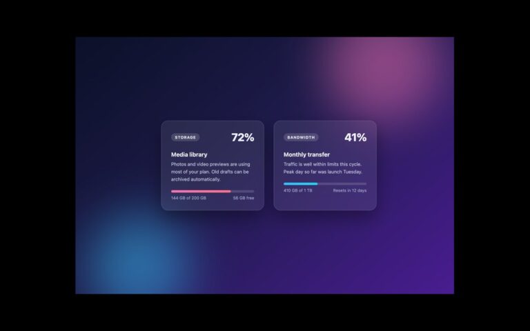
Frosted-glass cards for account usage: a storage card at 72 percent and a bandwidth card at 41 percent.
Cards
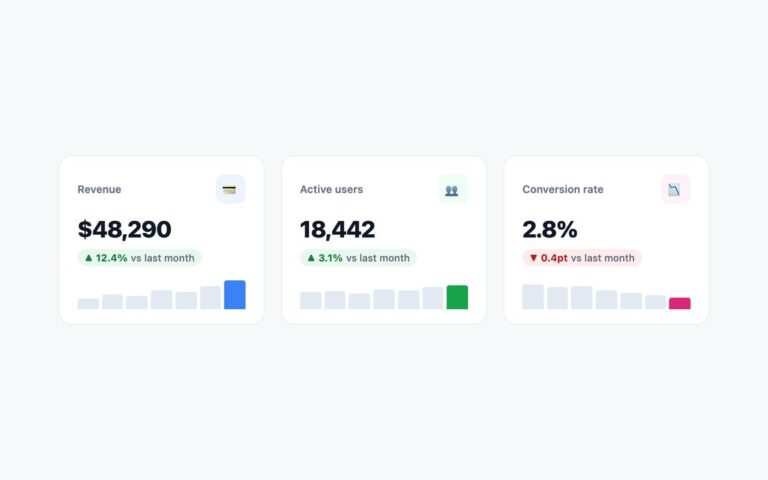
Three dashboard KPI cards: Revenue, Active users and Conversion rate.
Cards
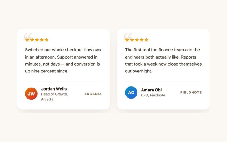
Customer quote cards on a warm cream page. Each card has a five-star rating, the quotation, and a footer with a gradient…
Cards
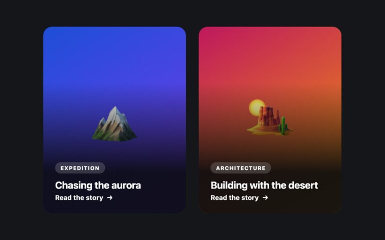
Tall story cards with full-bleed artwork and text laid over a dark gradient veil at the bottom: a frosted category tag, the…
Cards
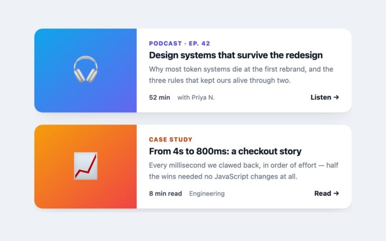
Wide cards with a media panel on the left and text on the right, stacked in a column: a podcast episode and…
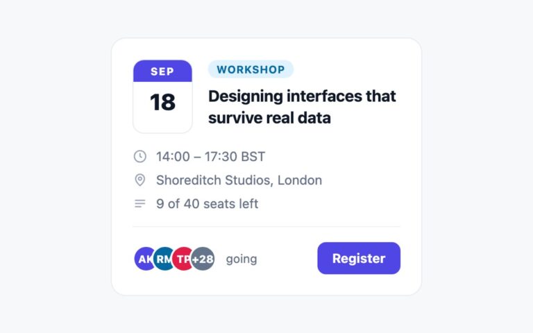
Cards
An event listing card for workshops, meetups and webinars. A calendar-style date block with an indigo month strip sits beside a type…
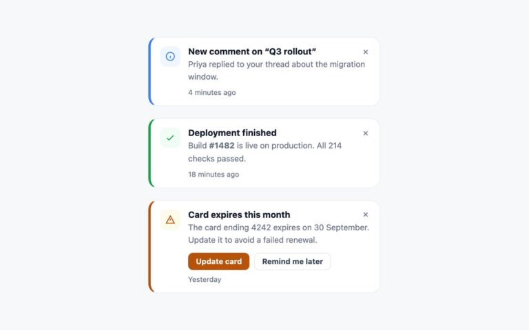
Cards
Three notification cards in the info, success and warning severities, stacked the way they would sit in a notification panel.
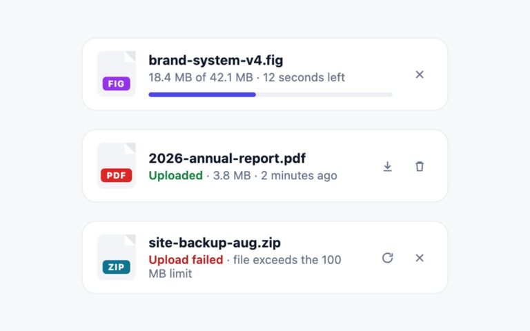
Cards
Three compact file cards that cover the life of an upload: in progress, uploaded and failed.
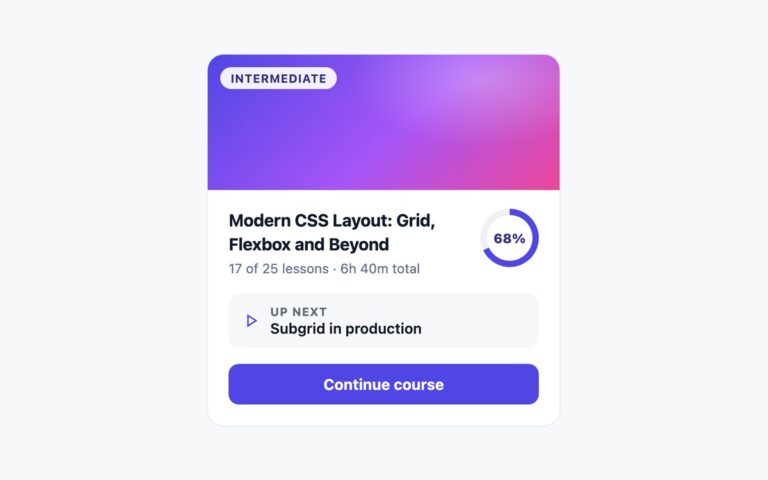
Cards
A single online-course card for a learner dashboard. A gradient cover carries an Intermediate level pill, and below it sit the course…
Cards
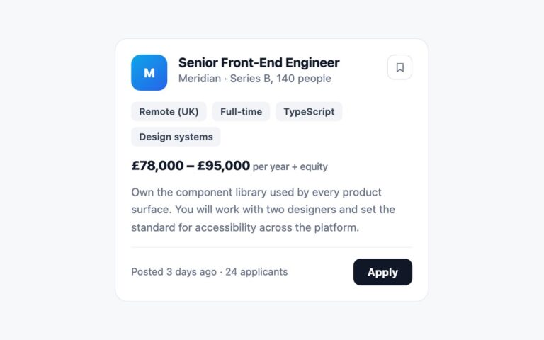
A job board card for one opening: a company logo tile, the job title and company line, a Save bookmark button, a…
Cards
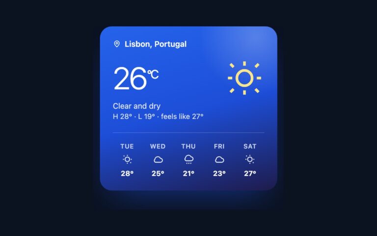
A weather widget card on a deep blue gradient with a soft light spot in the top corner.
Cards
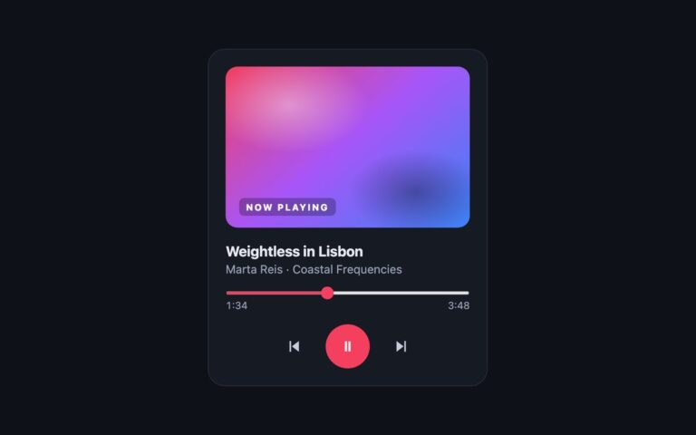
A dark now-playing card for a music or podcast player: gradient cover art with a Now playing tag, the track title, the…
Cards
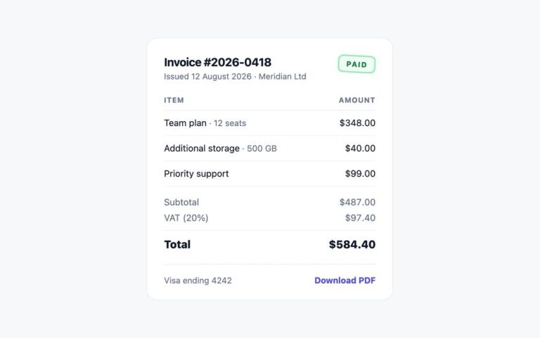
A receipt card for billing pages and order confirmations. The header shows the invoice number, the issue date and the customer, with…
Cards
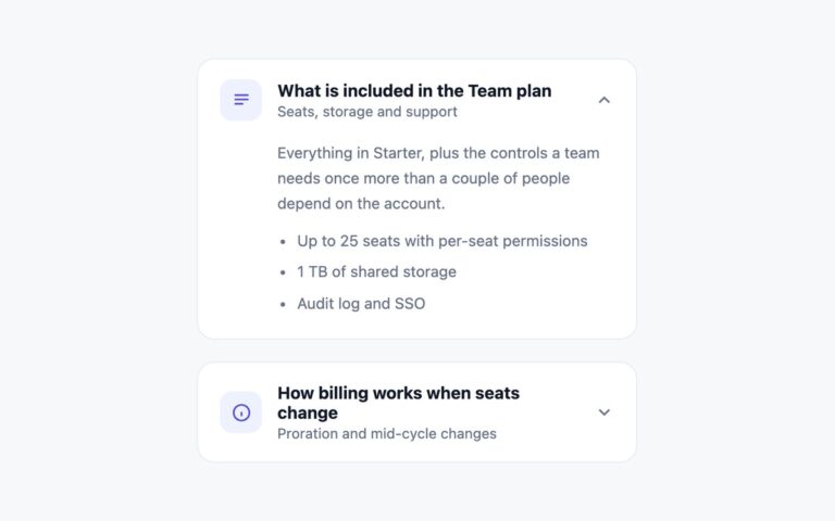
Two cards that expand in place to show more detail, one open and one closed, as used for plan comparisons, FAQs and…
Cards
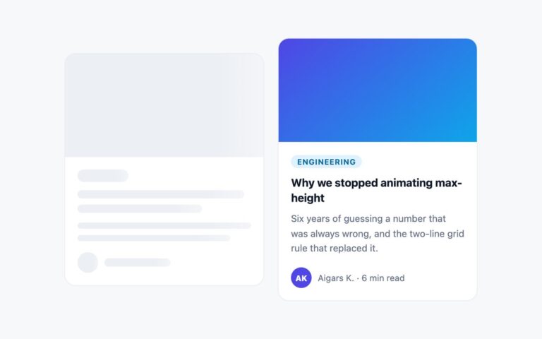
A blog post card shown twice: once as a skeleton while it loads and once with its content.
Cards
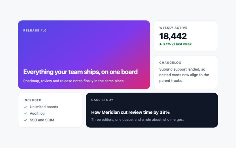
A bento grid of five cards of different sizes for landing pages, product updates and dashboards.
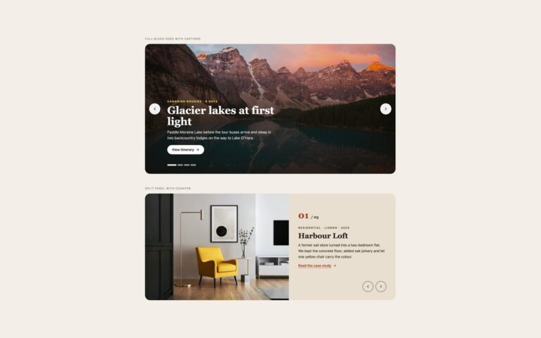
Carousels
Two hero carousels for the top of a page. Full-bleed hero with captions shows four travel slides with a photo, a dark…
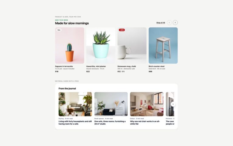
Carousels
Sliders that show several cards at once. Product slider, four per view is a shop row with a small heading, a Shop…
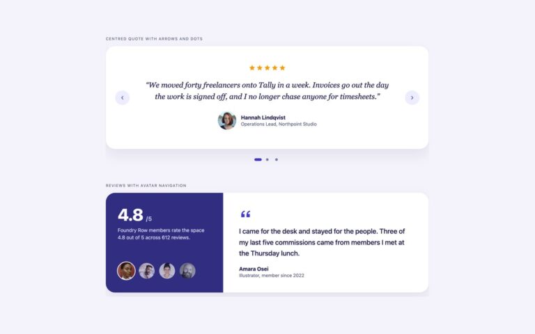
Carousels
Two ways to rotate customer quotes. Centred quote with arrows and dots is a white card with five stars, an italic serif…
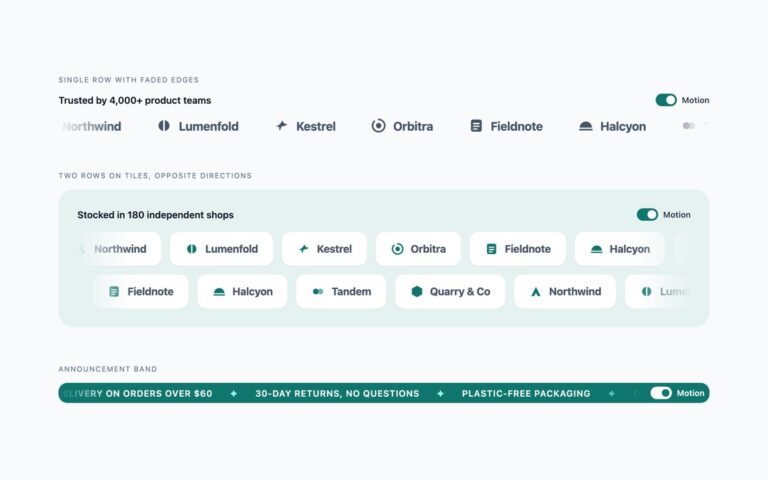
Carousels
Endless scrolling rows built with CSS alone. Single row with faded edges is the classic trusted-by strip: eight customer logos, each a…
Carousels
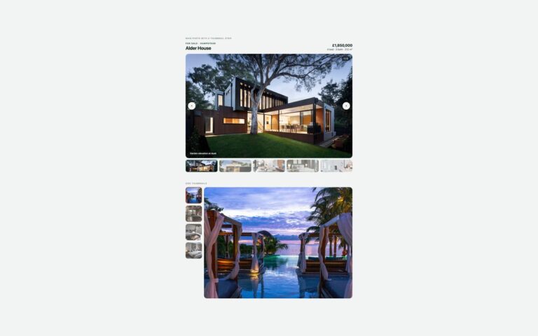
Photo galleries with a large image and thumbnails to pick from.
Carousels
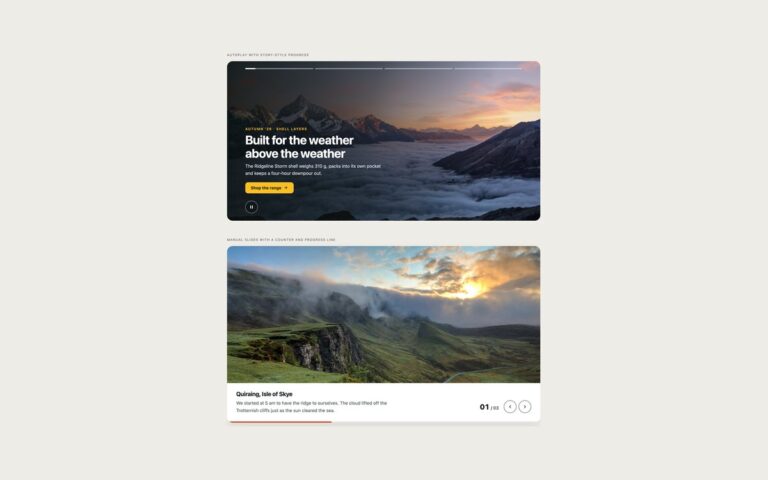
Full-width slides that show how far along you are. Autoplay with story-style progress is an outdoor clothing campaign with four slides and…
Carousels
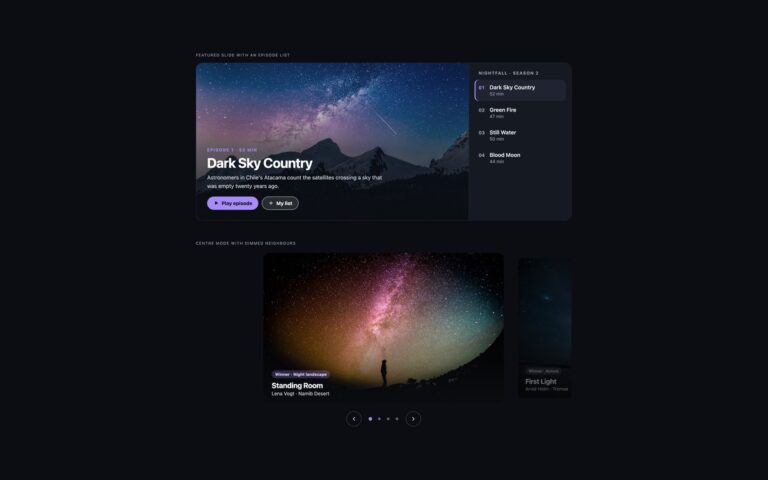
Carousels for dark interfaces such as streaming, music and photography sites.
Carousels
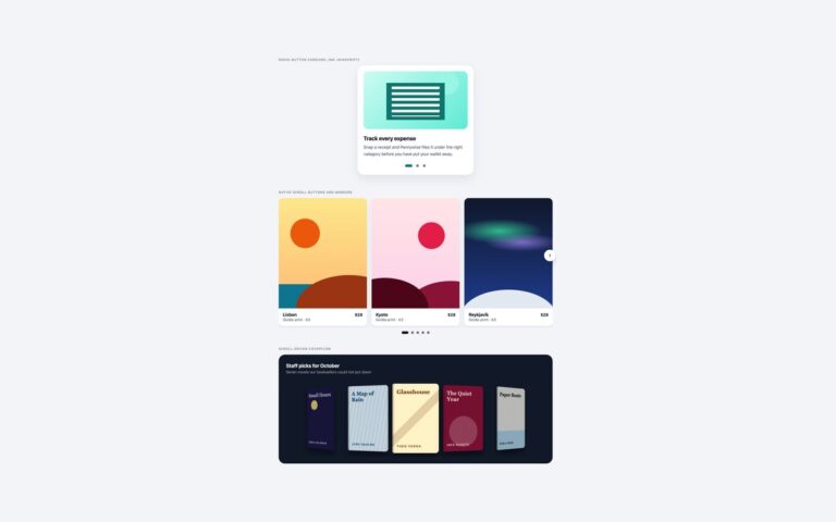
Three carousels that need no JavaScript at all, built on newer CSS.
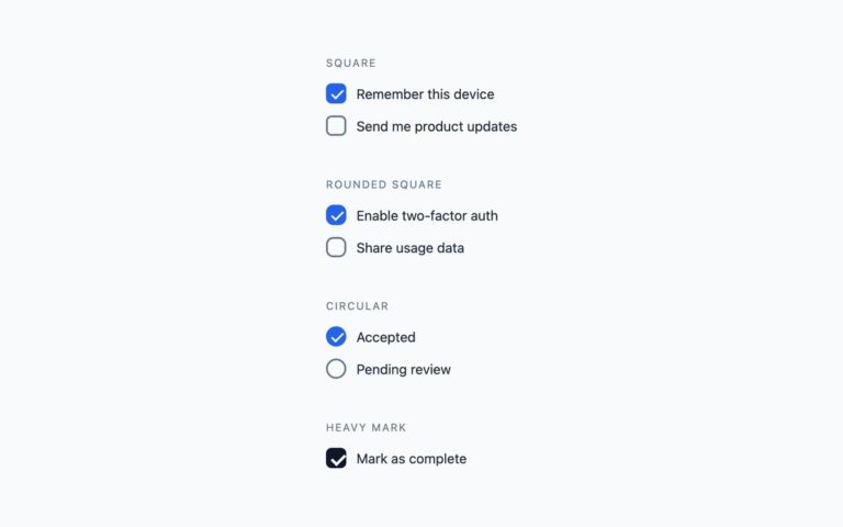
Checkboxes & Radios
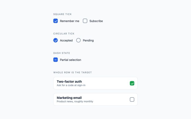
Four custom checkbox shapes that cover most forms: a square box that draws its tick, a rounded square, a circular checkbox and…
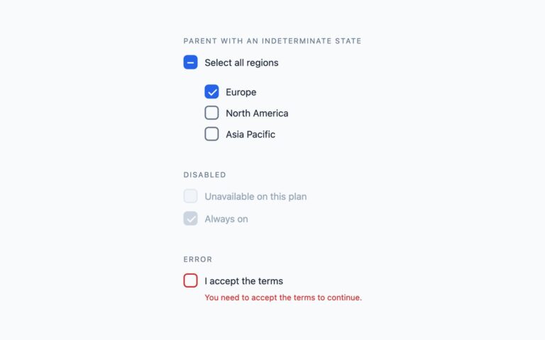
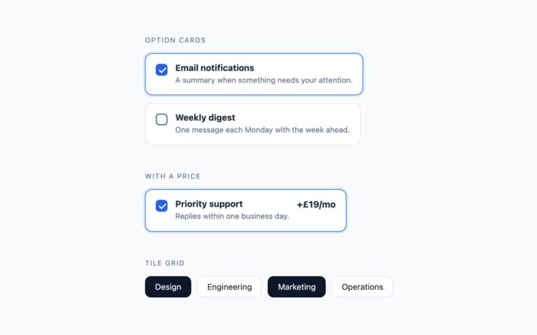
Checkboxes & Radios
Checkboxes where the whole card is the click target. The set has bordered option cards with a title and a one-line description,…
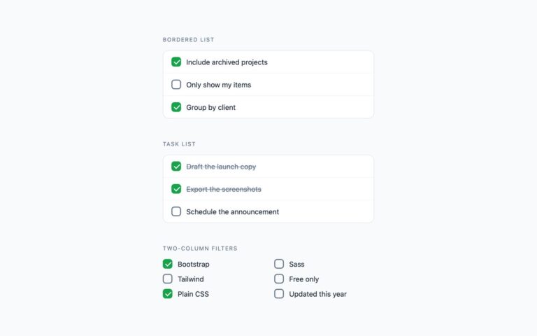
Checkboxes & Radios
Layouts for longer lists of checkboxes. A bordered list stacks options as full-width rows divided by hairlines, with a hover tint, for…
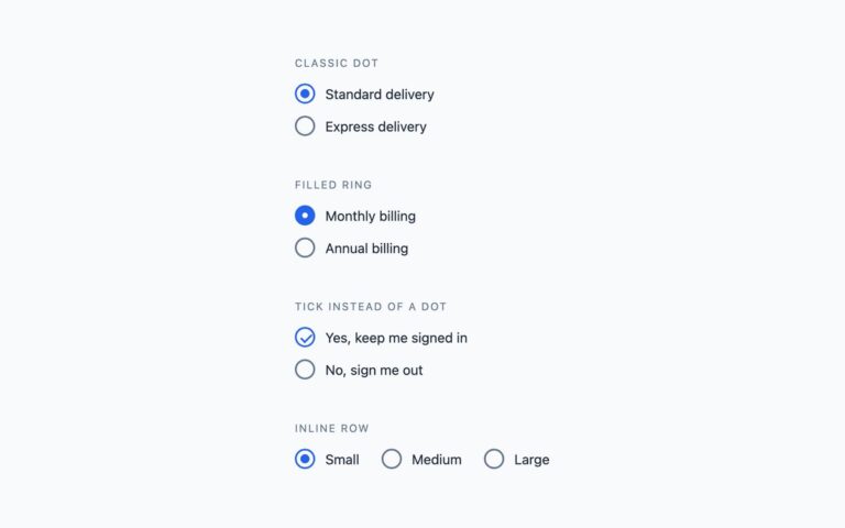
Checkboxes & Radios
Four radio button treatments for one-of-many choices. The classic dot keeps a light ring and scales a blue dot into it when…
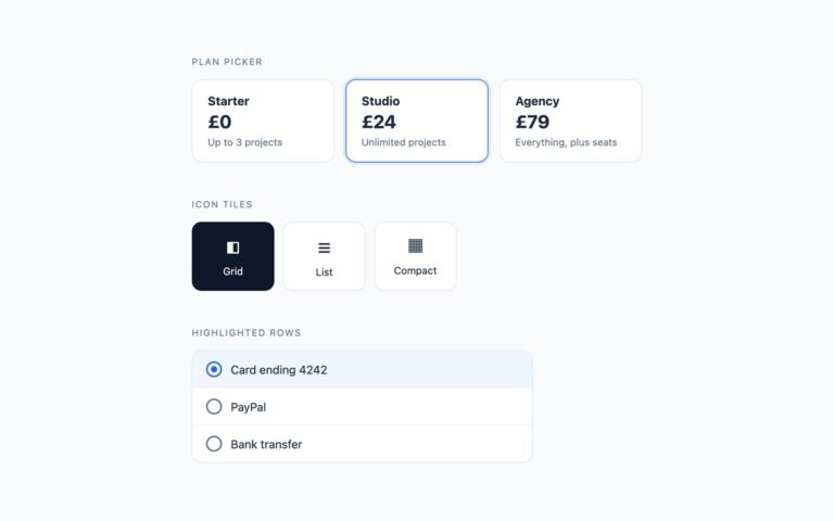
Checkboxes & Radios
One-of-many choices presented as cards. The plan picker shows three pricing cards with a name, a price and a line of detail;…
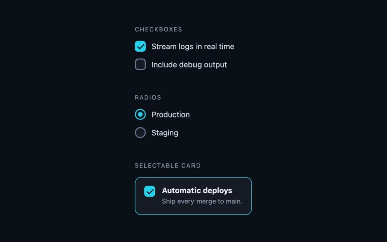
Checkboxes & Radios
Checkboxes and radio buttons built for dark surfaces, where a light-theme control loses its border and reads as a smudge.
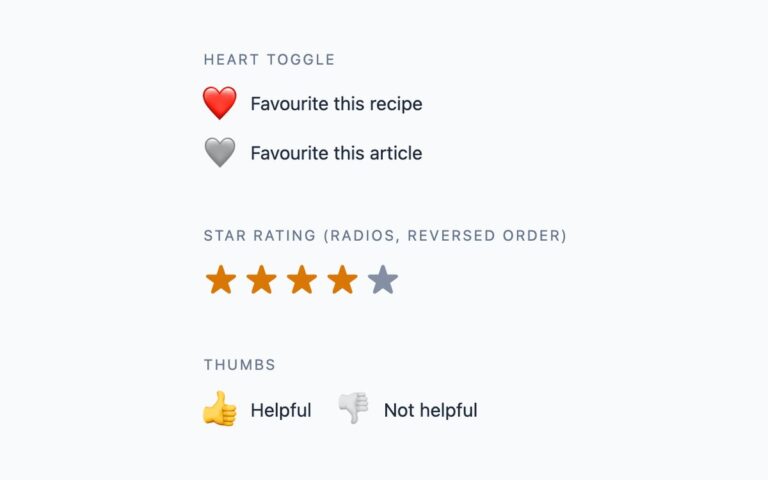
Checkboxes & Radios
Choice controls that carry some character. A heart toggle is a checkbox whose emoji heart is greyed out until the item is…
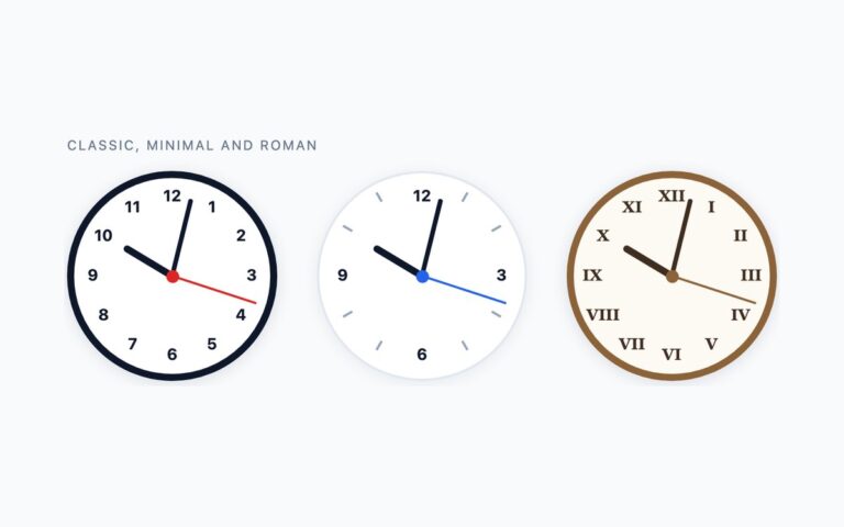
Clocks
Three analogue clock faces drawn entirely in CSS and set from the system time: a classic face with a dark rim and…
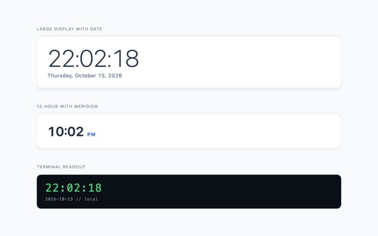
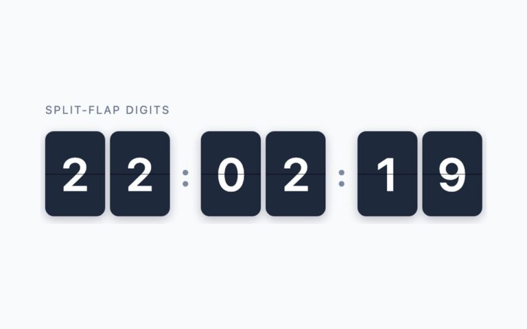
Clocks
A split-flap style clock in six dark digit cards, grouped as hours, minutes and seconds with colon separators.
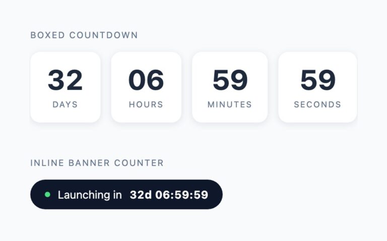
Clocks
Two countdowns to a launch moment. The boxed countdown shows days, hours, minutes and seconds in four white tiles with uppercase unit…
Clocks
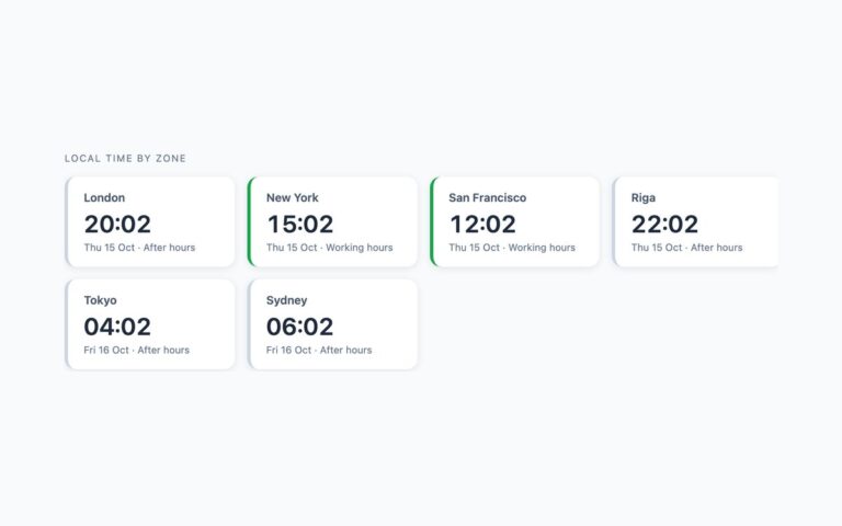
A grid of city clocks for a distributed team: London, New York, San Francisco, Riga, Tokyo and Sydney, each on its own…
Clocks
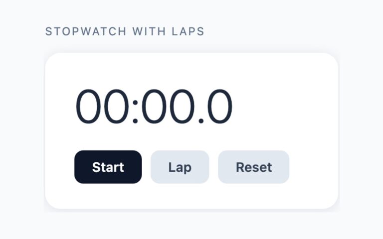
A stopwatch card with a large tenths-of-a-second readout, a dark Start button that becomes Stop while running, Lap and Reset buttons in…
Clocks
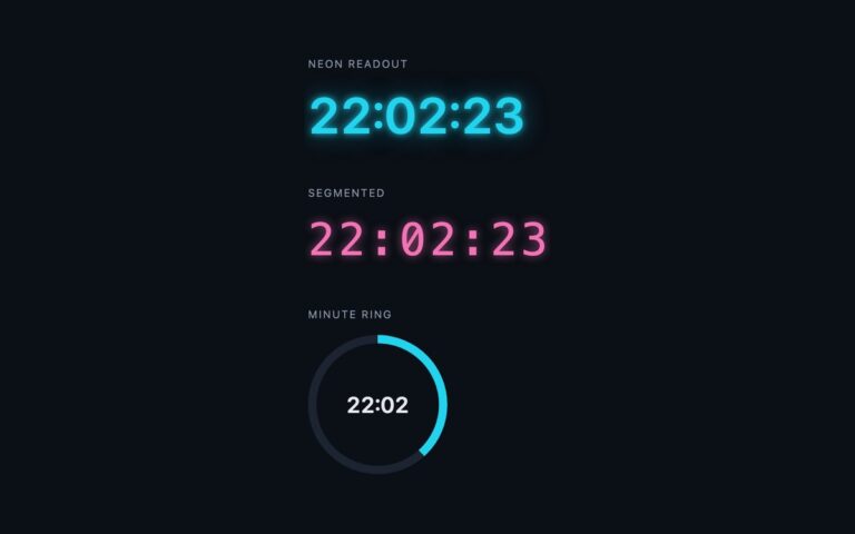
Three clocks designed for dark interfaces. The neon readout is a cyan 24-hour time with a two-layer text-shadow glow, for a hero,…
Coming Soon Pages
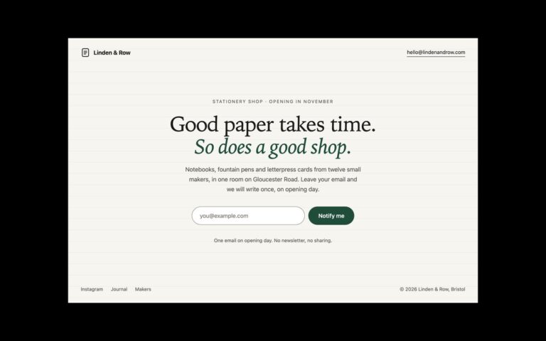
A single-screen coming soon page that says one thing and asks for one thing: a serif headline, two lines of context and…

Coming Soon Pages
A launch page built around a live countdown: four white tiles for days, hours, minutes and seconds on a soft indigo and…
Coming Soon Pages
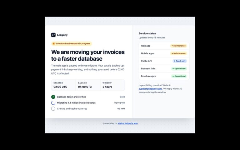
A scheduled maintenance page that answers the three questions users arrive with: what is happening, when it will be back, and what…
Coming Soon Pages
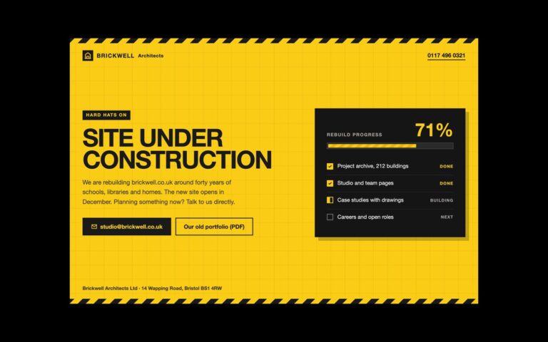
A bold under construction page on safety yellow with hazard tape along the top and bottom edges and a faint blueprint grid.
Coming Soon Pages
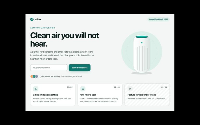
A pre-order style launch page for a physical product, with a hero and a row of feature teasers.
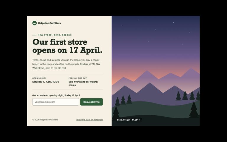
Coming Soon Pages
A two-column coming soon page with the message on one side and a full-height image on the other.
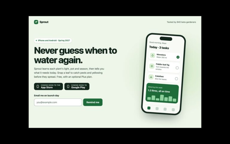
Coming Soon Pages
A pre-launch page for a mobile app, with a phone mock-up beside the pitch.
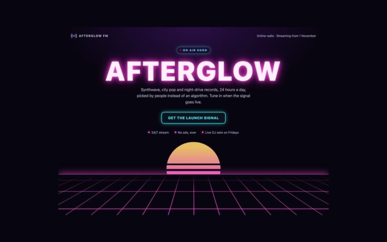
Coming Soon Pages
A dark synthwave coming soon page for an online radio station, and the modern-CSS set in this pack.
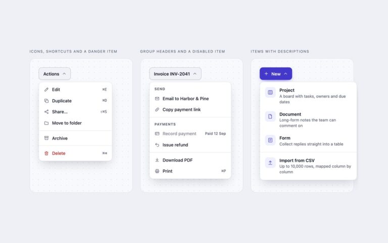
Dropdown Menus
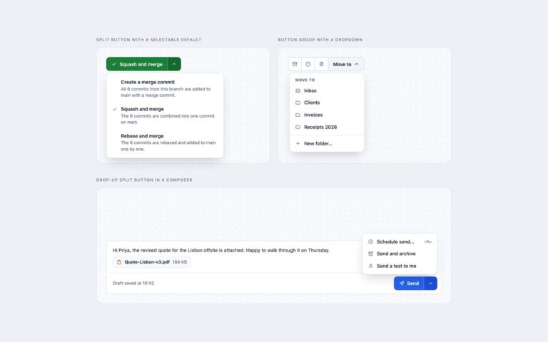
Three action menus of the kind every app needs, each opened from a menu button.
Dropdown Menus
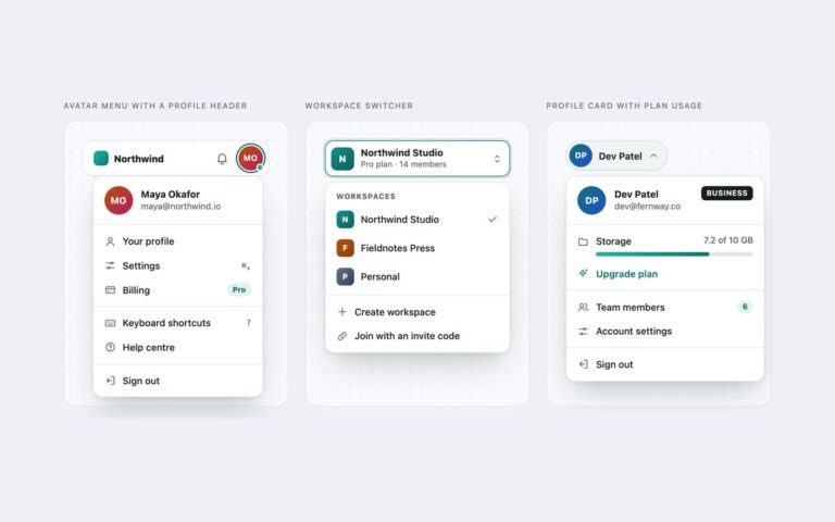
Three account menus for the top right corner of an app. Avatar menu with a profile header sits in a small app…
Dropdown Menus
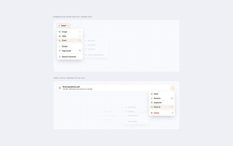
Dropdowns with submenus that work with a mouse and with the keyboard.
Dropdown Menus
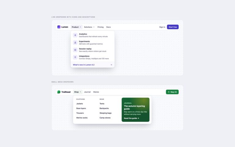
Dropdowns inside a site navbar, built for navigation rather than commands.
Dropdown Menus
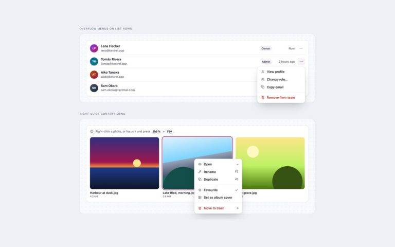
Menus that belong to a single item on the page. Overflow menus on list rows is a team members list where each…
Dropdown Menus
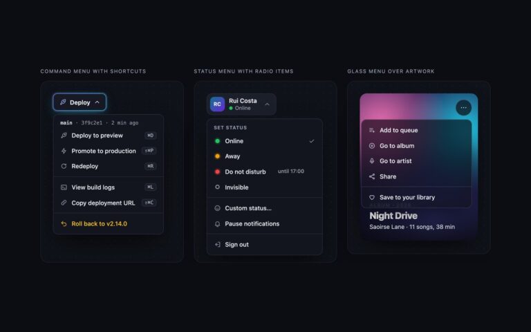
Three dropdowns for dark interfaces. Command menu with shortcuts is a Deploy button with a gradient border and glow, whose menu starts…
Dropdown Menus
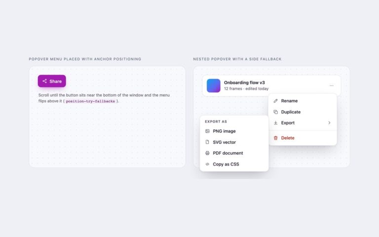
Dropdowns with no JavaScript at all, built on the popover attribute and CSS anchor positioning.
File Uploads
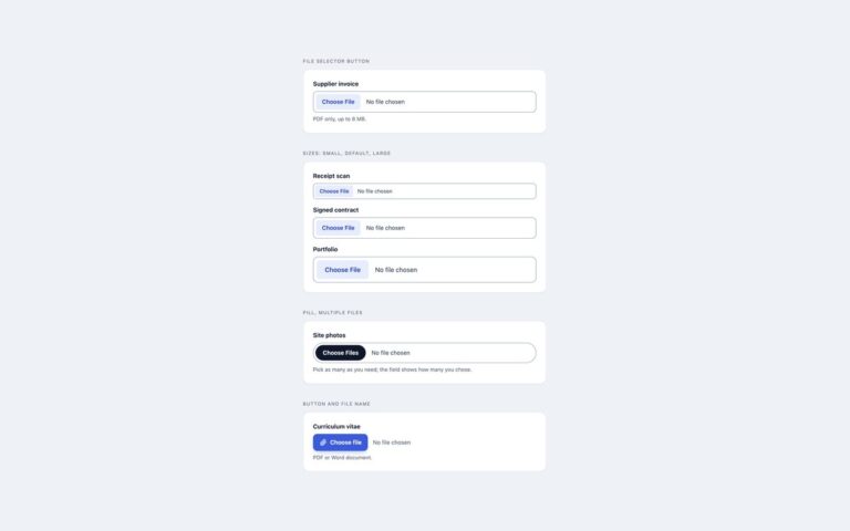
Four ways to make the plain file input look like the rest of a form without losing what the browser does for…
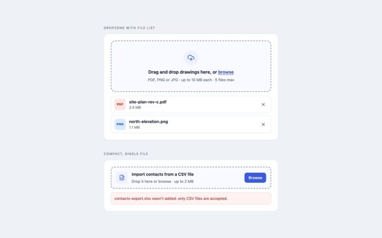
File Uploads
Two drag-and-drop file upload zones built around a real file input.
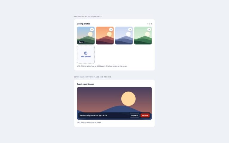
File Uploads
Image uploaders that show the picture straight away. Photo grid with thumbnails is built for listings and galleries: chosen photos appear as…
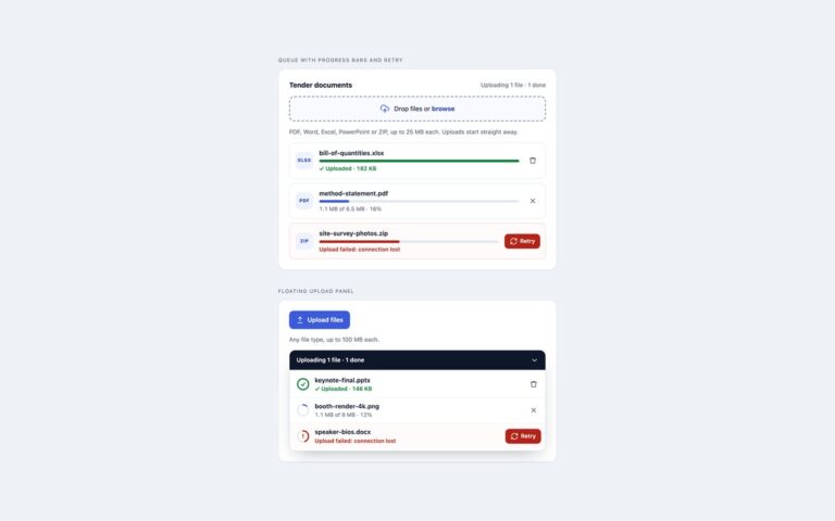
File Uploads
Upload queues that show every file's progress and what went wrong.
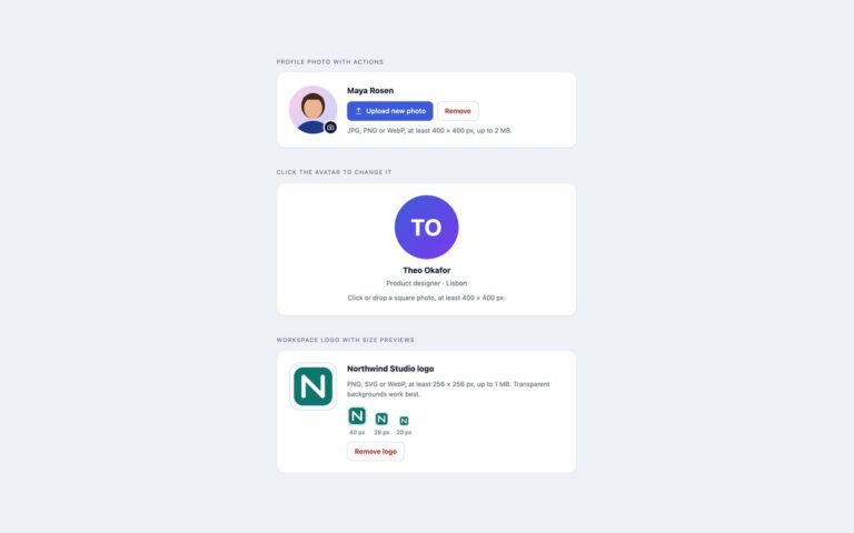
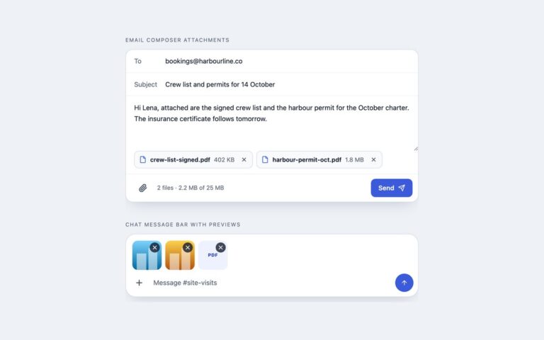
File Uploads
Attachment controls for places where uploading is secondary to writing.
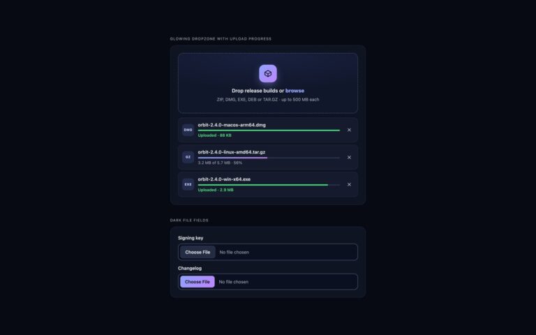
File Uploads
File upload components for dark interfaces such as developer tools, dashboards and media apps.
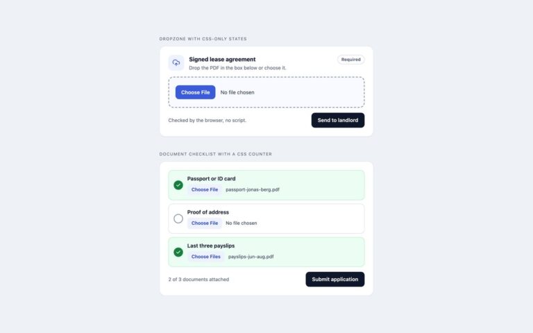
File Uploads
File upload states that usually need JavaScript, done with HTML validation and modern selectors.
Footers
A classic white site footer in two rows. The top row holds the brand, a gradient logo mark with a two-line blurb,…
Footers
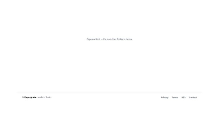
The smallest useful footer: a single row with the copyright and a note on the left and four short links on the…
Footers
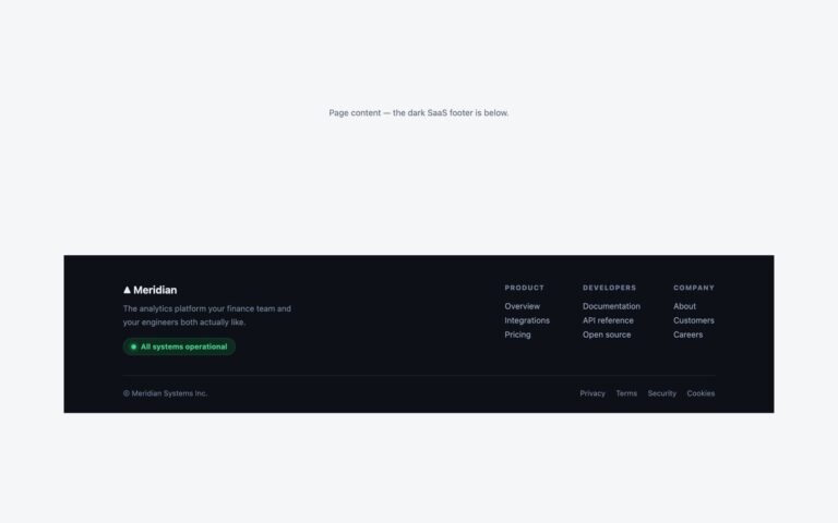
A near-black footer for software products. On the left sits the brand with a one-line pitch and a green pill link reading…
Footers
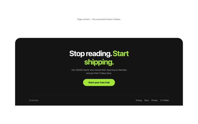
A conversion footer that ends the page with one last push. A dark panel with a rounded top holds a huge two-tone…
Footers
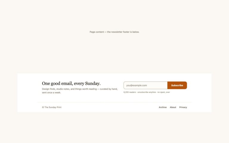
A newsletter-first footer in warm paper tones. The top band pairs a serif headline, One good email, every Sunday., and a short…
Footers
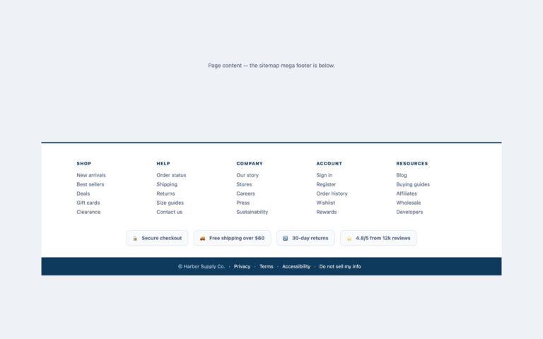
A full sitemap footer for online shops and larger sites. Five equal columns, Shop, Help, Company, Account and Resources, each hold five…
Footers
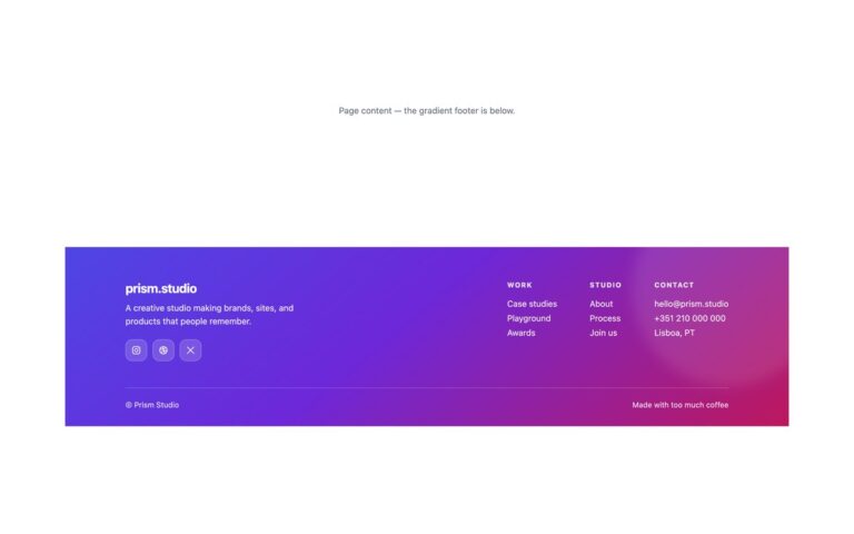
A bold footer for creative studios and agencies. A diagonal gradient runs from indigo through violet to pink, with a soft blurred…
Footers
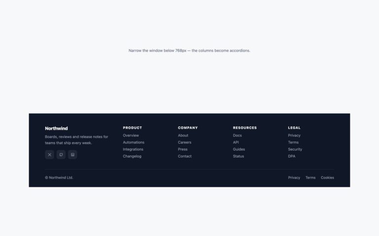
A dark footer whose link columns turn into accordions on phones.
Footers
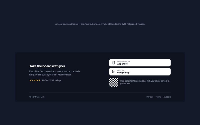
A footer that sends visitors to your mobile app. The left side has a short pitch, Take the board with you, a…
Footers
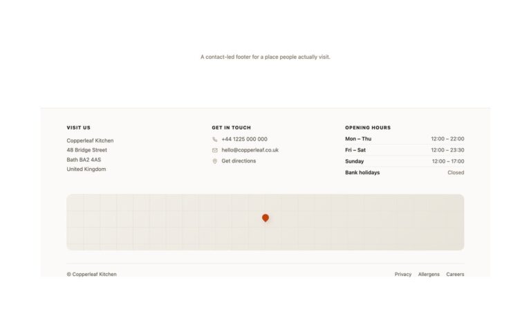
A contact-led footer for restaurants, shops, studios and any place people visit in person.
Footers
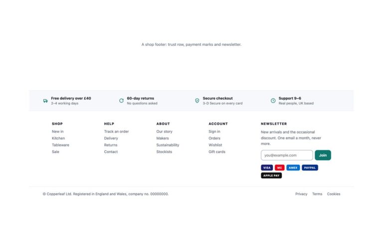
A footer for an online shop that does more than list links. It opens with a tinted trust row of four promises,…
Footers
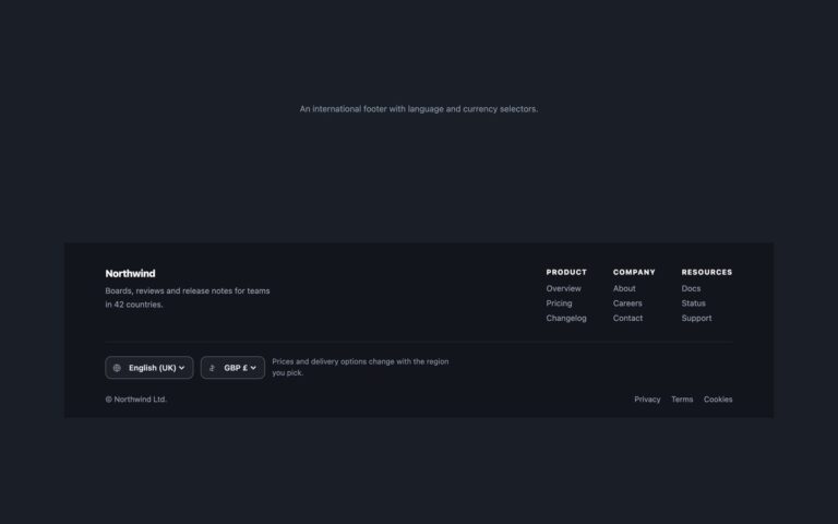
A dark footer for a product sold in several countries. The top row pairs the brand and a one-line description with three…
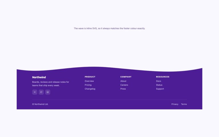
Footers
A deep violet footer that starts with a soft wave instead of a straight edge.
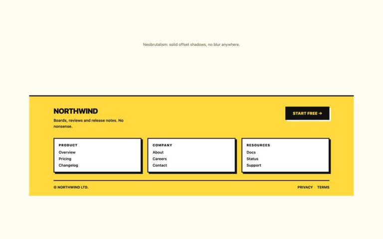
Footers
A loud yellow footer in the neobrutalist style: thick black borders, square corners and solid offset shadows with no blur anywhere.
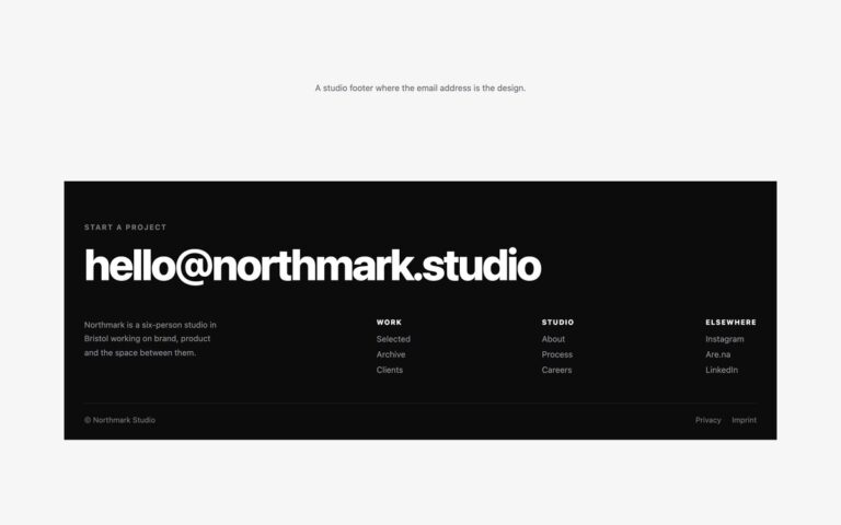
Footers
A black footer for a studio or freelancer where the email address is the design.
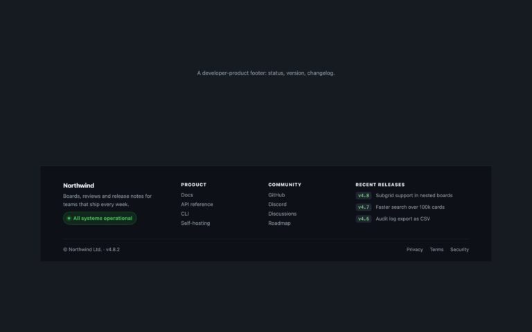
Footers
A dark footer for a developer product, the kind you see on API, CLI and hosting sites.
Footers
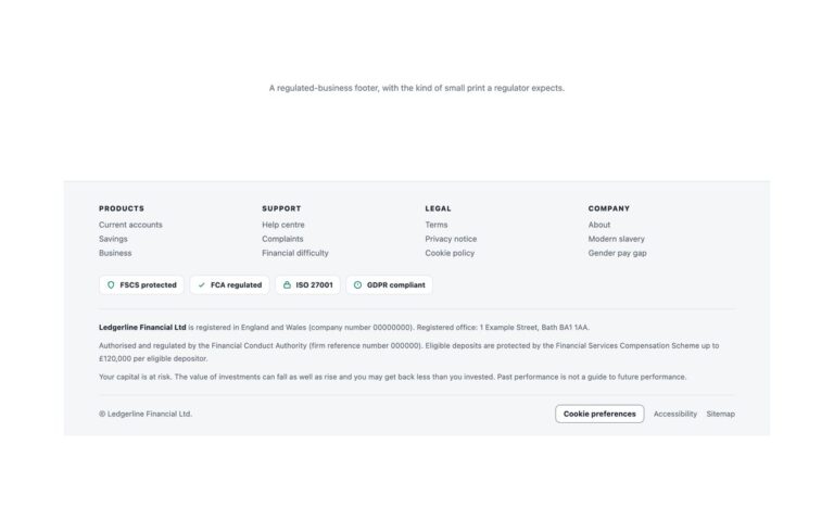
A light footer for a bank, lender, insurer or any regulated business that has to show small print on every page.
Footers
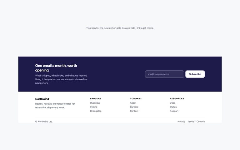
A footer in two bands, so the newsletter signup is not squeezed into a column.
Footers
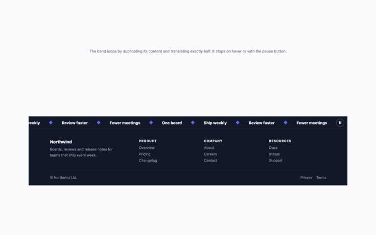
A dark footer topped by a band of short slogans that scrolls sideways without end, separated by small indigo diamonds.
Footers
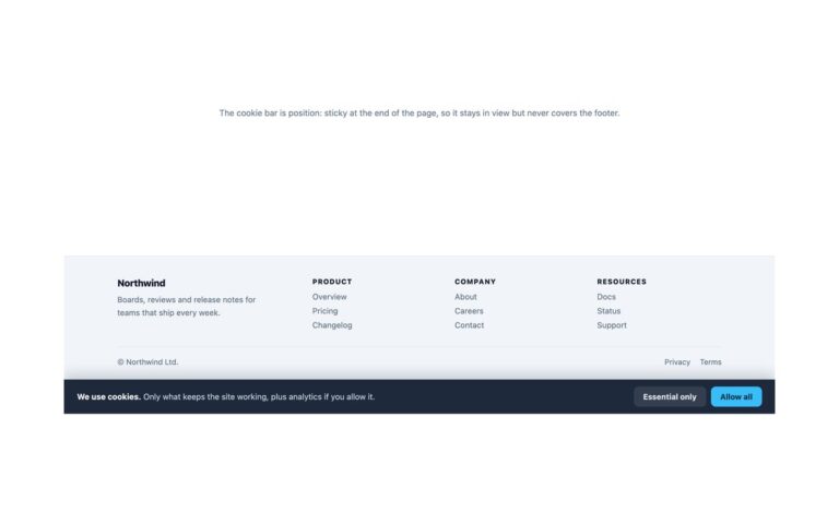
A light slate footer paired with a dark cookie bar pinned to the bottom of the screen.
Footers
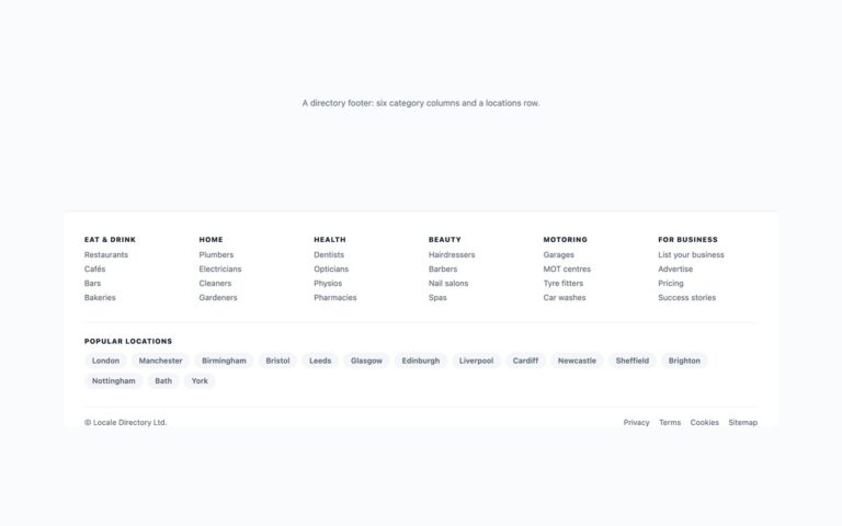
A wide, link-heavy footer for a local business directory, marketplace or listings site.
Form Wizards
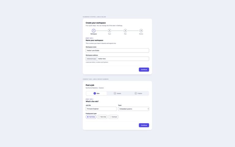
Two multi-step forms with the stepper across the top, the pattern most wizards start from.
Form Wizards
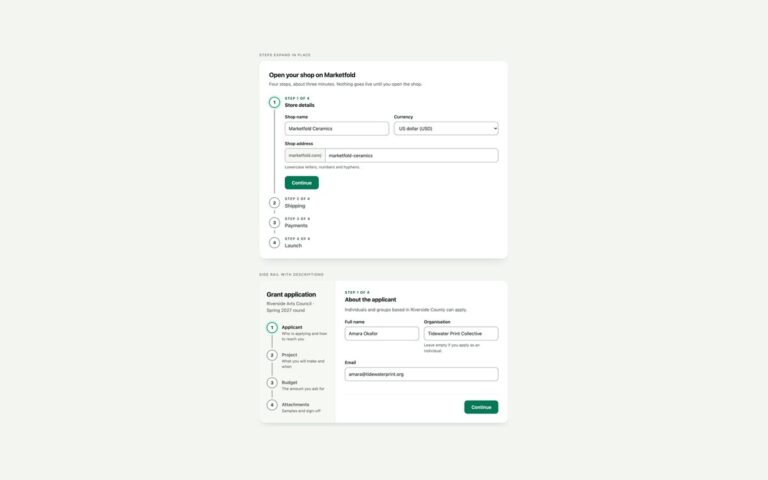
Two vertical multi-step forms that keep every step in view. Steps expand in place is a Material-style stepper where the ordered list…
Form Wizards
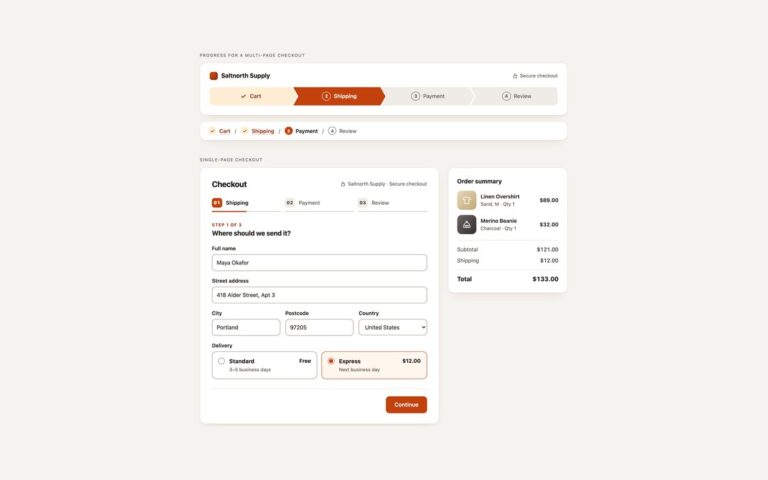
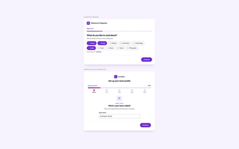
Two first-run onboarding flows where progress is shown as a bar rather than numbered steps.
Form Wizards
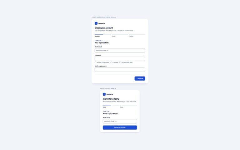
Two sign-up flows for a fictional accounting app, built around per-step validation.
Form Wizards
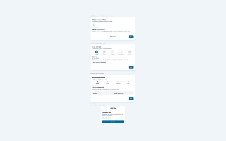
Four compact stepper designs, each shown as a small working wizard with Back and Next buttons.
Form Wizards
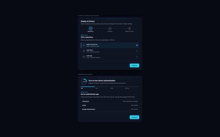
Two multi-step forms for dark interfaces, with a cyan glow for the current step and lime for finished ones.
Form Wizards
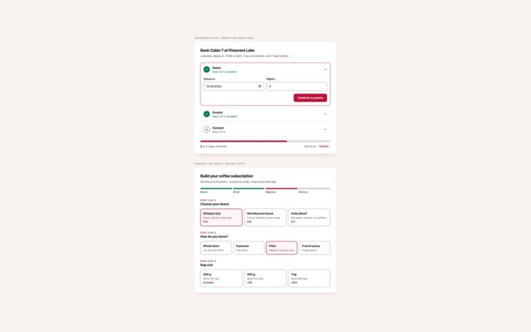
Two multi-step forms that run without any JavaScript. Accordion steps, completion from :has(), books a lakeside cabin in three steps built from…
Forms
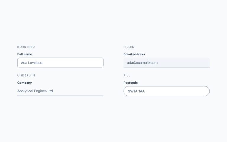
Four treatments for a single-line text field, each with a visible label above the input.
Forms
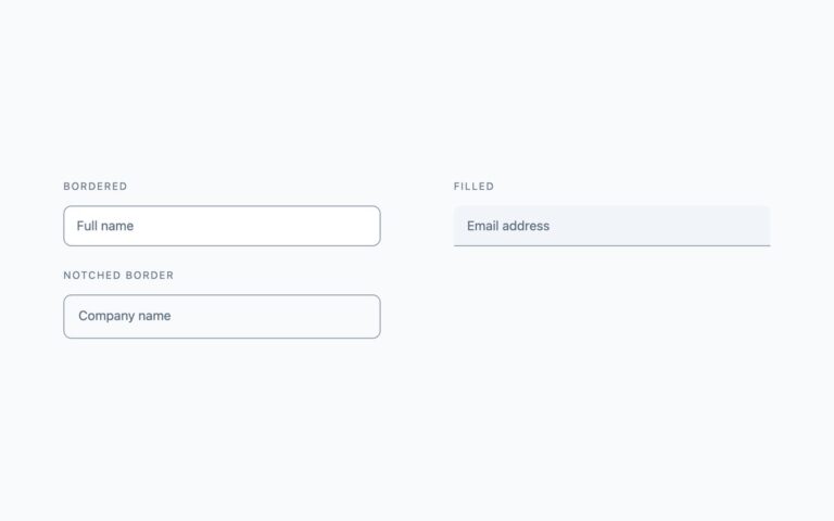
Three fields where the label starts inside the input, like a placeholder, and rises to the top edge when the field is…
Forms
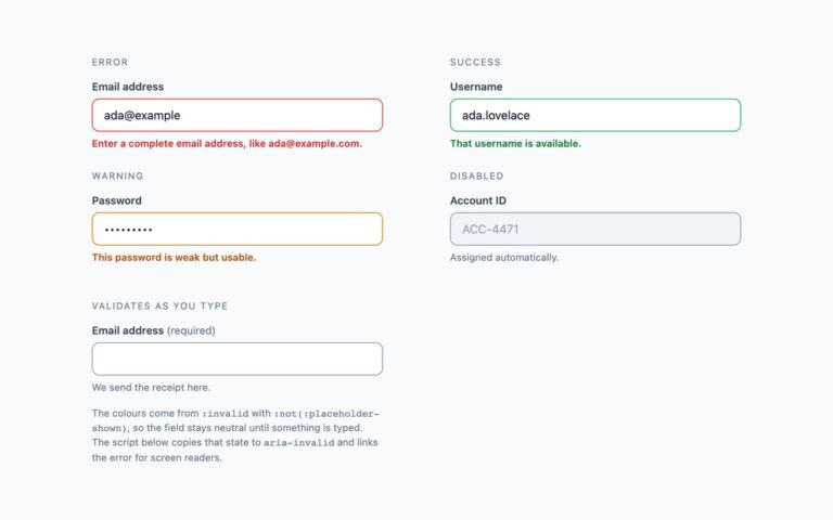
The five field states a real form needs, each with its message in words so the state never relies on colour alone.
Forms
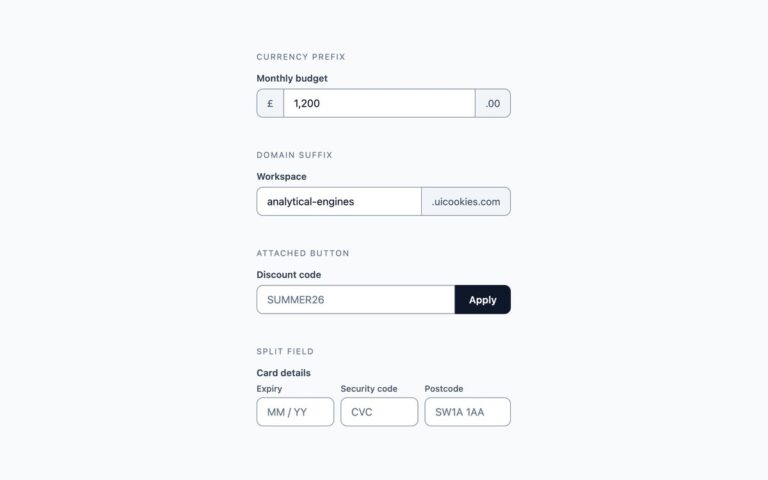
Fields joined to something else, with the borders merged so each group reads as one control.
Forms
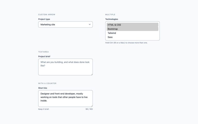
Styles for the two controls that look most out of place by default.
Forms
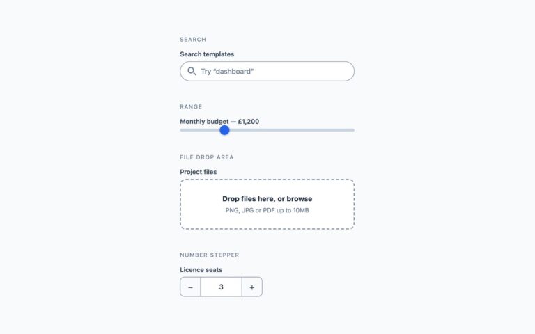
Four fields that are more than a line of text. Search is a pill-shaped type=search input with a magnifier drawn from two…
Forms
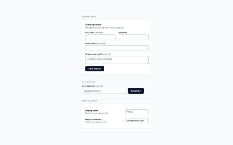
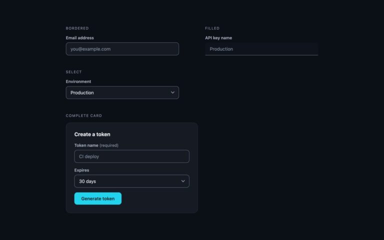
Three complete forms rather than single fields. The contact form sits in a white card with a heading and a response-time note;…
Forms
Form fields tuned for dark interfaces such as developer dashboards and admin panels, with a cyan accent.
Galleries
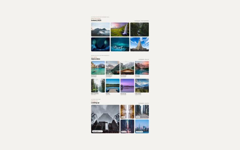
Three photo grids for the most common gallery job: showing a set of pictures in tidy rows.
Galleries
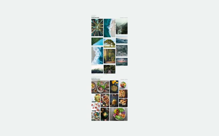
Two masonry layouts for photos that do not share one shape. Column masonry puts twelve forest and coast photographs of different heights…
Galleries
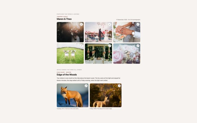
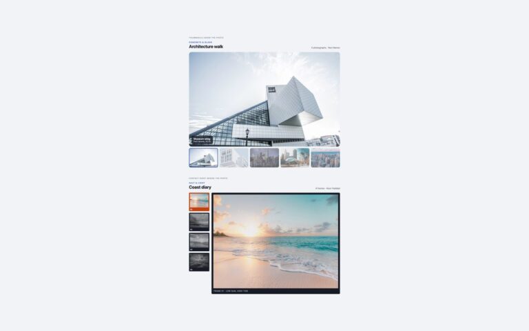
Two image viewers that switch the main photo from a row of thumbnails without any JavaScript.
Galleries
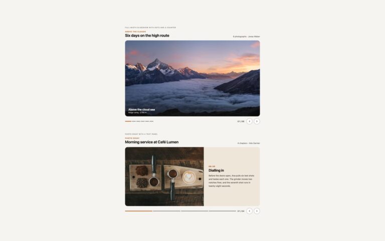
Two slideshows that show one photo at a time and never play on their own.
Galleries
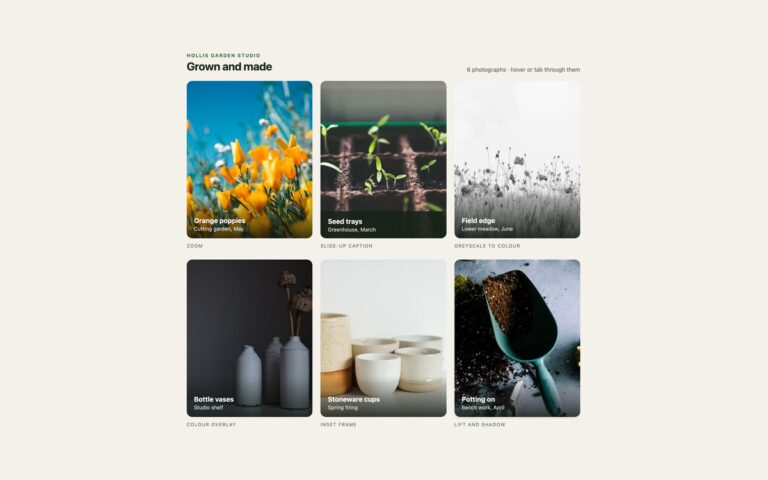
Six photo tiles from a garden and pottery studio, each showing one hover effect you can lift into any gallery.
Galleries
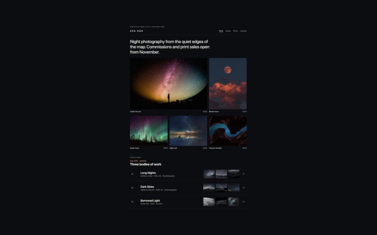
Two dark layouts for a photographer's portfolio, where a black ground lets night and landscape photos glow.
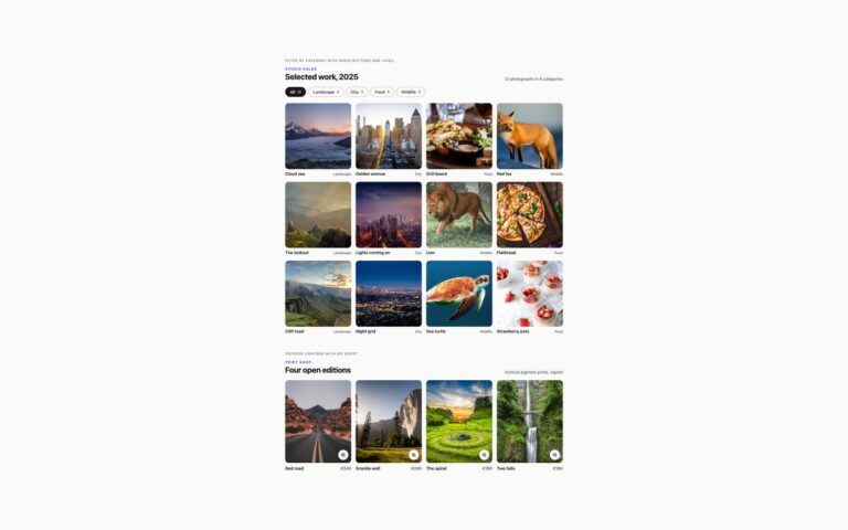
Galleries
Two gallery features that usually need JavaScript, done in CSS.

Headers
The classic software-product header: a gradient logo mark on the left, a row of links in the middle and Sign in plus…
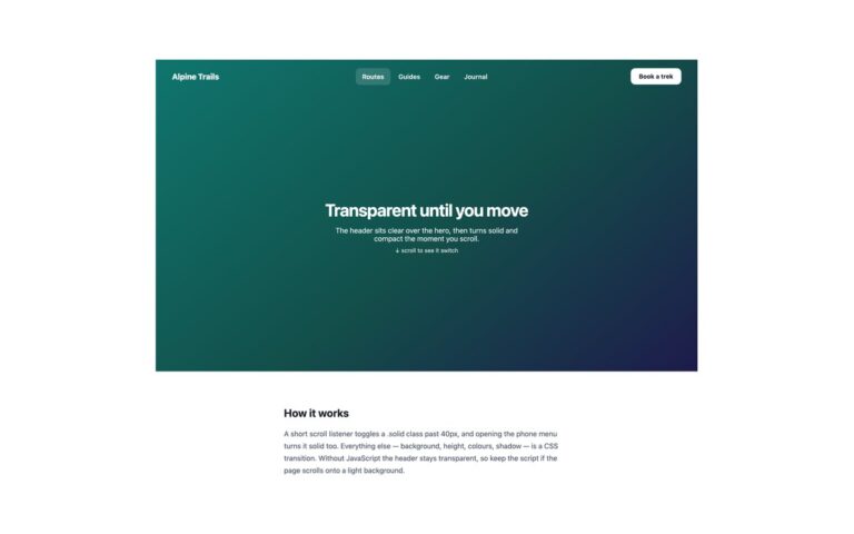
Headers
A fixed header that sits transparent over a full-height hero, with white text on the dark teal gradient, and turns into a…
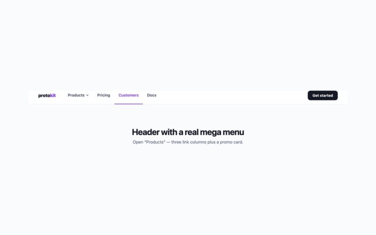
Headers
A product header whose Products item opens a full-width mega menu: three labelled columns of links (Build, Ship and Learn), each link…
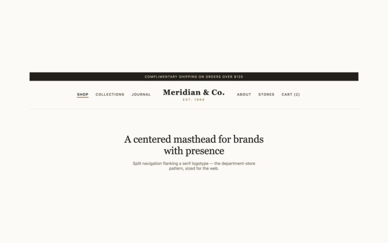
Headers
A department-store masthead: a dark message strip on top, then a serif logotype, Meridian & Co.
Headers
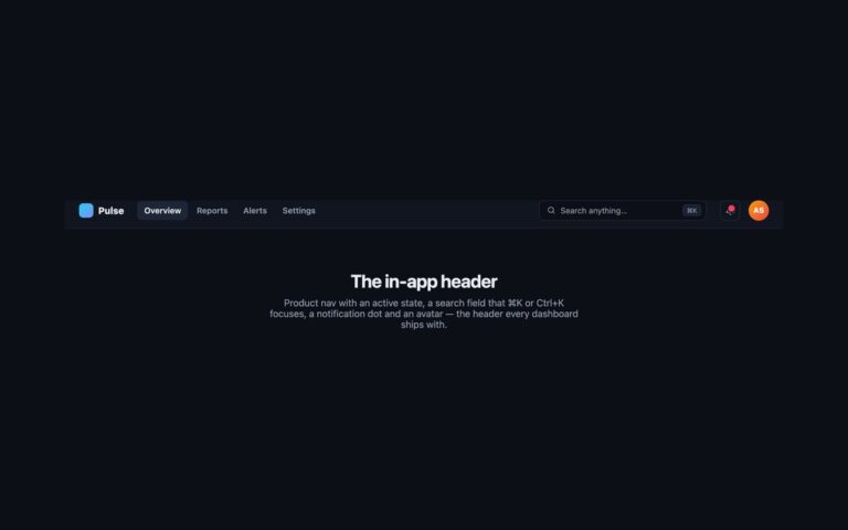
The header a dashboard or web app ships with, in a dark theme: a gradient logo mark, product navigation with a highlighted…
Headers
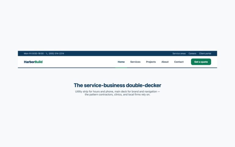
A two-level header for service businesses. A navy utility strip carries opening hours, a click-to-call phone number and three secondary links (Service
Headers
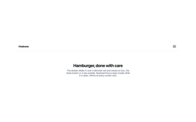
A minimal sticky header, a wordmark on the left and a hamburger button on the right at every screen size, that opens…
Headers
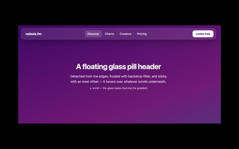
A header that floats as a rounded glass pill rather than spanning the page.
Headers
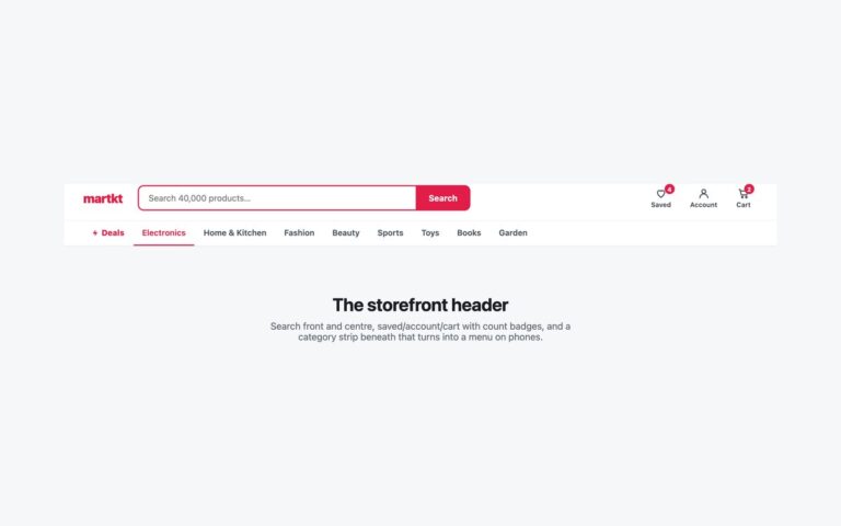
A storefront header in two rows. The top row has the red martkt wordmark, a wide search form with a red outlined…
Headers
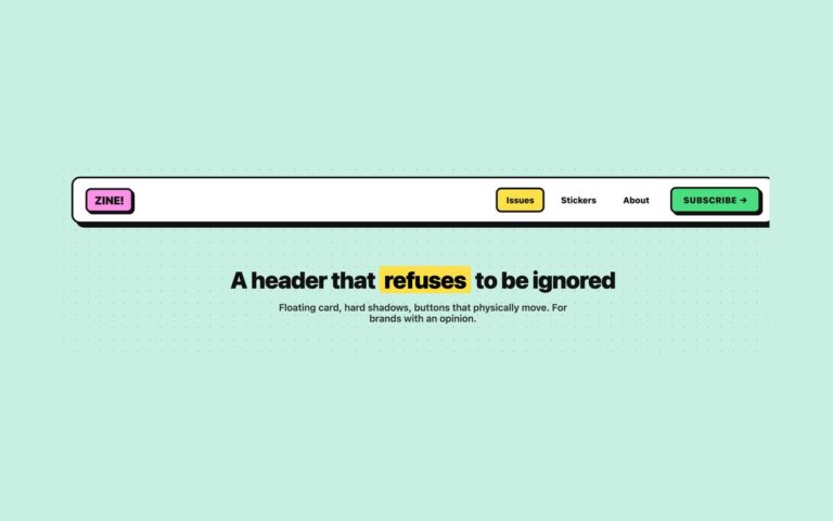
A loud, playful header drawn as a floating white card with a 3px black border, rounded corners and a hard 7px offset…
Headers
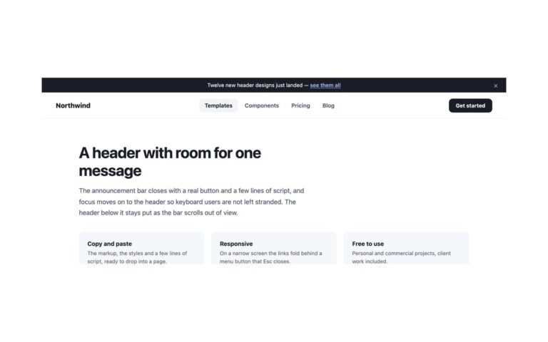
A dark announcement bar with one line of news and a link, sitting above a sticky white header with a logo, four…
Headers
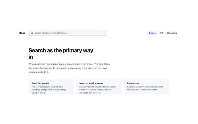
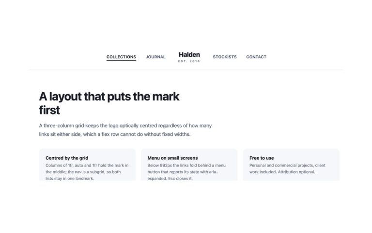
A header with the brand mark in the middle and the navigation split either side of it: Collections and Journal on the…
Headers
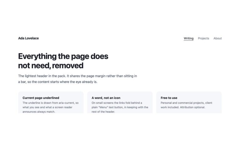
The lightest header in the pack: a name on the left and three text links on the right, with no bar, border…
Headers
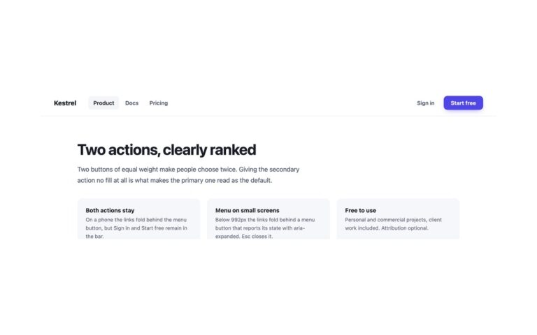
A SaaS header with two actions of clearly different weight: a quiet "Sign in" text link beside a filled indigo "Start free"…
Headers
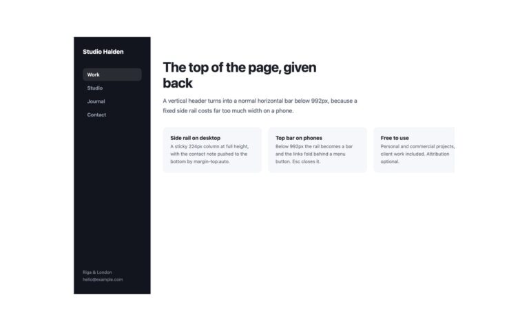
A dark header that runs down the left edge of the page instead of across the top: a 224px column holding the…
Headers
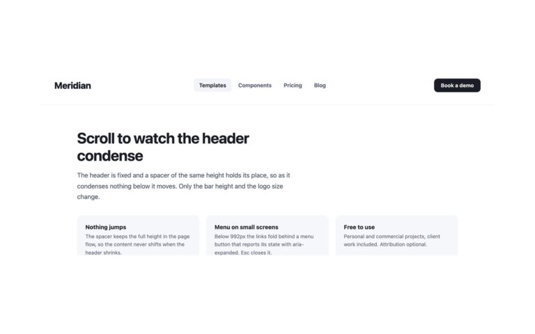
A tall 104px header that condenses to 62px once the page has scrolled 40px, with the logo shrinking from 1.5rem to 1.08rem…
Headers
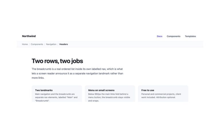
A two-row header for documentation and deep content: a top bar with the logo and three links, and a tinted row underneath…
Headers
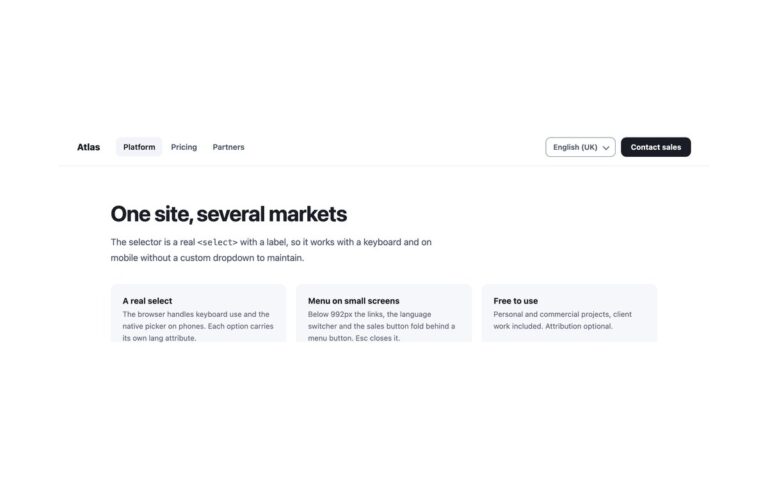
A sticky business header with a language and region switcher next to the call to action: logo and three links on the…
Headers
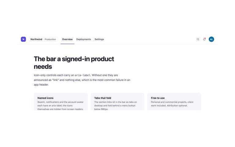
The compact 58px bar a signed-in product needs: a logo square, a workspace switcher ("Northwind · Production"), three section tabs (Overview, Deployme
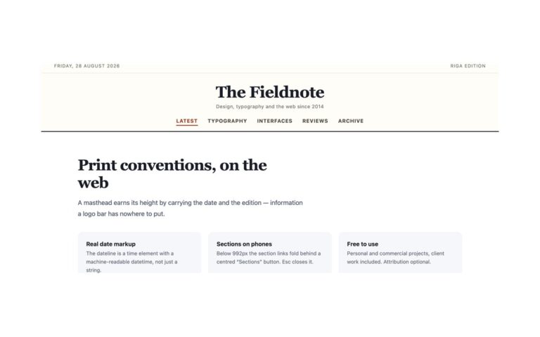
Headers
A newspaper-style masthead for a magazine or blog: a thin dateline strip with the date and the edition, a large centred serif…
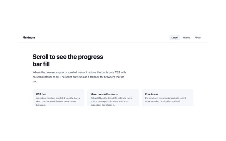
Headers
A sticky blog header with a 3px indigo bar along its bottom edge that fills from left to right as the reader…
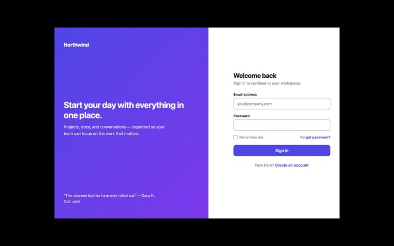
Login Forms
A full-page sign-in screen in two halves. On the left, an indigo-to-violet gradient panel carries the product name, a headline, a short…
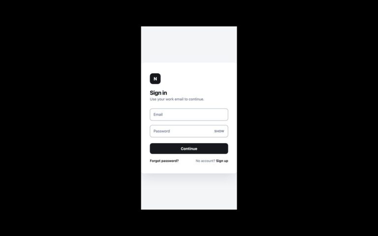
Login Forms
A small white card centred on a light grey page: a dark monogram tile, a Sign in heading, an email field and…
Login Forms
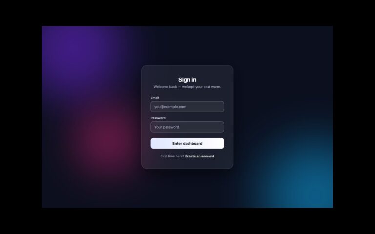
A dark sign-in screen with a frosted glass card floating over three large blurred colour blobs in violet, sky blue and pink.
Login Forms
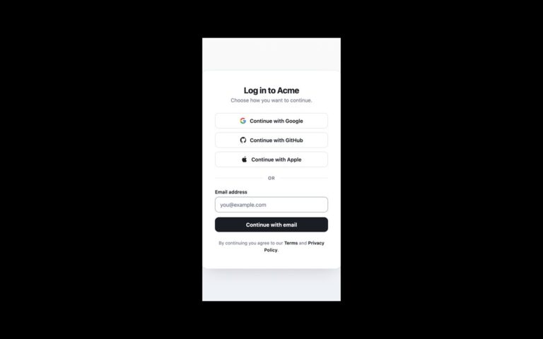
A sign-in card that puts third-party accounts first. Three full-width outline buttons read Continue with Google, Continue with GitHub and Continue wit
Login Forms
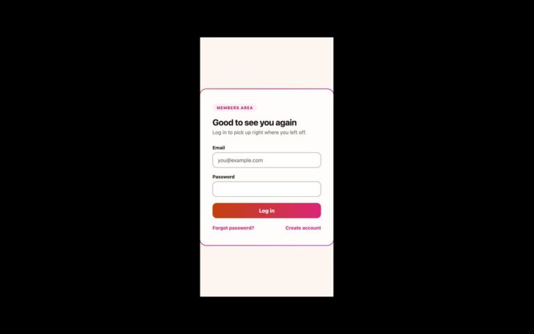
A warm cream sign-in card wrapped in a 2 pixel border that cycles through orange, pink and violet.
Login Forms
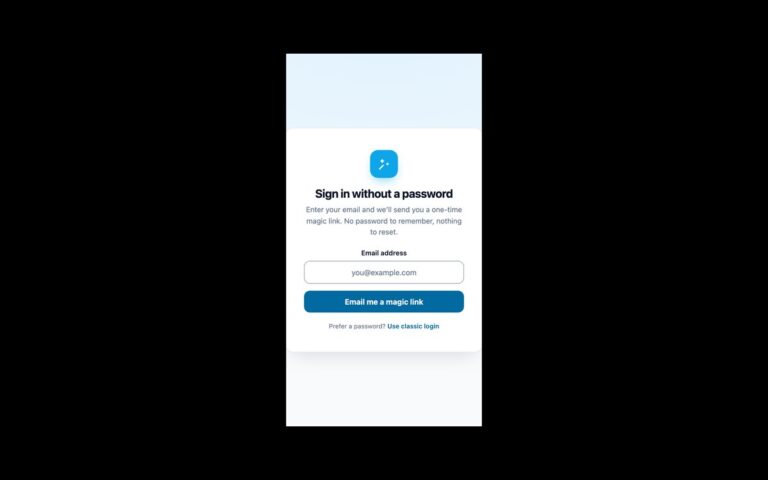
A passwordless sign-in card in two steps. The first step shows a wand icon, a heading, a line explaining that a one-time…
Login Forms
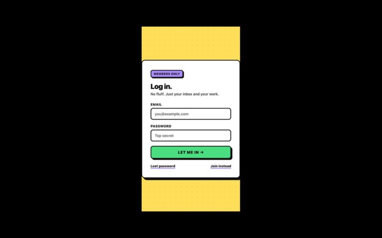
A loud, flat sign-in card on a yellow dotted background: 3 pixel black borders, hard offset shadows with no blur, a violet…
Login Forms
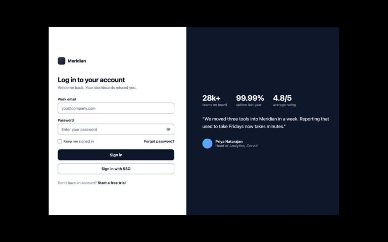
A two-column sign-in page for business software. The left column holds the logo, a heading, a work email field, a password field…
Login Forms
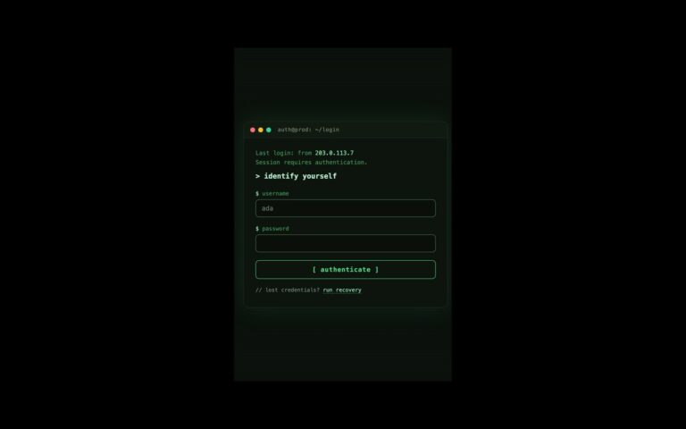
A sign-in window styled like a command-line session. A title bar with red, amber and green dots reads auth@prod: ~/login; below it,…
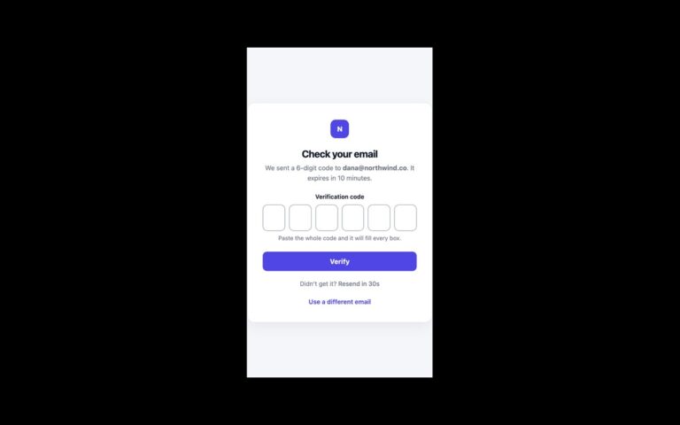
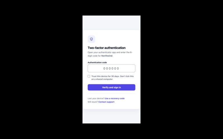
Login Forms
The second step of a sign-in that uses an authenticator app. A shield icon and a short line tell the person which…
Login Forms
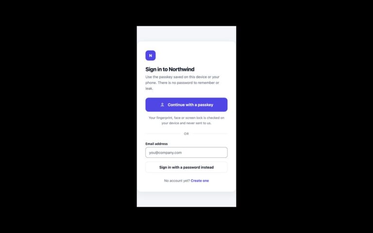
A sign-in screen that leads with passkeys and keeps a password route one step away.
Login Forms
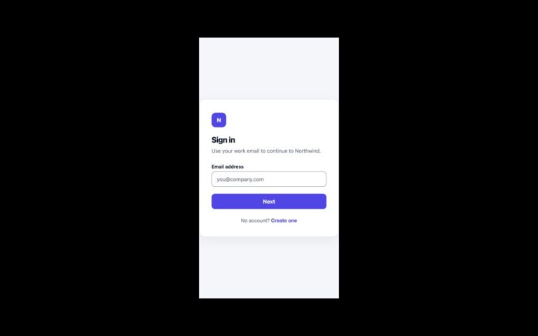
A two-panel login that asks for the email first and the password second, the pattern used when some accounts sign in through…
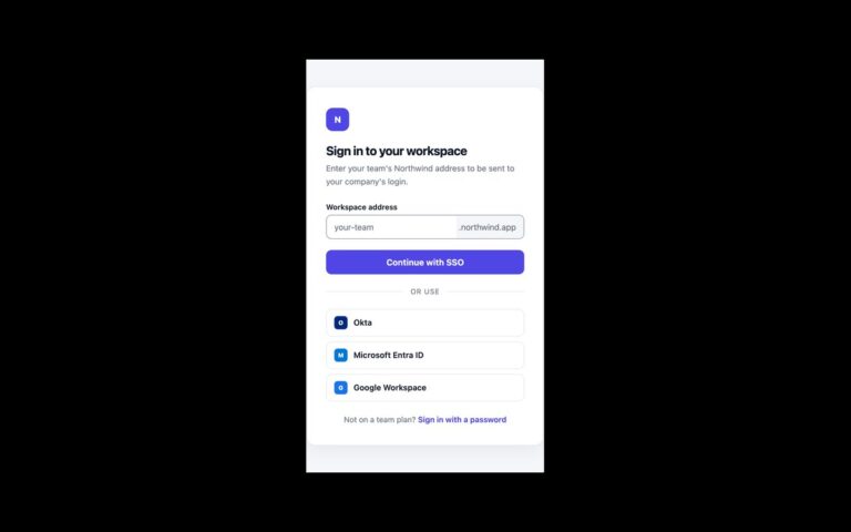
Login Forms
A sign-in screen for team plans that authenticate through a company identity provider.
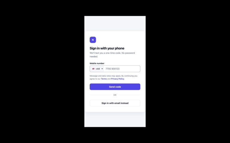
Login Forms
A passwordless login that sends a one-time code by text message.
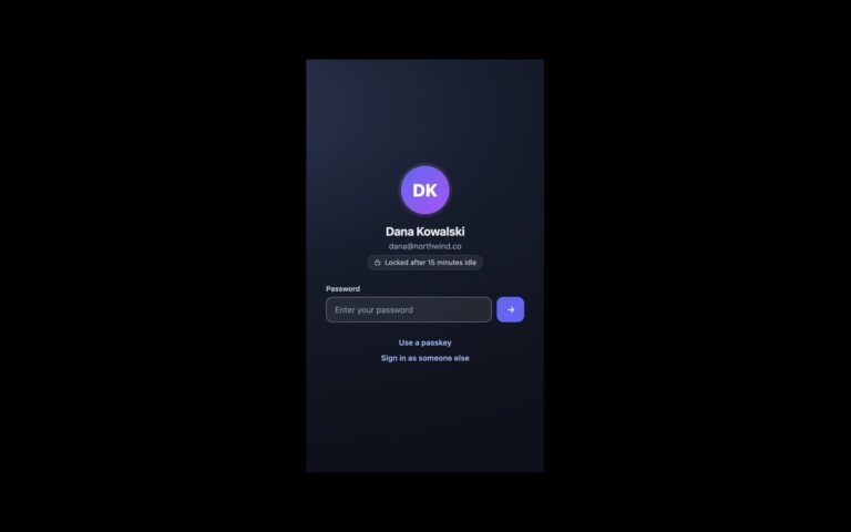
Login Forms
A lock screen for a known account that has been idle, the kind shown by admin panels and internal tools after a…
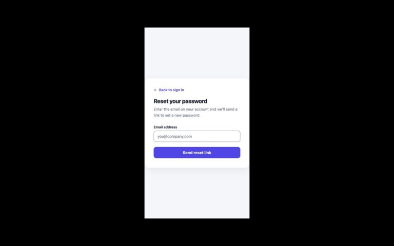
Login Forms
The forgotten-password screen and the confirmation that follows it.
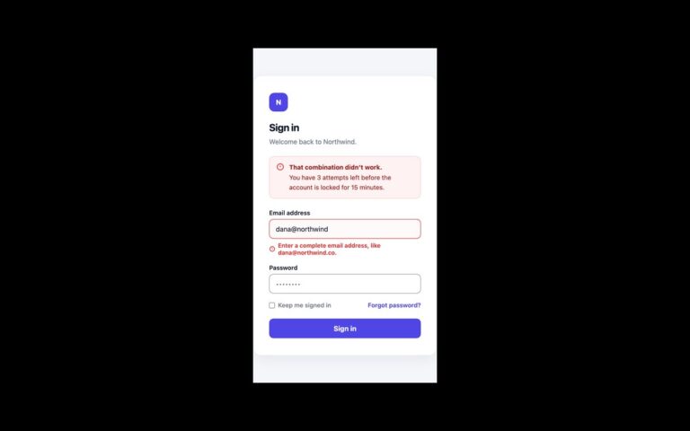
Login Forms
A sign-in card that shows the three errors a login form has to handle.
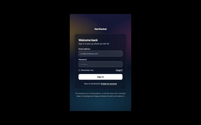
Login Forms
A login card floating over a full-bleed background, for brands that want a photograph or illustration on the sign-in page.
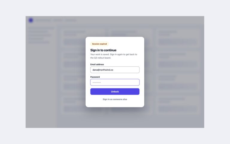
Login Forms
A sign-in dialog that opens over the application when a session expires, so people can re-authenticate without losing their place.
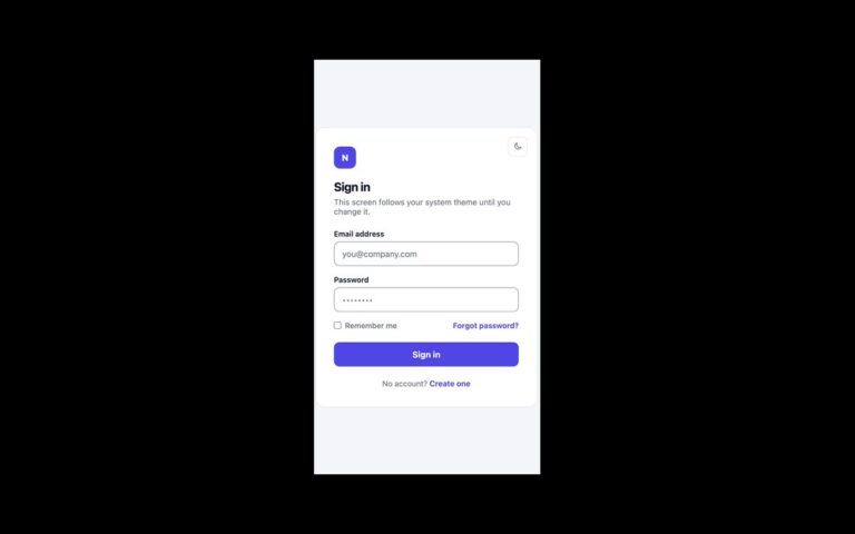
Login Forms
A login card with light and dark themes that follows the operating system until the person picks one.
Menus
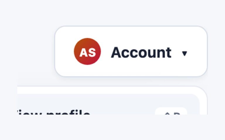
An account menu for the top right corner of an app: a trigger button with initials in a gradient avatar, and a…
Menus
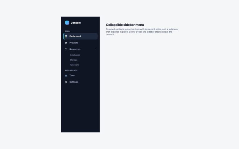
A dark 250 pixel sidebar for dashboards and admin panels. It has a logo row, two labelled groups (Main and Workspace), an…
Menus
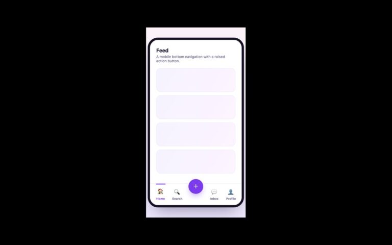
A bottom tab bar for mobile web apps, shown inside a phone frame.
Menus
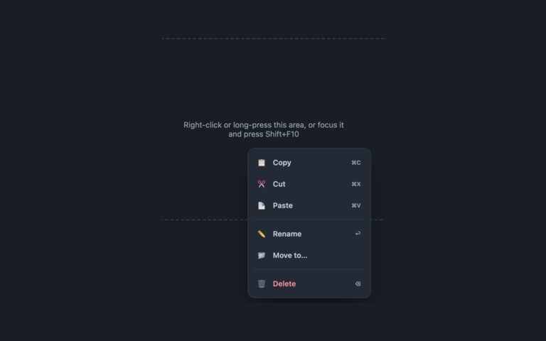
A dark context menu for file lists, canvases and editors. Right-clicking inside the dashed area opens a 230 pixel menu at the…
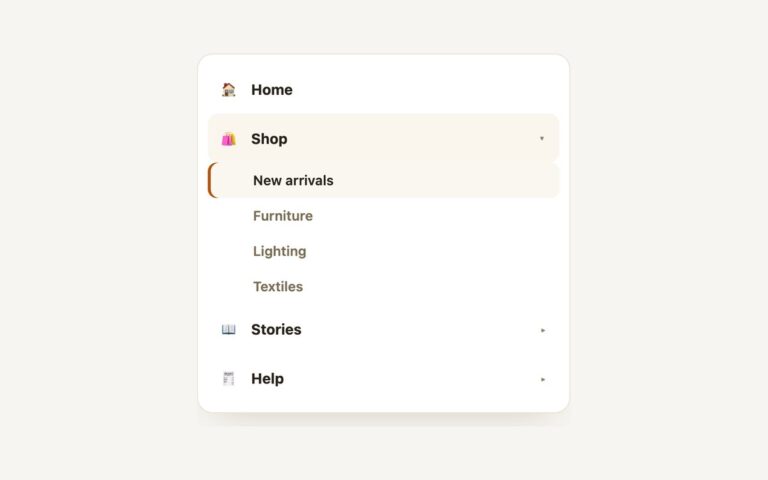
Menus
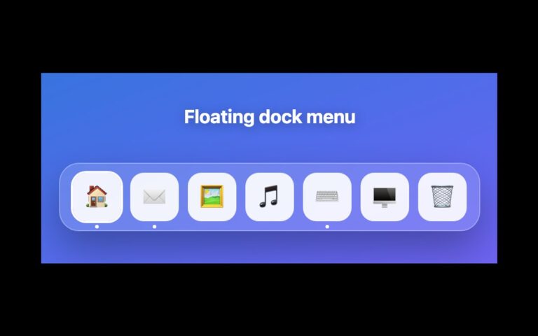
A macOS-style dock of app shortcuts floating on a gradient. Seven rounded tiles (Home, Mail, Photos, Music, Code, Terminal and Trash) sit…
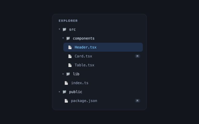
Menus
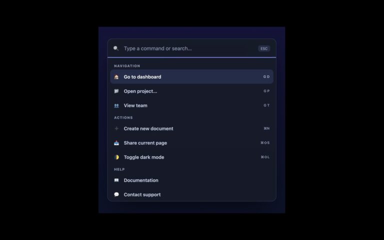
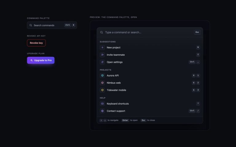
A dark command palette of the kind opened with Ctrl+K or Cmd+K in modern apps.
Menus
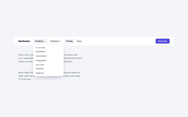
A white top navigation bar with a logo, two dropdowns, two plain links and an indigo Start free button on the right.
Menus
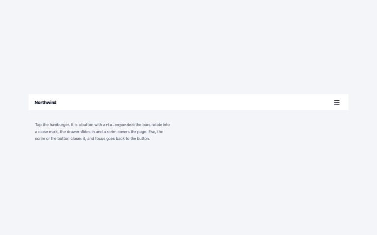
A mobile-style header with a logo and a three-bar hamburger button.
Menus
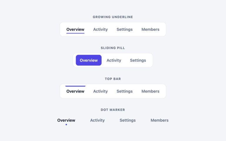
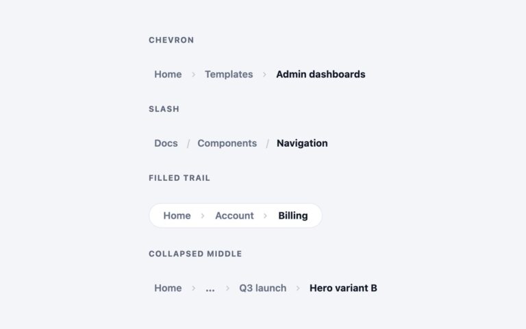
Four horizontal link bars that each mark the current page a different way.
Menus
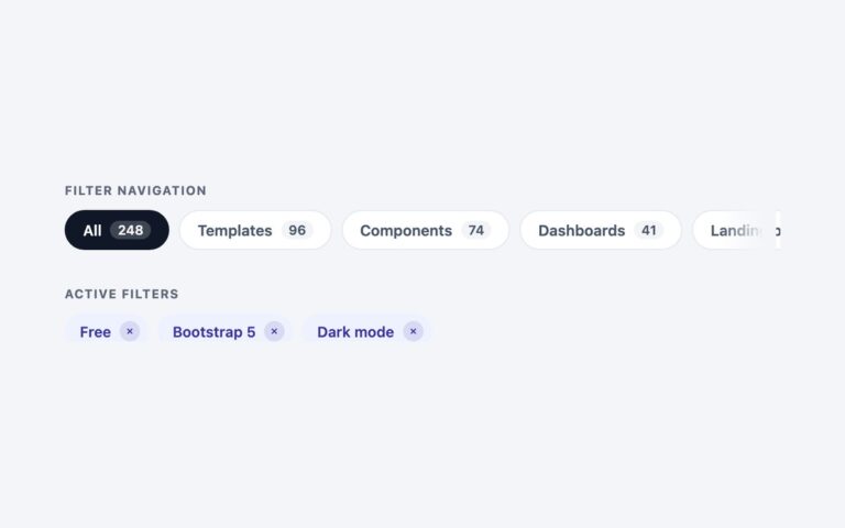
Two filter patterns for listing pages. Filter navigation is a single row of pill links, each with a count badge (All 248,…
Menus
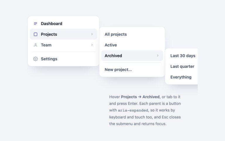
A vertical app menu whose parent items open flyout submenus to the side, two levels deep.
Menus
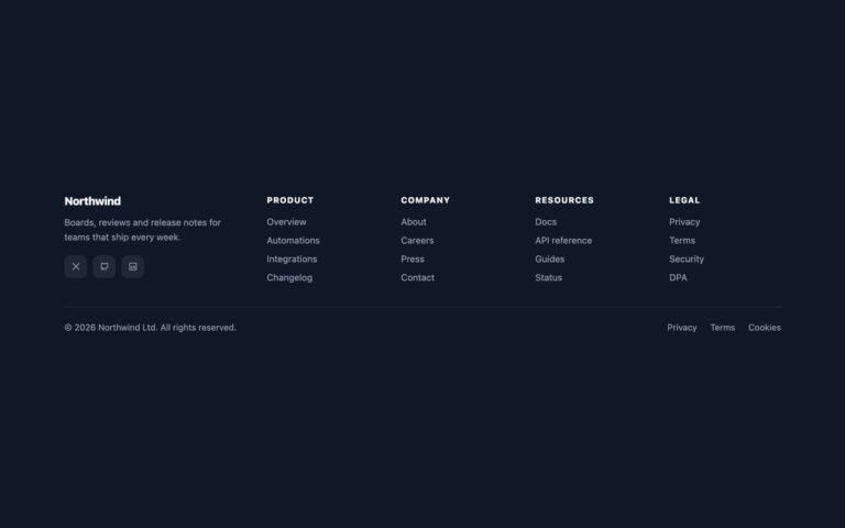
A dark site footer with a brand column and four link columns (Product, Company, Resources, Legal), finished with a copyright line and…
Menus
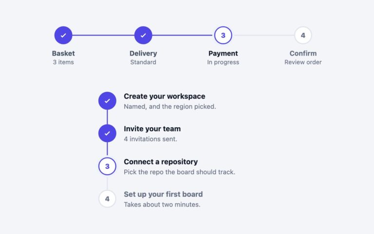
Two progress indicators for multi-step flows. The horizontal one is a four-step checkout (Basket, Delivery, Payment, Confirm) with numbered circles jo
Menus
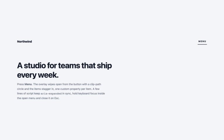
A studio-style header whose Menu button opens a full-screen dark overlay with four large links (Work, Studio, Journal, Contact) and a row…
Menus
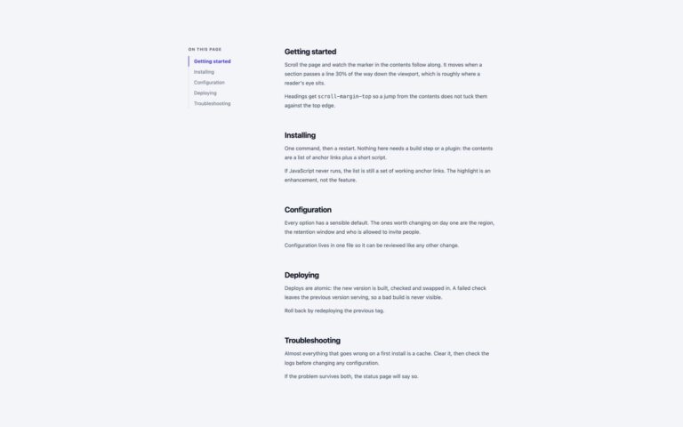
An "On this page" contents list that stays beside a long article and highlights the section being read.
Menus
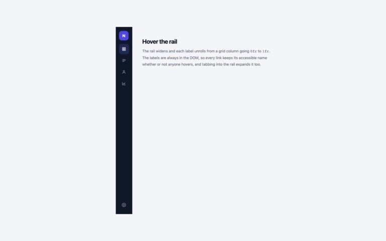
A dark 66px icon rail for app layouts that widens to 222px when a pointer rests on it or keyboard focus enters…
Menus
A mobile-style action sheet that slides up from the bottom of the screen over a dimmed page.
Menus
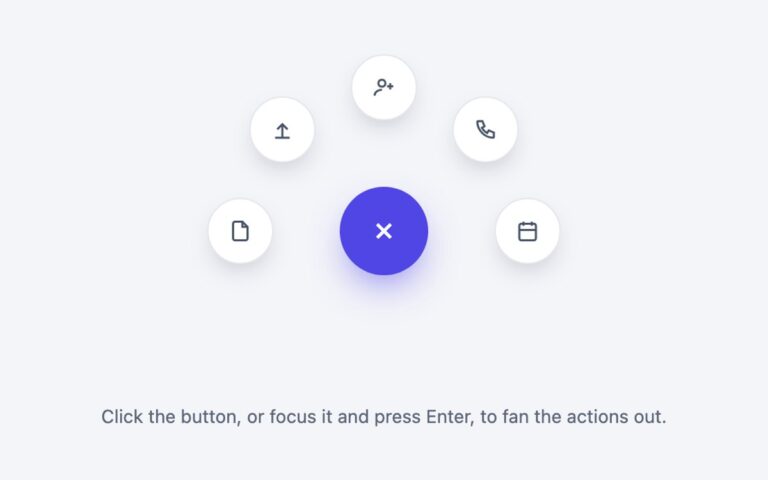
A round indigo action button that fans five circular shortcuts out along a half circle above it: New document, Upload file, Invite…
Modals
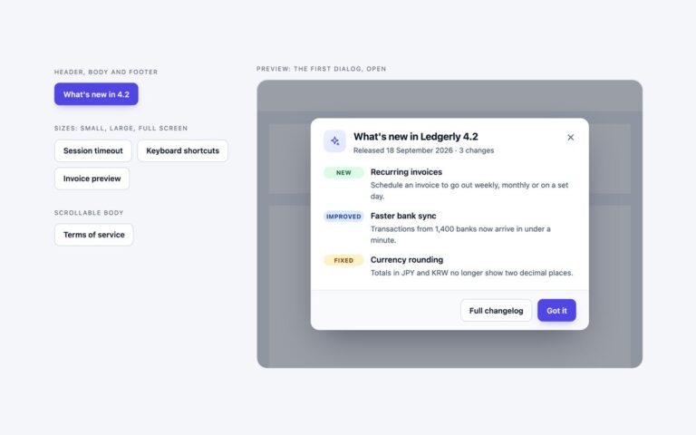
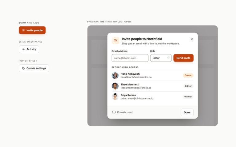
Five everyday modal dialogs for an invoicing app, grouped by what changes between them.
Modals
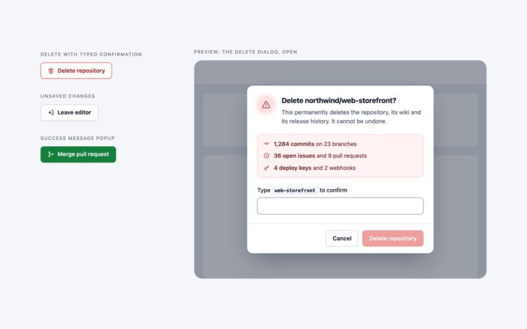
Three confirmation modals from a code-hosting app, for the moments when an action needs a second look or a clear result.
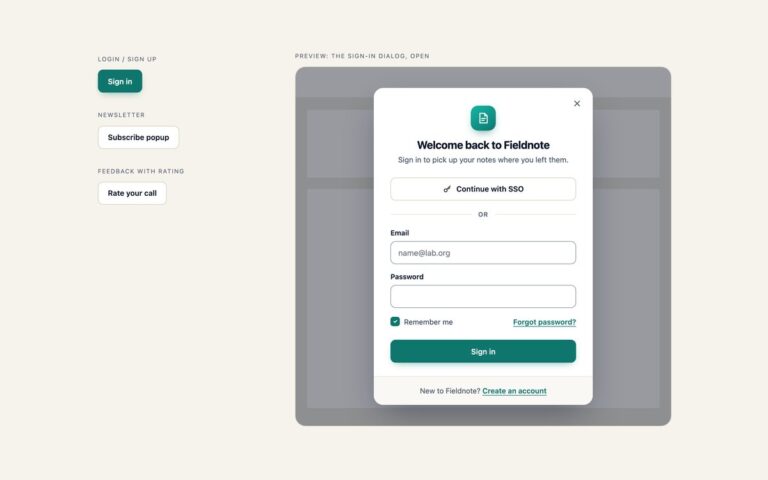
Modals
Form Modals is three dialogs for a note-taking app called Fieldnote, each built around a real form.
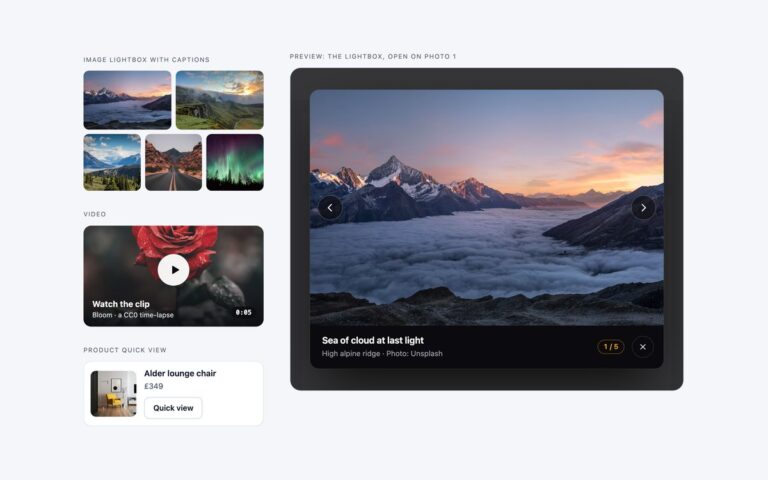
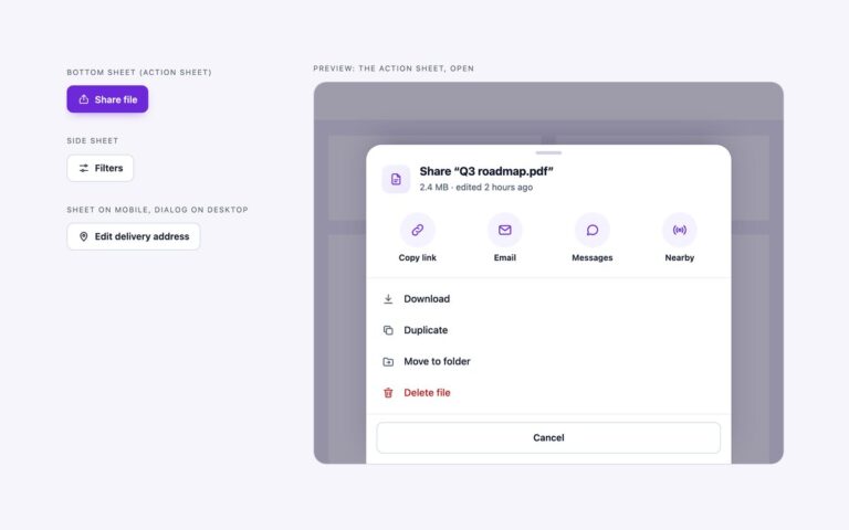
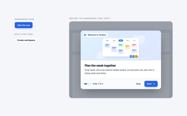
Modals
Two modals that walk the reader through more than one screen, for a team planning app called Tandem.
Modals
Three dark-theme dialogs for developer tools and SaaS dashboards: near-black panels with a hairline border, a soft top highlight, a cyan focus…
Modals
Three modal dialogs that open, close and animate with HTML and CSS alone, for a ceramics studio's workspace.
Multiselects
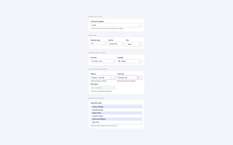
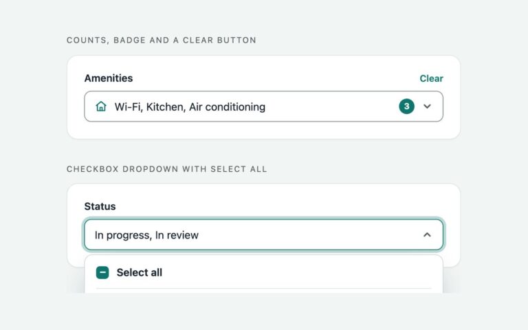
The multiselect dropdown most filter panels need: a closed field that summarises the choice and opens a list of checkboxes.
Multiselects
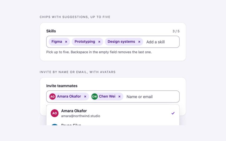
Multiselects where each pick becomes a removable chip inside the field, next to a text input that filters the suggestions as you…
Multiselects
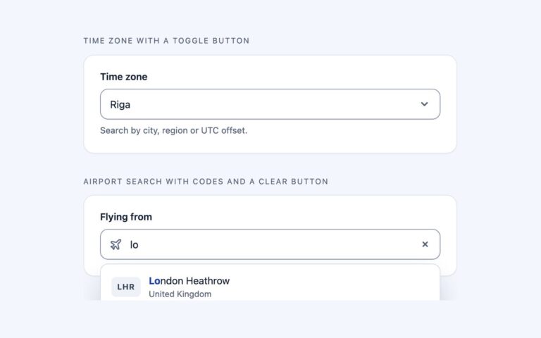
Single-choice selects you can type into, for lists too long to scroll.
Multiselects
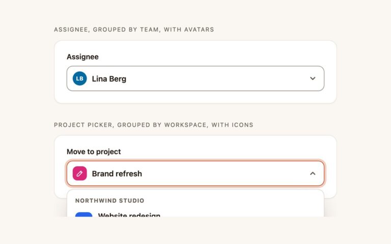
Single selects whose options need more than a line of text. Assignee, grouped by team, with avatars sorts people into Suggested, Design…
Multiselects
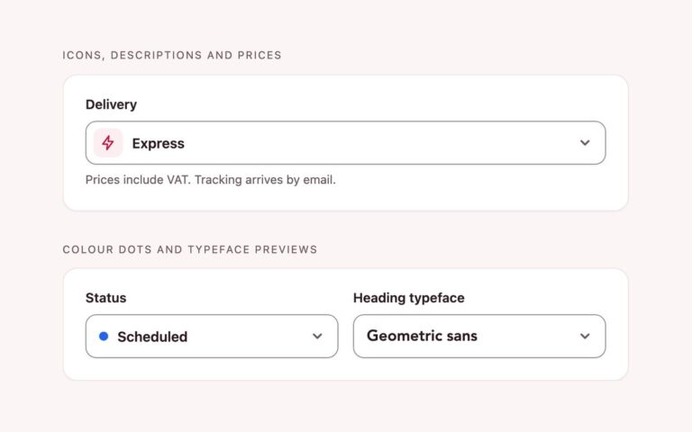
Rich dropdowns that are still a plain select element, built on the new customizable select.
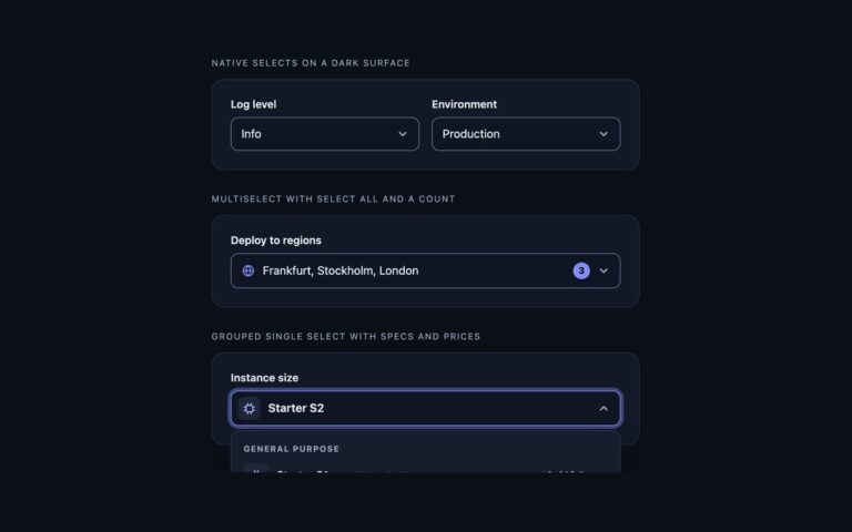
Multiselects
Selects for dark dashboards and developer tools, where light-theme controls lose their borders.
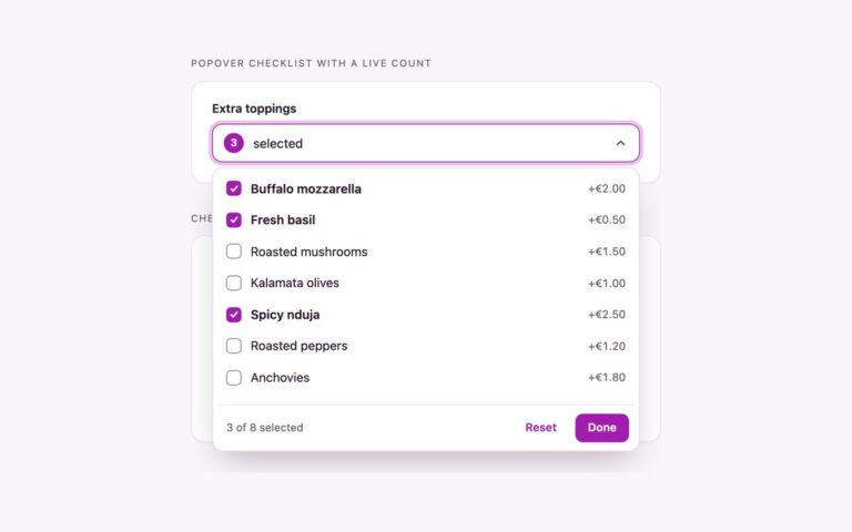
Multiselects
Multiselects that run on HTML and CSS alone, with no script at all.
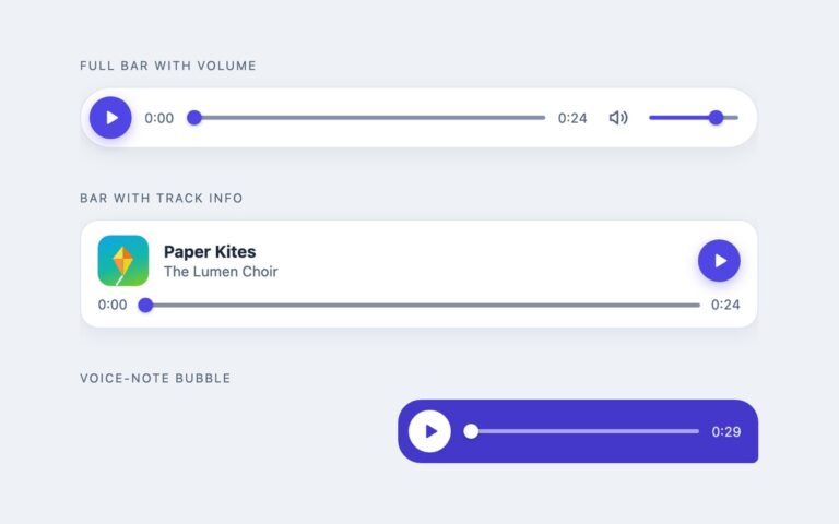
Music Players
Three compact audio players for pages where the sound is one element among many.
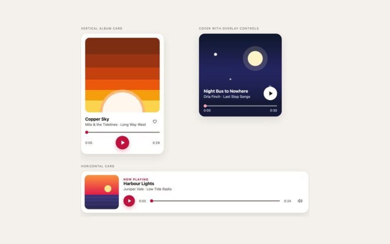
Music Players
Three card layouts that show the album art first. The vertical album card stacks a square cover, the title, the artist and…
Music Players
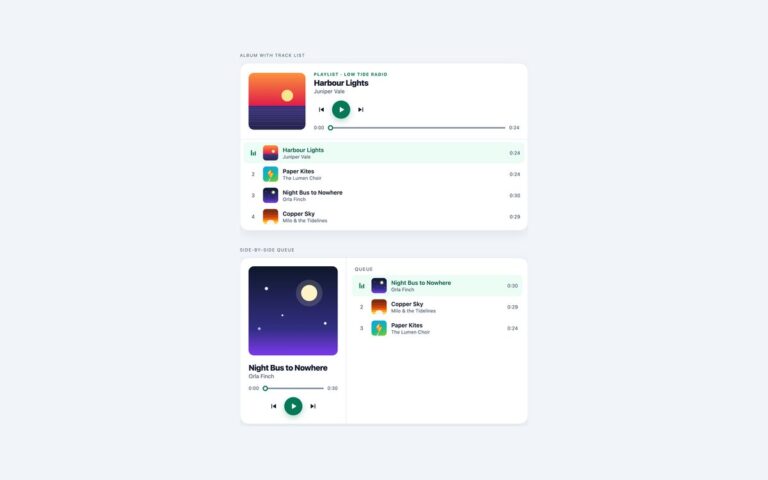
Two players that work through a list of tracks. The album with track list has a header with a cover, the playlist…
Music Players
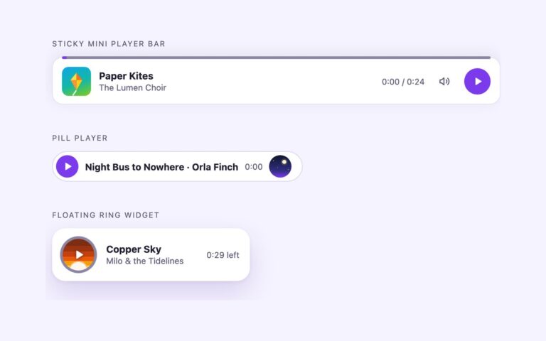
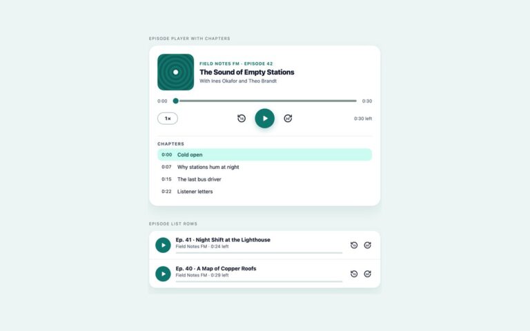
Three small players for when the music should stay out of the way.
Music Players
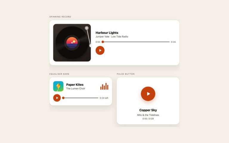
Three players with motion that follows the audio. The spinning record is a CSS turntable: a vinyl disc drawn with a repeating…
Music Players
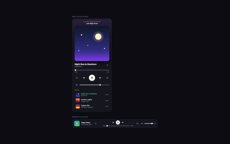
Two players for dark streaming-style interfaces. The now playing screen is a phone-width card with the playlist it is playing from, a…
Music Players
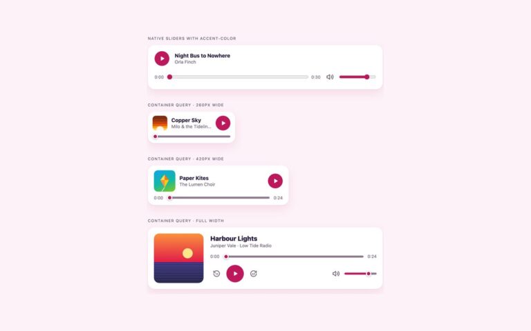
Two modern CSS techniques for audio players. The first player keeps the browser's own range inputs and colours them with accent-color alone:…
Pagination
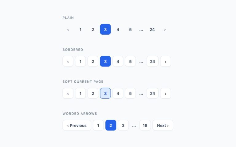
The standard numbered pagination control in four weights. Plain shows bare page numbers with a filled blue current page and a light…
Pagination
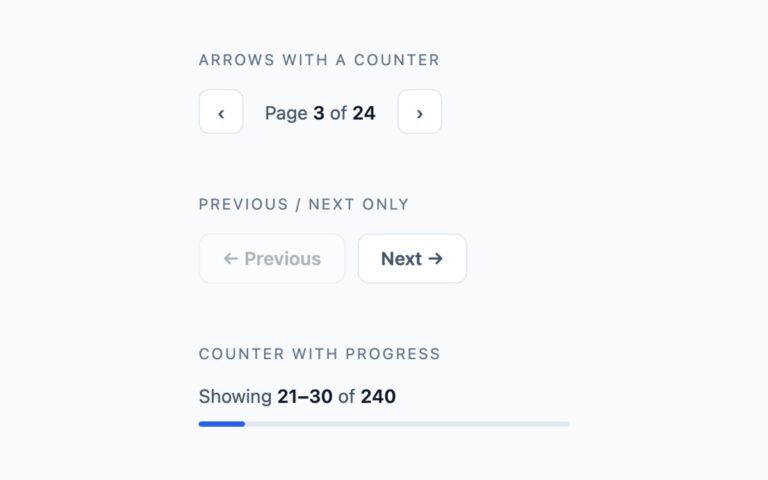
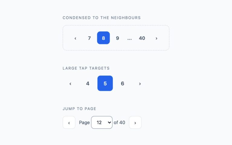
Three compact alternatives for when a full row of page numbers is too much, either because there are hundreds of pages or…
Pagination
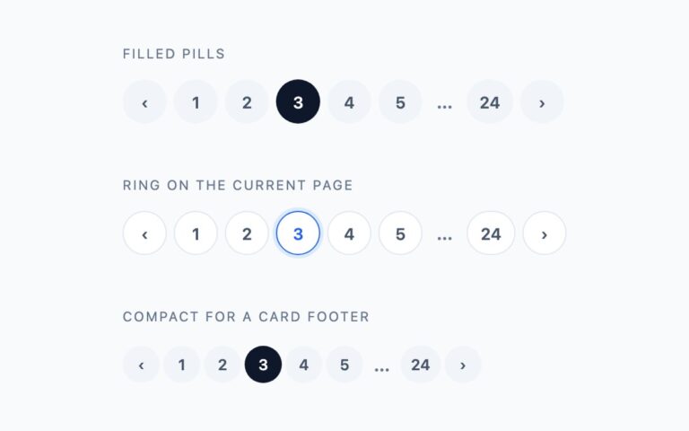
Fully rounded pagination for softer, friendlier interfaces. Filled pills gives every page a light grey circle and marks the current page with…
Pagination
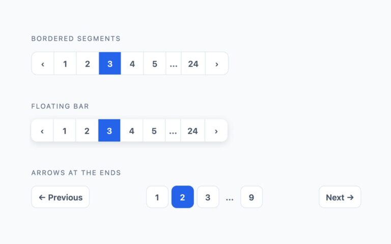
Pagination that reads as one joined object rather than a row of separate buttons.
Pagination
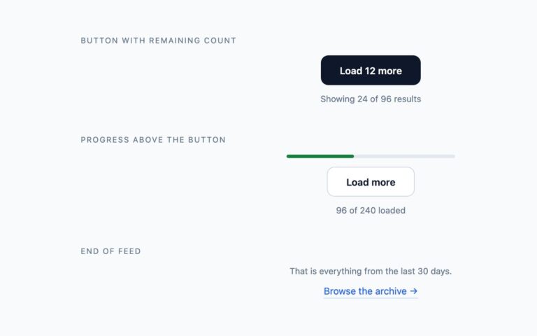
The alternative to numbered pages for feeds, product grids and comment threads, where readers keep scrolling rather than jumping to a page.
Pagination
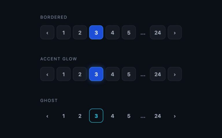
Numbered pagination built for dark interfaces such as dashboards, developer tools and media sites.
Progress Bars
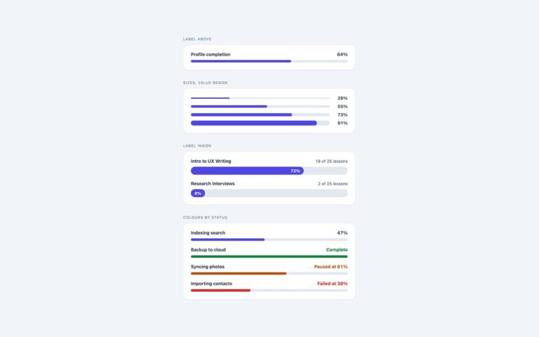
Four everyday progress bar layouts that cover most settings pages, course dashboards and task lists.
Progress Bars
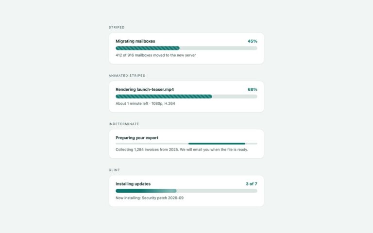
Four progress bars with texture and motion, for work that takes a while.
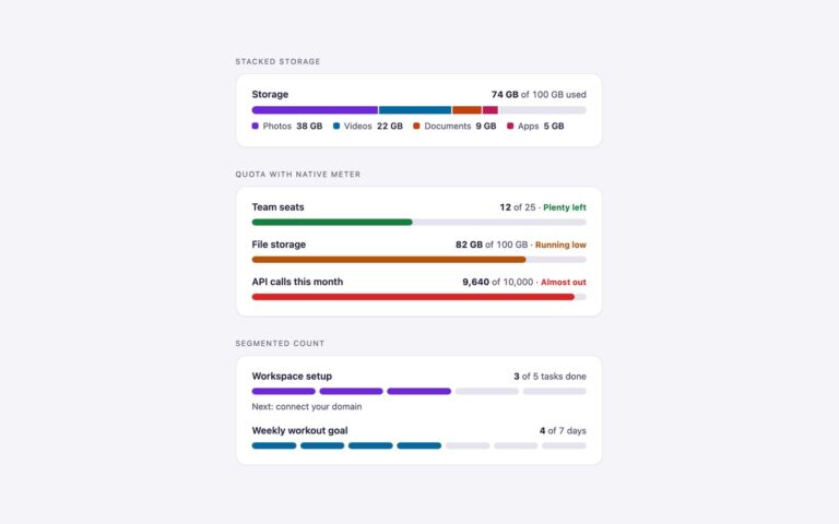
Progress Bars
Bars that show more than one value, or show a value as a count of blocks.
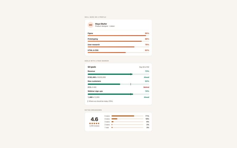
Progress Bars
Progress bars for profile pages, portfolios and dashboards. Skill bars on a profile puts a designer's name and role above four thin…
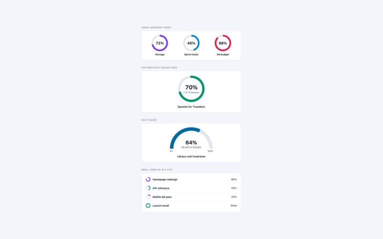
Progress Bars
Round progress indicators built two ways. Conic-gradient rings are three 92 pixel rings for storage, sprint tasks and ad budget: a conic-gradient…
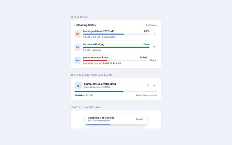
Progress Bars
File transfer progress for upload forms, media libraries and download managers.
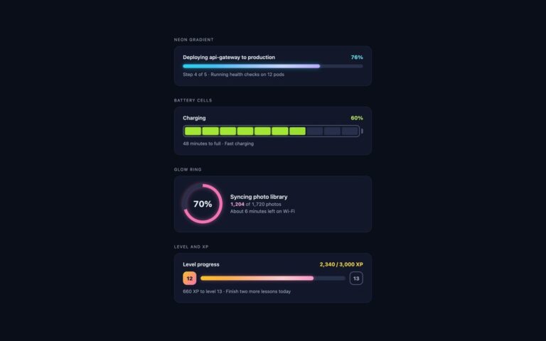
Progress Bars
Progress bars for dark dashboards, developer tools, games and night-mode apps, where a light-theme bar looks flat.
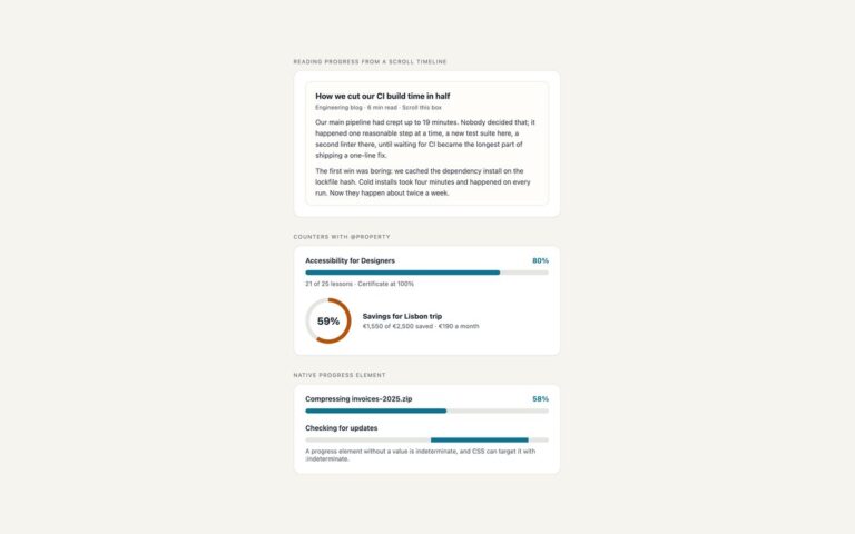
Progress Bars
Three progress indicators that usually take JavaScript, done in CSS.
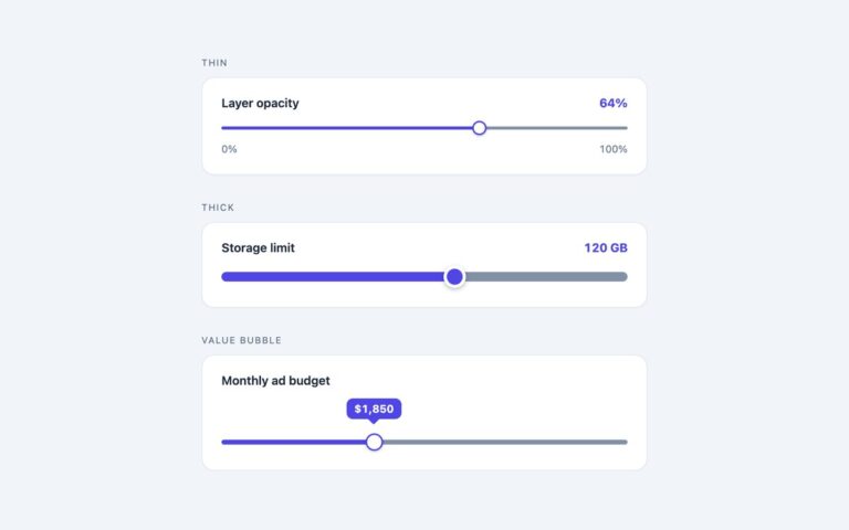
Range Sliders
Three everyday range sliders that cover most settings pages and filters.
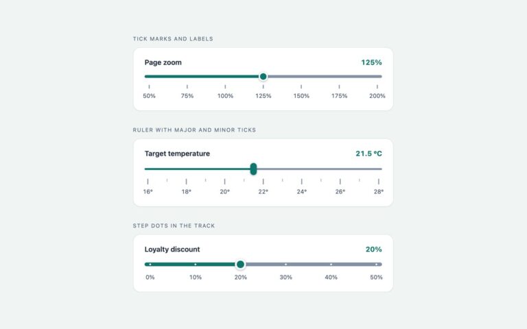
Range Sliders
Three sliders that show where the stops are. Tick marks and labels puts a short line and a label under every step…
Range Sliders
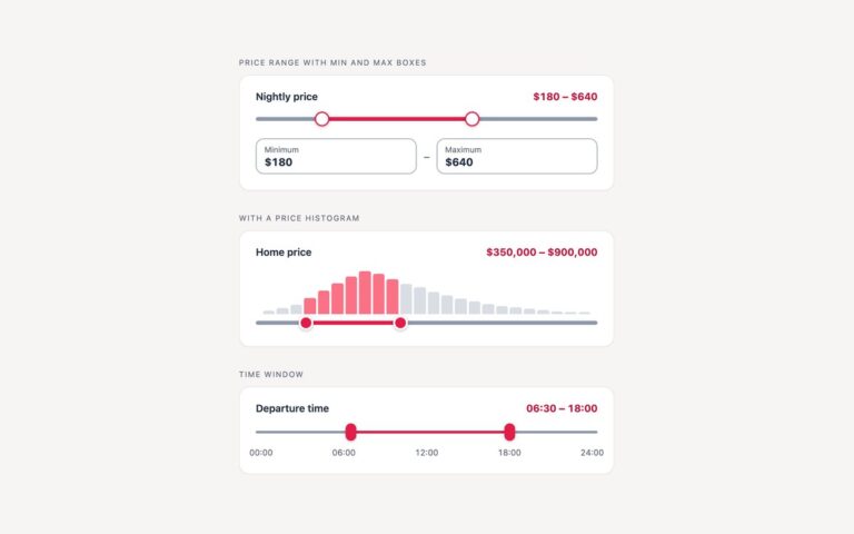
Two-thumb range sliders for filters. Price range with min and max boxes is the shop and booking pattern: a nightly price from…
Range Sliders
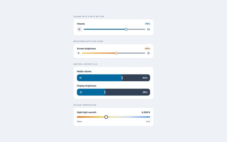
Sliders for media players, smart home panels and system settings, each with inline SVG icons.
Range Sliders
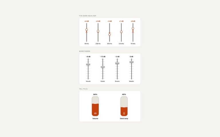
Upright sliders for audio and hardware style interfaces. Five-band equaliser runs five sliders from minus 12 to plus 12 dB; the fill…
Range Sliders
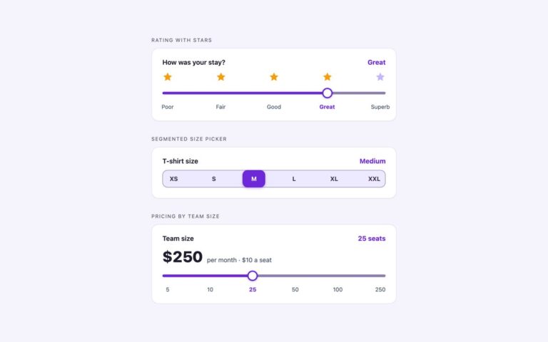
Sliders whose positions stand for words or plans rather than raw numbers.
Range Sliders
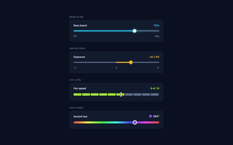
Four sliders drawn for dark interfaces, where a light theme slider loses its track against the background.
Range Sliders
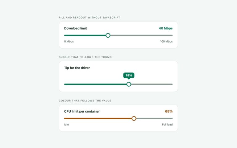
Range sliders whose fill, number, bubble and colour come from CSS rather than JavaScript.
Search Bars
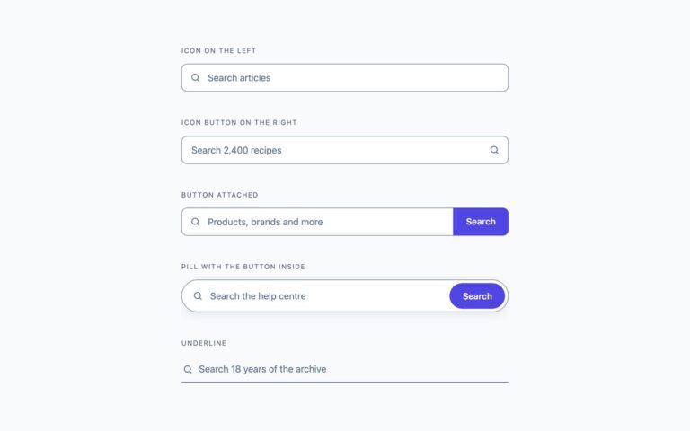
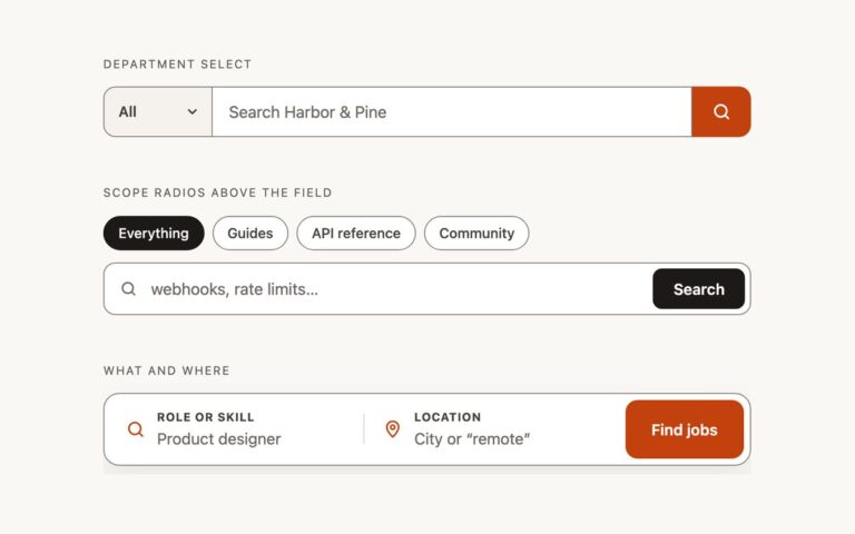
Five search inputs that cover most sites: a field with the magnifier on the left, a field with an icon submit button…
Search Bars
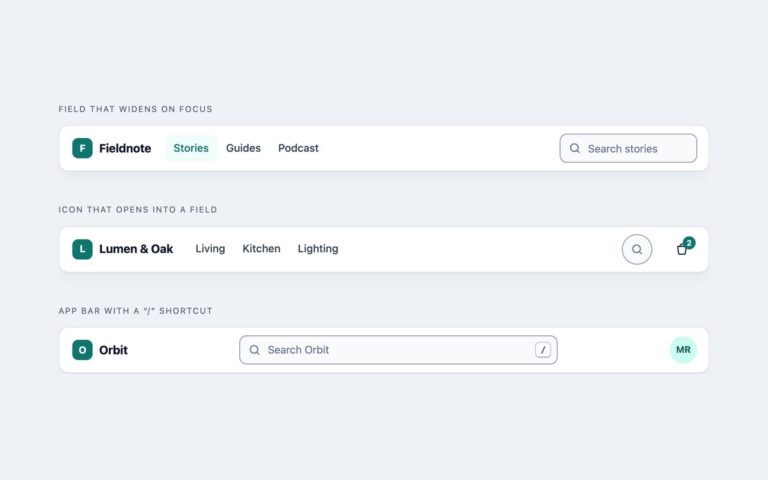
Three search bars built into a site header, where search has to share a row with a logo, navigation and account controls.
Search Bars
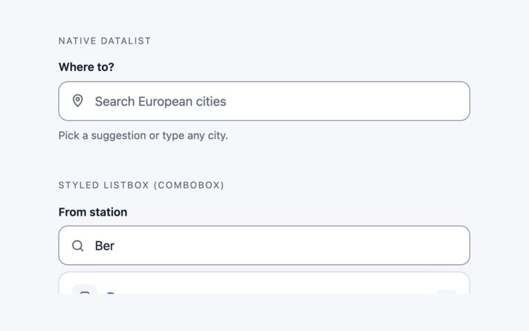
Two ways to suggest results while someone types. The native datalist version connects a search input to a datalist of fifteen European…
Search Bars
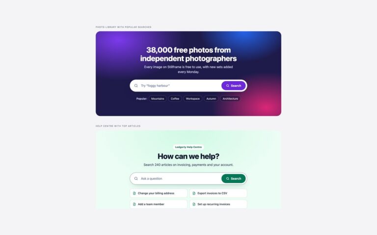
Big search sections for the top of a landing page, where the search box is the main action.
Search Bars
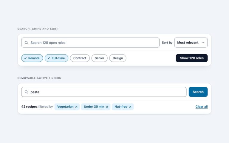
Toolbars that sit above a list of results and combine search with the controls that shape it.
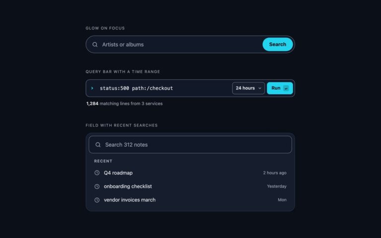
Search Bars
Search bars for dark interfaces, where a light-theme field becomes a grey smudge.
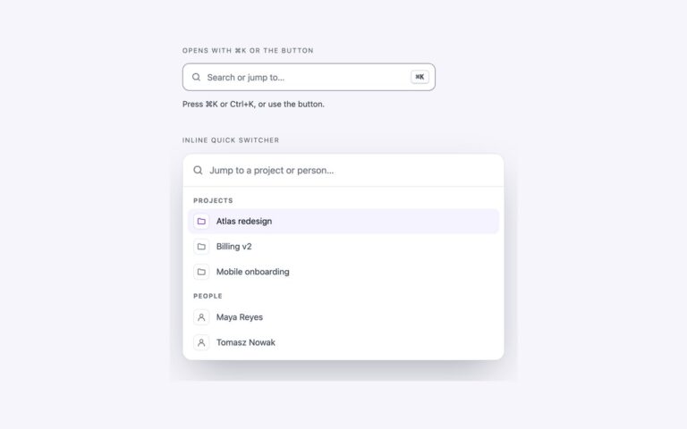
Search Bars
A command palette in the style of modern web apps, built with current platform features instead of a modal library.
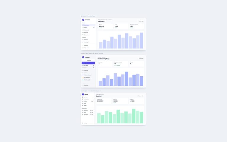
Sidebars
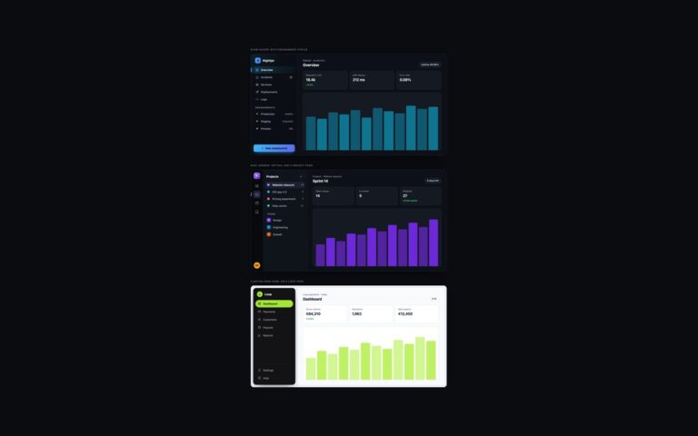
Three versions of the sidebar most dashboards start from, each shown in a small app frame.
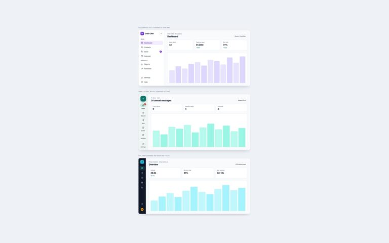
Sidebars
Three ways to give the content more room without losing the navigation.
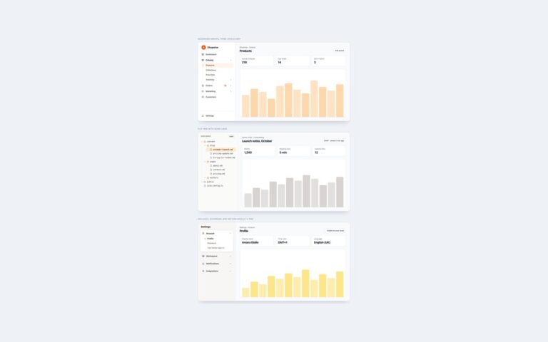
Sidebars
Multi-level sidebar menus built on the native details and summary elements, so they open and close without any JavaScript.
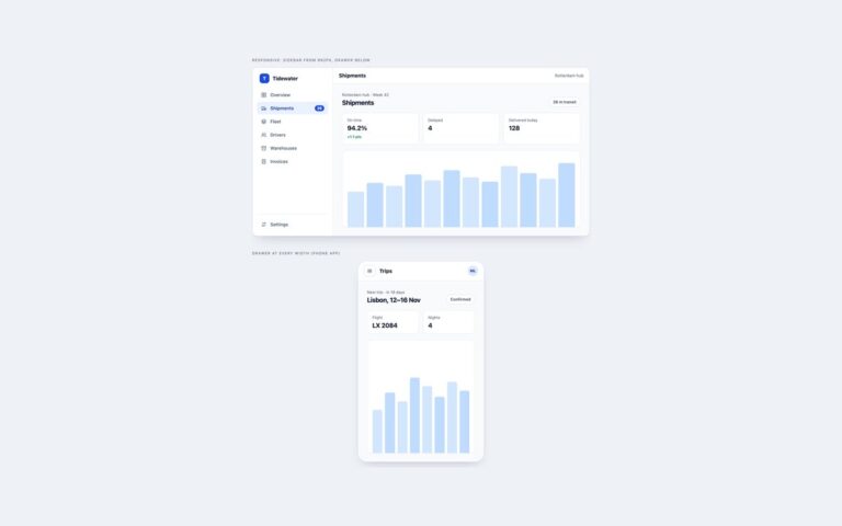
Sidebars
Sidebars that leave the screen on small devices and slide back in when asked.
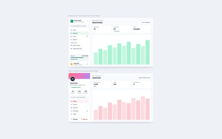
Sidebars
Two fuller sidebars that carry more than links. The workspace sidebar starts with a switcher that opens a menu of three workspaces…
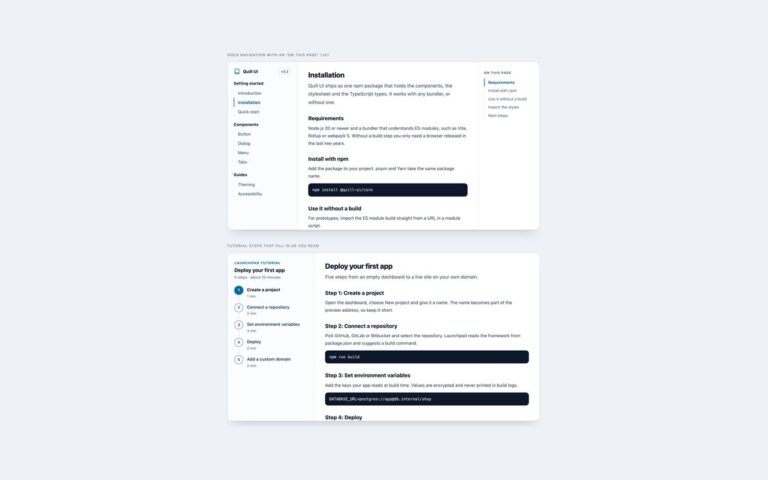
Sidebars
Sidebars for documentation and long guides, where the navigation follows the reader.
Sidebars
Three sidebars for dark interfaces, where light-theme greys turn into mud and focus rings vanish.
Sidebars
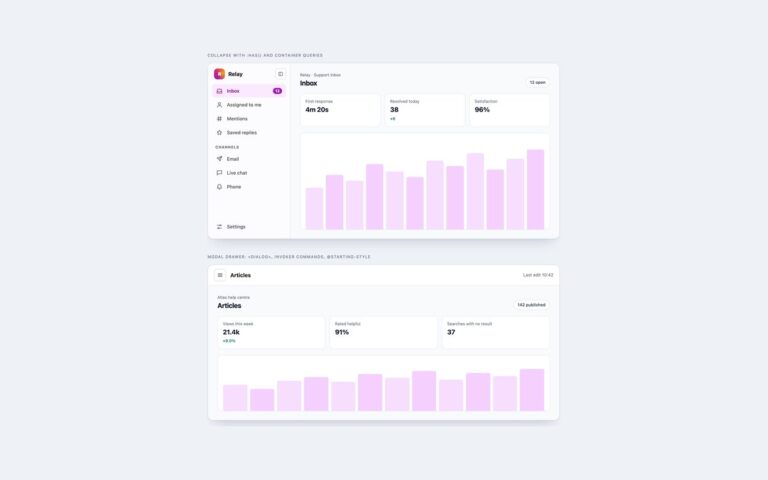
Two sidebars that use current CSS and HTML for behaviour that usually needs JavaScript.
Registration Forms
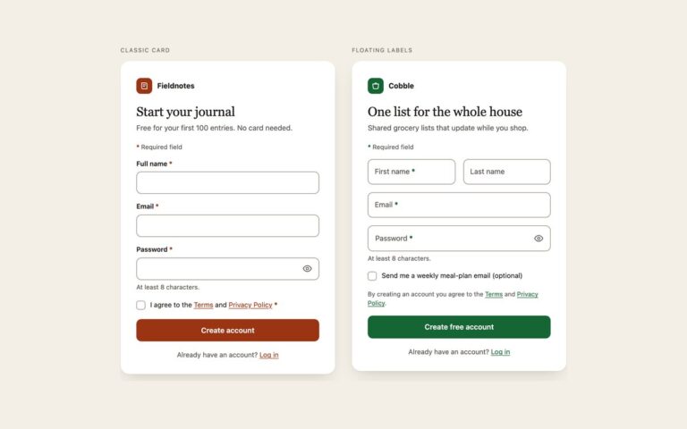
Two single-card sign-up forms that cover the account creation screen most products need.
Registration Forms
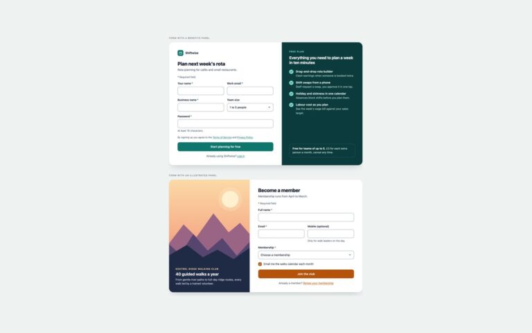
Two full-width registration layouts that put the form next to a panel explaining why people should sign up.
Registration Forms
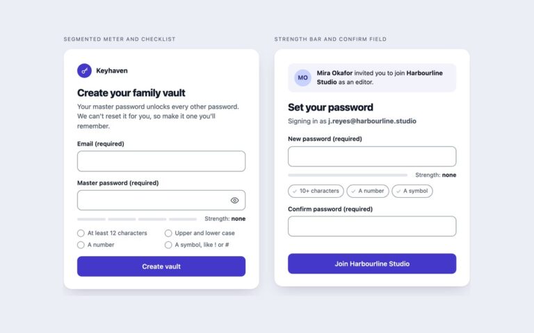
Two sign-up forms built around choosing a good password. Segmented meter and checklist is a password manager sign-up: an email field and…
Registration Forms
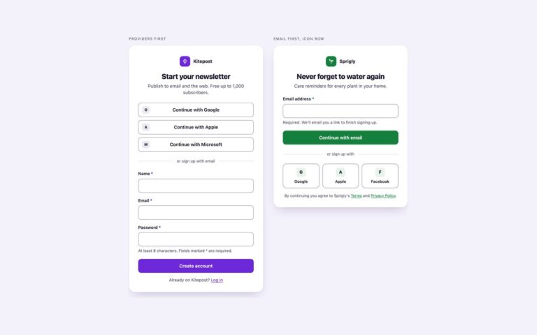
Two sign-up cards that offer third-party accounts alongside an email form.
Registration Forms
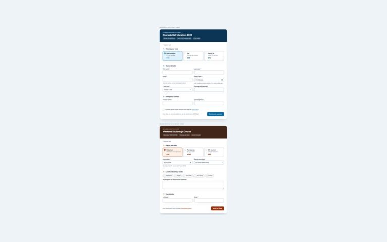
Two longer registration forms for events and courses, split into numbered sections.
Registration Forms
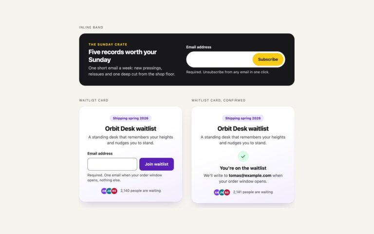
Single-field sign-ups for newsletters and launch waitlists, each with its confirmation state.
Registration Forms
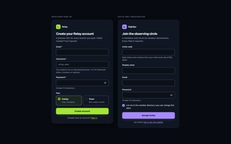
Two registration forms for dark interfaces such as developer tools and members' communities.
Registration Forms
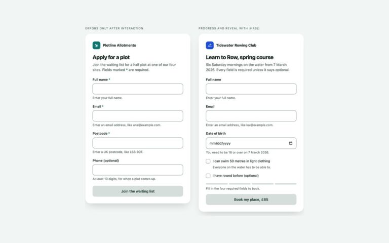
Two sign-up forms that do live validation, hints, progress and a ready state with CSS alone.
Tables
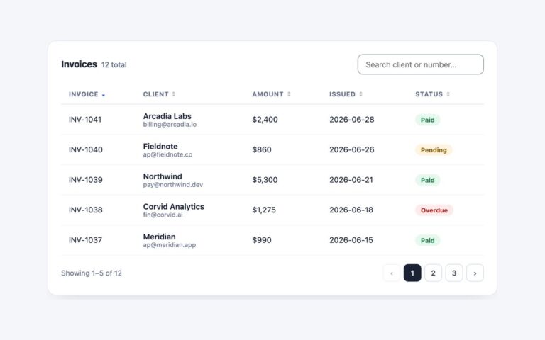
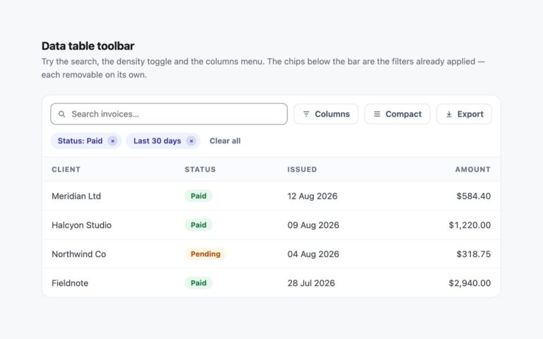
A complete invoice datatable with no library behind it: a live search box, five sortable columns and numbered pagination, all driven by…
Tables
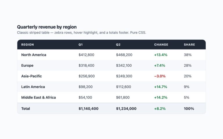
A classic report table: a dark header row, zebra-striped body rows, a hover highlight and a totals row in the footer.
Tables
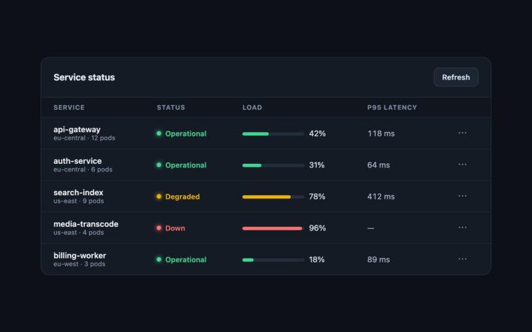
A dark admin panel for service health: a header bar with a title and a Refresh button, then a table of services…
Tables
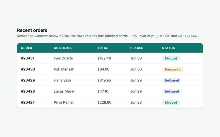
An orders table that stays a normal table on wide screens and turns every row into a labelled card below 620 pixels.
Tables
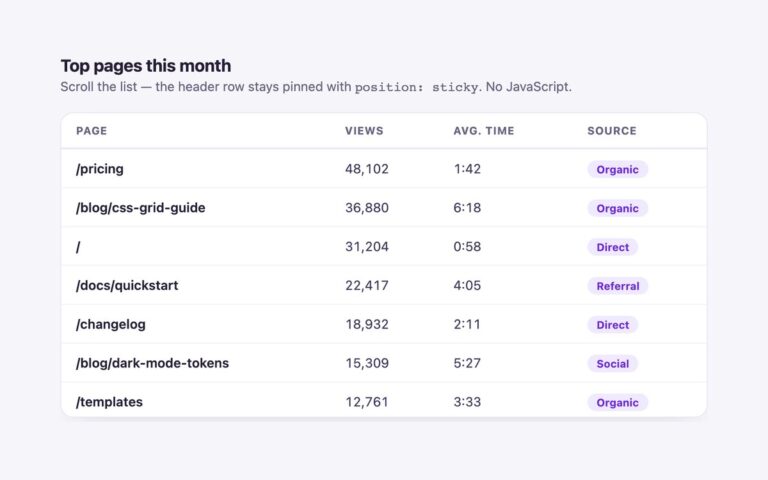
A scrolling list of top pages whose header row stays pinned while the body scrolls under it.
Tables
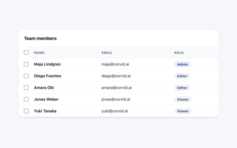
A team members table with a checkbox on every row, a select-all checkbox in the header and a bulk action bar that…
Tables
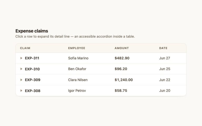
An expense claims table where each row opens a detail line underneath it, an accordion built inside a table.
Tables
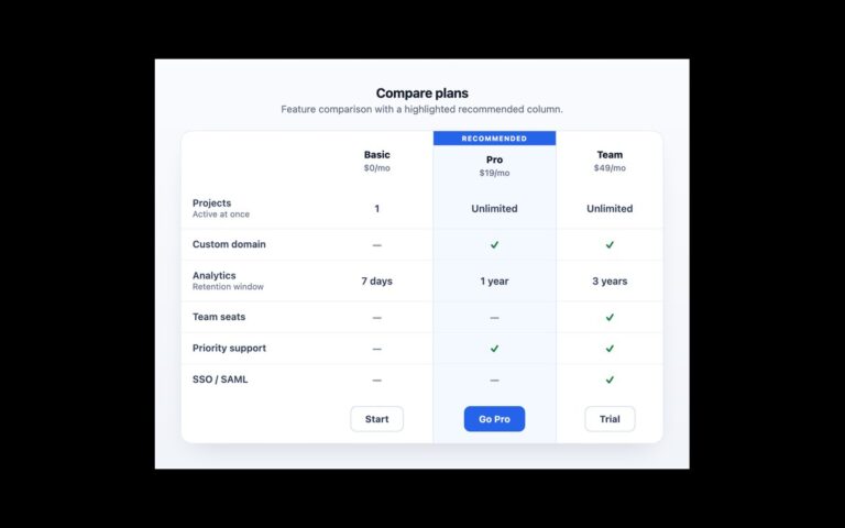
A pricing comparison for three plans with the recommended one highlighted.
Tables
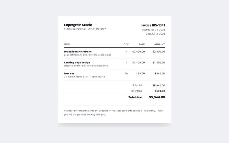
A printable invoice sheet built around a line items table. The header shows the studio name and contact line on the left…
Tables
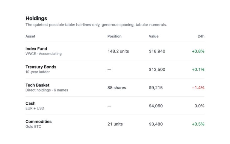
The quietest table in the pack: no backgrounds, no header fill and no vertical lines, only a one pixel hairline above each…
Tables
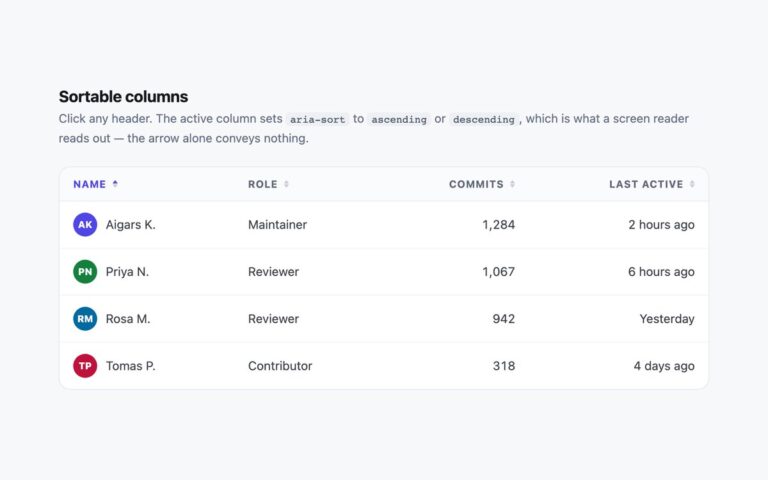
A team table whose four column headers sort the rows: name, role, commit count and last active time.
Tables
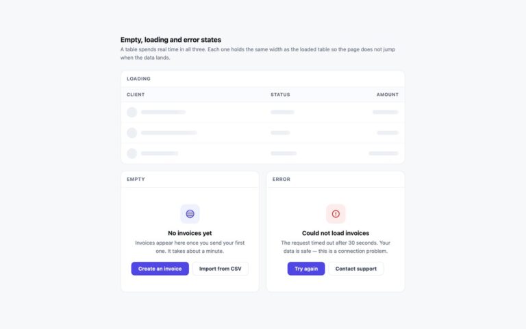
The three states a data table shows before it has rows to display, in one set.
Tables
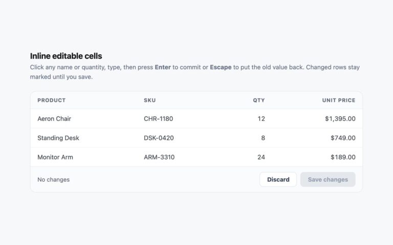
An order table where the product name and quantity cells can be edited in place, with a footer that counts changed rows…
Tables
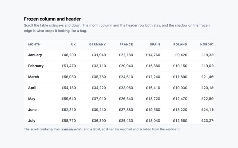
A wide revenue report, months down the side and six regions plus a total across the top, that scrolls in both directions…
Tables
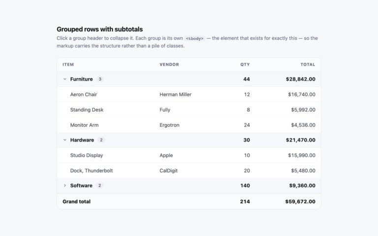
A purchase order split into Furniture, Hardware and Software, each group with a shaded header row that shows the item count and…
Tables
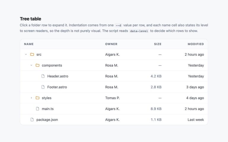
A file browser table with folders that open and close to show nested files, three levels deep, next to owner, size and…
Tables
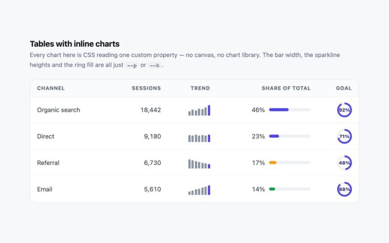
A traffic report by channel where three small charts sit inside the cells: a seven-bar sparkline for the recent trend, a horizontal…
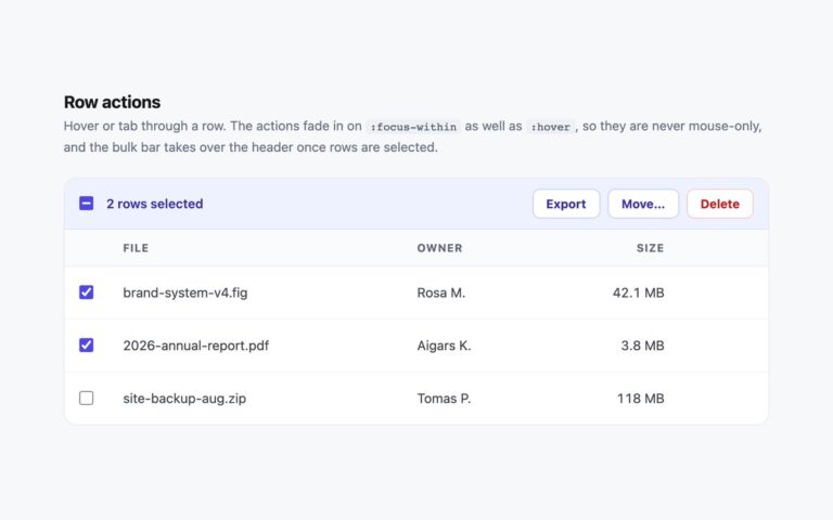
Tables
A file list with per-row actions and a bulk action bar. Each row ends with a download button and a more actions…
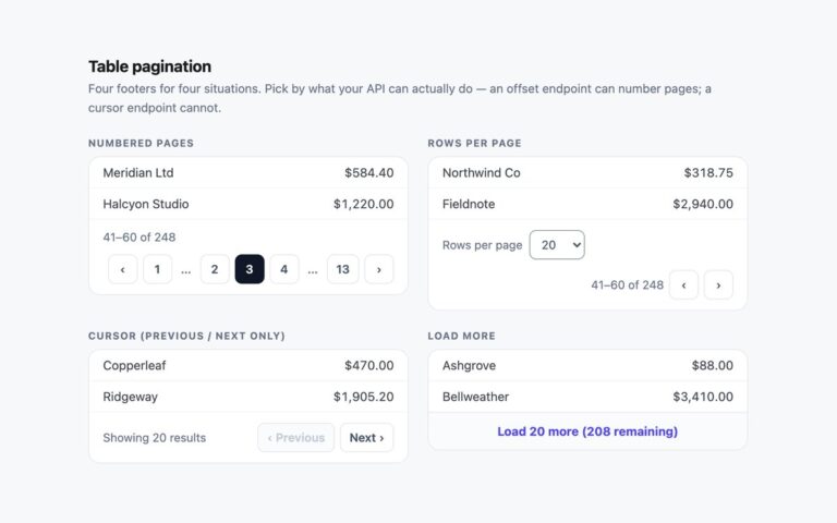
Tables
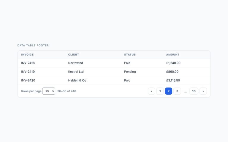
Four table footers, each suited to a different kind of data source, shown under the same two-row invoice table.
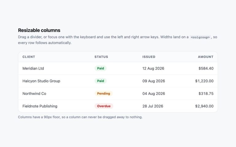
Tables
An invoice table with column dividers you can drag, or focus and move with the arrow keys, to resize the Client, Status…
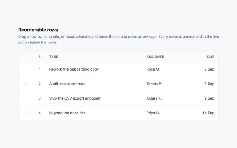
Tables
A prioritised task queue whose rows can be put in a new order by dragging or with the keyboard.
Tabs
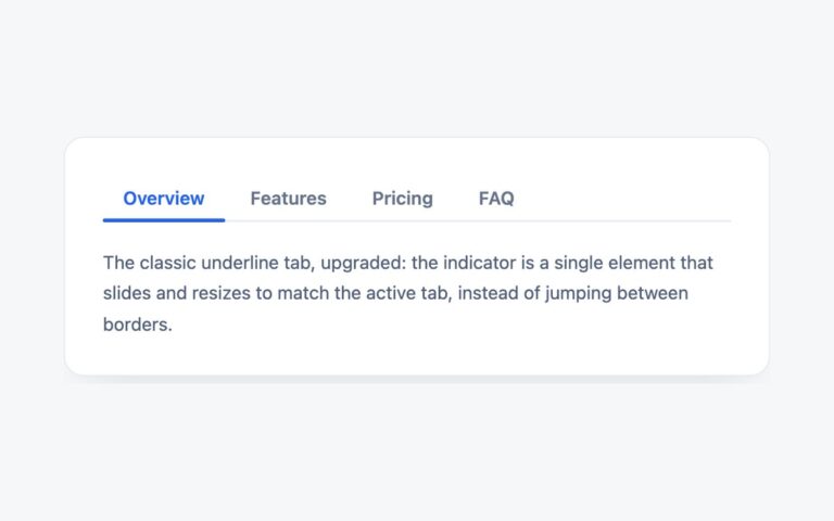
A white card with four text tabs, Overview, Features, Pricing and FAQ, over a thin grey baseline.
Tabs
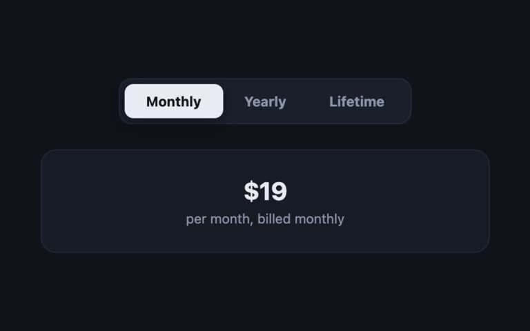
A dark segmented control with three options, Monthly, Yearly and Lifetime, where a light pill slides behind the selected option, and a…
Tabs
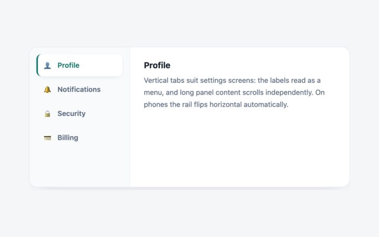
A settings card with a 200 pixel side rail of tabs, Profile, Notifications, Security and Billing, each with a small emoji icon,…
Tabs
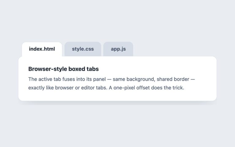
Folder-style tabs, labelled index.html, style.css and app.js, that sit on top of a white panel the way browser and code editor tabs…
Tabs
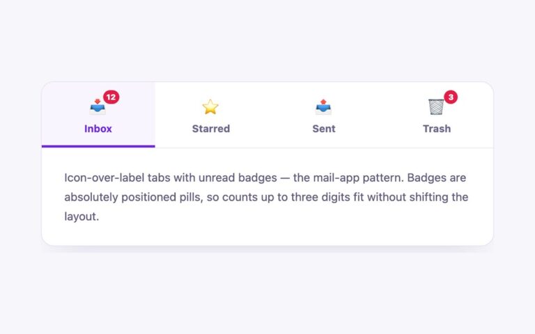
Four equal-width tabs in a mail-app layout, Inbox, Starred, Sent and Trash, each with an emoji icon above its label and red…
Tabs
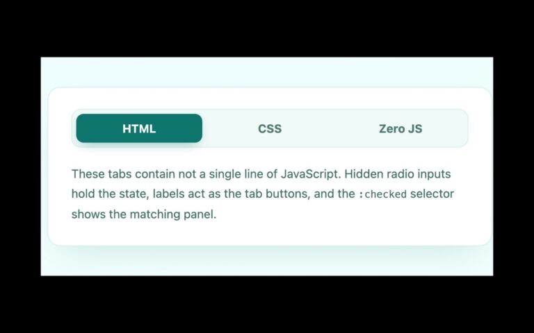
Three tabs, HTML, CSS and Zero JS, in a pale teal segmented bar above a text panel, built without any JavaScript.
Tabs
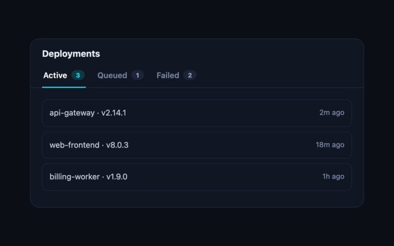
A dark card titled Deployments with three underline tabs, Active, Queued and Failed, each followed by a small count pill, and a…
Tabs
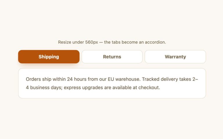
Three equal-width tabs, Shipping, Returns and Warranty, above a bordered panel on wide screens, which turn into a stacked accordion below 560…
Tabs
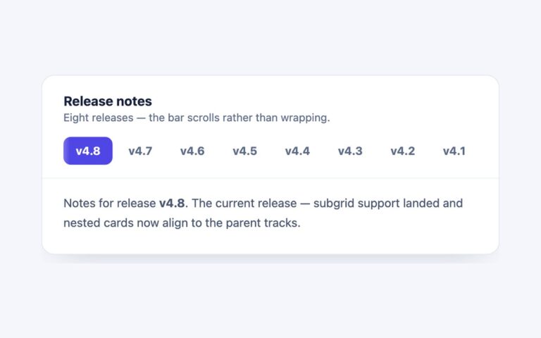
A Release notes card with eight version tabs, v4.8 down to v4.1, in a single row that scrolls sideways instead of wrapping,…
Tabs
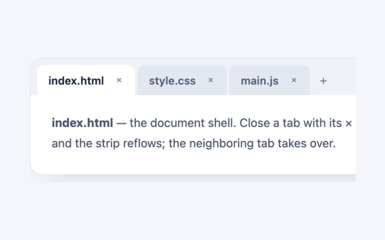
A browser-style tab strip with index.html, style.css and main.js, each tab carrying a close cross, and a plus button at the end…
Tabs
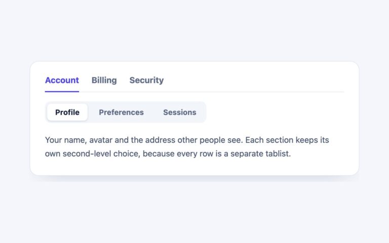
Two rows of tabs in one card: an underlined section row, Account, Billing and Security, and inside each section a grey segmented…
Tabs
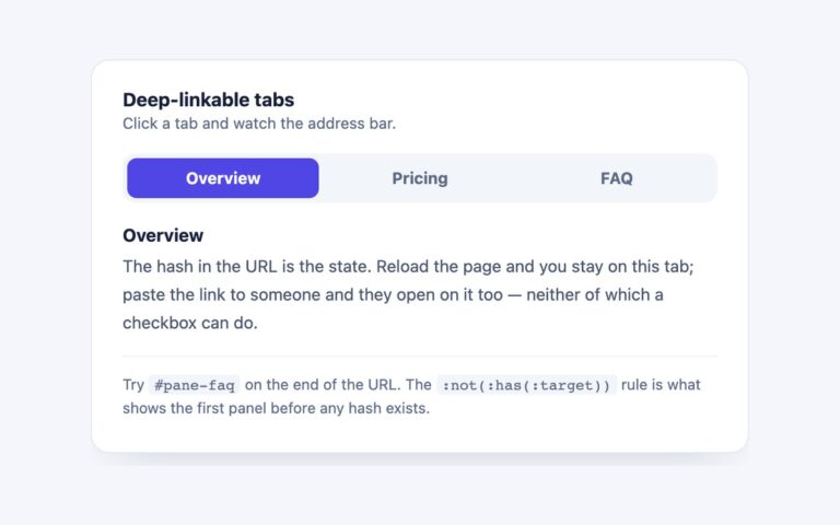
Tabs whose state lives in the URL hash, so a reload keeps the open tab and a pasted link such as #pane-faq…
Tabs
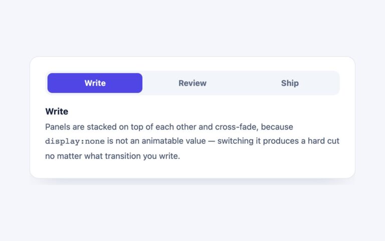
A segmented tab strip whose panels cross-fade and rise 8 pixels instead of cutting, with three steps named Write, Review and Ship.
Tabs
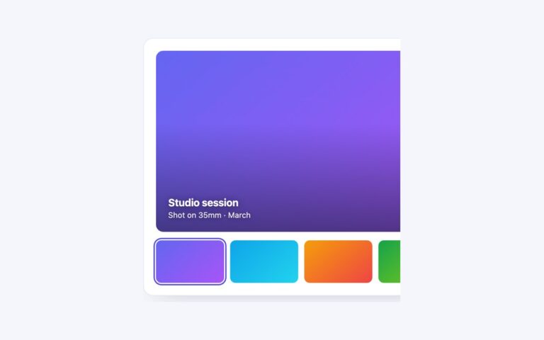
A media viewer built as tabs: a large 16:10 frame with a caption and a row of four thumbnails underneath, where each…
Tabs
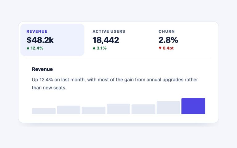
Dashboard tabs where each tab is a small KPI card: a label, a large value and the change since last period, with…
Tabs
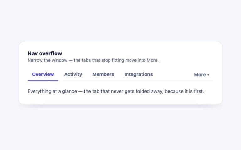
An underlined tab bar that measures itself and folds the tabs that do not fit into a More menu at the right,…
Tabs
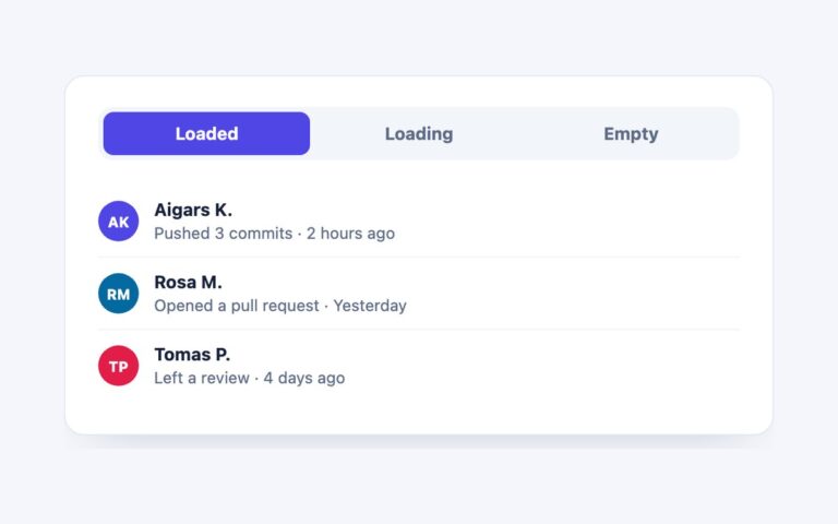
One activity panel shown in the three states a real tab panel goes through: Loaded, with three rows of avatars, names and…
Tabs
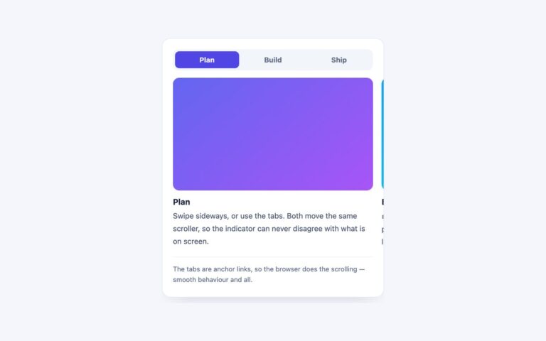
Tabs over a horizontal scroll-snap track, so on a phone you can swipe between panels as well as tap the tab strip.
Tabs
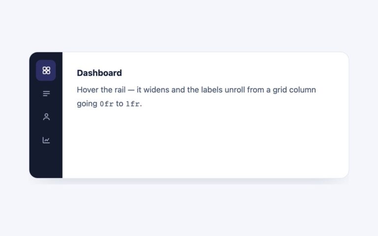
A dark vertical rail of icon tabs beside a content panel, for app shells, dashboards and settings screens where the navigation should…
Tabs
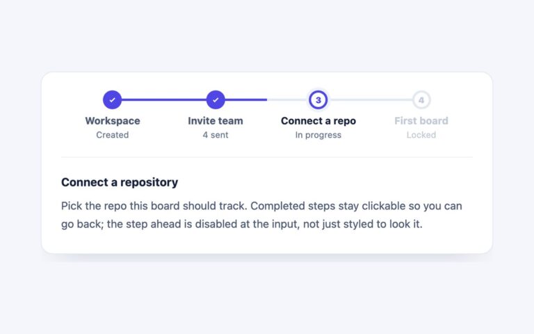
Tabs drawn as a four-step setup wizard: Workspace and Invite team are complete and show a tick, Connect a repo is the…
Tabs
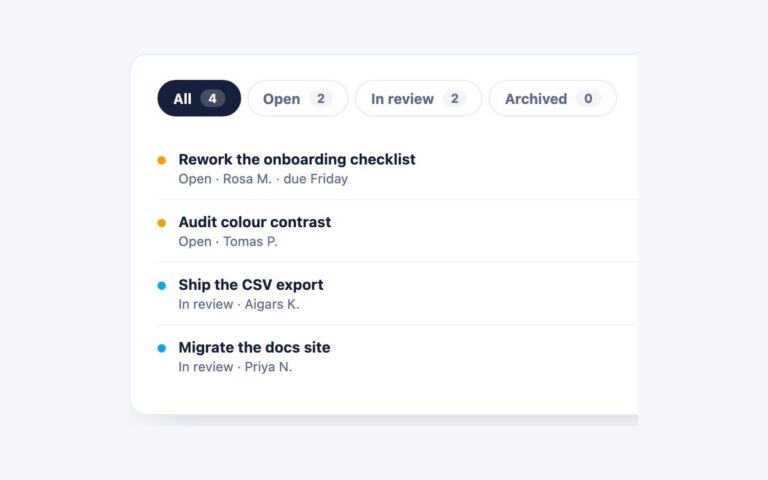
Pill-shaped filter tabs that carry a count, All, Open, In review and Archived, above a task list, so people can see how…
Tabs
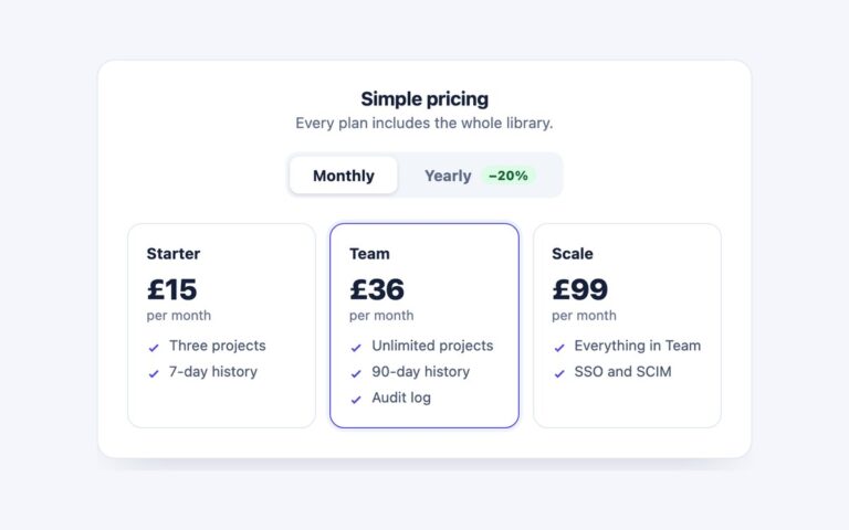
A pricing section where a Monthly and Yearly switch swaps the whole plan grid, not just the numbers.
Timelines
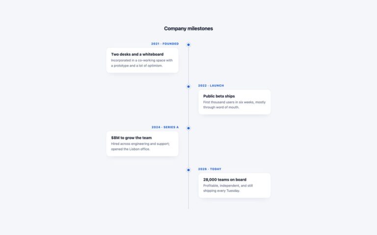
A company history laid out as an alternating vertical timeline: a 3px centre line, a blue dot for each event, and white…
Timelines
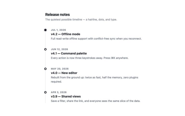
The quietest timeline in the pack: a 2px hairline on the left, a small ring for each entry and plain type.
Timelines
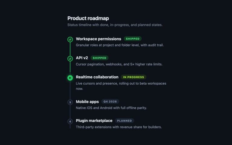
A dark product roadmap that shows status as well as order. Five items run down a thin line: two are Shipped with…
Timelines
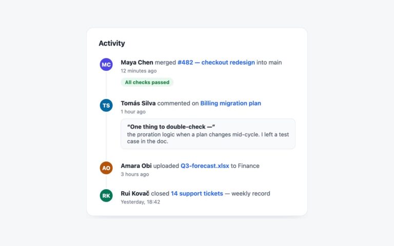
An activity feed in a white panel, the kind found on a dashboard home or beside a project.
Timelines
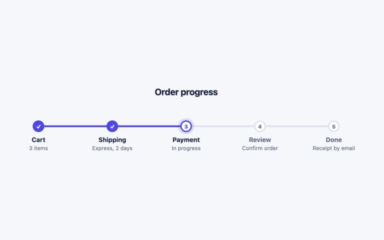
A horizontal step timeline for order progress: Cart, Shipping, Payment, Review and Done, each with a circle and a short caption.
Timelines
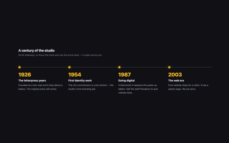
A dark, horizontally scrolling timeline that tells a hundred-year studio history in six eras, from 1926 The letterpress years to 2026 One…
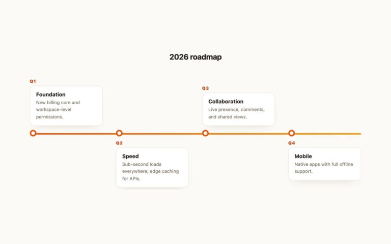
Timelines
A year roadmap on a horizontal orange gradient road, with one card per quarter alternating above and below it: Q1 Foundation, Q2…
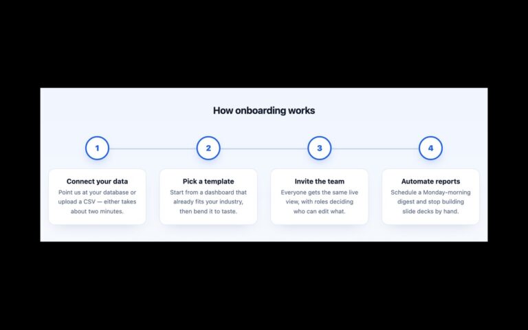
Timelines
Four onboarding milestones in a row: Connect your data, Pick a template, Invite the team and Automate reports.
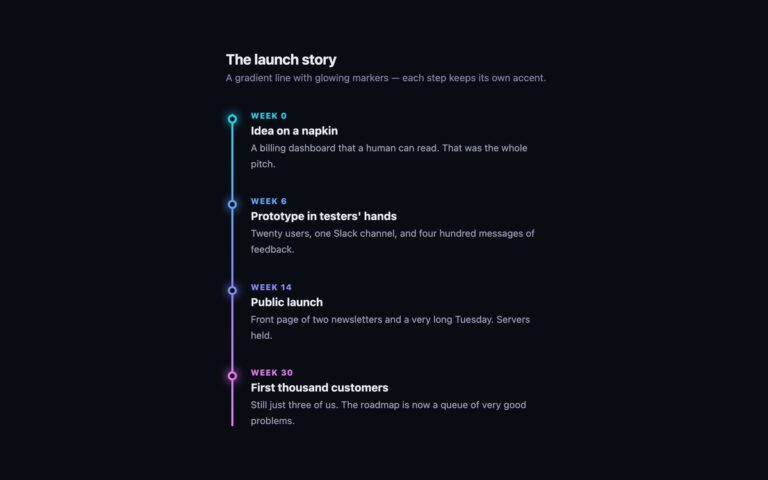
Timelines
A dark vertical timeline with a gradient line that runs from cyan through indigo to pink, and a glowing ring marker for…
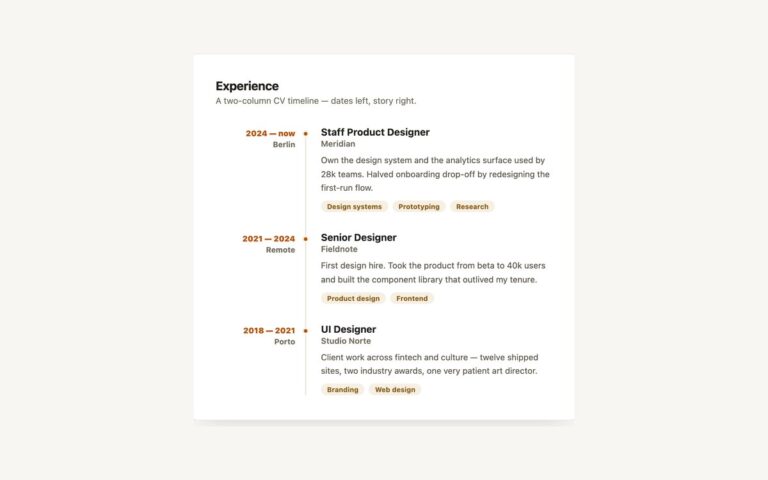
Timelines
A two-column experience timeline for a CV or portfolio. Dates and location sit right-aligned in a narrow left column, 2024 — now…
Timelines
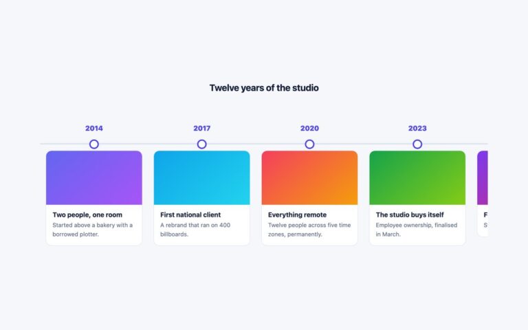
A horizontal timeline of image cards that scrolls sideways along a dated rail, built for a company history, a studio story or…
Timelines
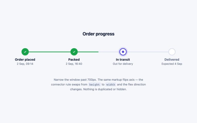
A progress timeline that runs horizontally on wide screens and turns into a vertical list below 700 pixels, from one piece of…
Timelines
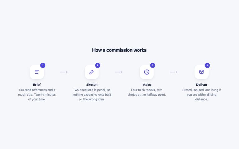
A four-stage process strip with an icon tile, a number badge, a short heading and a sentence per stage, joined by small…
Timelines
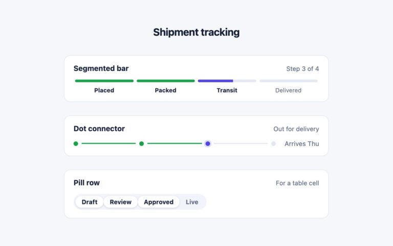
Three small progress trackers sized to sit inside a card, a list row or a table cell rather than take over a…
Timelines
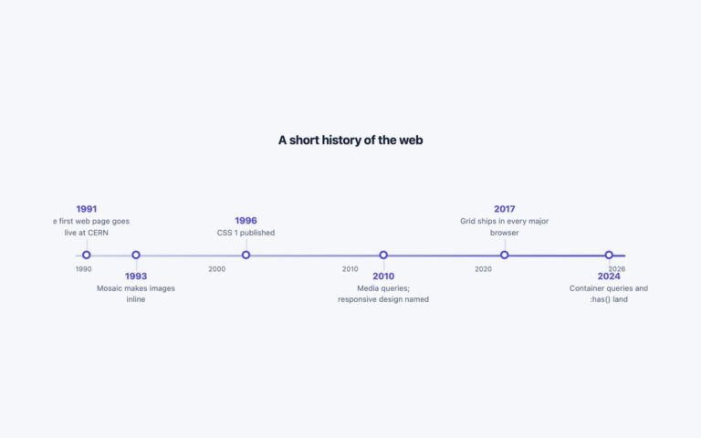
A horizontal timeline where events sit at their true distance along a dated axis instead of being spaced evenly, so a gap…
Timelines
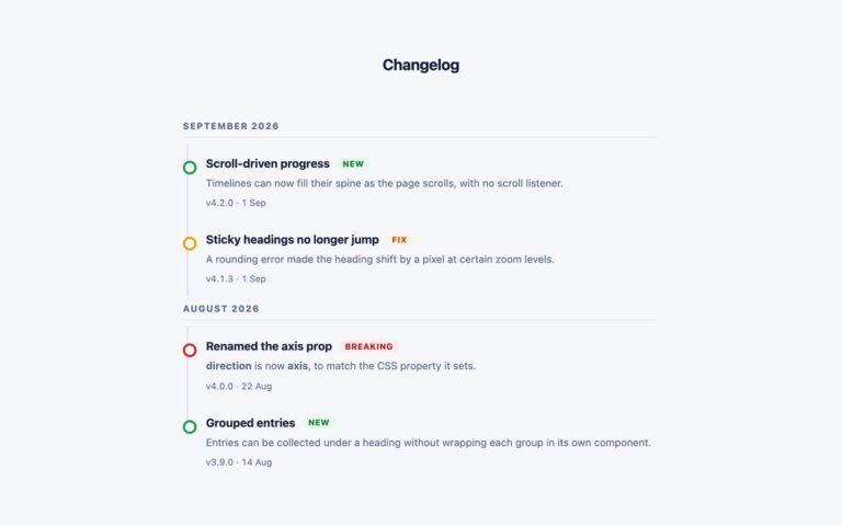
A changelog laid out as a timeline, with entries grouped under month headings that stick to the top of the viewport while…
Timelines
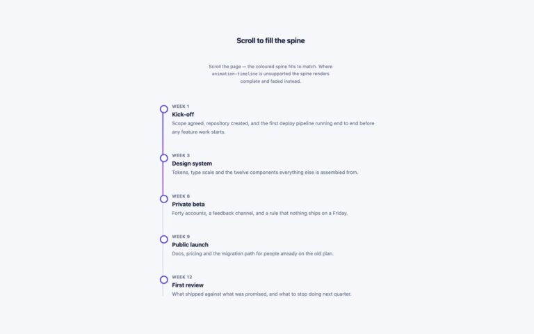
A vertical project timeline whose spine fills with an indigo to violet gradient as the timeline scrolls through the viewport, with no…
Timelines
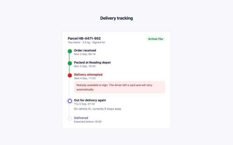
A parcel tracking card with a vertical timeline of delivery events, including a failed attempt, the live current step and the expected…
Timelines
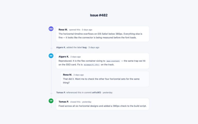
An issue or ticket thread that mixes comments and lighter system events on a single spine, in the style of a code…
Timelines
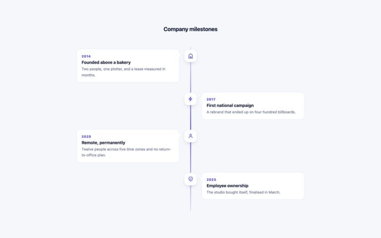
A centred vertical timeline with cards alternating left and right of a gradient line and a rounded icon tile on the line…
Timelines
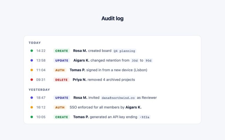
A dense audit log that fits one event per line, for admin panels and security pages where the list can run to…
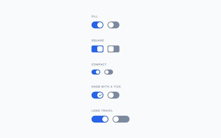
Toggles
Five switch shapes that cover most settings screens: a rounded pill, a square switch with 6px corners, a compact 38 by 22…
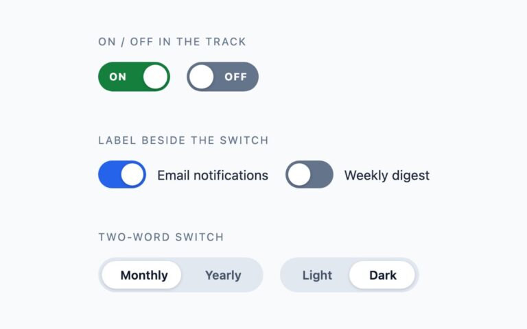
Toggles
Switches that say what state they are in, for places where a coloured track alone is not clear enough.
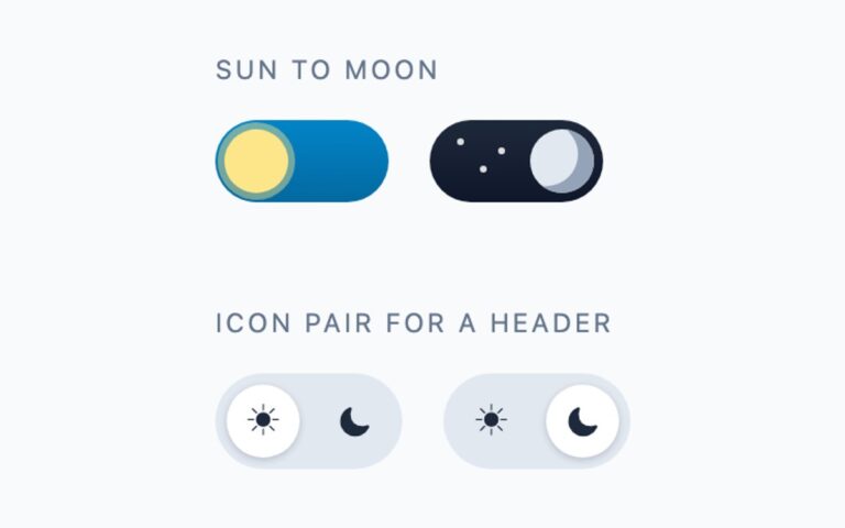
Toggles
Theme switches for a light and dark mode setting. Sun to moon is a 76 pixel track with a blue sky: when…
Toggles
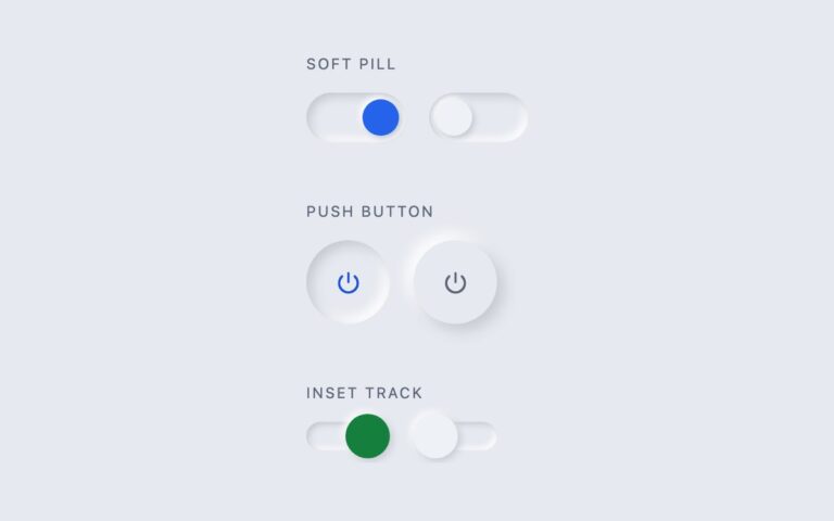
Switches drawn with paired light and dark shadows instead of borders, in the soft or neumorphic style, on a matched #e6e9ef grey…
Toggles
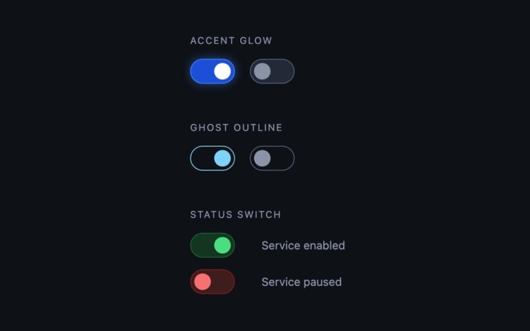
Switches designed for dark interfaces, where a switch made for a light theme loses its edges.
Toggles
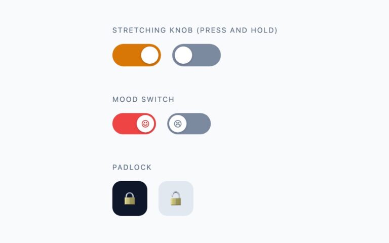
Switches with some personality, for games, onboarding flows, kids products and marketing pages.
No snippets match that search. Search the whole site instead