Open demo

CSS code

HTML
<div class="cd">
  <form class="cd-card" action="#" method="post" onsubmit="event.preventDefault()">
    <div class="cd-mark" aria-hidden="true">N</div>
    <h1>Sign in</h1>
    <p class="cd-sub">Use your work email to continue.</p>
    <div class="cd-field">
      <input type="email" id="cd-email" name="email" placeholder="Email" autocomplete="username" required>
      <label for="cd-email">Email</label>
    </div>
    <div class="cd-field">
      <input class="cd-pw" type="password" id="cd-password" name="password" placeholder="Password" autocomplete="current-password" required>
      <label for="cd-password">Password</label>
      <button type="button" class="cd-peek" data-peek aria-controls="cd-password" aria-pressed="false">Show<span class="sr-only"> password</span></button>
    </div>
    <button class="cd-go" type="submit">Continue</button>
    <div class="cd-meta">
      <a href="#">Forgot password?</a>
      <span>No account? <a href="#">Sign up</a></span>
    </div>
  </form>
</div>
CSS
/* Minimal card login: floating labels drawn with :placeholder-shown, and a Show button that reveals the password. */
.cd{--cd-ink:#16181d;--cd-muted:#667085;--cd-line:#8c93a0;
  min-height:100vh;display:flex;align-items:center;justify-content:center;padding:24px;background:#f4f5f7;color:var(--cd-ink);
  font-family:-apple-system,BlinkMacSystemFont,"Segoe UI",Roboto,Helvetica,Arial,sans-serif}
.cd h1,.cd p{margin:0}
.cd-card{width:100%;max-width:400px;background:#fff;border-radius:16px;padding:44px 40px;
  box-shadow:0 1px 2px rgba(16,24,40,.05),0 24px 48px -12px rgba(16,24,40,.12)}
.cd-mark{width:44px;height:44px;border-radius:12px;background:var(--cd-ink);color:#fff;display:flex;align-items:center;justify-content:center;
  font-weight:800;font-size:1.15rem;margin-bottom:22px}
.cd h1{font-size:1.45rem;letter-spacing:-.02em;margin-bottom:4px}
.cd-sub{color:var(--cd-muted);font-size:.93rem;margin-bottom:30px!important}
.cd-field{position:relative;margin-bottom:18px}
.cd-field input{display:block;width:100%;padding:22px 14px 8px;border:1px solid var(--cd-line);border-radius:10px;font:inherit;font-size:.95rem;
  color:inherit;background:transparent;transition:border-color .15s,box-shadow .15s}
.cd-field label{position:absolute;left:15px;top:15px;color:var(--cd-muted);font-size:.95rem;pointer-events:none;transition:all .15s ease}
.cd-field input:focus{outline:none;border-color:var(--cd-ink);box-shadow:0 0 0 3px rgba(22,24,29,.14)}
.cd-field input:focus+label,.cd-field input:not(:placeholder-shown)+label{top:7px;font-size:.7rem;font-weight:600;color:var(--cd-ink);letter-spacing:.02em;text-transform:uppercase}
.cd-field input::placeholder{color:transparent}
.cd-field .cd-pw{padding-right:72px}
.cd-peek{position:absolute;right:10px;top:50%;transform:translateY(-50%);border:0;border-radius:6px;background:none;color:var(--cd-muted);
  font:inherit;font-size:.78rem;font-weight:600;letter-spacing:.02em;text-transform:uppercase;cursor:pointer;padding:4px 6px}
.cd-peek:hover,.cd-peek[aria-pressed="true"]{color:var(--cd-ink)}
.cd-peek[aria-pressed="true"]{background:#eef0f3}
.cd-go{width:100%;padding:13px;border:0;border-radius:10px;background:var(--cd-ink);color:#fff;font:inherit;font-weight:700;font-size:.95rem;
  cursor:pointer;transition:opacity .15s;margin-top:6px}
.cd-go:hover{opacity:.88}
.cd-meta{display:flex;justify-content:space-between;flex-wrap:wrap;gap:8px 16px;margin-top:20px;font-size:.85rem}
.cd-meta a{color:var(--cd-ink);font-weight:600;text-decoration:none;border-radius:3px}
.cd-meta a:hover{text-decoration:underline}
.cd-meta span{color:var(--cd-muted)}
.cd a:focus-visible,.cd-peek:focus-visible,.cd-go:focus-visible{outline:2px solid var(--cd-ink);outline-offset:2px}
.cd .sr-only{position:absolute;width:1px;height:1px;padding:0;margin:-1px;overflow:hidden;clip:rect(0,0,0,0);white-space:nowrap;border:0}
@media (prefers-reduced-motion:reduce){.cd-field input,.cd-field label,.cd-go{transition:none}}
JavaScript
// Show / hide password. The button keeps one name ("Show password") and reports its state with aria-pressed.
document.querySelectorAll('[data-peek]').forEach(function (btn) {
  var input = document.getElementById(btn.getAttribute('aria-controls'));
  btn.addEventListener('click', function () {
    var show = input.type === 'password';
    input.type = show ? 'text' : 'password';
    btn.setAttribute('aria-pressed', String(show));
  });
});

Bootstrap 5 code

Requires: Bootstrap 5.3.8 CSS

HTML
<div class="cd d-flex align-items-center justify-content-center">
  <form class="card w-100" action="#" method="post" onsubmit="event.preventDefault()">
    <div class="card-body">
      <div class="cd-mark d-flex align-items-center justify-content-center text-white" aria-hidden="true">N</div>
      <h1 class="mb-1">Sign in</h1>
      <p class="cd-sub text-body-secondary">Use your work email to continue.</p>
      <div class="form-floating mb-3">
        <input class="form-control" type="email" id="cd-email" name="email" placeholder="Email" autocomplete="username" required>
        <label for="cd-email">Email</label>
      </div>
      <div class="form-floating mb-3">
        <input class="form-control cd-pw" type="password" id="cd-password" name="password" placeholder="Password" autocomplete="current-password" required>
        <label for="cd-password">Password</label>
        <button type="button" class="btn cd-peek position-absolute" data-peek aria-controls="cd-password" aria-pressed="false">Show<span class="visually-hidden"> password</span></button>
      </div>
      <button class="btn btn-cd w-100 mt-1" type="submit">Continue</button>
      <div class="cd-meta d-flex flex-wrap justify-content-between column-gap-3 row-gap-2 mt-3 pt-1">
        <a href="#">Forgot password?</a>
        <span class="text-body-secondary">No account? <a href="#">Sign up</a></span>
      </div>
    </div>
  </form>
</div>
CSS
/* Bootstrap .card with .form-floating fields; the floated label is restyled to a small uppercase caption. */
.cd{--cd-ink:#16181d;--cd-muted:#667085;
  --bs-body-color:#16181d;--bs-secondary-color:#667085;--bs-border-color:#8c93a0;
  --bs-body-font-family:-apple-system,BlinkMacSystemFont,"Segoe UI",Roboto,Helvetica,Arial,sans-serif;
  min-height:100vh;padding:24px;background:#f4f5f7;color:var(--bs-body-color);font-family:var(--bs-body-font-family);line-height:normal}
.cd .card{--bs-card-border-width:0;--bs-card-border-radius:16px;--bs-card-spacer-y:44px;--bs-card-spacer-x:40px;max-width:400px;
  box-shadow:0 1px 2px rgba(16,24,40,.05),0 24px 48px -12px rgba(16,24,40,.12)}
.cd-mark{width:44px;height:44px;border-radius:12px;background:var(--cd-ink);font-weight:800;font-size:1.15rem;margin-bottom:22px}
.cd h1{font-size:1.45rem;letter-spacing:-.02em;font-weight:700}
.cd-sub{font-size:.93rem;margin-bottom:30px}
.cd .form-floating>.form-control{height:auto;min-height:0;padding:22px 14px 8px;border-radius:10px;font-size:.95rem;line-height:1.2}
.cd .form-floating>.form-control:focus{border-color:var(--cd-ink);box-shadow:0 0 0 3px rgba(22,24,29,.14)}
.cd .form-floating>label{height:auto;padding:15px 15px;color:var(--cd-muted);font-size:.95rem;line-height:1.2;border:0}
.cd .form-floating>.form-control:focus~label,.cd .form-floating>.form-control:not(:placeholder-shown)~label{
  transform:none;padding-top:7px;font-size:.7rem;font-weight:600;letter-spacing:.02em;text-transform:uppercase;color:var(--cd-ink)}
.cd .form-floating>.form-control:focus~label::after,.cd .form-floating>.form-control:not(:placeholder-shown)~label::after{display:none}
.cd .form-floating>.cd-pw{padding-right:72px}
.cd-peek{top:50%;right:10px;transform:translateY(-50%);z-index:3;--bs-btn-padding-x:6px;--bs-btn-padding-y:4px;--bs-btn-font-size:.78rem;
  --bs-btn-font-weight:600;--bs-btn-border-radius:6px;--bs-btn-border-width:0;--bs-btn-color:var(--cd-muted);--bs-btn-hover-color:var(--cd-ink);
  --bs-btn-active-color:var(--cd-ink);--bs-btn-active-bg:#eef0f3;--bs-btn-focus-box-shadow:none;letter-spacing:.02em;text-transform:uppercase;line-height:1.2}
.cd-peek[aria-pressed="true"]{background:#eef0f3;color:var(--cd-ink)}
.cd .btn-cd{--bs-btn-bg:var(--cd-ink);--bs-btn-border-color:var(--cd-ink);--bs-btn-color:#fff;--bs-btn-hover-bg:var(--cd-ink);
  --bs-btn-hover-border-color:var(--cd-ink);--bs-btn-hover-color:#fff;--bs-btn-active-bg:var(--cd-ink);--bs-btn-active-border-color:var(--cd-ink);
  --bs-btn-active-color:#fff;--bs-btn-padding-y:13px;--bs-btn-font-size:.95rem;--bs-btn-font-weight:700;--bs-btn-border-radius:10px;
  --bs-btn-line-height:1.2;--bs-btn-focus-box-shadow:none}
.cd .btn-cd:hover{opacity:.88}
.cd-meta{font-size:.85rem}
.cd-meta a{color:var(--cd-ink);font-weight:600;text-decoration:none;border-radius:3px}
.cd-meta a:hover{text-decoration:underline}
.cd a:focus-visible,.cd .btn:focus-visible{outline:2px solid var(--cd-ink);outline-offset:2px}
@media (prefers-reduced-motion:reduce){.cd .form-control,.cd .btn{transition:none}}
JavaScript
// Show / hide password. The button keeps one name ("Show password") and reports its state with aria-pressed.
document.querySelectorAll('[data-peek]').forEach(function (btn) {
  var input = document.getElementById(btn.getAttribute('aria-controls'));
  btn.addEventListener('click', function () {
    var show = input.type === 'password';
    input.type = show ? 'text' : 'password';
    btn.setAttribute('aria-pressed', String(show));
  });
});

Tailwind 4 code

Requires: Tailwind CSS 4

HTML
<div class="flex min-h-screen items-center justify-center bg-[#f4f5f7] p-6 font-[-apple-system,BlinkMacSystemFont,'Segoe_UI',Roboto,Helvetica,Arial,sans-serif] leading-[normal] text-cd-ink">
  <form class="w-full max-w-[400px] rounded-2xl bg-white px-10 py-11 shadow-[0_1px_2px_rgba(16,24,40,.05),0_24px_48px_-12px_rgba(16,24,40,.12)]" action="#" method="post" onsubmit="event.preventDefault()">
    <div class="mb-[22px] flex size-11 items-center justify-center rounded-xl bg-cd-ink text-[1.15rem] font-extrabold text-white" aria-hidden="true">N</div>
    <h1 class="mb-1 text-[1.45rem] font-bold tracking-[-.02em]">Sign in</h1>
    <p class="mb-[30px] text-[.93rem] text-cd-muted">Use your work email to continue.</p>
    <div class="relative mb-[18px]">
      <input class="peer block w-full rounded-[10px] border border-cd-line bg-transparent px-3.5 pt-[22px] pb-2 text-[.95rem] transition-[border-color,box-shadow] duration-150 placeholder:text-transparent focus:border-cd-ink focus:shadow-[0_0_0_3px_rgba(22,24,29,.14)] focus:outline-none motion-reduce:transition-none" type="email" id="cd-email" name="email" placeholder="Email" autocomplete="username" required>
      <label class="pointer-events-none absolute top-[15px] left-[15px] text-[.95rem] text-cd-muted transition-all duration-150 peer-focus:top-[7px] peer-focus:text-[.7rem] peer-focus:font-semibold peer-focus:tracking-[.02em] peer-focus:text-cd-ink peer-focus:uppercase peer-[:not(:placeholder-shown)]:top-[7px] peer-[:not(:placeholder-shown)]:text-[.7rem] peer-[:not(:placeholder-shown)]:font-semibold peer-[:not(:placeholder-shown)]:tracking-[.02em] peer-[:not(:placeholder-shown)]:text-cd-ink peer-[:not(:placeholder-shown)]:uppercase motion-reduce:transition-none" for="cd-email">Email</label>
    </div>
    <div class="relative mb-[18px]">
      <input class="peer block w-full rounded-[10px] border border-cd-line bg-transparent pt-[22px] pr-[72px] pb-2 pl-3.5 text-[.95rem] transition-[border-color,box-shadow] duration-150 placeholder:text-transparent focus:border-cd-ink focus:shadow-[0_0_0_3px_rgba(22,24,29,.14)] focus:outline-none motion-reduce:transition-none" type="password" id="cd-password" name="password" placeholder="Password" autocomplete="current-password" required>
      <label class="pointer-events-none absolute top-[15px] left-[15px] text-[.95rem] text-cd-muted transition-all duration-150 peer-focus:top-[7px] peer-focus:text-[.7rem] peer-focus:font-semibold peer-focus:tracking-[.02em] peer-focus:text-cd-ink peer-focus:uppercase peer-[:not(:placeholder-shown)]:top-[7px] peer-[:not(:placeholder-shown)]:text-[.7rem] peer-[:not(:placeholder-shown)]:font-semibold peer-[:not(:placeholder-shown)]:tracking-[.02em] peer-[:not(:placeholder-shown)]:text-cd-ink peer-[:not(:placeholder-shown)]:uppercase motion-reduce:transition-none" for="cd-password">Password</label>
      <button type="button" class="absolute top-1/2 right-2.5 -translate-y-1/2 cursor-pointer rounded-md px-1.5 py-1 text-[.78rem] font-semibold tracking-[.02em] text-cd-muted uppercase hover:text-cd-ink focus-visible:outline-2 focus-visible:outline-offset-2 focus-visible:outline-cd-ink aria-pressed:bg-[#eef0f3] aria-pressed:text-cd-ink" data-peek aria-controls="cd-password" aria-pressed="false">Show<span class="sr-only"> password</span></button>
    </div>
    <button class="mt-1.5 w-full cursor-pointer rounded-[10px] bg-cd-ink p-[13px] text-[.95rem] font-bold text-white transition-opacity duration-150 hover:opacity-[.88] focus-visible:outline-2 focus-visible:outline-offset-2 focus-visible:outline-cd-ink motion-reduce:transition-none" type="submit">Continue</button>
    <div class="mt-5 flex flex-wrap justify-between gap-x-4 gap-y-2 text-[.85rem]">
      <a class="rounded-[3px] font-semibold hover:underline focus-visible:outline-2 focus-visible:outline-offset-2 focus-visible:outline-cd-ink" href="#">Forgot password?</a>
      <span class="text-cd-muted">No account? <a class="rounded-[3px] font-semibold text-cd-ink hover:underline focus-visible:outline-2 focus-visible:outline-offset-2 focus-visible:outline-cd-ink" href="#">Sign up</a></span>
    </div>
  </form>
</div>
CSS
@theme {
  --color-cd-ink: #16181d;
  --color-cd-muted: #667085;
  --color-cd-line: #8c93a0;
}
JavaScript
// Show / hide password. The button keeps one name ("Show password") and reports its state with aria-pressed.
document.querySelectorAll('[data-peek]').forEach(function (btn) {
  var input = document.getElementById(btn.getAttribute('aria-controls'));
  btn.addEventListener('click', function () {
    var show = input.type === 'password';
    input.type = show ? 'text' : 'password';
    btn.setAttribute('aria-pressed', String(show));
  });
});

About this set

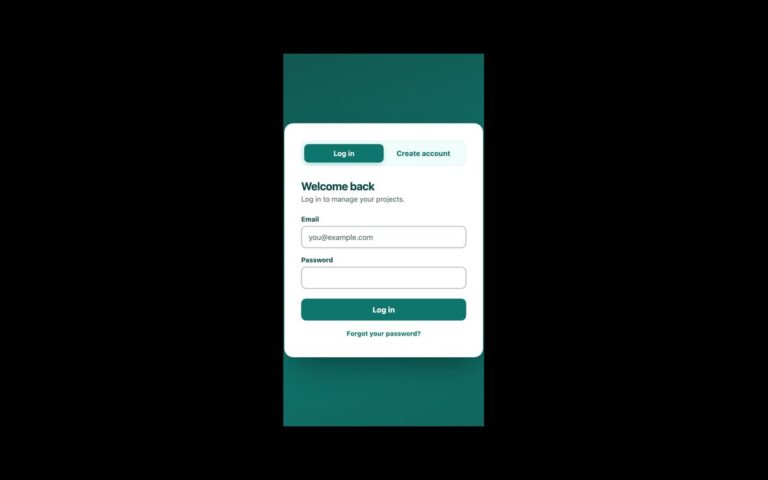
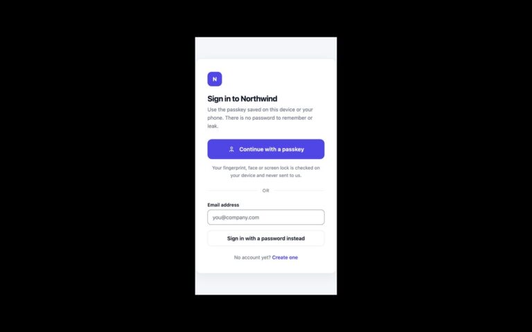
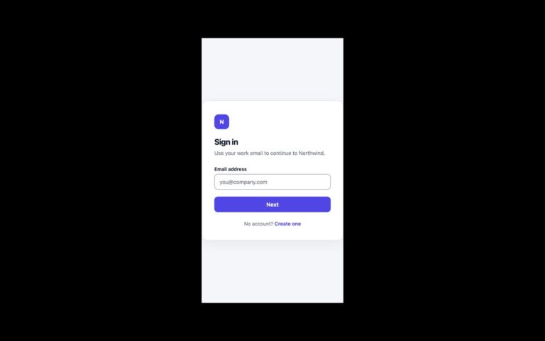
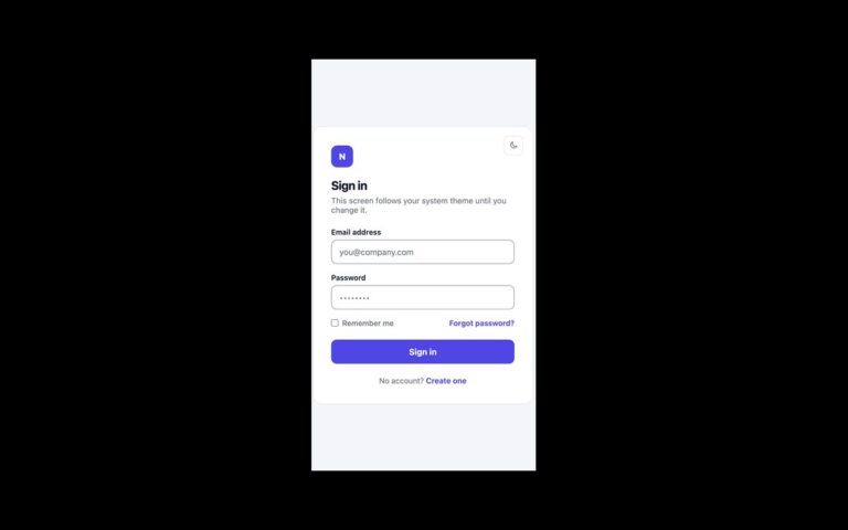
A small white card centred on a light grey page: a dark monogram tile, a Sign in heading, an email field and a password field with floating labels, a black Continue button, and links to reset the password or sign up. The labels start inside the fields and move up into a small uppercase caption when the field is focused or filled. In plain CSS and Tailwind that is done with :placeholder-shown and a sibling selector, so it needs no JavaScript; the Bootstrap version uses the stock .form-floating component with the floated label restyled to match. The password field has a Show button that reveals what you typed. It is a real button with the name Show password and aria-pressed, so screen readers hear a toggle and its state; a pale background marks it when it is on. A few lines of script handle the toggle. Use this card when the sign-in page should be quiet and compact, for internal tools, dashboards or any product that does not need a marketing panel. The email and password fields carry autocomplete=”username” and “current-password” so password managers work.

What’s included

  • Floating labels with no JavaScript, built on :placeholder-shown
  • Show password toggle with aria-pressed and a constant accessible name
  • Bootstrap version uses the native .form-floating component
  • Label and border colours adjusted to meet WCAG AA contrast
  • Password managers supported through autocomplete attributes

Accessibility

Every input keeps a real label element, which stays visible as a caption once the field has content. The Show password button is a type="button" toggle with aria-pressed and aria-controls. Fields show a dark border and ring on focus, and links and buttons show a 2px outline on keyboard focus. Label and focus transitions switch off under prefers-reduced-motion.

Customise it

Change --cd-ink, --cd-muted and --cd-line on .cd for colour. In Bootstrap the same variables sit on .cd beside --bs-border-color; in Tailwind edit the --color-cd-* theme colours and the peer-focus: label utilities.