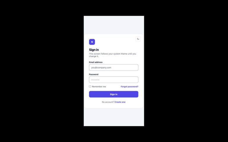
About this set
A sign-in screen that leads with passkeys and keeps a password route one step away. A large filled button reads Continue with a passkey, with a line underneath explaining that the fingerprint, face or screen lock is checked on the device and never sent to the site. An or divider separates it from an email field and an outlined Sign in with a password instead button, and a footer link covers people without an account. Use it when your service already supports WebAuthn and you want most people to take the passwordless path while nobody is locked out. The markup is ready for both passkey flows: wire the button to navigator.credentials.get() for the explicit flow, and the email field carries autocomplete=”username webauthn” so the browser can list saved passkeys in the field’s autofill once your script requests conditional mediation. No WebAuthn code is included, because it depends on your server’s challenge. The Bootstrap version builds the same layout from .card, .form-control and two .btn variants; the Tailwind version uses utilities and a small theme.
What’s included
- Primary passkey button with an explanatory line tied by aria-describedby
- Email field with autocomplete="username webauthn" for passkey autofill
- Password fallback as a secondary outlined button
- Or divider drawn with pseudo-elements, no extra markup
- Press feedback that is removed under prefers-reduced-motion
Accessibility
The passkey button has visible text and is described by the privacy line beneath it; the email field has a visible label. Tab moves through the passkey button, the email field, the fallback button and the footer link, each with a 2px outline or a focus ring. Transitions and the pressed scale effect switch off under prefers-reduced-motion.
Customise it
Set --lf-brand and --lf-brand-dark on .lf for the passkey button (plain CSS and Bootstrap, where they also feed .btn-passkey), or edit --color-brand and --color-brand-dark in the Tailwind theme. Button height comes from its 16px padding.