About this set
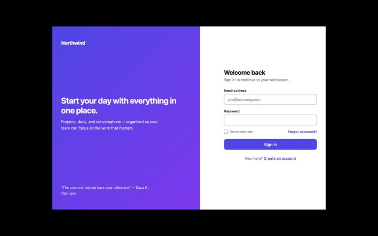
A two-column sign-in page for business software. The left column holds the logo, a heading, a work email field, a password field with an eye icon that shows or hides the password, a Keep me signed in checkbox, a Forgot password link, a dark Sign in button and a secondary Sign in with SSO button, followed by a free trial link. From 960 pixels wide a dark navy panel appears on the right with three headline stats, a customer quote and the person’s name and role. Use it for B2B products where teams sign in with single sign-on and the login page doubles as social proof. The eye button is a real toggle named Show password with aria-pressed, and its icon switches to a crossed-out eye while the password is visible. The icon colour was darkened so it reaches 3:1 against white, and field borders were darkened to match. The Bootstrap version uses .form-control, .form-check and two .btn styles; the Tailwind version swaps the eye icons with group-aria-pressed: utilities.
What’s included
- Show password icon button with aria-pressed and swapping icon
- Sign in with SSO as a secondary action
- Stats and testimonial panel shown from 960px
- Keep me signed in checkbox and Forgot password link
- Icon and border colours adjusted to 3:1
Accessibility
Every field has a visible label and the checkbox sits inside its label. The password toggle has a fixed accessible name, Show password, and reports its state with aria-pressed. Inputs show a slate border and ring on focus; buttons, links and the checkbox show a 2px outline on keyboard focus. Transitions switch off under prefers-reduced-motion.
Customise it
Change --ss-ink, --ss-slate, --ss-muted and --ss-line on .ss. In Tailwind edit the --color-ss-* theme colours, and the min-[960px]:flex breakpoint on the aside.