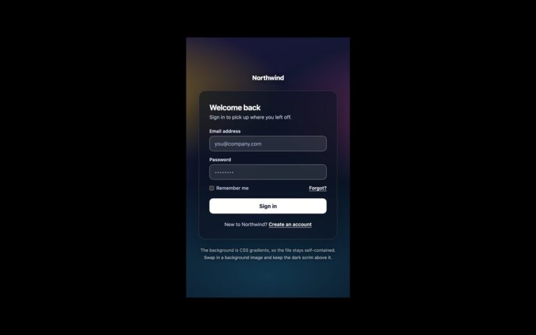
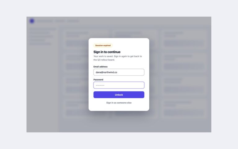
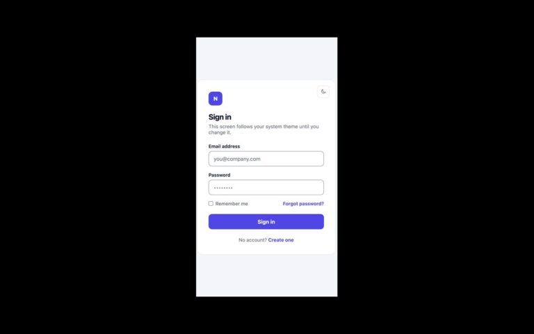
About this set
A sign-in card that shows the three errors a login form has to handle. At the top, a red form-level alert reports a failed attempt and how many tries are left before a 15-minute lock; that one comes from your server. Under the email field, a field-level message explains what is wrong with the address, with the input marked aria-invalid and a red border. Under the password field, a Caps Lock warning appears while Caps Lock is on, because it is the most common reason a correct password fails. A short script makes the field error live: typing a valid address clears it, and submitting with an invalid one brings it back and returns focus to the field. The check asks for a dot in the domain, since type=”email” alone accepts name@host. The Caps Lock check uses getModifierState and never reads what was typed. In Bootstrap the states map to .alert-danger, .is-invalid with .invalid-feedback and .form-check; Tailwind uses the aria-invalid variant.
What’s included
- Form-level alert with role="alert"
- Field error linked by aria-describedby and aria-invalid
- Error clears as soon as the address becomes valid
- Caps Lock warning in a polite live region
- Remember-me checkbox and forgotten-password link
Accessibility
The email error is tied to the field with aria-describedby and the field carries aria-invalid, so screen readers read the message with the label. The Caps Lock notice is a role="status" region that the password field also references. On a failed submit focus returns to the invalid field; all controls show a focus ring or outline, and transitions switch off under prefers-reduced-motion.
Customise it
The error red is --lf-bad (plain CSS), --bs-form-invalid-color (Bootstrap) or --color-bad (Tailwind); the alert and Caps Lock colours are the pink and amber values on .lf-alert and .lf-caps or their utilities.