About this set
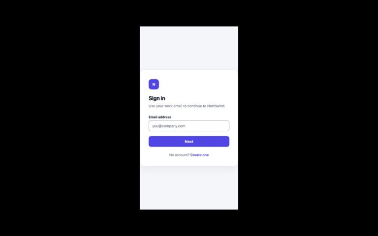
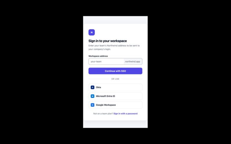
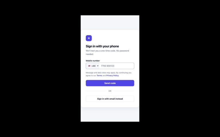
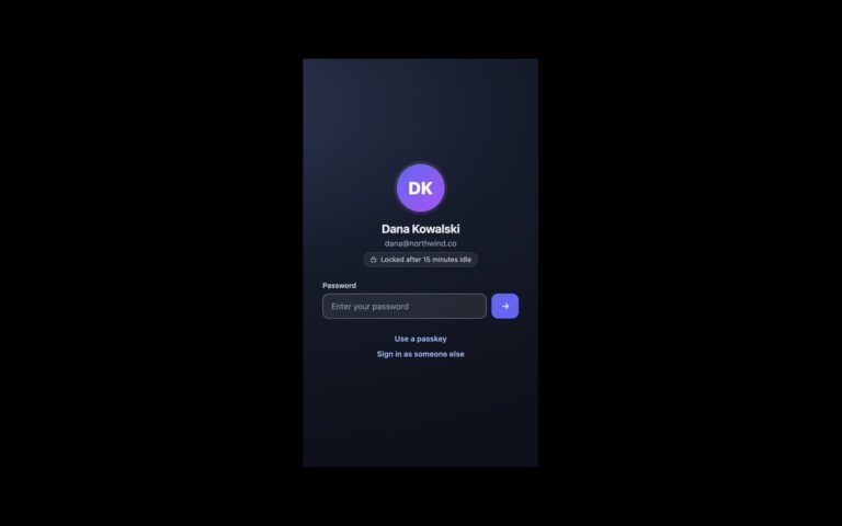
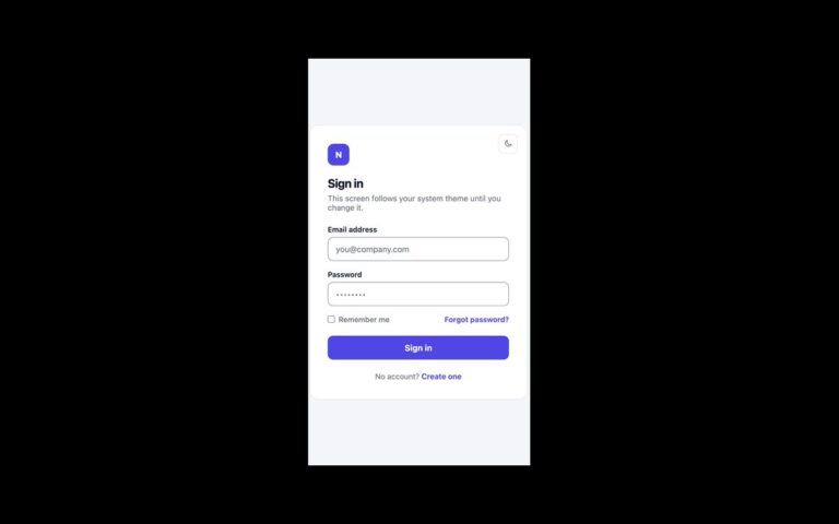
A sign-in card that puts third-party accounts first. Three full-width outline buttons read Continue with Google, Continue with GitHub and Continue with Apple, each with the provider’s logo drawn as inline SVG. Below an OR divider, a single email field and a dark Continue with email button offer the fallback, and a line of small print links to the terms and privacy policy. Use it when most of your users already have one of these accounts and a password field would only slow them down; the email route can lead to a magic link or a password step. The provider buttons are type=”button” placeholders, so wire each one to your OAuth start URL. Logos are aria-hidden, so each button is announced by its text alone. The original hid the email label; it is now visible above the field, and the divider and small print were darkened to meet 4.5:1. The Bootstrap version builds the provider buttons from .btn with custom –bs-btn-* colours and uses .form-control for the email field.
What’s included
- Google, GitHub and Apple buttons with inline SVG logos
- Single email field as a fallback below an OR divider
- Visible email label with autocomplete="username"
- Divider and terms text darkened to meet WCAG AA
- No icon font or image requests
Accessibility
Provider buttons are named by their visible text and their logos are hidden from assistive technology. The email field has a visible label. Every button and link shows a 2px dark outline on keyboard focus and the input gets a dark border and ring. Transitions switch off under prefers-reduced-motion.
Customise it
Change --so-ink, --so-muted and --so-line on .so. In Bootstrap the provider style lives in .btn-provider as --bs-btn-* variables; in Tailwind edit the --color-so-* theme colours and the border-[#dcdfe8] on the provider buttons.