About this set
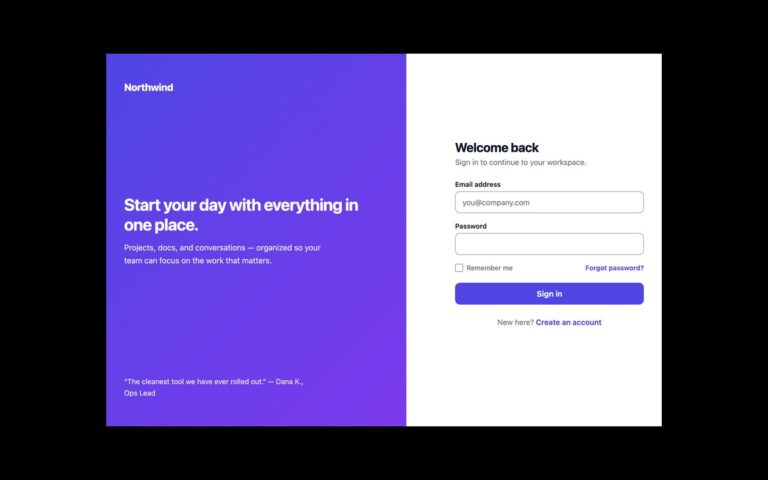
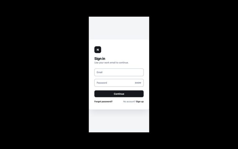
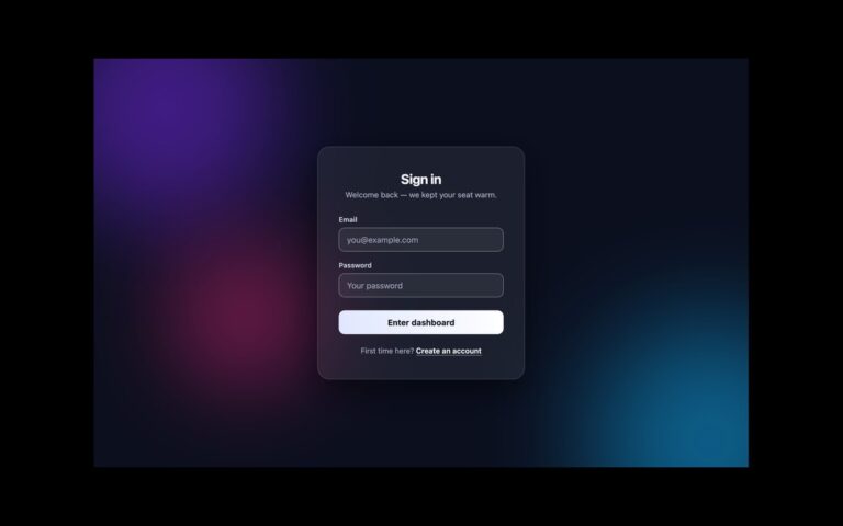
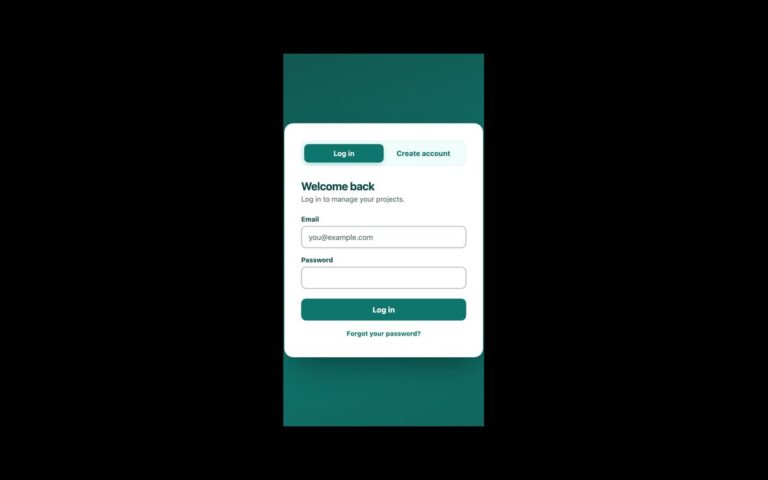
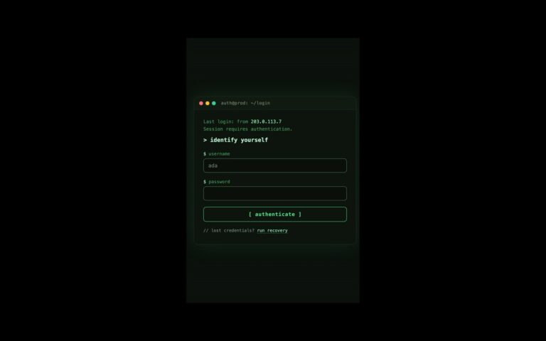
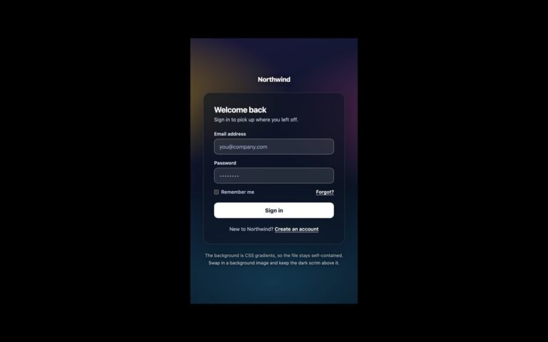
A login card with light and dark themes that follows the operating system until the person picks one. It holds a brand mark, email and password fields, a remember-me checkbox, a forgotten-password link, a Sign in button and a sign-up link, with a small square toggle in the top-right corner that shows a moon in light mode and a sun in dark mode. In plain CSS every colour is a custom property on :root; prefers-color-scheme swaps the set, and a data-theme attribute that the toggle writes on the html element overrides the media query, so the page follows the OS with JavaScript turned off. color-scheme is set too, so native checkboxes and autofill match. The Tailwind version redefines the dark variant to honour the same attribute and media query. Bootstrap’s colour modes are attribute-driven, so its version runs a few lines in the head that set data-bs-theme from the OS before first paint, then let the toggle override it. The choice lasts for the visit; add storage if you want it remembered.
What’s included
- Light and dark themes from prefers-color-scheme
- Toggle with aria-pressed that overrides the OS setting
- Dark indigo and link colours tuned for 4.5:1 text contrast
- color-scheme set so native controls match the theme
- Bootstrap data-bs-theme and a custom Tailwind dark variant
Accessibility
The toggle is a button named Dark theme with aria-pressed reflecting the current state, and its icons are hidden from assistive technology. Fields have visible labels and username and current-password autocomplete. Focus outlines switch to a light indigo in dark mode so they stay visible, and colour transitions are removed under prefers-reduced-motion.
Customise it
Edit the --lf-* tokens in the :root and dark blocks (plain CSS), the --lf-* values under .lf and [data-bs-theme=dark] .lf (Bootstrap), or the paired --color-* and --color-*-night theme values (Tailwind).