Open demo

CSS code

HTML
<div class="gb">
  <div class="gb-frame">
    <form class="gb-inner" action="#" method="post" onsubmit="event.preventDefault()">
      <span class="gb-badge">Members area</span>
      <h1>Good to see you again</h1>
      <p class="gb-sub">Log in to pick up right where you left off.</p>
      <label class="gb-label" for="gb-email">Email</label>
      <input class="gb-input" type="email" id="gb-email" name="email" placeholder="[email protected]" autocomplete="username" required>
      <label class="gb-label" for="gb-password">Password</label>
      <input class="gb-input" type="password" id="gb-password" name="password" autocomplete="current-password" required>
      <button class="gb-btn" type="submit">Log in</button>
      <div class="gb-links">
        <a href="#">Forgot password?</a>
        <a href="#">Create account</a>
      </div>
    </form>
  </div>
</div>
CSS
/* Gradient border login: a 2px padded frame whose oversized gradient background slides around the card. */
.gb{--gb-ink:#241f1c;--gb-muted:#766b64;--gb-pink:#db2777;--gb-line:#9a8f87;
  min-height:100vh;display:flex;align-items:center;justify-content:center;padding:24px;background:#fdf6f0;color:var(--gb-ink);
  font-family:-apple-system,BlinkMacSystemFont,"Segoe UI",Roboto,Helvetica,Arial,sans-serif}
.gb h1,.gb p{margin:0}
.gb-frame{width:100%;max-width:390px;border-radius:20px;padding:2px;background:linear-gradient(120deg,#f97316,#db2777,#8b5cf6,#f97316);
  background-size:300% 300%;animation:gb-slide 7s linear infinite}
@keyframes gb-slide{0%{background-position:0% 50%}50%{background-position:100% 50%}100%{background-position:0% 50%}}
.gb-inner{background:#fffdfb;border-radius:18px;padding:42px 36px}
.gb-badge{display:inline-block;font-size:.72rem;font-weight:700;letter-spacing:.08em;text-transform:uppercase;color:#be185d;background:#fdeef5;
  border-radius:999px;padding:5px 12px;margin-bottom:16px}
.gb h1{font-size:1.55rem;letter-spacing:-.02em;margin-bottom:6px}
.gb-sub{color:var(--gb-muted);font-size:.92rem;margin-bottom:28px!important}
.gb-label{display:block;font-size:.83rem;font-weight:700;margin-bottom:6px}
.gb-input{display:block;width:100%;padding:12px 14px;margin-bottom:18px;border:1.5px solid var(--gb-line);border-radius:12px;background:#fff;
  font:inherit;font-size:.95rem;color:inherit;transition:border-color .15s,box-shadow .15s}
.gb-input::placeholder{color:var(--gb-muted)}
.gb-input:focus{outline:none;border-color:var(--gb-pink);box-shadow:0 0 0 3px rgba(219,39,119,.2)}
.gb-btn{width:100%;padding:13px;border:0;border-radius:12px;font:inherit;font-size:.95rem;font-weight:800;color:#fff;cursor:pointer;
  background:linear-gradient(90deg,#c2410c,#db2777);transition:filter .15s,transform .12s}
.gb-btn:hover{filter:brightness(1.06);transform:translateY(-1px)}
.gb-links{display:flex;justify-content:space-between;gap:12px;flex-wrap:wrap;margin-top:20px;font-size:.85rem}
.gb-links a{color:var(--gb-pink);font-weight:700;text-decoration:none;border-radius:3px}
.gb-links a:hover{text-decoration:underline}
.gb a:focus-visible,.gb-btn:focus-visible{outline:2px solid var(--gb-pink);outline-offset:2px}
@media (prefers-reduced-motion:reduce){.gb-frame{animation:none}.gb-input,.gb-btn{transition:none}.gb-btn:hover{transform:none}}

Bootstrap 5 code

Requires: Bootstrap 5.3.8 CSS

HTML
<div class="gb d-flex align-items-center justify-content-center">
  <div class="gb-frame w-100">
    <form class="card" action="#" method="post" onsubmit="event.preventDefault()">
      <div class="card-body">
        <span class="badge text-uppercase">Members area</span>
        <h1>Good to see you again</h1>
        <p class="gb-sub text-body-secondary">Log in to pick up right where you left off.</p>
        <div class="gb-field">
          <label class="form-label" for="gb-email">Email</label>
          <input class="form-control" type="email" id="gb-email" name="email" placeholder="[email protected]" autocomplete="username" required>
        </div>
        <div class="gb-field">
          <label class="form-label" for="gb-password">Password</label>
          <input class="form-control" type="password" id="gb-password" name="password" autocomplete="current-password" required>
        </div>
        <button class="btn btn-gb w-100" type="submit">Log in</button>
        <div class="gb-links d-flex flex-wrap justify-content-between gap-3">
          <a href="#">Forgot password?</a>
          <a href="#">Create account</a>
        </div>
      </div>
    </form>
  </div>
</div>
CSS
/* Bootstrap .card inside a 2px animated gradient frame, with .badge, .form-control and a gradient .btn. */
.gb{--gb-ink:#241f1c;--gb-pink:#db2777;
  --bs-body-color:#241f1c;--bs-secondary-color:#766b64;--bs-border-color:#9a8f87;--bs-border-width:1.5px;
  --bs-body-font-family:-apple-system,BlinkMacSystemFont,"Segoe UI",Roboto,Helvetica,Arial,sans-serif;
  min-height:100vh;padding:24px;background:#fdf6f0;color:var(--bs-body-color);font-family:var(--bs-body-font-family);line-height:normal}
.gb-frame{max-width:390px;border-radius:20px;padding:2px;background:linear-gradient(120deg,#f97316,#db2777,#8b5cf6,#f97316);
  background-size:300% 300%;animation:gb-slide 7s linear infinite}
@keyframes gb-slide{0%{background-position:0% 50%}50%{background-position:100% 50%}100%{background-position:0% 50%}}
.gb .card{--bs-card-bg:#fffdfb;--bs-card-border-width:0;--bs-card-border-radius:18px;--bs-card-spacer-y:42px;--bs-card-spacer-x:36px}
.gb .badge{--bs-badge-font-size:.72rem;--bs-badge-font-weight:700;--bs-badge-padding-x:12px;--bs-badge-padding-y:5px;--bs-badge-color:#be185d;
  --bs-badge-border-radius:999px;background:#fdeef5;letter-spacing:.08em;margin-bottom:16px}
.gb h1{font-size:1.55rem;letter-spacing:-.02em;font-weight:700;margin-bottom:6px}
.gb-sub{font-size:.92rem;margin-bottom:28px}
.gb .form-label{font-size:.83rem;font-weight:700;margin-bottom:6px}
.gb .form-control{padding:12px 14px;border-radius:12px;background:#fff;font-size:.95rem;line-height:1.2}
.gb .form-control::placeholder{color:var(--bs-secondary-color)}
.gb .form-control:focus{border-color:var(--gb-pink);box-shadow:0 0 0 3px rgba(219,39,119,.2)}
.gb-field{margin-bottom:18px}
.gb .btn-gb{--bs-btn-color:#fff;--bs-btn-hover-color:#fff;--bs-btn-active-color:#fff;--bs-btn-border-width:0;--bs-btn-padding-y:13px;
  --bs-btn-font-size:.95rem;--bs-btn-font-weight:800;--bs-btn-border-radius:12px;--bs-btn-line-height:1.2;--bs-btn-focus-box-shadow:none;
  background:linear-gradient(90deg,#c2410c,#db2777);transition:filter .15s,transform .12s}
.gb .btn-gb:hover{filter:brightness(1.06);transform:translateY(-1px)}
.gb-links{margin-top:20px;font-size:.85rem}
.gb-links a{color:var(--gb-pink);font-weight:700;text-decoration:none;border-radius:3px}
.gb-links a:hover{text-decoration:underline}
.gb a:focus-visible,.gb .btn-gb:focus-visible{outline:2px solid var(--gb-pink);outline-offset:2px}
@media (prefers-reduced-motion:reduce){.gb-frame{animation:none}.gb .form-control,.gb .btn-gb{transition:none}.gb .btn-gb:hover{transform:none}}

Tailwind 4 code

Requires: Tailwind CSS 4

HTML
<div class="flex min-h-screen items-center justify-center bg-[#fdf6f0] p-6 font-[-apple-system,BlinkMacSystemFont,'Segoe_UI',Roboto,Helvetica,Arial,sans-serif] leading-[normal] text-gb-ink">
  <div class="w-full max-w-[390px] rounded-[20px] bg-[linear-gradient(120deg,#f97316,#db2777,#8b5cf6,#f97316)] bg-size-[300%_300%] p-0.5 motion-safe:animate-gb-slide">
    <form class="rounded-[18px] bg-[#fffdfb] px-9 py-[42px]" action="#" method="post" onsubmit="event.preventDefault()">
      <span class="mb-4 inline-block rounded-full bg-[#fdeef5] px-3 py-[5px] text-[.72rem] font-bold tracking-[.08em] text-[#be185d] uppercase">Members area</span>
      <h1 class="mb-1.5 text-[1.55rem] font-bold tracking-[-.02em]">Good to see you again</h1>
      <p class="mb-7 text-[.92rem] text-gb-muted">Log in to pick up right where you left off.</p>
      <label class="mb-1.5 block text-[.83rem] font-bold" for="gb-email">Email</label>
      <input class="mb-[18px] block w-full rounded-xl border-[1.5px] border-gb-line bg-white px-3.5 py-3 text-[.95rem] transition-[border-color,box-shadow] duration-150 placeholder:text-gb-muted focus:border-gb-pink focus:shadow-[0_0_0_3px_rgba(219,39,119,.2)] focus:outline-none motion-reduce:transition-none" type="email" id="gb-email" name="email" placeholder="[email protected]" autocomplete="username" required>
      <label class="mb-1.5 block text-[.83rem] font-bold" for="gb-password">Password</label>
      <input class="mb-[18px] block w-full rounded-xl border-[1.5px] border-gb-line bg-white px-3.5 py-3 text-[.95rem] transition-[border-color,box-shadow] duration-150 focus:border-gb-pink focus:shadow-[0_0_0_3px_rgba(219,39,119,.2)] focus:outline-none motion-reduce:transition-none" type="password" id="gb-password" name="password" autocomplete="current-password" required>
      <button class="w-full cursor-pointer rounded-xl bg-linear-90 from-[#c2410c] to-[#db2777] p-[13px] text-[.95rem] font-extrabold text-white transition-[filter,transform] duration-150 hover:-translate-y-px hover:brightness-106 focus-visible:outline-2 focus-visible:outline-offset-2 focus-visible:outline-gb-pink motion-reduce:transition-none motion-reduce:hover:translate-y-0" type="submit">Log in</button>
      <div class="mt-5 flex flex-wrap justify-between gap-3 text-[.85rem]">
        <a class="rounded-[3px] font-bold text-gb-pink hover:underline focus-visible:outline-2 focus-visible:outline-offset-2 focus-visible:outline-gb-pink" href="#">Forgot password?</a>
        <a class="rounded-[3px] font-bold text-gb-pink hover:underline focus-visible:outline-2 focus-visible:outline-offset-2 focus-visible:outline-gb-pink" href="#">Create account</a>
      </div>
    </form>
  </div>
</div>
CSS
@theme {
  --color-gb-ink: #241f1c;
  --color-gb-muted: #766b64;
  --color-gb-pink: #db2777;
  --color-gb-line: #9a8f87;
  --animate-gb-slide: gb-slide 7s linear infinite;
  @keyframes gb-slide { 0% { background-position: 0% 50%; } 50% { background-position: 100% 50%; } 100% { background-position: 0% 50%; } }
}

About this set

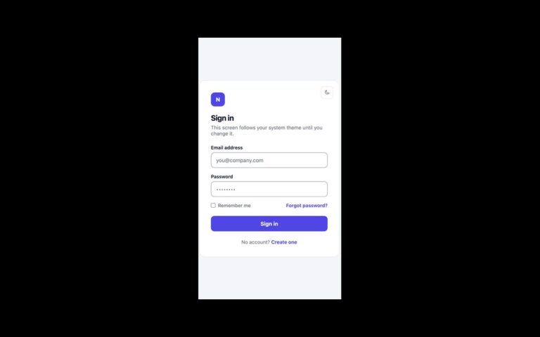
A warm cream sign-in card wrapped in a 2 pixel border that cycles through orange, pink and violet. The border is a padded wrapper whose gradient background is three times its size and slides back and forth over seven seconds, so the colours travel around the card without any extra elements or masks. Inside sit a pink Members area badge, a heading, a short line of copy, email and password fields, an orange-to-pink Log in button, and links to reset the password or create an account. Use it for membership sites, communities and creator products that want a little colour and movement on an otherwise simple form. The animation stops under prefers-reduced-motion, leaving a static gradient border. To keep white button text readable, the gradient now starts at a deeper orange (#c2410c) instead of #f97316; the badge text, muted copy and field borders were darkened to meet WCAG AA. The Bootstrap version uses .card, .badge, .form-control and a gradient .btn; the Tailwind version defines the slide keyframes in @theme.

What’s included

  • Gradient border that animates with background-position only
  • Static border under prefers-reduced-motion
  • Button gradient deepened so white text meets 4.5:1
  • Members badge, visible labels and autocomplete attributes
  • Bootstrap .card and .badge restyled through CSS variables

Accessibility

Both fields have visible labels and autocomplete attributes, and all text meets WCAG AA contrast. Inputs show a pink border and ring on focus, while the button and links show a 2px pink outline on keyboard focus. The border animation, transitions and hover lift stop under prefers-reduced-motion.

Customise it

Edit the colours in the .gb-frame gradient and the 7s duration for speed; --gb-pink and --gb-line set the accent and field borders. In Tailwind change the arbitrary linear-gradient on the frame and the --animate-gb-slide value in @theme.