Open demo

CSS code

HTML
<div class="lf">
<div class="lf-wrap">
  <p class="lf-brand">Northwind</p>
  <main class="lf-box">
    <h1>Welcome back</h1>
    <p class="lf-sub">Sign in to pick up where you left off.</p>
    <form onsubmit="event.preventDefault()">
      <label class="lf-label" for="bmail">Email address</label>
      <input class="lf-field" id="bmail" name="username" type="email" autocomplete="username" placeholder="[email protected]" required>
      <label class="lf-label" for="bpw">Password</label>
      <input class="lf-field" id="bpw" name="password" type="password" autocomplete="current-password" placeholder="••••••••" required>
      <div class="lf-row">
        <label class="lf-check"><input type="checkbox" name="remember"> Remember me</label>
        <a href="#" aria-label="Forgot password?">Forgot?</a>
      </div>
      <button class="lf-btn" type="submit">Sign in</button>
    </form>
    <p class="lf-foot">New to Northwind? <a href="#">Create an account</a></p>
  </main>
  <p class="lf-caption">The background is CSS gradients, so the file stays self-contained.
    Swap in a background image and keep the dark scrim above it.</p>
</div>
</div>
CSS
/* Full-bleed background login: a translucent, blurred card over a backdrop with a dark scrim for legibility.
   .lf::before is the backdrop (CSS gradients here: swap in background-image:url(photo.jpg) center/cover),
   .lf::after is the scrim; keep it when you use a photo. */
.lf{min-height:100vh;display:grid;grid-template-columns:minmax(0,1fr);place-items:center;padding:28px 20px;
  position:relative;isolation:isolate;color:#fff;background:#1b2540;line-height:normal;color-scheme:dark;
  font-family:-apple-system,BlinkMacSystemFont,"Segoe UI",Roboto,Helvetica,Arial,sans-serif}
.lf,.lf *,.lf *::before,.lf *::after{box-sizing:border-box}
.lf::before{content:"";position:absolute;inset:0;z-index:-2;
  background:
    radial-gradient(58% 44% at 18% 22%,rgba(251,191,36,.75),transparent 62%),
    radial-gradient(52% 48% at 82% 30%,rgba(236,72,153,.62),transparent 60%),
    radial-gradient(70% 60% at 50% 92%,rgba(56,189,248,.55),transparent 64%),
    linear-gradient(155deg,#2a1b52,#0f2036 62%,#07131f)}
.lf::after{content:"";position:absolute;inset:0;z-index:-1;
  background:linear-gradient(180deg,rgba(6,12,22,.32),rgba(6,12,22,.62))}
.lf :where(h1,p,form){margin:0}
.lf :where(input,button){font:inherit}
.lf :focus-visible{outline:2px solid #fff;outline-offset:2px}
.lf-wrap{width:100%;max-width:400px;text-align:center}
.lf-brand{font-weight:800;font-size:1.15rem;letter-spacing:-.02em;margin-bottom:26px;text-shadow:0 1px 12px rgba(0,0,0,.5)}
.lf-box{background:rgba(12,18,32,.62);backdrop-filter:blur(18px);-webkit-backdrop-filter:blur(18px);
  border:1px solid rgba(255,255,255,.16);border-radius:20px;padding:34px 30px;text-align:left;
  box-shadow:0 22px 60px rgba(3,8,18,.42)}
.lf h1{font-size:1.4rem;letter-spacing:-.02em;margin-bottom:6px}
.lf-sub{color:#c9d2e4;font-size:.9rem;margin-bottom:24px}
.lf-label{display:block;font-size:.83rem;font-weight:600;margin-bottom:6px;color:#e3e9f5}
.lf-field{width:100%;padding:12px 14px;border-radius:11px;font-size:.95rem;margin-bottom:16px;color:#fff;
  background:rgba(255,255,255,.1);border:1px solid rgba(255,255,255,.45);transition:border-color .15s,background .15s,box-shadow .15s}
.lf-field::placeholder{color:#9fabc4}
.lf-field:focus{outline:none;border-color:#fff;background:rgba(255,255,255,.16);box-shadow:0 0 0 3px rgba(255,255,255,.22)}
.lf-row{display:flex;justify-content:space-between;align-items:center;gap:12px;margin-bottom:22px;font-size:.85rem;color:#c9d2e4}
.lf-check{display:flex;align-items:center;gap:7px;font-weight:500;cursor:pointer}
.lf-check input{margin:0;accent-color:#fff}
.lf a{color:#fff;font-weight:600;text-decoration:underline;text-underline-offset:3px}
.lf-btn{width:100%;padding:13px;border:0;border-radius:11px;background:#fff;color:#121a2b;
  font-size:.96rem;font-weight:700;cursor:pointer;transition:transform .12s}
.lf-btn:hover{transform:translateY(-1px)}
.lf-foot{margin-top:22px;font-size:.88rem;color:#c9d2e4;text-align:center}
.lf-caption{margin-top:22px;font-size:.79rem;color:rgba(255,255,255,.78);text-shadow:0 1px 8px rgba(0,0,0,.5);line-height:1.6}
@media (prefers-reduced-motion:reduce){.lf-field,.lf-btn{transition:none}.lf-btn:hover{transform:none}}

Bootstrap 5 code

Requires: Bootstrap 5.3.8 CSS

HTML
<div class="lf d-grid" data-bs-theme="dark">
<div class="lf-wrap w-100 text-center">
  <p class="lf-brand">Northwind</p>
  <main class="card text-start">
    <div class="card-body">
      <h1>Welcome back</h1>
      <p class="lf-sub">Sign in to pick up where you left off.</p>
      <form onsubmit="event.preventDefault()">
        <label class="form-label" for="bmail">Email address</label>
        <input class="form-control" id="bmail" name="username" type="email" autocomplete="username" placeholder="[email protected]" required>
        <label class="form-label" for="bpw">Password</label>
        <input class="form-control" id="bpw" name="password" type="password" autocomplete="current-password" placeholder="••••••••" required>
        <div class="lf-row d-flex justify-content-between align-items-center">
          <div class="form-check">
            <input class="form-check-input" type="checkbox" id="remember" name="remember">
            <label class="form-check-label" for="remember">Remember me</label>
          </div>
          <a href="#" aria-label="Forgot password?">Forgot?</a>
        </div>
        <button class="btn btn-light w-100" type="submit">Sign in</button>
      </form>
      <p class="lf-foot text-center mb-0">New to Northwind? <a href="#">Create an account</a></p>
    </div>
  </main>
  <p class="lf-caption mb-0">The background is CSS gradients, so the file stays self-contained.
    Swap in a background image and keep the dark scrim above it.</p>
</div>
</div>
CSS
/* Bootstrap dark colour mode with a translucent .card, .form-control, .form-check and .btn restyled through CSS variables.
   .lf::before is the backdrop (CSS gradients here: swap in background-image:url(photo.jpg) center/cover),
   .lf::after is the scrim; keep it when you use a photo. */
.lf{--bs-body-color:#fff;--bs-link-color-rgb:255,255,255;--bs-link-hover-color-rgb:255,255,255;
  min-height:100vh;grid-template-columns:minmax(0,1fr);place-items:center;padding:28px 20px;
  position:relative;isolation:isolate;color:#fff;background:#1b2540;line-height:normal}
.lf::before{content:"";position:absolute;inset:0;z-index:-2;
  background:
    radial-gradient(58% 44% at 18% 22%,rgba(251,191,36,.75),transparent 62%),
    radial-gradient(52% 48% at 82% 30%,rgba(236,72,153,.62),transparent 60%),
    radial-gradient(70% 60% at 50% 92%,rgba(56,189,248,.55),transparent 64%),
    linear-gradient(155deg,#2a1b52,#0f2036 62%,#07131f)}
.lf::after{content:"";position:absolute;inset:0;z-index:-1;
  background:linear-gradient(180deg,rgba(6,12,22,.32),rgba(6,12,22,.62))}
.lf :focus-visible{outline:2px solid #fff;outline-offset:2px}
.lf a{font-weight:600;text-underline-offset:3px}
.lf-wrap{max-width:400px}
.lf-brand{font-weight:800;font-size:1.15rem;letter-spacing:-.02em;margin-bottom:26px;text-shadow:0 1px 12px rgba(0,0,0,.5)}
.lf .card{--bs-card-bg:rgba(12,18,32,.62);--bs-card-color:#fff;--bs-card-border-color:rgba(255,255,255,.16);--bs-card-border-radius:20px;
  --bs-card-spacer-y:34px;--bs-card-spacer-x:30px;backdrop-filter:blur(18px);-webkit-backdrop-filter:blur(18px);box-shadow:0 22px 60px rgba(3,8,18,.42)}
.lf h1{font-size:1.4rem;font-weight:700;line-height:normal;letter-spacing:-.02em;margin-bottom:6px}
.lf-sub{color:#c9d2e4;font-size:.9rem;margin-bottom:24px}
.lf .form-label{font-size:.83rem;font-weight:600;margin-bottom:6px;color:#e3e9f5}
.lf .form-control{padding:12px 14px;border-radius:11px;font-size:.95rem;line-height:normal;margin-bottom:16px;color:#fff;
  background:rgba(255,255,255,.1);border:1px solid rgba(255,255,255,.45);transition:border-color .15s,background-color .15s,box-shadow .15s}
.lf .form-control::placeholder{color:#9fabc4}
.lf .form-control:focus{outline:none;color:#fff;border-color:#fff;background:rgba(255,255,255,.16);box-shadow:0 0 0 3px rgba(255,255,255,.22)}
.lf-row{gap:12px;margin-bottom:22px;font-size:.85rem;color:#c9d2e4}
.lf .form-check{display:flex;align-items:center;gap:7px;padding:0;margin:0;min-height:0}
.lf .form-check-input{float:none;margin:0;cursor:pointer;background-color:rgba(255,255,255,.1);border-color:rgba(255,255,255,.6)}
.lf .form-check-input:checked{background-color:#fff;border-color:#fff;
  --bs-form-check-bg-image:url("data:image/svg+xml,%3csvg xmlns='http://www.w3.org/2000/svg' viewBox='0 0 20 20'%3e%3cpath fill='none' stroke='%23121a2b' stroke-linecap='round' stroke-linejoin='round' stroke-width='3' d='m6 10 3 3 6-6'/%3e%3c/svg%3e")}
.lf .form-check-input:focus{box-shadow:none}
.lf .form-check-label{font-weight:500;cursor:pointer}
.lf .btn-light{--bs-btn-line-height:normal;--bs-btn-border-width:0;--bs-btn-padding-y:13px;--bs-btn-font-size:.96rem;--bs-btn-font-weight:700;--bs-btn-border-radius:11px;
  --bs-btn-bg:#fff;--bs-btn-border-color:#fff;--bs-btn-color:#121a2b;--bs-btn-hover-bg:#fff;--bs-btn-hover-border-color:#fff;--bs-btn-hover-color:#121a2b;
  --bs-btn-active-bg:#fff;--bs-btn-active-border-color:#fff;--bs-btn-active-color:#121a2b;--bs-btn-focus-box-shadow:none;transition:transform .12s}
.lf .btn-light:hover{transform:translateY(-1px)}
.lf-foot{margin-top:22px;font-size:.88rem;color:#c9d2e4}
.lf-caption{margin-top:22px;font-size:.79rem;color:rgba(255,255,255,.78);text-shadow:0 1px 8px rgba(0,0,0,.5);line-height:1.6}
@media (prefers-reduced-motion:reduce){.lf .form-control,.lf .btn{transition:none}.lf .btn-light:hover{transform:none}}

Tailwind 4 code

Requires: Tailwind CSS 4

HTML
<div class="relative isolate grid min-h-screen grid-cols-[minmax(0,1fr)] place-items-center bg-[#1b2540] px-5 py-7 font-[-apple-system,BlinkMacSystemFont,'Segoe_UI',Roboto,Helvetica,Arial,sans-serif] leading-[normal] text-white scheme-dark before:absolute before:inset-0 before:-z-2 before:bg-[radial-gradient(58%_44%_at_18%_22%,rgba(251,191,36,.75),transparent_62%),radial-gradient(52%_48%_at_82%_30%,rgba(236,72,153,.62),transparent_60%),radial-gradient(70%_60%_at_50%_92%,rgba(56,189,248,.55),transparent_64%),linear-gradient(155deg,#2a1b52,#0f2036_62%,#07131f)] after:absolute after:inset-0 after:-z-1 after:bg-[linear-gradient(180deg,rgba(6,12,22,.32),rgba(6,12,22,.62))]">
<div class="w-full max-w-[400px] text-center">
  <p class="mb-[26px] text-[1.15rem] font-extrabold tracking-[-.02em] [text-shadow:0_1px_12px_rgba(0,0,0,.5)]">Northwind</p>
  <main class="rounded-[20px] border border-white/16 bg-[rgba(12,18,32,.62)] px-[30px] py-[34px] text-left shadow-[0_22px_60px_rgba(3,8,18,.42)] backdrop-blur-[18px]">
    <h1 class="mb-1.5 text-[1.4rem] font-bold tracking-[-.02em]">Welcome back</h1>
    <p class="mb-6 text-[.9rem] text-pale">Sign in to pick up where you left off.</p>
    <form onsubmit="event.preventDefault()">
      <label class="mb-1.5 block text-[.83rem] font-semibold text-[#e3e9f5]" for="bmail">Email address</label>
      <input class="mb-4 w-full rounded-[11px] border border-white/45 bg-white/10 px-3.5 py-3 text-[.95rem] text-white transition-[border-color,background-color,box-shadow] duration-150 placeholder:text-hint focus:border-white focus:bg-white/16 focus:shadow-[0_0_0_3px_rgba(255,255,255,.22)] focus:outline-none motion-reduce:transition-none"
             id="bmail" name="username" type="email" autocomplete="username" placeholder="[email protected]" required>
      <label class="mb-1.5 block text-[.83rem] font-semibold text-[#e3e9f5]" for="bpw">Password</label>
      <input class="mb-4 w-full rounded-[11px] border border-white/45 bg-white/10 px-3.5 py-3 text-[.95rem] text-white transition-[border-color,background-color,box-shadow] duration-150 placeholder:text-hint focus:border-white focus:bg-white/16 focus:shadow-[0_0_0_3px_rgba(255,255,255,.22)] focus:outline-none motion-reduce:transition-none"
             id="bpw" name="password" type="password" autocomplete="current-password" placeholder="••••••••" required>
      <div class="mb-[22px] flex items-center justify-between gap-3 text-[.85rem] text-pale">
        <label class="flex cursor-pointer items-center gap-[7px] font-medium"><input class="accent-white focus-visible:outline-2 focus-visible:outline-offset-2 focus-visible:outline-white" type="checkbox" name="remember"> Remember me</label>
        <a class="font-semibold text-white underline underline-offset-3 focus-visible:outline-2 focus-visible:outline-offset-2 focus-visible:outline-white" href="#" aria-label="Forgot password?">Forgot?</a>
      </div>
      <button class="w-full cursor-pointer rounded-[11px] bg-white p-[13px] text-[.96rem] font-bold text-night transition-transform duration-[120ms] hover:-translate-y-px focus-visible:outline-2 focus-visible:outline-offset-2 focus-visible:outline-white motion-reduce:transition-none motion-reduce:hover:translate-y-0" type="submit">Sign in</button>
    </form>
    <p class="mt-[22px] text-center text-[.88rem] text-pale">New to Northwind? <a class="font-semibold text-white underline underline-offset-3 focus-visible:outline-2 focus-visible:outline-offset-2 focus-visible:outline-white" href="#">Create an account</a></p>
  </main>
  <p class="mt-[22px] text-[.79rem] leading-[1.6] text-white/78 [text-shadow:0_1px_8px_rgba(0,0,0,.5)]">The background is CSS gradients, so the file stays self-contained.
    Swap in a background image and keep the dark scrim above it.</p>
</div>
</div>
CSS
/* The before: layer is the backdrop (CSS gradients here: swap in before:bg-[url(photo.jpg)] before:bg-cover before:bg-center),
   the after: layer is the scrim; keep it when you use a photo. */
@theme {
  --color-pale: #c9d2e4;
  --color-hint: #9fabc4;
  --color-night: #121a2b;
}

About this set

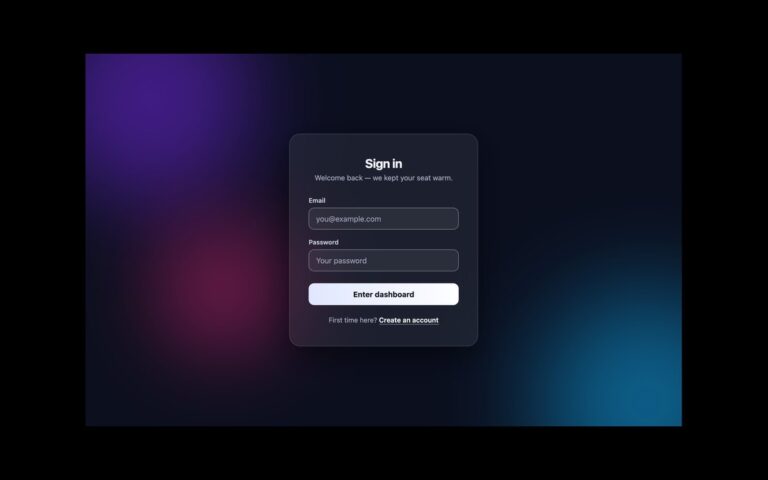
A login card floating over a full-bleed background, for brands that want a photograph or illustration on the sign-in page. The wrapper paints two layers behind the content: a backdrop, here three coloured radial gradients over a deep blue so the file stays self-contained, and a dark top-to-bottom scrim that keeps white text readable whatever image you swap in. The card itself is translucent navy with an 18px backdrop blur, a thin white border and a large soft shadow. Inside are the email and password fields, a remember-me checkbox with a forgotten-password link, a white Sign in button that lifts slightly on hover, and a create-account link. A caption under the card tells developers how to replace the gradient. Use it for consumer products, events and portfolios where the background carries the brand. To use a photo, set background-image on the ::before layer and keep the ::after scrim. The Bootstrap version uses a translucent .card in dark colour mode; the Tailwind version draws both layers with before: and after: utilities.

What’s included

  • Backdrop and scrim as two pseudo-element layers
  • Translucent card with an 18px backdrop blur
  • Field borders raised to 45% white for a visible edge
  • White checkbox and focus outlines that show on dark glass
  • Hover lift removed under prefers-reduced-motion

Accessibility

Both fields have visible labels and username and current-password autocomplete tokens; the short Forgot link is named Forgot password. Focus shows a white outline or a white ring, chosen to stand out on the dark card. The scrim keeps text contrast independent of the image, and the button lift and transitions stop under prefers-reduced-motion.

Customise it

Replace the gradient on .lf::before (plain CSS, Bootstrap) or the before:bg-[...] utility (Tailwind) with your image, and tune the scrim alpha on ::after. Card tint and blur are the rgba background and backdrop-filter values on the card.