About this set
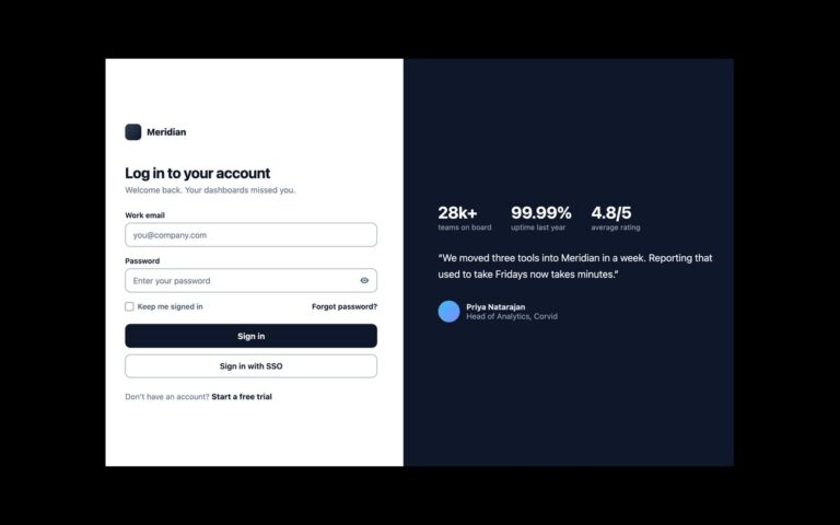
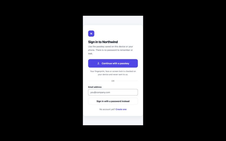
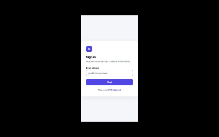
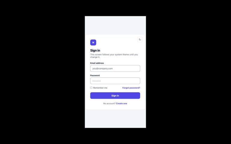
A full-page sign-in screen in two halves. On the left, an indigo-to-violet gradient panel carries the product name, a headline, a short pitch and a customer quote. On the right, a plain form asks for an email address and password, with a Remember me checkbox, a Forgot password link, an indigo Sign in button and a link to create an account. Below 880 pixels the brand panel is hidden and the form takes the whole screen, so phones get a short, focused page. Use it for SaaS and workspace products where the login page is also the first thing a returning customer sees and a little marketing space is welcome. Every field has a visible label above it, the email field uses autocomplete=”username” and the password field autocomplete=”current-password”, so browsers and password managers fill them correctly. The form is front end only: the demo cancels submission, and you point the action at your own sign-in endpoint. The Bootstrap version uses .form-control, .form-check and a recoloured .btn; the Tailwind version uses a min-[880px]:flex breakpoint for the panel.
What’s included
- Gradient brand panel with headline and quote, hidden below 880px
- Visible labels, autocomplete="username" and "current-password"
- Remember me checkbox and Forgot password link on one row
- Input borders darkened to 3:1 against white
- Plain CSS, Bootstrap 5 and Tailwind CSS 4 versions of the same design
Accessibility
Each input has a visible label tied to it with for and id, and the checkbox sits inside its label. Inputs show a coloured border and ring on focus; links, the checkbox and the button show a 2px indigo outline on keyboard focus. Transitions are removed under prefers-reduced-motion.
Customise it
Change --sp-brand, --sp-brand2 and --sp-line on .sp in plain CSS or Bootstrap. In Tailwind edit the --color-sp-* theme colours; the gradient is bg-linear-135 from-sp-brand to-sp-brand2.