About this set
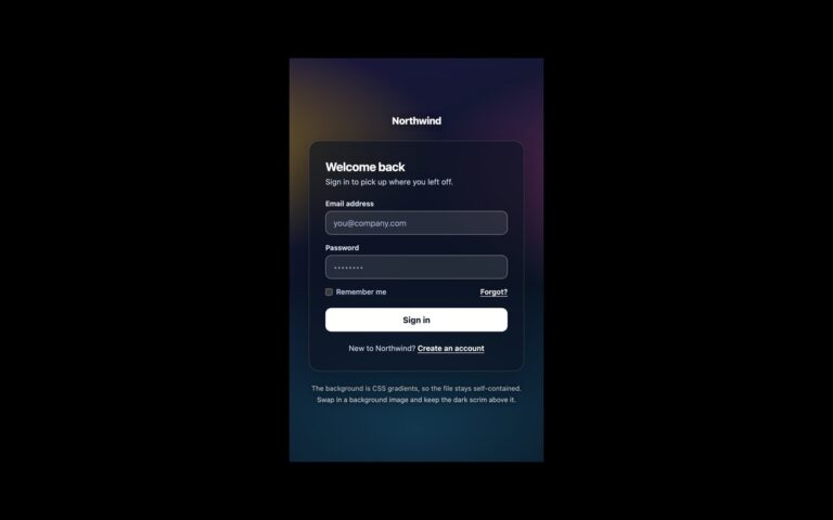
A dark sign-in screen with a frosted glass card floating over three large blurred colour blobs in violet, sky blue and pink. The blobs drift slowly on 14 to 21 second loops, and the card blurs whatever is behind it with backdrop-filter, so the colours move softly through the glass. The card holds a centred heading, a short welcome line, email and password fields with visible labels, a pale gradient Enter dashboard button and a link to create an account. Use it for apps with a dark interface, creative tools or a product launch where the login screen should feel atmospheric. The field borders were lightened from the original so they reach 3:1 against the dark card, and placeholder text was brightened to meet 4.5:1. The drift animation and the button lift on hover stop completely when the visitor prefers reduced motion. The Bootstrap version turns .card translucent through its –bs-card-* variables and restyles .form-control for a dark surface; the Tailwind version defines the drift keyframes in @theme and applies them with motion-safe:.
What’s included
- Frosted card using backdrop-filter blur over animated colour blobs
- Blob drift and hover lift disabled under prefers-reduced-motion
- Dark-surface fields with 3:1 borders and 4.5:1 placeholder text
- Visible labels and autocomplete attributes on both fields
- Bootstrap .card made translucent through CSS variables
Accessibility
Both fields have visible labels, the decorative blobs are aria-hidden, and text on the card meets WCAG AA contrast. Inputs brighten their border and gain a ring on focus; the button and link show a 2px white outline on keyboard focus. All animation and transitions stop under prefers-reduced-motion.
Customise it
Change the blob colours on .gl-b1 to .gl-b3 and --gl-line for the field borders. In Tailwind edit the bg-[#...] colours on the three blob divs and the --animate-gl-drift timing in @theme.