About this set
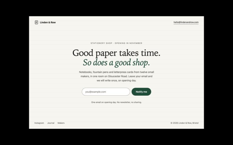
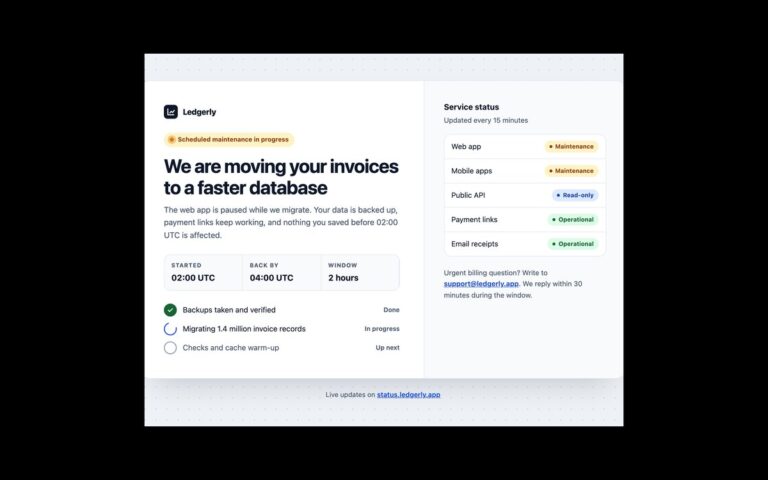
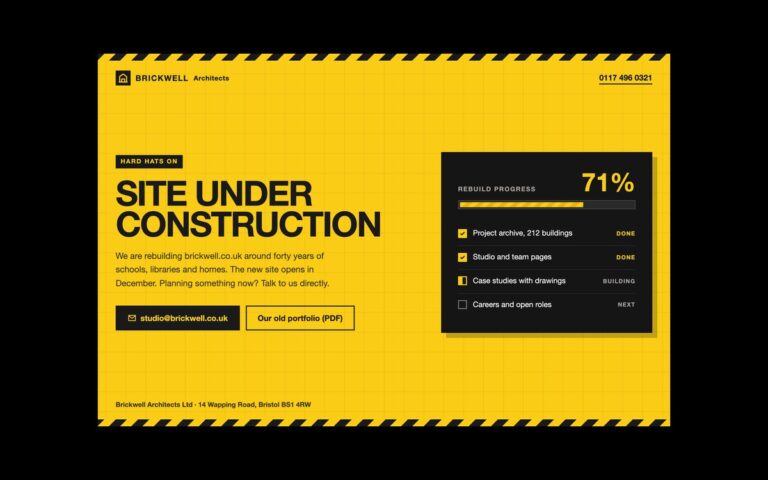
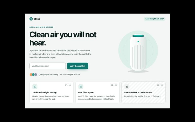
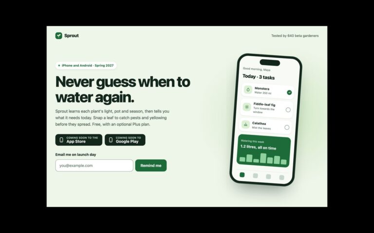
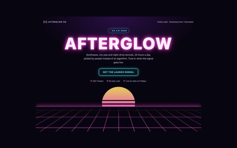
A two-column coming soon page with the message on one side and a full-height image on the other. The demo is an outdoor shop opening its first store: a logo, an eyebrow with a rule, a slab-serif headline with the opening date, a paragraph with the address, a two-item fact strip for the opening day and what is free on the day, and a form to request an invite to opening night with a visible label. The right half is an inline SVG landscape of ridges and pines at sunrise with a location caption in a dark pill, and a comment shows how to swap in a photo with an img element. Use it for a physical opening, a restaurant, a studio or anything where a picture sells the place better than words. Both halves are equal columns that fill the viewport. Below 768 pixels the image moves to the top as a 240 pixel band and the content follows. The invite form is front end only: it validates the address and shows a confirmation that tells the visitor what happens next.
What’s included
- Equal split with a full-height image column
- Inline SVG landscape, with a comment on swapping in a photo
- Opening facts in a description list
- Visible form label and an invite confirmation
- Image moves to a top band on small screens
Accessibility
The illustration has role="img" and an aria-label, and the caption is real text in a figcaption with 4.5:1 contrast on its dark pill. The form label is visible, the error is an aria-live region linked with aria-describedby, the field gets aria-invalid when wrong, and focus moves to the confirmation on success. Links, the field and the button show a 2px green focus outline, and the button's transition is removed under prefers-reduced-motion.
Customise it
Colours are --sp-bg, --sp-ink and --sp-accent on .sp (plain CSS and Bootstrap) or the --color-sp-* theme colours in Tailwind, and the headline font is the Rockwell stack. To use a photo, put an img inside .sp-media; it is absolutely positioned with object-fit: cover.