/* ── Neobrutalism UI kit tokens (uiCookies) — identical in every set ─────────────
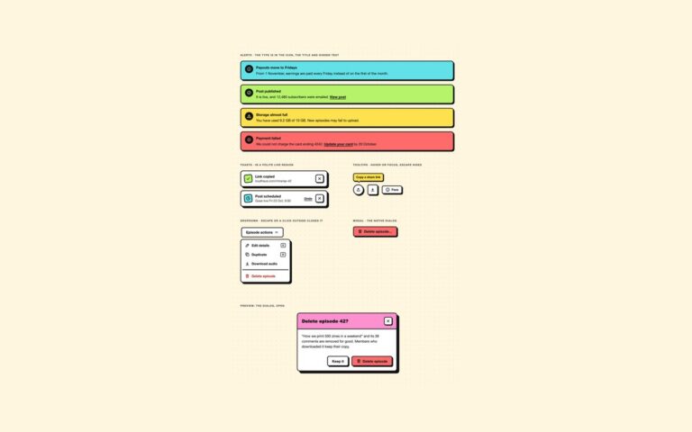
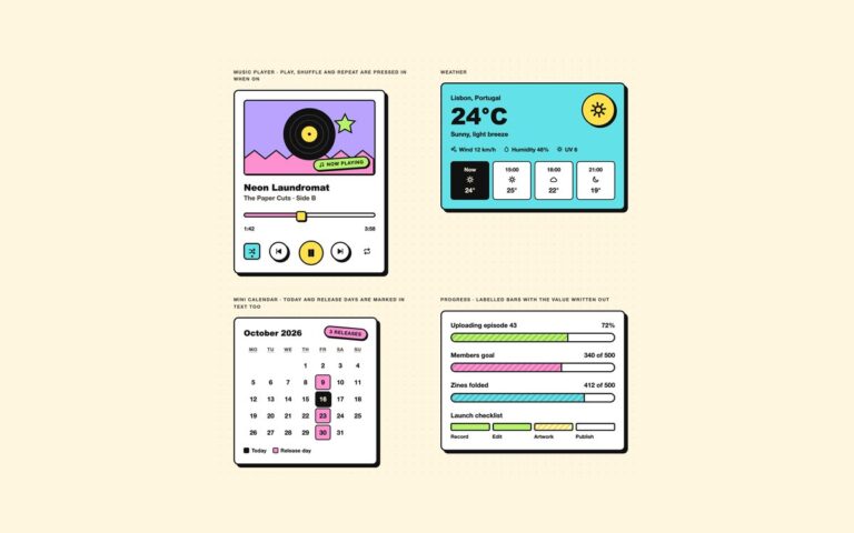
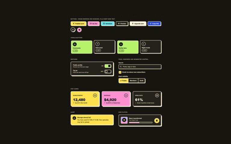
   Thick ink borders, hard offset shadows and flat saturated fills on cream paper.
   Change a token and the whole kit follows; the border and shadow recipes below are built from them. */
:root{
  --nb-paper:#fff6e0;        /* page background, cream */
  --nb-surface:#ffffff;      /* card, field and button faces */
  --nb-ink:#111111;          /* text, 17.5:1 on paper */
  --nb-muted:#454036;        /* secondary text, 9.6:1 on paper */
  --nb-line:#111111;         /* border colour */
  --nb-bw:3px;               /* border width */
  --nb-shadow-x:4px;         /* hard shadow offset; pressed controls move this far into it */
  --nb-shadow-y:4px;
  --nb-shadow-color:#111111;
  --nb-radius:12px;          /* cards and panels */
  --nb-radius-sm:8px;        /* buttons and fields */
  --nb-focus:#1d4ed8;        /* dashed focus outline, 6.2:1 on paper, never the shadow */
  --nb-on-fill:#111111;      /* text on every palette fill below, 6.8:1 or more */
  --nb-on-fill-muted:#2b2822;/* secondary text on fills, 5.2:1 or more */
  --nb-lemon:#ffe14d;--nb-pink:#ff90d0;--nb-cyan:#62e2e8;--nb-lime:#b6f36a;
  --nb-orange:#ffa94d;--nb-violet:#b9a3ff;--nb-red:#ff6b6b;
  --nb-blue:#2448e0;--nb-on-blue:#ffffff; /* the only fill that takes white text, 6.8:1 */
  --nb-danger:#b42318;       /* destructive text, 6.1:1 on paper */
  --nb-font:"Space Grotesk","Archivo","Helvetica Neue",Arial,system-ui,sans-serif;
  --nb-font-display:"Archivo Black","Arial Black","Helvetica Neue",Arial,sans-serif;
}
/* Dark brutalism: data-nb="dark" on any wrapper, or a checked .nb-theme-input inside a [data-nb] element.
   :is() is a forgiving list, so browsers without :has() still apply data-nb="dark". Fills keep dark text. */
[data-nb]:is([data-nb="dark"],:has(.nb-theme-input:checked)){
  --nb-paper:#17150f;--nb-surface:#25221b;--nb-ink:#fbf3dc;--nb-muted:#d6ccb2;--nb-line:#fbf3dc;
  --nb-shadow-color:#fbf3dc;--nb-focus:#8db4ff;--nb-danger:#ff9b8f;color-scheme:dark}
/* More contrast requested: secondary text turns full ink */
@media (prefers-contrast:more){:root,[data-nb]:is([data-nb],:has(.nb-theme-input:checked)){--nb-muted:var(--nb-ink);--nb-on-fill-muted:var(--nb-on-fill)}}
:root,[data-nb]{
  --nb-border:var(--nb-bw) solid var(--nb-line);
  --nb-shadow:var(--nb-shadow-x) var(--nb-shadow-y) 0 0 var(--nb-shadow-color);
  --nb-shadow-sm:calc(var(--nb-shadow-x)*.5) calc(var(--nb-shadow-y)*.5) 0 0 var(--nb-shadow-color);
  --nb-shadow-lg:calc(var(--nb-shadow-x)*1.75) calc(var(--nb-shadow-y)*1.75) 0 0 var(--nb-shadow-color);
  --nb-shadow-hover:calc(var(--nb-shadow-x) + 2px) calc(var(--nb-shadow-y) + 2px) 0 0 var(--nb-shadow-color);
  --nb-press:var(--nb-shadow-x) var(--nb-shadow-y);                       /* translate for a pressed control */
  --nb-press-sm:calc(var(--nb-shadow-x)*.5) calc(var(--nb-shadow-y)*.5);  /* …for one with the small shadow */
}
[data-nb]{background:var(--nb-paper);color:var(--nb-ink);font-family:var(--nb-font)}
/* Components */
:where([class*="nb-"]),:where([class*="nb-"])::before,:where([class*="nb-"])::after{box-sizing:border-box}
.nb-sr{position:absolute;width:1px;height:1px;padding:0;margin:-1px;overflow:hidden;clip:rect(0,0,0,0);white-space:nowrap;border:0}
.nb-ico{width:20px;height:20px;flex:none}
.nb-display{font-family:var(--nb-font-display);font-weight:900;letter-spacing:-.01em;line-height:1.05}
.nb-link{color:inherit;font-weight:700;text-decoration:underline;text-decoration-thickness:2px;text-underline-offset:3px}
.nb-link:hover{text-decoration-thickness:4px}
.nb-link:focus-visible{outline:3px dashed var(--nb-focus);outline-offset:3px;border-radius:2px}
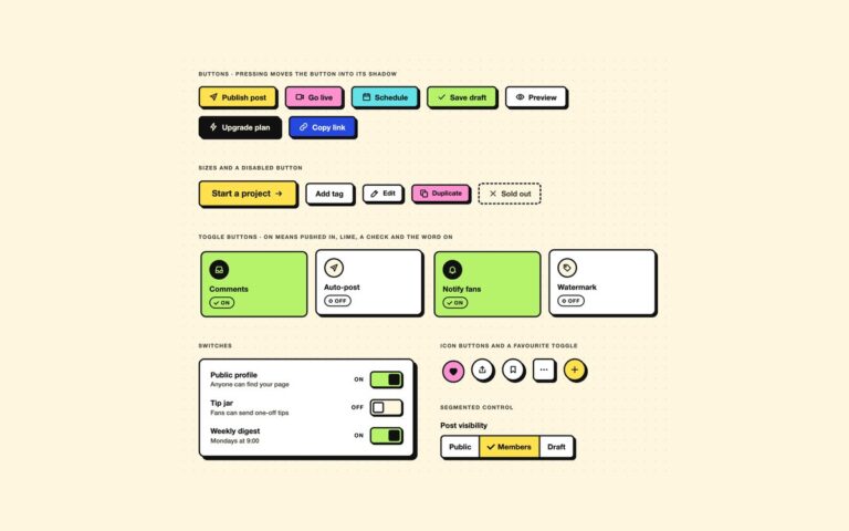
/* Buttons: a face, a thick border and a hard shadow. Hover lifts it, pressing moves it into its shadow */
.nb-btn{--nb-fill:var(--nb-surface);--nb-text:var(--nb-ink);
  display:inline-flex;align-items:center;justify-content:center;gap:.5rem;min-height:46px;padding:.6rem 1.2rem;
  border:var(--nb-border);border-radius:var(--nb-radius-sm);background:var(--nb-fill);color:var(--nb-text);
  font:700 1rem/1.2 var(--nb-font);text-decoration:none;cursor:pointer;box-shadow:var(--nb-shadow);
  transition:translate .12s,box-shadow .12s}
.nb-btn:hover{translate:-2px -2px;box-shadow:var(--nb-shadow-hover)}
.nb-btn:active{translate:var(--nb-press);box-shadow:none}
.nb-btn:focus-visible{outline:3px dashed var(--nb-focus);outline-offset:5px}
.nb-btn--lemon{--nb-fill:var(--nb-lemon);--nb-text:var(--nb-on-fill)}
.nb-btn--pink{--nb-fill:var(--nb-pink);--nb-text:var(--nb-on-fill)}
.nb-btn--cyan{--nb-fill:var(--nb-cyan);--nb-text:var(--nb-on-fill)}
.nb-btn--lime{--nb-fill:var(--nb-lime);--nb-text:var(--nb-on-fill)}
.nb-btn--red{--nb-fill:var(--nb-red);--nb-text:var(--nb-on-fill)}
.nb-btn--blue{--nb-fill:var(--nb-blue);--nb-text:var(--nb-on-blue)}
.nb-btn--ink{--nb-fill:var(--nb-ink);--nb-text:var(--nb-paper)}
.nb-btn--sm{min-height:38px;padding:.4rem .85rem;font-size:.875rem}
.nb-btn--lg{min-height:56px;padding:.8rem 1.6rem;font-size:1.15rem}
.nb-btn--block{width:100%}
.nb-btn--icon{width:48px;height:48px;min-height:0;padding:0}
.nb-btn--icon-sm{width:38px;height:38px;box-shadow:var(--nb-shadow-sm)}
.nb-btn--icon-sm:hover{box-shadow:var(--nb-shadow)}
.nb-btn--icon-sm:active{translate:var(--nb-press-sm)}
.nb-btn--round{border-radius:50%}
.nb-btn:disabled{--nb-fill:var(--nb-paper);--nb-text:var(--nb-muted);border-style:dashed;box-shadow:none;translate:none;cursor:not-allowed}
/* Switches: a checkbox with role="switch". On = the square knob slides right, the track fills lime and the label says On */
.nb-switch{position:relative;display:flex;align-items:center;gap:.8rem;cursor:pointer}
.nb-switch__text{flex:1;min-width:0;font-weight:800;line-height:1.3}
.nb-switch__text small{display:block;margin-top:.1rem;font-size:.85rem;font-weight:500;color:var(--nb-muted)}
.nb-switch__state{min-width:2.2em;font-size:.75rem;font-weight:800;letter-spacing:.08em;text-align:right;text-transform:uppercase}
.nb-switch__state::after{content:"Off"}
.nb-switch__track{position:relative;flex:none;width:70px;height:36px;border:var(--nb-border);border-radius:var(--nb-radius-sm);background:var(--nb-paper);
  box-shadow:var(--nb-shadow-sm);transition:background-color .12s}
.nb-switch__track::before{content:"";position:absolute;top:3px;left:3px;width:24px;height:24px;border:var(--nb-border);border-radius:4px;background:var(--nb-surface);transition:translate .15s}
.nb-switch input:checked~.nb-switch__track{background:var(--nb-lime)}
.nb-switch input:checked~.nb-switch__track::before{translate:34px 0;border-color:var(--nb-on-fill);background:var(--nb-on-fill)}
.nb-switch input:checked~.nb-switch__state::after{content:"On"}
.nb-switch input:focus-visible~.nb-switch__track{outline:3px dashed var(--nb-focus);outline-offset:4px}
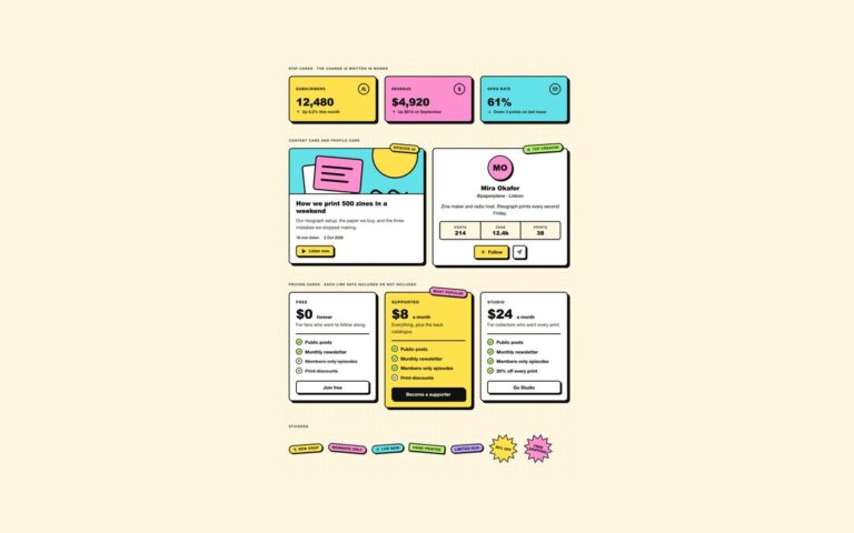
/* Card: a white panel, the thick border and the large hard shadow. Fill variants keep dark text */
.nb-card{position:relative;padding:1.4rem;border:var(--nb-border);border-radius:var(--nb-radius);background:var(--nb-surface);color:var(--nb-ink);box-shadow:var(--nb-shadow-lg);font-family:var(--nb-font)}
.nb-card h2,.nb-card h3,.nb-card p{margin:0}
.nb-card--lemon,.nb-card--pink,.nb-card--cyan,.nb-card--lime,.nb-card--orange,.nb-card--violet{--nb-muted:var(--nb-on-fill-muted);color:var(--nb-on-fill)}
.nb-card--lemon{background:var(--nb-lemon)}.nb-card--pink{background:var(--nb-pink)}.nb-card--cyan{background:var(--nb-cyan)}
.nb-card--lime{background:var(--nb-lime)}.nb-card--orange{background:var(--nb-orange)}.nb-card--violet{background:var(--nb-violet)}
/* Stickers: tilted labels that sit on or over a card */
.nb-sticker{display:inline-flex;align-items:center;gap:.35rem;width:max-content;padding:.3rem .7rem;border:var(--nb-border);border-radius:999px;
  background:var(--nb-lemon);color:var(--nb-on-fill);font:800 .75rem/1.1 var(--nb-font);letter-spacing:.06em;text-transform:uppercase;box-shadow:var(--nb-shadow-sm);rotate:-4deg}
.nb-sticker .nb-ico{width:14px;height:14px}
.nb-sticker--pink{background:var(--nb-pink)}.nb-sticker--cyan{background:var(--nb-cyan)}.nb-sticker--lime{background:var(--nb-lime)}
.nb-sticker--orange{background:var(--nb-orange)}.nb-sticker--violet{background:var(--nb-violet)}
.nb-sticker--right{rotate:5deg}
.nb-sticker--corner{position:absolute;top:-16px;right:14px;z-index:2}
.nb-sticker--square{border-radius:4px}
/* Layout helpers */
.nb-cluster{display:flex;flex-wrap:wrap;align-items:center;gap:18px}
.nb-tiles{display:grid;grid-template-columns:repeat(auto-fit,minmax(150px,1fr));gap:20px}
.nb-grid{display:grid;grid-template-columns:repeat(auto-fit,minmax(min(100%,260px),1fr));gap:28px;align-items:start}
.nb-stack{display:grid;gap:1.25rem}
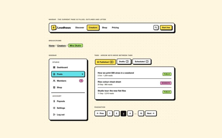
/* Navbar: the current link is filled, outlined and lifted on a small shadow, with aria-current */
.nb-navbar{display:flex;flex-wrap:wrap;align-items:center;gap:.75rem 1.25rem;padding:.75rem 1rem;border:var(--nb-border);border-radius:var(--nb-radius);background:var(--nb-surface);color:var(--nb-ink);box-shadow:var(--nb-shadow-lg);font-family:var(--nb-font)}
.nb-brand{display:inline-flex;align-items:center;gap:.55rem;color:var(--nb-ink);font:900 1.25rem/1 var(--nb-font-display);text-decoration:none}
.nb-brand__mark{display:grid;place-items:center;width:38px;height:38px;border:var(--nb-border);border-radius:8px;background:var(--nb-lemon);color:var(--nb-on-fill);box-shadow:var(--nb-shadow-sm);rotate:-6deg}
.nb-brand:focus-visible{outline:3px dashed var(--nb-focus);outline-offset:4px;border-radius:4px}
.nb-navbar__links{display:flex;flex-wrap:wrap;gap:.35rem;margin:0 auto 0 0;padding:0;list-style:none}
.nb-navlink{display:block;padding:.45rem .8rem;border:var(--nb-bw) solid transparent;border-radius:var(--nb-radius-sm);color:var(--nb-ink);font-weight:700;text-decoration:none}
.nb-navlink:hover{border-color:var(--nb-line)}
.nb-navlink[aria-current="page"]{border-color:var(--nb-line);background:var(--nb-lemon);color:var(--nb-on-fill);box-shadow:var(--nb-shadow-sm)}
.nb-navlink:focus-visible{outline:3px dashed var(--nb-focus);outline-offset:3px}
.nb-navbar__end{display:flex;align-items:center;gap:12px}
@media (max-width:680px){.nb-navbar__links{order:3;width:100%;margin:0}}
/* Stat cards: a label, a big figure, and the change written in words beside its arrow */
.nb-stat{display:grid;gap:.35rem}
.nb-stat__top{display:flex;align-items:center;justify-content:space-between;gap:.75rem}
.nb-stat__label{font-size:.8rem;font-weight:800;letter-spacing:.08em;text-transform:uppercase}
.nb-stat__icon{display:grid;place-items:center;width:40px;height:40px;border:var(--nb-bw) solid currentColor;border-radius:50%}
.nb-stat__value{font-size:2.3rem}
.nb-stat__delta{display:flex;align-items:center;gap:.35rem;font-size:.88rem;font-weight:700;color:var(--nb-muted)}
.nb-stat__delta .nb-ico{width:16px;height:16px}
/* Sidebar: grouped links; the current one is cyan, outlined and marked with an arrow */
.nb-side{width:100%;max-width:300px;padding:1rem;border:var(--nb-border);border-radius:var(--nb-radius);background:var(--nb-surface);color:var(--nb-ink);box-shadow:var(--nb-shadow-lg);font-family:var(--nb-font)}
.nb-side__group+.nb-side__group{margin-top:1rem;padding-top:1rem;border-top:var(--nb-border)}
.nb-side__heading{margin:0 0 .45rem;padding:0 .65rem;font-size:.75rem;font-weight:800;letter-spacing:.1em;text-transform:uppercase;color:var(--nb-muted)}
.nb-side__list{display:grid;gap:.3rem;margin:0;padding:0;list-style:none}
.nb-side__link{display:flex;align-items:center;gap:.7rem;padding:.55rem .65rem;border:var(--nb-bw) solid transparent;border-radius:var(--nb-radius-sm);color:var(--nb-ink);font-weight:700;text-decoration:none}
.nb-side__link:hover{border-color:var(--nb-line)}
.nb-side__link[aria-current="page"]{border-color:var(--nb-line);background:var(--nb-cyan);color:var(--nb-on-fill);box-shadow:var(--nb-shadow-sm)}
.nb-side__link[aria-current="page"]::after{content:"";margin-left:auto;border-style:solid;border-width:6px 0 6px 9px;border-color:transparent currentColor}
.nb-side__link:focus-visible{outline:3px dashed var(--nb-focus);outline-offset:3px}
.nb-count{margin-left:auto;min-width:1.7rem;padding:.05rem .4rem;border:2px solid var(--nb-line);border-radius:999px;background:var(--nb-pink);color:var(--nb-on-fill);font-size:.75rem;font-weight:800;text-align:center}
/* Tabs: the selected tab is pushed into its shadow, filled lemon and marked with a square; ARIA tabs with arrow keys */
.nb-tablist{display:flex;flex-wrap:wrap;gap:.6rem;margin-bottom:1.1rem}
.nb-tab{display:inline-flex;align-items:center;gap:.45rem;min-height:44px;padding:.5rem 1rem;border:var(--nb-border);border-radius:var(--nb-radius-sm);background:var(--nb-surface);color:var(--nb-ink);
  font:700 .95rem/1.2 var(--nb-font);box-shadow:var(--nb-shadow);cursor:pointer;transition:translate .12s,box-shadow .12s}
.nb-tab[aria-selected="true"]{translate:var(--nb-press);box-shadow:none;background:var(--nb-lemon);color:var(--nb-on-fill)}
.nb-tab[aria-selected="true"]::before{content:"";width:9px;height:9px;background:currentColor}
.nb-tab:focus-visible{outline:3px dashed var(--nb-focus);outline-offset:5px}
.nb-tab__count{padding:0 .4rem;border:2px solid currentColor;border-radius:999px;font-size:.75rem;font-weight:800}
.nb-tabpanel:focus-visible{outline:3px dashed var(--nb-focus);outline-offset:4px}
.nb-list{display:grid;margin:0;padding:0;list-style:none}
.nb-list li{display:flex;align-items:center;justify-content:space-between;gap:1rem;padding:.75rem 0;font-weight:700}
.nb-list li+li{border-top:2px solid var(--nb-line)}
.nb-list small{display:block;font-weight:500;color:var(--nb-muted)}
.nb-badge{flex:none;padding:.1rem .5rem;border:2px solid var(--nb-line);border-radius:5px;background:var(--nb-lime);color:var(--nb-on-fill);font-size:.75rem;font-weight:800;letter-spacing:.04em;text-transform:uppercase}
.nb-badge--lemon{background:var(--nb-lemon)}.nb-badge--cyan{background:var(--nb-cyan)}.nb-badge--pink{background:var(--nb-pink)}.nb-badge--paper{background:var(--nb-paper);color:var(--nb-ink)}
/* Progress: labelled bars with a hatched fill and the value written out */
.nb-progress{display:grid;gap:.45rem}
.nb-progress__top{display:flex;justify-content:space-between;gap:1rem;font-weight:800}
.nb-progress__top span{font-variant-numeric:tabular-nums}
.nb-bar{height:24px;border:var(--nb-border);border-radius:999px;background:var(--nb-surface);overflow:hidden}
.nb-bar__fill{display:block;width:var(--p);height:100%;border-right:var(--nb-border);background:repeating-linear-gradient(-45deg,transparent 0 8px,rgba(17,17,17,.22) 8px 11px),var(--nb-tone,var(--nb-lime))}
.nb-bar--pink{--nb-tone:var(--nb-pink)}.nb-bar--cyan{--nb-tone:var(--nb-cyan)}.nb-bar--lemon{--nb-tone:var(--nb-lemon)}
.nb-steps{display:grid;grid-template-columns:repeat(4,1fr);gap:6px;margin:0;padding:0;list-style:none;counter-reset:nb-step}
.nb-steps li{display:grid;gap:.35rem;font-size:.8rem;font-weight:800}
.nb-steps li::before{content:"";height:14px;border:var(--nb-border);border-radius:4px;background:var(--nb-surface)}
.nb-steps li.is-done::before{background:var(--nb-lime)}
.nb-steps li[aria-current="step"]::before{background:repeating-linear-gradient(-45deg,var(--nb-lemon) 0 6px,var(--nb-surface) 6px 10px)}
/* Profile card */
.nb-profile{text-align:center}
.nb-avatar{display:grid;place-items:center;width:88px;height:88px;margin:0 auto .9rem;border:var(--nb-border);border-radius:50%;background:var(--nb-pink);color:var(--nb-on-fill);
  font:900 1.8rem/1 var(--nb-font-display);box-shadow:var(--nb-shadow)}
.nb-profile__handle{margin-top:.15rem!important;font-weight:600;color:var(--nb-muted)}
.nb-profile__bio{margin:.8rem 0 1rem!important}
.nb-dl{display:grid;grid-template-columns:repeat(3,1fr);margin:0 0 1.2rem;border:var(--nb-border);border-radius:var(--nb-radius-sm);overflow:hidden}
.nb-dl div{padding:.6rem .3rem;background:var(--nb-paper)}
.nb-dl div+div{border-left:var(--nb-border)}
.nb-dl dt{font-size:.72rem;font-weight:800;letter-spacing:.08em;text-transform:uppercase;color:var(--nb-muted)}
.nb-dl dd{margin:0;font:900 1.2rem/1.2 var(--nb-font-display)}
.nb-actions{display:flex;flex-wrap:wrap;justify-content:center;gap:14px}
/* Creator dashboard: sidebar + main grid; the theme switch is a checkbox and :has() swaps every token */
.nb-dash{display:grid;grid-template-columns:250px minmax(0,1fr);border:var(--nb-border);border-radius:var(--nb-radius);overflow:hidden;box-shadow:var(--nb-shadow-lg);font-family:var(--nb-font)}
.nb-dash__side{display:flex;flex-direction:column;gap:1.4rem;padding:1.25rem;border-right:var(--nb-border);background:var(--nb-surface)}
.nb-dash__main{display:grid;gap:28px;align-content:start;min-width:0;padding:1.6rem}
.nb-dash__top{display:flex;flex-wrap:wrap;align-items:center;justify-content:space-between;gap:1rem 1.5rem}
.nb-dash__date{margin:0;font-weight:700;color:var(--nb-muted)}
.nb-dash__title{margin:.15rem 0 0;font-size:2.2rem}
.nb-dash__actions{display:flex;flex-wrap:wrap;align-items:center;gap:1.2rem}
.nb-dash__stats{display:grid;grid-template-columns:repeat(auto-fit,minmax(min(100%,190px),1fr));gap:22px}
.nb-dash__row{display:grid;grid-template-columns:minmax(0,1.35fr) minmax(0,1fr);gap:28px;align-items:start}
.nb-panel__head{display:flex;flex-wrap:wrap;align-items:center;justify-content:space-between;gap:.5rem 1rem;margin-bottom:1rem}
.nb-panel__title{margin:0;font-size:1.25rem}
.nb-promo{margin-top:auto;padding:1rem;border:var(--nb-border);border-radius:var(--nb-radius-sm);background:var(--nb-pink);color:var(--nb-on-fill);box-shadow:var(--nb-shadow)}
.nb-promo p{margin:0 0 .75rem;font-weight:700;line-height:1.35}
.nb-theme{gap:.6rem}
.nb-theme .nb-switch__text{flex:none}
.nb-chart{display:grid;grid-template-columns:repeat(7,minmax(0,1fr));align-items:end;gap:10px;height:190px;margin:0;padding:0;border-bottom:var(--nb-border);list-style:none}
.nb-chart li{display:flex;flex-direction:column;justify-content:flex-end;align-items:center;gap:.3rem;height:100%;font-size:.75rem;font-weight:800;font-variant-numeric:tabular-nums}
.nb-chart__bar{width:100%;height:var(--h);border:var(--nb-border);border-bottom:0;border-radius:6px 6px 0 0;background:var(--nb-lime)}
.nb-chart .is-top .nb-chart__bar{background:var(--nb-pink)}
.nb-chart-days{display:grid;grid-template-columns:repeat(7,minmax(0,1fr));gap:10px;margin:.4rem 0 0;font-size:.75rem;font-weight:800;text-align:center;color:var(--nb-muted)}
.nb-payout__amount{margin:.2rem 0 1rem!important;font-size:2.4rem}
.nb-payout .nb-actions{justify-content:flex-start;margin-top:1.1rem}
@media (max-width:1000px){.nb-dash__row{grid-template-columns:minmax(0,1fr)}}
@media (max-width:900px){.nb-dash{grid-template-columns:minmax(0,1fr)}.nb-dash__side{border-right:0;border-bottom:var(--nb-border)}
  .nb-dash__side .nb-side__list{display:flex;flex-wrap:wrap}.nb-promo{display:none}}
@media (max-width:600px){.nb-dash__main{padding:1.1rem}.nb-dash__title{font-size:1.8rem}.nb-chart,.nb-chart-days{gap:5px}}
@media (prefers-reduced-motion:reduce){[class*="nb-"],[class*="nb-"]::before,[class*="nb-"]::after{transition:none!important;animation:none!important}}
/* ── Neobrutalism UI kit tokens (uiCookies) — identical in every set ─────────────
   Thick ink borders, hard offset shadows and flat saturated fills on cream paper.
   Change a token and the whole kit follows; the border and shadow recipes below are built from them. */
:root{
  --nb-paper:#fff6e0;        /* page background, cream */
  --nb-surface:#ffffff;      /* card, field and button faces */
  --nb-ink:#111111;          /* text, 17.5:1 on paper */
  --nb-muted:#454036;        /* secondary text, 9.6:1 on paper */
  --nb-line:#111111;         /* border colour */
  --nb-bw:3px;               /* border width */
  --nb-shadow-x:4px;         /* hard shadow offset; pressed controls move this far into it */
  --nb-shadow-y:4px;
  --nb-shadow-color:#111111;
  --nb-radius:12px;          /* cards and panels */
  --nb-radius-sm:8px;        /* buttons and fields */
  --nb-focus:#1d4ed8;        /* dashed focus outline, 6.2:1 on paper, never the shadow */
  --nb-on-fill:#111111;      /* text on every palette fill below, 6.8:1 or more */
  --nb-on-fill-muted:#2b2822;/* secondary text on fills, 5.2:1 or more */
  --nb-lemon:#ffe14d;--nb-pink:#ff90d0;--nb-cyan:#62e2e8;--nb-lime:#b6f36a;
  --nb-orange:#ffa94d;--nb-violet:#b9a3ff;--nb-red:#ff6b6b;
  --nb-blue:#2448e0;--nb-on-blue:#ffffff; /* the only fill that takes white text, 6.8:1 */
  --nb-danger:#b42318;       /* destructive text, 6.1:1 on paper */
  --nb-font:"Space Grotesk","Archivo","Helvetica Neue",Arial,system-ui,sans-serif;
  --nb-font-display:"Archivo Black","Arial Black","Helvetica Neue",Arial,sans-serif;
}
/* Dark brutalism: data-nb="dark" on any wrapper, or a checked .nb-theme-input inside a [data-nb] element.
   :is() is a forgiving list, so browsers without :has() still apply data-nb="dark". Fills keep dark text. */
[data-nb]:is([data-nb="dark"],:has(.nb-theme-input:checked)){
  --nb-paper:#17150f;--nb-surface:#25221b;--nb-ink:#fbf3dc;--nb-muted:#d6ccb2;--nb-line:#fbf3dc;
  --nb-shadow-color:#fbf3dc;--nb-focus:#8db4ff;--nb-danger:#ff9b8f;color-scheme:dark}
/* More contrast requested: secondary text turns full ink */
@media (prefers-contrast:more){:root,[data-nb]:is([data-nb],:has(.nb-theme-input:checked)){--nb-muted:var(--nb-ink);--nb-on-fill-muted:var(--nb-on-fill)}}
:root,[data-nb]{
  --nb-border:var(--nb-bw) solid var(--nb-line);
  --nb-shadow:var(--nb-shadow-x) var(--nb-shadow-y) 0 0 var(--nb-shadow-color);
  --nb-shadow-sm:calc(var(--nb-shadow-x)*.5) calc(var(--nb-shadow-y)*.5) 0 0 var(--nb-shadow-color);
  --nb-shadow-lg:calc(var(--nb-shadow-x)*1.75) calc(var(--nb-shadow-y)*1.75) 0 0 var(--nb-shadow-color);
  --nb-shadow-hover:calc(var(--nb-shadow-x) + 2px) calc(var(--nb-shadow-y) + 2px) 0 0 var(--nb-shadow-color);
  --nb-press:var(--nb-shadow-x) var(--nb-shadow-y);                       /* translate for a pressed control */
  --nb-press-sm:calc(var(--nb-shadow-x)*.5) calc(var(--nb-shadow-y)*.5);  /* …for one with the small shadow */
}
[data-nb]{background:var(--nb-paper);color:var(--nb-ink);font-family:var(--nb-font)}
/* The tokens above, exposed as Tailwind utilities: bg-nb-paper, bg-nb-lemon, text-nb-ink, border-nb-line,
   shadow-nb, shadow-nb-sm, shadow-nb-lg, rounded-nb, rounded-nb-sm, font-nb, font-nb-display, outline-nb-focus… */
@theme inline {
  --color-nb-paper: var(--nb-paper); --color-nb-surface: var(--nb-surface); --color-nb-ink: var(--nb-ink);
  --color-nb-muted: var(--nb-muted); --color-nb-line: var(--nb-line); --color-nb-focus: var(--nb-focus);
  --color-nb-on-fill: var(--nb-on-fill); --color-nb-on-fill-muted: var(--nb-on-fill-muted);
  --color-nb-lemon: var(--nb-lemon); --color-nb-pink: var(--nb-pink); --color-nb-cyan: var(--nb-cyan); --color-nb-lime: var(--nb-lime);
  --color-nb-orange: var(--nb-orange); --color-nb-violet: var(--nb-violet); --color-nb-red: var(--nb-red);
  --color-nb-blue: var(--nb-blue); --color-nb-on-blue: var(--nb-on-blue); --color-nb-danger: var(--nb-danger);
  --shadow-nb: var(--nb-shadow); --shadow-nb-sm: var(--nb-shadow-sm); --shadow-nb-lg: var(--nb-shadow-lg); --shadow-nb-hover: var(--nb-shadow-hover);
  --radius-nb: var(--nb-radius); --radius-nb-sm: var(--nb-radius-sm);
  --font-nb: var(--nb-font); --font-nb-display: var(--nb-font-display);
}
/* Starburst sticker outline (Tailwind has no clip-path utility) */
@utility clip-nb-burst {
  clip-path: polygon(50% 0%,59.1% 16.1%,75% 6.7%,74.8% 25.2%,93.3% 25%,83.9% 40.9%,100% 50%,83.9% 59.1%,93.3% 75%,74.8% 74.8%,75% 93.3%,59.1% 83.9%,50% 100%,40.9% 83.9%,25% 93.3%,25.2% 74.8%,6.7% 75%,16.1% 59.1%,0% 50%,16.1% 40.9%,6.7% 25%,25.2% 25.2%,25% 6.7%,40.9% 16.1%);
}
About this set
A full creator dashboard assembled from the kit, with a light and dark switch that needs no JavaScript. A sidebar with the logo, six links, a members count and a pink promo card sits beside a greeting, three stat cards for subscribers, revenue and open rate, a bar chart of the week’s earnings with the top day in pink, a coming up list of scheduled episodes and drops, a recent posts list with Public and Members badges, and a lemon payout card with the amount to withdraw, a progress bar toward the monthly goal and Withdraw and History buttons. The dark mode switch is a checkbox with the class nb-theme-input; the token block’s [data-nb]:has(.nb-theme-input:checked) rule swaps every token to the dark set, so the whole dashboard changes theme in CSS alone and the fills keep their dark text. The chart is an ordered list whose items read as Monday: $412, with the day labels hidden from screen readers. Use it as a starting point for a creator, newsletter or shop admin. Under 900 pixels the sidebar moves above the content and its links wrap, and the panels stack.
What’s included
Light and dark theme switch built on :has(), no JavaScript
Sidebar, stat cards, bar chart, lists, payout card and promo
Uses the same tokens and components as the rest of the kit
Bar chart as a readable ordered list
Bootstrap version on .card, .nav, .form-switch, .badge and .progress
Accessibility
The page has a labelled navigation with aria-current, one h1 and an h2 for each panel, and every panel is a section named by its heading. The theme switch is a native checkbox with role="switch" and a visible On or Off word, the chart reads each day with its amount, and the payout bar is a labelled progressbar. Focus shows a dashed outline in both themes, and transitions stop under prefers-reduced-motion.
Customise it
Change the --nb-* tokens on :root for the light theme and in the [data-nb] dark rule for the dark one. Column widths come from .nb-dash and .nb-dash__row; in Tailwind edit the min-[901px]:grid-cols-[250px_minmax(0,1fr)] utility on the root.