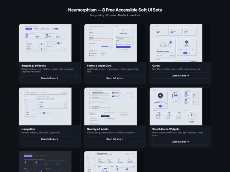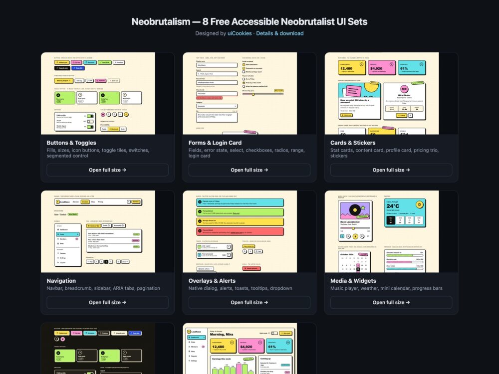
Neobrutalism is a free neobrutalist UI kit of eight sets, designed and maintained in-house by uiCookies. Every set comes in three versions that look the same: plain HTML and CSS, Bootstrap 5 with its own buttons, form controls, cards, navbar, pagination, alerts, toasts, dropdowns and progress bars restyled through CSS variables, and Tailwind CSS 4 with the tokens exposed as theme utilities. The sets cover buttons and toggles, form controls with a login card, cards and stickers, navigation, overlays and feedback, media widgets, a dark variant and a full creator dashboard. They all read the same token block, so one change to the ink, the paper, the border width, the shadow offset or a palette colour restyles the whole kit.
Neobrutalism, also called neubrutalism or neo brutalism, is known for thick black borders, hard offset shadows, flat saturated colours and bold type, and its high contrast is an advantage for accessibility if the details are right. The usual mistakes are white text on pastel fills, a focus ring that looks just like the black shadow, and on states shown only by a colour change. This kit keeps dark text on every fill at 6.8:1 or more and uses white text only on a deep blue that reaches 6.8:1. Keyboard focus is a dashed blue outline set apart from the shadow. Pressed, on, selected and current states move the element into its shadow and also add a check, a word such as On, a mark or aria-current, so they read without colour.
Free download Browse live demos All snippets
The sets
1. Neobrutalism Buttons & Toggles
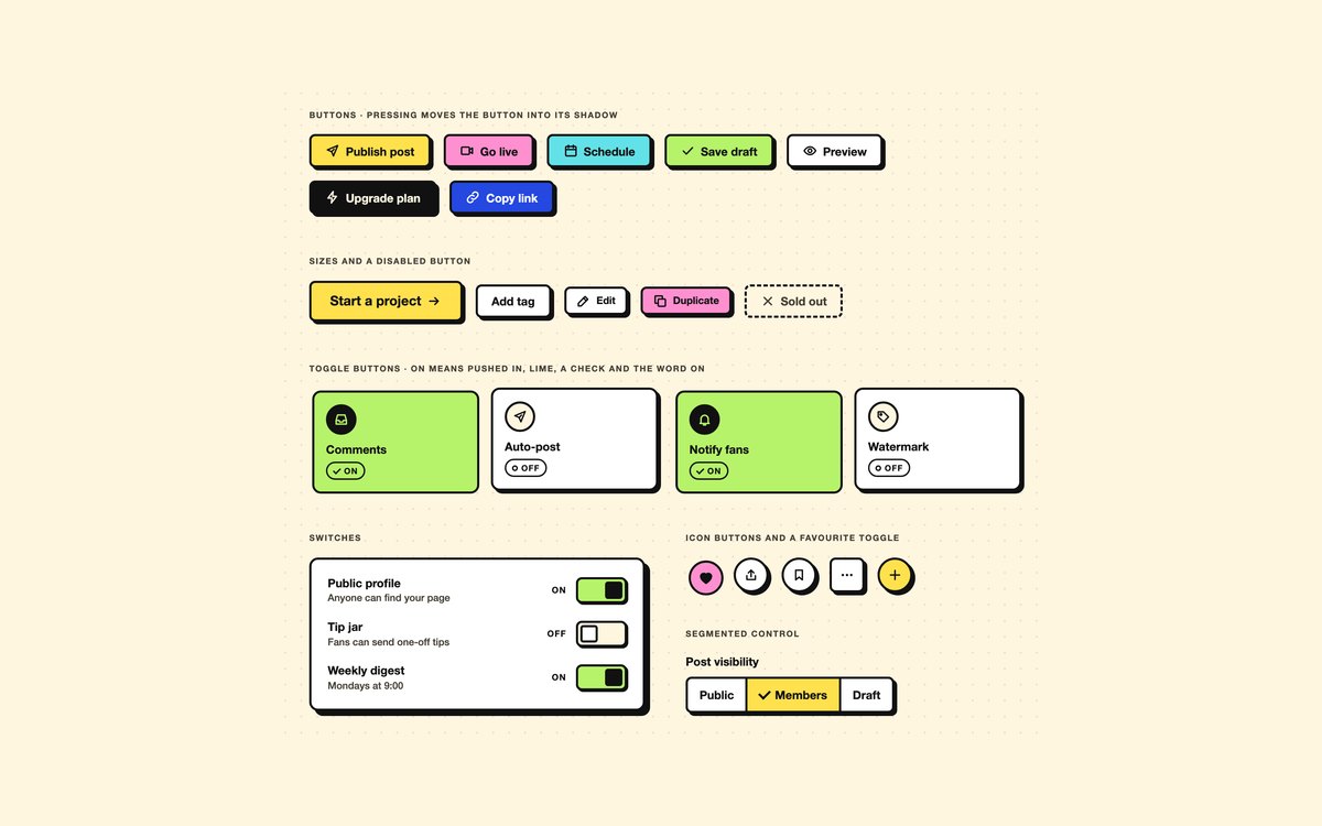
Buttons in seven fills and three sizes, a dashed disabled state, round and square icon buttons, a favourite toggle, toggle tiles, switch rows and a segmented control.
Pressing a button moves it into its own shadow, and toggle tiles add a check and the word On when they are on. The Bootstrap version uses .btn, .btn-check and .form-switch.
Live Demo CSS, Bootstrap & Tailwind code
2. Neobrutalism Forms & Login Card
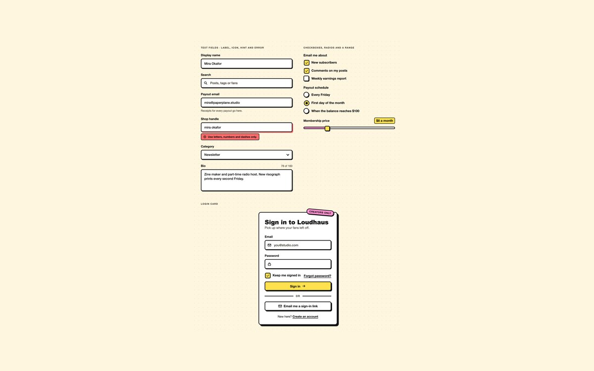
Text fields with an icon, a hint and an error state, a select, a textarea with a character count, checkboxes, radios, a price slider and a complete login card.
Errors are tied to their field with aria-describedby and shown by a red box and text, not only a colour. Bootstrap uses .form-control, .form-select, .form-check-input and .form-range.
Live Demo CSS, Bootstrap & Tailwind code
3. Neobrutalism Cards
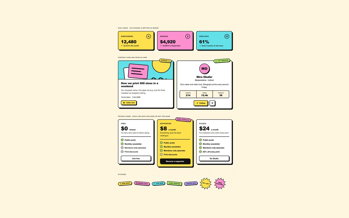
Stat cards for subscribers, revenue and open rate, a content card with SVG cover art, a profile card, three pricing cards and a sheet of stickers.
Use them for dashboards, articles and upgrade pages. Changes are written in words next to their arrows, and the featured plan has a visible Most popular sticker.
Live Demo CSS, Bootstrap & Tailwind code
4. Neobrutalism Navigation
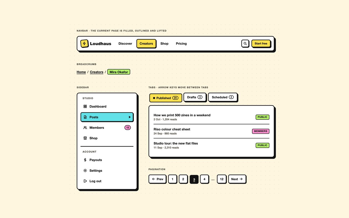
A navbar, a breadcrumb, a grouped sidebar with an unread count, tabs for published, draft and scheduled posts, and square pagination.
The current item gains a border and a fill and is marked with aria-current. The tabs follow the ARIA pattern with arrow keys, and Bootstrap uses its own tab plugin.
Live Demo CSS, Bootstrap & Tailwind code
5. Neobrutalism Overlays & Alerts
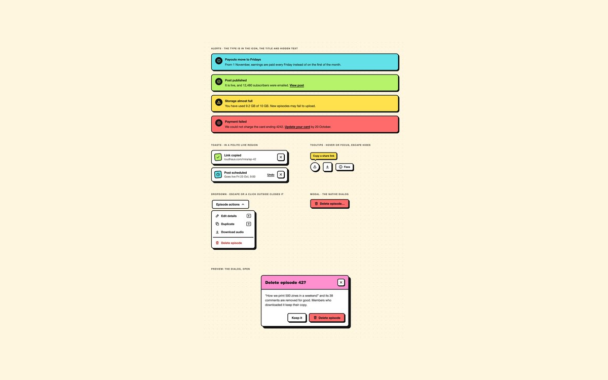
Information, success, warning and error alerts, toasts with Undo and close buttons, tooltips, a dropdown of episode actions and a confirmation modal.
The modal is the native dialog element, so focus is trapped and Escape closes it. Alerts name their type in an icon, a title and hidden text.
Live Demo CSS, Bootstrap & Tailwind code
6. Neobrutalism Media & Widgets
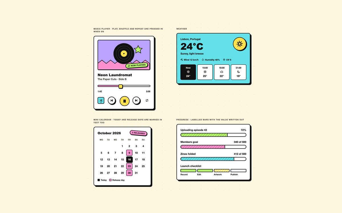
A music player with a working seek bar, a weather card with hourly tiles, a mini calendar for October 2026 and hatched progress bars with a step checklist.
The calendar is a real table with hidden text for today and release days, and the bars are labelled progressbars. A short script keeps the seek time in step.
Live Demo CSS, Bootstrap & Tailwind code
7. Dark Neobrutalism UI
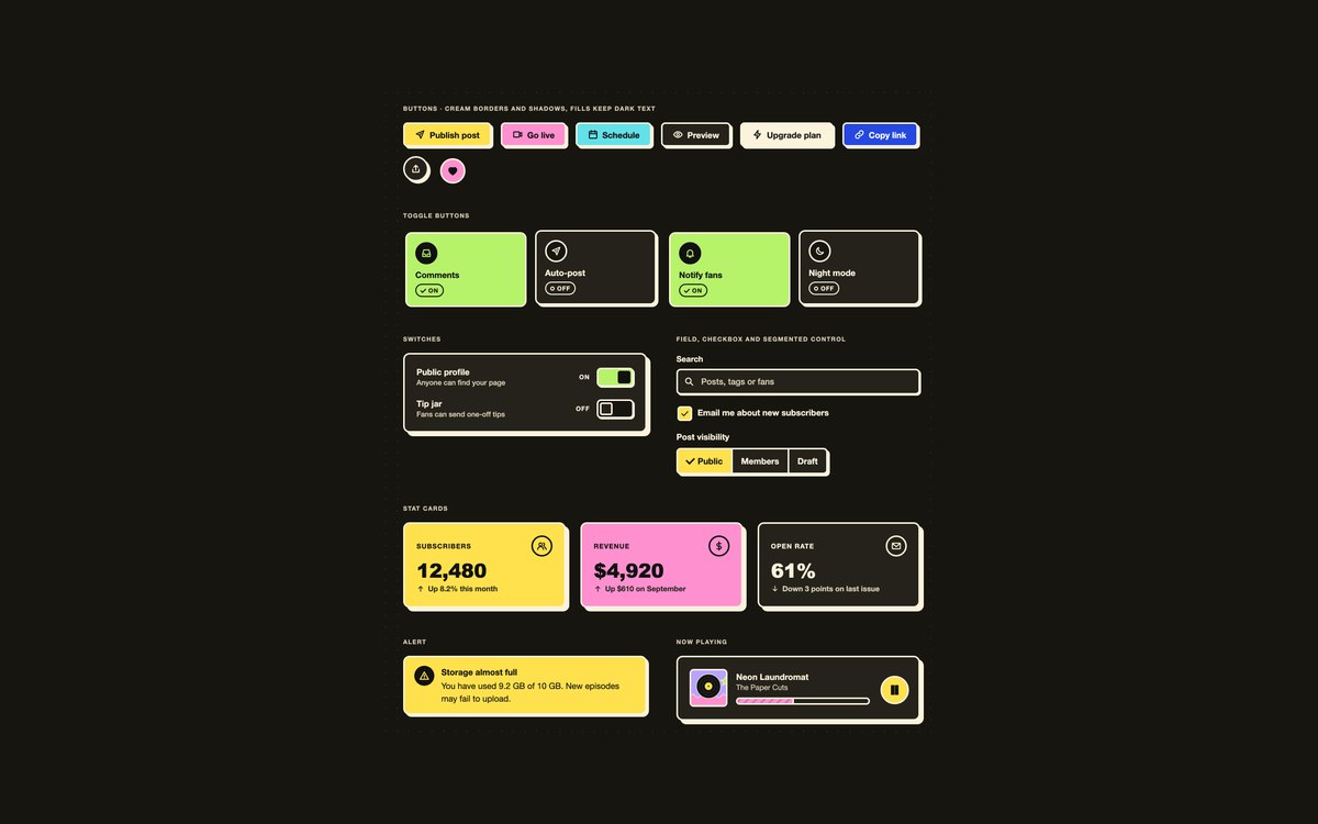
Buttons, toggle tiles, switches, a search field, a segmented control, stat cards, an alert and a now playing bar on near-black paper.
One attribute, data-nb="dark", swaps every token to cream borders and shadows while the fills keep dark text. Bootstrap pairs it with data-bs-theme="dark".
Live Demo CSS, Bootstrap & Tailwind code
8. Neobrutalism Creator Dashboard
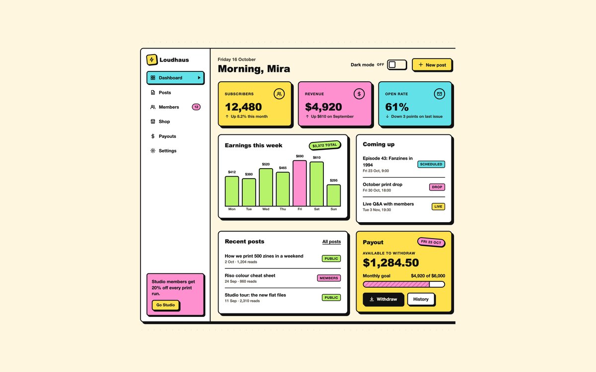
A full creator dashboard with a sidebar, stat cards, a weekly earnings chart, upcoming and recent post lists and a payout card.
The dark mode switch is a checkbox and :has() re-themes the whole page with no JavaScript. Under 900 pixels the sidebar moves above the content and the panels stack.
Live Demo CSS, Bootstrap & Tailwind code
Frequently asked questions
Is this neobrutalism UI kit free for commercial projects?
Yes. Every set is free for personal and commercial projects, including client work and products you sell. Attribution is optional but always welcome. The licence is at uicookies.com/license/.
Does the kit need JavaScript?
Most of it does not. Buttons, toggles, switches, the segmented control, cards, stickers, the sidebar, pagination, tooltips and the dashboard’s dark mode switch are HTML and CSS. Short vanilla scripts paint the range sliders, run the plain and Tailwind tabs, open the dialog, close toasts and the dropdown, and update the music player’s seek time. The Bootstrap versions use Bootstrap’s bundle for tabs, toasts and the dropdown.
Is neobrutalism accessible?
It can be, because its black borders and flat fills give strong contrast. This kit keeps dark text on every fill at 6.8:1 or more, uses white text only on a blue that reaches 6.8:1, draws keyboard focus as a dashed blue outline that is distinct from the offset shadow, and shows every on, selected or current state with a check, a word or a mark as well as colour. Motion stops under prefers-reduced-motion, and every set passes an automated axe-core WCAG 2.1 AA check.
Which frameworks are included?
Every set has three files that look the same: plain HTML and CSS, Bootstrap 5.3.8 and Tailwind CSS 4. Bootstrap’s own components are restyled by mapping its –bs-* variables to the kit tokens, with a small style block for the rest. The Tailwind files map the tokens into an @theme inline block, which gives utilities such as bg-nb-lemon, shadow-nb, shadow-nb-lg and rounded-nb.
How do I make a neobrutalist shadow in CSS?
Use a box shadow with an offset and no blur in a solid colour, such as 4px 4px 0 0 #111, on an element with a thick solid border. For a pressed state, translate the element by the same offset and remove the shadow, so it looks pushed into it. This kit builds those values from the –nb-shadow-x, –nb-shadow-y, –nb-shadow-color and –nb-bw tokens, so changing one value changes every component.