About this set
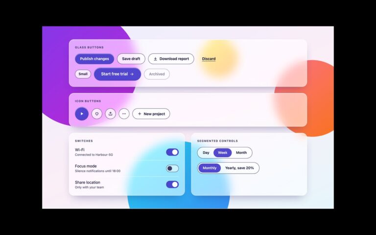
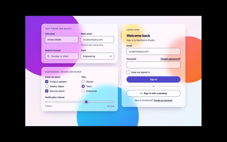
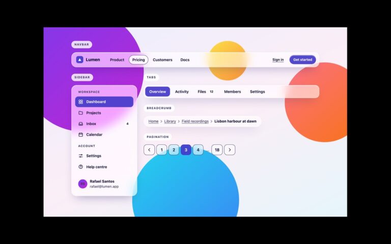
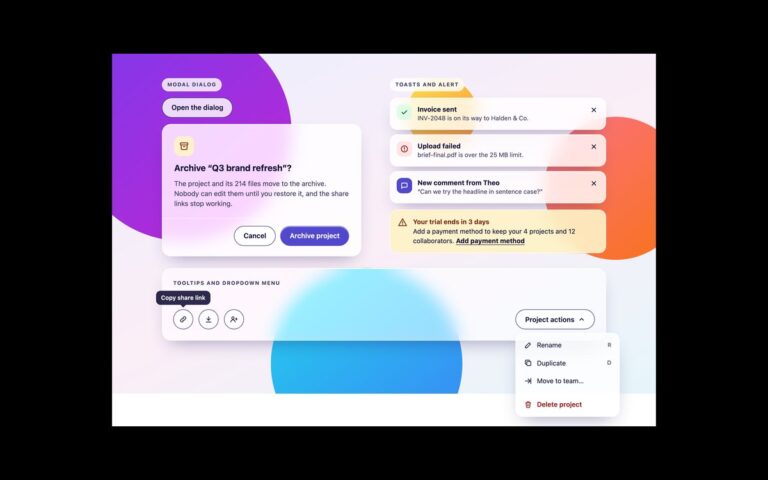
Four glass cards from the uiCookies glassmorphism UI kit, laid out side by side so you can see one design language across them. The content card has an illustrated cover, a tag chip, a linked headline, a short excerpt and an author line. The stat tile shows active subscribers with a large figure, a percentage change in a green chip, two small sub-figures and a sparkline whose meaning is repeated as visually hidden text. The profile card has an initials avatar, name and role, three counts in a description list and Follow and Message buttons. The pricing card has a Most popular chip, a large price, the billing note, a feature list with ticks and an accent trial button. All four use the same glass surface, so a frosted panel, a tinted chip and an accent button look the same wherever they appear. Small text on glass is set in the darker –glass-ink-soft rather than a pale grey, the delta chip has its own light background so green text keeps its contrast over any orb, and the captions above the cards sit on a frosted scrim. The Bootstrap version feeds the tokens into Bootstrap’s own component variables, and the Tailwind version maps them to theme utilities such as bg-glass, border-glass-edge, backdrop-blur-glass and text-ink.
What’s included
- Content card with cover art, tag, headline link and byline
- Stat tile with delta chip, sub-figures and a text alternative for the sparkline
- Profile card with avatar, counts and two actions
- Pricing card with a visible Most popular label and feature list
- Same glass surface, chips and buttons across all four
Accessibility
Each card is an article with a heading, the headline is a real link with a visible focus outline, and decorative art, icons and the sparkline are hidden from assistive technology, with the trend repeated as visually hidden text. Counts use a description list. All text was measured at 4.5:1 against the worst orb colour behind the glass, and the Most popular label is text rather than colour alone.
Customise it
Change --glass-alpha and --glass-radius for the card surface, --glass-accent-bg for chips and buttons and --scene-1 for the avatar gradient. In Bootstrap the tokens feed --bs-card-bg, --bs-card-border-color and --bs-badge-* variables; in Tailwind edit bg-glass, rounded-glass and bg-accent-glass.