/* ===== uiCookies Glassmorphism kit: design tokens (identical in every set) =====
   Retheme the whole kit here. Light scene on :root, dark scene on [data-scene="dark"]
   (or any [data-scene] holding a checked [data-scene-switch]). Selectors use :where()
   so the fallbacks below always win. */
:where(:root,[data-scene="light"]){
  color-scheme:light;
  /* background scene: the colour the glass frosts */
  --scene-base:linear-gradient(155deg,#eceffe 0%,#fbeef7 52%,#e6f6fb 100%);
  --scene-1:linear-gradient(140deg,#7c3aed,#c026d3);
  --scene-2:linear-gradient(140deg,#fb7185,#f97316);
  --scene-3:linear-gradient(140deg,#22d3ee,#3b82f6);
  --scene-4:linear-gradient(140deg,#fde047,#fb923c);
  /* glass */
  --glass-tint:255 255 255;
  --glass-border:rgb(255 255 255 / .8);
  --glass-edge:rgb(36 32 88 / .9);
  --glass-highlight:inset 0 1px 0 rgb(255 255 255 / .85);
  --glass-shadow:0 18px 40px -18px rgb(37 30 102 / .45);
  --glass-ink:#16133a;
  --glass-ink-soft:#3b3862;
  --glass-accent:#4338ca;
  --glass-accent-bg:rgb(67 56 202 / .92);
  --glass-on-accent:#fff;
  --glass-check-icon:url("data:image/svg+xml,%3Csvg xmlns='http://www.w3.org/2000/svg' viewBox='0 0 16 16'%3E%3Cpath d='M3.5 8.5l3 3 6-7' fill='none' stroke='%23fff' stroke-width='2.4' stroke-linecap='round' stroke-linejoin='round'/%3E%3C/svg%3E");
  --glass-focus:#1e1b4b;
  --glass-good:#14532d;--glass-good-bg:rgb(220 252 231 / .9);
  --glass-bad:#991b1b;--glass-bad-bg:rgb(254 226 226 / .9);
  --glass-warn:#7c2d12;--glass-warn-bg:rgb(254 243 199 / .9);
  --glass-scrim:rgb(22 19 58 / .3);
}
:where([data-scene="dark"]),:where([data-scene]:has([data-scene-switch]:checked)){
  color-scheme:dark;
  --scene-base:linear-gradient(155deg,#0a0c22 0%,#170c2c 52%,#06171f 100%);
  --scene-1:linear-gradient(140deg,#6d28d9,#a21caf);
  --scene-2:linear-gradient(140deg,#e11d48,#ea580c);
  --scene-3:linear-gradient(140deg,#0891b2,#2563eb);
  --scene-4:linear-gradient(140deg,#ca8a04,#c2410c);
  --glass-tint:16 18 44;
  --glass-border:rgb(255 255 255 / .2);
  --glass-edge:rgb(214 220 255 / .72);
  --glass-highlight:inset 0 1px 0 rgb(255 255 255 / .16);
  --glass-shadow:0 18px 40px -18px rgb(0 0 0 / .75);
  --glass-ink:#f5f6ff;
  --glass-ink-soft:#d0d3ee;
  --glass-accent:#a5b4fc;
  --glass-accent-bg:rgb(165 180 252 / .96);
  --glass-on-accent:#14123a;
  --glass-check-icon:url("data:image/svg+xml,%3Csvg xmlns='http://www.w3.org/2000/svg' viewBox='0 0 16 16'%3E%3Cpath d='M3.5 8.5l3 3 6-7' fill='none' stroke='%2314123a' stroke-width='2.4' stroke-linecap='round' stroke-linejoin='round'/%3E%3C/svg%3E");
  --glass-focus:#c7d2fe;
  --glass-good:#bbf7d0;--glass-good-bg:rgb(20 83 45 / .7);
  --glass-bad:#fecaca;--glass-bad-bg:rgb(127 29 29 / .7);
  --glass-warn:#fde68a;--glass-warn-bg:rgb(120 53 15 / .7);
  --glass-scrim:rgb(0 0 0 / .5);
}
:where(:root){
  --glass-alpha:.6;          /* panels and cards */
  --glass-alpha-strong:.82;  /* menus, dialogs, toasts: they cover unknown content */
  --glass-alpha-control:.5;  /* buttons and fields sitting on a panel */
  --glass-blur:18px;
  --glass-saturate:150%;
  --glass-radius:20px;
}
/* derived: recomputed inside every scene so a dark scene gets dark glass */
:where(:root,[data-scene]){
  --glass-bg:rgb(var(--glass-tint) / var(--glass-alpha));
  --glass-bg-strong:rgb(var(--glass-tint) / var(--glass-alpha-strong));
  --glass-bg-control:rgb(var(--glass-tint) / var(--glass-alpha-control));
}
/* no backdrop-filter: frosting can't happen, so the glass turns nearly solid */
@supports not ((backdrop-filter:blur(1px)) or (-webkit-backdrop-filter:blur(1px))){
  :where(:root){--glass-alpha:.94;--glass-alpha-strong:.97;--glass-alpha-control:.9}
}
@media (prefers-reduced-transparency:reduce){
  :where(:root){--glass-alpha:.93;--glass-alpha-strong:.97;--glass-alpha-control:.9;--glass-blur:8px}
}
@media (prefers-contrast:more){
  :where(:root){--glass-alpha:.96;--glass-alpha-strong:.98;--glass-alpha-control:.96}
  :where(:root,[data-scene]){--glass-border:var(--glass-ink);--glass-edge:var(--glass-ink)}
}
/* ===== end of tokens ===== */
/* Tailwind theme: utilities such as bg-glass, border-glass-edge, backdrop-blur-glass and text-ink read the tokens above */
@theme inline {
  --color-glass: var(--glass-bg);
  --color-glass-strong: var(--glass-bg-strong);
  --color-glass-control: var(--glass-bg-control);
  --color-glass-border: var(--glass-border);
  --color-glass-edge: var(--glass-edge);
  --color-ink: var(--glass-ink);
  --color-ink-soft: var(--glass-ink-soft);
  --color-accent: var(--glass-accent);
  --color-accent-glass: var(--glass-accent-bg);
  --color-on-accent: var(--glass-on-accent);
  --color-focus: var(--glass-focus);
  --color-good: var(--glass-good);
  --color-good-glass: var(--glass-good-bg);
  --color-bad: var(--glass-bad);
  --color-bad-glass: var(--glass-bad-bg);
  --color-warn: var(--glass-warn);
  --color-warn-glass: var(--glass-warn-bg);
  --color-scrim: var(--glass-scrim);
  --blur-glass: var(--glass-blur);
  --radius-glass: var(--glass-radius);
  --shadow-glass: var(--glass-shadow);
  --inset-shadow-glass: var(--glass-highlight);
  --animate-drift: g-drift 32s ease-in-out infinite alternate;
}
@keyframes g-drift { to { transform: translate3d(3vw,4vh,0) scale(1.06); } }
About this set
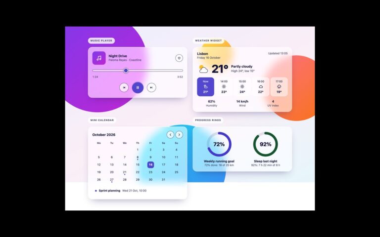
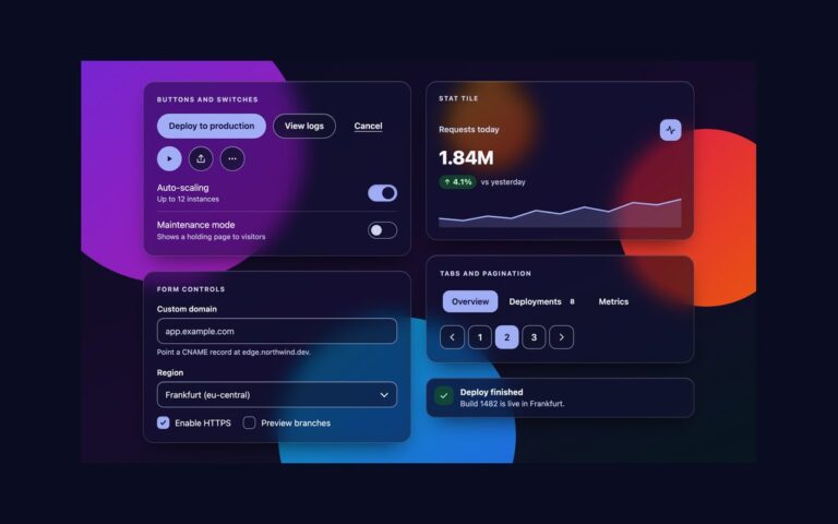
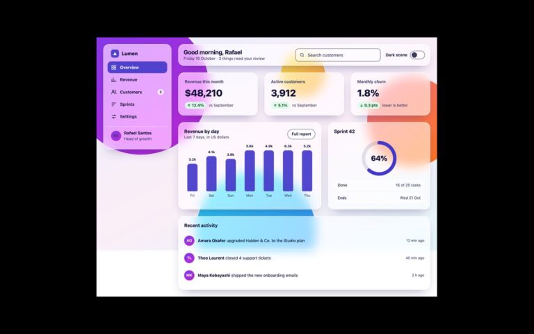
The buttons and toggles of the uiCookies glassmorphism UI kit, shown on the kit’s signature scene of gradient orbs. Glass buttons come as a frosted default, a tinted accent button for the main action, a quiet text button, small and large sizes, a button with an icon and a disabled state. Icon buttons are round frosted controls with an accent play button. Switches are real checkboxes with role=”switch” in a settings list, each with a label and a line of help text, and the segmented controls are radio groups for a calendar view and a billing period. The frost is backdrop-filter: blur() with saturate() over a translucent white tint. What keeps it readable is the tint strength: panels are 60 percent opaque, so dark text stays above 4.5:1 even over the violet orb, and every control has a dark –glass-edge border that keeps a 3:1 boundary whatever colour sits behind it. The switch knob is dark when off and light when on, so the state never depends on colour alone. Every set starts with the same block of design tokens: –scene-base and –scene-1 to –scene-4 for the background, and –glass-tint, –glass-alpha, –glass-blur, –glass-border, –glass-edge, –glass-highlight, –glass-shadow, –glass-ink and –glass-accent for the glass.
What’s included
Frosted, accent, quiet, small, large, icon and disabled glass buttons
Round icon buttons with accessible names
Switches built on checkboxes with role="switch" and visible labels
Segmented controls built on native radio groups
Shared design tokens identical across all eight sets
Accessibility
Every button has visible text or an aria-label, and each switch is a native checkbox with role="switch" inside its label, so it is announced with its name and on or off state. All text was measured at 4.5:1 or more against the darkest and lightest orb colours behind the glass, and button and switch boundaries at 3:1. Focus shows a 3px outline, transitions stop under prefers-reduced-motion, the glass turns almost opaque under prefers-reduced-transparency or without backdrop-filter support, and borders turn solid under prefers-contrast: more.
Customise it
Change --glass-accent-bg, --glass-edge, --glass-alpha and --glass-blur in the token block to retheme every button and switch. In Bootstrap they feed the --bs-btn-* variables and --bs-form-switch-bg; in Tailwind use the bg-accent-glass, border-glass-edge and bg-glass-control utilities.