About this set
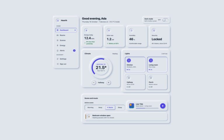
A navbar, a sidebar, tabs and pagination that share one rule for where you are: the current item is pressed into the surface, turns accent, gains an accent edge, and adds a mark that does not rely on colour, either an underline bar or a dot. The navbar carries a brand, four links and two round actions, and moves its links onto their own row on narrow screens. The sidebar groups links under Home and Account headings and shows an unread count as text. The tabs switch between four rooms, each panel listing devices with an On or Off tag, and follow the ARIA tabs pattern: arrow keys, Home and End move between tabs and only the selected tab sits in the Tab order. Pagination uses round page buttons with a filled current page and named previous and next buttons. Use the navbar and sidebar together for an app shell, and the tabs where several panels share one space. The plain and Tailwind tabs use about twenty lines of vanilla JavaScript; the Bootstrap version uses Bootstrap’s own tab plugin.
What’s included
- Current item shown by pressed shape, accent colour and a bar or dot
- aria-current on the navbar, sidebar and pagination
- ARIA tabs with arrow key, Home and End support
- Pagination with named previous, next and page links
- Bootstrap version on .navbar, .nav-pills, .pagination and the tab plugin
Accessibility
Each navigation region is a nav element with its own label, the current page is marked with aria-current="page", and page links read as Page 3 rather than a bare number. Tabs use role="tablist", "tab" and "tabpanel" with aria-selected, aria-controls and a roving tabindex. Every link, tab and panel shows a 3px accent focus ring, and transitions stop under prefers-reduced-motion.
Customise it
Edit the --neu-* tokens for colour and depth. In Bootstrap the rules set --bs-navbar-*, --bs-nav-pills-* and --bs-pagination-* from the tokens; in Tailwind the current state uses aria-[current=page]: and aria-selected: variants with shadow-neu-in-sm and text-neu-accent.