/* ── Neumorphism UI kit tokens (uiCookies) — identical in every set ──────────────
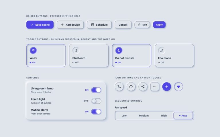
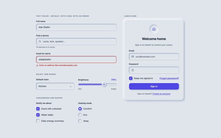
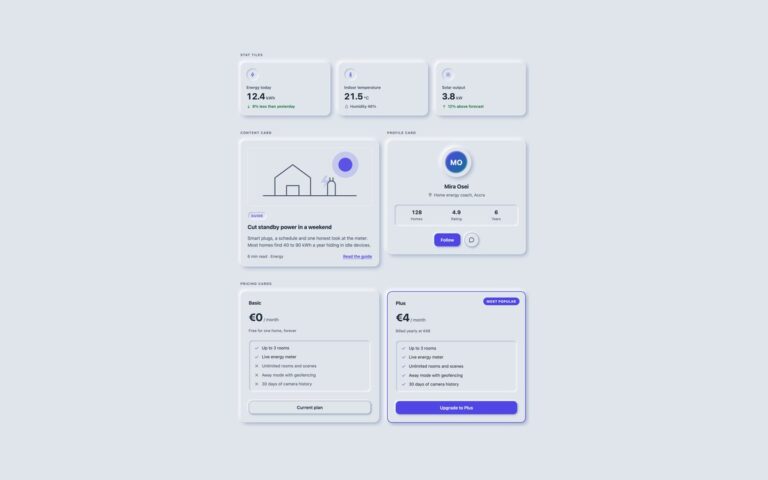
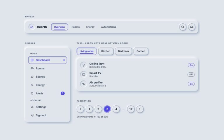
   Every component is moulded from --neu-bg and lit from the top left. Change a token and
   the whole kit follows; the shadow recipes below are built from these values. */
:root{
  --neu-bg:#e0e5ec;          /* the one surface colour */
  --neu-light:#ffffff;       /* highlight, top left */
  --neu-dark:#a3b1c6;        /* shade, bottom right */
  --neu-distance:6px;        /* how far a shape rises */
  --neu-blur:14px;           /* how soft its shadow is */
  --neu-radius:18px;         /* cards; buttons use .75 of it, fields .6 */
  --neu-accent:#4f46e5;      /* focus ring and on / selected / current states, 4.9:1 on --neu-bg */
  --neu-on-accent:#ffffff;   /* text and marks on accent fills, 6.3:1 */
  --neu-ink:#1f2937;         /* text, 11.6:1 */
  --neu-muted:#4a5568;       /* secondary text, 5.9:1 */
  --neu-edge:#74819a;        /* control boundary (fields, tracks, boxes, buttons), 3.1:1 */
  --neu-line:rgba(255,255,255,.6); /* decorative edge on cards and panels */
  --neu-bw:1px;              /* control border width */
  --neu-success:#126b35;--neu-warning:#8a5300;--neu-danger:#b42318;
}
/* Dark neumorphism: data-neu="dark" on any wrapper, or a checked .neu-theme-input inside a [data-neu] element.
   :is() is a forgiving list, so browsers without :has() still apply data-neu="dark" */
[data-neu]:is([data-neu="dark"],:has(.neu-theme-input:checked)){
  --neu-bg:#262b33;--neu-light:#323944;--neu-dark:#14171c;
  --neu-accent:#8f88ff;--neu-on-accent:#14161b;--neu-ink:#e7ebf2;--neu-muted:#aab4c3;--neu-edge:#717d90;
  --neu-line:rgba(255,255,255,.06);--neu-success:#6fdc9a;--neu-warning:#f3c164;--neu-danger:#ff8f84;color-scheme:dark}
/* More contrast requested: the soft shadows go, every control and panel gets a solid outline */
@media (prefers-contrast:more){:root,[data-neu]:is([data-neu],:has(.neu-theme-input:checked)){
  --neu-light:transparent;--neu-dark:transparent;--neu-edge:var(--neu-ink);--neu-line:var(--neu-ink);--neu-muted:var(--neu-ink);--neu-bw:2px}}
:root,[data-neu]{
  --neu-raised:var(--neu-distance) var(--neu-distance) var(--neu-blur) var(--neu-dark),calc(var(--neu-distance)*-1) calc(var(--neu-distance)*-1) var(--neu-blur) var(--neu-light);
  --neu-raised-sm:calc(var(--neu-distance)*.5) calc(var(--neu-distance)*.5) calc(var(--neu-blur)*.5) var(--neu-dark),calc(var(--neu-distance)*-.5) calc(var(--neu-distance)*-.5) calc(var(--neu-blur)*.5) var(--neu-light);
  --neu-inset:inset calc(var(--neu-distance)*.6) calc(var(--neu-distance)*.6) calc(var(--neu-blur)*.6) var(--neu-dark),inset calc(var(--neu-distance)*-.6) calc(var(--neu-distance)*-.6) calc(var(--neu-blur)*.6) var(--neu-light);
  --neu-inset-sm:inset calc(var(--neu-distance)*.35) calc(var(--neu-distance)*.35) calc(var(--neu-blur)*.35) var(--neu-dark),inset calc(var(--neu-distance)*-.35) calc(var(--neu-distance)*-.35) calc(var(--neu-blur)*.35) var(--neu-light);
}
[data-neu]{background:var(--neu-bg);color:var(--neu-ink)}
/* The tokens above, exposed as Tailwind utilities: bg-neu-bg, text-neu-muted, border-neu-edge,
   shadow-neu, shadow-neu-sm, shadow-neu-in, shadow-neu-in-sm, rounded-neu, rounded-neu-btn, rounded-neu-field… */
@theme inline {
  --color-neu-bg: var(--neu-bg); --color-neu-ink: var(--neu-ink); --color-neu-muted: var(--neu-muted);
  --color-neu-edge: var(--neu-edge); --color-neu-line: var(--neu-line);
  --color-neu-accent: var(--neu-accent); --color-neu-on-accent: var(--neu-on-accent);
  --color-neu-success: var(--neu-success); --color-neu-warning: var(--neu-warning); --color-neu-danger: var(--neu-danger);
  --shadow-neu: var(--neu-raised); --shadow-neu-sm: var(--neu-raised-sm);
  --shadow-neu-in: var(--neu-inset); --shadow-neu-in-sm: var(--neu-inset-sm);
  --radius-neu: var(--neu-radius); --radius-neu-btn: calc(var(--neu-radius) * .75); --radius-neu-field: calc(var(--neu-radius) * .6);
}
About this set
The same kit on a dark surface, switched by one attribute. Put data-neu=”dark” on any wrapper and the shared tokens change to a slate background, a soft highlight and a deep shade, a lavender accent with dark text on it, and lighter body and secondary text, so every component in the kit follows without its own dark rules. This set shows buttons and icon buttons, quick toggle tiles, switch rows, a search field, a segmented control, two stat tiles, a mini player with a progress groove and a play toggle, and two progress rings. Dark neumorphism tends to fail on contrast because the shadows that make it are close to the background; here the text keeps 4.5:1, control edges keep 3:1 against the dark surface, and the focus ring and on states use the lighter accent so they stay visible. Use it for night modes, media apps and dashboards that live in dim rooms. Bootstrap adds data-bs-theme=”dark” next to data-neu so its own components match, and Tailwind needs no dark: classes because the utilities read the tokens.
What’s included
One attribute, data-neu="dark", re-themes every component
Dark tokens checked for 4.5:1 text and 3:1 control edges
Buttons, toggles, switches, field, segmented control, tiles, player and rings
Accent fills switch to dark text to keep contrast
Works with Bootstrap's data-bs-theme="dark"
Accessibility
Every control keeps its native semantics and its name from the light kit, and the on state is still shown by shape, accent colour and text. The focus ring uses the lighter dark-mode accent, the mini player's play control is a named checkbox and its progress is a labelled progressbar. Transitions stop under prefers-reduced-motion and prefers-contrast: more draws solid outlines in light ink.
Customise it
Edit the [data-neu] dark token rule in the block at the top; the light values are on :root. Bootstrap reads the same tokens through the --bs-* mapping, and Tailwind's bg-neu-bg, text-neu-ink and shadow-neu utilities change with them.