Open demo

CSS code

HTML
<div><span class="lbl">Plan picker</span><div class="rcards" role="radiogroup" aria-label="Plan">
<label class="rc"><input type="radio" name="p"><b>Starter</b><span class="rc-price">£0</span>
<small>Up to 3 projects</small></label>
<label class="rc"><input type="radio" name="p" checked><b>Studio</b><span class="rc-price">£24</span>
<small>Unlimited projects</small></label>
<label class="rc"><input type="radio" name="p"><b>Agency</b><span class="rc-price">£79</span>
<small>Everything, plus seats</small></label>
</div></div>
<div><span class="lbl">Icon tiles</span><div class="icons" role="radiogroup" aria-label="Layout">
<label class="ic"><input type="radio" name="i" checked><span class="ic-glyph" aria-hidden="true">◧</span><span class="ic-text">Grid</span></label>
<label class="ic"><input type="radio" name="i"><span class="ic-glyph" aria-hidden="true">☰</span><span class="ic-text">List</span></label>
<label class="ic"><input type="radio" name="i"><span class="ic-glyph" aria-hidden="true">▦</span><span class="ic-text">Compact</span></label>
</div></div>
<div><span class="lbl">Highlighted rows</span><div class="rrows" role="radiogroup" aria-label="Payment method">
<label class="rrow"><input type="radio" name="r" checked><span class="rd"></span><span>Card ending 4242</span></label>
<label class="rrow"><input type="radio" name="r"><span class="rd"></span><span>PayPal</span></label>
<label class="rrow"><input type="radio" name="r"><span class="rd"></span><span>Bank transfer</span></label>
</div></div>
CSS
.rc input,.ic input,.rrow input{position:absolute;opacity:0;width:0;height:0}

/* plan picker */
.rcards{display:flex;gap:14px;flex-wrap:wrap}
.rc{position:relative;border:1px solid #e2e8f0;border-radius:13px;padding:17px 19px;background:#fff;cursor:pointer;
  min-width:180px;display:block;font-size:.92rem;transition:border-color .16s,box-shadow .16s}
.rc:has(input:checked){border-color:#2563eb;box-shadow:0 0 0 3px #dbeafe}
.rc:has(input:focus-visible){outline:2px solid #2563eb;outline-offset:2px}
.rc b{display:block;font-size:.95rem;margin-bottom:4px}
.rc-price{font-size:1.45rem;font-weight:700;letter-spacing:-.01em}
.rc small{display:block;font-size:.78rem;color:#64748b;margin-top:5px}

/* icon tiles */
.icons{display:flex;gap:11px;flex-wrap:wrap}
.ic{position:relative;border:1px solid #e2e8f0;border-radius:12px;padding:15px 20px;background:#fff;cursor:pointer;
  text-align:center;min-width:104px;transition:background .16s,border-color .16s,color .16s}
.ic:has(input:checked){border-color:#0f172a;background:#0f172a;color:#fff}
.ic:has(input:focus-visible){outline:2px solid #2563eb;outline-offset:2px}
.ic-glyph{display:block;font-size:1.5rem;margin-bottom:7px}
.ic-text{font-size:.8rem}

/* highlighted rows */
.rrows{border:1px solid #e2e8f0;border-radius:12px;overflow:hidden;background:#fff;max-width:430px}
.rrow{position:relative;display:flex;align-items:center;gap:11px;padding:13px 17px;border-bottom:1px solid #f1f5f9;
  width:100%;cursor:pointer;font-size:.92rem}
.rrow:last-child{border-bottom:0}
.rrow:has(input:checked){background:#eff6ff}
.rd{width:20px;height:20px;border:2px solid #64748b;border-radius:50%;position:relative;flex:none}
.rd::after{content:"";position:absolute;inset:4px;border-radius:50%;background:#2563eb;
  transform:scale(0);transition:transform .16s}
.rrow input:checked+.rd{border-color:#2563eb}
.rrow input:checked+.rd::after{transform:scale(1)}
.rrow input:focus-visible+.rd{outline:2px solid #2563eb;outline-offset:2px}

@media(prefers-reduced-motion:reduce){.rc,.ic,.rd::after{transition:none}}

Bootstrap 5 code

Requires: Bootstrap 5.3.8 CSS

HTML
<div><span class="lbl">Plan picker</span><div class="d-flex flex-wrap gap-3" role="radiogroup" aria-label="Plan">
<input type="radio" class="btn-check" name="p" id="p1"><label class="card choice-plan" for="p1"><b>Starter</b><span class="choice-plan-price">£0</span>
<small>Up to 3 projects</small></label>
<input type="radio" class="btn-check" name="p" id="p2" checked><label class="card choice-plan" for="p2"><b>Studio</b><span class="choice-plan-price">£24</span>
<small>Unlimited projects</small></label>
<input type="radio" class="btn-check" name="p" id="p3"><label class="card choice-plan" for="p3"><b>Agency</b><span class="choice-plan-price">£79</span>
<small>Everything, plus seats</small></label>
</div></div>
<div><span class="lbl">Icon tiles</span><div class="d-flex flex-wrap gap-2" role="radiogroup" aria-label="Layout">
<input type="radio" class="btn-check" name="i" id="i1" checked><label class="btn btn-icon" for="i1"><span class="btn-icon-glyph" aria-hidden="true">◧</span><span class="btn-icon-text">Grid</span></label>
<input type="radio" class="btn-check" name="i" id="i2"><label class="btn btn-icon" for="i2"><span class="btn-icon-glyph" aria-hidden="true">☰</span><span class="btn-icon-text">List</span></label>
<input type="radio" class="btn-check" name="i" id="i3"><label class="btn btn-icon" for="i3"><span class="btn-icon-glyph" aria-hidden="true">▦</span><span class="btn-icon-text">Compact</span></label>
</div></div>
<div><span class="lbl">Highlighted rows</span><div class="list-group choice-rows" role="radiogroup" aria-label="Payment method">
<label class="list-group-item"><input class="form-check-input" type="radio" name="r" checked><span>Card ending 4242</span></label>
<label class="list-group-item"><input class="form-check-input" type="radio" name="r"><span>PayPal</span></label>
<label class="list-group-item"><input class="form-check-input" type="radio" name="r"><span>Bank transfer</span></label>
</div></div>
CSS
/* plan picker: a Bootstrap .card behind a visually hidden .btn-check radio */
.choice-plan{--choice-accent:#2563eb;--bs-card-bg:#fff;--bs-card-border-color:#e2e8f0;--bs-card-border-radius:13px;
  padding:17px 19px;min-width:180px;cursor:pointer;font-size:.92rem;line-height:1.3;transition:border-color .16s,box-shadow .16s}
.btn-check:checked+.choice-plan{--bs-card-border-color:var(--choice-accent);box-shadow:0 0 0 3px #dbeafe}
.btn-check:focus-visible+.choice-plan{outline:2px solid var(--choice-accent);outline-offset:2px}
.choice-plan b{font-size:.95rem;margin-bottom:4px}
.choice-plan-price{font-size:1.45rem;font-weight:700;letter-spacing:-.01em}
.choice-plan small{font-size:.78rem;color:#64748b;margin-top:5px}

/* icon tiles: Bootstrap's .btn-check toggle buttons */
.btn-icon{--bs-btn-bg:#fff;--bs-btn-color:#1e293b;--bs-btn-border-color:#e2e8f0;--bs-btn-border-radius:12px;
  --bs-btn-padding-x:20px;--bs-btn-padding-y:15px;--bs-btn-line-height:1.2;
  --bs-btn-hover-bg:#fff;--bs-btn-hover-color:#1e293b;--bs-btn-hover-border-color:#cbd5e1;
  --bs-btn-active-bg:#0f172a;--bs-btn-active-color:#fff;--bs-btn-active-border-color:#0f172a;min-width:104px}
.btn-check:focus-visible+.btn-icon{box-shadow:none;outline:2px solid #2563eb;outline-offset:2px}
.btn-icon-glyph{display:block;font-size:1.5rem;margin-bottom:7px}
.btn-icon-text{font-size:.8rem}

/* highlighted rows: Bootstrap .list-group with radios */
.choice-rows{--choice-accent:#2563eb;--bs-list-group-bg:#fff;--bs-list-group-color:#1e293b;--bs-list-group-border-color:#e2e8f0;
  --bs-list-group-border-radius:12px;--bs-list-group-item-padding-x:17px;--bs-list-group-item-padding-y:13px;max-width:430px;font-size:.92rem}
.choice-rows .list-group-item{display:flex;align-items:center;gap:11px;cursor:pointer;line-height:1.3}
.choice-rows .list-group-item:not(:last-child){border-bottom-color:#f1f5f9}
.choice-rows .list-group-item:has(.form-check-input:checked){background:#eff6ff}
.choice-rows .form-check-input{--bs-form-check-bg:#fff;float:none;margin:0;width:20px;height:20px;flex:none;
  border:2px solid #64748b;cursor:pointer}
.choice-rows .form-check-input:checked{background-color:#fff;border-color:var(--choice-accent);
  --bs-form-check-bg-image:url("data:image/svg+xml,%3csvg xmlns='http://www.w3.org/2000/svg' viewBox='-4 -4 8 8'%3e%3ccircle r='2.25' fill='%232563eb'/%3e%3c/svg%3e")}
.choice-rows .form-check-input:focus{box-shadow:none}
.choice-rows .form-check-input:not(:checked):focus{border-color:#64748b}
.choice-rows .form-check-input:focus-visible{outline:2px solid var(--choice-accent);outline-offset:2px}

@media(prefers-reduced-motion:reduce){.choice-plan{transition:none}}

Tailwind 4 code

Requires: Tailwind CSS 4

HTML
<div><span class="mb-4 block text-[.72rem] tracking-[.12em] text-slate-500 uppercase">Plan picker</span><div class="flex flex-wrap gap-3.5" role="radiogroup" aria-label="Plan">
<label class="relative block min-w-[180px] cursor-pointer rounded-[13px] border border-slate-200 bg-white px-[19px] py-[17px] text-[.92rem] leading-snug transition-[border-color,box-shadow] duration-150 has-[:checked]:border-blue-600 has-[:checked]:ring-3 has-[:checked]:ring-blue-100 has-[:focus-visible]:outline-2 has-[:focus-visible]:outline-offset-2 has-[:focus-visible]:outline-blue-600 motion-reduce:transition-none"><input type="radio" name="p" class="sr-only"><b class="mb-1 block text-[.95rem]">Starter</b><span class="text-[1.45rem] font-bold tracking-[-.01em]">£0</span>
<small class="mt-[5px] block text-[.78rem] text-slate-500">Up to 3 projects</small></label>
<label class="relative block min-w-[180px] cursor-pointer rounded-[13px] border border-slate-200 bg-white px-[19px] py-[17px] text-[.92rem] leading-snug transition-[border-color,box-shadow] duration-150 has-[:checked]:border-blue-600 has-[:checked]:ring-3 has-[:checked]:ring-blue-100 has-[:focus-visible]:outline-2 has-[:focus-visible]:outline-offset-2 has-[:focus-visible]:outline-blue-600 motion-reduce:transition-none"><input type="radio" name="p" class="sr-only" checked><b class="mb-1 block text-[.95rem]">Studio</b><span class="text-[1.45rem] font-bold tracking-[-.01em]">£24</span>
<small class="mt-[5px] block text-[.78rem] text-slate-500">Unlimited projects</small></label>
<label class="relative block min-w-[180px] cursor-pointer rounded-[13px] border border-slate-200 bg-white px-[19px] py-[17px] text-[.92rem] leading-snug transition-[border-color,box-shadow] duration-150 has-[:checked]:border-blue-600 has-[:checked]:ring-3 has-[:checked]:ring-blue-100 has-[:focus-visible]:outline-2 has-[:focus-visible]:outline-offset-2 has-[:focus-visible]:outline-blue-600 motion-reduce:transition-none"><input type="radio" name="p" class="sr-only"><b class="mb-1 block text-[.95rem]">Agency</b><span class="text-[1.45rem] font-bold tracking-[-.01em]">£79</span>
<small class="mt-[5px] block text-[.78rem] text-slate-500">Everything, plus seats</small></label>
</div></div>
<div><span class="mb-4 block text-[.72rem] tracking-[.12em] text-slate-500 uppercase">Icon tiles</span><div class="flex flex-wrap gap-[11px]" role="radiogroup" aria-label="Layout">
<label class="relative min-w-[104px] cursor-pointer rounded-xl border border-slate-200 bg-white px-5 py-[15px] text-center leading-tight transition-[background-color,border-color,color] duration-150 has-[:checked]:border-slate-900 has-[:checked]:bg-slate-900 has-[:checked]:text-white has-[:focus-visible]:outline-2 has-[:focus-visible]:outline-offset-2 has-[:focus-visible]:outline-blue-600 motion-reduce:transition-none"><input type="radio" name="i" class="sr-only" checked><span class="mb-[7px] block text-[1.5rem]" aria-hidden="true">◧</span><span class="text-[.8rem]">Grid</span></label>
<label class="relative min-w-[104px] cursor-pointer rounded-xl border border-slate-200 bg-white px-5 py-[15px] text-center leading-tight transition-[background-color,border-color,color] duration-150 has-[:checked]:border-slate-900 has-[:checked]:bg-slate-900 has-[:checked]:text-white has-[:focus-visible]:outline-2 has-[:focus-visible]:outline-offset-2 has-[:focus-visible]:outline-blue-600 motion-reduce:transition-none"><input type="radio" name="i" class="sr-only"><span class="mb-[7px] block text-[1.5rem]" aria-hidden="true">☰</span><span class="text-[.8rem]">List</span></label>
<label class="relative min-w-[104px] cursor-pointer rounded-xl border border-slate-200 bg-white px-5 py-[15px] text-center leading-tight transition-[background-color,border-color,color] duration-150 has-[:checked]:border-slate-900 has-[:checked]:bg-slate-900 has-[:checked]:text-white has-[:focus-visible]:outline-2 has-[:focus-visible]:outline-offset-2 has-[:focus-visible]:outline-blue-600 motion-reduce:transition-none"><input type="radio" name="i" class="sr-only"><span class="mb-[7px] block text-[1.5rem]" aria-hidden="true">▦</span><span class="text-[.8rem]">Compact</span></label>
</div></div>
<div><span class="mb-4 block text-[.72rem] tracking-[.12em] text-slate-500 uppercase">Highlighted rows</span><div class="max-w-[430px] divide-y divide-slate-100 overflow-hidden rounded-xl border border-slate-200 bg-white" role="radiogroup" aria-label="Payment method">
<label class="relative flex w-full cursor-pointer items-center gap-[11px] px-[17px] py-[13px] text-[.92rem] leading-snug has-[:checked]:bg-blue-50"><input type="radio" name="r" class="peer sr-only" checked><span class="relative size-5 flex-none rounded-full border-2 border-slate-500 peer-checked:border-blue-600 peer-focus-visible:outline-2 peer-focus-visible:outline-offset-2 peer-focus-visible:outline-blue-600 after:absolute after:inset-1 after:scale-0 after:rounded-full after:bg-blue-600 after:transition-[scale] after:duration-150 after:content-[''] peer-checked:after:scale-100 motion-reduce:after:transition-none"></span><span>Card ending 4242</span></label>
<label class="relative flex w-full cursor-pointer items-center gap-[11px] px-[17px] py-[13px] text-[.92rem] leading-snug has-[:checked]:bg-blue-50"><input type="radio" name="r" class="peer sr-only"><span class="relative size-5 flex-none rounded-full border-2 border-slate-500 peer-checked:border-blue-600 peer-focus-visible:outline-2 peer-focus-visible:outline-offset-2 peer-focus-visible:outline-blue-600 after:absolute after:inset-1 after:scale-0 after:rounded-full after:bg-blue-600 after:transition-[scale] after:duration-150 after:content-[''] peer-checked:after:scale-100 motion-reduce:after:transition-none"></span><span>PayPal</span></label>
<label class="relative flex w-full cursor-pointer items-center gap-[11px] px-[17px] py-[13px] text-[.92rem] leading-snug has-[:checked]:bg-blue-50"><input type="radio" name="r" class="peer sr-only"><span class="relative size-5 flex-none rounded-full border-2 border-slate-500 peer-checked:border-blue-600 peer-focus-visible:outline-2 peer-focus-visible:outline-offset-2 peer-focus-visible:outline-blue-600 after:absolute after:inset-1 after:scale-0 after:rounded-full after:bg-blue-600 after:transition-[scale] after:duration-150 after:content-[''] peer-checked:after:scale-100 motion-reduce:after:transition-none"></span><span>Bank transfer</span></label>
</div></div>

About this set

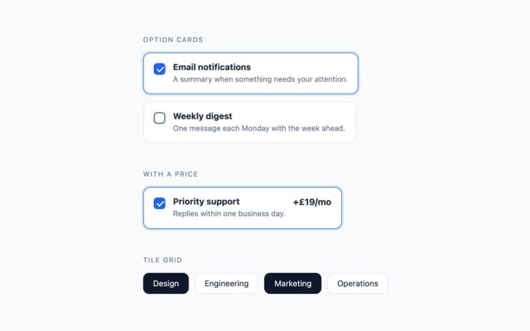
One-of-many choices presented as cards. The plan picker shows three pricing cards with a name, a price and a line of detail; the selected plan gets a blue border and a soft ring. The icon tiles offer view layouts as square tiles with a symbol and a caption, and the selected tile fills dark. The highlighted rows list payment methods in a bordered panel, with a visible radio circle and a tinted background on the selected row. Use cards when each option needs a little more than a word, and rows when the options are long or there are many of them. Every card is a label around a real radio input, and all options in a group share a name, so the browser keeps exactly one selected. The selected and focused styles come from :has() on the label. The Bootstrap version pairs a visually hidden .btn-check radio with a .card or .btn label and uses a .list-group for the rows. The Tailwind version uses has-[:checked] on the label and peer-checked on the row circles.

What’s included

  • Plan picker cards with prices
  • Icon tiles that fill when selected
  • Payment rows with a highlighted selection
  • Whole card is the click target
  • Bootstrap version uses .btn-check, .card and .list-group

Accessibility

Each group has role="radiogroup" and an aria-label, and each card's visible text forms its accessible name; the icon glyphs are aria-hidden so they are not read out. Tab enters a group and the arrow keys move the selection. The focused card or tile shows a 2px blue outline, and in the rows the outline is drawn around the radio circle. Transitions are disabled under prefers-reduced-motion.

Customise it

Plain CSS: change #2563eb and #dbeafe in the .rc:has(input:checked) rule, #0f172a for the tiles and #eff6ff for the selected row. Bootstrap: set --choice-accent on .choice-plan and .choice-rows and the --bs-btn-active-* variables on .btn-icon. Tailwind: swap blue-600, blue-100, blue-50 and slate-900 in the has-[:checked] classes.